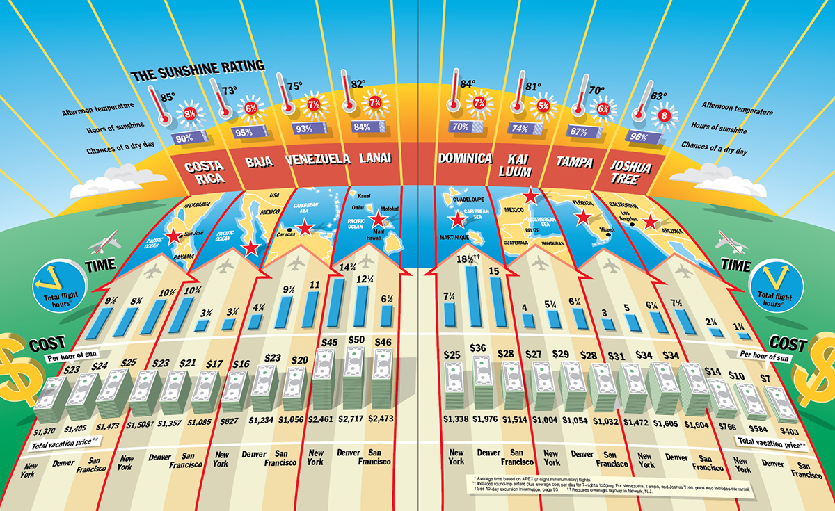
NOT ONE OF MY FINEST MOMENTS.

We have all probably had an infographic (or several) that failed. Perhaps the original concept was flawed, the information was of poor quality, or the execution let the project down. In my career, I have had numerous misfires. They have mostly been deleted, or consigned to old and (hopefully) unreliable hard drives. This is one of the most memorable examples. It’s from my “Looney Tunes” period, complete with wacky perspective, drop shadows, and assorted other types of graphic gimmickry. It is clearly an infographic that cannot be trusted.
In fact, while it was in the preliminary stages, Alexander Liberman, the legendary editorial director of Condé Nast, summoned me to his office (for the one and only time) to explain it. And somehow, in a feat of surprising infographic gusto, I managed to persuade him that it was showing something worthwhile. However, his initial reservations subsequently turned out to be entirely justified.
Once the pain of an infographic screw-up like this has subsided, it’s time to learn from the experience and move forward. Fortunately, I had better moments at Condé Nast, but I remembered this nightmare.

One comment
Comments are closed.