SIMPLER MIGHT SOMETIMES BE BETTER.

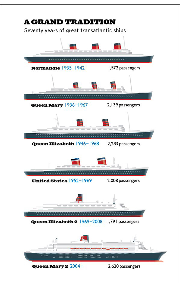
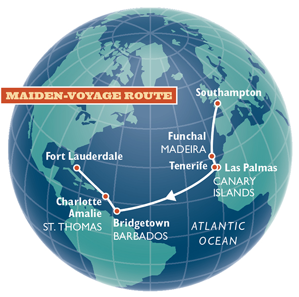
I didn’t make this ocean liner comparison as a free-standing graphic. It was part of a big, and much too complicated, display about the Queen Mary 2 (shown lower down this post). I’m now thinking that this historical timeline captured the main point of the feature. (The ships are drawn to the same scale.) It was interesting to know where the QM2 was sailing on it’s maiden voyage, and the globe addresses that aspect. (It ran on another page of the feature.) These two small graphics would probably have been enough, but I was a graphics director, and I wanted to make a statement.

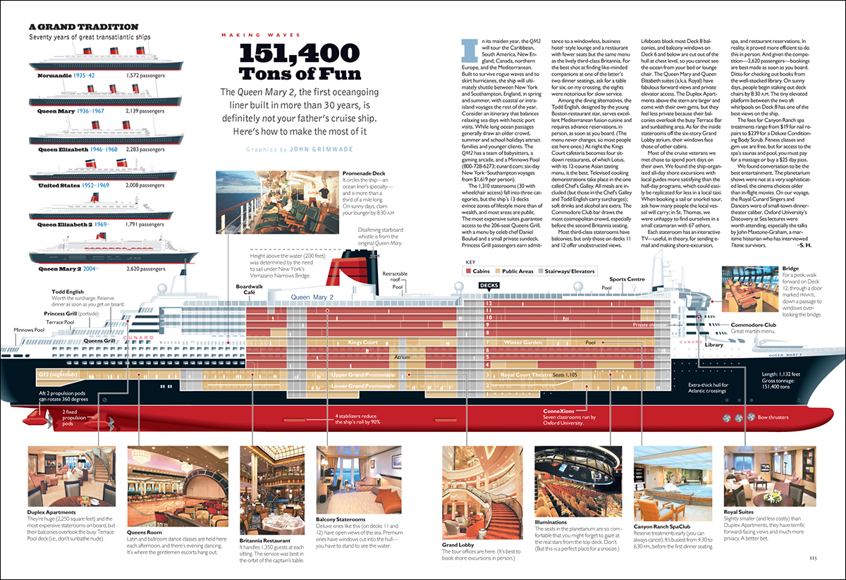
So… I wonder how many times I’ve made infographics that are more dense than they need to be? I collected a lot of information for the graphic below, but I didn’t have to use it. The lower section of the spread looks like it might be from a cruise brochure. And apart from the overcrowding, an elevation view doesn’t give enough of an idea about the interior spaces of the ship. That’s obviously why this type of rendering is usually a three-quarter view. (Which is a hell of a lot harder to create!)

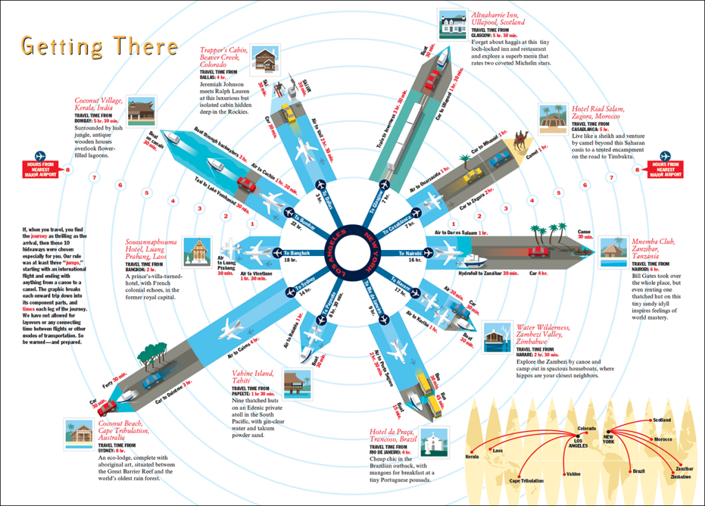
This travel graphic is another example of too much information. I meant well, but I was carried away by the enthusiasm of wanting to show everything. I worry that presentations like this might alienate readers, to whom it could seem like too much hard work.

