Category: Design

Clearview

A BATTLE BETWEEN TWO HIGHWAY TYPEFACES.

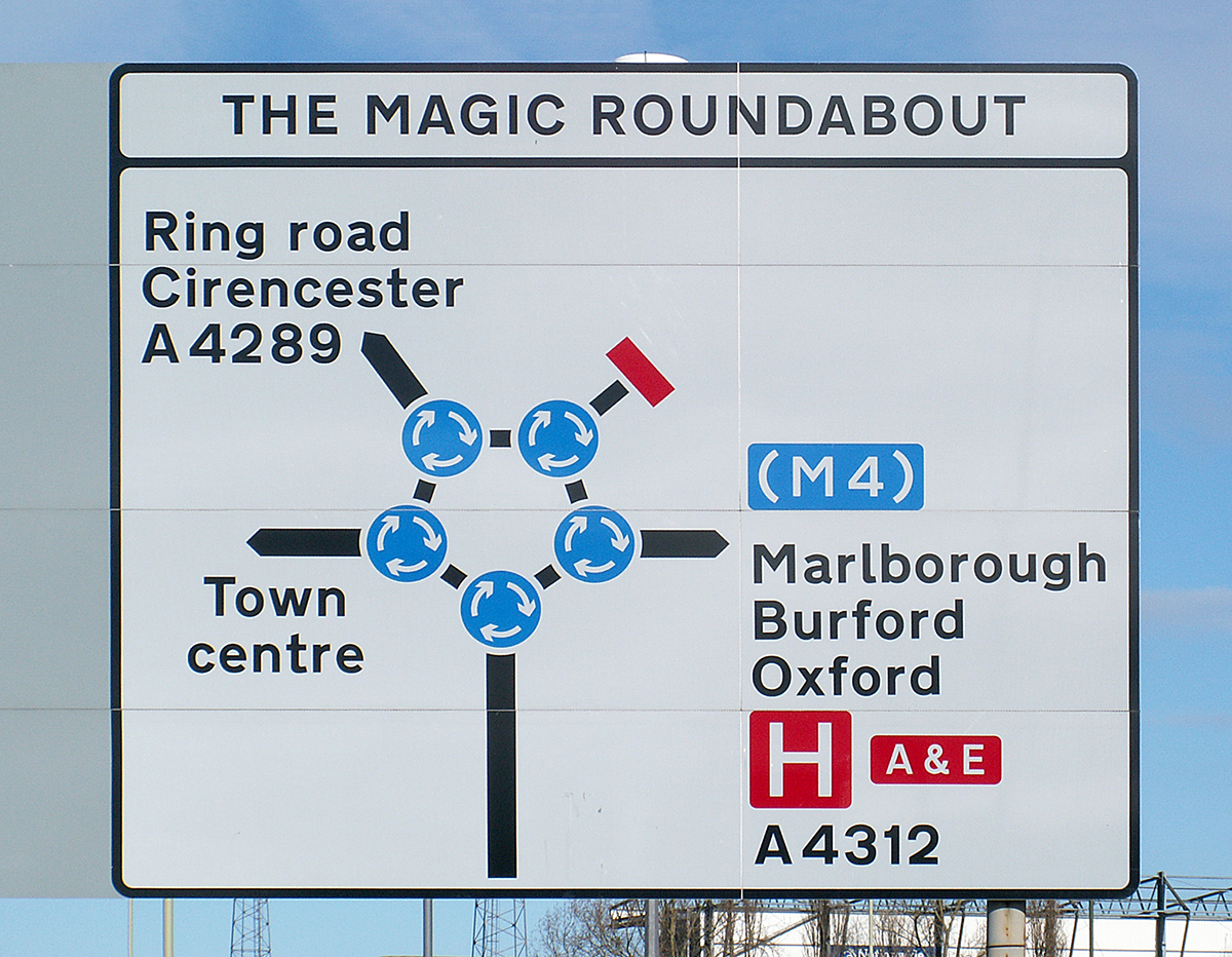
There are countless signs in the U.S. National Highway System, and the typeface that is used on them is the subject of a long-running argument about the attributes of two informational fonts.

Typeface upgrade In the 1990s, Clearview (or ClearviewHwy) was designed to replace the existing road sign typeface, the Standard Highway Alphabet (or Highway Gothic). That font dates from the 1940s. Initial testing showed Clearview to be 2 to 8 percent more legible. A later test showed an improvement of as much as 12 percent. Unfortunately, further testing suggested that it might not be as effective at night as the original signs, despite the fact that a goal of the new design was to reduce excessive glow on reflective signs.

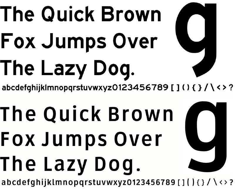
Upper and lower The existing road sign typefaces were used in a system where originally almost every word was capitalized. Clearview was designed to address the use of uppercase and lowercase characters with larger counter spaces and increased x-height. The space inside letters like “e,” “a” and “d” is much larger. The overall effect is intended to be increased legibility. Below, Highway Gothic and Clearview alphabets compared.

On and off In 2004, Clearview was provisionally approved by the Federal Highway Administration for use on positive signs (light characters on a dark background). But it was never approved for black on a light background, although some agencies used it this way. By 2014, there was a government-level move to stop using it, and by 2016 it was deauthorized. However, a bill was introduced in April this year asking Congress to approve Clearview for positive contrast signs.

In 2011, Clearview became the first digital font to be made part of the Cooper Hewitt, Smithsonian Design Museum. It has had some non-highway use, such as AT&T corporate applications and advertising, and signs at Dallas-Fort Worth International Airport.

Mixed signage Some states use Clearview and some states don’t. Ohio, where I live, had switched a lot of signs to Clearview, and now it’s started switching back to Highway Gothic (a process that will take decades). Many states have some signs in each font, due to the replacement of signs during different stages of the Clearview approval/non-approval process.

Money Clearview, unlike Highway Gothic, is not free. It’s licensed to state agencies. Is this a factor in it’s difficult path to acceptance? It’s been suggested that it might be the case.

Clearview was designed by Meeker & Associates and Terminal Design: http://www.terminaldesign.com/fonts/clearviewhwy-complete-family/


Illusion

DECEIVING THE EYE.

Space master Felice Varini creates geometric images, in public spaces, that defy our visual logic. His team uses a projector and stencils to painstakingly put each distorted component in the correct place. When viewed from a precise position, it all locks together for a spectacular effect. This example was installed on the Grand Palais in Paris. http://www.varini.org


The same squares
A and B are identical. It’s all a matter of contrast.

Old favorite We all know this kind of image. Two faces or a white vase?


Motion
Strangely transfixing.


Not motion
 This is a static image. Where’s the Dramamine?


Dinner table
Everything appears to be sinking into the dining table with this completely flat placemat. goo.gl/VbQ3oY


Illustrations that bend reality 
Below, by Robert Gonsalves.

An example of the very popular work of M.C. Escher.

Chalk artists know how to manipulate perspective. By Edgar Mueller.

Maze and labyrinth

WAYFINDING PUZZLES.

Classic hedge maze The Longleat Maze in Wiltshire (England) has viewing bridges that give people an overview before they return to the pathways between tall hedges. Photograph by Niki Odolphie.

Definitions A maze has multiple entrances and exits, choices of direction, and dead-ends. A labyrinth has only one way in and one way out.

Garden labyrinth Below, the Edinburgh Labyrinth (Scotland) in George Square Gardens. Photograph by Di Williams.

World’s largest The Guinness Book of Records lists The Maze of Butterfly Lovers in Ningbo, China, as the largest permanent hedge maze, with a total path length of 8.38 km (5.2 miles). It opened in April this year. Designed by Adrian Fisher, it contains the shapes of two butterflies. Adrian has designed hundreds of mazes and puzzles (in various formats) all over the world. Image from Google Maps.


Labyrinth project
As a celebration of the 150th anniversary of the London Underground in 2013, Mark Wallinger created a unique enamel labyrinth for every one of the 270 stations. They’re a connection to the system’s history of classic graphic design, and reflect the idea of entering the labyrinth of walkways and tunnels that make up a journey.


Photograph by Jack Gordon.

All of them are photographed here: http://labyrinthtubephoto.tumblr.com

Book cover design

EXAMPLES FROM THREE ERAS.

Vintage The beauty of these decorative book covers stands the test of time. Examples from the 18th and early 19th centuries.


Graphic animation
Henning M. Lederer has brought motion to some 1950s, 60s, and 70s graphic covers.

There’s a lot more. 55 examples are shown in this video: https://vimeo.com/141891887
And 36 more here: https://vimeo.com/228577316


Modern
Examples from 2016 and 2017. Below, design by Oliver Munday.

Design by Jaya Miceli. Art by Valerie Hegarty.

Design by Will Staehle.

Design by Mark Swan.

Roundabout

THE ULTIMATE TRAFFIC JUNCTION.

I was driving through Swindon, which is between London and Bristol, and I arrived at the “Magic Roundabout,” which has been described as the most complicated traffic intersection in the world. Five roads meet here, and five small circles feed a large central one. The traffic direction is clockwise on the small roundabouts, and counter-clockwise on the large one.  The easiest track is just to stay on the outer circle, or you can take a shorter route by heading into the central one. I did that (perhaps unintentionally), and went through with no problem. But then again, I wasn’t in the rush hour. Photo by Dickbauch.

Constructed in 1972, it took on it’s current (popular) name in the 1980s. This mega-roundabout has a good safety record, perhaps because traffic moves so slowly through it. Diagram by Hk ing.

From Google Maps.

This is not the Magic Roundabout, but it shows how this type of road feature works.

Not everyone loves this junction. Some drivers’ surveys have chosen “The Magic Roundabout” as being amongst the worst intersections in the United Kingdom.

It’s named after a long-running 1960s and 70s French/British children’s TV program.

Badges

IDENTIFICATION DESIGN.


Wartime World War II wings.

Bike Historical (and beautiful) bicycle head badges.

Soviet era I bought these enamel badges, pinned to a postcard, from a vendor on a Moscow street.

Police An essential addition to the uniform.

Scouting achievements I was in the scouts, but I didn’t earn anything like this number of merit badges.

I.D. The modern tag is very different from these twentieth-century analog predecessors.

Playing games Children like to be the sheriff etc.

VisCom Our School of Visual Communication (at Ohio University) has a simple “V” badge that we like to wear. There’s also a more detailed enamel version that is given to graduating students.


Photograph by Kate Stone (while a VisCom student): http://www.katestonephoto.com

Graphic

INSPIRATIONAL DESIGN.

This small book (with a lot of pages) gives an overview of classic graphic design. The reproductions are small (obviously), so it’s best to look for a larger version to really appreciate any particular example. Here’s a sample of the 500 pieces that the book contains.

Woolmark logo,1964 Franco Grignani

The Gutenberg Bible, c.1453-1455 Johannes Gutenberg

Metropolitan World Atlas, 2005 Joost Grooten

The Man of Letters, or Pierrot’s Alphabet, 1794 Unknown

Vertigo poster, 1958 Saul Bass

Shell logo, 1971 Raymond Loewy

Physikalischer, 1845/48 Heinrich Berghaus. Detail below. A high-res version: goo.gl/sejFrP

Mexico Olympics identity 1968 Lance Wyman

London Underground logo, 1918 Edward Johnston. A post about the Underground Map is here:
https://www.johngrimwade.com/blog/2017/07/20/underground/

Unknown Pleasures album cover, 1979 Peter Saville. A post about it is here:
https://www.johngrimwade.com/blog/2017/04/06/the-dataviz-album-cover/

The Elements of Euclid, 1847 Oliver Byrne

IBM logo, 1972 Paul Rand

Bauhaus Book, 1929 László Moholy-Nagy

Esso logo, 1933 Unknown


Eight by Eight: Issue 11

A NEW SEASON, A STRATOSPHERIC TRANSFER FEE.

The latest issue of my favorite football (soccer) magazine* came out a few weeks ago, just before the new season in Europe began. The cover story was right on the money. Neymar suddenly moved from Barcelona to Paris Saint-Germain for 222 million euros ($263 million ), which blew away the previous highest fee of 105 million euros ($116 million at the time). The deal will cost PSG nearly 500 million euros ($600 million) over a five-year period, with an annual salary of 45 million euros ($53 million) a year (including endorsements etc).

Below, some spreads from the issue. Subscribe here: https://shop.8by8mag.com/collections/subscribe

My main infographic didn’t materialize because of problems with obtaining the data, but I did get to make a million pound note.
The Bank of England doesn’t have one at the moment. Mine is an adaptation of the new plastic fiver.

* Note: I’m the infographics director.

Pictorial typefaces

ALPHABETS FROM IMAGES.

Smoke An ephemeral typeface by David Zinyama.

Eggs Font Fried egg characters from Handmadefont in Estonia. https://handmadefont.com

Alarmlight Another alphabet from Handmadefont.

Zee Kerozen spelled out the name of the studio using elements from the faces of people who work there. http://agence-kerozen.com


Alphabeard 
Michael Allen shaved his beard, letting it grow back before each new character, so it took two years to make.

Hair Typography By Monique Goossens.


Peak 
Ariane Spanier used magnets on acrylic paint that had been mixed with iron filings. http://arianespanier.com/category/all/

Optometric

EYES AND INFOGRAPHICS.

Teaching aid A 1965 model from Michael Stoll’s collection. Made by Somso Models of Sonneberg, Germany. http://www.somso.de/en/somso/

Eye test The Snellen chart (which originated in 1862) is the most common.

Poster Of course, there are plenty of detailed eye diagrams around. If you want one for the wall: goo.gl/6SjuZz

Phoropter Great-looking instrument for precise optical measurements. I don’t care what it does, I just like the dials.


Photograph by Christian Weibull.

Color vision The Ishihara test can detect red-green vision deficiencies. This is one of the 38 test plates.

Vintage Illustrations from historical medical books.

Above, from Die Frau als Hausärztin, 1911. Below, from Meyers Konversations-Lexicon, 1897. (Hein Nouwens/shutterstock.com)

Eye color There are endless variations. Brown is the most common color, according to the American Academy of Ophthalmology.


Photograph © Taiga/123rf

A chart of doll eyes.

Signage This kind of design was very common years ago.

Giant eye Tony Tasset created a 30-foot (9-meter) diameter fiberglass eyeball (modeled on his own eye) in 2007. It’s a well-traveled item. First on display in Chicago’s Pritzer Park, then on the roadside in Sparta, Wisconsin (where it was originally constructed), and now in the Joule Hotel’s sculpture garden in Dallas.


Photograph by Carol M.Highsmith.