YES, THERE WERE SIGNS OF GRAPHIC LIFE BEFORE THE COMPUTER.
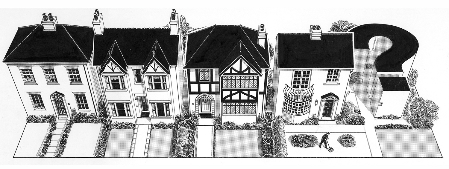
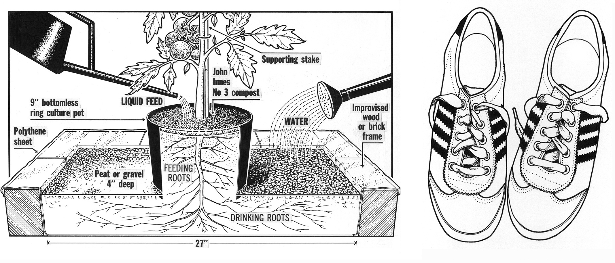
A very long time ago, I carried around a bag of technical pens, french curves, ellipse templates and shiny drawing instruments. And somehow I used them to make the examples shown here. All of my early work was produced in black and white. Sometimes I almost thought that the world was really monochrome.
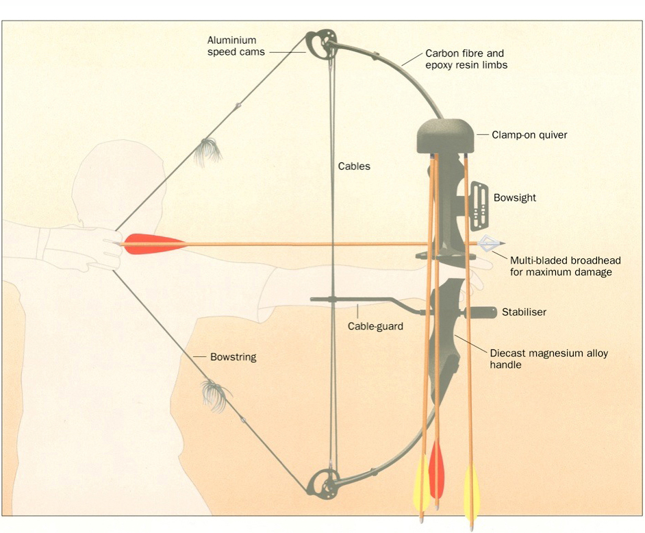
Then came color. Gouache and paintbrushes. The airbrush process (seen here) alternated between euphoria and misery (when the equipment suddenly malfunctioned). The outline of this archer was drawn on a film overlay with a technical pen.
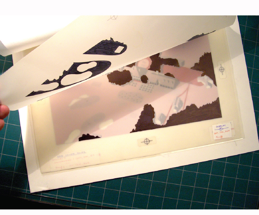
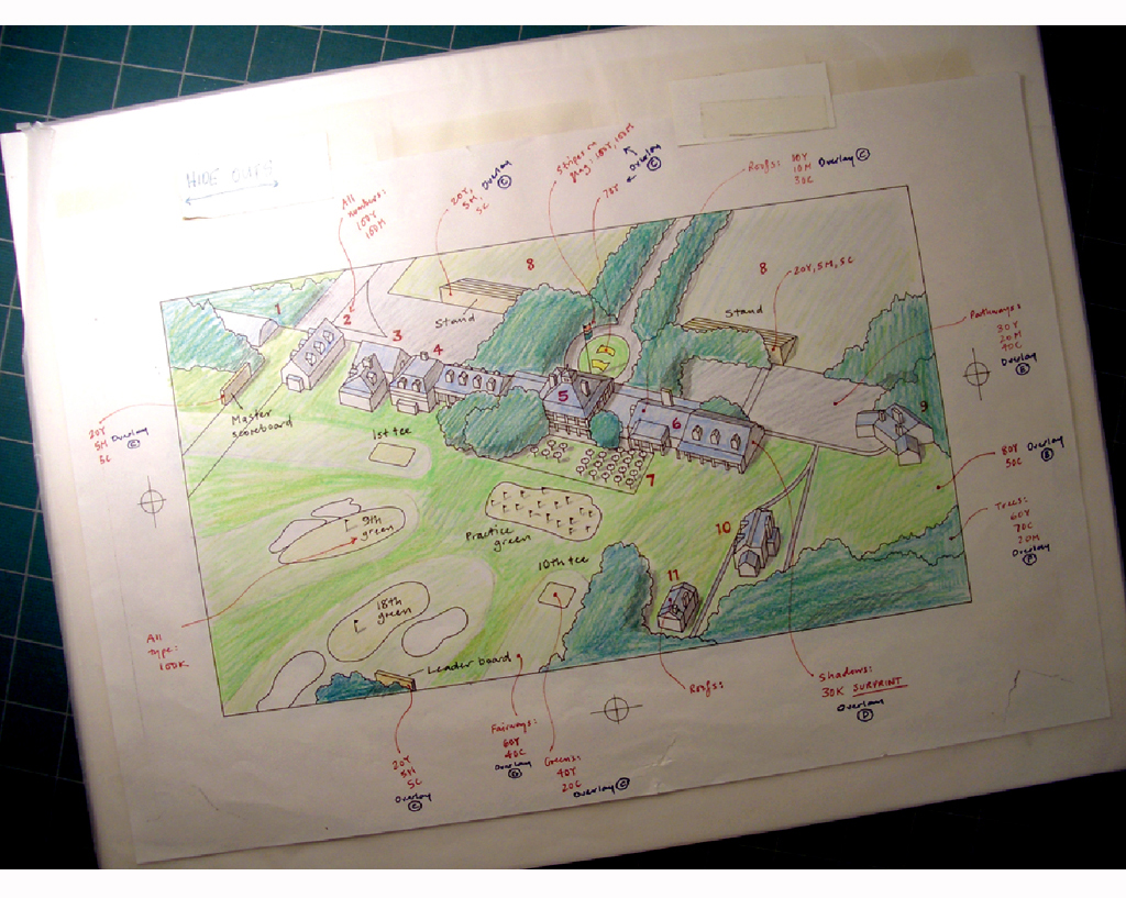
My next infographic phase involved producing “mechanicals.” Artwork that was made up of layers of film over a keyline base layer. Countless hours were spent cutting rubylith film with a sharp knife and peeling away the unwanted areas, or filling in areas with black ink. Adhesive registration marks kept it all aligned, and you needed a lot of them as there was often a substantial stack of layers. The last step was to make a mind-blowing guide for the print technician to piece it all together. Infographics people would impress each other with statements like, “That’s nothing. I did a map yesterday with twenty-two layers”.
Here’s an example of a markup that would guide the technician who put together the color separations for printing. How it was done correctly always amazed me. I have a sense of wonder about it to this day. In a later era, but before I had a computer, I sat with the technician as the graphic was assembled on a computer monitor.
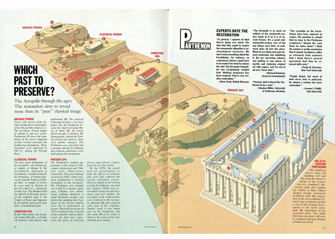
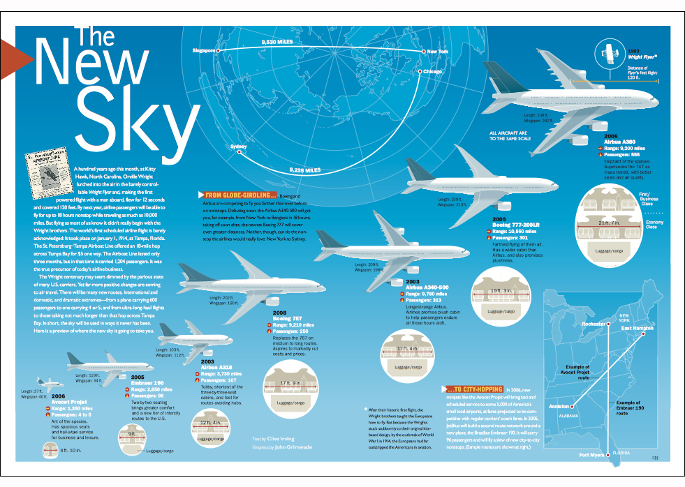
This 1988 spread from Condé Nast Traveler magazine was produced as a mechanical.
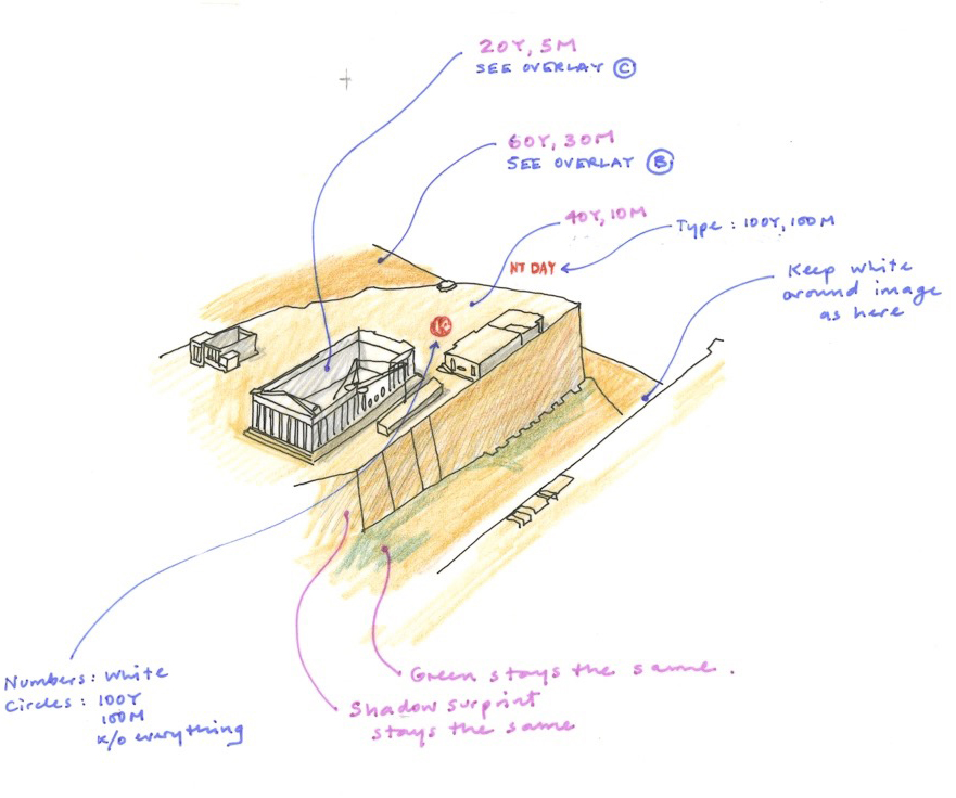
Below is a color guide used to revise the graphic after the first set of separations. It accompanied the proof version, which had overlays B and C attached to it.
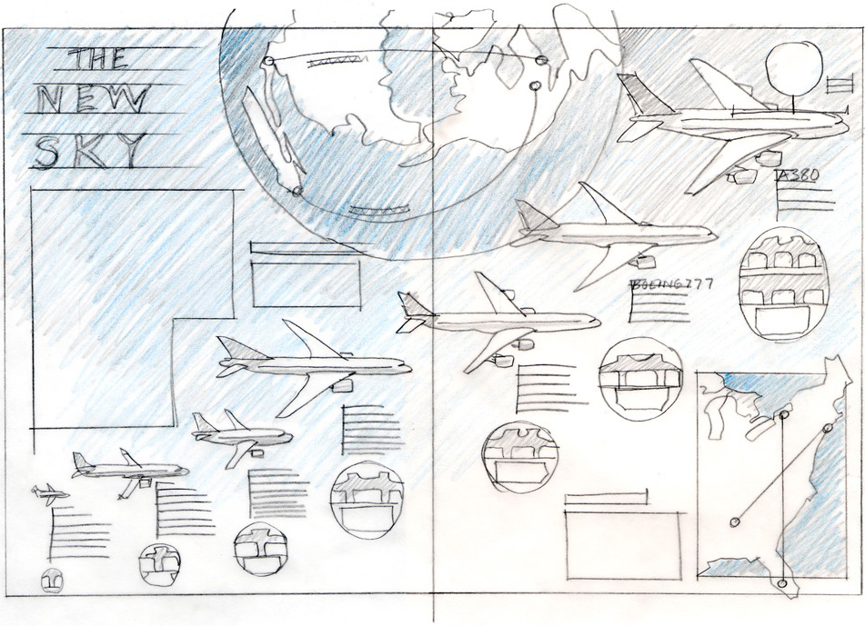
In the pre-computer era, you could not easily make changes once you were into the artwork phase, so you had to be sure you had a good plan. Or risk a nervous breakdown. The process of making a rough sketch carried over into my computer-generated world. The following statement is not a revelation (many designers much younger than me use this method), but drawings are a great way to both work out ideas, and get feedback from your editor or client, who knows the sketch is the language of a flexible idea.
A rough assembly in Illustrator (or InDesign or Photoshop), with real components, is not the same thing. People can feel intimidated about suggesting changes because you’re presenting something that looks like a finished item. At least, that’s my opinion.
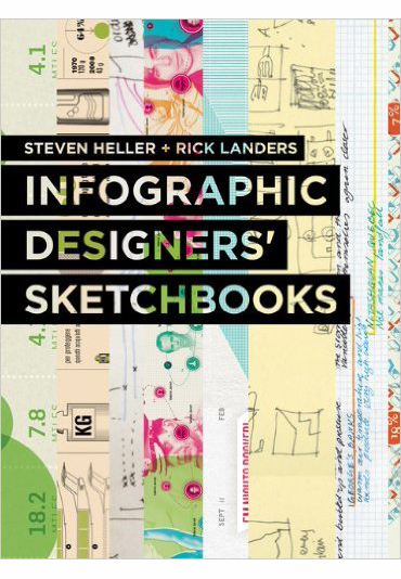
This book is well worth exploring:
