Month: October 2016

Old school

ANOTHER TRIP DOWN INFOGRAPHIC MEMORY LANE.

I’ve been looking at my old, pre-computer artwork again. All created with pens, ink, and a fair amount of white paint. In terms of quality, it’s a mixed bag. Not all greatness, by any means, but it has a certain hard-to-resist appeal.


landmark

A selection of architectural items that are protected by English Heritage. (Click on the image to see a larger version.)

I wanted to see what was inside this boxing glove, so I cut it in half with an expensive kitchen knife, which ruined both items.

boxing_gloves

With ink around, sometimes there would be an accident. I had an unfortunate spill over a business chart, so instead of starting immediately again, I illustrated the event. And I have no idea why.

accident1

This kind of village school was disappearing. Unfortunately, it looks like all life has disappeared too. That is a problem.

school1

Detail.

school_detail1

cue

Snooker cue Illustration.

Below is a cruise missile diagram painted with gouache, and airbrushed, that seems somewhat over-worked now. But bear in mind that it was very hard to go backwards in those days. There was no “Command-Z.”

cruisemissile


For this tall buildings page, each building was drawn in pencil separately, then xeroxed and assembled as a layout. When I was happy with that stage, I began drawing the various elements in ink.

towers_com_a

towers

The same process was used for these space shuttle fantasies.

shuttle_comp

shuttles_a


Trees are easy. You can quote me on that.

trees

Pencil power

WHAT’S BETTER THAN A SMALL STORE THAT SELLS ONLY PENCILS?

On a visit last week to CW Pencil Enterprises (https://cwpencils.com) in New York City, I had trouble leaving the premises. There are all kinds of pencils there from around the world, along with sharpeners and notebooks. You can even have the pencils personalized with a 1960s foil-stamping machine. Coincidentally, or perhaps it’s just good karma, the store is right next to the studio of Bryan Christie Design (http://bryanchristiedesign.com). The owner of this pencil-lovers paradise, Caroline Weaver, is (of course) pencil-crazy, which is confirmed by a sizeable pencil tattoo on her arm. She had thought about selling pens as well, but decided to stay faithful to the pencil, and not dilute the concept. Yes, to that!

pencilgift

Pencils are such a great bargain. You can buy someone a beautiful, creative gift for a very reasonable price. Inside the package above are five gems that I chose on my visit.

pencils

pencil_shelves

pencils_erasers

And if you really want to go for it…

VINTAGE GRAPHITE

I talked about the original Blackwing 602 pencil in a previous post (https://www.johngrimwade.com/blog/2016/09/05/the-ultimate-pencil/). You can see a Palomino Blackwing Grand Piano Box Set in the photo above. Go to eBay and see if you can get a Eberhart Faber original set for less than $400. I have not bought one. Yet.

Portfolio infographics

MY FORAY INTO THE WORLD OF BUSINESS MAGAZINES.

Condé Nast Portfolio lasted two years. Ironically, it was sunk by the stock market meltdown of 2008, which was it’s biggest story to cover. The subsequent recession had a huge negative effect on advertising. The magazine was designed by Robert Priest and Grace Lee (priestandgrace.com), and I was the graphics director. Previously in my career I had often created my own artwork, but here I decided to mostly just design the infographics, and then get the best possible people to illustrate them.

I designed the graphics with both business people and the general public in mind, and this lighter approach generated some criticism from the infographic police, who accused me of creating image-driven graphics without enough information per square inch. Well, this is my blog, and so here it comes: They can all go and jump in the lake. I am completely done with that argument. If it is pursued relentlessly, we will not have any audience in the future.

I feel better for getting that one off my chest. It’s just my opinion.

Anyway, here are six examples from the magazine. Most of them feature the talents of Bryan Christie (http://bryanchristiedesign.com). The Maglev train is illustrated by John MacNeill (http://www.johnmacneill.com). The art direction is by Priest and Grace, and the Portfolio design team, with some vital contributions from various editors and writers.
I’ll be showing some more in a future post. (Click on the infographics for larger versions.)

dreamliner1

maglev2

heathrow

gasprices

medals

money

As a footnote, this is the cover of the magazine’s first issue, complete with transparent cover line flap.

portfoliocover_may07

Flag-o-rama

MORE EXAMPLES FROM THE GRIMWADE SCHOOL OF VEXILLOLOGY (THE STUDY OF FLAGS).

This is my second post about flags. In the earlier one (https://www.johngrimwade.com/blog/2016/09/08/pictograms-on-poles/), I referred to my flag collection, which has long since been sold off for a vast profit (just kidding). However, my love of flags continues unabated. I own a quality Stars and Stripes, a classy Ohio University banner, and a flagpole, so all that completely qualifies me to pontificate about flags. So here goes.

CAT FLAGS Why not show how serious I am, and start with cat flags? In his brilliant one-man show “The Book of Everything” (https://www.amazon.com/Book-Everything-Visual-Guide-Travel/dp/1742209637), Nigel Holmes made a spread of them.
“I like cats. They should have their own flags,” says Nigel (http://www.nigelholmes.com).
Fair enough.
(Click on the image for a larger version.)

NEW ZEALAND I’ve been following with interest the process of selecting a new flag for this excellent, but far-away, country. Incidentally, there is a website (http://worldmapswithout.nz) where New Zealanders can post images of world maps that have left their homeland out. One is at the UN Office in Geneva (http://worldmapswithout.nz/post/100846576379/the-world-map-logo-at-the-un-office-in-geneva).

In 2015, a referendum was held to select a finalist to compete against the current flag. These flags were eliminated in that vote.

nzflags

The finalists. The Silver Fern against tradition. In March this year, the nation voted to keep the current flag, which has the Union Jack in the corner (Go U.K!)

silverfern

newzealand

ISLE OF MAN The flag of this island between England and Northern Ireland is a triskelion, three armored legs with golden spurs. I like it.

mann

ALBANIA You can’t beat a good pictogram, as far as I’m concerned.

albania

SEYCHELLES This Indian Ocean-based one has some serious graphic punch.

seychelles

And finally… check out this ambitious piece of data visualization by ferdio, an infographic agency based in Copenhagen: http://flagstories.co

flagstories

Jaime Serra’s game-changer

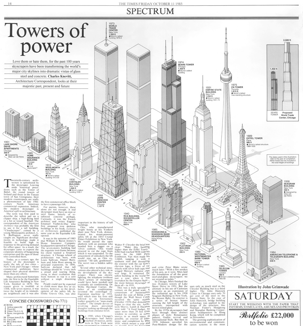
TWENTY YEARS AGO, I SAW THIS MAP AND I KNEW THAT INFOGRAPHICS WERE ENTERING A RICHER PHASE.

ruanda1

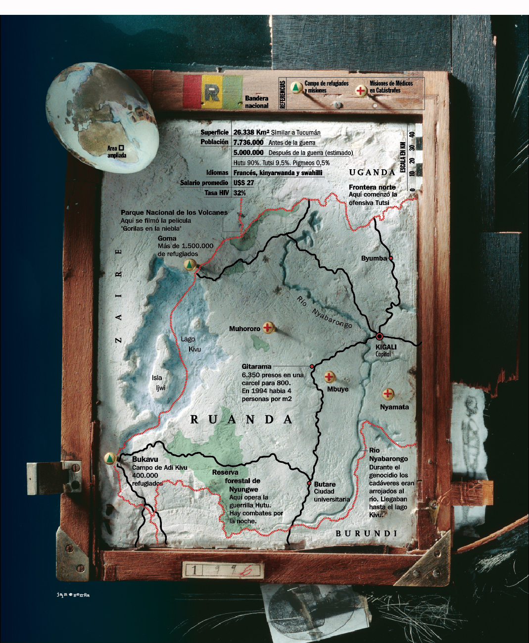
Genocide in Rwanda. (Click on the image for a larger version.)

Back in 1996, when Jaime put this graphic on my desk, I could see that the gap had been bridged from the computer-generated graphics of that time back to our rich, artistic infographic heritage. Art and information were brought together in a beautiful form, with function intact. As far as I’m concerned, this is one of the milestones of late twentieth-century information design. Jaime went on to produce numerous award-winning graphics at Clarín (see below), and many of you know them very well, but this one is really where it started.

Here are Jaime’s thoughts about the graphic. Written a few weeks ago, with the hindsight of the years in-between.

“Some background to the subject: In 1994 the Rwandan government, controlled by the Hutu community, were responsible for the murder of between 500,000 and one million Tutsis, equivalent to 75% of the population of that ethnic group.

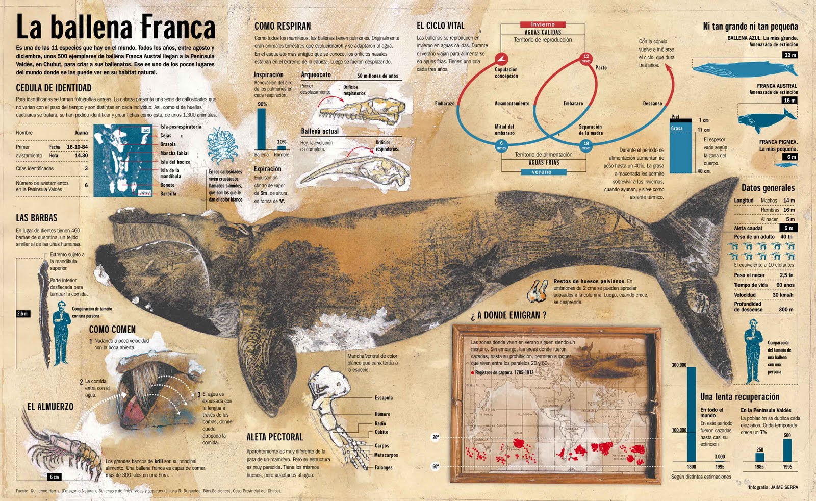
A year after the genocide, a Clarín team traveled to the refugee camps in the area. The infographic contribution to the coverage was just a small locator map. But it grew into a page in the Sunday magazine, mainly because of the graphic treatment. Pre-dating my better-known works such as “La Balena Franca” (Editor’s note: Gold medal winner at the Malofiej Awards.), this map was one of the first examples where I was able to capture my personal graphic style in a complete and radical way.

ARGENTINA

A year earlier, I had arrived in Argentina to create a graphics department at Clarín, a daily newspaper with the most readers in the Spanish-speaking world. At that time, there were no infographics in Argentine journalism, and although that was on the one hand a serious handicap, it also meant that I had the freedom to rethink the foundations on which we had built the profession in recent years.

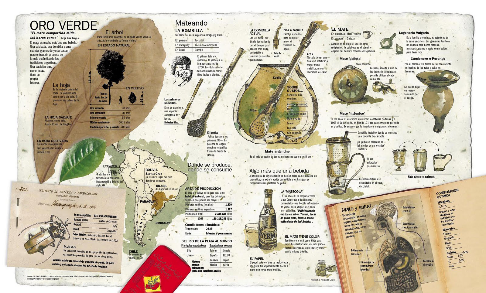
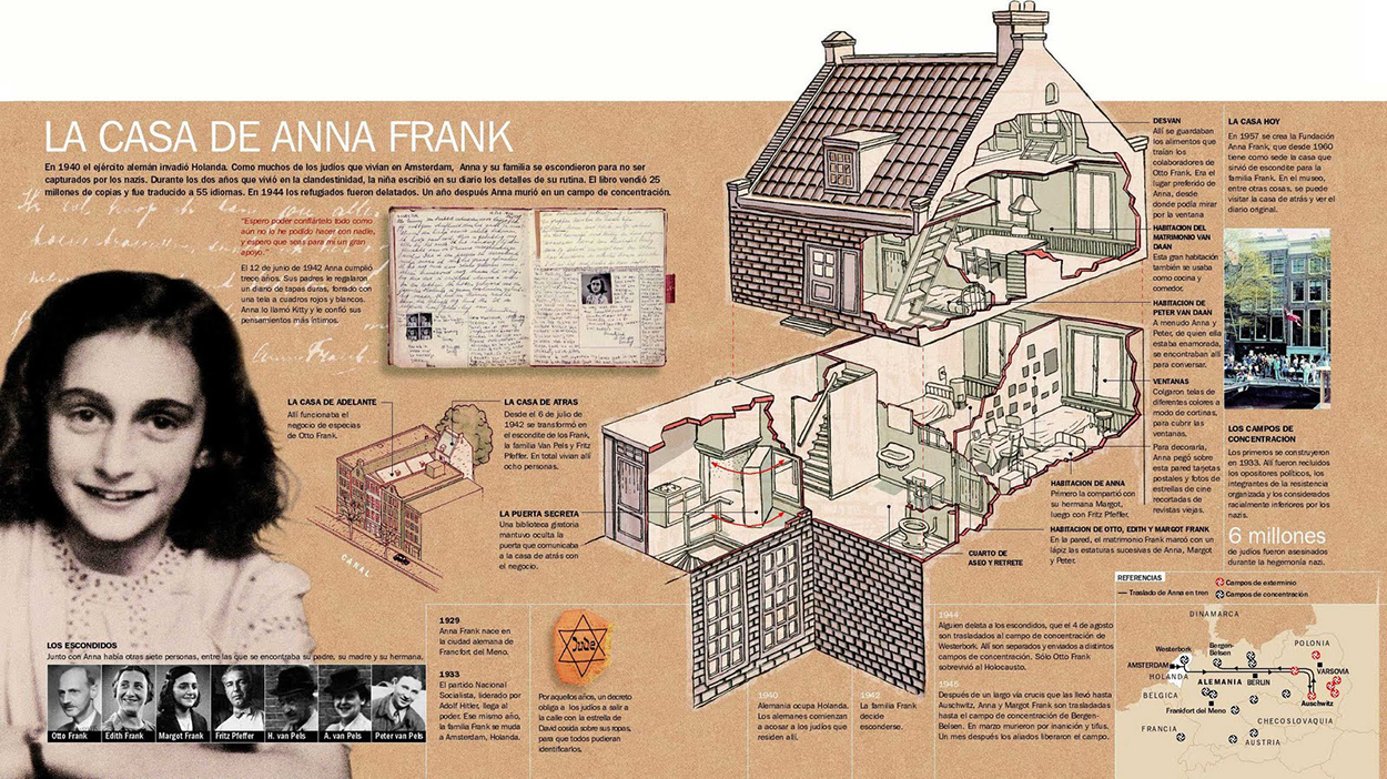
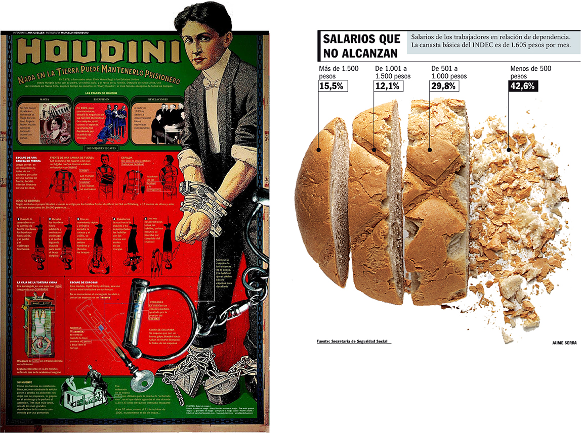
Back then, the general style of infographics was always the same, regardless of the subject. A somewhat cold, sterile style created with vector software. I was convinced that we were wasting a primary way to attract readers—aesthetics. So ready to take some risks, I gave Clarín a complete style manual that would be rigidly applied, while also starting a concept which I called “aesthetics and ethics” for the numerous exceptions where the graphic style manual would not be used. This idea was not a style, but rather the absence of it. Each infographic would be treated according to it’s subject matter. Using this approach, the Clarín team created, more or less successfully, each individual infographic, whether it was about rubber, Houdini, or the Anne Frank House.

Looking back, I think that this was the natural evolution of my understanding of the components of infographics (illustration, information and design). Clarín was the place where my previous work and the new path came together. (Click on the infographics for larger versions.)

ballena

mate_

eureka1

annafrank

houdini_pan

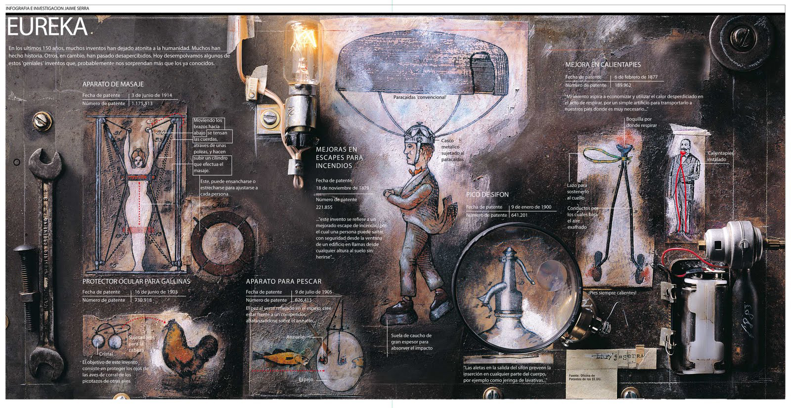
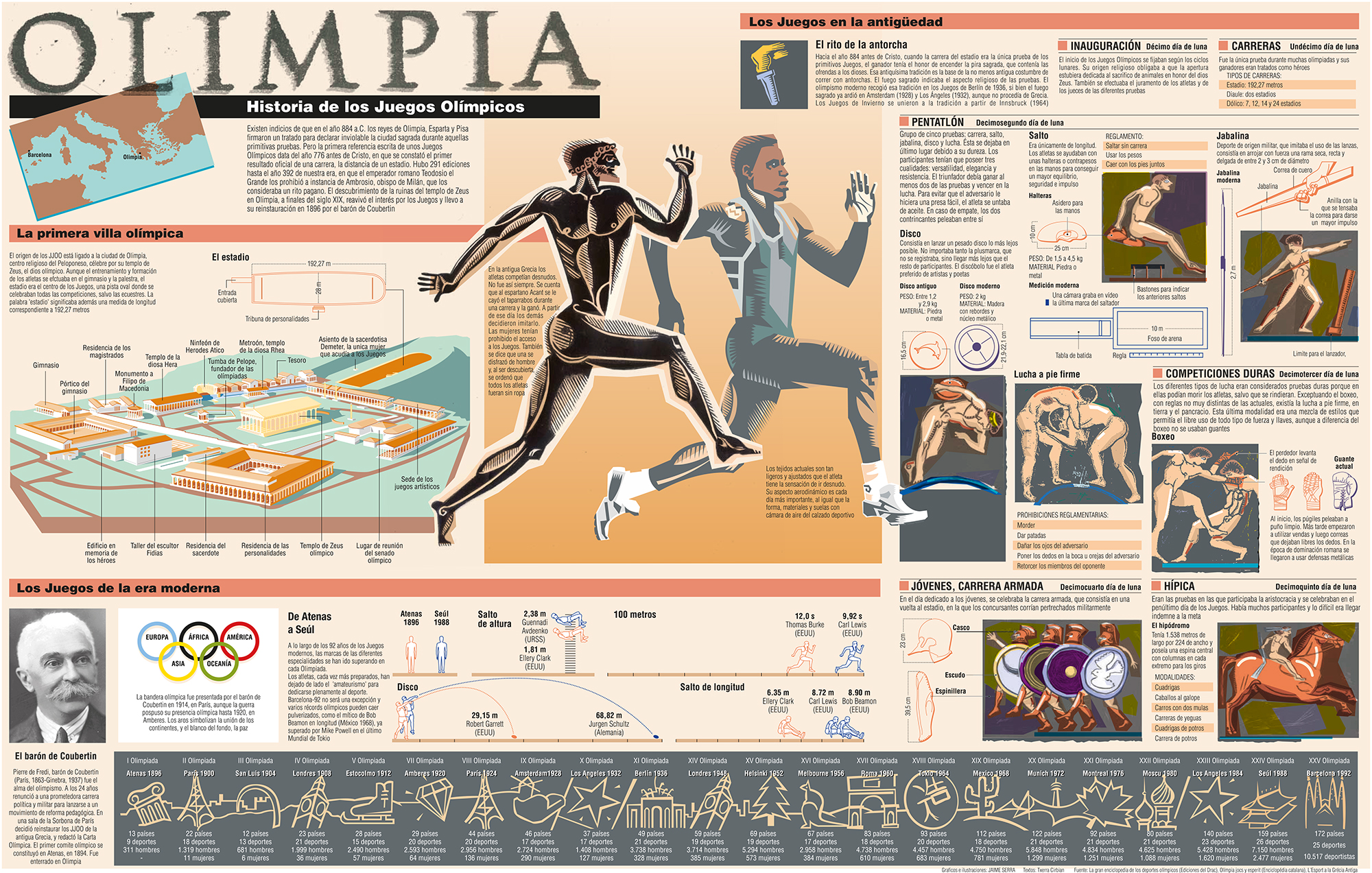
A clear precursor is the double-page spread (below) on the 1992 Olympic Games for El Periódico de Catalunya (where I had worked before moving to Clarín). It won my first Gold Malofiej medal. The illustrations that explain the sports of the ancient Olympic Games are hand-drawn with a scratchboard technique, using a stroke and color inspired by images of ceramics from ancient Greece. Peter Sullivan had made the point about hand-drawn elements in his book “Information Graphics in Colour” (published by IFRA in 1993), but I don’t think that many people followed the path he was suggesting.

Doble Historica (Converted) copia

While I was using the idea of a stylebook and the option to go outside it, I had another thought that would take me further: Could I use my own style in infographics, the same as I used in my most personal work, without compromising the information, and perhaps even improve it?

So with a graphic style influenced by illustrators like Henrik Drescher (http://www.hdrescher.com/), designer David Carson’s work in the magazine Ray Gun (http://www.davidcarsondesign.com/), and Anselm Kiefer (an artist who still fascinates me today), the strong content of the Rwanda map was an opportunity to explore the answers.

NEW YORK

John remembers the time we met in his office in Manhattan. I took a trip there to get a reaction to the work I had done in my first year of Clarín. That was how I met, among others, Charles Blow, graphics director of the New York Times; Joe Zeff, graphics director at Time Magazine and John, graphics director at Conde Nast Traveler magazine.

To be honest, I had never heard of Blow or Zeff. It was how they worked that interested me. But I knew John’s work very well, although I did not really know Condé Nast Traveler, apart from the infographics. If Carson, Dresher and Kiefer were the role models for my style, Grimwade was my main reference for infographics. My objective was to apply my personal aesthetic to the communication skills that I had learned from observing how these graphics directors worked.

STILL RELEVANT TODAY

At the bottom of the Rwanda map is a hand-drawn date. It’s the year that I made it: 1996. Twenty years later, I wonder (and I asked John this recently), who would be interested in it? His answer: many people, and for me it is more than enough that he thinks it still seems relevant.

(Another editor’s note: I called this blog “Infographics for the People” to draw our attention to the need to add warmth to information presentations, and generally engage the public. Jaime was doing that decades ago.)
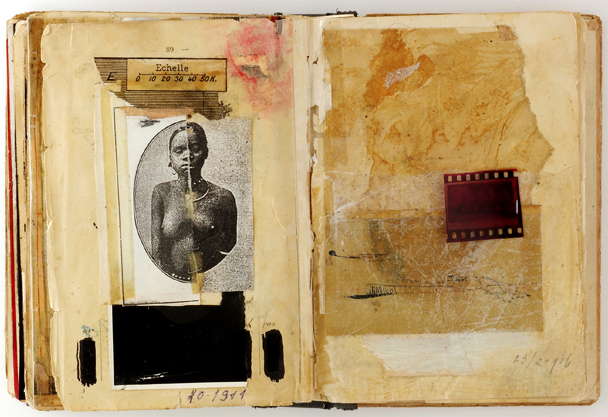
sketchbook_ruanda

STYLE SKETCH

In addition to making sketches to plan the layout and content of the infographic, I also made drawings to find the right tone. In my sketchbook, I made this montage with photocopies of two very similar black women. There was no racial difference between Tutsi and Hutu. They are two divisions within the Banyarwanda ethnic group. After the genocide, they were eliminated from a national document which was cut and re-joined with staples. Most of the countless murders that were documented were carried out with machetes. The geographical scale is in French: Rwanda had been a Belgian colony, and this seems to suggest the dimension of human and social costs.”

See more of Jaime’s brilliant work, and the process behind it, here: http://jaimeserra-archivos.blogspot.com.es


Infographics for aliens

FIRST CONTACT PROBABLY INVOLVES SOME INFORMATION DESIGN.

They have green eyes on stalks, and huge brains, but will they like our infographics? This is a question that is often on my mind. The most important graphics of all time could be the ones we’ve attached to a spacecraft, or beamed into space.

Let’s take a look at three classics. (All are from the decade of the interstellar graphic, the 1970s.) And anyway, it’s a good excuse to use NASA’s retro logo.

pioneer10_nasa1

INFOGRAPHIC PLAQUE

Pioneer 10, launched in 1972, was the first spacecraft to fly by Jupiter. By 2003, it was 7.5 billion miles (12 billion kilometers) out into space, when contact was lost. This gold-anodized aluminum plaque is attached to it, thanks to the efforts of Carl Sagan. The design is by Sagan’s wife, Linda Salzman, who had a tight deadline. There were only three weeks between the original idea and making the engraving. So perhaps we should make some allowance for that. (Incidentally, Pioneer 11 also carries a plaque.)
There was a lot of debate at the time about the nude figures. Some people wanted them to have modesty rectangles added. Others felt that although they were supposed to be “representative of all mankind,” they only represent Caucasians. And then there’s the “We come in peace” gesture, which unfortunately means “Go to hell” in Greece and Turkey. If the aliens take this sign the wrong way, we can perhaps expect a visit like this: https://www.youtube.com/watch?v=nxVxtvJWoqs

pioneer10_plaque


A MESSAGE TO THE STARS

In 1974, the Arecibo Radio Telescope aimed a radio message at the star cluster M13, which is 25,000 light years away. Why there? Because it was in the sky at the time of the broadcast. The 1,679 binary digits (approximately 210 bytes) took less than three minutes to send. Obviously, the information is in black and white, but is colorized here to show the different components. Carl Sagan was involved with this one too.
It will only take about 25,000 years to get to M13, and 25,000 years after that before we get an answer. Unless the aliens are way ahead of us in terms of technology.

radio_message

THE GOLDEN RECORD

Another Carl Sagan-led project. Voyager 1 and 2 both carried a 12-inch disk, complete with cartridge, needle and diagrammatic instructions on the cover for playing the record. Of course, the aliens who capture Voyager in their tractor beam may not need those if they happen to have a compatible stereo handy. It’s very much an idea forever rooted in 1970s technology. The record contained spoken “Greetings to the Universe” in multiple languages, animal sounds, music, and a mixed-bag of images (see examples below). Quite what our bug-eyed potential friends will make of them remains to be seen. Voyager 1 is currently about 12 billion miles (19 billion kilometers) from Earth. And it will be 40,000 years before the spacecraft gets close to another planetary system, so perhaps we don’t need to worry.

golden_record1

fetus1

Fetus diagram.

childrenglobe1

Children with globe.

eatingdrinking1

Demonstration of licking, eating and drinking. This one scares me, and probably our alien audience too.


The rough idea

PLANNING INFOGRAPHICS WITH SKETCHES.

a380_1

I mentioned my reasoning about rough sketches for infographics in an earlier post (http://johngrimwade.com/blog/2016/09/26/when-infographic-dinosaurs-roamed-the-earth/), and it’s not a very original idea, as I pointed out.

I’ve never considered myself to be very good at drawing, and I definitely don’t make these sketches so that they can be considered as art. A few friends have had one framed, and although I must admit that I am flattered, I’m also slightly uncomfortable with the idea. In my mind, they’re just the first stage of an infographic process. No more, no less.

platform_rough_1

platform_final

angkorwat_rough

angkorwat_final_1

grandcentral_rough

grandcentral_final

ps

Danger1.jpg

qm2rough

foodmountains_rough

Atlas heaven

A RECENT ADDITION TO MICHAEL STOLL’S IMPRESSIVE COLLECTION OF HISTORICAL INFORMATION DESIGN.

Quotemark1  I don’t cry often, but when this gem finally arrived on my desk, I nearly did. QuoteMark2

cover

The Atlas to Alexander von Humboldt’s “Kosmos,” by Traugott Bromme. Stuttgart: Krais & Hoffmann, 1851

THE SEARCH

“It began after I heard a radio discussion about the influential German geographer and explorer, Alexander von Humboldt. Although the publications containing his findings dealt with geographical, botanical and weather related topics, there were very few explanatory graphics. Humboldt clearly didn’t intend “Kosmos” to be a textbook for use in schools and universities, even though it was a summary of the talks he had given over the years. Nevertheless, the public recognized the exceptional content of the book, although they probably didn’t understand the details as well as they might. There was a demand for a more popular and explanatory version. Traugott Bromme’s atlas was a companion volume that responded to that need.

After almost a year of searching (these things can take a while), I stumbled upon a copy that was up for auction. No one (except me) made a bid for it, probably because the listing describing the item contained many spelling errors.”

MY OWN COPY.

“The atlas measures only about 13 by 11 inches, is leather bound, and except for the foreword (which was set in movable type), all of the 42 pages have maps, diagrams and charts. They are steel engraved in such impressive detail, that you need a magnifying glass to discover the smallest spills of lava or rocks, thrown out by a volcano. Then you realize that all the engravings were water-colored by hand. You can feel the passion and dedication of the author and the publisher.

These two plates are my favorites”. (For larger images, click on the examples.)

atlas_a

The design of the Earth.

“An elegant symmetrical layout, with integrated descriptive text elements. In the top center of the page, Bromme explains, in two lines of text, the visual effects of a curved surface. A sailor approaching a harbor first sees a mountain peak before he sees the shore, harbor walls etc. The two lines of description curve with the diagram. We know this convention from the way river names are shown on a map, but here it is used to link the words to the image. The colored chart at the bottom tells us immediately how the Earth’s surface divides between land and sea, and how many square miles of land are in each continent”.


atlas_b

A comparative overview of the biggest lakes on Earth, in relation to the Black Sea.

“Each lake is precisely outlined, with its size in square miles, position above sea level, length and width, major inlets, and location so the interested reader can find it on any map. You could almost miss this, but the lakes carry small numbers, which rank them by size, and they are subdivided into Western and Eastern Hemispheres. A nice addition is the small circle, that appears several times, to indicate how far you would be able to see from a ship’s crow’s nest.

I don’t think the slow food movement results in great food all the time, but I do think that, on this occasion, a slow, and well-conceived, design and production process resulted in a wonderful atlas”.


See the full atlas here: http://www.e-rara.ch/zut/content/titleinfo/2551486

You can even download the whole book as a pdf from this site.


Michael teaches media theory and infographics at the Augsburg University of Applied Sciences, where he is head of the information design study track in the Department of Design. He has amassed a broad collection of historical information design, that is completely made up of original books, maps and posters. In the digital age, with images at all kinds of sizes all over the internet, he feels it is very important to go to the source and see historical infographics in their original context.

Nigel Holmes on humor

A WARMER APPROACH TO INFOGRAPHICS.

kisses

(From Wordless Diagrams: https://www.amazon.com/Wordless-Diagrams-Nigel-Holmes/dp/1582345228)

It’s turned out to be quite a lot of work putting these posts together. Perhaps, upon reflection, a twice-a-week schedule was ambitious. So today, I am very happy to turn the blog over to Nigel Holmes, especially as I consider this a must-read piece. With bells on! No one can make the point about the use of humor more convincingly than him.

In Nigel’s words:

“I’ve long advocated using a touch of humor in information graphics. It’s a way to make friends with readers/viewers/users, helping them to relax when confronted with a string of numbers or obscure scientific concepts. I have tried to make reading and understanding graphics a pleasurable experience instead of homework. If I can raise a smile, I’ll be half way to helping readers see what I’m trying to explain. Many academics and data visualizers hate this approach. They insist on “just the facts.” Any deviation from or addition to the facts is wrong, wrong, just plain wrong! They even invent pseudo-scientific theories that sound important: “optimal data-ink-ratio,” and “chartjunk.” (The same purists do allow elegant design…but that’s another story, one that often results in data art, with no discernable meaning. That’s what I call chartjunk.)

I’m not suggesting that all infographics should be funny. Or any of them, actually. Humor might be the wrong word here. I’m referring more to “good humor”—a good feeling, a sense of friendliness and approachability. Of course some subjects, by their very nature, are serious; there’s no room for humor (of any kind) if the graphic is about cancer, or slavery, or terrorism. But do we have to be so damn serious about everything else? Are we never allowed to help readers understand a subject by making graphics more approachable—by including an element that evokes a smile? Just because a thing is serious, does that automatically make it authoritative? Just because a thing is light-hearted does that mean that it’s not?

strugglesfluid2

(From the New York Observer, left. The Atlantic, right.)

brooklyn_jobs2

(From the New York Observer.)

fall_leaves2

(From U.S. Airways magazine.)

virgins

(From Glamour magazine.)


In the 1930s, Irving Geis used gentle humor in most of the business charts he did for Fortune magazine (and also in his illustrations for Darrell Huff’s still-relevant 1954 book “How to Lie with Statistics”). Geis based the design of most of his Fortune charts on Otto Neurath’s method of lining up little pictograms in place of abstract bars, but he mildly criticized Neurath for insisting that the pictorial symbols remain static images. Geis wanted to “activate” his own pictorial symbols—to give them some life, some humor. Neurath never used humor, because he wanted to demonstrate that his charts were “statistically accountable.” In other words, he was already breaking enough new ground* with his iconic work, and perhaps he thought that touches of humor would dilute it.


geis

What Geis did was to give us all permission to use humor—where appropriate—in serious publications. I followed his lead (it’s all been done before, folks!) when I arrived at Time magazine some 40 years later. I brought with me my own humorous influences, including Edward Lear’s limericks, The Goons (a BBC radio show from the 1950s), Monty Python, Dada—all of which I now realize are based on a sense of the absurd, even nonsense: not exactly examples to emulate when trying to explain things clearly! But there’s nothing wrong with letting your mind wander away from the subject, even into nonsense territory. Looking at data and numbers in different and unexpected ways can lead to a way of presenting data in different, and unexpected, and memorable ways.


paychecks

(From Time magazine.)

In the recent past, John Stewart and Stephen Colbert (and today, John Oliver) have shown us that making fun of politicians and others is the best way to explain what they are up to. John Oliver calls his work “investigative comedy.” We laugh while watching their shows, but we remember the facts. Ridicule is a powerful teaching tool. Adding humor to information graphics isn’t the same thing as the ridicule on fake TV news shows, but it’s related. As long as we remember that the story behind the data in an infographic should never be hidden by humor, but rather can be amplified by it, humor (and approachability) can be that same powerful tool, and one that we designers shouldn’t be shy to use.

Footnote: *OK, all you infographic historians, Neurath wasn’t the first to use rows of pictorial symbols in place of abstract bars. He had a good look at early examples of this kind of statistical visualization (see his autobiography “From Hieroglyphics to Isotope”). However, he and his artist-collaborator Gerd Arntz perfected the art, and their work from the 1930s still looks surprisingly modern.

SOME RELATED LINKS.

Irving Geis: https://en.wikipedia.org/wiki/Irving_Geis

huff2

“How to Lie with Statistics”: https://www.amazon.com/How-Lie-Statistics-Darrell-Huff/dp/0393310728/ref=sr_1_1?s=books&ie=UTF8&qid=1474992676&sr=1-1&keywords=how+to+lie+with+statistics+by+darrell+huff

JacketFinal2-Front

“From Hieroglyphics to Isotope”: https://www.amazon.com/Hieroglyphics-Isotype-Visual-Autobiography/dp/0907259448/ref=sr_1_1?s=books&ie=UTF8&qid=1475174891&sr=1-1&keywords=from+hieroglyphics+to+isotype+a+visual+autobiography

“The Goon Show”: https://en.wikipedia.org/wiki/The_Goon_Show