A WARMER APPROACH TO INFOGRAPHICS.
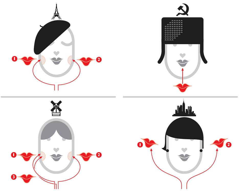
(From Wordless Diagrams: https://www.amazon.com/Wordless-Diagrams-Nigel-Holmes/dp/1582345228)
It’s turned out to be quite a lot of work putting these posts together. Perhaps, upon reflection, a twice-a-week schedule was ambitious. So today, I am very happy to turn the blog over to Nigel Holmes, especially as I consider this a must-read piece. With bells on! No one can make the point about the use of humor more convincingly than him.
In Nigel’s words:
“I’ve long advocated using a touch of humor in information graphics. It’s a way to make friends with readers/viewers/users, helping them to relax when confronted with a string of numbers or obscure scientific concepts. I have tried to make reading and understanding graphics a pleasurable experience instead of homework. If I can raise a smile, I’ll be half way to helping readers see what I’m trying to explain. Many academics and data visualizers hate this approach. They insist on “just the facts.” Any deviation from or addition to the facts is wrong, wrong, just plain wrong! They even invent pseudo-scientific theories that sound important: “optimal data-ink-ratio,” and “chartjunk.” (The same purists do allow elegant design…but that’s another story, one that often results in data art, with no discernable meaning. That’s what I call chartjunk.)
I’m not suggesting that all infographics should be funny. Or any of them, actually. Humor might be the wrong word here. I’m referring more to “good humor”—a good feeling, a sense of friendliness and approachability. Of course some subjects, by their very nature, are serious; there’s no room for humor (of any kind) if the graphic is about cancer, or slavery, or terrorism. But do we have to be so damn serious about everything else? Are we never allowed to help readers understand a subject by making graphics more approachable—by including an element that evokes a smile? Just because a thing is serious, does that automatically make it authoritative? Just because a thing is light-hearted does that mean that it’s not?
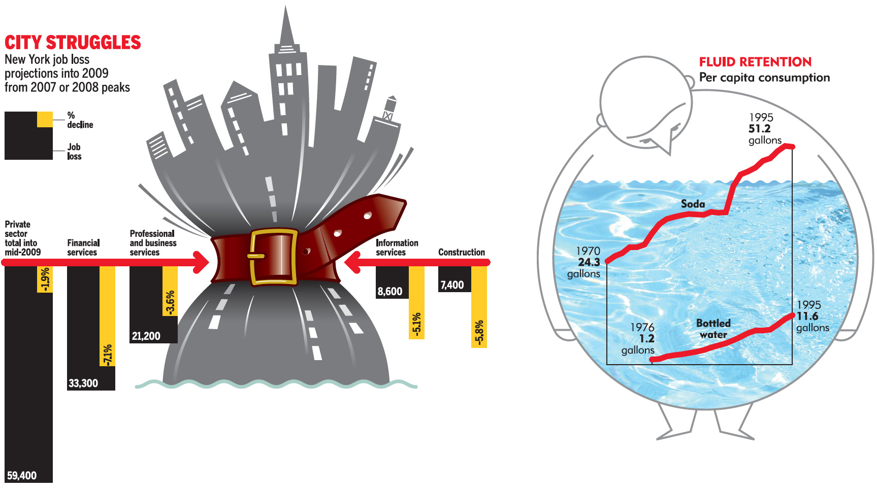
(From the New York Observer, left. The Atlantic, right.)

(From the New York Observer.)
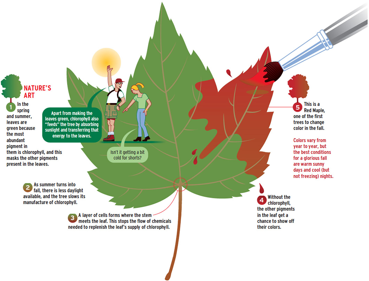
(From U.S. Airways magazine.)
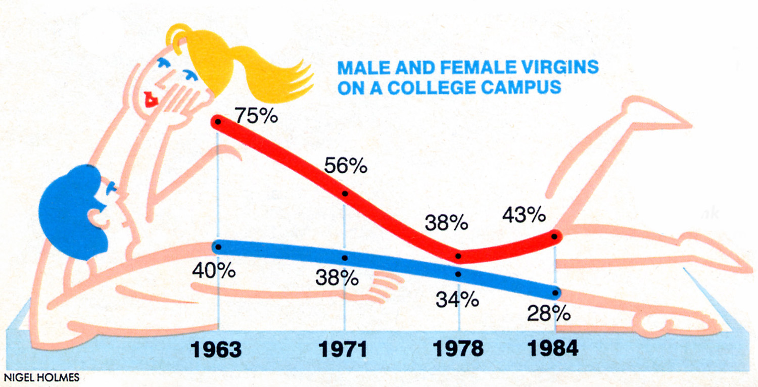
(From Glamour magazine.)
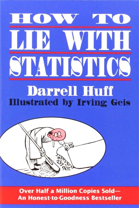
In the 1930s, Irving Geis used gentle humor in most of the business charts he did for Fortune magazine (and also in his illustrations for Darrell Huff’s still-relevant 1954 book “How to Lie with Statistics”). Geis based the design of most of his Fortune charts on Otto Neurath’s method of lining up little pictograms in place of abstract bars, but he mildly criticized Neurath for insisting that the pictorial symbols remain static images. Geis wanted to “activate” his own pictorial symbols—to give them some life, some humor. Neurath never used humor, because he wanted to demonstrate that his charts were “statistically accountable.” In other words, he was already breaking enough new ground* with his iconic work, and perhaps he thought that touches of humor would dilute it.
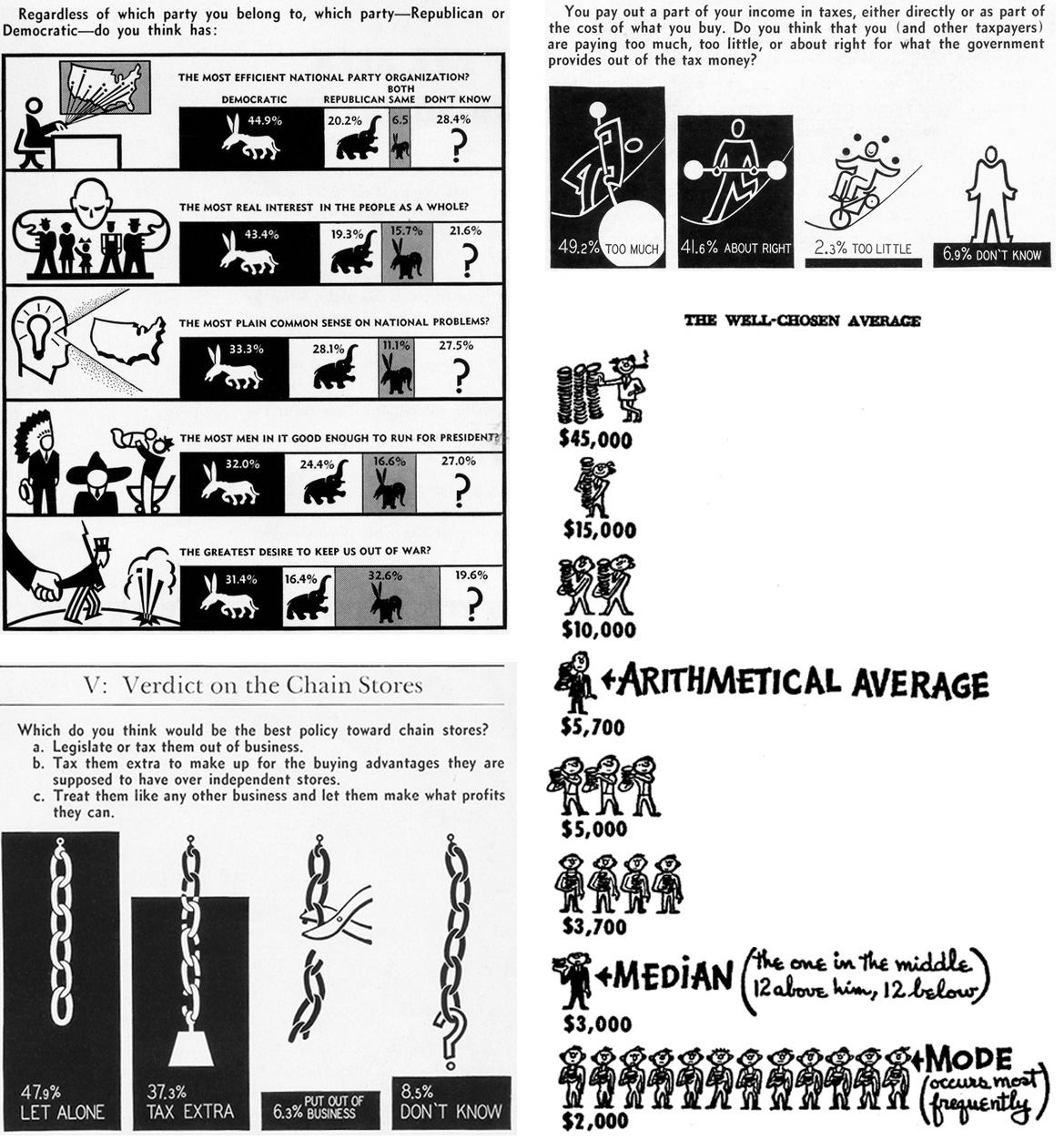
What Geis did was to give us all permission to use humor—where appropriate—in serious publications. I followed his lead (it’s all been done before, folks!) when I arrived at Time magazine some 40 years later. I brought with me my own humorous influences, including Edward Lear’s limericks, The Goons (a BBC radio show from the 1950s), Monty Python, Dada—all of which I now realize are based on a sense of the absurd, even nonsense: not exactly examples to emulate when trying to explain things clearly! But there’s nothing wrong with letting your mind wander away from the subject, even into nonsense territory. Looking at data and numbers in different and unexpected ways can lead to a way of presenting data in different, and unexpected, and memorable ways.
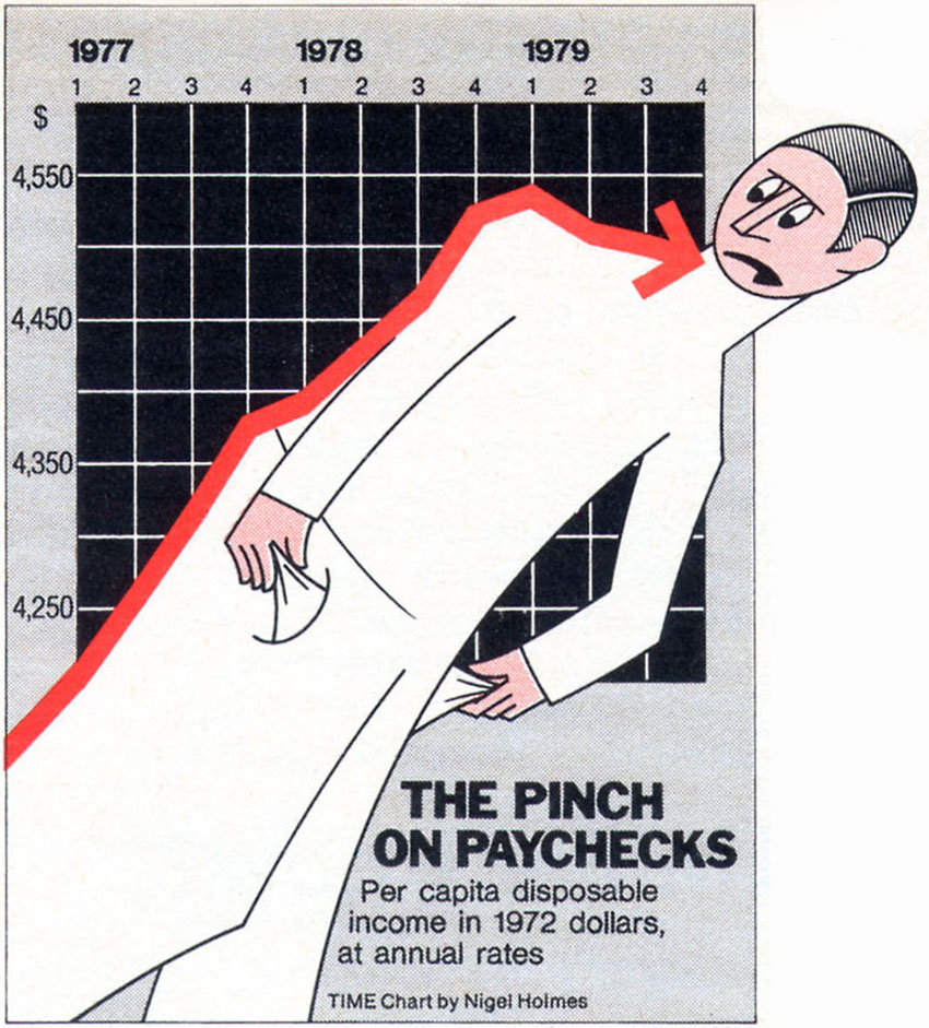
(From Time magazine.)
In the recent past, John Stewart and Stephen Colbert (and today, John Oliver) have shown us that making fun of politicians and others is the best way to explain what they are up to. John Oliver calls his work “investigative comedy.” We laugh while watching their shows, but we remember the facts. Ridicule is a powerful teaching tool. Adding humor to information graphics isn’t the same thing as the ridicule on fake TV news shows, but it’s related. As long as we remember that the story behind the data in an infographic should never be hidden by humor, but rather can be amplified by it, humor (and approachability) can be that same powerful tool, and one that we designers shouldn’t be shy to use.
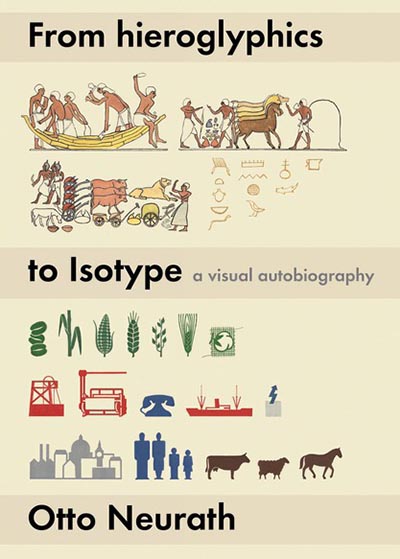
Footnote: *OK, all you infographic historians, Neurath wasn’t the first to use rows of pictorial symbols in place of abstract bars. He had a good look at early examples of this kind of statistical visualization (see his autobiography “From Hieroglyphics to Isotope”). However, he and his artist-collaborator Gerd Arntz perfected the art, and their work from the 1930s still looks surprisingly modern.
SOME RELATED LINKS.
Irving Geis: https://en.wikipedia.org/wiki/Irving_Geis
“How to Lie with Statistics”: https://www.amazon.com/How-Lie-Statistics-Darrell-Huff/dp/0393310728/ref=sr_1_1?s=books&ie=UTF8&qid=1474992676&sr=1-1&keywords=how+to+lie+with+statistics+by+darrell+huff
“From Hieroglyphics to Isotope”: https://www.amazon.com/Hieroglyphics-Isotype-Visual-Autobiography/dp/0907259448/ref=sr_1_1?s=books&ie=UTF8&qid=1475174891&sr=1-1&keywords=from+hieroglyphics+to+isotype+a+visual+autobiography
“The Goon Show”: https://en.wikipedia.org/wiki/The_Goon_Show

One comment
Comments are closed.