A RECENT ADDITION TO MICHAEL STOLL’S IMPRESSIVE COLLECTION OF HISTORICAL INFORMATION DESIGN.
![]() I don’t cry often, but when this gem finally arrived on my desk, I nearly did.
I don’t cry often, but when this gem finally arrived on my desk, I nearly did. ![]()

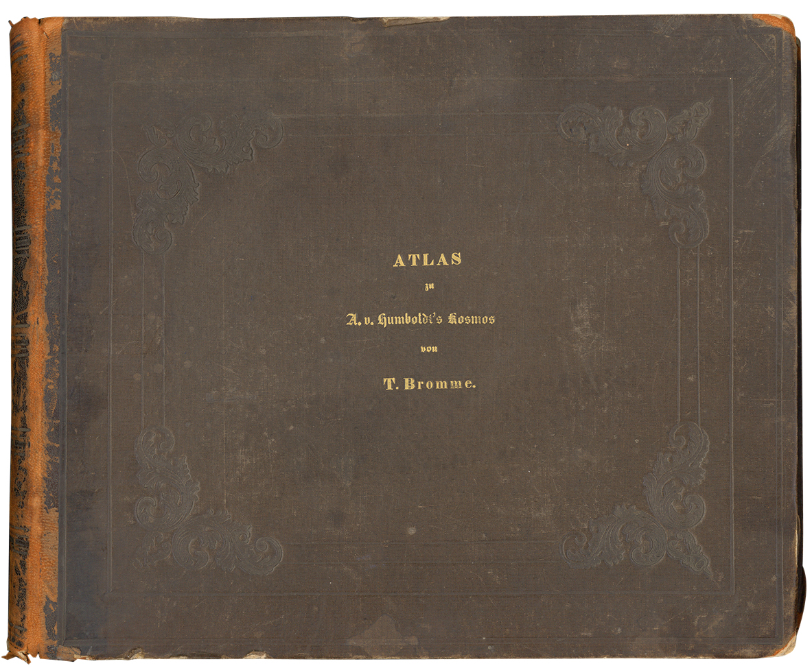
The Atlas to Alexander von Humboldt’s “Kosmos,” by Traugott Bromme. Stuttgart: Krais & Hoffmann, 1851
THE SEARCH
“It began after I heard a radio discussion about the influential German geographer and explorer, Alexander von Humboldt. Although the publications containing his findings dealt with geographical, botanical and weather related topics, there were very few explanatory graphics. Humboldt clearly didn’t intend “Kosmos” to be a textbook for use in schools and universities, even though it was a summary of the talks he had given over the years. Nevertheless, the public recognized the exceptional content of the book, although they probably didn’t understand the details as well as they might. There was a demand for a more popular and explanatory version. Traugott Bromme’s atlas was a companion volume that responded to that need.
After almost a year of searching (these things can take a while), I stumbled upon a copy that was up for auction. No one (except me) made a bid for it, probably because the listing describing the item contained many spelling errors.”
MY OWN COPY.
“The atlas measures only about 13 by 11 inches, is leather bound, and except for the foreword (which was set in movable type), all of the 42 pages have maps, diagrams and charts. They are steel engraved in such impressive detail, that you need a magnifying glass to discover the smallest spills of lava or rocks, thrown out by a volcano. Then you realize that all the engravings were water-colored by hand. You can feel the passion and dedication of the author and the publisher.
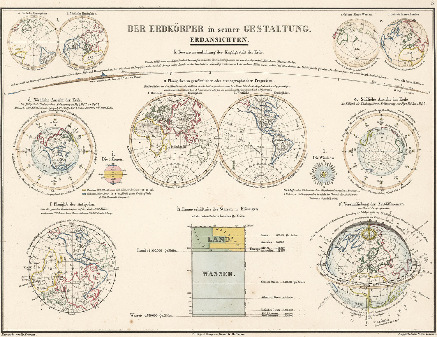
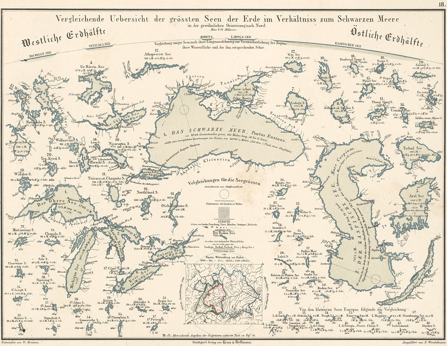
These two plates are my favorites”. (For larger images, click on the examples.)
The design of the Earth.
“An elegant symmetrical layout, with integrated descriptive text elements. In the top center of the page, Bromme explains, in two lines of text, the visual effects of a curved surface. A sailor approaching a harbor first sees a mountain peak before he sees the shore, harbor walls etc. The two lines of description curve with the diagram. We know this convention from the way river names are shown on a map, but here it is used to link the words to the image. The colored chart at the bottom tells us immediately how the Earth’s surface divides between land and sea, and how many square miles of land are in each continent”.
A comparative overview of the biggest lakes on Earth, in relation to the Black Sea.
“Each lake is precisely outlined, with its size in square miles, position above sea level, length and width, major inlets, and location so the interested reader can find it on any map. You could almost miss this, but the lakes carry small numbers, which rank them by size, and they are subdivided into Western and Eastern Hemispheres. A nice addition is the small circle, that appears several times, to indicate how far you would be able to see from a ship’s crow’s nest.
I don’t think the slow food movement results in great food all the time, but I do think that, on this occasion, a slow, and well-conceived, design and production process resulted in a wonderful atlas”.
See the full atlas here: http://www.e-rara.ch/zut/content/titleinfo/2551486
You can even download the whole book as a pdf from this site.
Michael teaches media theory and infographics at the Augsburg University of Applied Sciences, where he is head of the information design study track in the Department of Design. He has amassed a broad collection of historical information design, that is completely made up of original books, maps and posters. In the digital age, with images at all kinds of sizes all over the internet, he feels it is very important to go to the source and see historical infographics in their original context.


