MY FORAY INTO THE WORLD OF BUSINESS MAGAZINES.
Condé Nast Portfolio lasted two years. Ironically, it was sunk by the stock market meltdown of 2008, which was it’s biggest story to cover. The subsequent recession had a huge negative effect on advertising. The magazine was designed by Robert Priest and Grace Lee (priestandgrace.com), and I was the graphics director. Previously in my career I had often created my own artwork, but here I decided to mostly just design the infographics, and then get the best possible people to illustrate them.
I designed the graphics with both business people and the general public in mind, and this lighter approach generated some criticism from the infographic police, who accused me of creating image-driven graphics without enough information per square inch. Well, this is my blog, and so here it comes: They can all go and jump in the lake. I am completely done with that argument. If it is pursued relentlessly, we will not have any audience in the future.
I feel better for getting that one off my chest. It’s just my opinion.
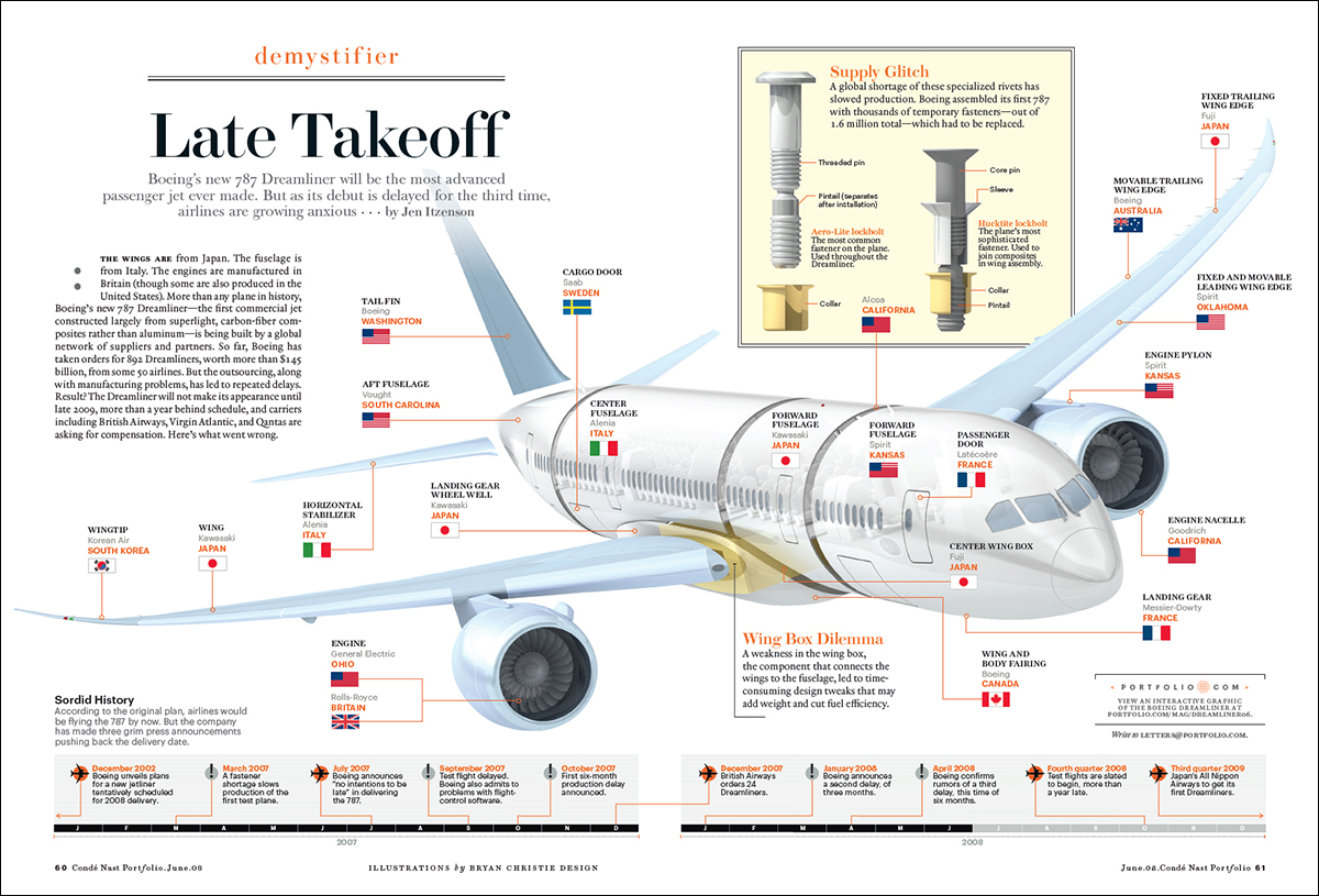
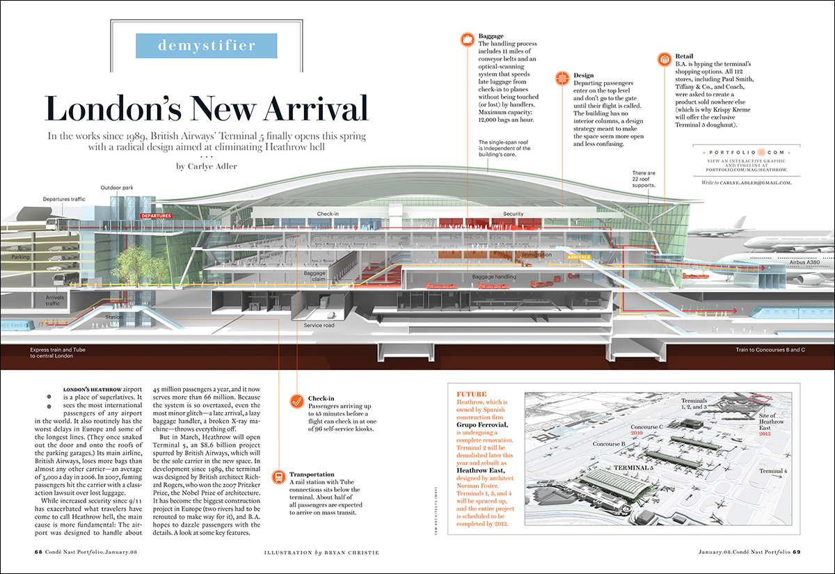
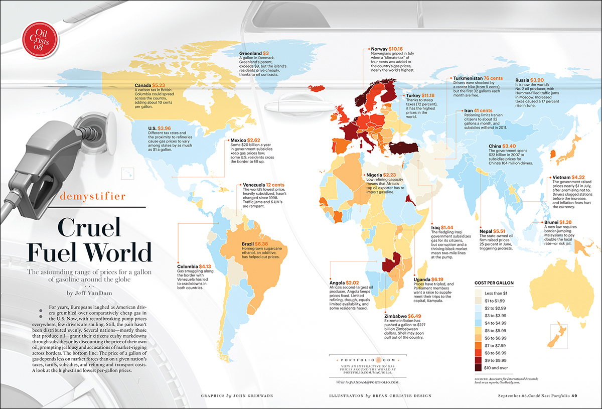
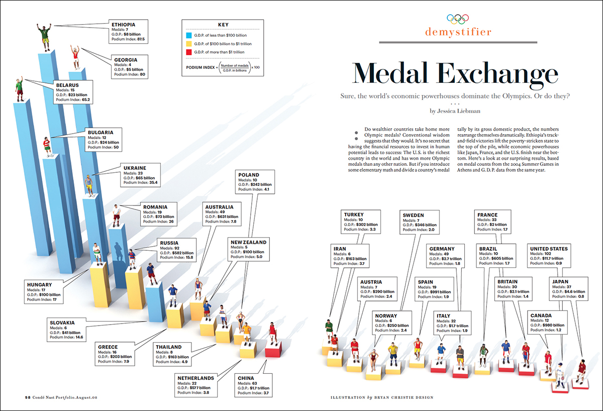
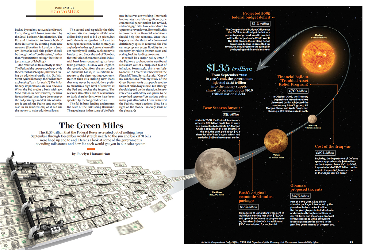
Anyway, here are six examples from the magazine. Most of them feature the talents of Bryan Christie (http://bryanchristiedesign.com). The Maglev train is illustrated by John MacNeill (http://www.johnmacneill.com). The art direction is by Priest and Grace, and the Portfolio design team, with some vital contributions from various editors and writers.
I’ll be showing some more in a future post. (Click on the infographics for larger versions.)
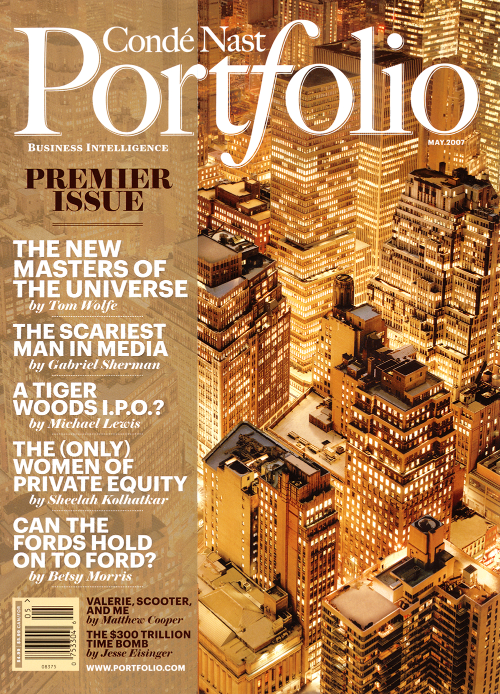
As a footnote, this is the cover of the magazine’s first issue, complete with transparent cover line flap.
