REFLECTIONS ON THE UBIQUITOUS PANTONE SYSTEM.

PANTONE MATCH
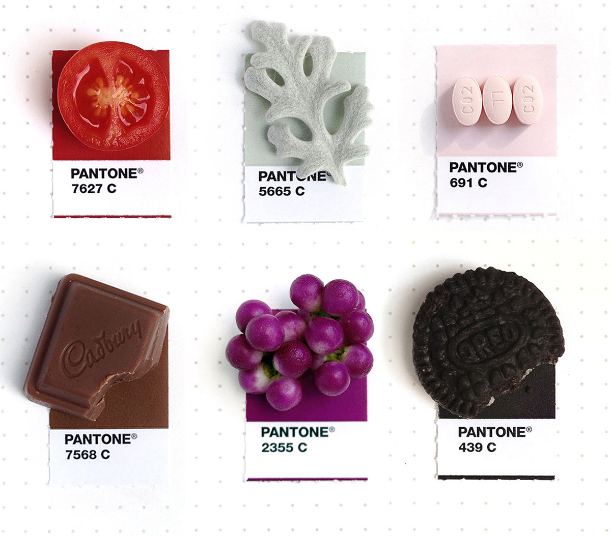
A brilliantly simple project by Inka Matthew. Why don’t I have great ideas like this? Don’t answer that question, please. Anyway, more examples can be seen here: http://tinypmsmatch.tumblr.com

CHRISTMAS CHEER
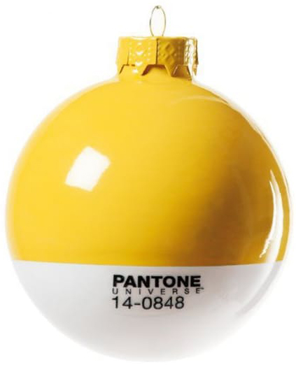
With the holiday season approaching you might want to start thinking about a designer tree: https://www.shopspring.com/search?query=seletti+pantone
More stuff at Pantone Universe: https://www.pantone.com/pantone-universe

THE WORLD’S UGLIEST COLOR
In a 2012 market research survey, 1,000 smokers selected Pantone 448 as the world’s most repulsive color. The Australian government was looking for a suitably awful color to mandate for cigarette packaging. They combined this with shocking images of the effects of smoking in an attempt to reduce cigarette use. Other countries are now following the same track. In May this year, the United Kingdom introduced the same approach.

THE PANTONE HOTEL
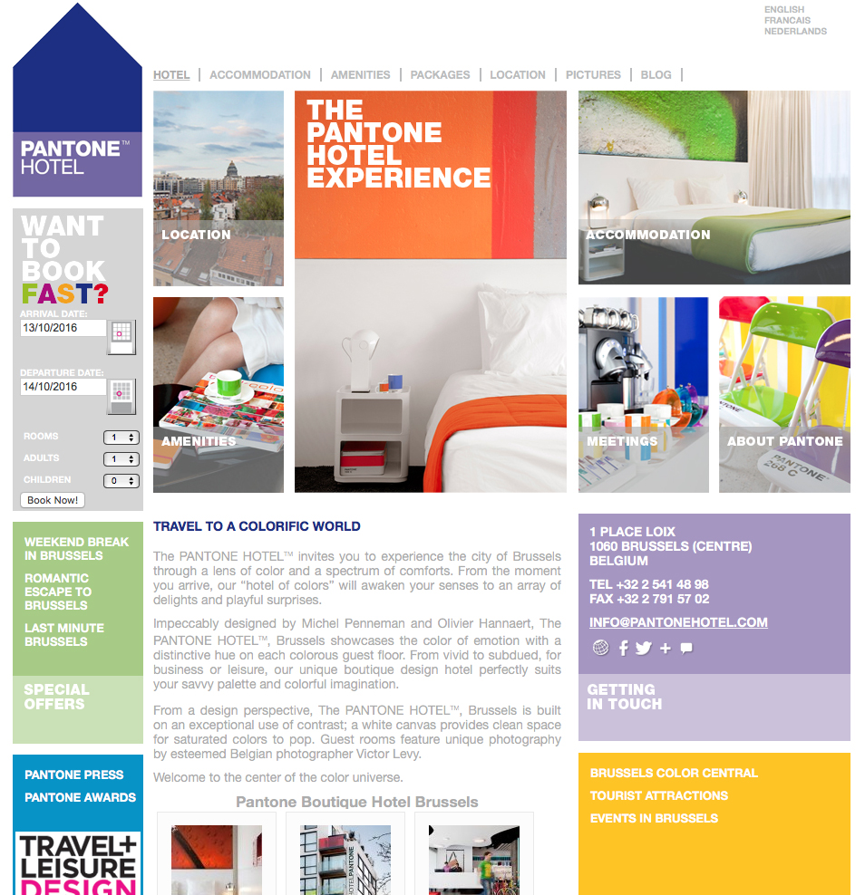
Next time you’re in Brussels, stay at a hotel that’s a tribute to the color system.
