DESIGNING A SET OF SYMBOLS.
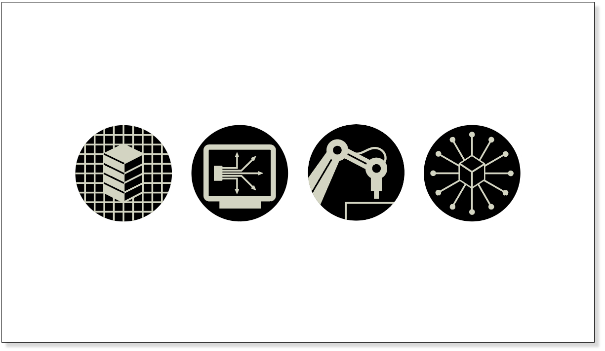
The pictograms on the back of my business card are part of a set that was designed for Managing Automation magazine. More about them later in this post.
ICONIC DEVELOPMENT
I’ve always appreciated the graphic simplicity of pictograms (or icons, or symbols, or whatever else we may call them). They can convey an effective visual signal, and if necessary, do it in a very small space. But, as all information designers know, symbols are not as easy to create as they look. An elegant, unified set, particularly when it contains some fairly abstract subjects, probably gives no hint of the many hours of work involved. The same thing could be said about a lot of good design.
I usually go through the rough sketch process that I’ve mentioned in earlier posts. It’s a good way to try out the options. Email it to the client, get some feedback, and move on from there. Incidentally, there’s often one symbol in a set that is difficult to solve. Either because no one understands it, or because it doesn’t look like it is from the same family as the others. That one can end up taking as long as all the rest.
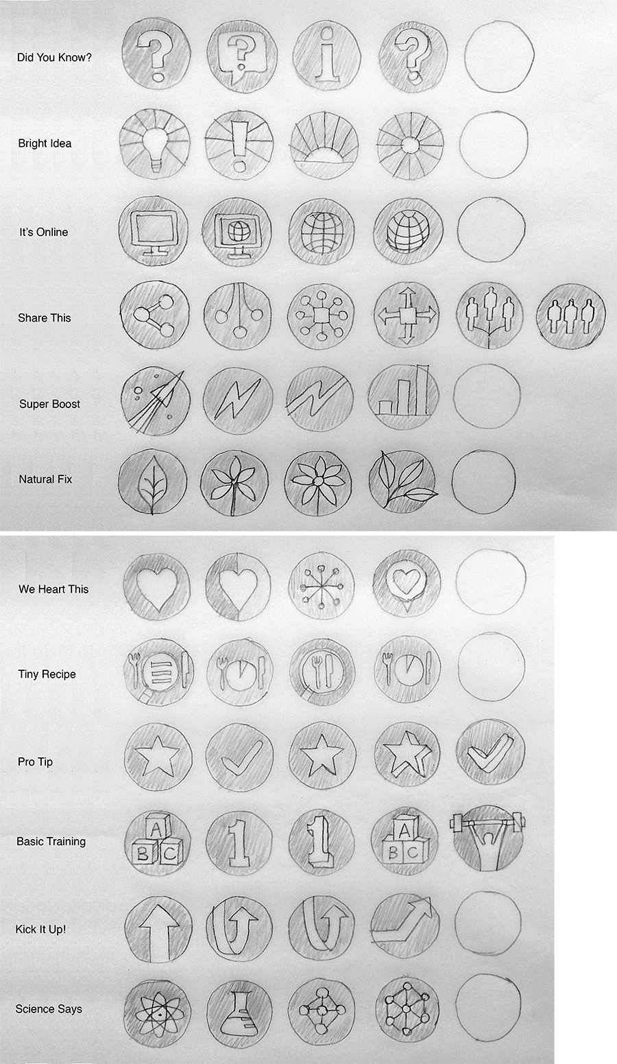
Below is the complete development of a set of icons that I designed last year for The Good Life magazine. First came the rough ideas. This image is the second stage of the pencil sketches.
Next came the refinement of the style. These symbols needed to work at a small size. I started with circles holding the icons, and tried some bold color in the test below, but the project gradually headed towards a line style with free shapes on white. Note: In any set of pictograms, it’s important to keep both a consistent line weight and even spacing.
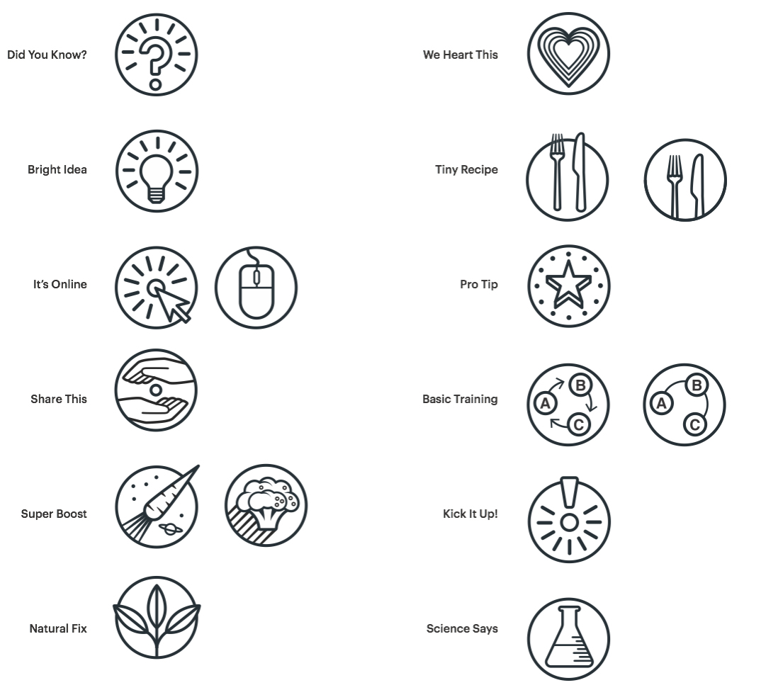

Possible line styles without the circles.
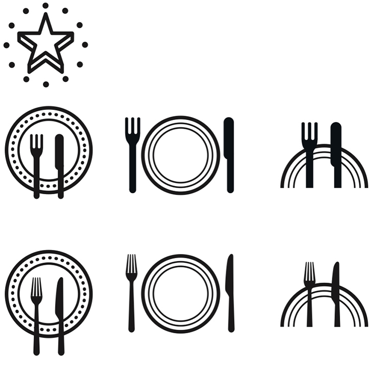
Getting closer in the version below. “Share This” and “Super Boost” were giving me trouble. Especially the latter. Clearly!
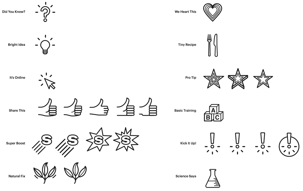
This is a nearly-final stage. I was refining the symbols with the magazine’s editorial and designer input (which had accompanied each step). As with all infographic elements, pictograms have to work well at the final size and in the intended format. By the way, collaboration is always good, and many of my projects owe a great deal to the smart thinking of design departments.
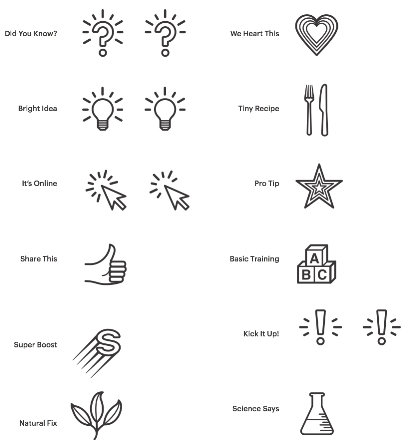
Examples from the final set (below). This is just one possible color that would be used depending on the issue.

Below is the second stage of development for the Managing Automation pictograms shown at the beginning of this post. There was (of course) once a pencil rough on paper, but long ago it was probably recycled into a lampshade.
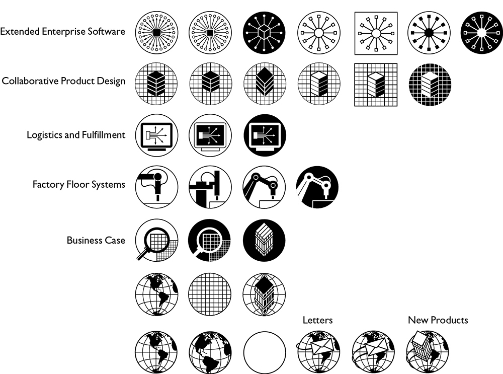
Final version.
![]()
Some other sets for various clients. Flat color, line art, dimension, drop shadows, I’ve tried it all.
![]()
See a lot more here: http://johngrimwade.com/ICindex.html
