INFOGRAPHICS THAT WENT WRONG.

I am finding far too many of these badly-conceived graphics in my collection. I could delete the files and pretend that I didn’t create them (“What food chart?”), or post the examples here and hope there is something positive that can be taken from them. We all learn from our mistakes, and I encourage my students to be adventurous, even if potential failure lurks in the shadows.
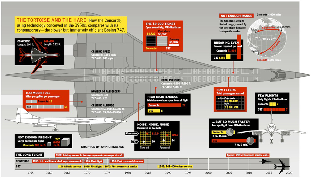
Concorde confusion Questions: Why does the color used for Concorde and the 747 keep switching around? Was my medication wrongly prescribed? There is an interesting use of boxes as well. I have trouble believing that I am responsible for this one. On second thoughts, it must have been done by someone else. Well, that’s a relief.
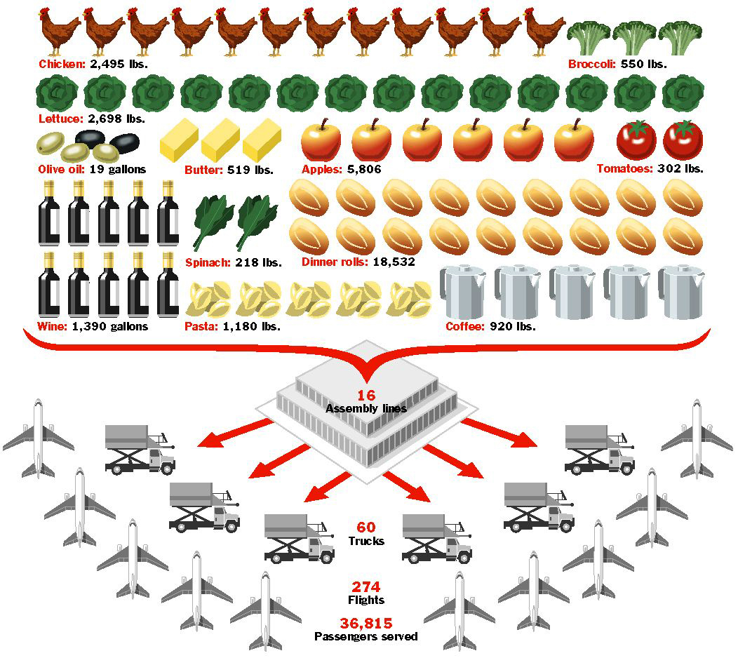
Catering nonsense There is, believe it or not, an underlying logic to the chart below. I wrote it all out on a piece of paper, so there must be. One chicken represents 200 lbs. One apple equals 6,000. (What?) These items cannot be compared, and it doesn’t make any sense as a chart. This is complete crap. Memo to curriculum committee: Do not let this person teach data visualization.

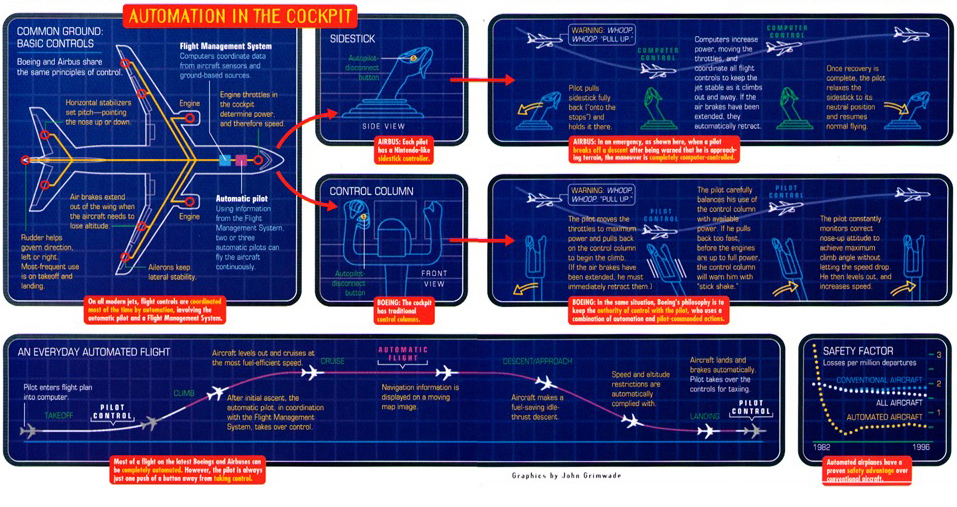
Styling takes over The next infographic (might be the wrong name for it) apparently explains and compares the cockpit systems of Airbus and Boeing. It’s a very poor graphic, but a very fine example of a heavy-handed stylistic idea ruining an explanation.

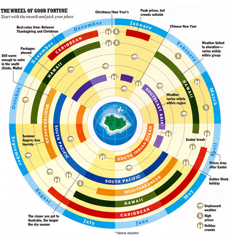
NO That’s my only comment on this wheel thing.

