THE AXONOMETRIC VIEW.
(See Part 1 here: https://www.johngrimwade.com/blog/2017/03/27/the-incredible-bollmann-map-workshop-part-1/)
Perspective effect
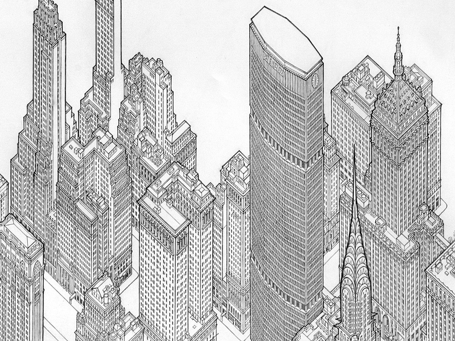
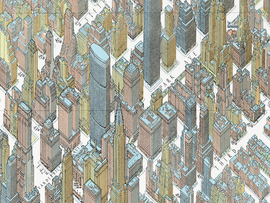
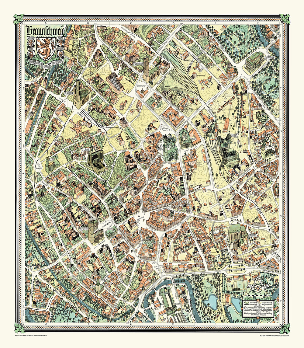
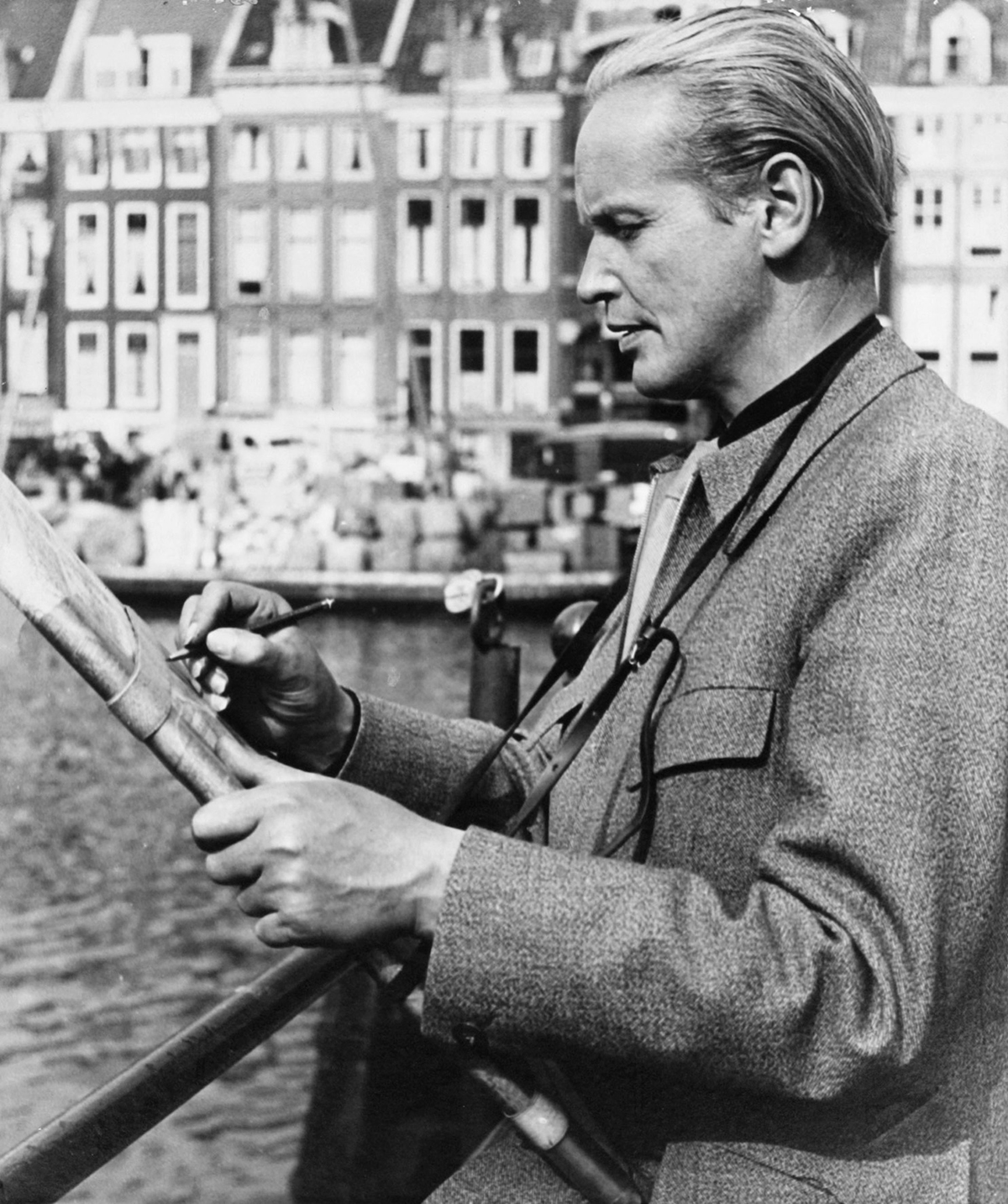
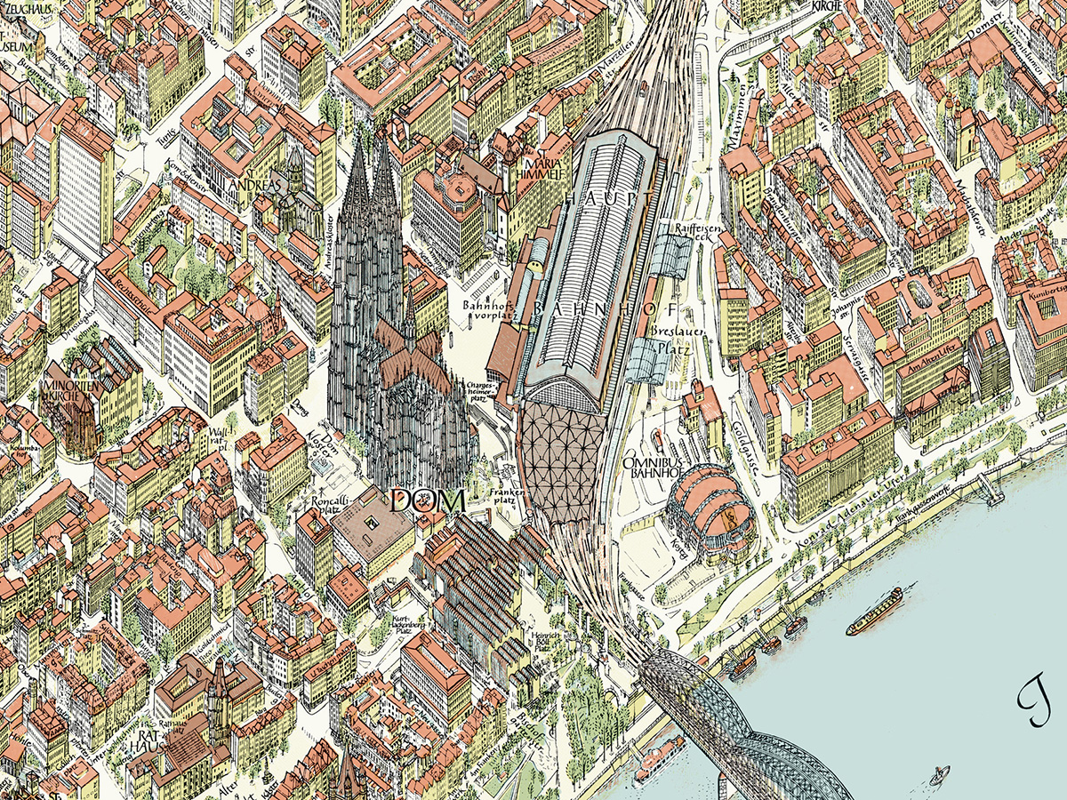
The maps are obviously not drawn in perspective. They use a modified axonometric projection, invented by Hermann Bollmann. With this kind of parallel projection, the scale is constant across the map. A 45-degree angle gives the best compromise of dimension and clarity, and each map has it’s own unique viewpoint which is chosen to best show that city. The color palette is also selected on a case-by-case basis.
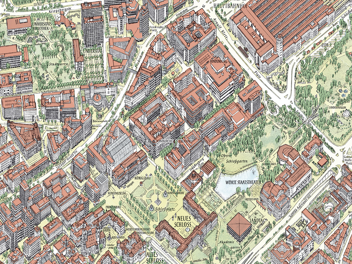
Detail from the Stuttgart map.
The secret of success
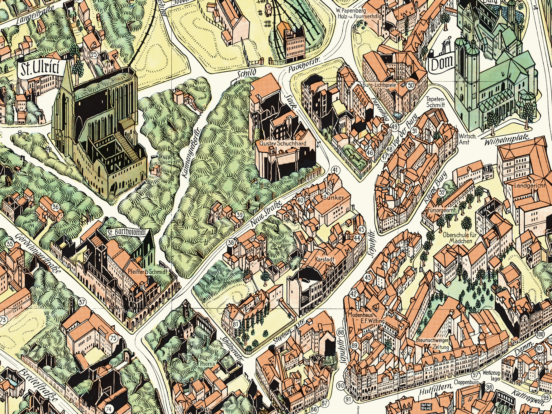
Why do Bollmann’s maps seem so much more informative, in terms of being useful navigational aids, than aerial photos and 3D-rendered views like Google Earth? There is a lot of high-tech, data-driven mapping at our disposal, but it is no match for their informational artistry. A key factor is that the Bollmann maps are not drawn in an exact realistic proportion. Otherwise we would mostly see roofs with compressed facades, which would not be useful for helping navigation on the ground. Buildings are adjusted to be more visually descriptive without compromising the character of the structure. A vertical exaggeration of between 120% and 170% is applied, depending on the character of the city. Also, the streets have been considerably widened, so we can clearly see them and their labels. It’s not obvious until you compare one of these maps to an aerial photo. “We draw cities from above, as you see them from below”, says Sven. Like all good informational graphics, the interpretation enhances our understanding. A crucial point. It’s why many 3D-rendered maps are very unsatisfying. Just disappointing pieces of technical wizardry, in terms of wayfinding, without this careful infographic intervention.
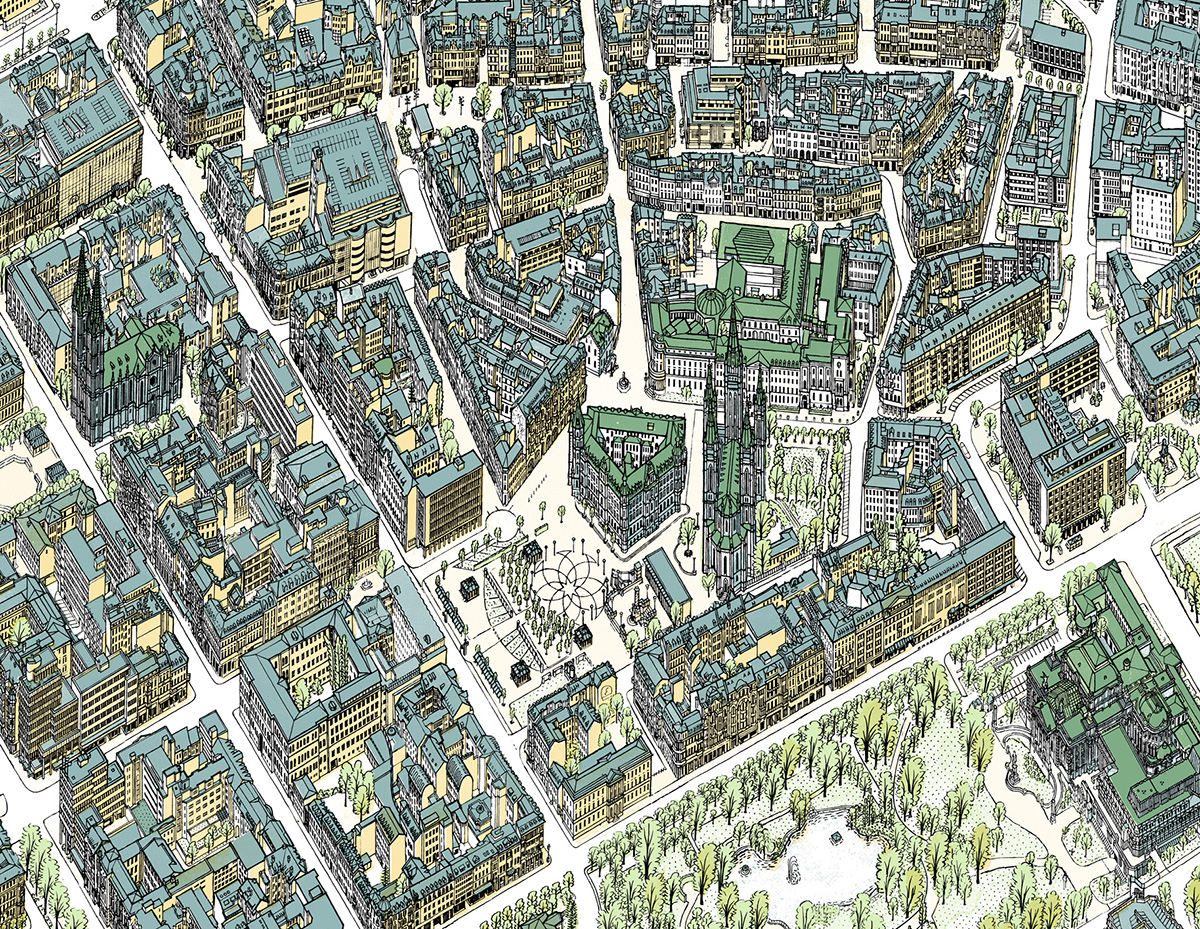
Detail of the Wiesbaden map.
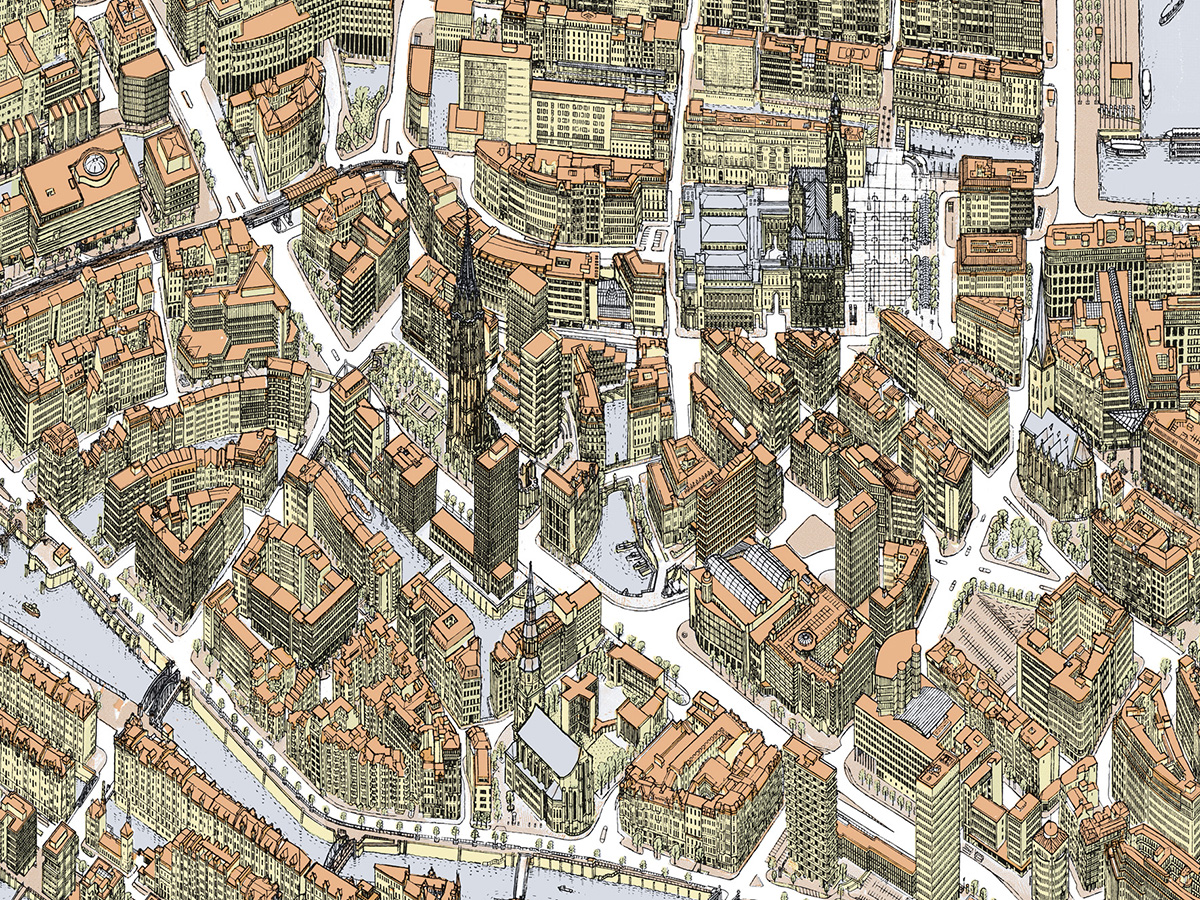
Detail of the Hamburg map.
Master mapmaker
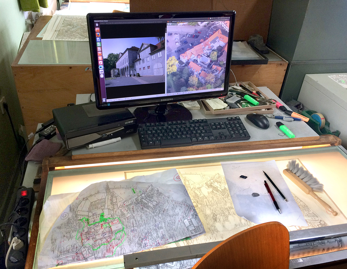
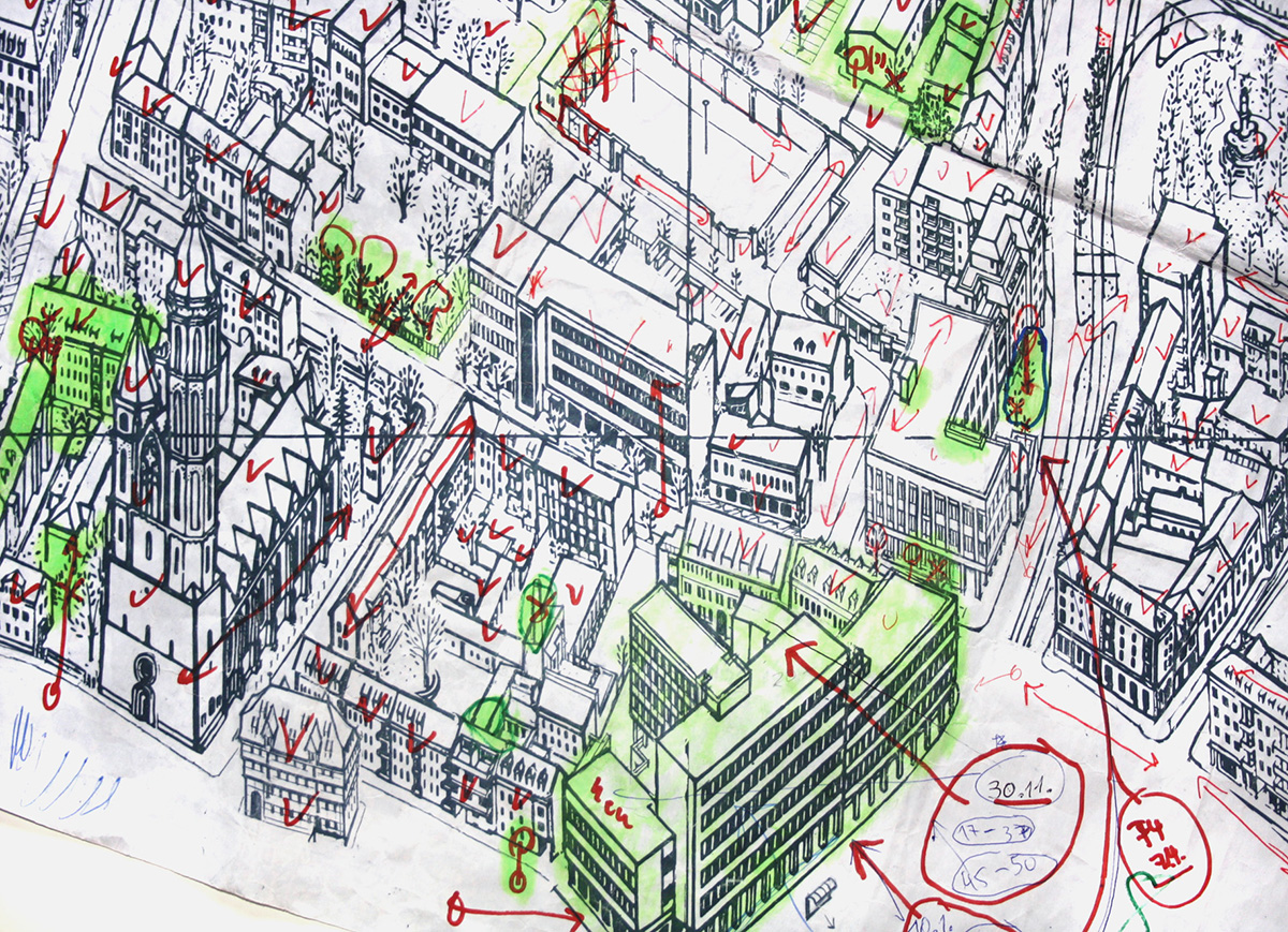
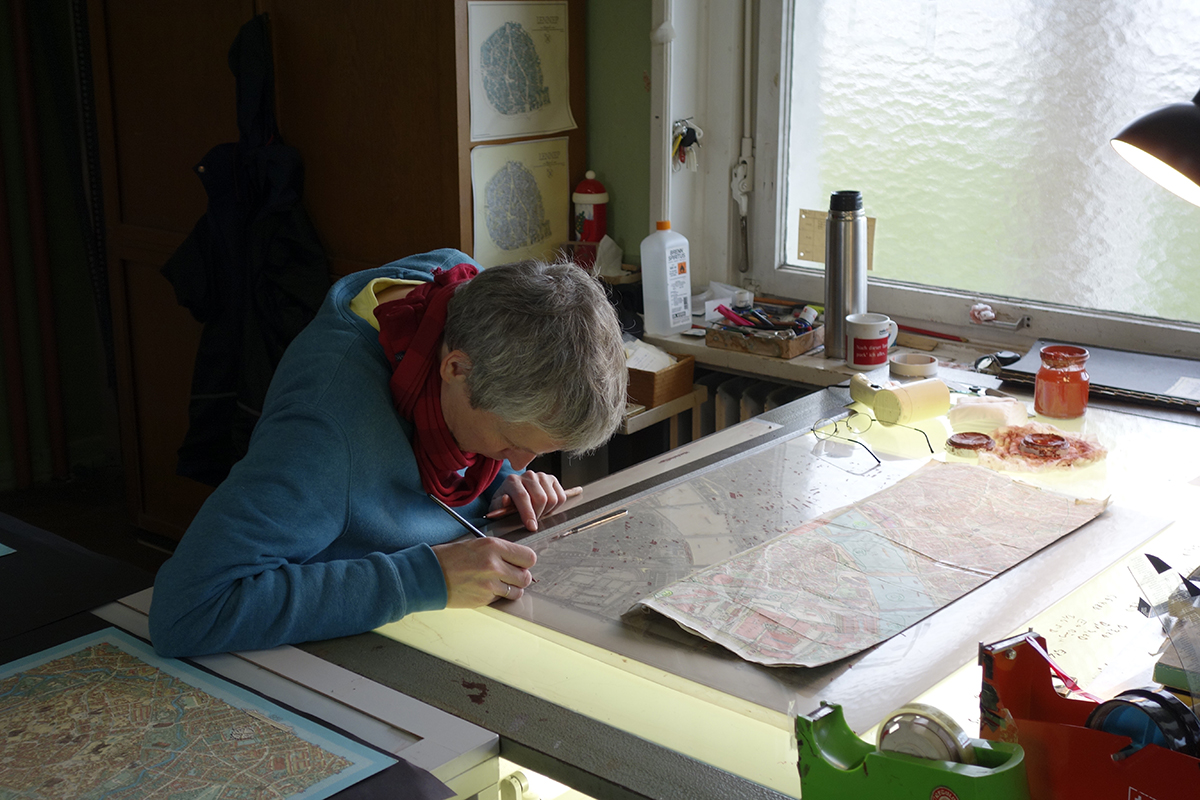
Above is Thomas Greve’s workstation, where he spends many hours making hand-drawn map corrections. It’s a mixture of analog and digital. Photos from the street, and from the air, are on the monitor. Areas needing attention are marked in green. The detail below (different from the one shown above) shows the painstaking checking and correction process.
Advertising pays the bills
90% of Bollmann’s income is from companies having their small logo placed on a map. This has been the business model since the company began. Without that source of revenue, they would not have been able to maintain their standards. Well, not without having to charge a very high price for each map. The current cost of a folded city map is 6.90 Euros (about $7.25).
New York City
I mentioned in an earlier post, the classic map of the 1964/65 World’s Fair that I have on the wall in my office:
www.johngrimwade.com/blog/2016/08/25/the-biggest-globes.
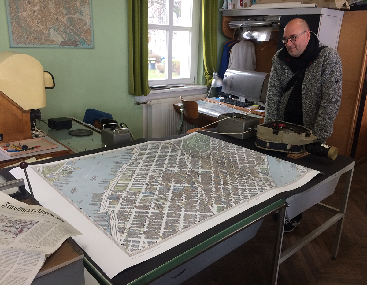
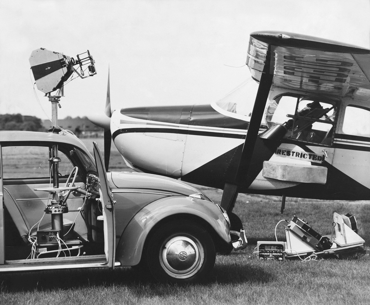
To mark my visit, the Bollmanns presented me with the best gift imaginable, a specially-printed oversize version of the classic map of New York City. This 1962 tour-de-force was based on 50,000 street-level photographs, and 17,000 from the air. The print is huge and magnificent, and framing it will cost me a very large amount of money, but I’m finding a wall and this is going on it. Here is Michael Stoll* standing near the map, and perhaps wishing it was his.
A big thank you to Sven Bollmann for his invaluable help with these two posts. And for that amazing map!
Bollmann Maps: www.bollmann-bildkarten.de
(All map images © Bollmann Bildkarten. All photographs by Bollmann Bildkarten, or Michael Stoll.)
*Professor Stoll organized this trip for myself and four of his students from the Augsburg University of Applied Sciences. Michael’s superb collection of classic information design has featured in this blog a number of times already, and will be here in the future.

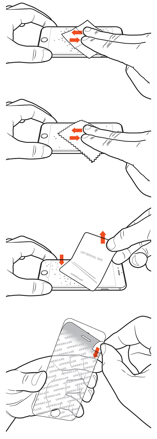
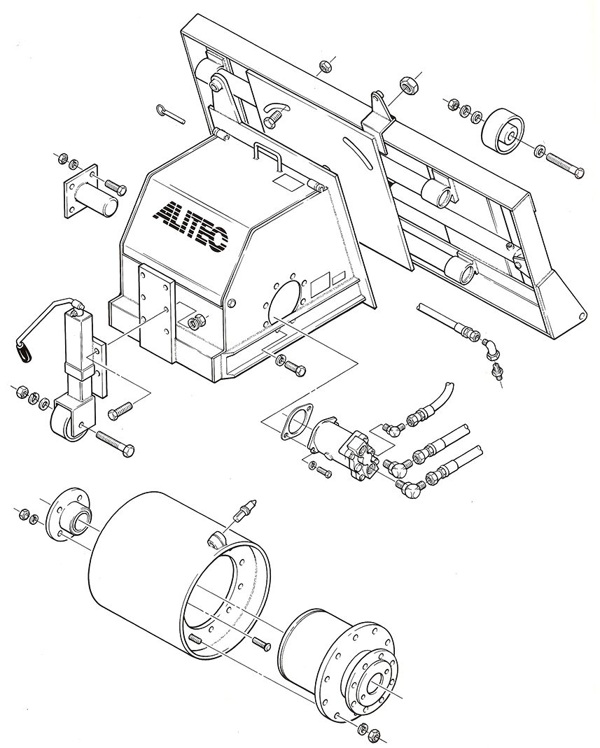
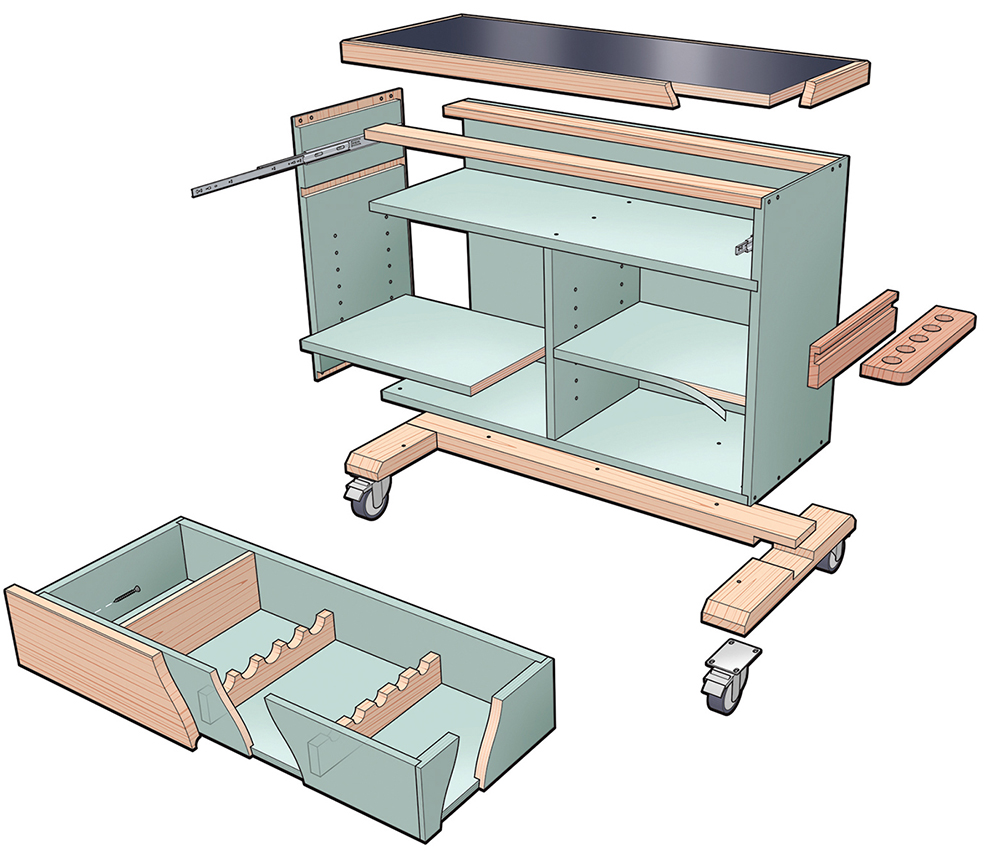
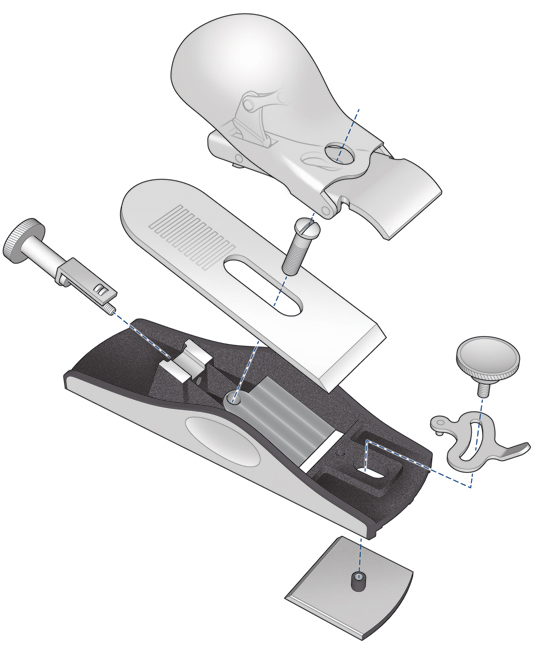
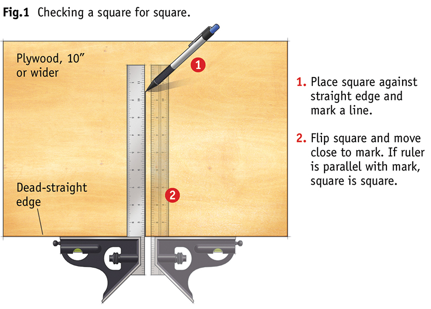
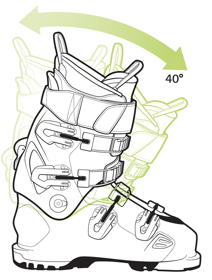
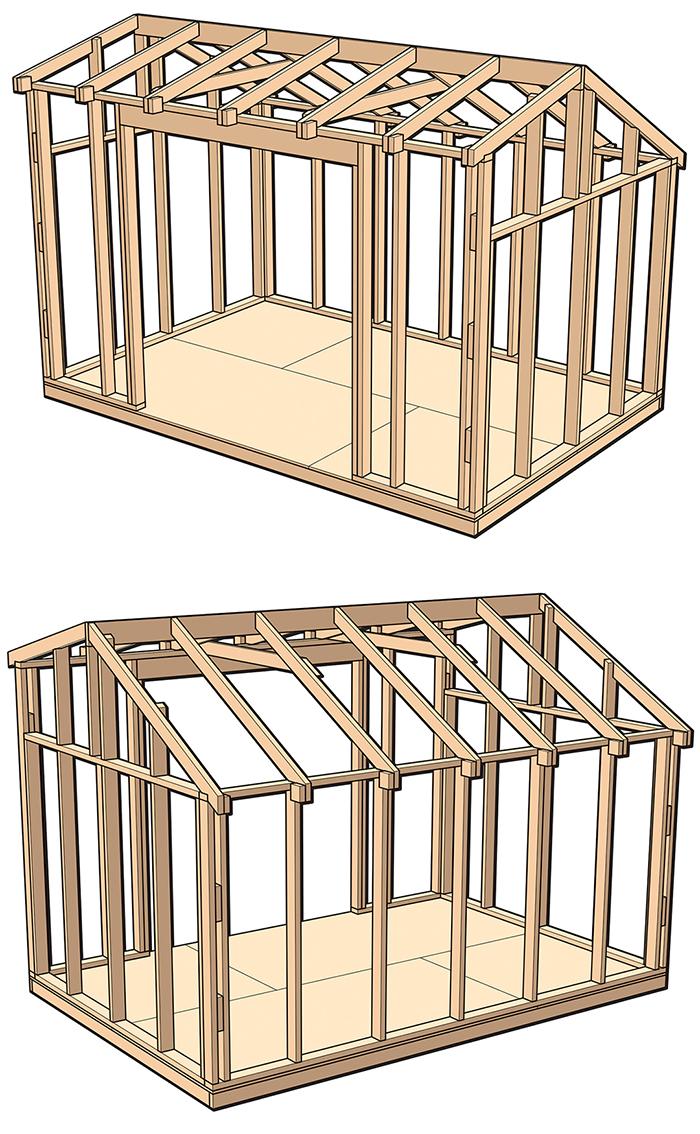
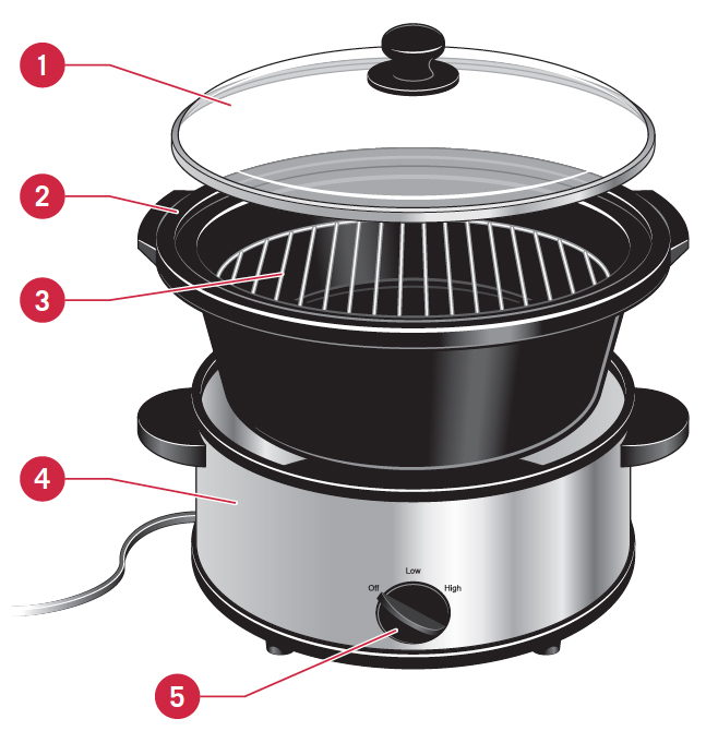
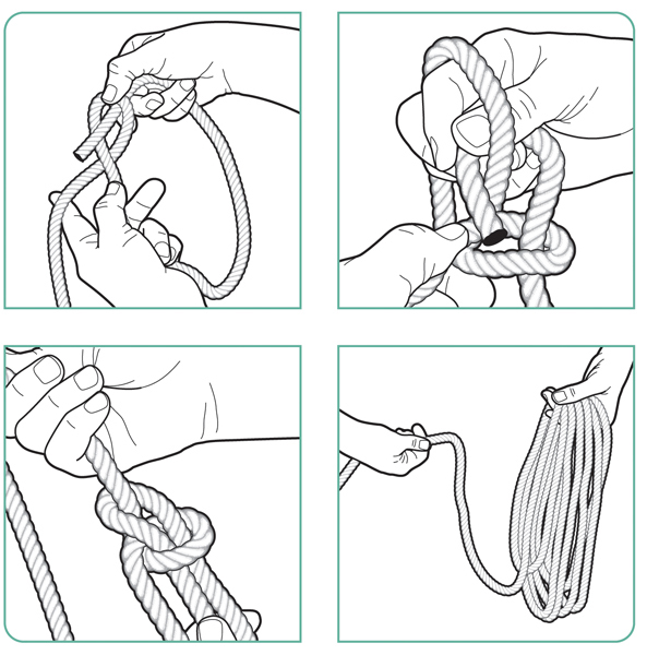
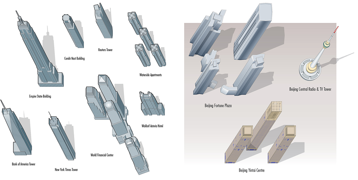
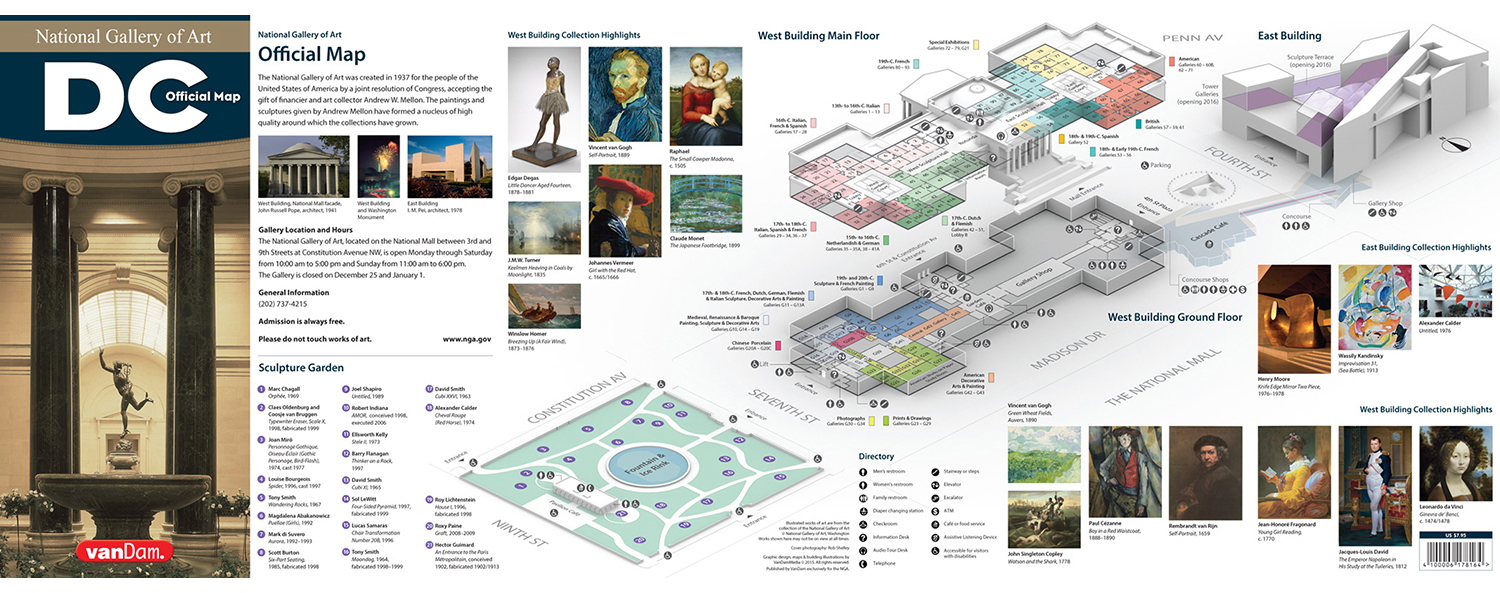
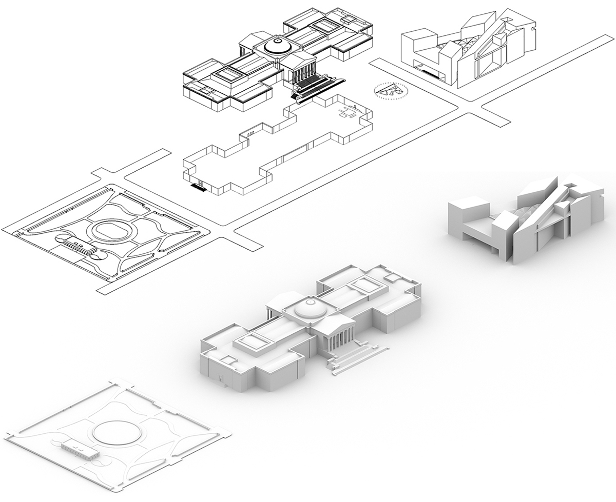
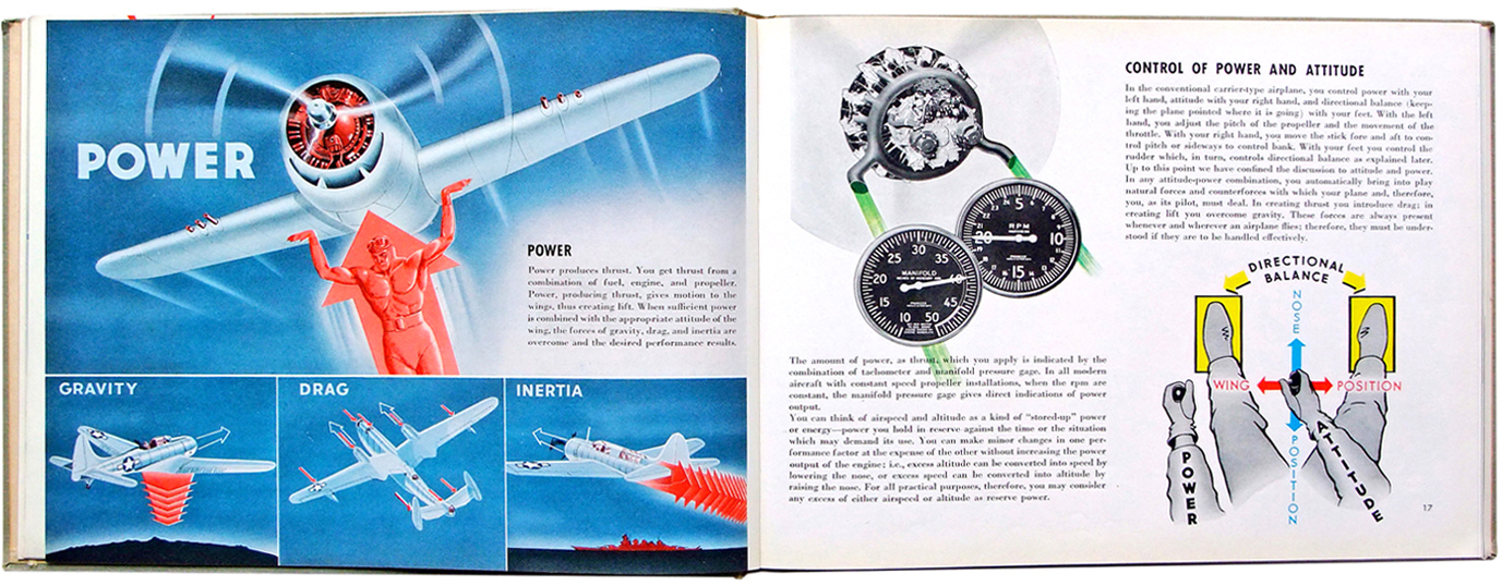
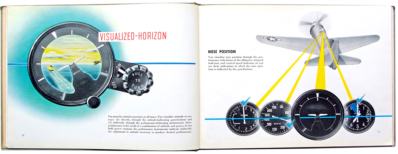
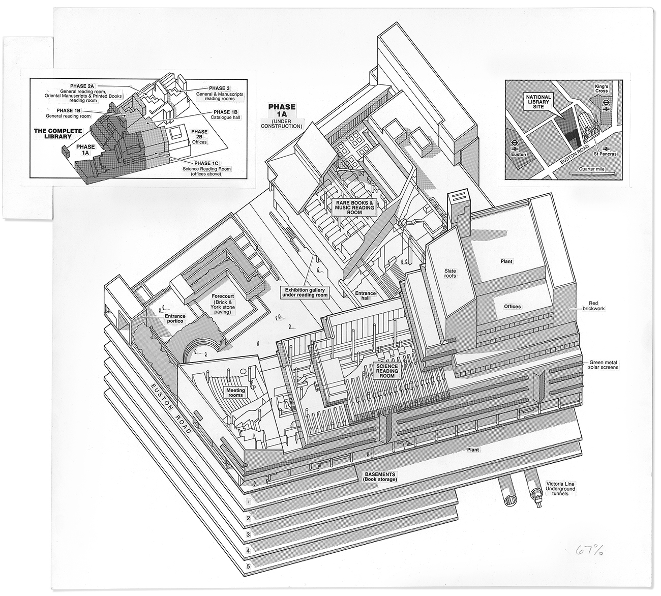
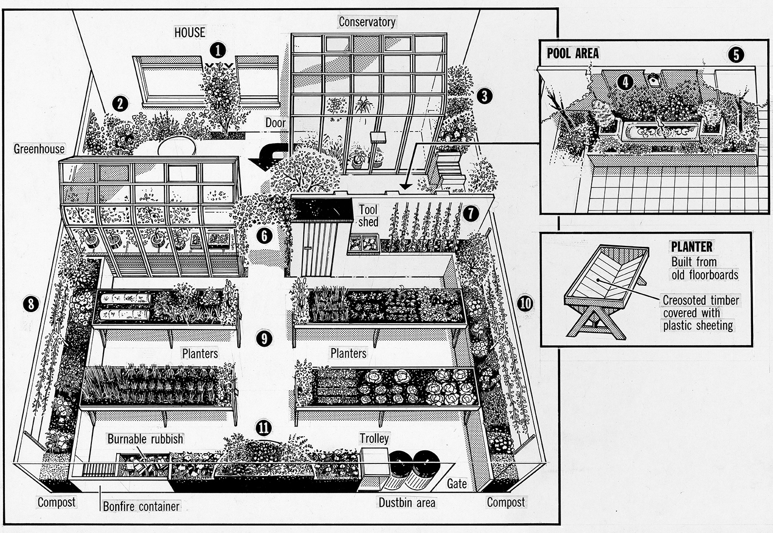
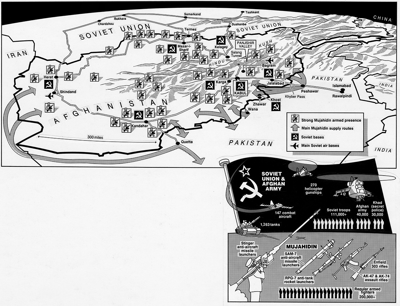
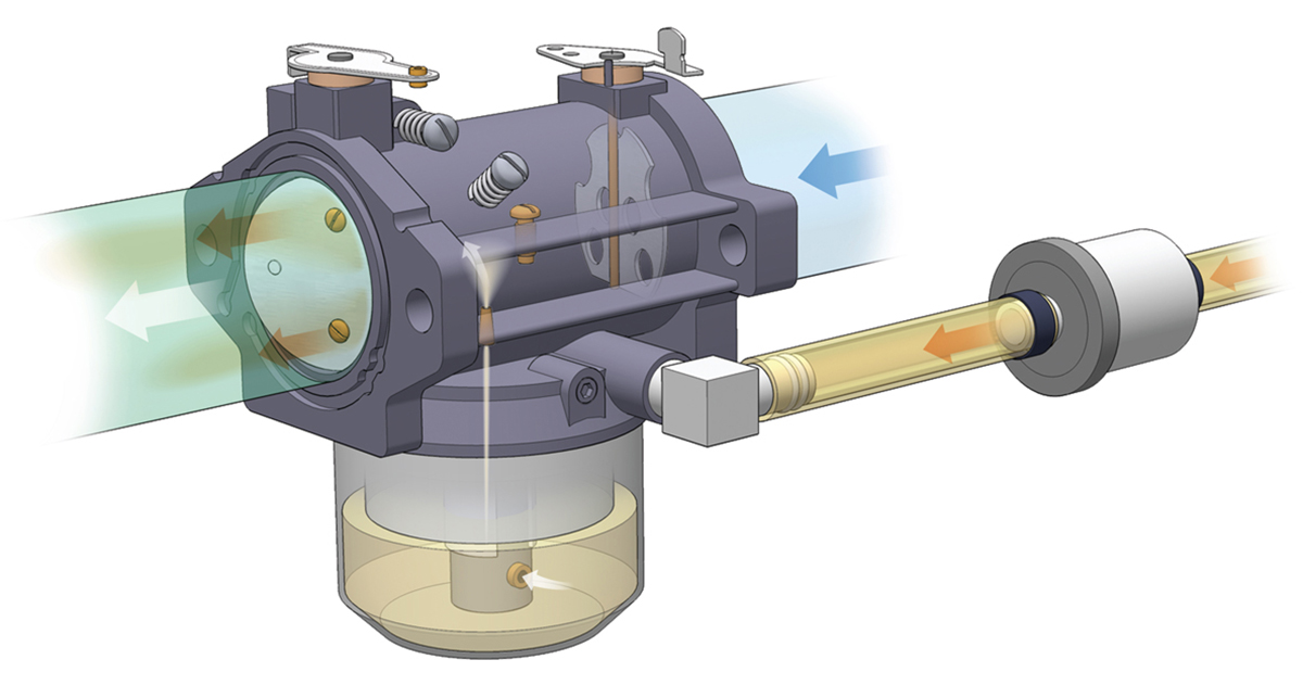 When I was the consulting graphics director for Popular Science back in the 1990s, I commissioned Greg to produce many diagrams. Like me, he began in the world of analog graphics, working with technical draughtsman tools, and by the 90s was, of course, working on the computer. Here are some examples of his precise, clear style. These instructional graphics help us with our day-to-day life, and deserve as much respect as the mega-graphics that frequently sweep up the prizes. See more of Greg’s work here: