ONE MORE TRIP TO THE GRIMWADE ARCHIVE.

An exhibition of my career starts on Thursday in Munich. (See below.) A fair amount of my original artwork from the 70s and 80s is on show there. I’ve put a lot of it in previous posts, but here a few other pieces. And after this I will stop. I promise.
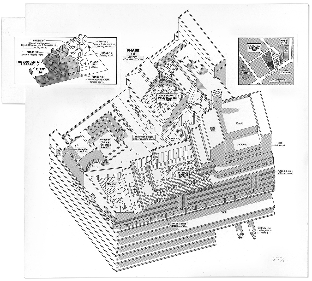
The graphic above was for The Times (1980s), before the new British Library opened. I worked from the architect’s plans. Unfortunately, I ran out of room on the left, and had to tape a piece of artboard on to the side to support the inset. The reduction of 67% was standard for me. I worked at 150% of the final size.

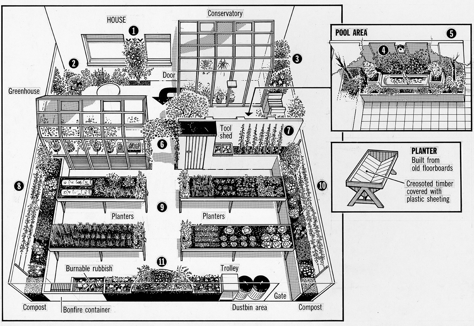
This is a garden for people who use a wheelchair (from the Sunday Times in the late 1970s). The different perspectives seem slightly uncomfortable, and it badly needs a person for scale. I’ve often criticized students for leaving out any trace of humanity, and here I’ve done it myself.

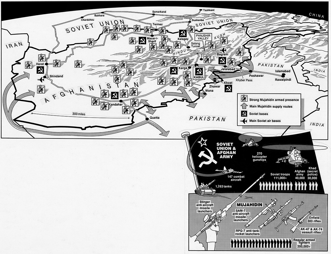
For a feature page on Afghanistan, which has been racked by conflict for a very long time. This is from The Times (1980s).

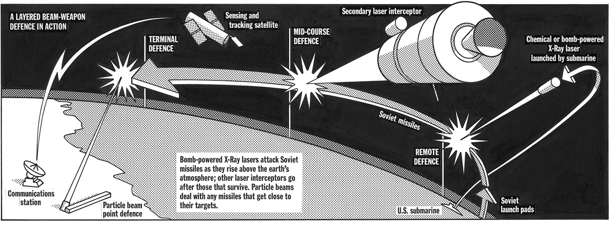
Heavily influenced by Nigel Holmes’ and Richard Draper’s work in the Radio Times . I loved their dimensional arrows, and I wanted to do some. The headline is not big enough. In fact, there is little hierarchy here.
This kind of artwork is featured in an exhibition this week, at the EDCH and INCH conferences.
I will also be giving one of the keynote presentations at INCH, and running an information graphics workshop called “The Infographic Upgrade”. It will try to make it both informative and fun.
Design conference: http://www.edch-conference.com
Infographics conference: http://www.inch-conference.com
Infographic workshop: http://www.inch-conference.com/en/workshops


