MAPPING THE “TUBE.”
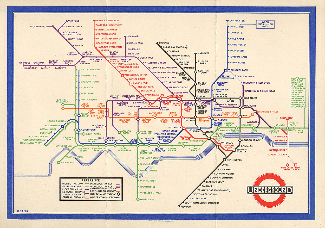
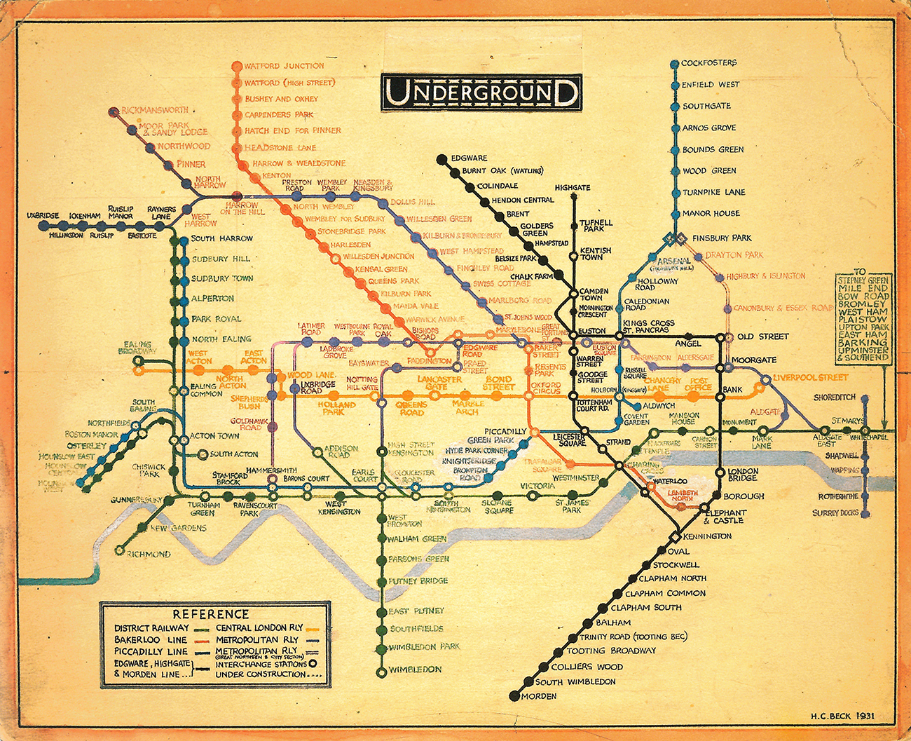
Harry Beck really started something. His elegant map of the London Underground (which is more of a diagram than a map) set the style of the modern subway guide. It’s designed to help people use the network. To show them clearly how to get from A to B, and make the correct connections. Beck aimed to strike a balance between a clear system diagram and the geography. This involved making some compromises with the distances between stations and their relative positions, and enlarging the center area where so many lines intersect. The first map printed in a large quantity (1933) is shown above. It was produced first as a folding, pocket-size map (shown here), and soon followed by a poster-size version. The design allowed for future expansion of the network.
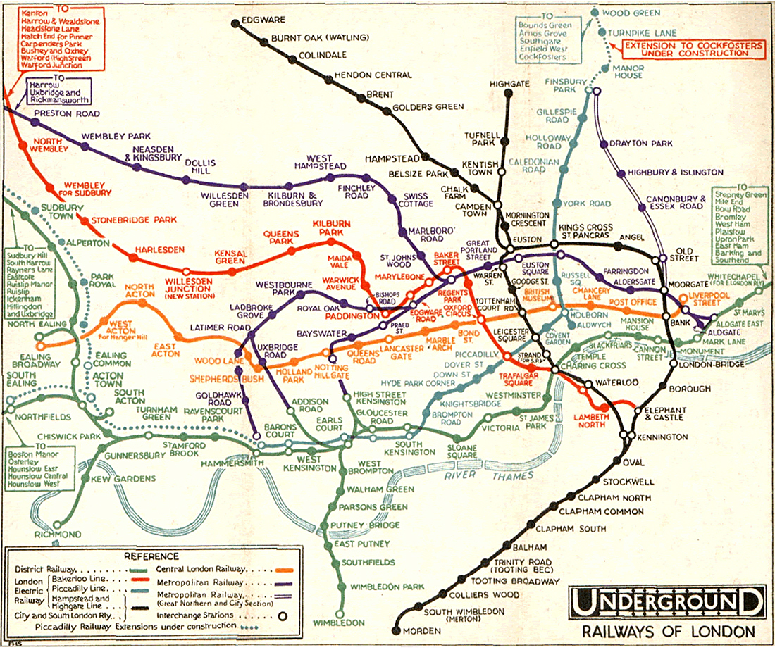
The 1932 map (below) that preceded Beck’s was by F. H. Stingemore who designed the map from 1925 to 1932. The central area in the Stingemore map was slightly exaggerated and the outer stations were listed at the edges of the map. Beck’s redesign was a radical departure.
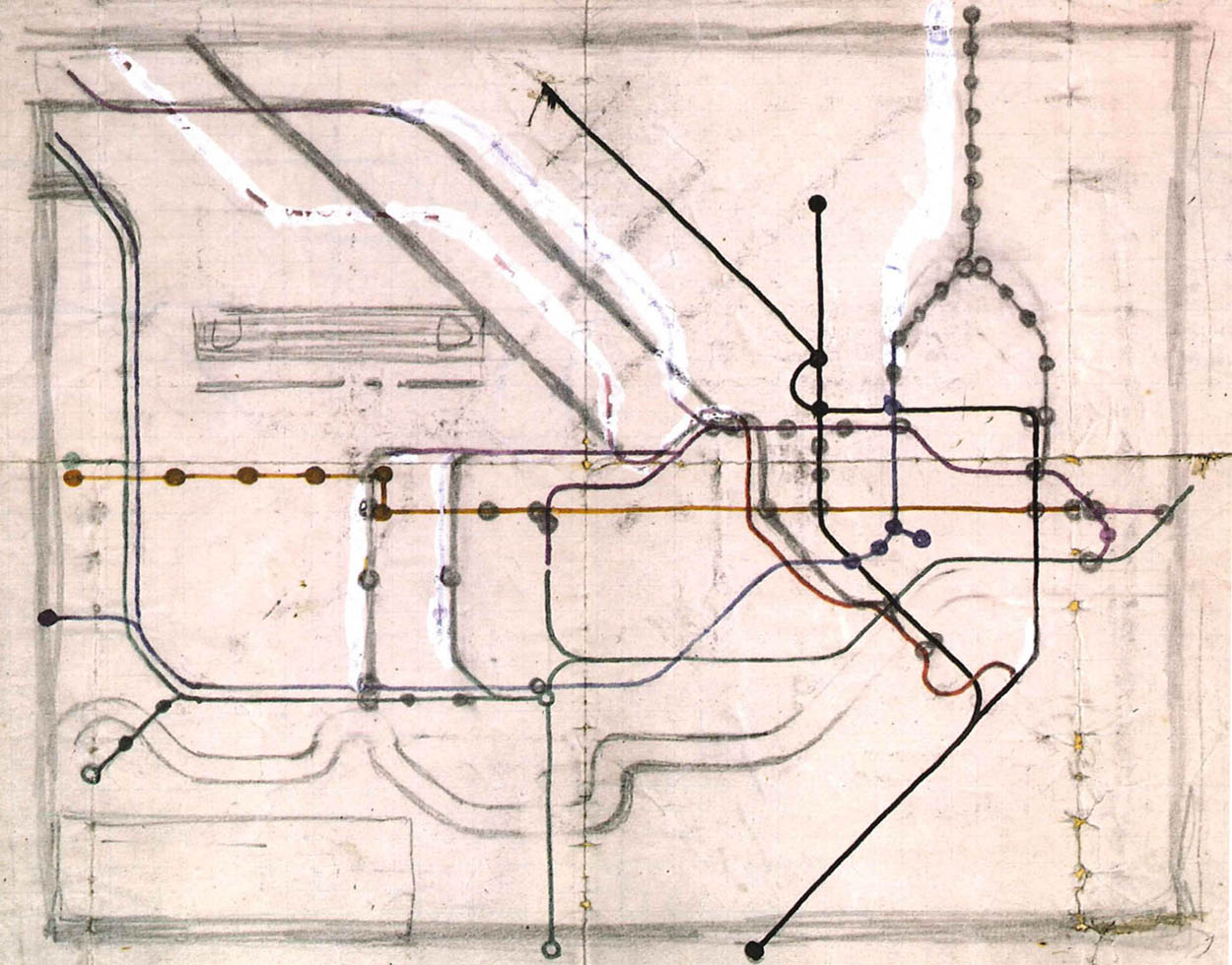
A rough drawing from 1931 shows Beck’s initial plan for his more diagrammatic map. He was an engineering draughtsman, not a graphic designer, so he looked at the project like an electrical circuit diagram.
A presentation version (1931) was rejected at first, but the following year was the basis for a test run of 500 copies. At this point, Beck was still using circles for most of the stations. He switched to tick marks in the 1933 version.
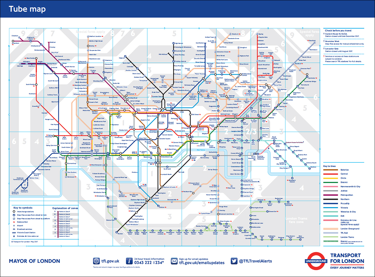
The current map is a lot more complicated with fare zones and additional subway lines.
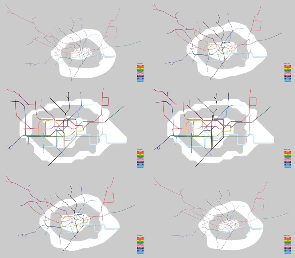
The distortion from actual relationships to the diagrammatic map is shown in this animation. By Pham_Trinli.
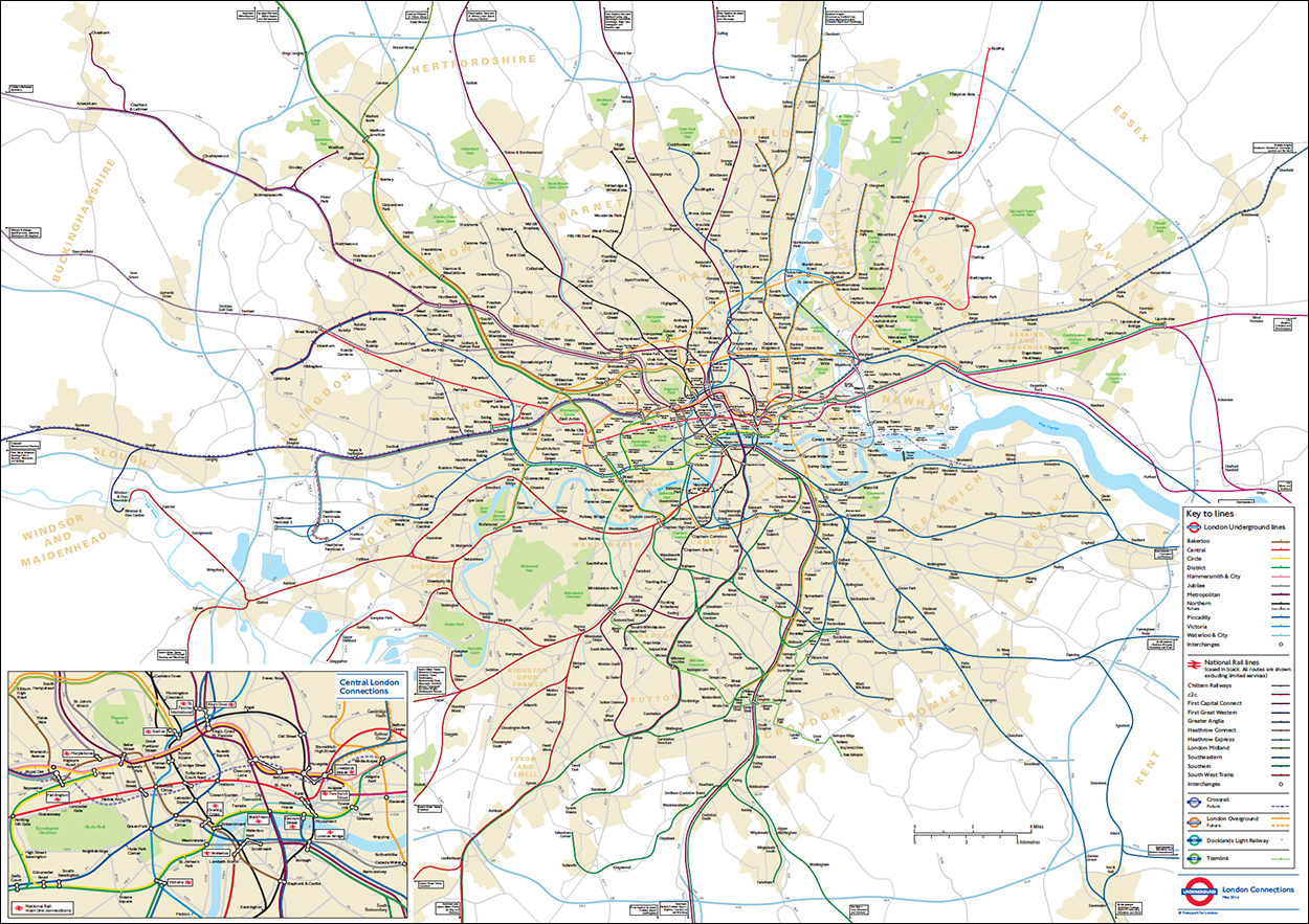
In 2015, Transport for London released a more geographically-correct map that could be a real help for walkers, bikers etc. It was forced into the public area by a Freedom of Information request. Click on the image for a pdf version.
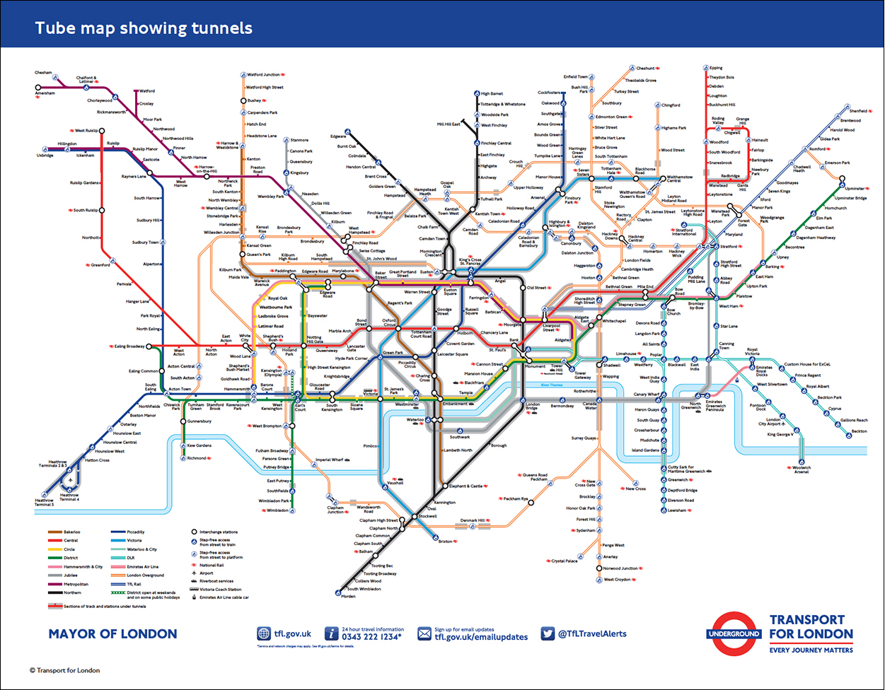
Earlier this month, Transport for London published a map for people who don’t like to be inside a tunnel, showing where the trains are actually underground. Despite the name of the system, 55% of it is above ground. Click on the image for a pdf version.

