MAKING INFOGRAPHICS AND ILLUSTRATIONS ON THE OTHER SIDE OF THE GLASS.

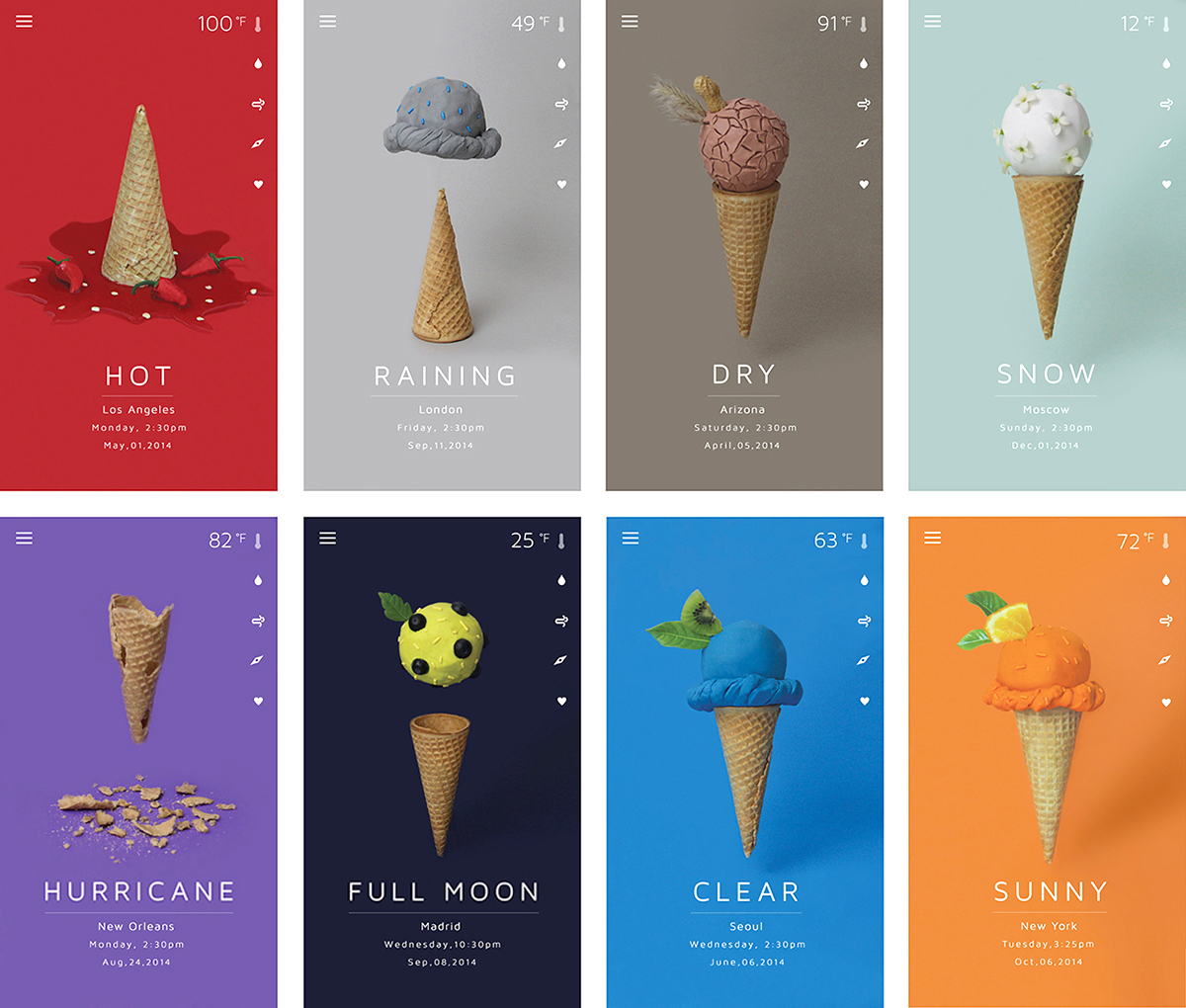
Weather An engaging prototype app by Sunny Park, designed while she was a student at SVA NYC (She’s now a UX designer at Microsoft). Sculpey clay stands in for ice cream.
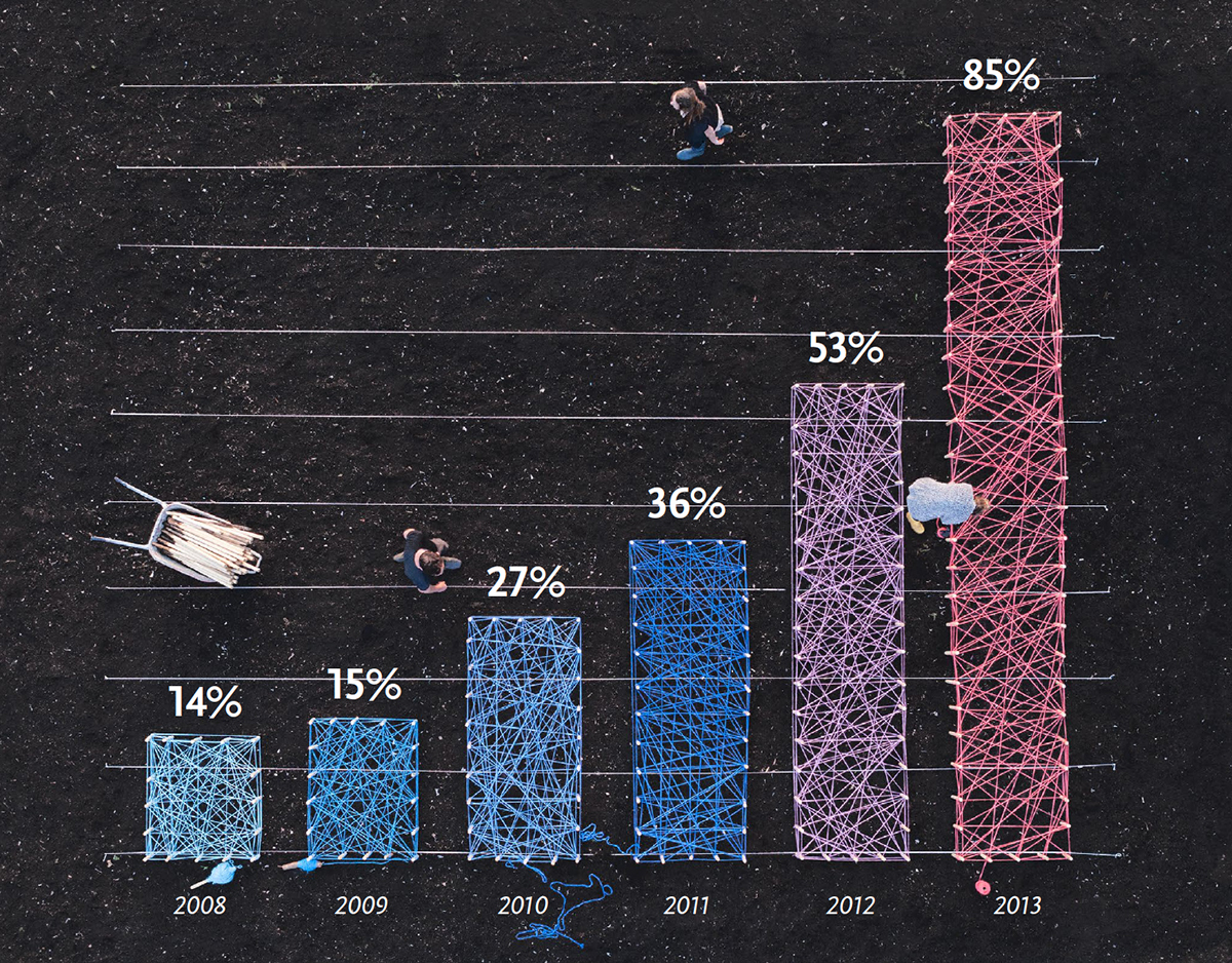
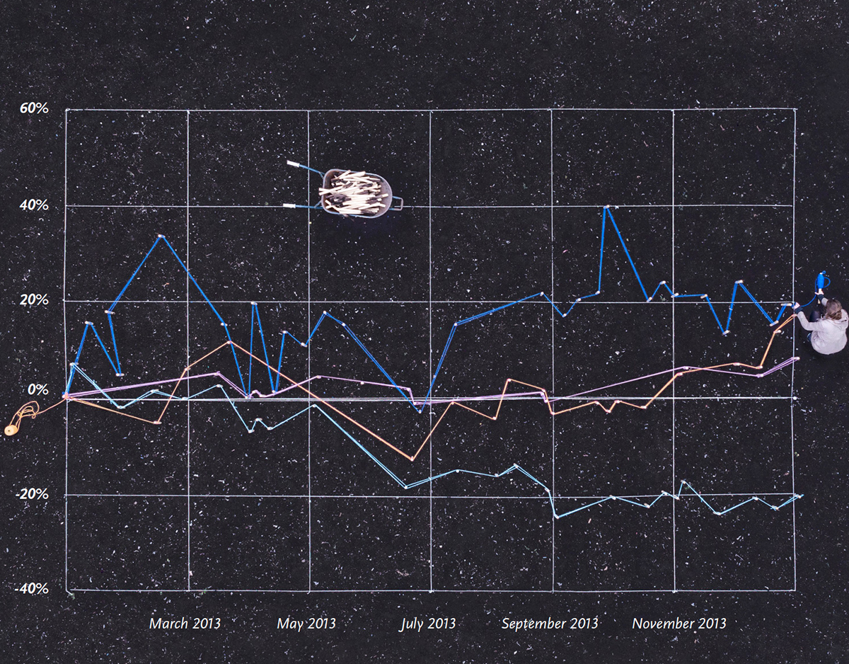
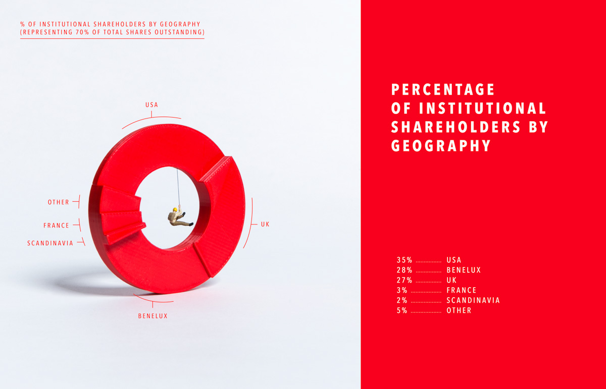
Data viz For the Ablynx 2013 annual report, Soon (a studio based in Belgium) went out to the fields with sticks and colored ropes to visualize the data. They used black sand to make the backgrounds.

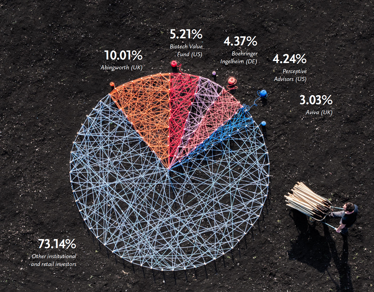
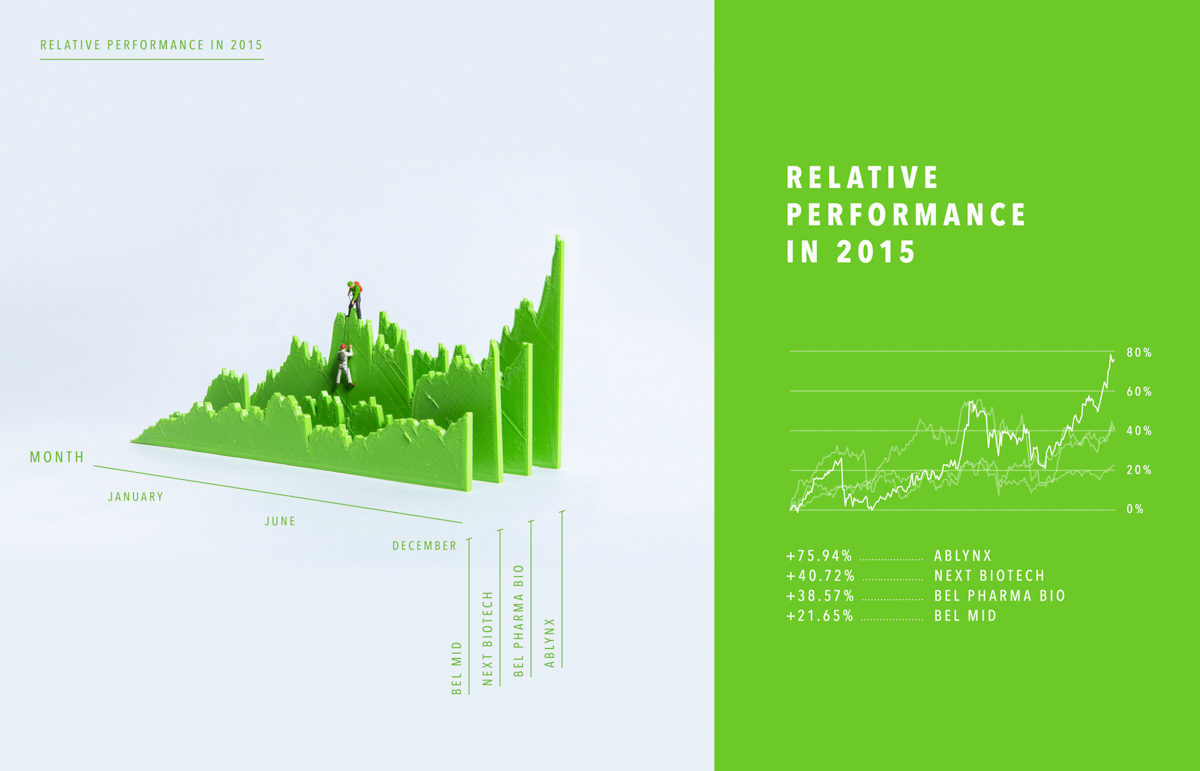
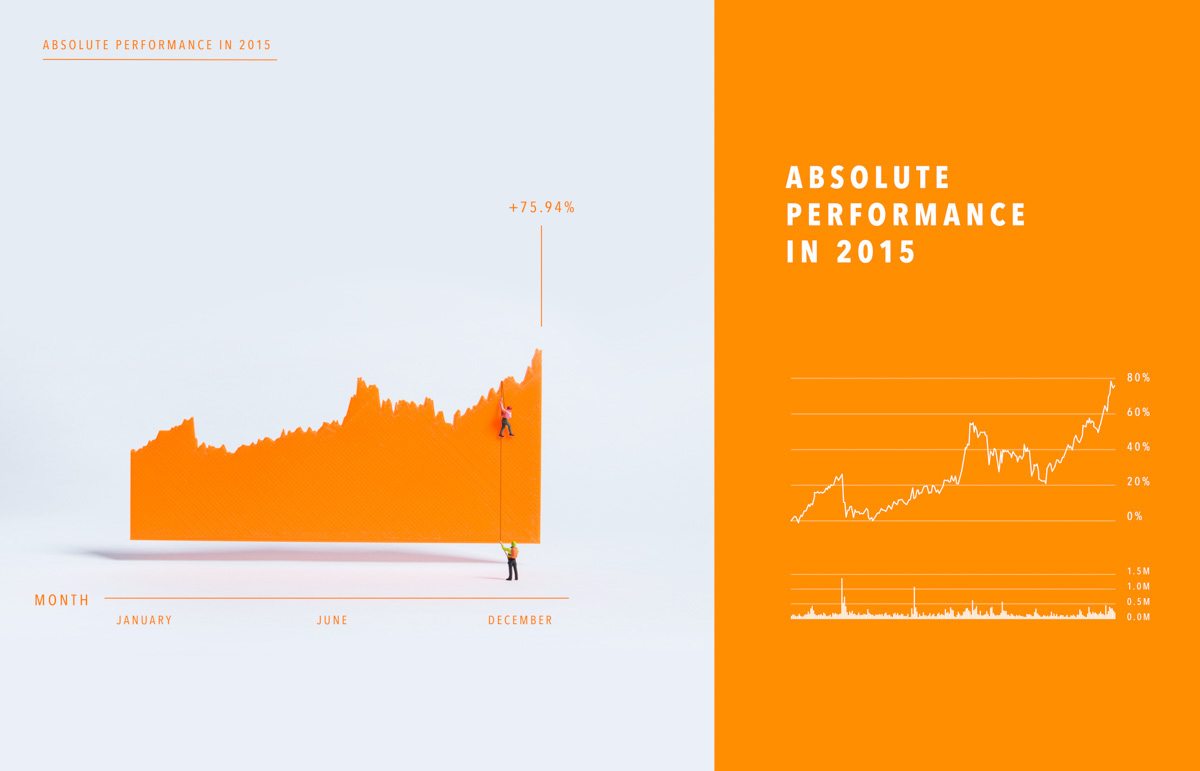
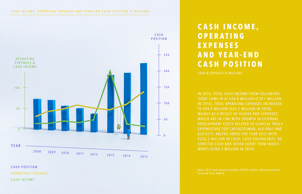
3D-printed Another Soon project. The Ablynx 2015 annual report.
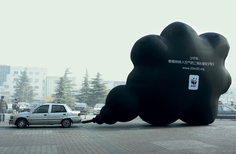
Black cloud One day’s CO2 emissions made real by Ogilvy/Bejing.
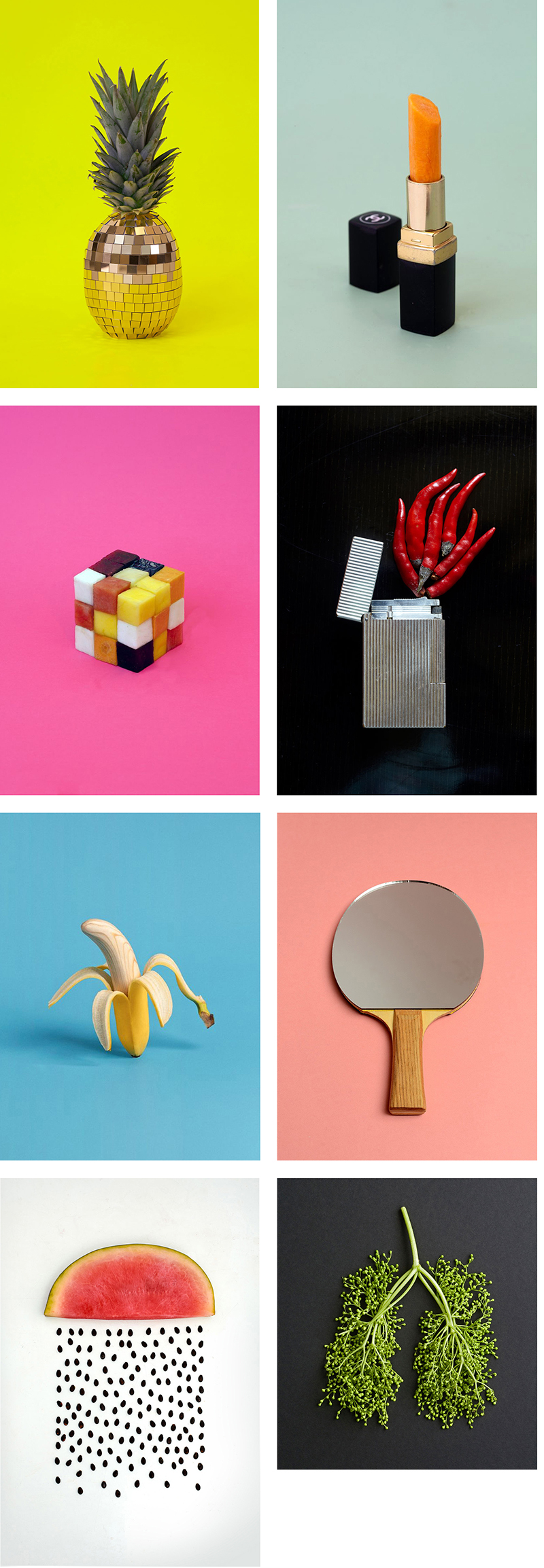
Sarah Illenberger Creative use of everyday objects to make other everyday objects. Beautifully styled.
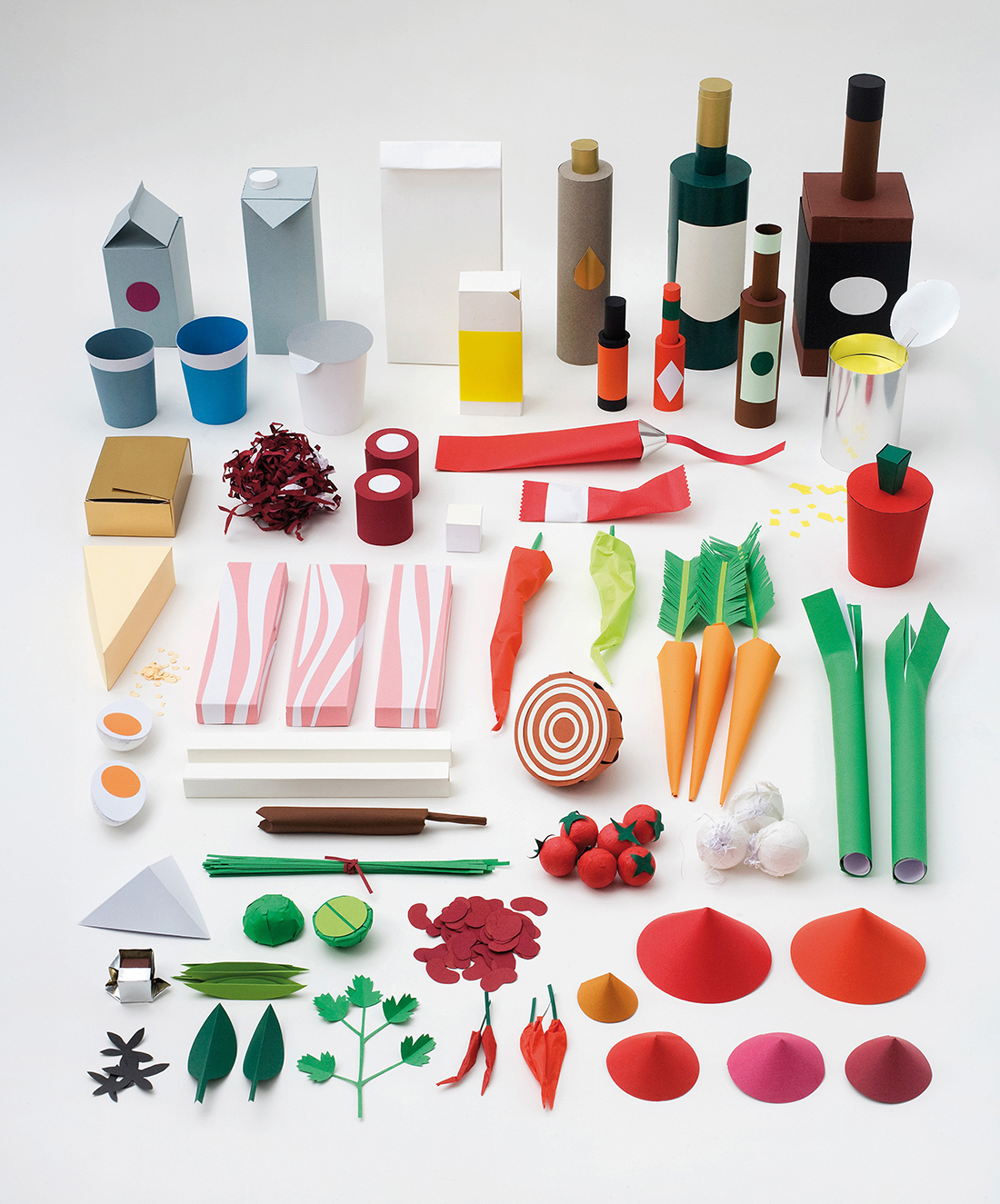
And paper-made illustration.
Educational challenge The number of students that dropped out of U.S. high school in 2012 averaged 857 per hour on every school day. The College Board visualized it by putting that number of desks around the Washington Monument.

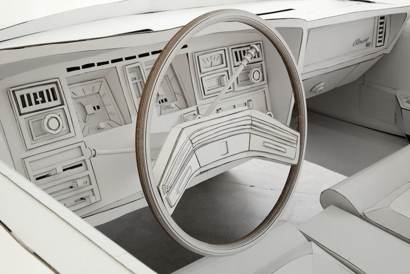
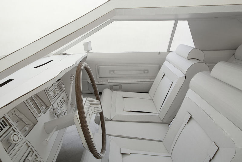
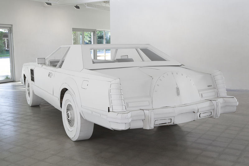
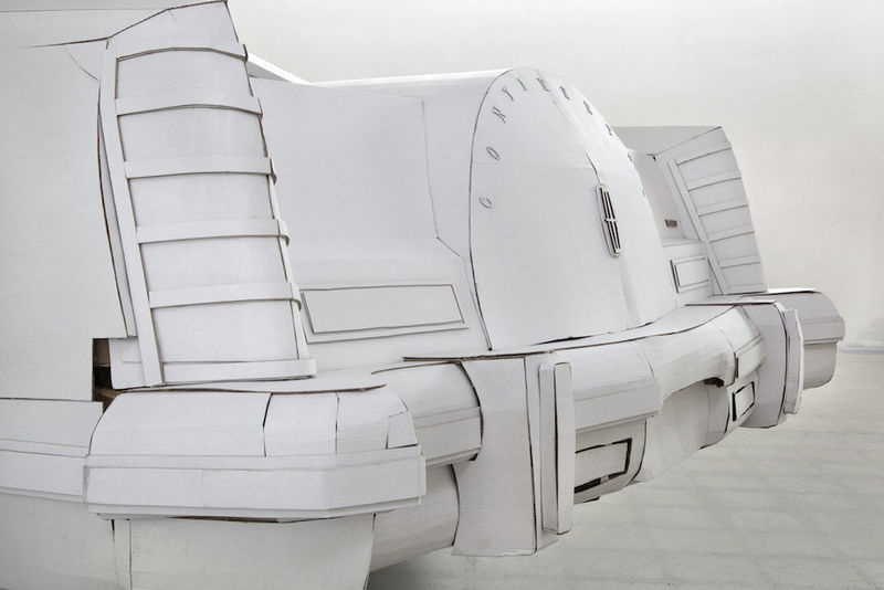
Cardboard car Shannon Goff made this replica of a 1979 Lincoln Continental as a tribute to her grandfather (who owned one), and to her hometown: Detroit, the “Motor City.”
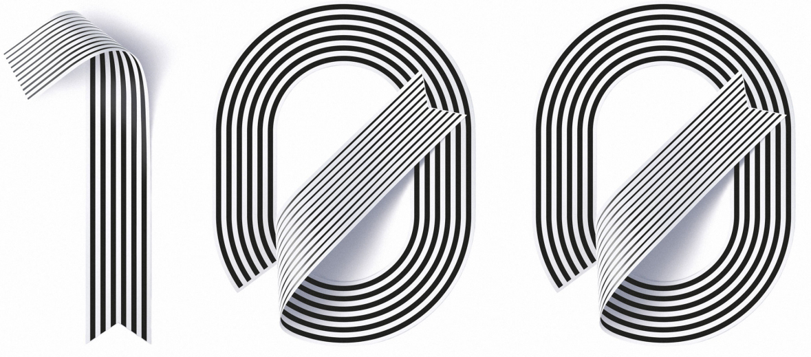
And… This is (incredibly) my 100th post, so to mark this earth-shattering occasion, here are a few “one-hundreds.”
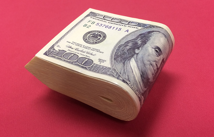
I have a fake wad of $100 bills (with a belt clip) that I bought in a Halloween store. In case I want to look like I have some cash.
Neutra house numbers from Design Within Reach: goo.gl/gQ149C

Typeface by Sawdust: http://www.madebysawdust.co.uk
62.1 miles per hour.

Metrics Over 30,000 views of the blog so far. The most viewed post is “Tools of the trade”: https://www.johngrimwade.com/blog/2017/01/09/tools-of-the-trade/
Thank you for reading the blog. I appreciate it. Happy Infographics!
