MAPPING METRO SYSTEMS.
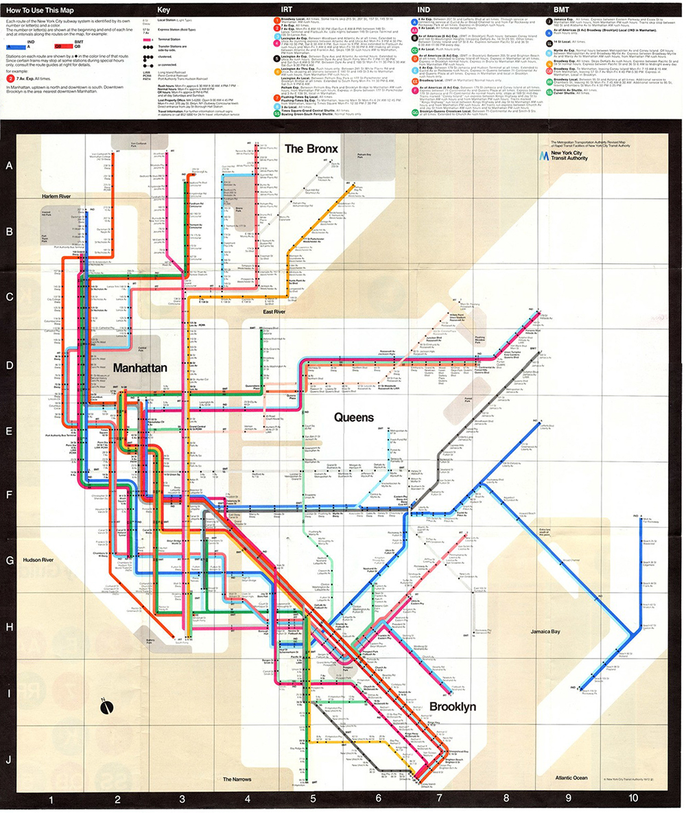
New York City Subway Map, 1972 by Massimo Vignelli.
This week’s posts follow on from a recent one about Harry Beck’s seminal Underground map: goo.gl/Fpn3Qk
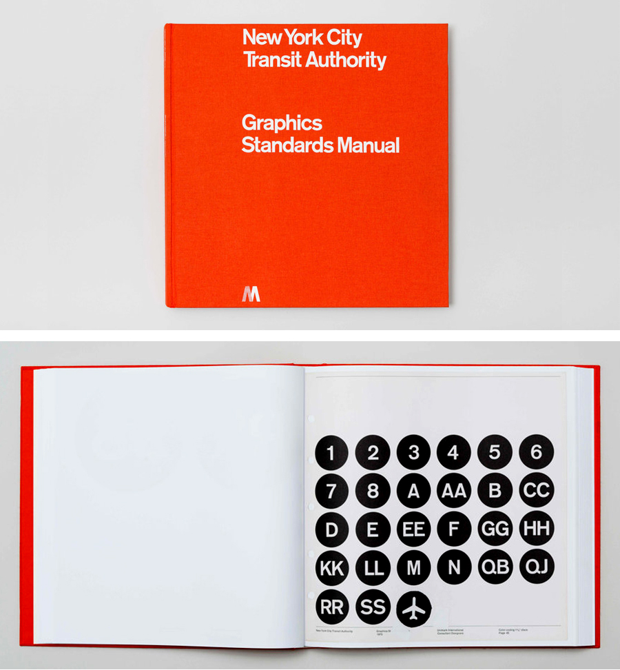
New York design classics The Graphics Standards Manual (1970) designed by Massimo Vignelli and Bob Noorda set the design parameters for modern New York subway signage. A reprinted version, originally funded by a Kickstarter campaign, is available here: https://standardsmanual.com/pages/shop (along with a few other gems).
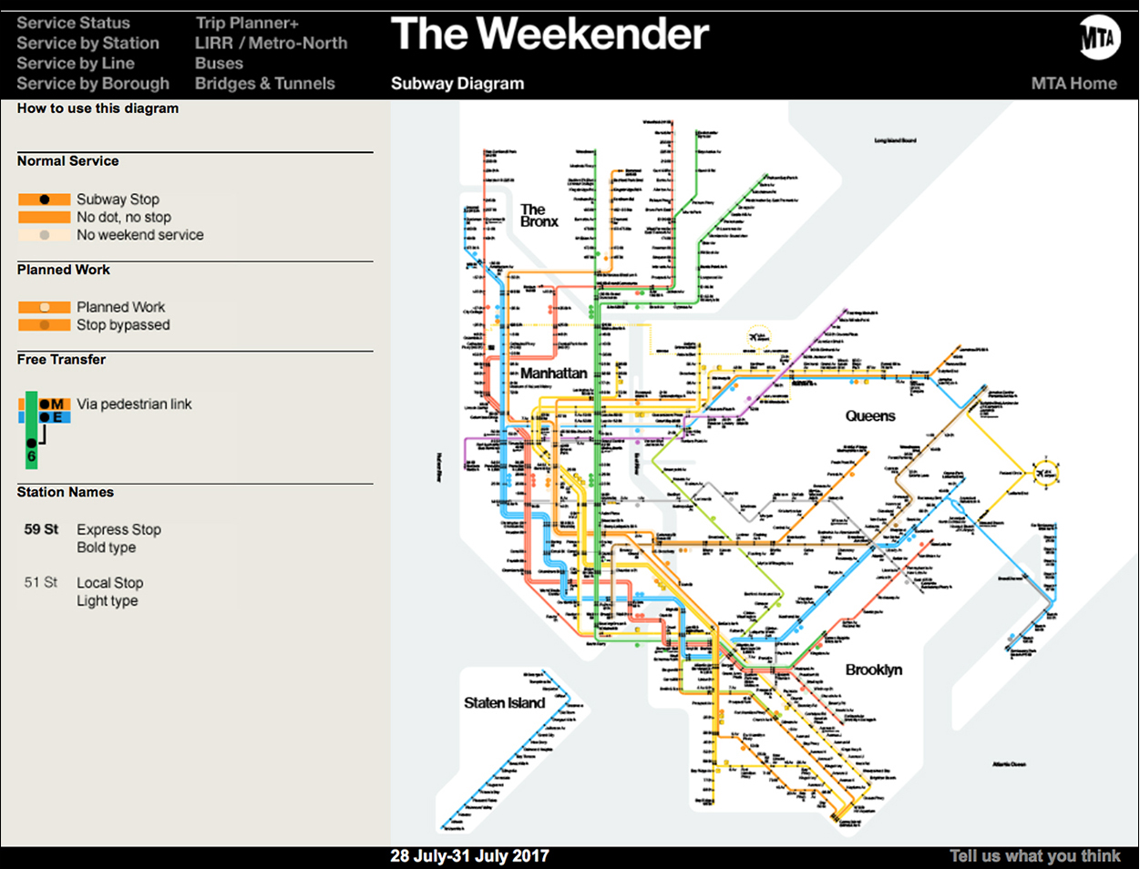
Two years later, the schematic map (shown at the top of this post) was introduced, and there was a lot of criticism. For London’s map, Harry Beck had chosen diagrammatic clarity over geographical accuracy, but a similar approach by Vignelli did not go down well with some of the inhabitants of NYC. After substantial changes (not overseen by its creator), the design was dropped in 1979. However, in 2012, the Metropolitan Transit Authority asked Vignelli to design a similar version for its Weekender app.
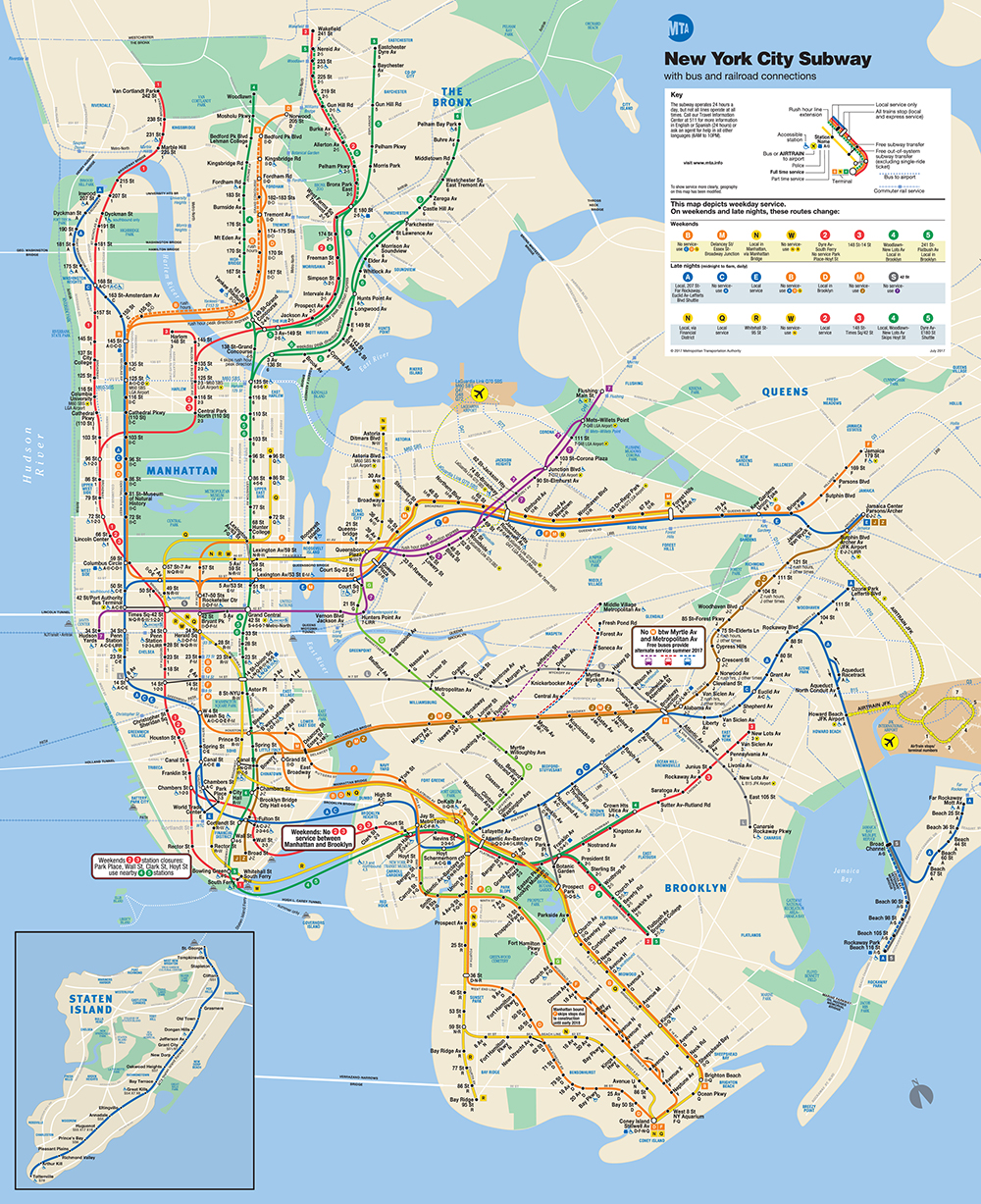
NYC today More geographically-correct, less of a design system. I don’t love it, but I understand why it’s the way it is.
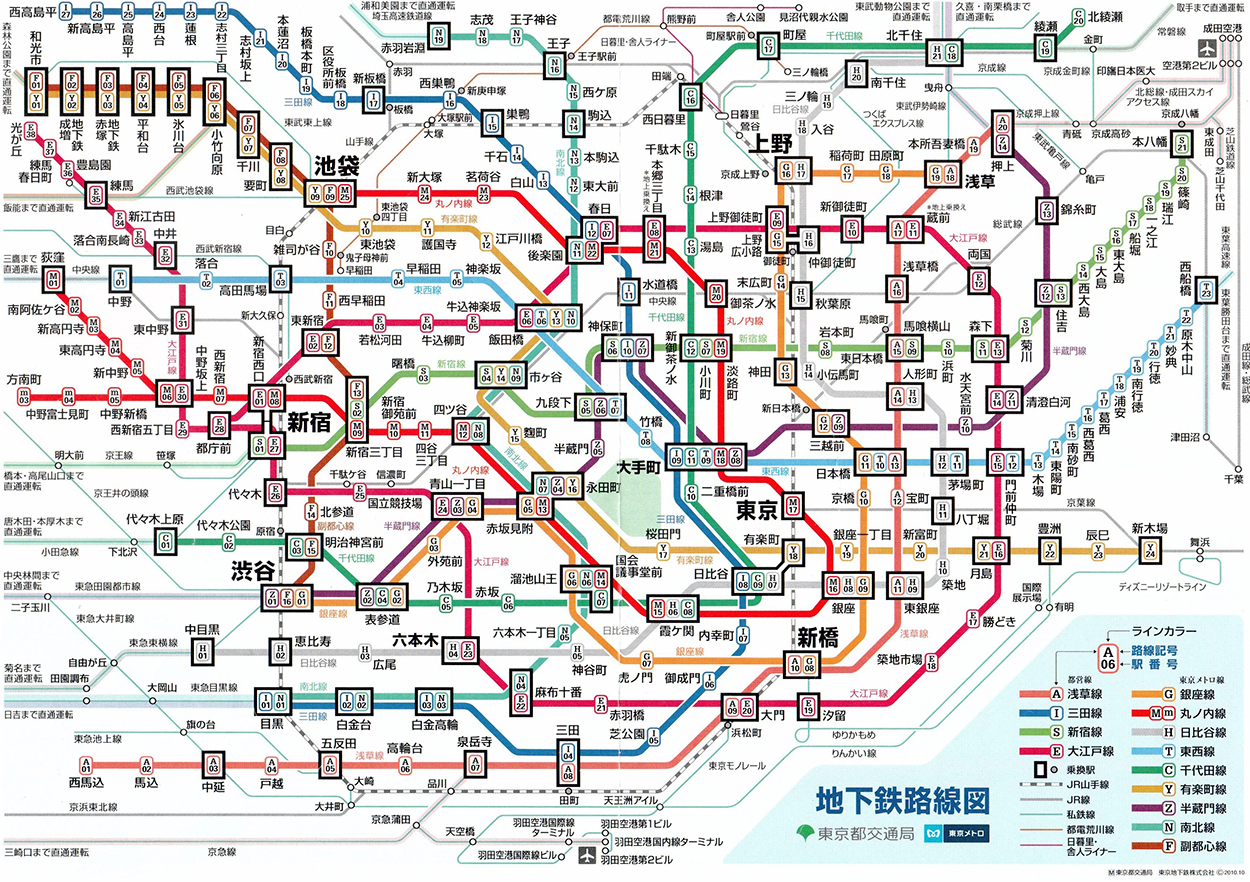
Tokyo
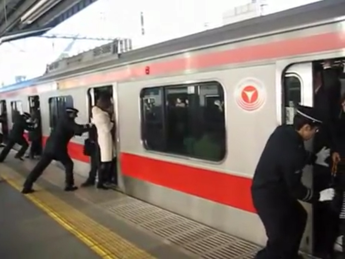
The Tokyo trains can get very crowded. However, there are people who’s job is to push everyone in. Click on the image below to see the video.
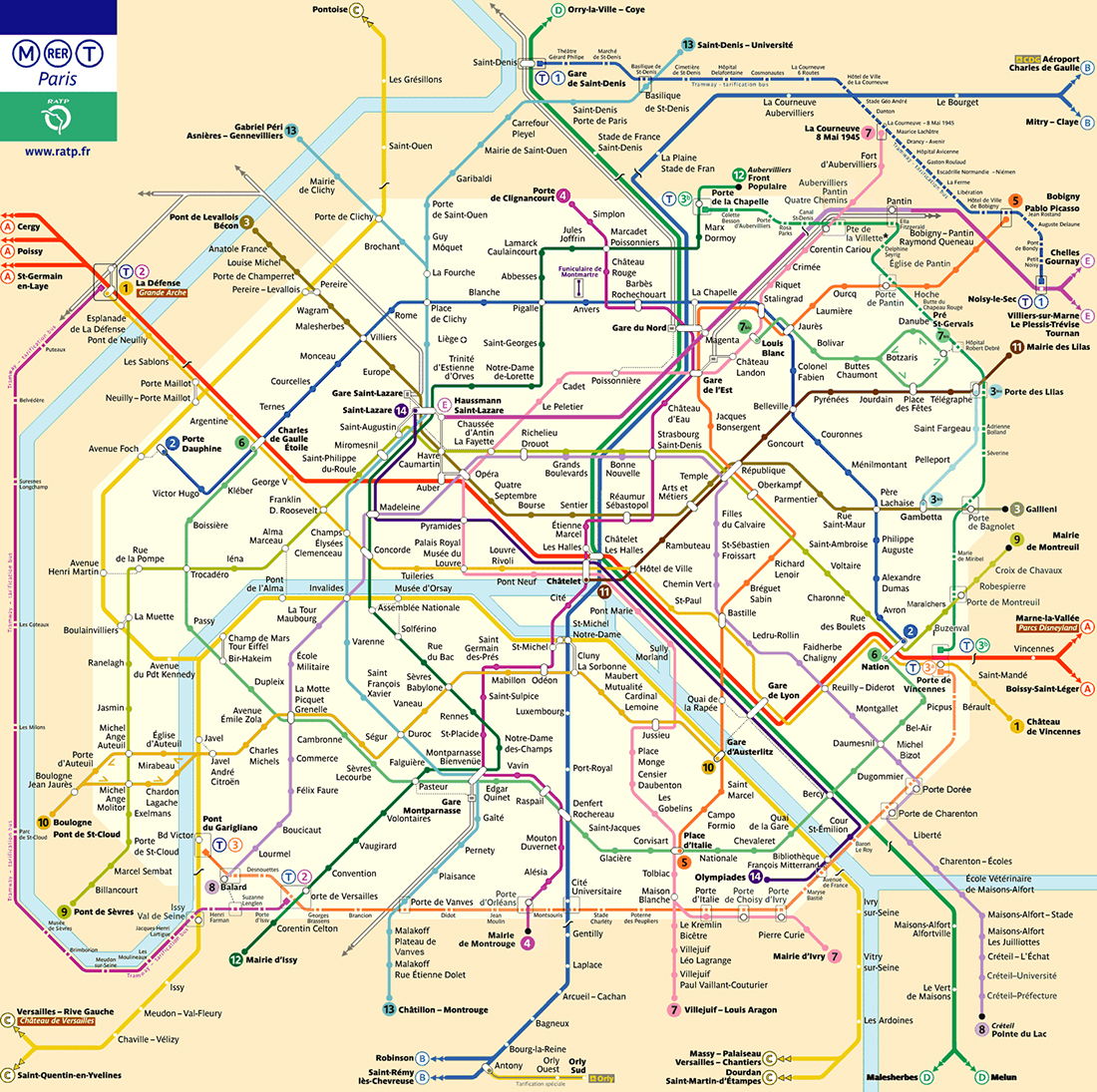
Paris
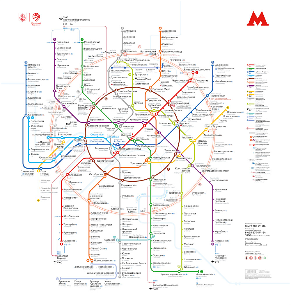
Moscow
Circular Max Roberts has redesigned several subway maps using a circular arrangement. Here are New York, London and Paris.
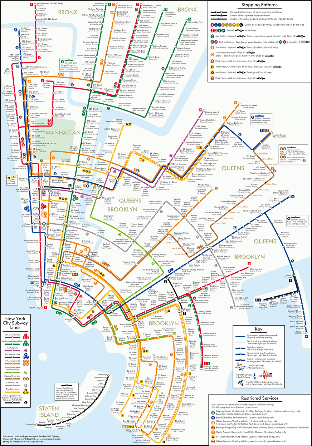
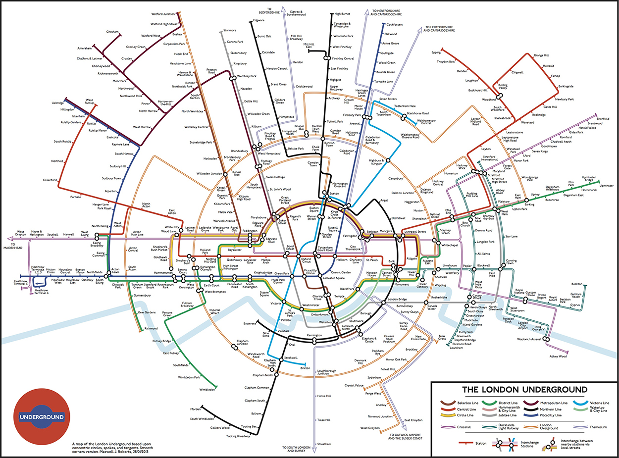
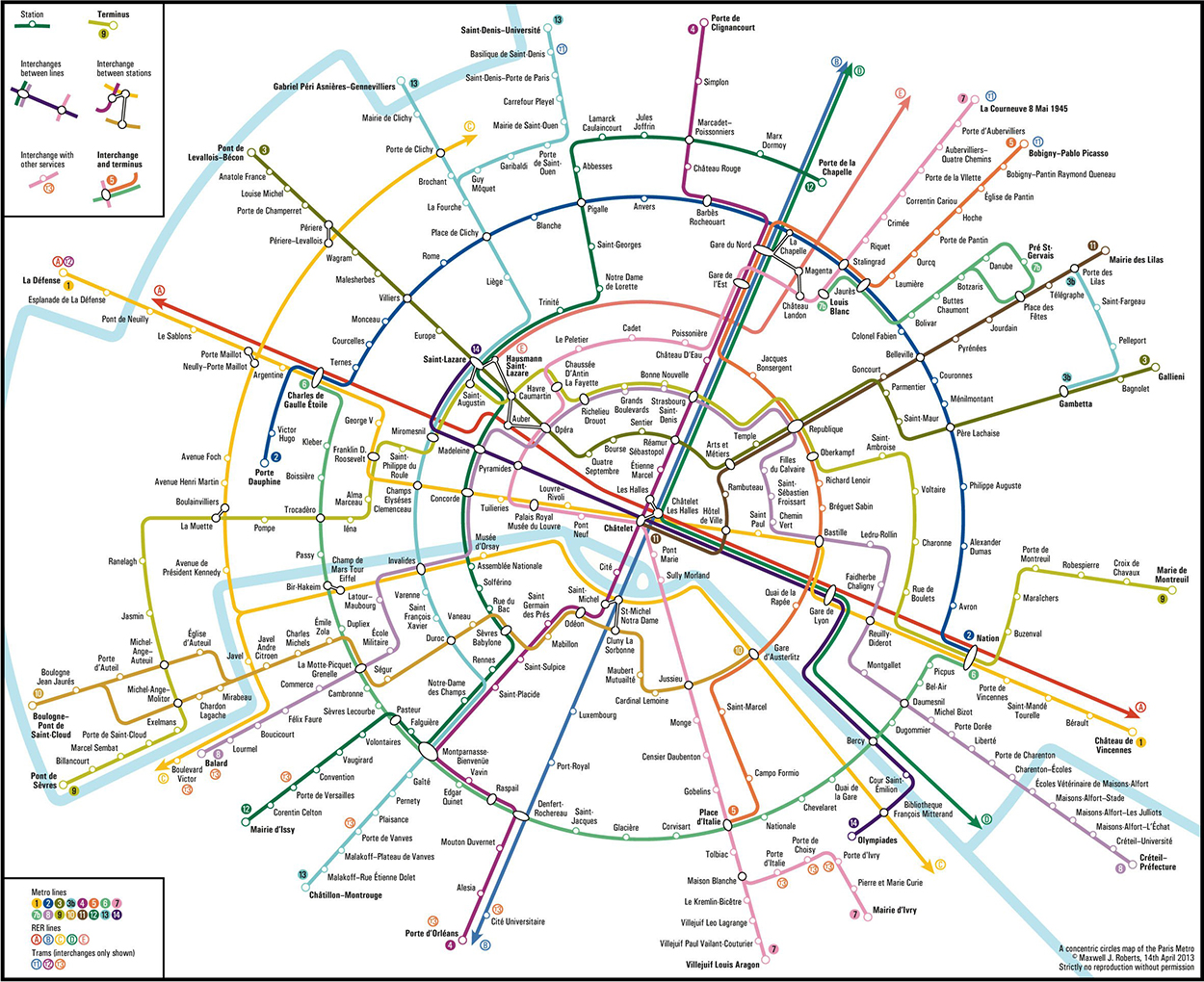
See more maps by Max Roberts here: http://www.tubemapcentral.com
Map or diagram? This animation of the Berlin subway first appeared on Reddit, and inspired others to make geographical comparisons with the diagrams of various cities. Some examples below.
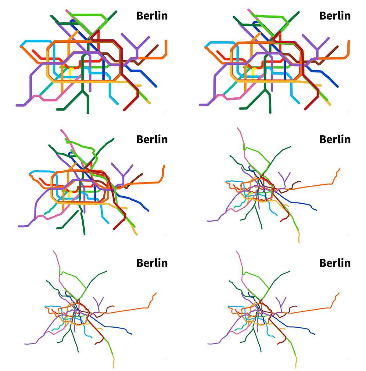
By vinnivinnivinni.
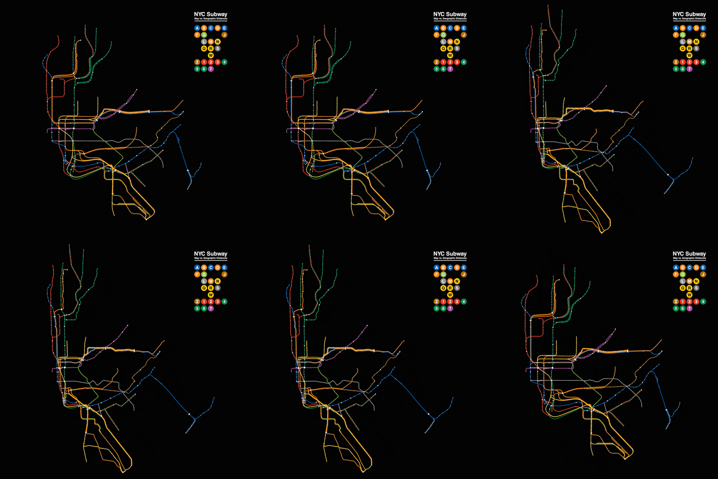
By playhouse_animation.
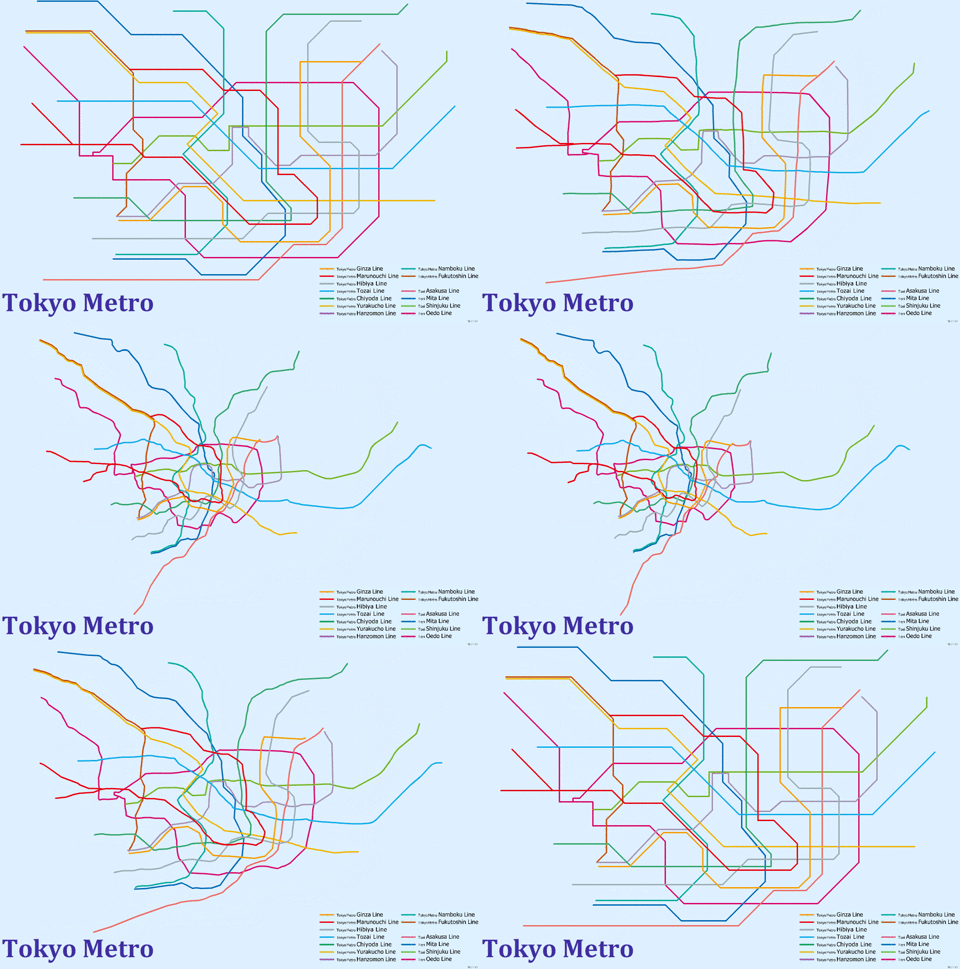
By ninja.
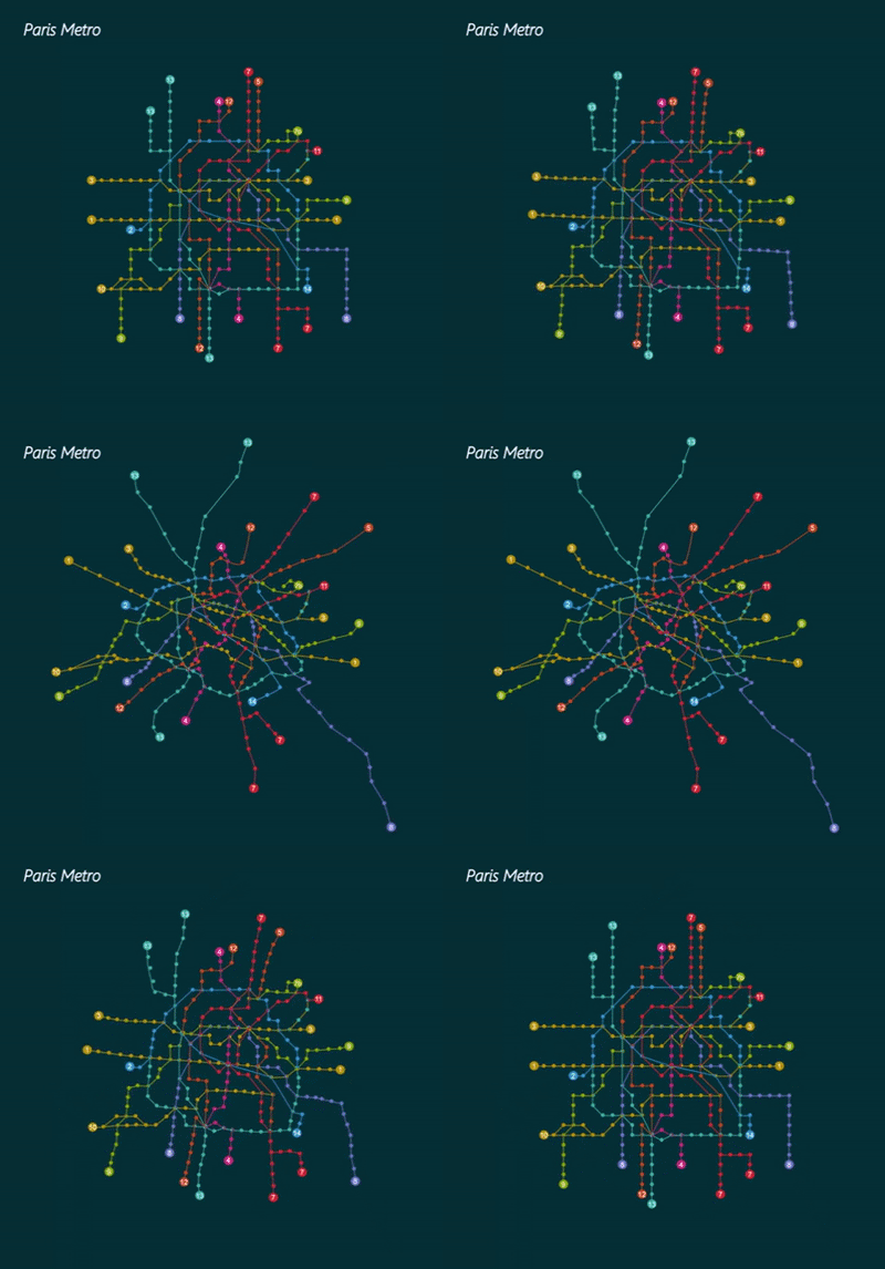
By hlake.
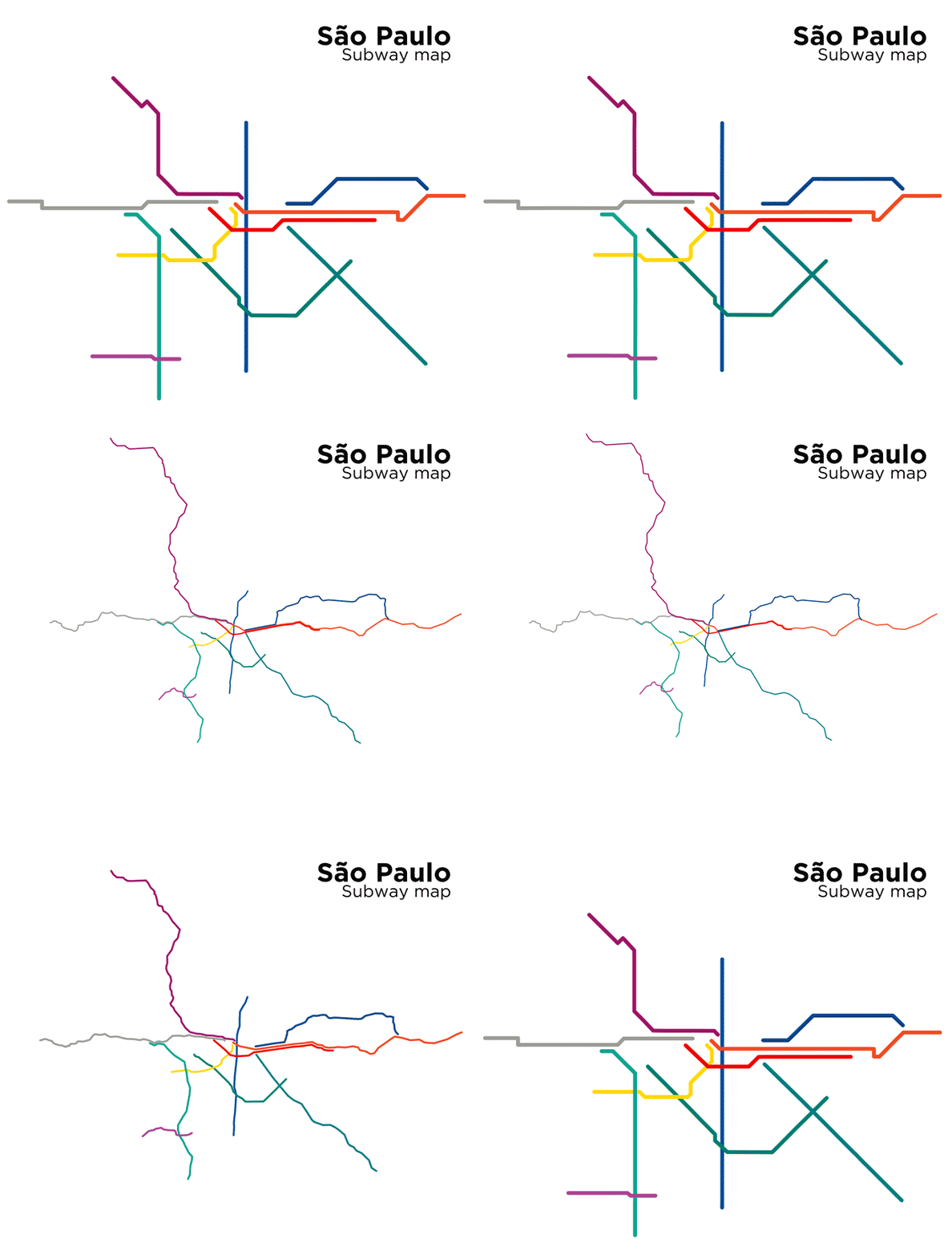
By sweedfishoreo.
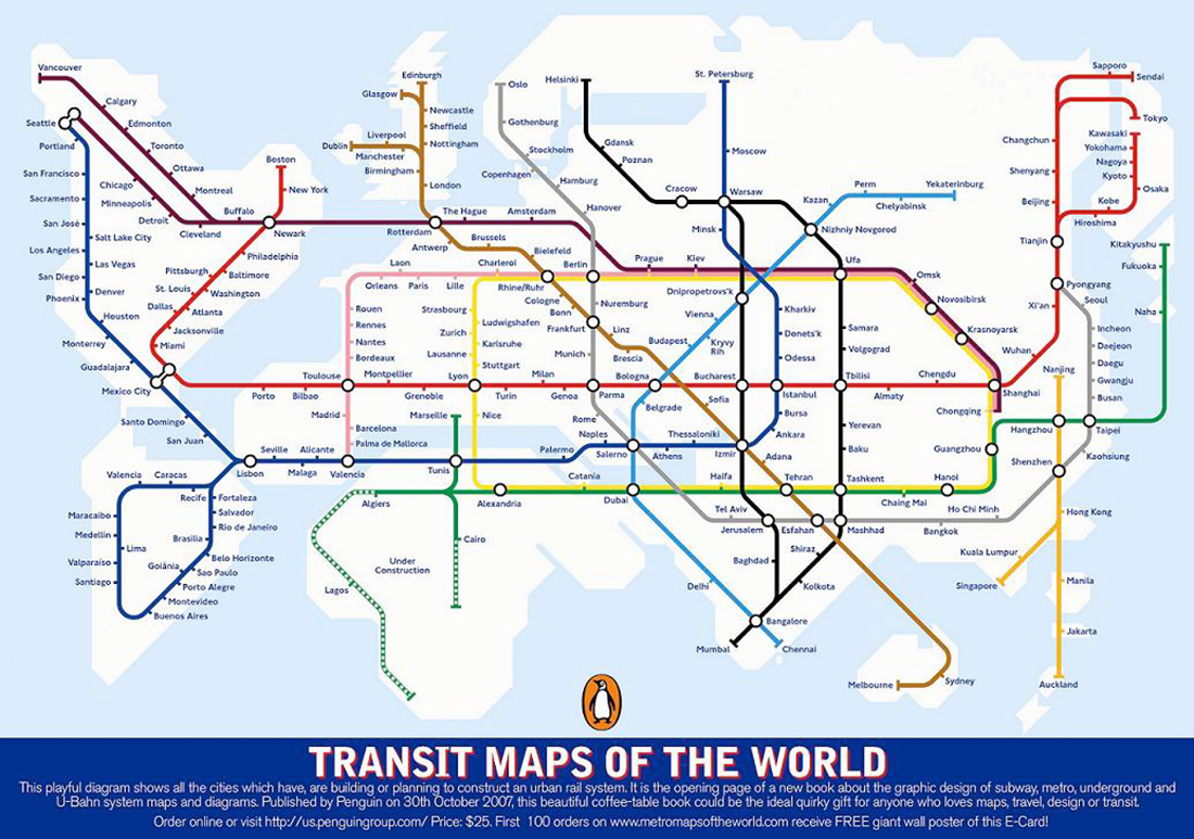
Subway world A subway-style map of cities with urban transit systems.
