SHAPES AND ARROWS.
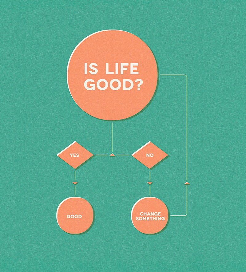
Most of the flowcharts that we remember are humorous or philosophical (above example by Gustavo Vieira-Dias), but explaining a process through a series of options has many utilitarian uses in a wide range of disciplines. However, this humble infographic format has been much maligned because of it’s use in unspeakably bad PowerPoint slides and various other baffling informational material. I was in an interminable presentation recently when a thought occurred to me: No need to protect this proprietary process, just convert it into a bad flow chart. Then people will have absolutely no chance of decoding it.
Although most examples are not admirable in terms of design, many of them have a very worthwhile function. They present information about a sequence of decisions in a relatively clear way. This is especially useful in, for example, the design of computer programs.
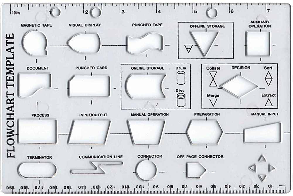
There’s a recognized system of meanings for different shapes in a flowchart. More technical charts often use a wide range of shapes.

Before computers, templates like this were common. And they’re still available, if you want to make a chart the analog way.
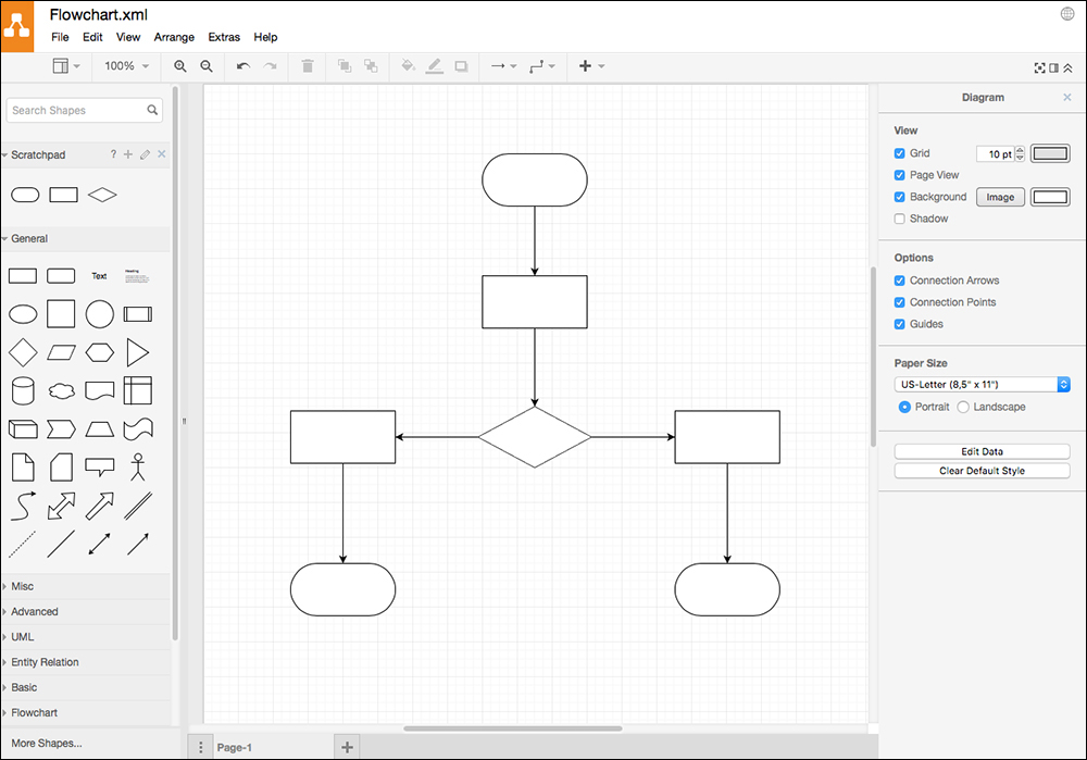
Draw.io is a good online resource for creating flowcharts (and other process charts): https://www.draw.io
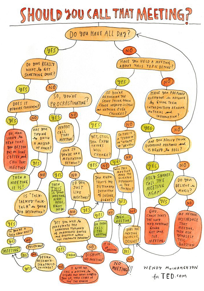
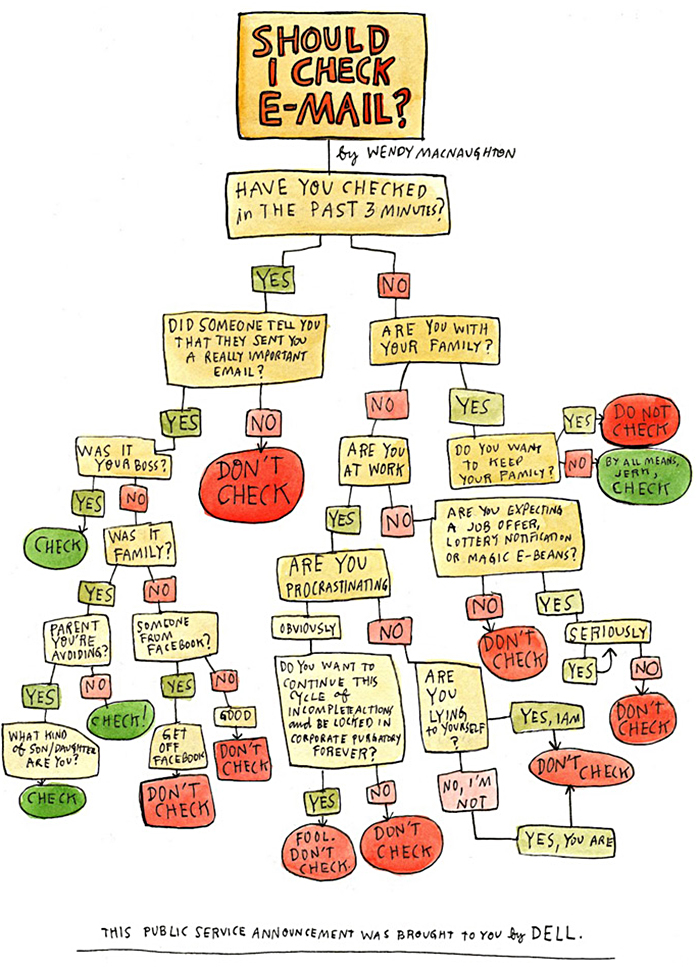
Two fun examples by Wendy MacNaughton, whose work will be featured in an upcoming post.

One comment
Comments are closed.