FROM ATLAS TO INTERACTIVE.
Today is International Chart Day. https://www.internationalchartday.com

So it’s seems appropriate to feature a book that is in Michael Stoll’s collection of historical infographics. Especially as he is a speaker at the inaugural Chart Day event in Washington, D.C.
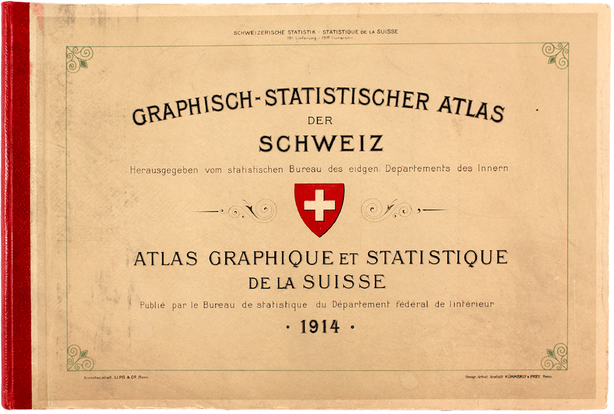
Michael gave me a copy of the Graphic-Statistical Atlas of Switzerland (1914) a while ago. It’s a data visualization classic, from an age when data was collected in ledgers.
Here are three spreads. Click on the images for larger versions.
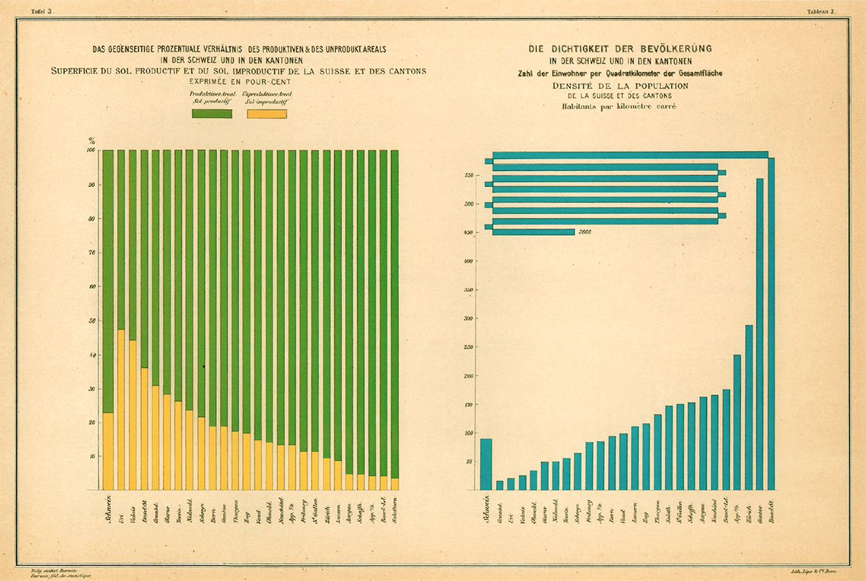
Below, the percentage of productive land use (left), and the population density of the states (right), compared to the nation. The Basel-Stadt number is so large that an unusual method was used to get the bar onto the page.
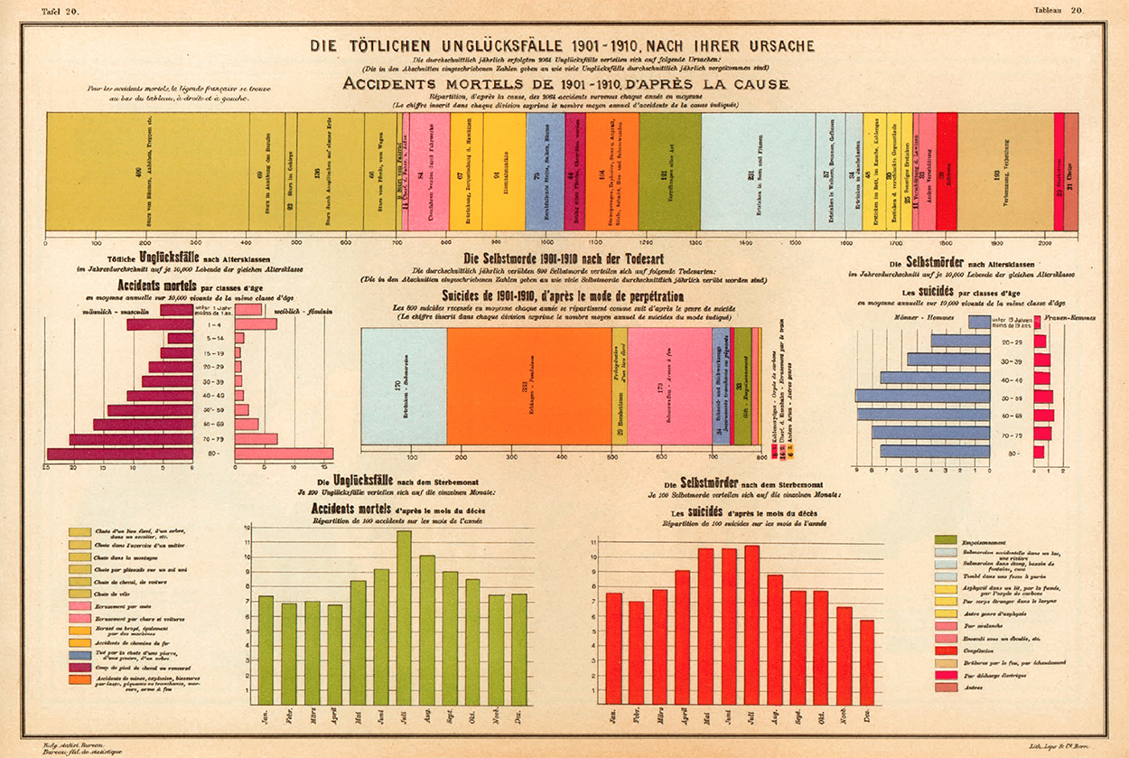
Causes of death, 1901–1910
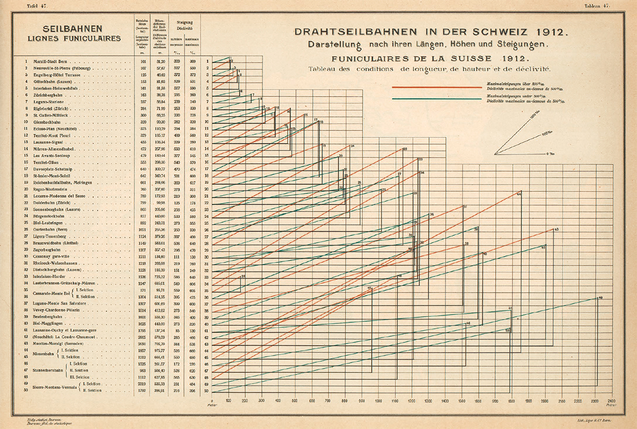
Cableways by length and altitude. A red line shows a climb of more than five times the initial height. Blue shows less than five times.
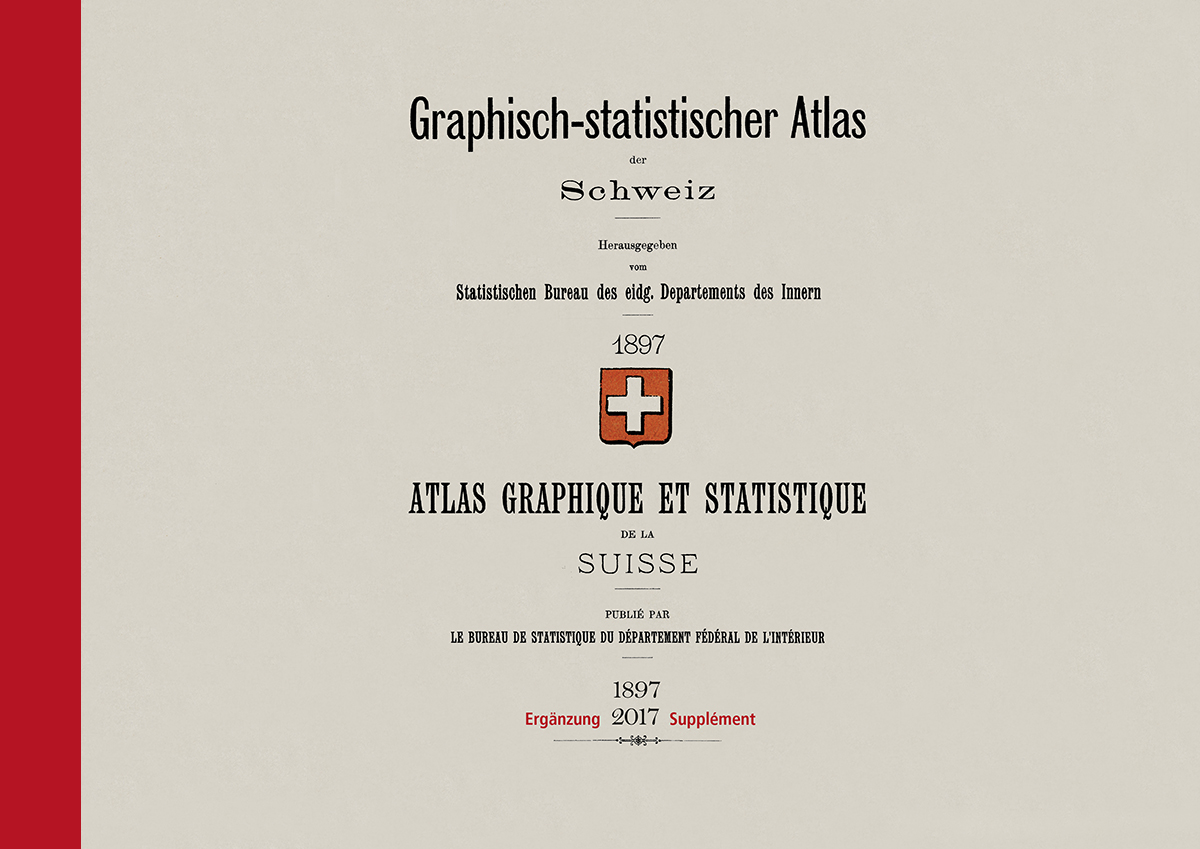
To mark the 125th edition of the Statistical Yearbook, the Federal Statistical Office published an atlas that updated the charts from the early editions with modern data. https://goo.gl/7XAVJG
There was a long period when the books did not contain any information graphics, before a revival of that visual approach in the late 1980s.
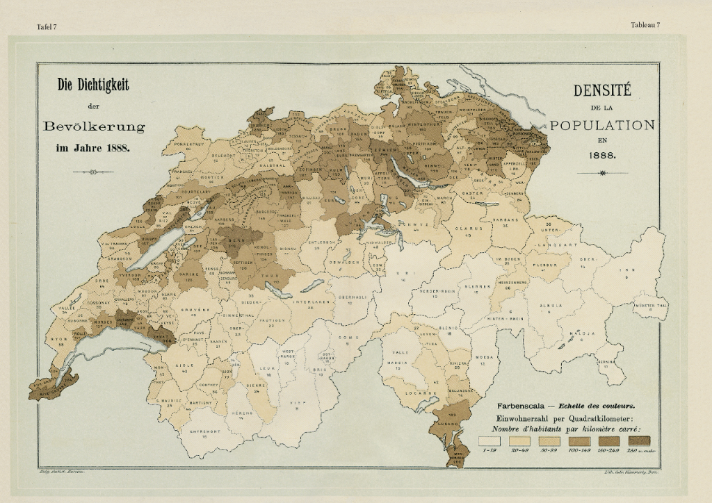
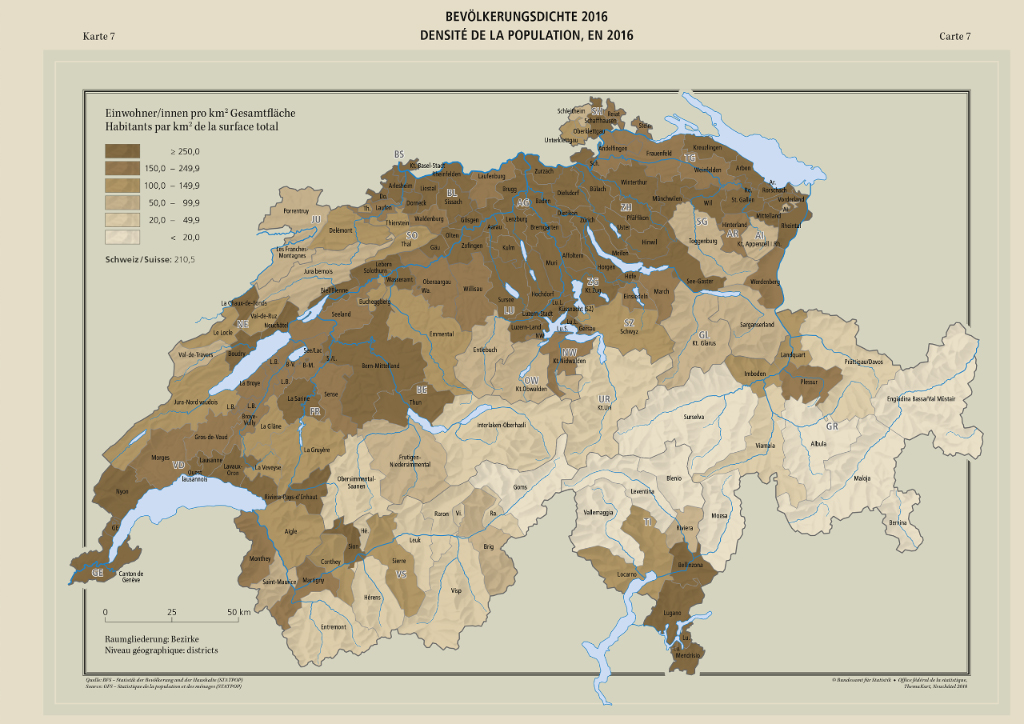
Population density 1888 compared to 2016.
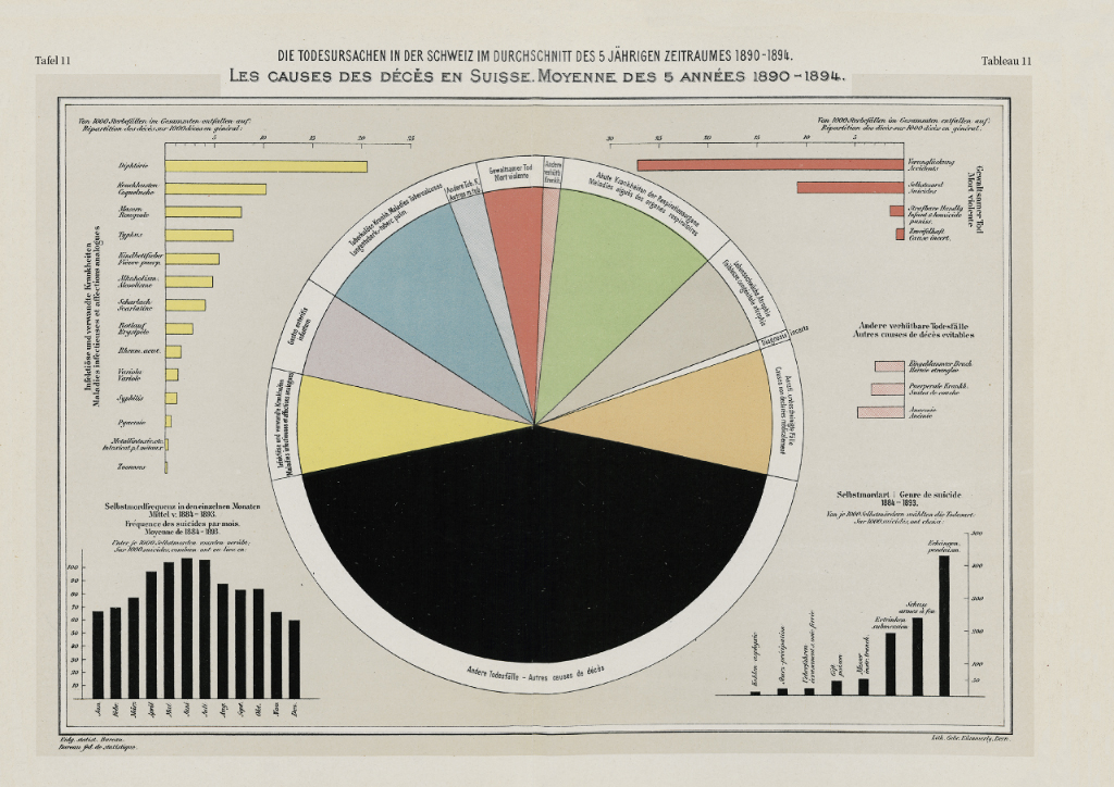
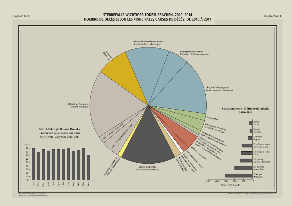
Fatalities 1890–94 compared to 2010–14.
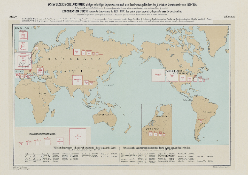
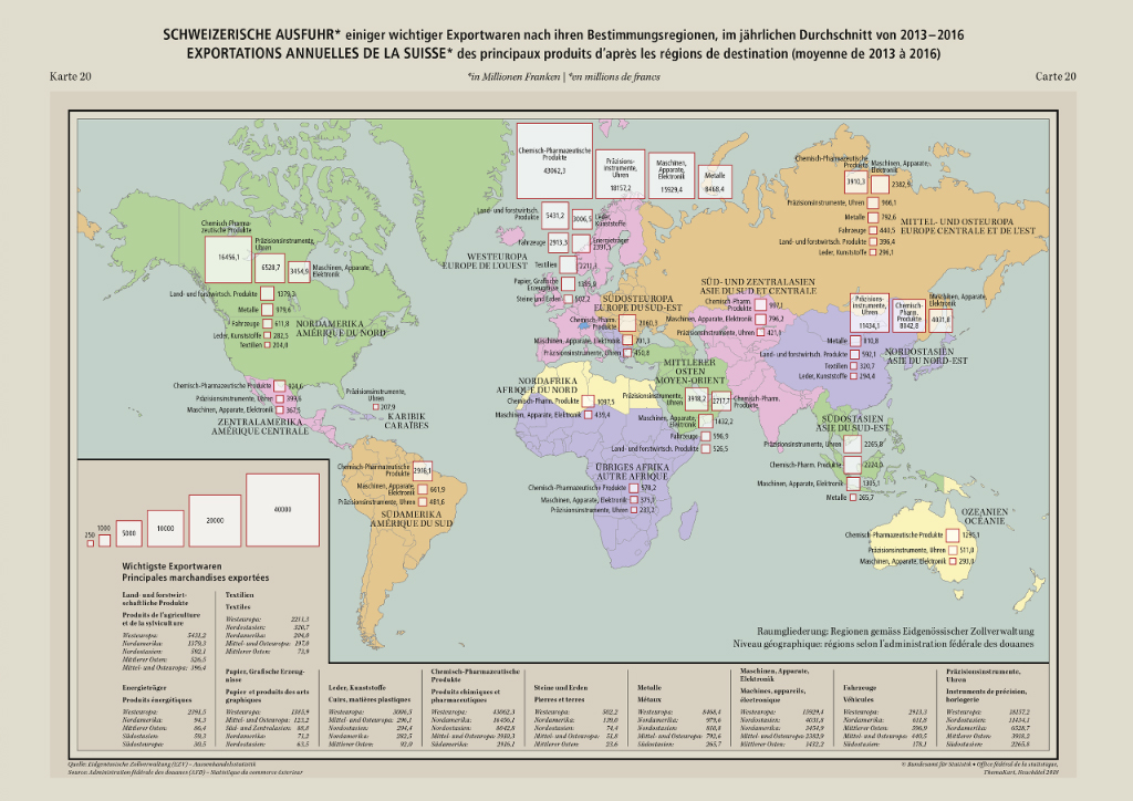
Exports 1891–94 compared to 2013–16.
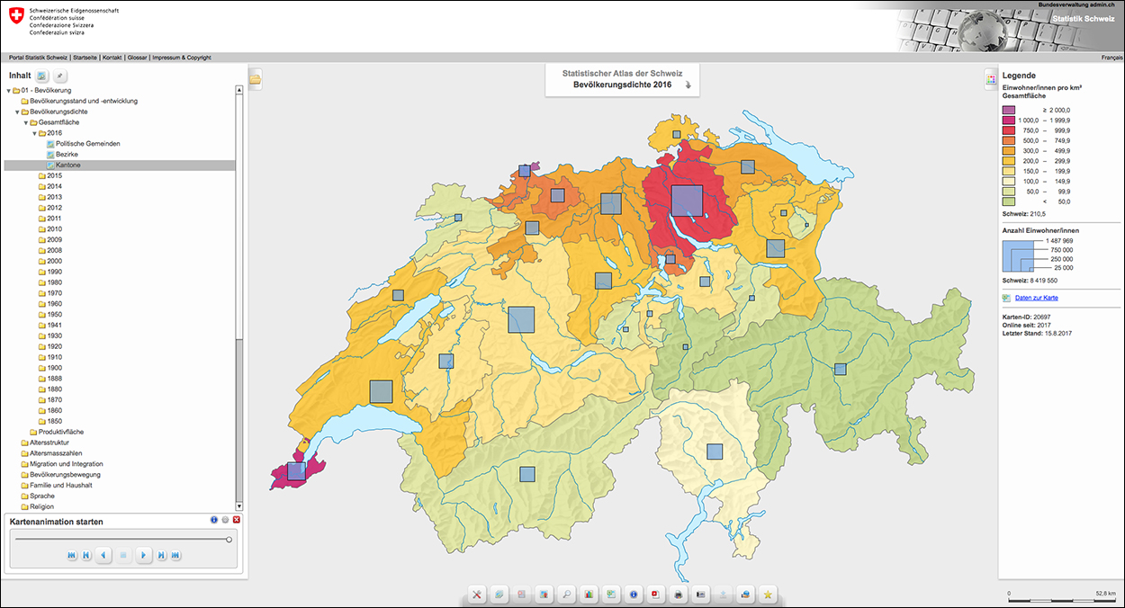
The modern book is supported by an online version: the Interactive Statistical Atlas of Switzerland. https://goo.gl/QeLpbt
