METEOROLOGICAL VISUALIZATION.
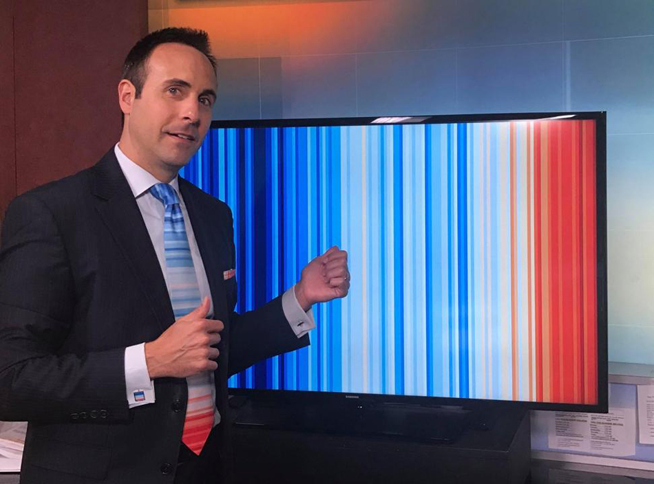
Many male weather presenters wore an infographic tie on the summer solstice (June 21). It’s a data visualization of the change in global temperature from 1850 to 2017, by Ed Hawkings. http://www.climate-lab-book.ac.uk/2018/warming-stripes/
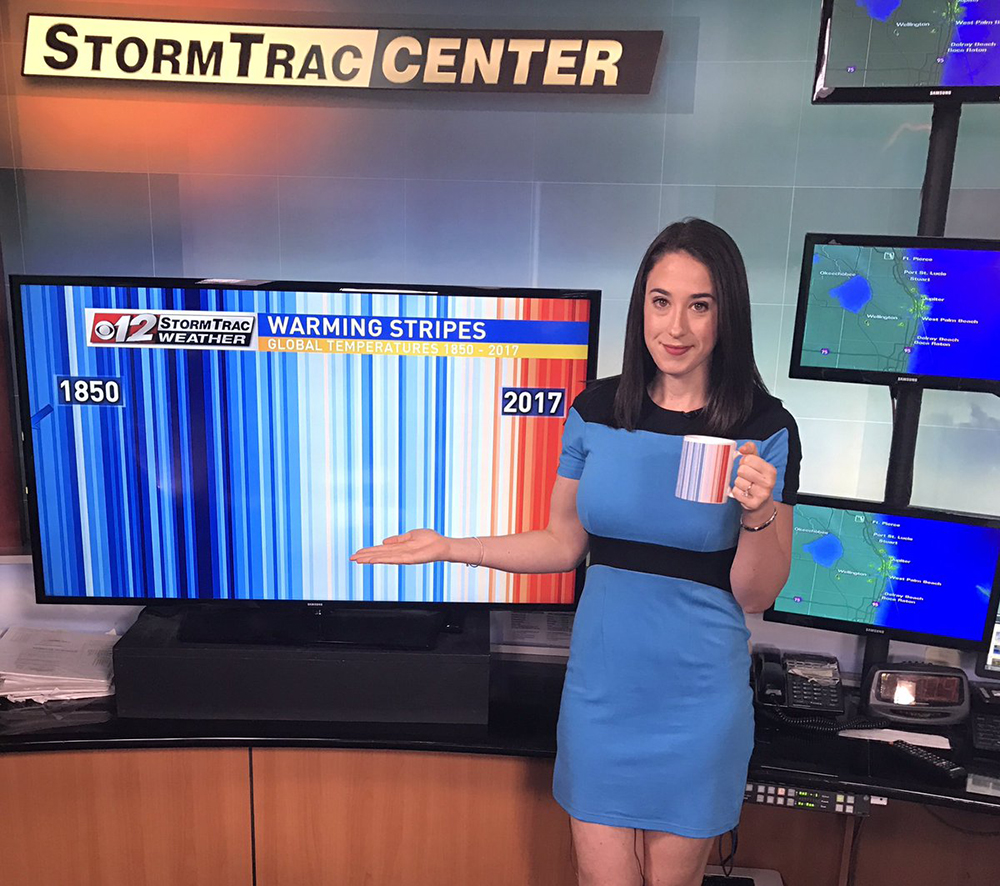
Jeff Berardelli at WPEC CBS 12 in West Palm Beach led this initiative of the #MetsUnite movement. The color scale represents the change in global temperatures covering 2.43° F. (1.35° C.) Blue indicates annual average temperatures below normal, and red shows average annual temperatures above normal.
Merchandise for meteorologists
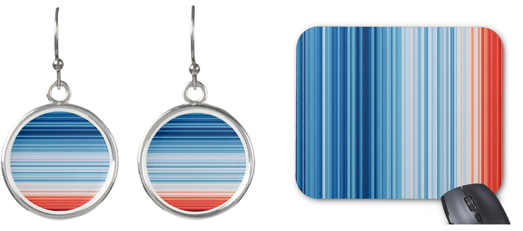
Below, Lauren Olesky (also a presenter at CBS 12) with her morning coffee. The chart is available in a range of items from earrings to mousepads. https://www.zazzle.com/climate_change
Outfit confusion
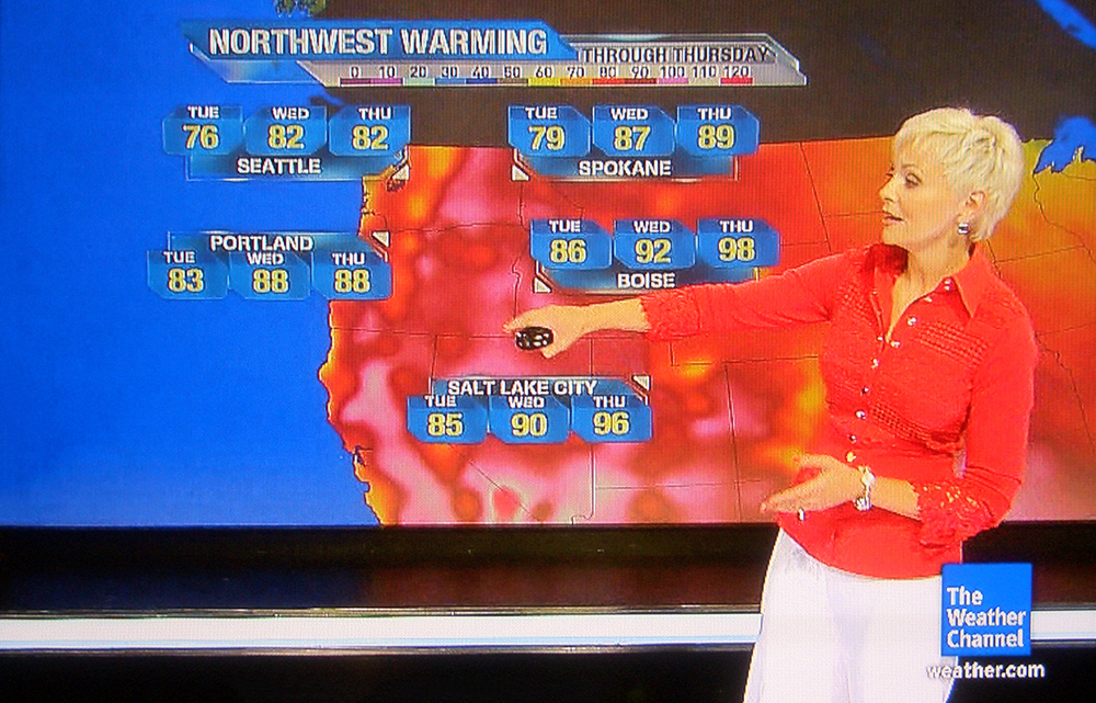
I wish the producers of weather broadcasts would persuade presenters to dress in more neutral outfits. For obvious informational reasons.
Augmented reality
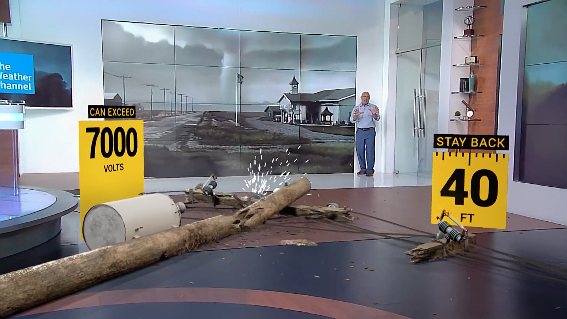
The Weather Channel recently started using “Max Reality” to add impact to weather explainers. The Future Group’s technology is the driving force behind this. Click on the image below to see Jim Cantore describe the dangers that accompany a tornado. Check out the crashing utility pole at 1:50, and the flying car at 4:00.
Technical issues
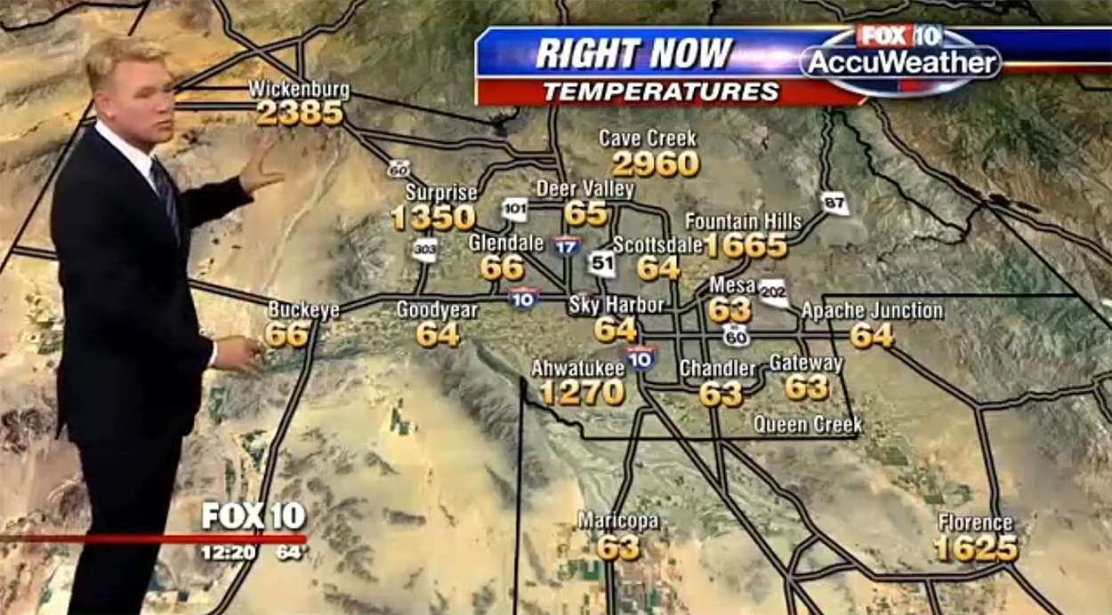
We all have our problems. Cave Creek’s evening temperature is hotter than molten steel at 2,960° F. (1,627 C.)
Cranking it up
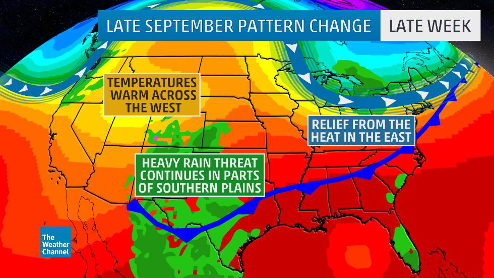
TV weather forecast graphics tend to be in the showbiz end of information design. They’re often very colorful, but don’t promote a feeling of reliability. (Well, not to me.) I guess it’s the result of a battle for viewers. Information graphic critique: There’s no key to the colors, and this is a problem. We assume (correctly) that the graphic goes from cool to hot in terms of temperature, but green has also been used to show rainfall. Two additional blues show a front and the jet stream. The visualization is not wrong, but it could be clearer.
Inconsistency
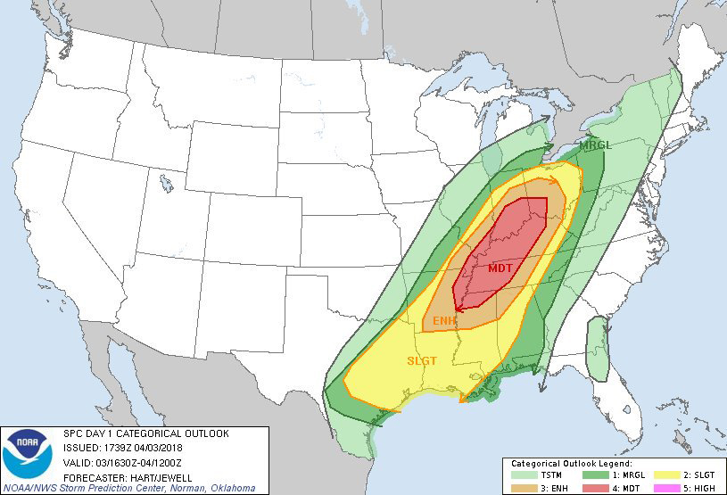
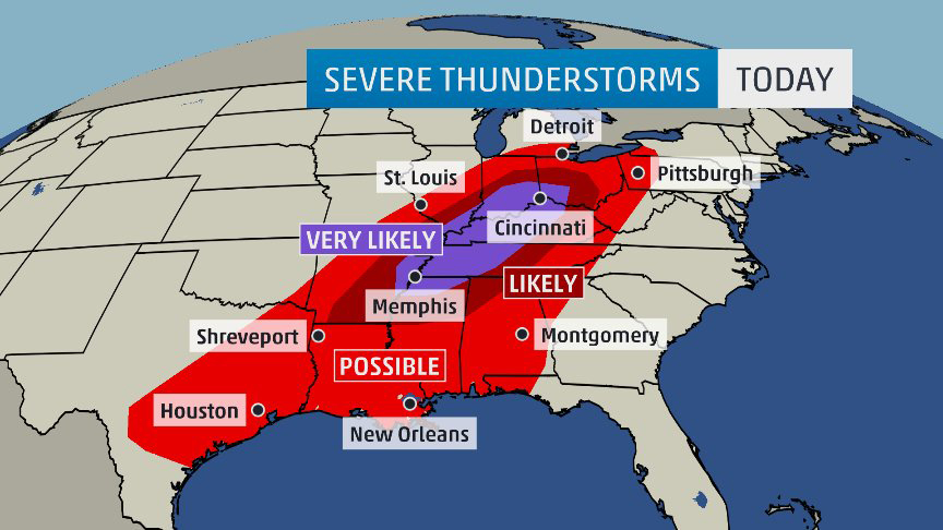
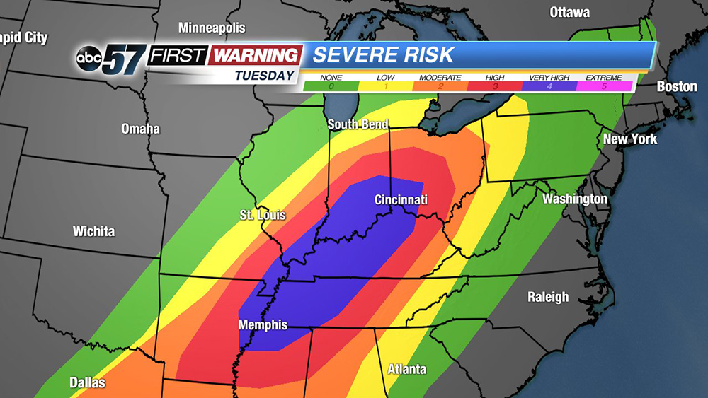
There’s a standard color scale to use for storm prediction in the U.S. (below). However, various outlets interpret it in different ways. These three forecasts are for the same severe weather pattern, in our area, earlier this year.
More accurate hurricane forecast maps
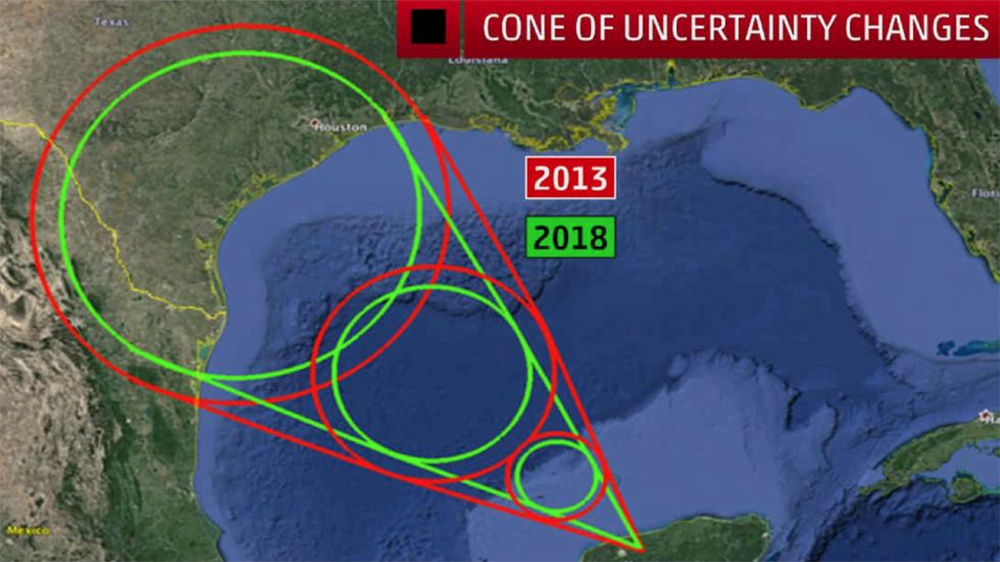
I’ll finish on a more positive note (for a change). This year, the National Hurricane Center is shrinking the “cone of uncertainty” that predicts the possible track of the center of a hurricane, by analyzing the previous five hurricane seasons.
Thank you to two former Ohio University students for help with elements of this post: Alex Hurley, M.S. Environmental Studies, and Ethan Emery, B.S. Meteorology.

