JOSHUA STEVENS VISUALIZES THE WORLD’S CLIMATE AND ENVIRONMENTAL DATA.
Joshua creates compelling and important visuals for NASA’s Earth Observatory, where he’s the lead for data visualization and cartographic quality. Satellites provide the data that drives an impressive range of informative visualizations. They often illuminate key issues that our precious planet faces. See many more examples at: http://www.joshuastevens.net/
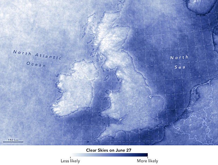
Cloud cover (above)
A subject that used to be dear to my heart: the likelihood of clear skies over the U.K. and Ireland. (I’m from England.)
https://go.nasa.gov/2CynLKv
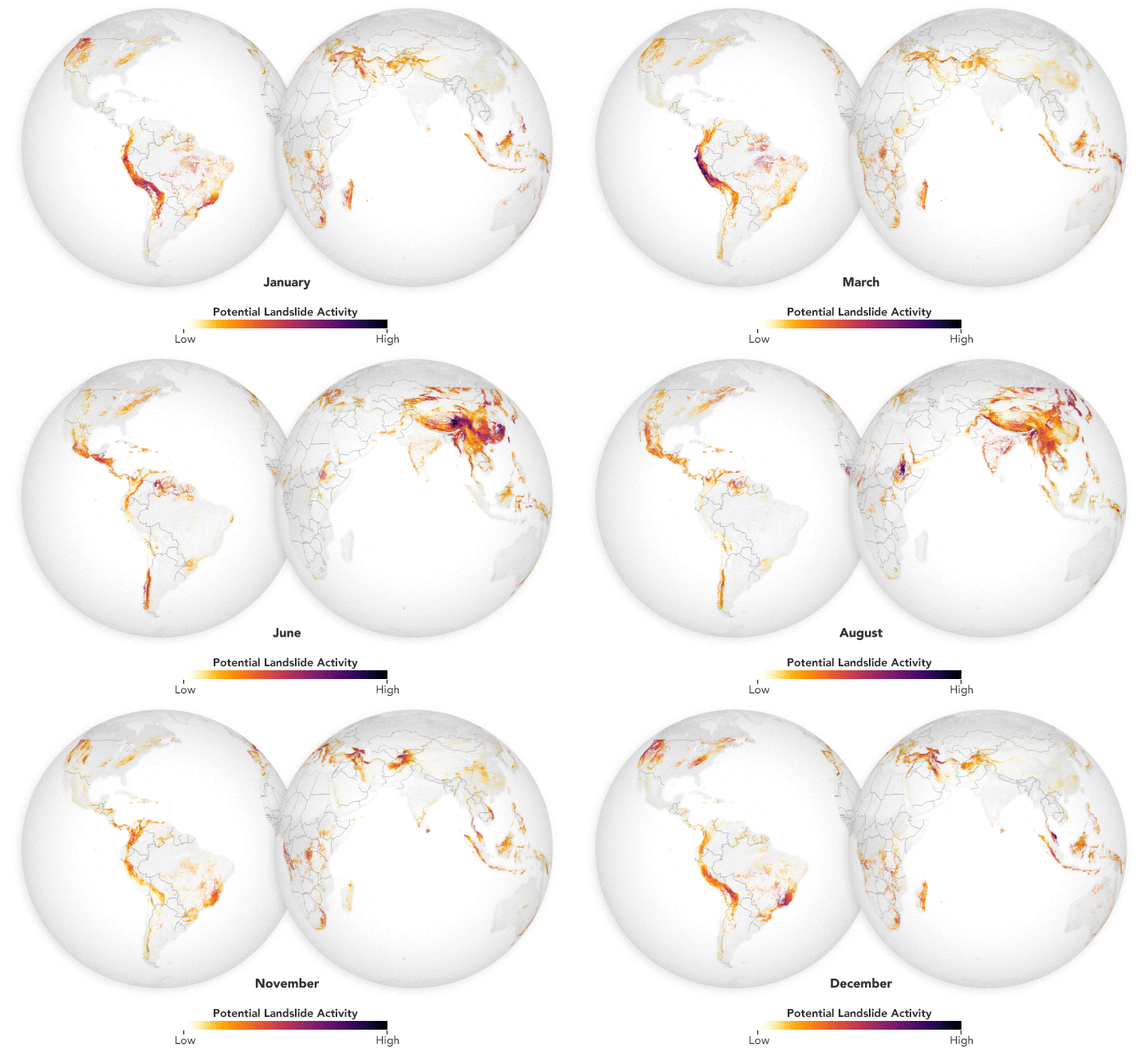
Landslides
Satellite data every thirty minutes gives new insights into long-term patterns. https://go.nasa.gov/2yYaibh
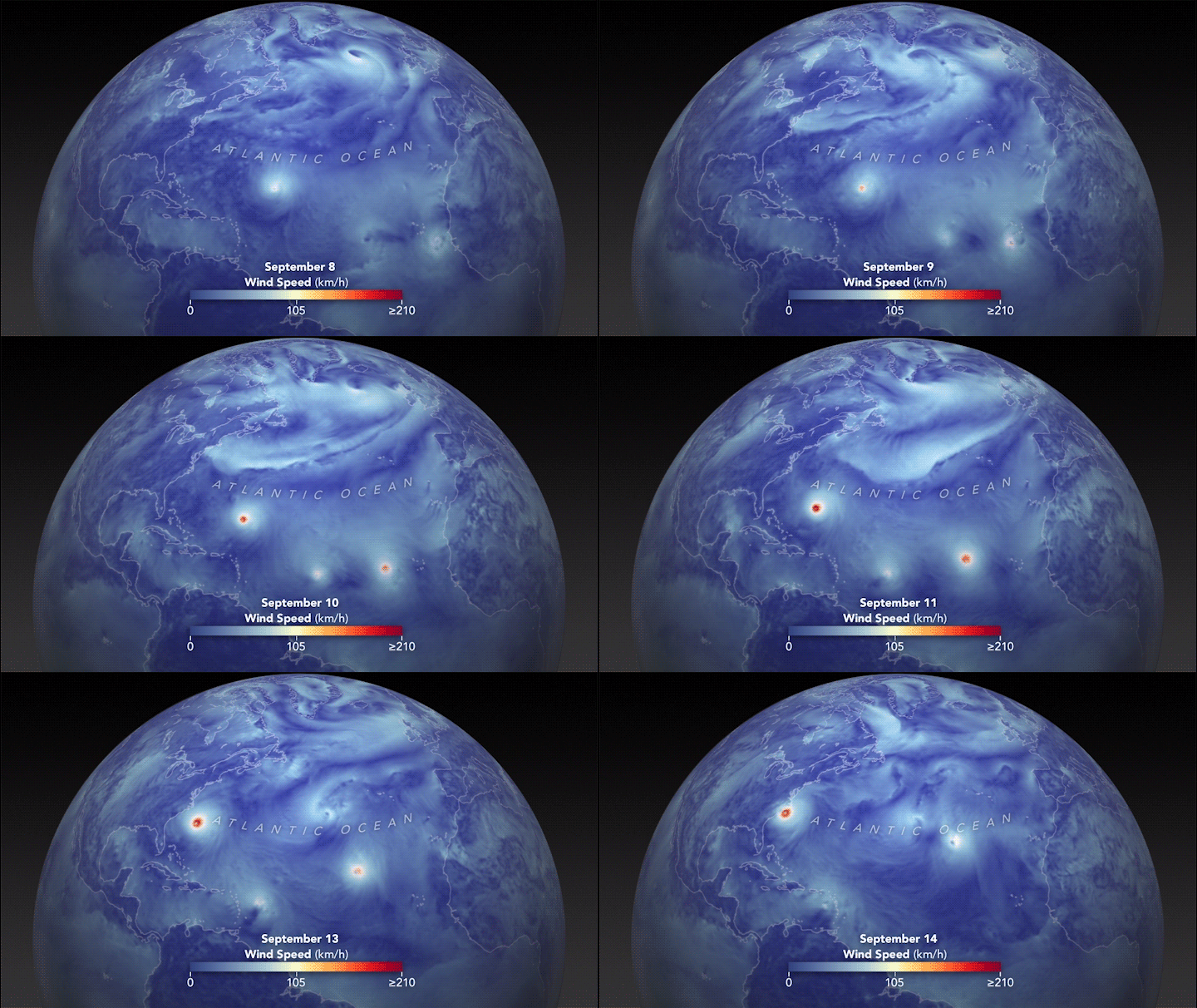
Hurricane effect
Wind speeds as Florence churned across the Atlantic. See the full animation here: https://go.nasa.gov/2T1MAUS4g
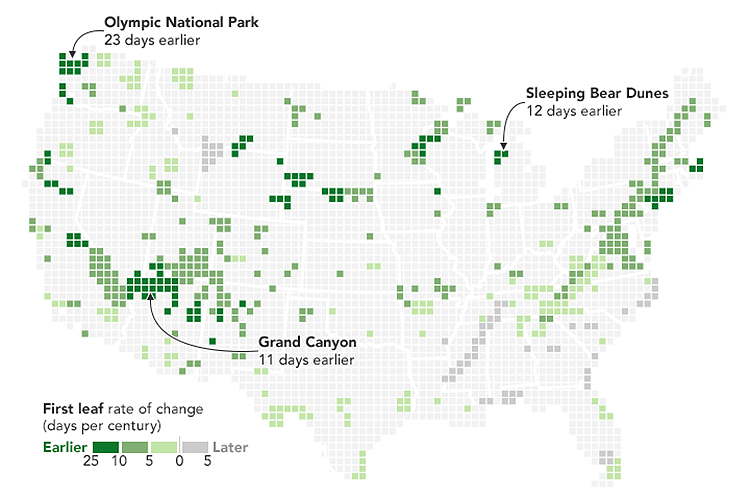
Early spring
Climate change is bringing an earlier end to winter. https://go.nasa.gov/2PegKFj
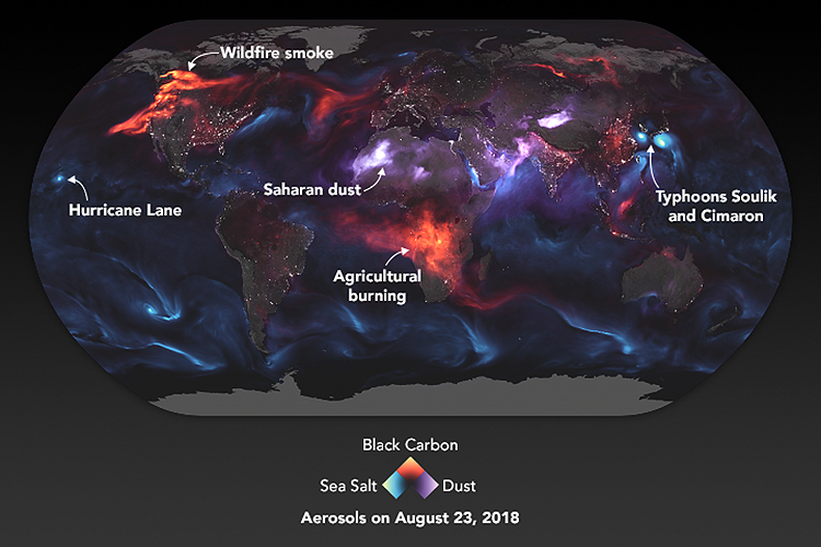
Aerosol earth
Our fragile atmosphere faces many challenges. https://go.nasa.gov/2MsyDQl
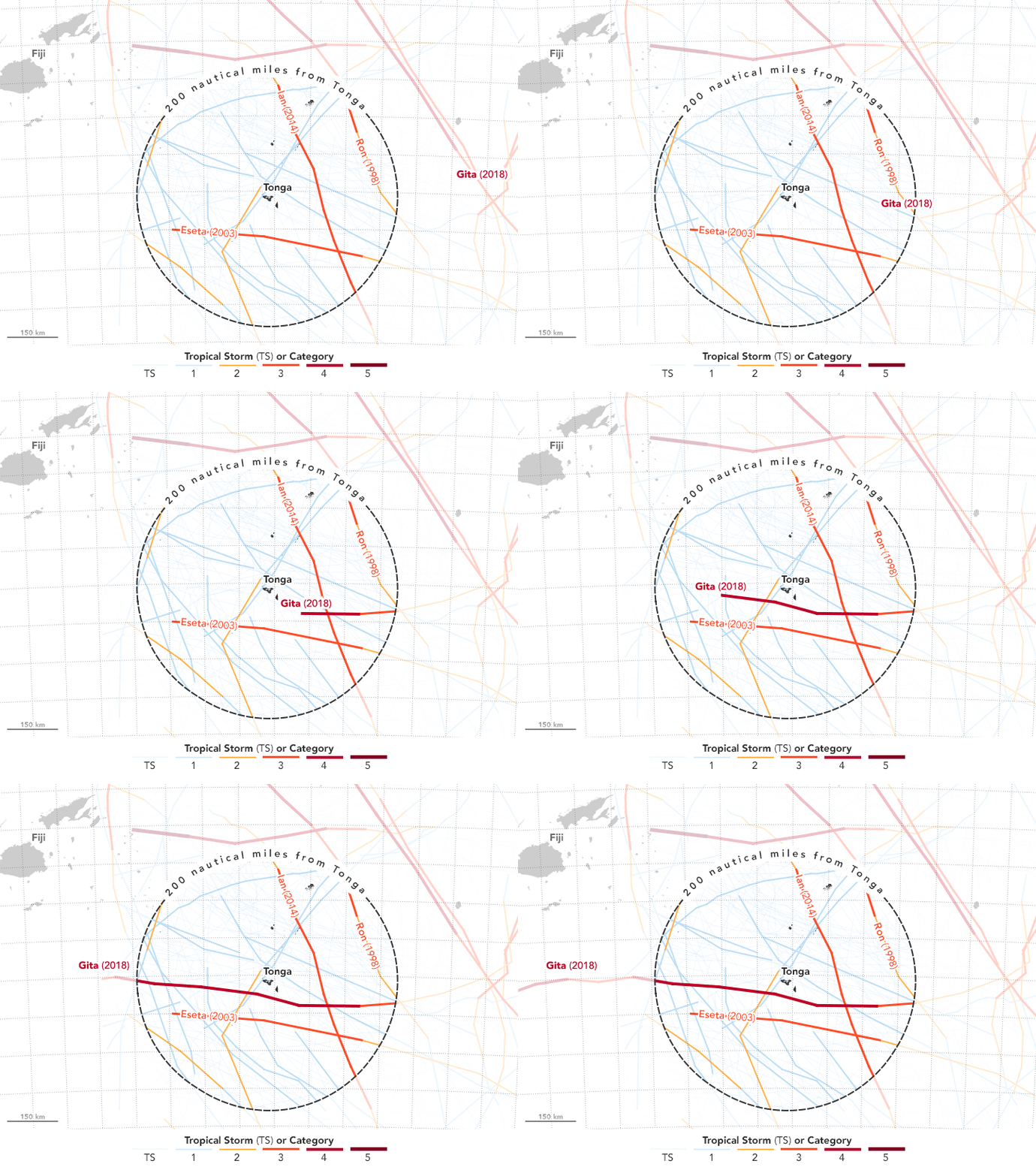
Cyclone menace
The path of Tropical Cyclone Gita, which hit Tonga with winds of up to 145 miles per hour (233 km).
https://go.nasa.gov/2JbEVPp
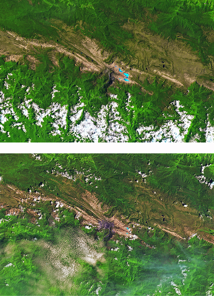
Shrinking glaciers
A dramatic decrease in the size of tropical glaciers. https://go.nasa.gov/2yWp6Yh
Joshua helps to run the subreddit, dataisbeautiful: https://www.reddit.com/r/dataisbeautiful

