FROM PIE CHARTS TO FAKE CHARTS.

Following on from last week’s roundup of past infographic posts, here’s ten from the data visualization category.
Pie chart anxiety https://wp.me/p7LiLW-zt

Colors of cars https://wp.me/p7LiLW-2b1

Venn diagram https://wp.me/p7LiLW-1F9

A question of scale https://wp.me/p7LiLW-Fc
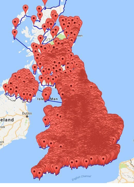
Circular data https://wp.me/p7LiLW-24O

Invisible Netherlands https://wp.me/p7LiLW-Ru

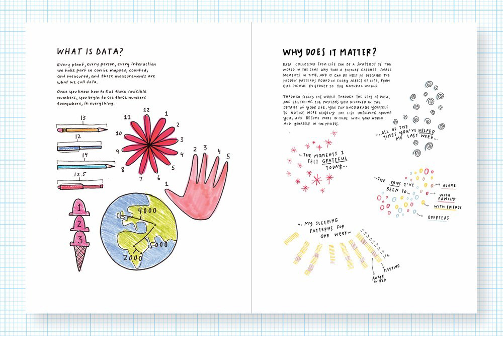
Personal data viz https://wp.me/p7LiLW-2Ip
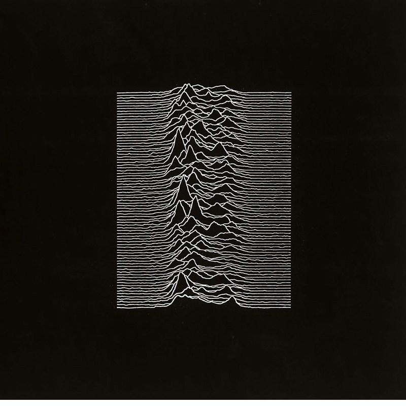
The dataviz album cover https://wp.me/p7LiLW-Yb
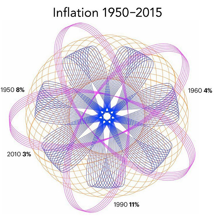
Fake data viz https://wp.me/p7LiLW-11q
Last week’s post: Infographics revisited
https://wp.me/p7LiLW-2Y6
Next week: Maps
