LOOKING AT THE BIGGER PICTURE.
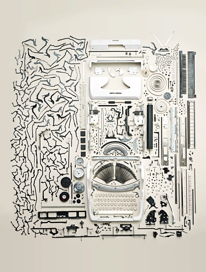
Of course, good design is vital if our infographics are going work effectively (and attract attention).
Here’s some posts that look at general design themes.
Organized https://wp.me/p7LiLW-Z4
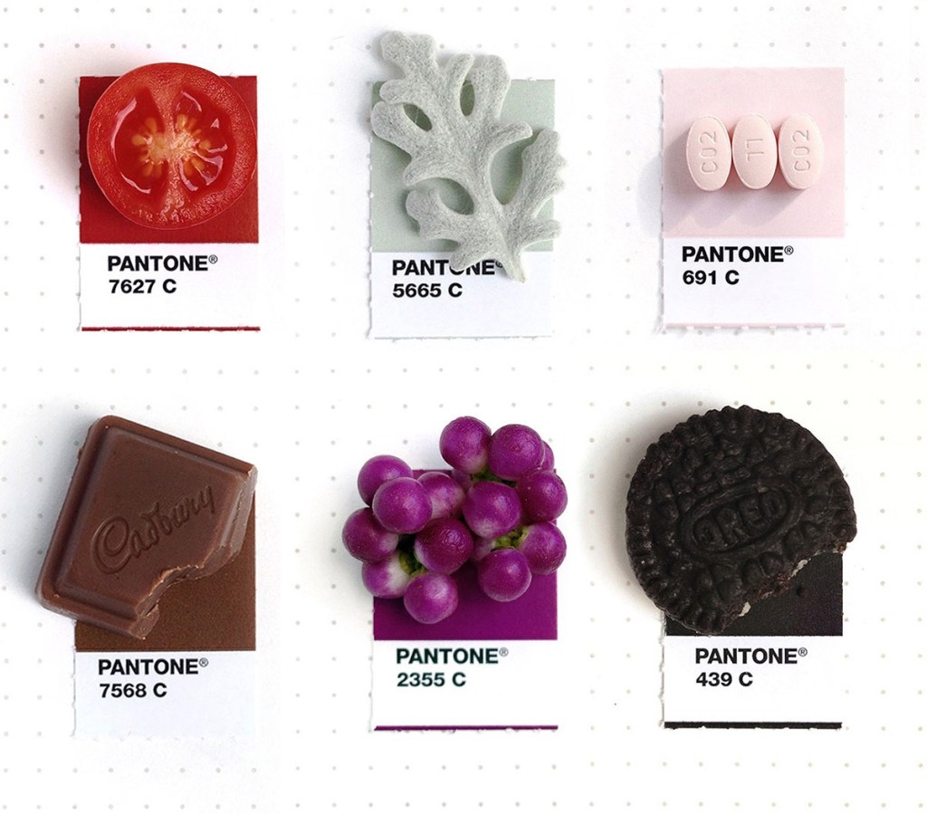
Pantone https://wp.me/p7LiLW-qq
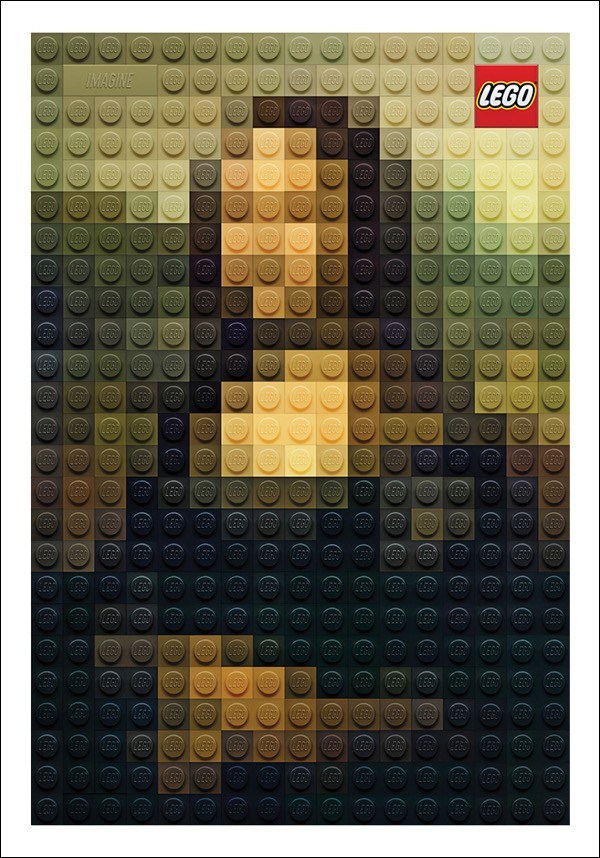
Low-res https://wp.me/p7LiLW-Z1
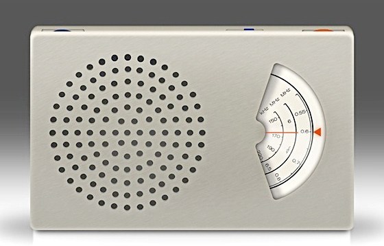
Less but better https://wp.me/p7LiLW-13C
Paper graphics https://wp.me/p7LiLW-17m
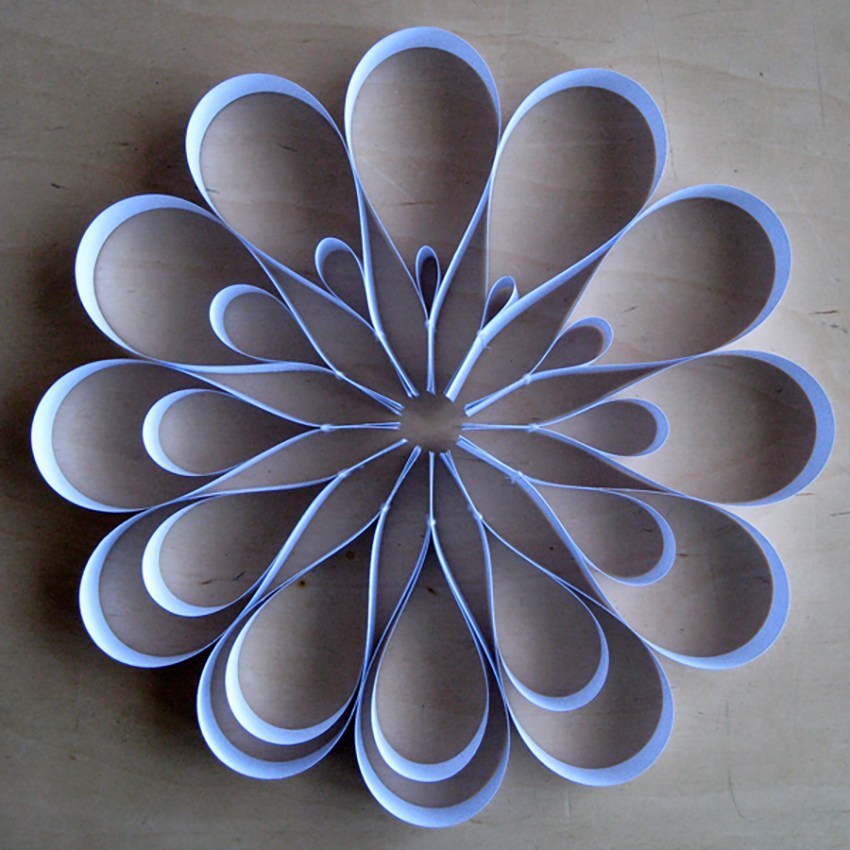
The Hollywood effect https://wp.me/p7LiLW-5a
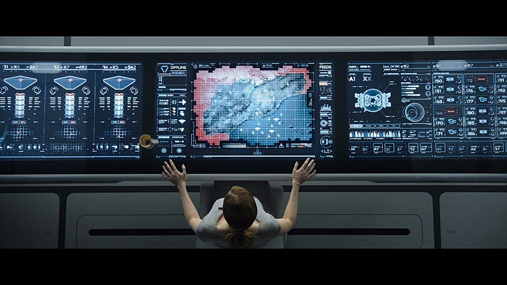
Simplicity https://wp.me/p7LiLW-17S
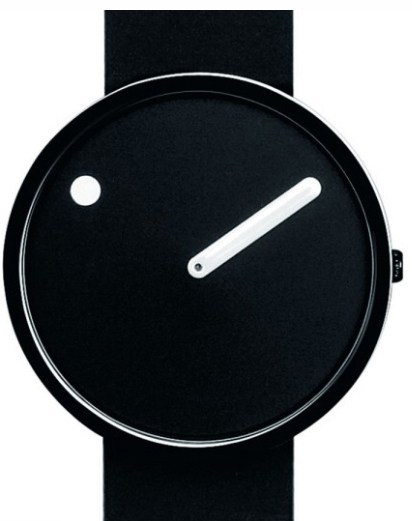
Radio displays https://wp.me/p7LiLW-17t
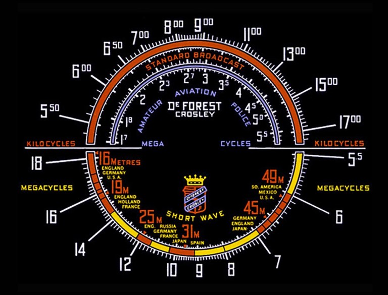
Outside the box https://wp.me/p7LiLW-1pF
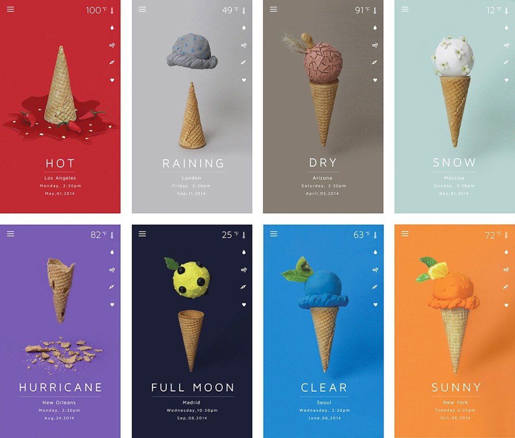
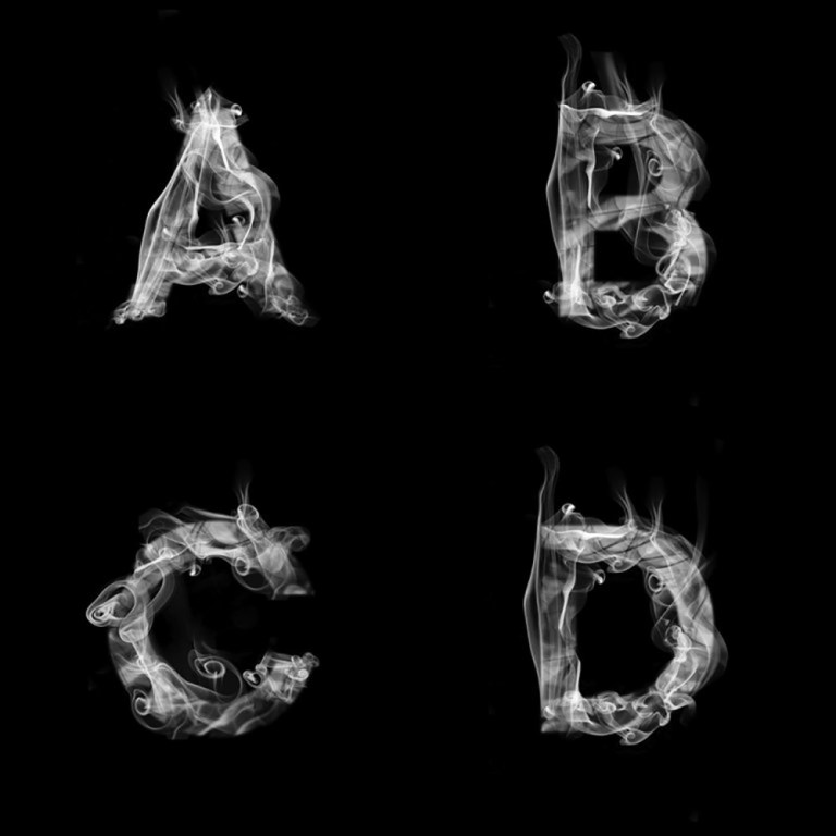
Pictorial typefaces https://wp.me/p7LiLW-1yQ
Last week’s post: Tools
https://wp.me/p7LiLW-30D
Next week’s post: Pictograms
