A NEW SHOW EXPLAINS HOW SEVERAL OF HIS INFOGRAPHIC MASTERPIECES WERE MADE.
The first post about Fernando’s process (in February) featured the story behind his National Geographic sabertooth project: https://wp.me/p7LiLW-3iR
It also previewed an exhibition (then under construction) that provides a comprehensive look, for the first time, at the development of Fernando’s Nat Geo infographics for print and digital.
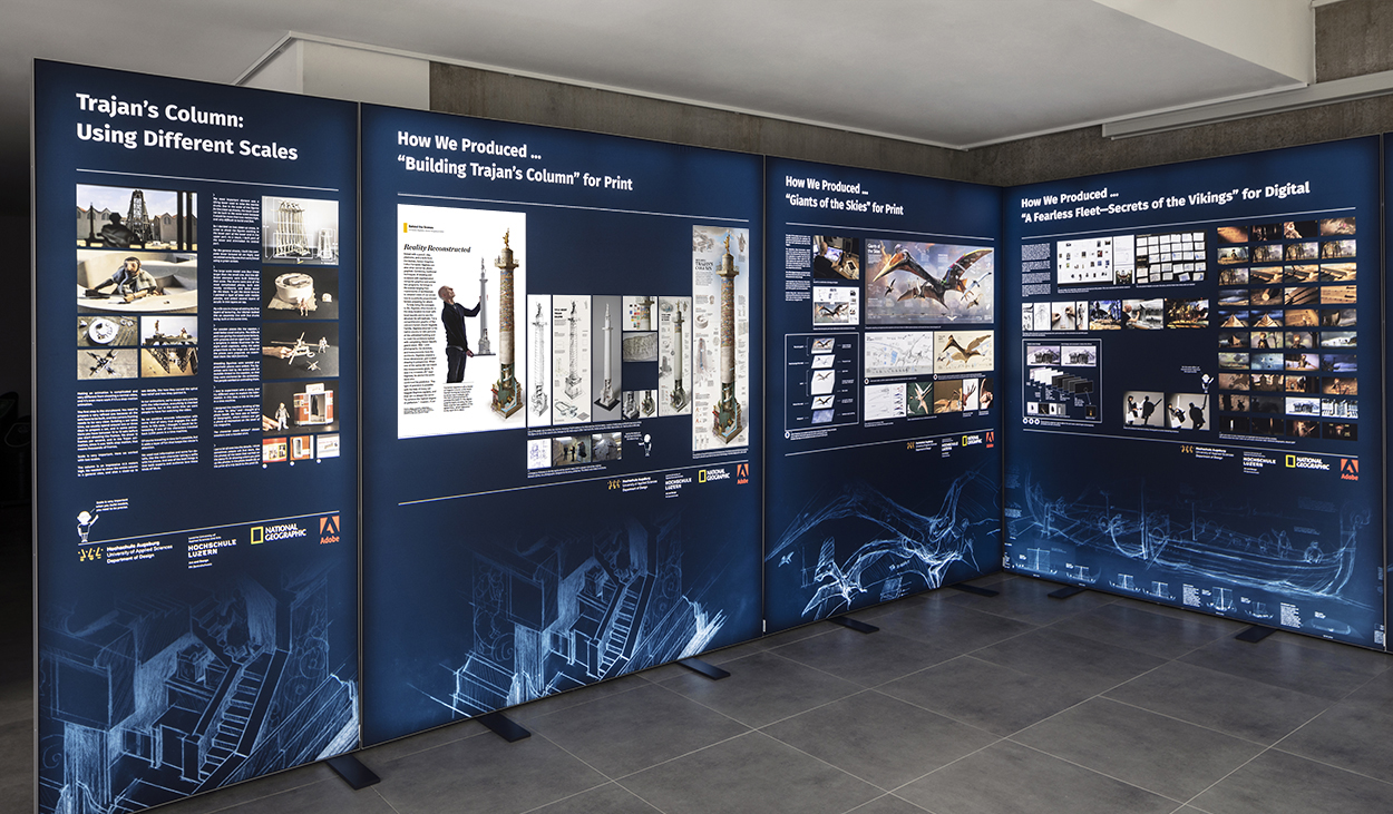
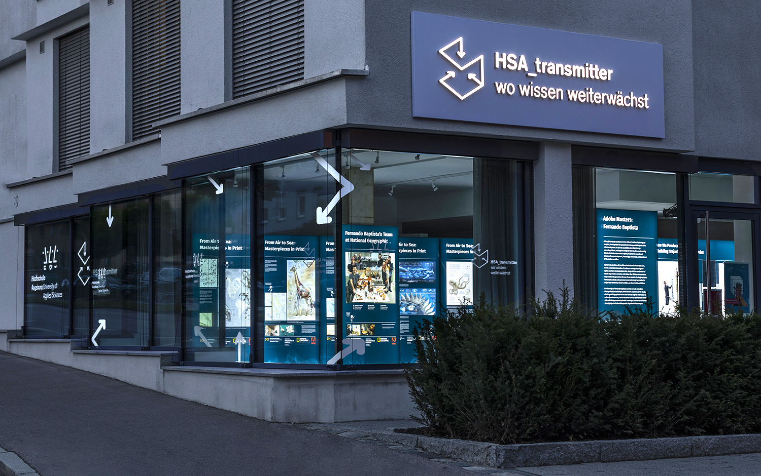
The show was assembled for the first time this summer at Augsburg University of Applied Sciences (Germany) in their “HSA_transmitter” innovation room. Unfortunately, it could only be viewed properly by appointment (because of pandemic restrictions), but the overall effect was tantalizingly seen from the sidewalk through large windows. Anyway, this is a traveling show that will be seen at several other locations in the future. The next stop planned is Lucerne University. Also, it will be possible to borrow the show and present it at your location.
Photographs © 2021 Tanja Bux
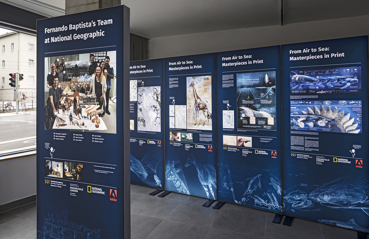
The eighteen panels have rear LED illumination.
Example panels
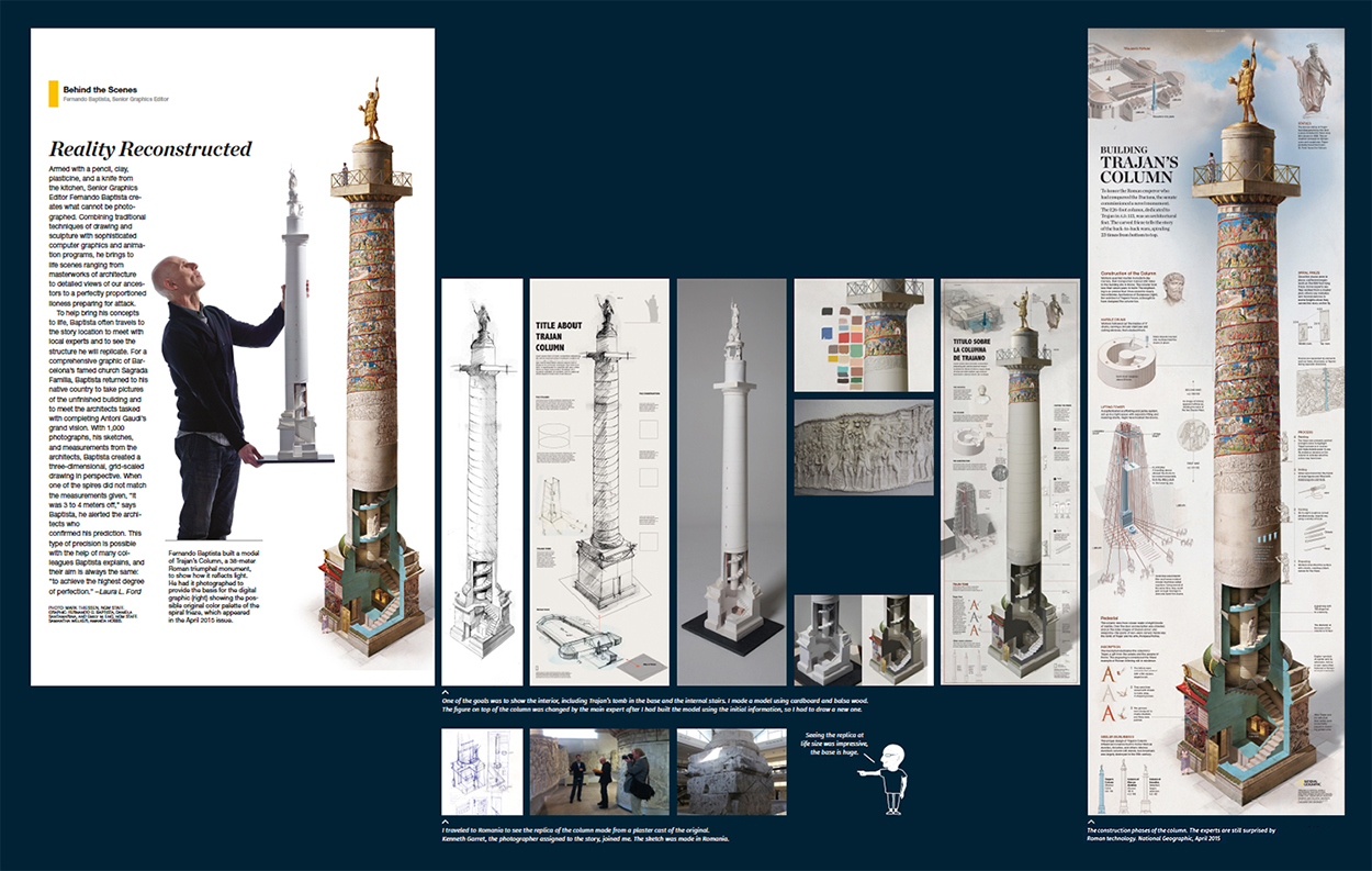
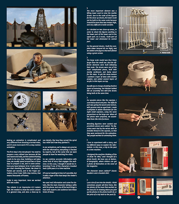
How Fernando’s Trajan’s Column feature was produced for print and digital. Click on the images for larger versions.
(Two other panels were shown in the previous Fernando process post: https://wp.me/p7LiLW-3iR)
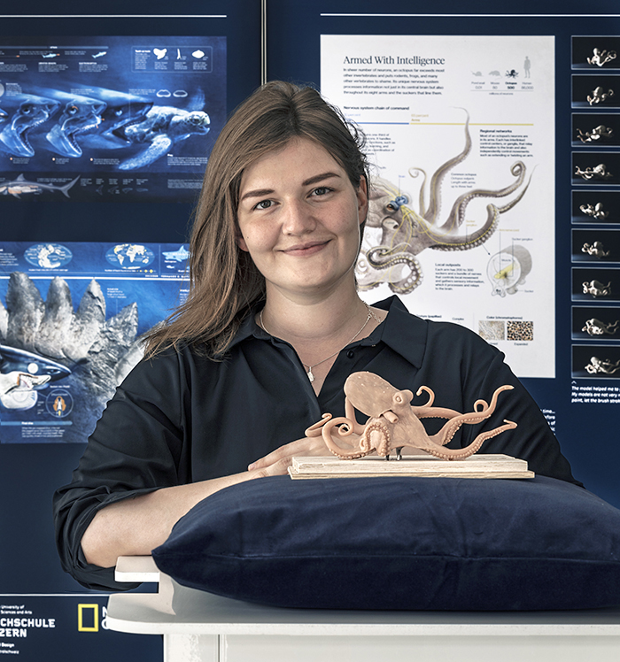
The team behind the show
Nina Krug (above), an Augsburg University B.A. student, was responsible for the concept, layout and design.
Professor Michael Stoll, Augsburg University
Professor Roland Hauscheer, Lucerne University
Dr. Aiko Onken, Adobe
Me… I was involved with the text side of the project, which was a great opportunity to study all the elements of this insightful show.
And, obviously, a huge contribution was made by Fernando put all this together.
Adobe Max 2021
Fernando and Michael are speaking about the exhibition at the free virtual conference next week.
They are both in these two sessions: https://adobe.ly/3G0kFgJ
Register here: https://max.adobe.com/emea/

