A NEW BOOK FROM A MASTER OF VISUAL EXPLANATION.
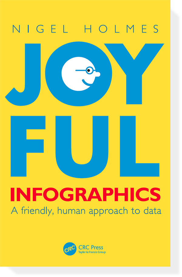
Nigel Holmes is a brilliant designer of infographics, but it’s his inherently human approach that makes his work so effective. It’s as if a friend is guiding us through the information. Indeed, many of Nigel’s graphics contain illustrated people pointing out, or discussing, key details.
Obviously, there are various degrees of warmth and humor that can be applied to visual communication, and where we position the fun dial depends greatly on the type of information and the intended audience, a point that Nigel clearly makes in this book. I know one thing for certain: In a sometimes cold and alienating world of infographics, there’s plenty of room for the Nigel Holmes approach.
Published today. Website that supports the book (and has links to buy it): www.joyfulinfographics.com
Humor post
A previous (and much-viewed) post by Nigel about the use of humor in infographics: https://wp.me/p7LiLW-iZ
From the book
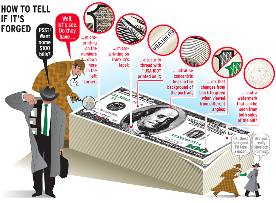
Below, a typical Nigel Holmes graphic: solid information, engaging presentation. For Attaché magazine.
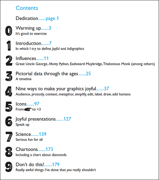
Nine (or ten) chapters
On one level this is an infographic autobiography. We find out why Nigel thinks about graphics the way he does. The influences, the development of his approach. It’s also a seminal book on how to add warmth to our work.
Here’s the list of contents which, by the way, uses numbers inspired by those on British raffle tickets from long ago.
More examples
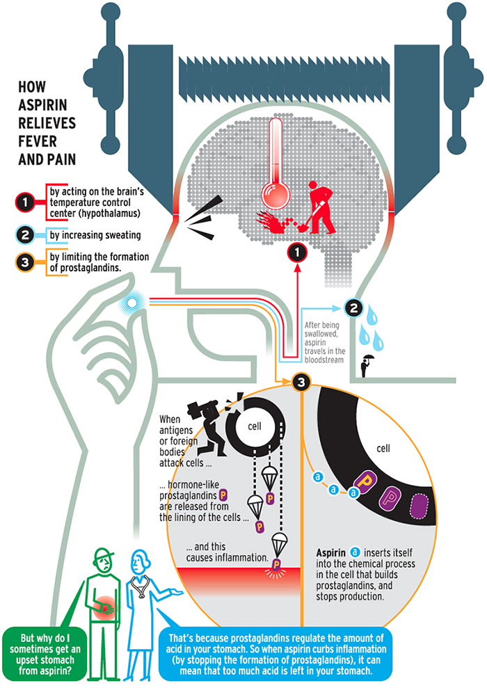
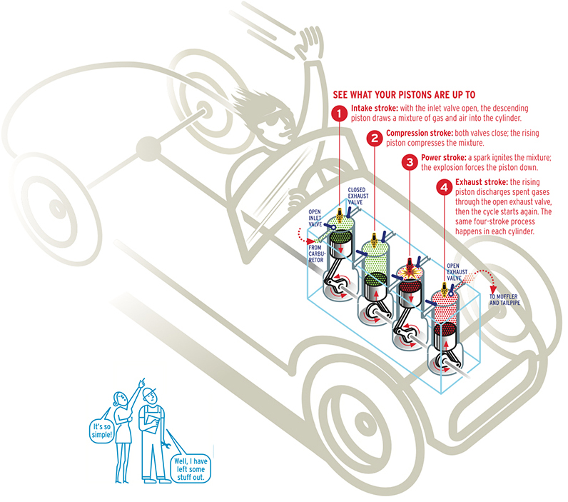
Nigel calls the people commenting at the bottom of the graphic, “the Greek chorus.”
For Attaché magazine.
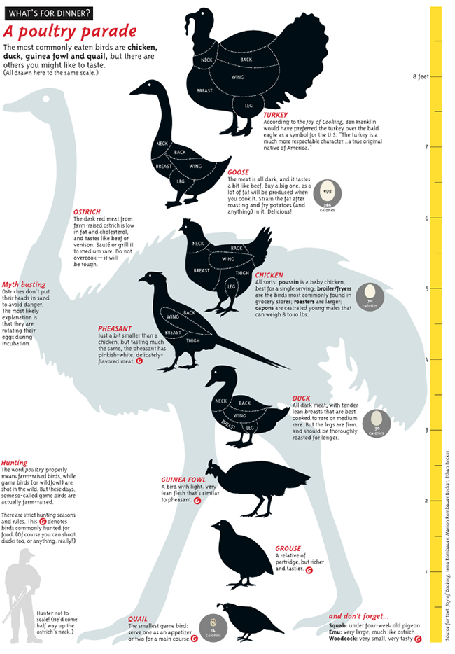
A size comparison of eaten birds for Taschen’s “Food and Drink Infographics.”
How the book began
Nigel explains: “Alberto Cairo*, my editor, came up with both the idea for the book and the title. I was initially concerned that my work, and the way I would write about it, might not be a good fit for an academic publisher. But Alberto assured me that I should just go ahead and write it the way I wanted to, and that the publisher wasn’t expecting a textbook. The more I wrote, the less like an academic book it became. I wondered if it was too much like a memoir—even further away from the kind of book that the publishers typically produced. But they said I’d been around long enough in the field to be a little indulgent about my infographic influences and early life.”
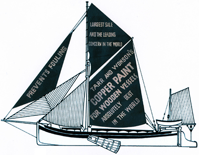
Below, an early (1967) illustration for the Observer Magazine.
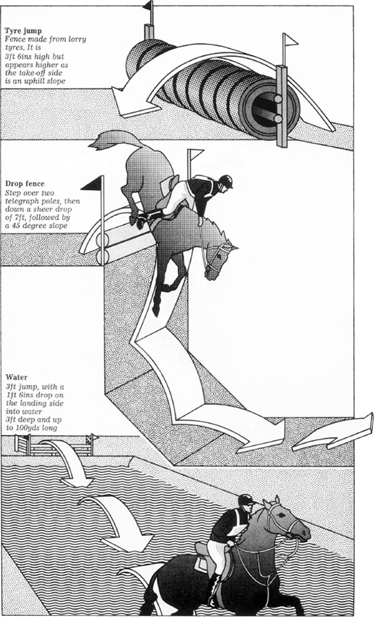
Steeplechase obstacles for the Radio Times (1972).
Designing for an audience
Matching the approach to the people viewing the explanation is crucial.
This Attaché magazine graphic is intended for casual readers as opposed to car enthusiasts.
Icons, icons, icons
Nigel has made a crazy number of icons during his long career.
Here’s a complete set for the Billion People Project. And how they look in use.
![]()
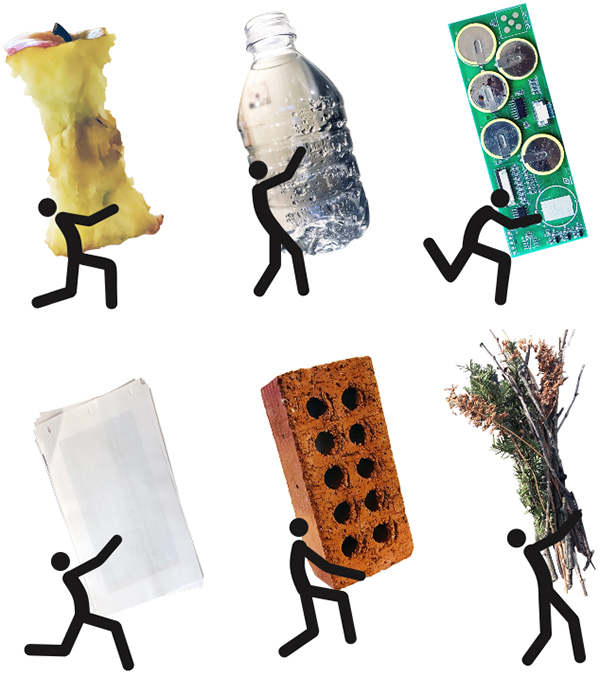
For a recycling feature in Stanford magazine.
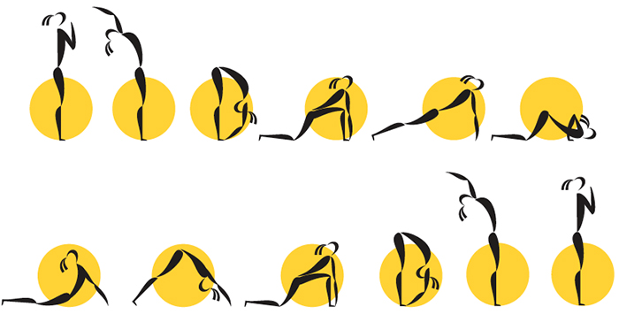
Yoga sun salutation. Unpublished.
For Smithfield Farms.

Big metrics
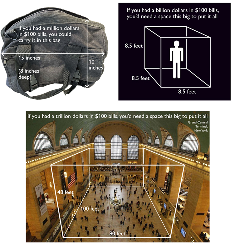
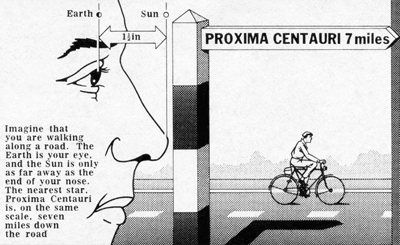
Nigel has often tackled the task of explaining large (and frequently misunderstood) numbers and distances.
This size-of-money explanation was made for a presentation.
How far to the nearest star? From the Radio Times, 1974.
Wait for the hardback
A note from Nigel: “If you’re tempted to buy the hardback version, don’t do that yet; the publisher made a mistake and applied their generic book cover, not the custom yellow one you see on various sites. The problem will be fixed in a few weeks. Meanwhile, the paperback is fine (and costs about a quarter of the hardback price!)”
* Alberto Cairo is the Knight Chair in Visual Journalism at the School of Visual Communication of the University of Miami. He’s the author of three infographic/data visualization books, and he’s working on a fourth.
