MAKING INFOGRAPHICS FOR PRINT AND DIGITAL.
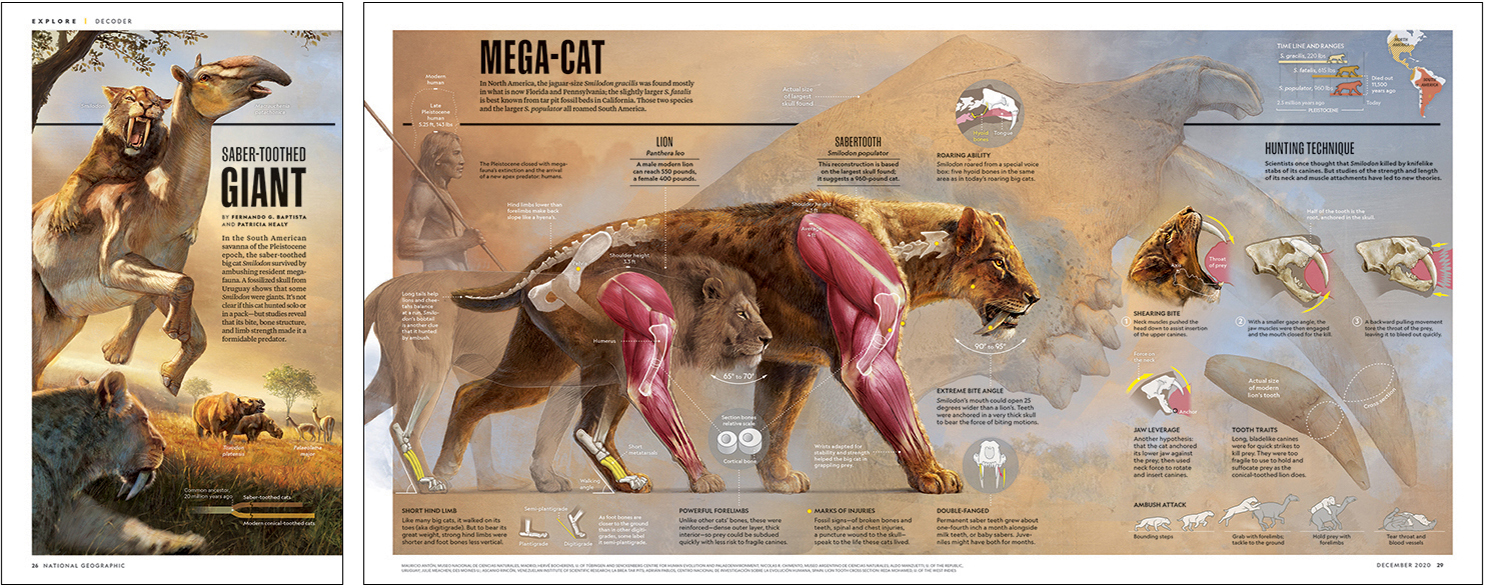
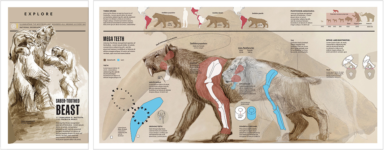
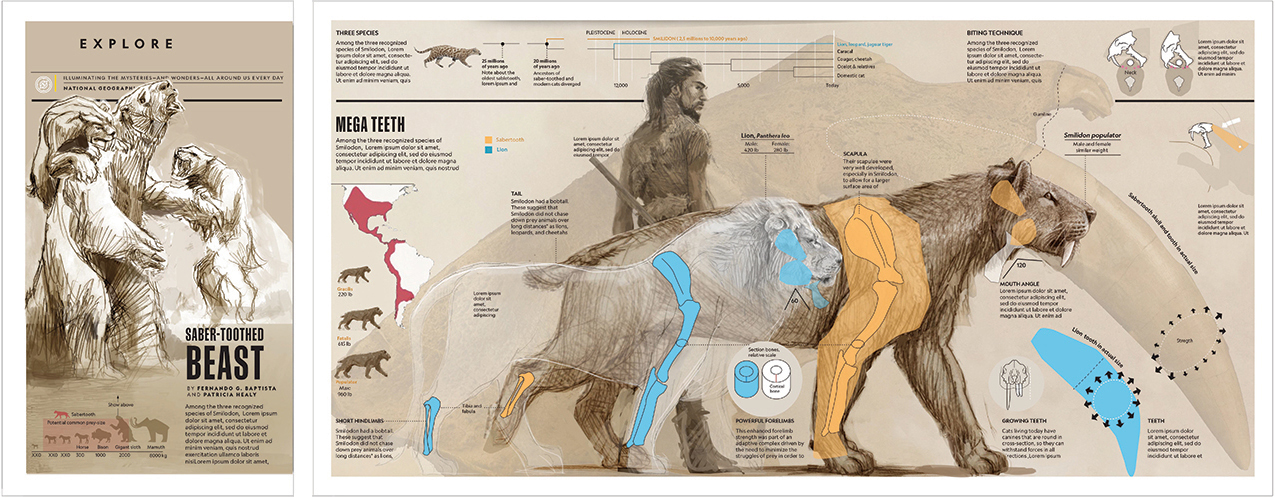
This four-page sabertooth feature appeared in the December issue of National Geographic Magazine. As with many of Fernando’s projects, the presentation was rethought for the online, animated version. Click on the image for a larger version.
Fernando takes us through the development of the project, from initial idea to finished version.

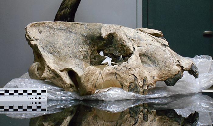
I’m always looking for ideas for graphics, and usually these are topics that I’m really interested in. I love the sabertooth, it’s such an iconic cat. I read about a huge skull that was discovered in Uruguay, the largest one found so far, which is from a species called Smilodon populator. This mega-cat weighed almost twice as much as a modern lion, around 960 lbs (408 kg). So I proposed this idea to the creative director and the director of the front section of the magazine, and it was approved. Below, the skull.
We hired Patricia Healy as the researcher, and started to compile the information and develop the presentation. I decided on a design over a total of four pages: a single page and a three-page gatefold. The first page would be a hunting scene showing that these cats hunted large prey like the Giant sloth. However, the experts later recommended another large species to represent the prey, Macrauchenia patachonica, which is related to even-toed ungulates. It looked like a mixture of horse, camel and tapir.
For the three gatefold pages, I thought that a comparison between the mega-cat and the modern lion would tell the reader a lot. Lions are very powerful, but when you compare bones and muscles in both species, it’s clear why the Smilodon populator was such a phenomenal predator.
Elements shown at actual size are often included in my graphics. It’s something that can only be done in a print format. In this case, the skull of the Smilodon is in the background along with a lion’s tooth. Other secondary elements add different layers of information. I spent a lot of time on the layout, trying to organize the information in a way that is easy to read.
Preliminary versions
I made three main rough drafts and decided to refine the third one. Patricia Edmonds wrote the text, which involved a complicated back-and-forth discussion with the experts.
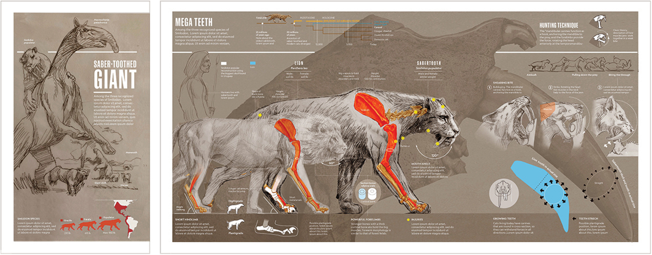
Expert advice
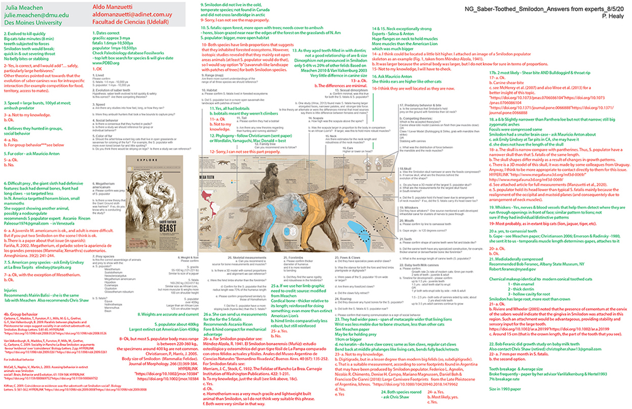
We worked with nine experts to be sure that we had the most accurate information, which is sometimes very specific. We used one expert just for the size and weight of the human of that period, and another for the lion’s tooth. Patricia Healey spent around 100 hours researching the project. There were hundreds of emails.
Below are the answers to our questions from just two of those experts. Color-coded by Patricia.
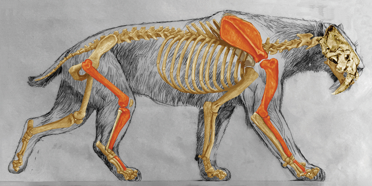
We determined the overall size of this saber-toothed cat (the biggest discovered so far), by using the skull that an expert found in Uruguay, and the skeleton provided by another expert. The overall size of the Smilodon was calculated by extrapolating the skull to an average skeleton. We adjusted the angle of the legs to match this size. (The sabertooth hind limb has a lower angle, like it’s flexed. The hind limbs being lower than the forelimbs is a factor in the back sloping like a hyena’s. In the case of runners, like lions or cheetahs, the angle of the hind limbs is higher, leading to a more erect pose. This is one of the reasons why experts think the sabertooth wasn’t a very good runner.) Both of our experts approved this revised skeleton.
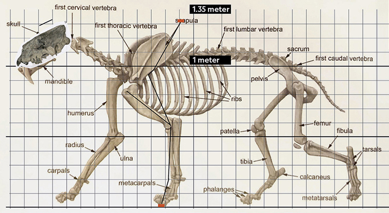
Building an accurate model
When I was finally satisfied with the design and the information, I started to create a model to help me to figure out light and texture for the illustrations. The final pose was sketched using the measurements from the approved skeleton.
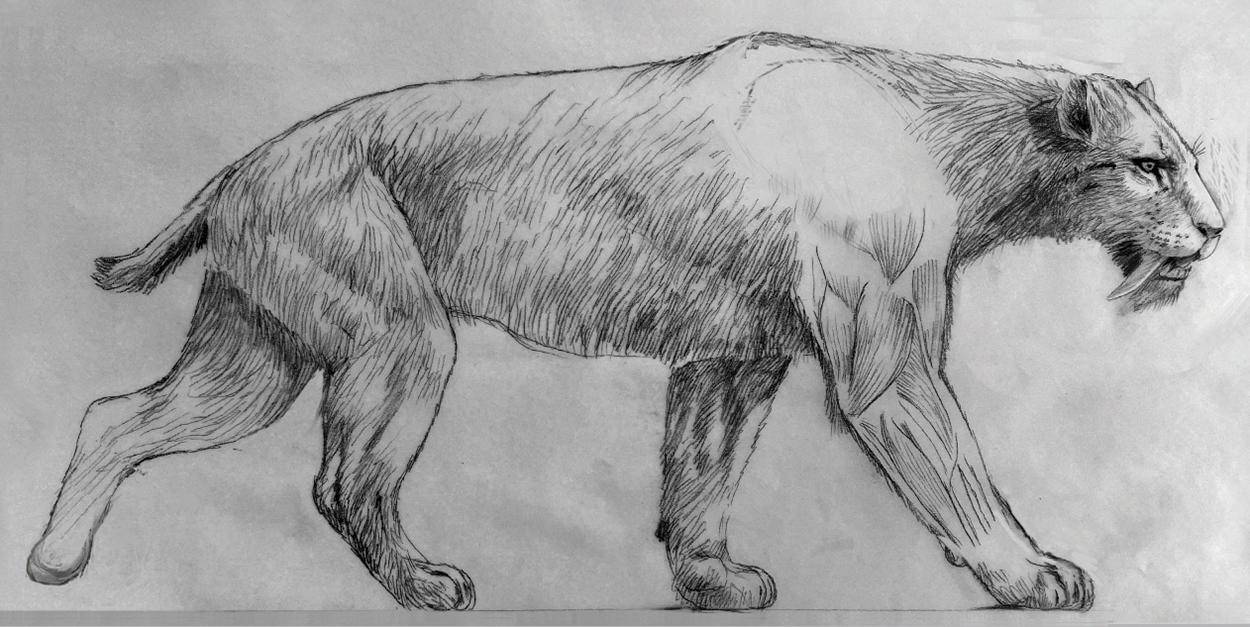
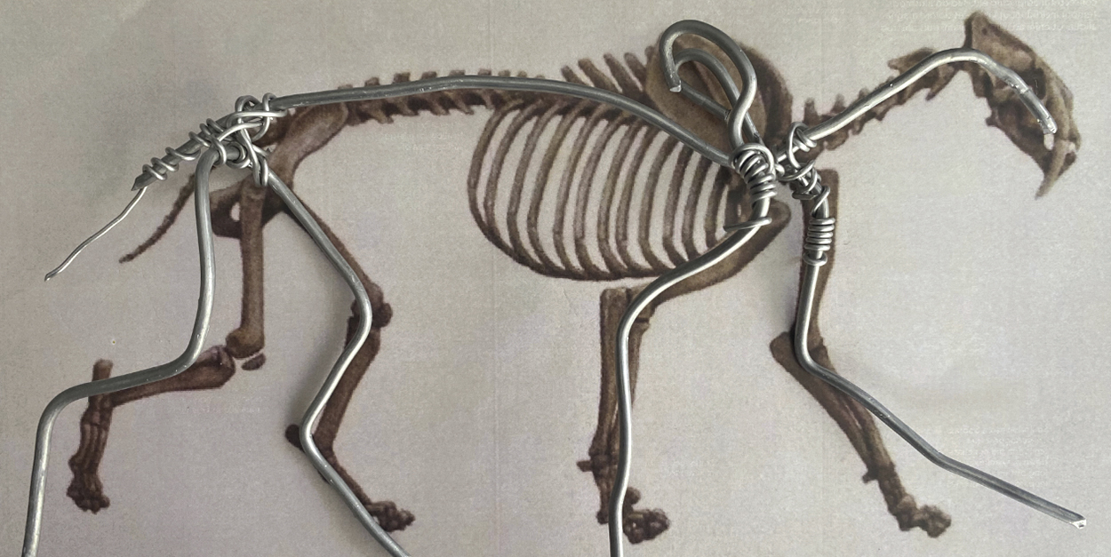
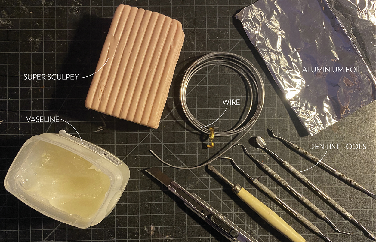
Aluminum wire matches the proportions of the skeleton.
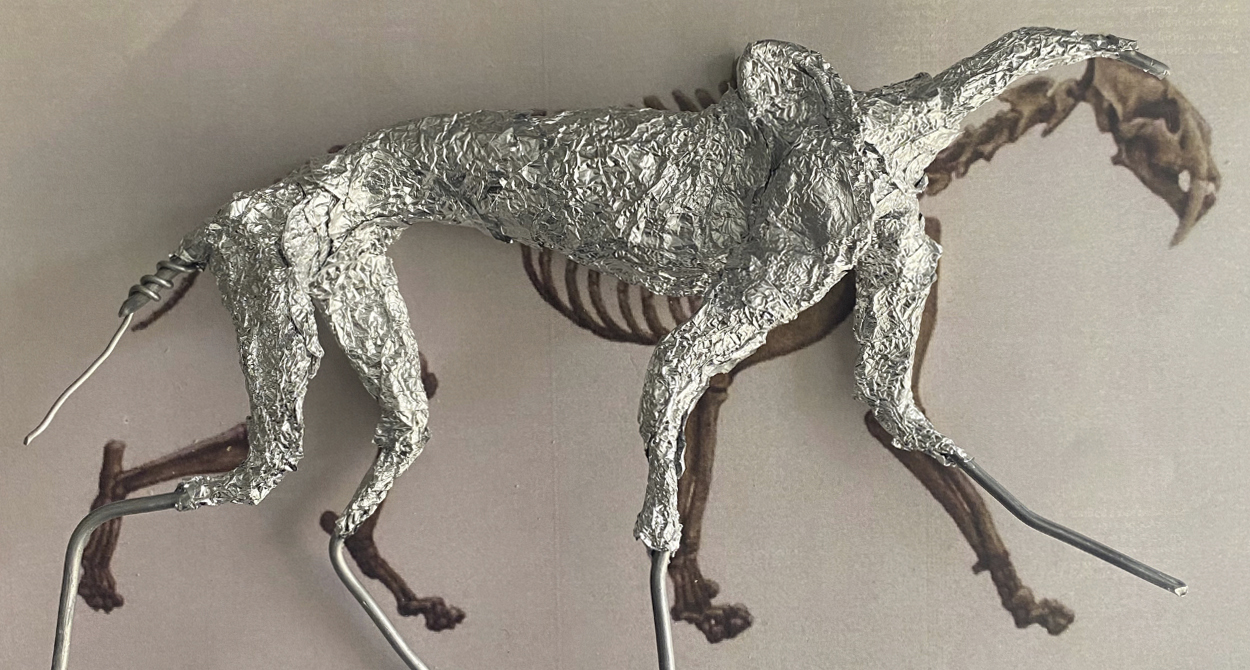
Aluminum foil covering the wire to help support the polymer clay, and to keep the model lighter.
I started to work on the muscles using references from books that had been approved by the experts.
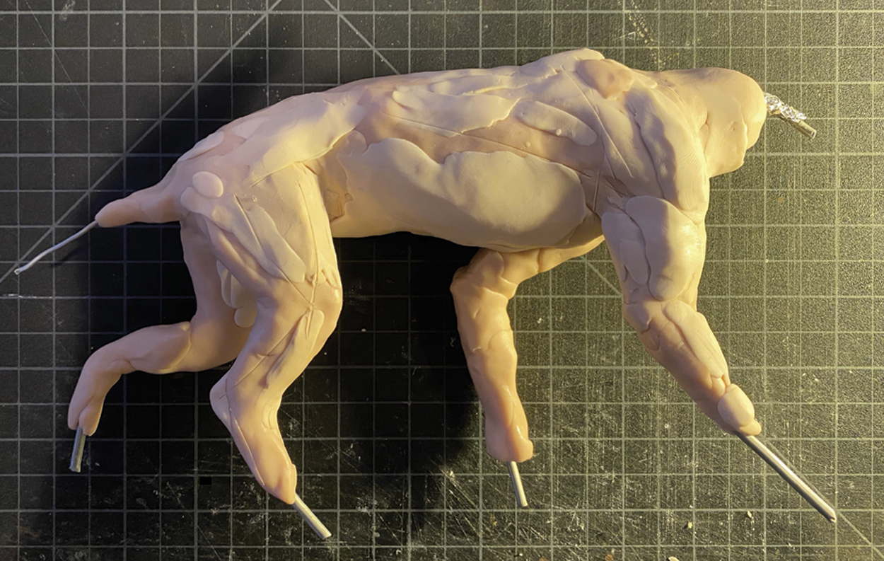
Refining the details and the pose. I constantly checked the measurements against my references. Sometimes I needed to remove a section and start again. In this version, the neck and forelimb wasn’t correct, so I removed them and made the adjustments.
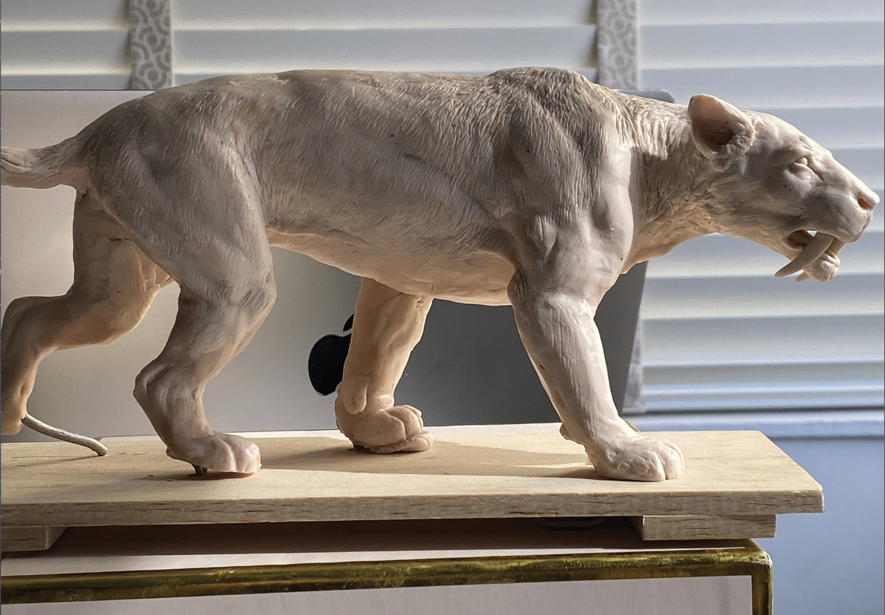
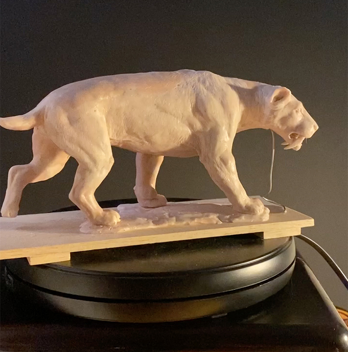
Final model. Glass eyes added, and for the whiskers, some bristles from a brush. We used this model for the animation.
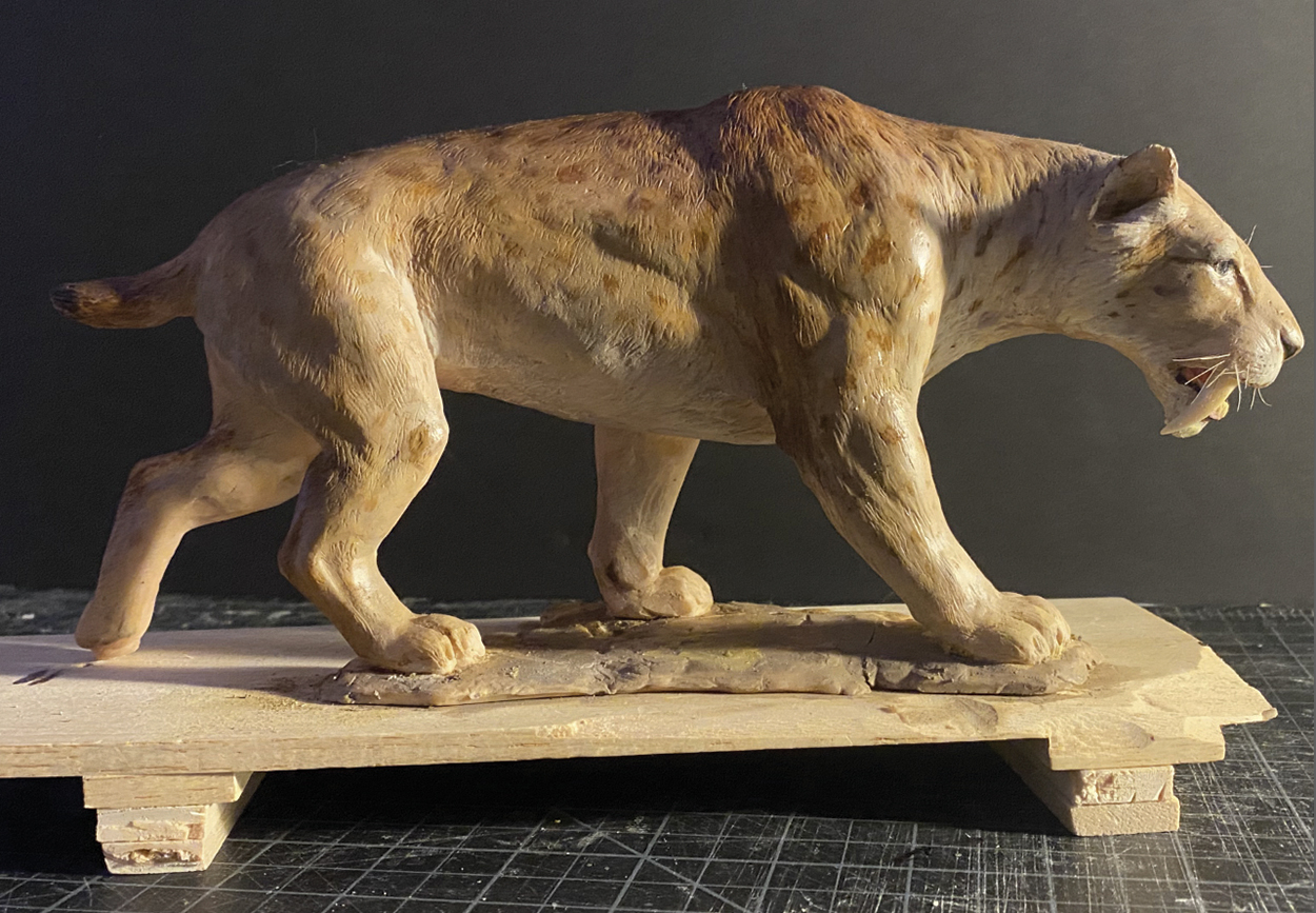
Model rotation. Click on the image to see the video.
Sculpting the model.
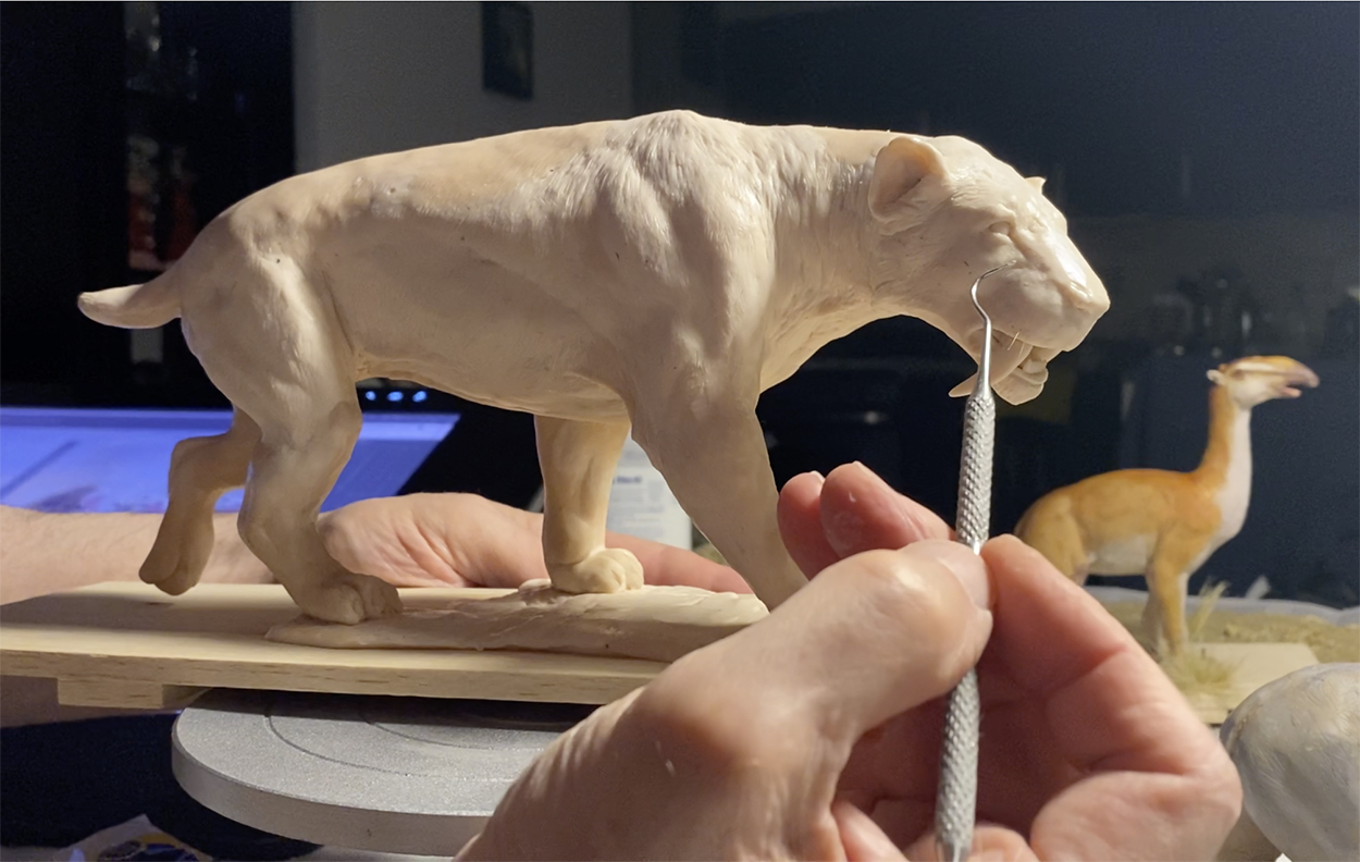
The materials and tools used.
The illustrations
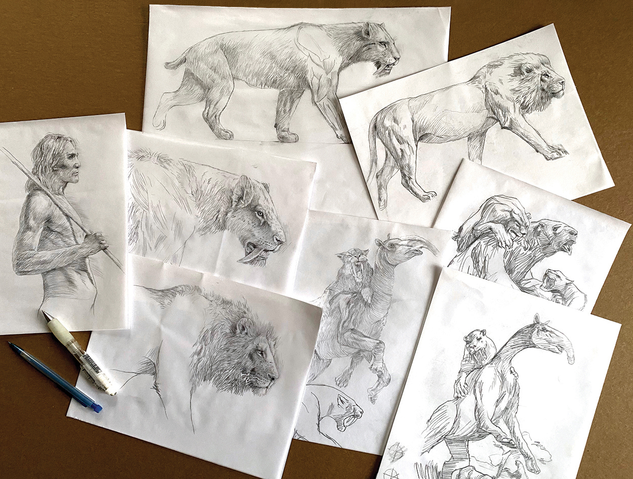
I made several drawings, from initial sketches to more refined pencil drawings.
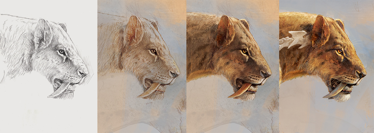
Usually I start an illustration with a pencil layer on top of a painted background, and color is added with Photoshop. My model was the reference for lighting and volume. And some textures from the model were used for the Smilodon’s back. I like using this kind of the effect because it’s irregular, from the strokes of the tools, and not super-realistic,
Animation
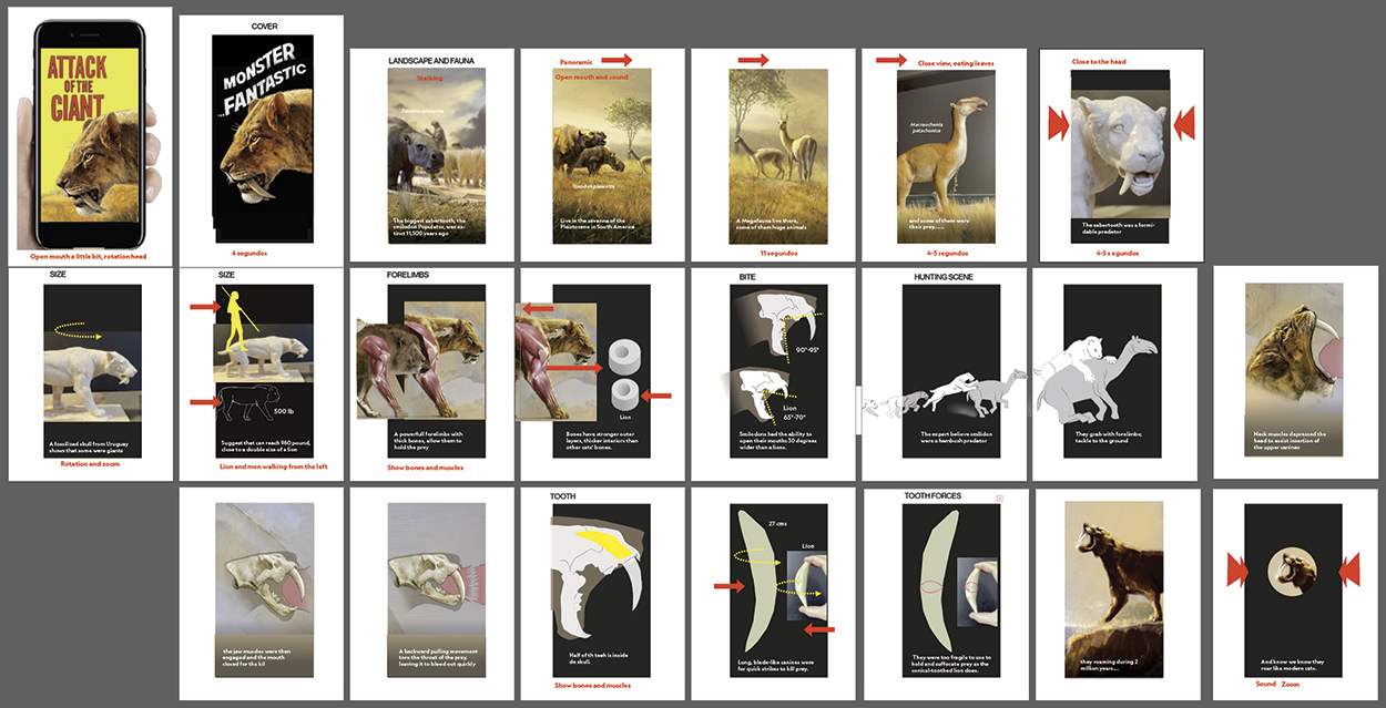
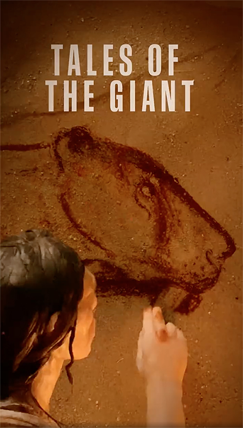
Our animation was designed to work primarily in Instagram for mobile with chapters, in a vertical format. I made the first storyboard and script to determine the information that we would include, and worked with Monica Serrano to plan the animations and transitions. Monica is an expert in After Effects, which she uses to animate, to add all kinds of special effects like atmosphere, and to hide mistakes or wires when we use puppets. There are three styles in the animation: models, two-dimensional illustrations and cave painting details. In the two-dimensional style, we have movements like a mouth opening, or the sabertooth hunting or walking. These things are very difficult to do with models. The models don’t have a lot of movement, and the main movement comes from the camera. Usually there are several layers in the background that give the feeling of movement. We used the three styles throughout the animation to unify the style of the video, and tried to blend the video narrative smoothly with the infographics. Below, the first storyboard. Click on the image to see a larger version.
Obviously, we are not Pixar or DreamWorks. We have around two months to produce an animation, while working other projects at the same time, so we need to organize the workflow carefully.
This kind of animation is a team effort. We need people to help us get a project completed. For example, Diana Marques worked on the vector animation of a saber-tooth hunting it’s prey. Christopher Turner worked on the lion and human walking. Cosima Amelang and Brian Gutierrez, from the video team, joined the project. Cosima was the video editor, and Brian was the narrator. Both worked from the initial script to make a cool narration. Oscar Santamarina gave us ideas during our meetings. We met several times, and little by little we refined the different parts of the video.
I started to make models and build sets in my apartment, which was not easy as it’s pretty small. The sets were in a corner of the living room.
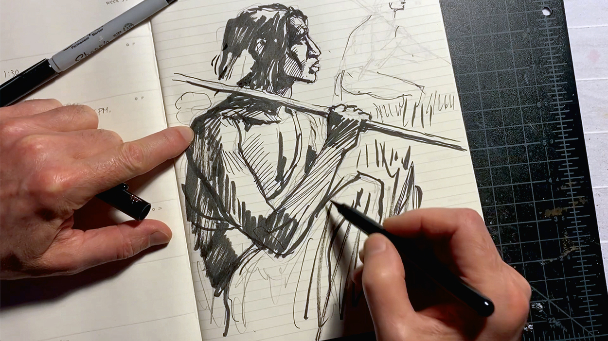
For some of the scenes, I made sketches to find the best point of view.
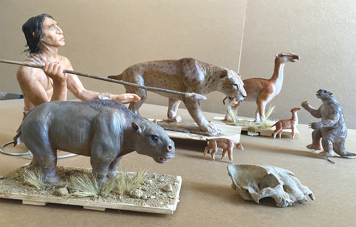
Some of the principal models.
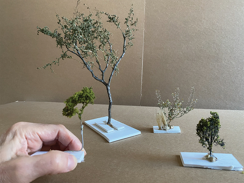
I made trees and bushes from real plants, and used a material that is intended for model railroad scenery for the small ones in the background.
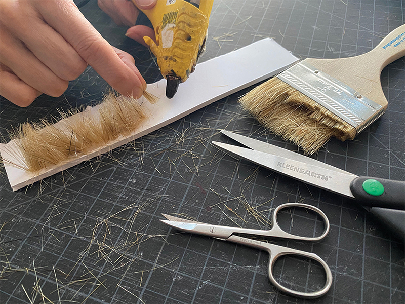
Creativity is a big part of the animation process. My wife, Begoña, made the grass with bristles from cheap brushes. For another scene, I bought a doormat to use for the overhead view of the savanna.
We started to shoot scenes to give Monica time to add special effects using After Effects. Every scene has some of those effects to unify the project. At the same time, we made a mockup of the video where we could test how the visuals and narration worked together. Kevin Laba, a freelancer, provided the sounds, which were added in the last few days of production. We faked the perspective and positioned the camera so that it looked like there is a big landscape in the background. Here I’m working with Monica Serrano and Steven Loh on the first (and most complex) scene featuring the megafauna, the huge animals of the period.
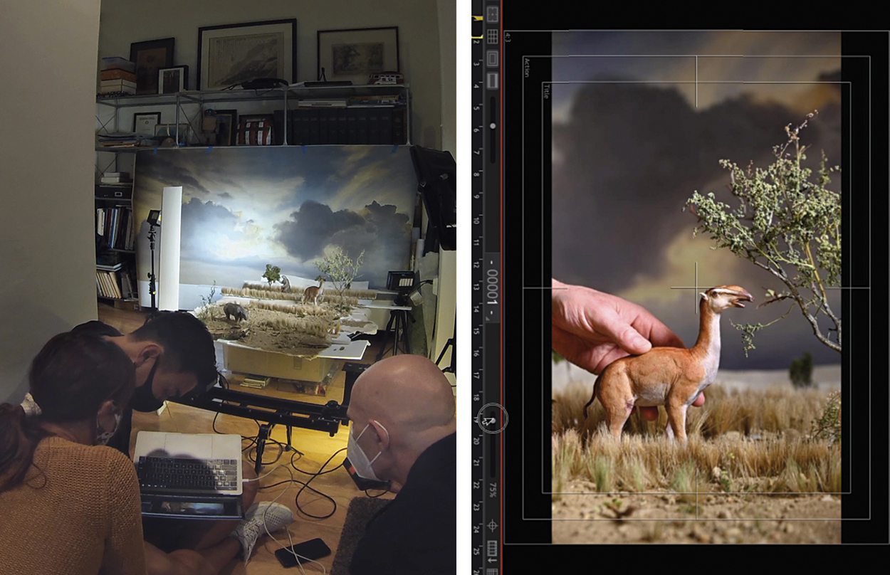
The sabertooth in position.
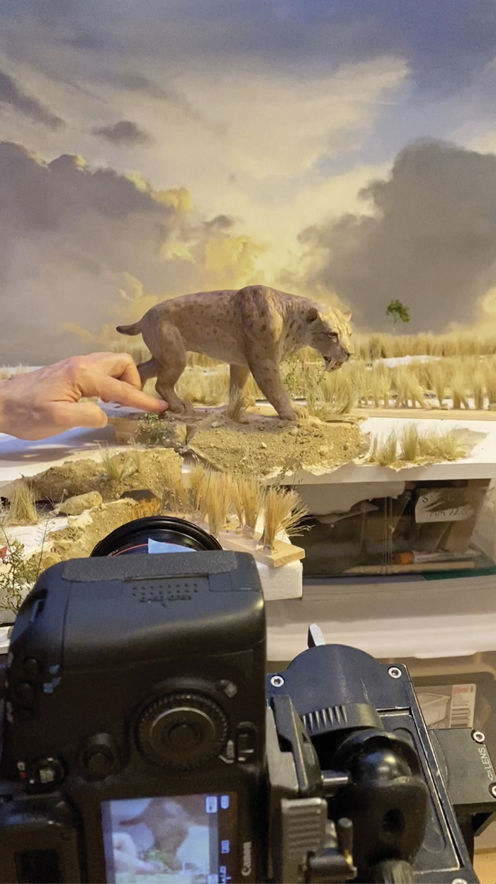
The set for the final scene.
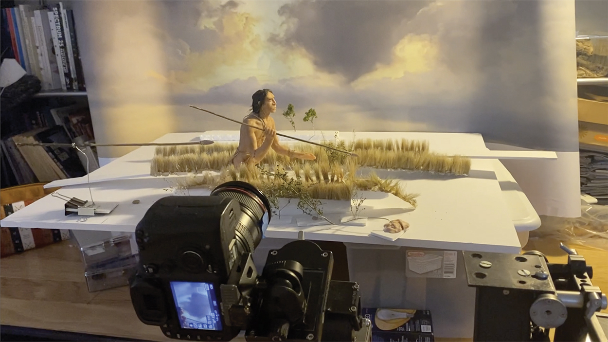
The final image in the video.
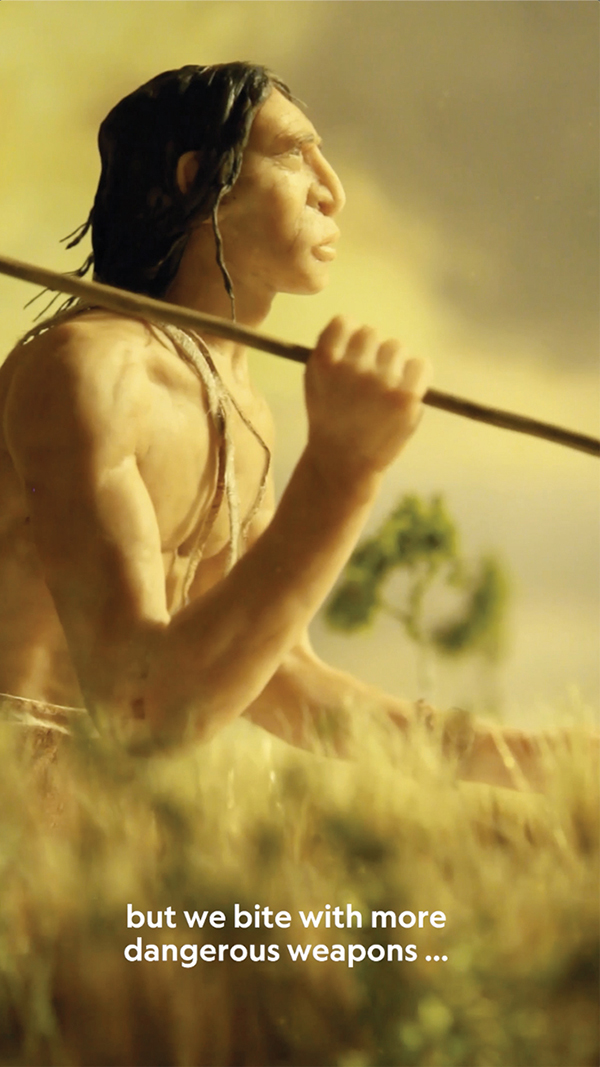
See the video here: https://bit.ly/3rTtO3v

Fernando Baptista Exhibition 2021
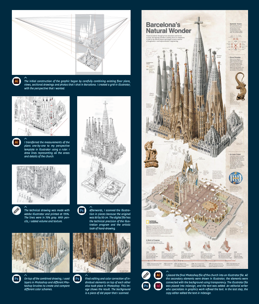
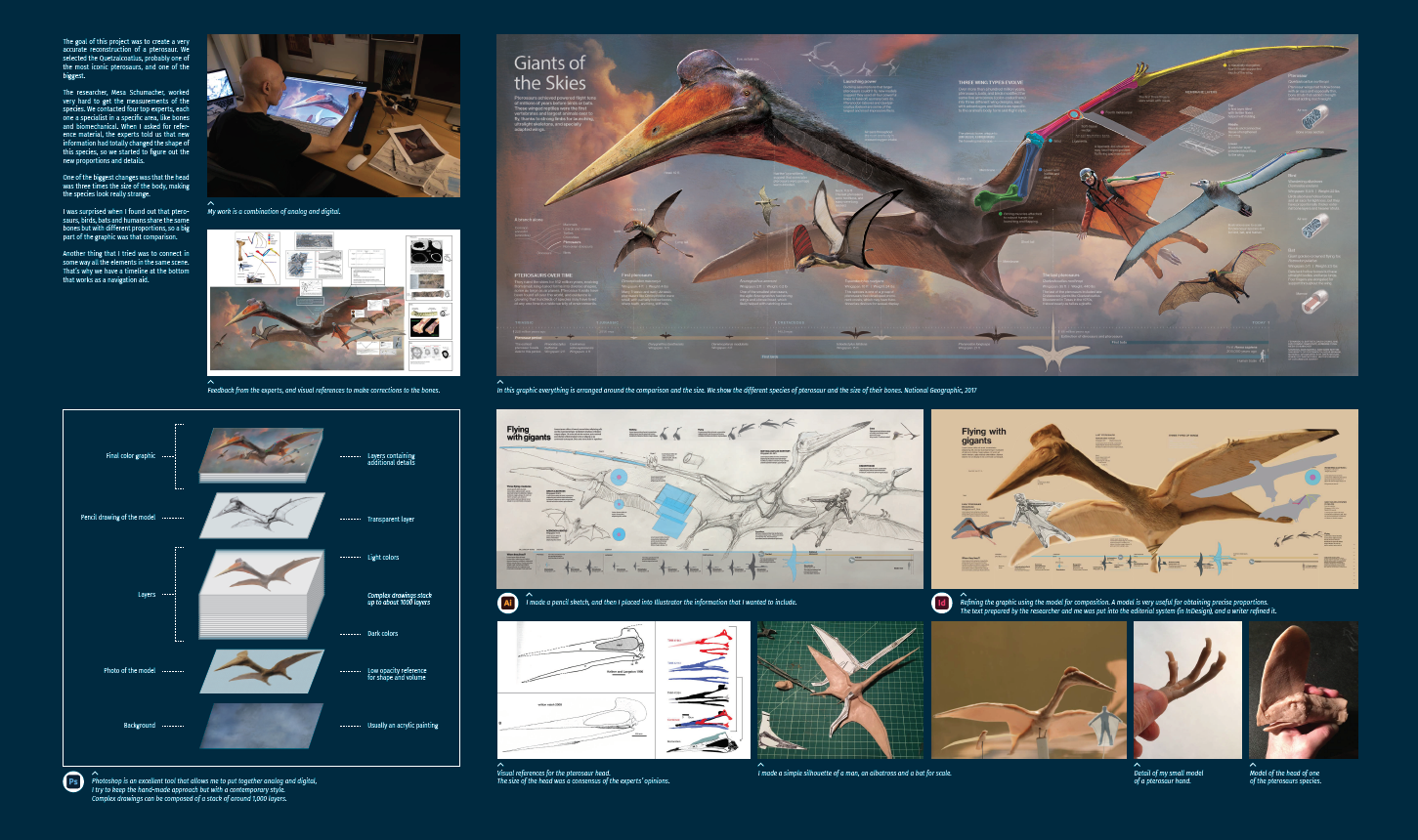
A comprehensive exhibition, which reveals the process behind several of Fernando’s projects, will be on show at various locations this year. The dates depend on the pandemic situation. The first venue will be Augsburg University of Applied Sciences (Germany), which put the show together in partnership with Lucerne University of Applied Sciences and Art (Switzerland), which will be the next stop. The exhibition is sponsored by Adobe.
Editor’s note: I was very fortunate to be involved in the preparation of this exhibition. The show’s emphasis is not on the final, brilliant graphics, but on the way that they were created. It’s an in-depth look inside the mind of an infographic master.
Below, two examples from the exhibit.
