THE WORLD OF TRAVEL INFOGRAPHICS.
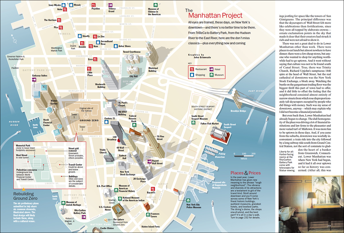
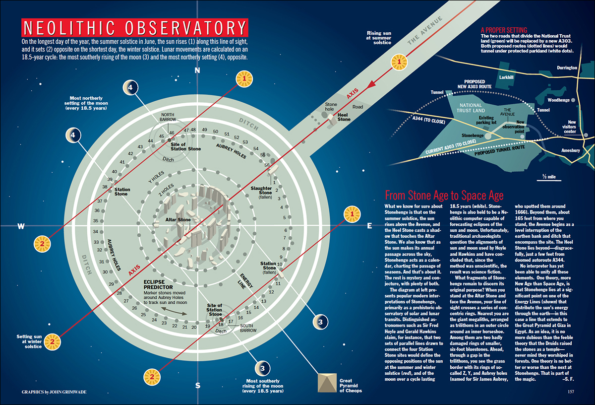
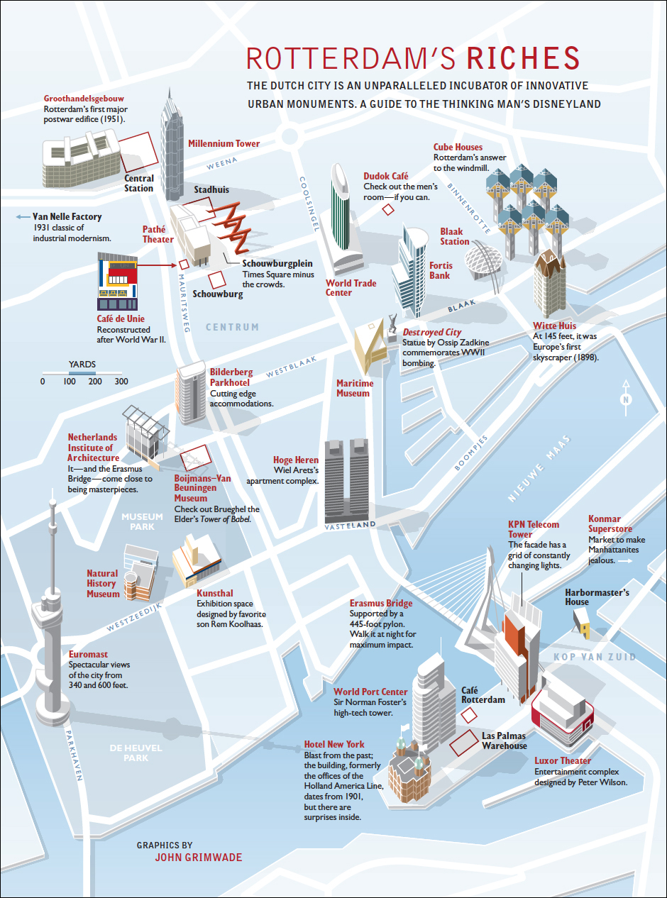
Clive Irving (who is the most infographic-minded editor I have ever worked with) coined the term Grimwadia (pronounced grim-way-dia) to describe the kind of infographics we were running in Condé Nast Traveler magazine. Soon editors there were announcing, “We need some Grimwadia in this feature,” as if that was a normal thing to be saying. I found it slightly odd, to be honest, but loved the implication that infographics had become part of the brand.
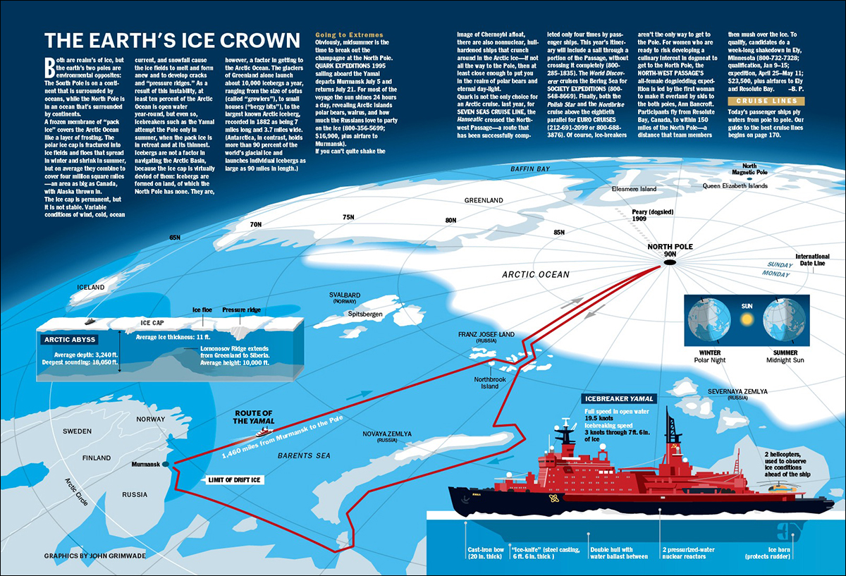
I tried very hard to compliment the features that contained these graphics. A huge amount of work in the research and copy-editing departments, and super-smart editorial support, went into these pieces. Then there was the vital input of the design department. The people who worked with me are very much a part of this, especially Clive, whose infographic intelligence, superb crafting of headlines and text, and unfailing enthusiasm for the projects made them happen.
I think all people making infographics hope to find like-minded individuals on the editorial side who realize the value of visual explanation. When you have that support, everything works. When you don’t, infographics can be a big struggle.
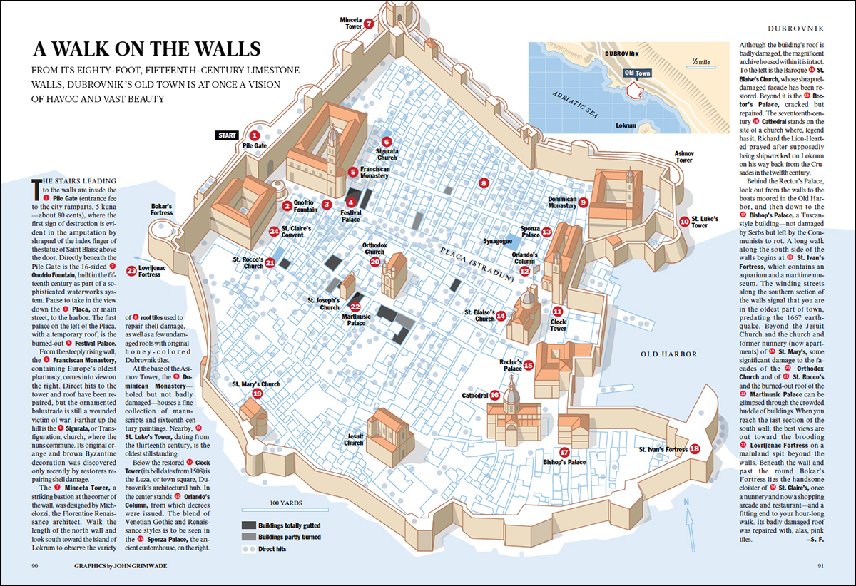
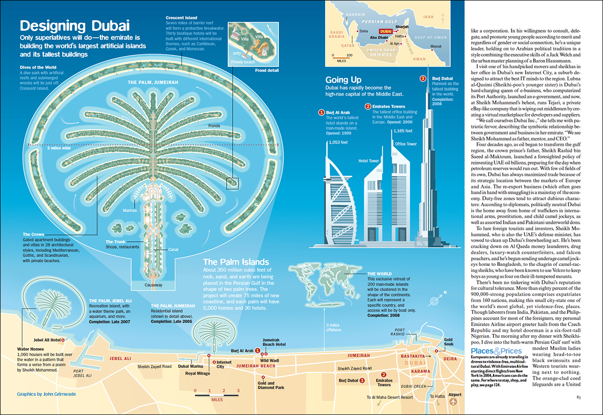
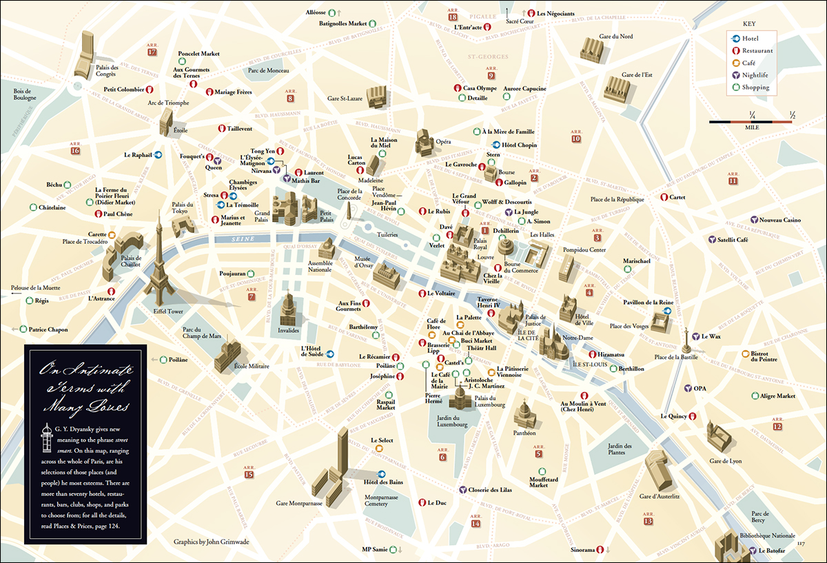
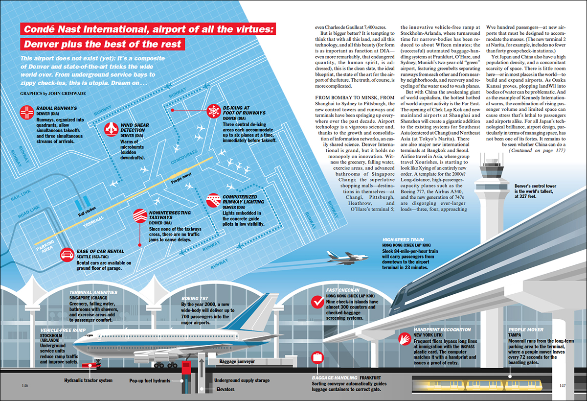
So here are some examples from that period, mostly from the 1990s and early 2000s. Although these graphics are the rear-view mirror now, I have a soft spot for them.
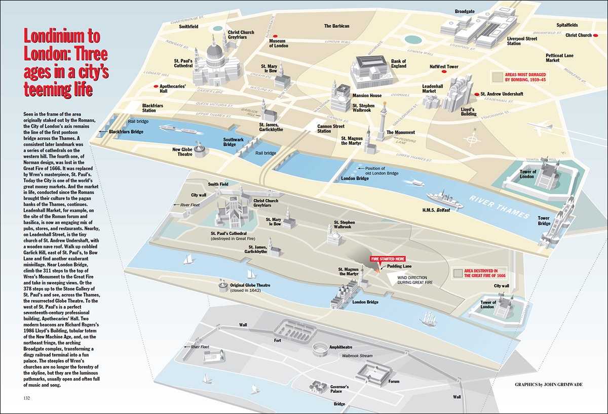
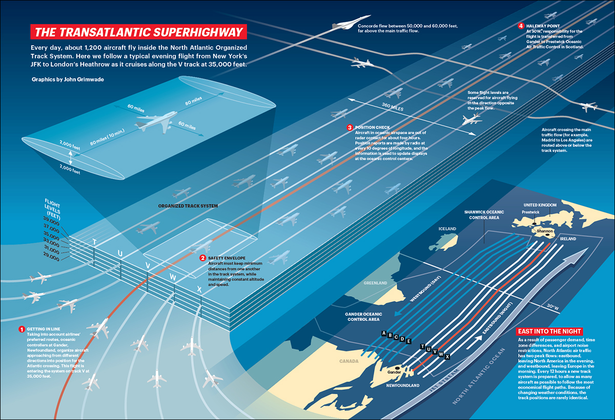
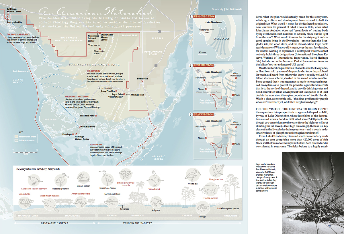
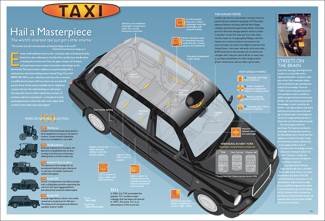
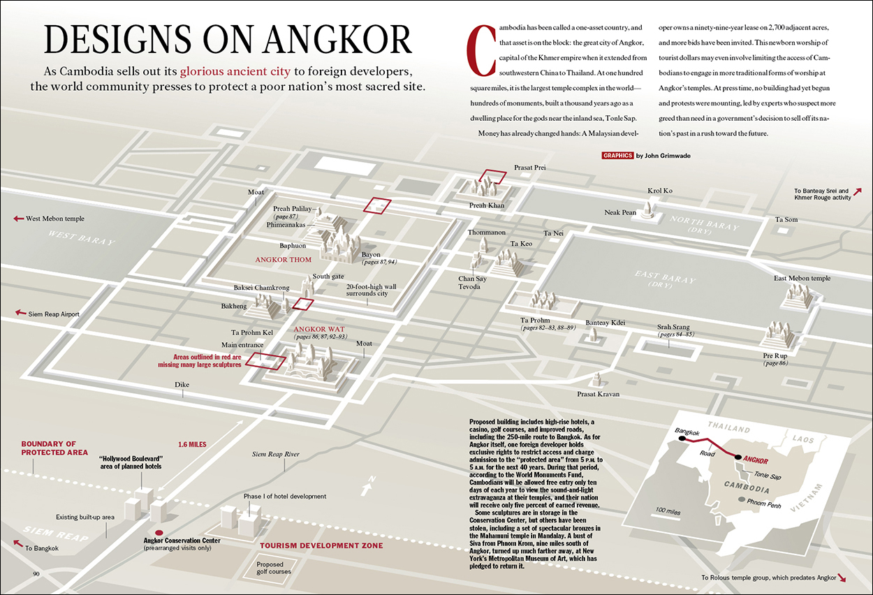
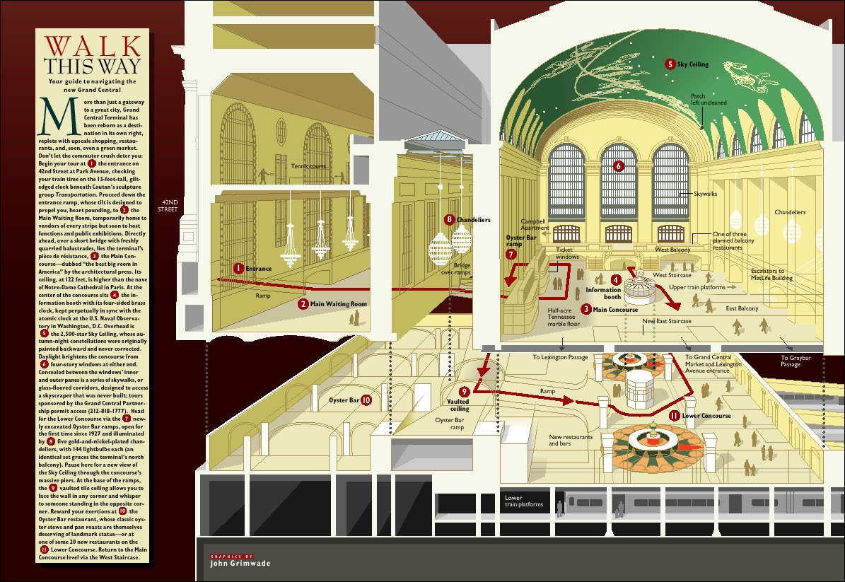
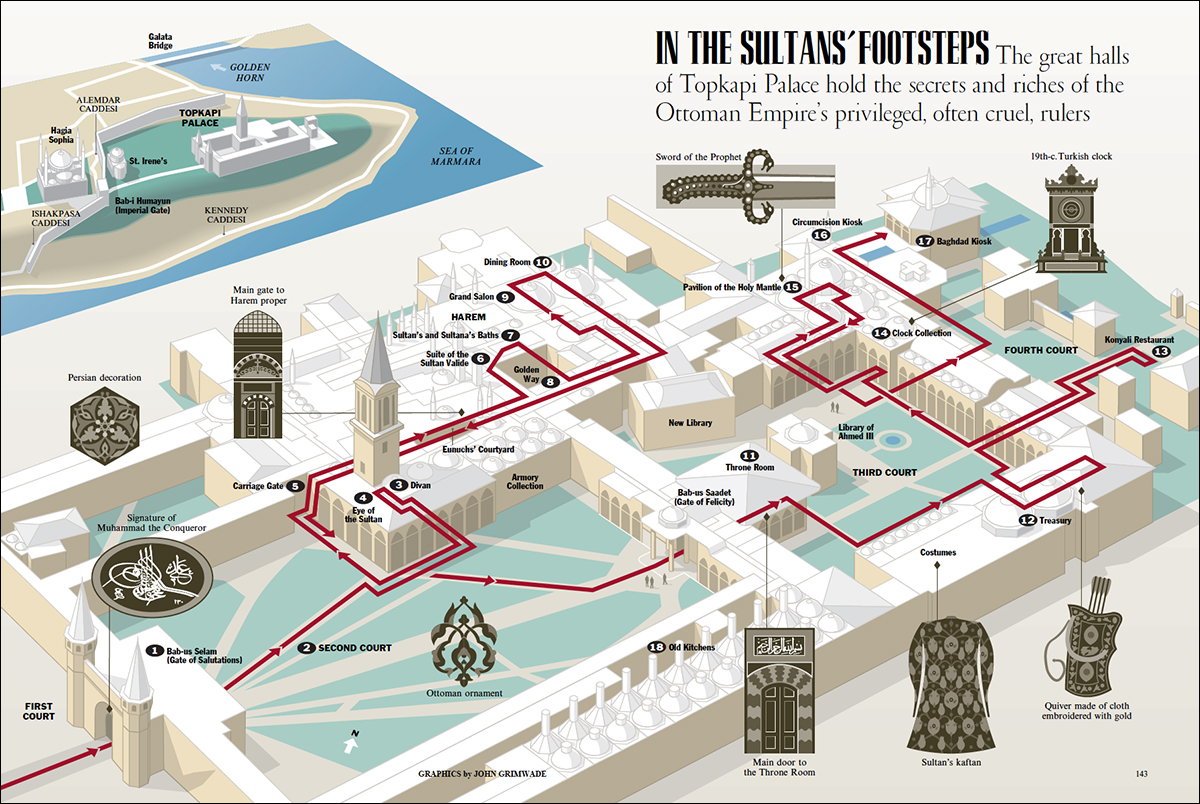
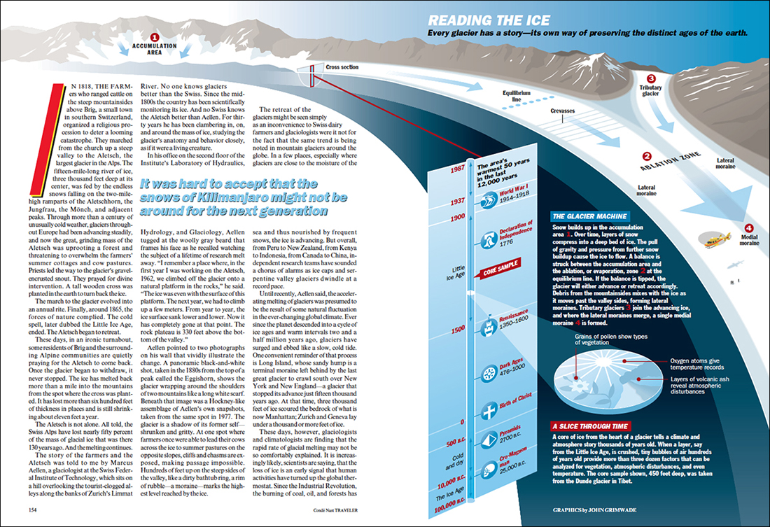
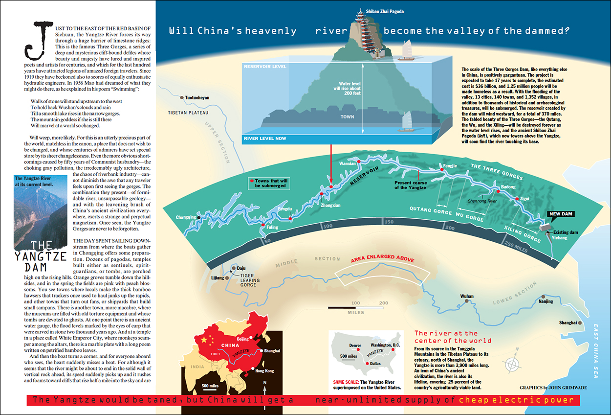
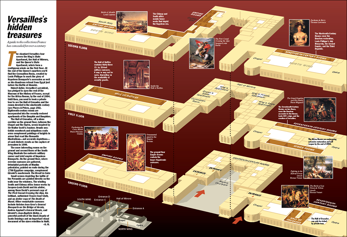
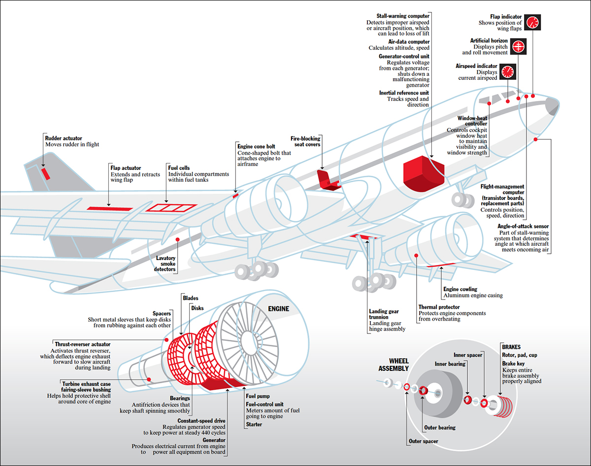
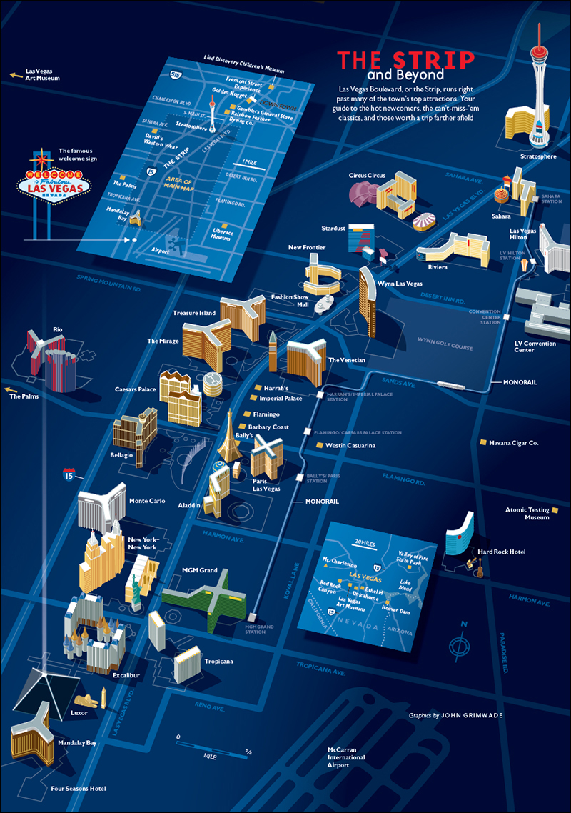
And sometimes I imagined Grimwadia as a small nation full of infographic-minded citizens. I was the king, looking something like this. Riding my faithful horse, Adobe.
Or the emperor, on my imperial throne.
