THE 1953 WORLD GEO-GRAPHIC ATLAS.
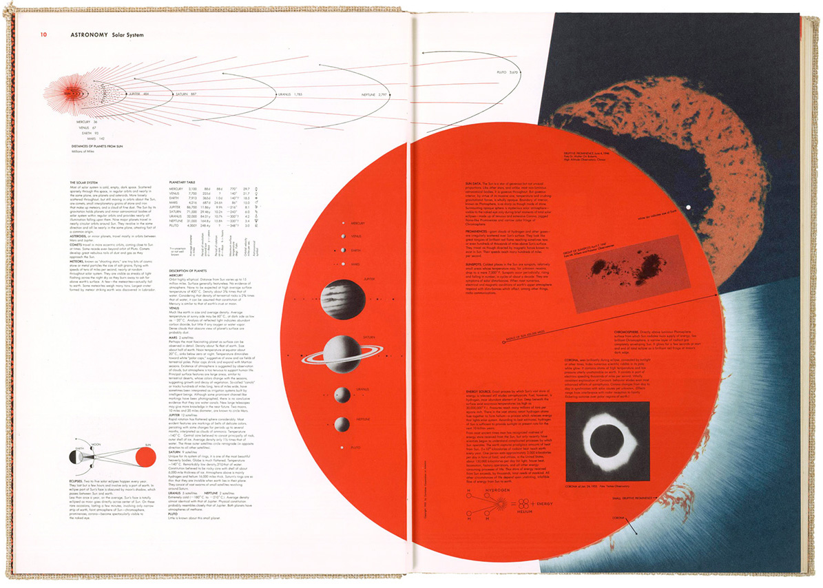
This informational gem took five years to produce and contains a few thousand infographic items. I don’t own a copy, but Michael Stoll, who I mentioned in an earlier post (https://www.johngrimwade.com/blog/2016/10/06/atlas-heaven/ ), has one (naturally) in his superb collection of historical information design. I was in Augsburg two weeks ago, and was able to examine the real thing, instead of looking at digital images. Seeing design in it’s original format, as opposed to looking at different sizes and variable image quality online (or in this blog, for that matter) is a vastly different experience. Often difficult to achieve, but worth the effort.
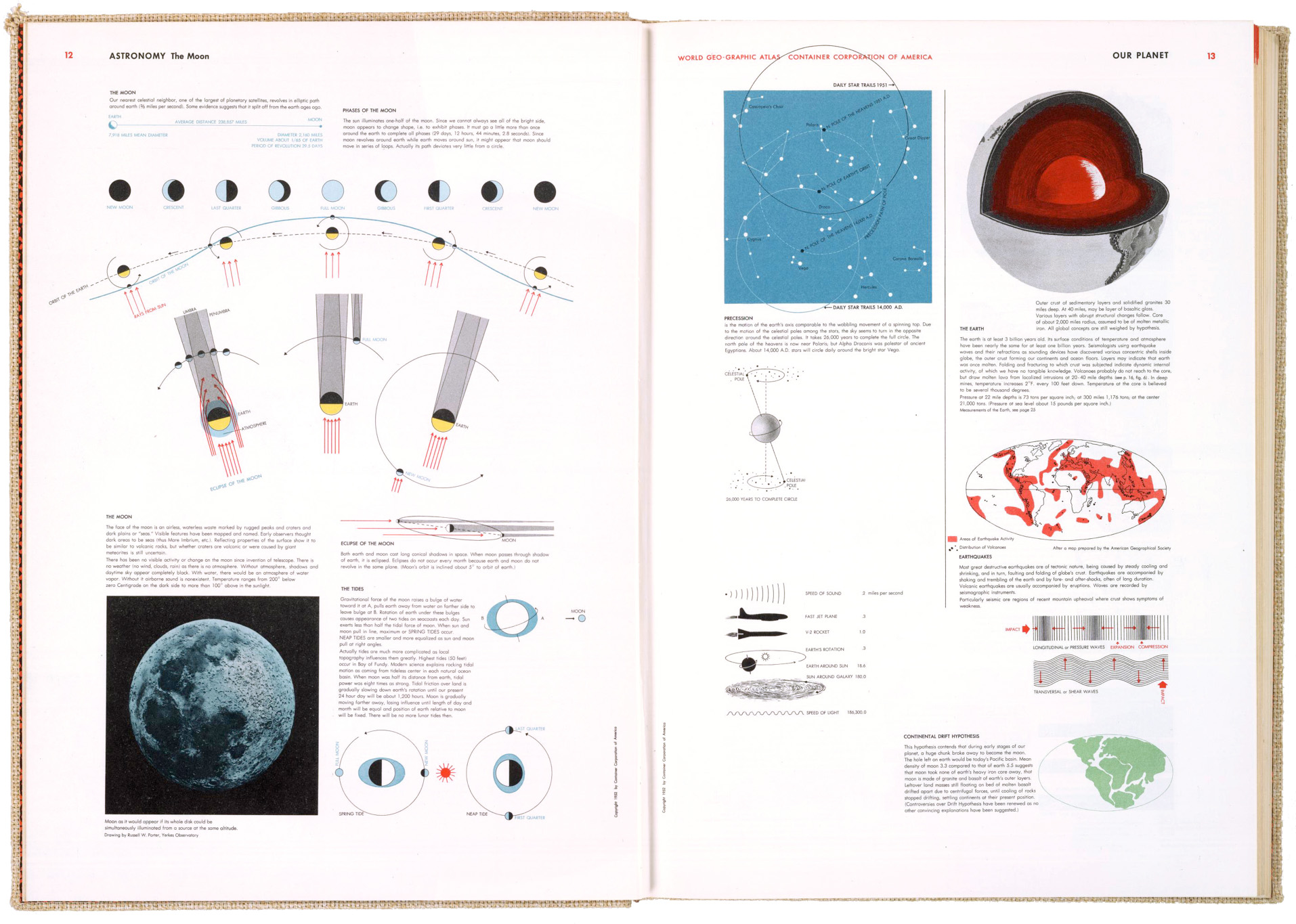
The atlas was produced for the Container Corporation of America to commemorate their twenty-fifth anniversary. 30,000 copies were printed. They were distributed to customers as a gift, and given to numerous colleges and universities. It was never produced commercially, or reprinted, so original atlases in good condition are quite rare, and thus expensive to acquire.
A team of three designers worked under Bayer to develop a graphic language for the book, using the color system that had been developed for CCA by Egbert Jacobsen. Bayer did his own research, traveling widely to assemble the information. There are many design influences to be seen in the pages, like the Isotype system of pictograms. I’m struck by how it looks so modern, sixty-three years after publication. It shows the staying power of precise, clear information design.
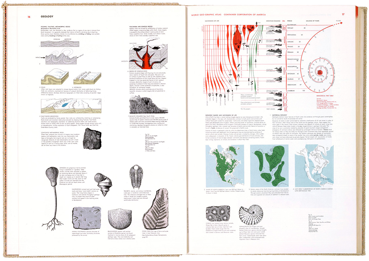
Herbert Bayer was a Renaissance Man. A graphic designer, typographer, photographer, artist, interior designer and architect who studied and taught at the legendary Bauhaus school. He emigrated to the U.S. before the Second World War, and produced all kinds of impressive design across many fields.
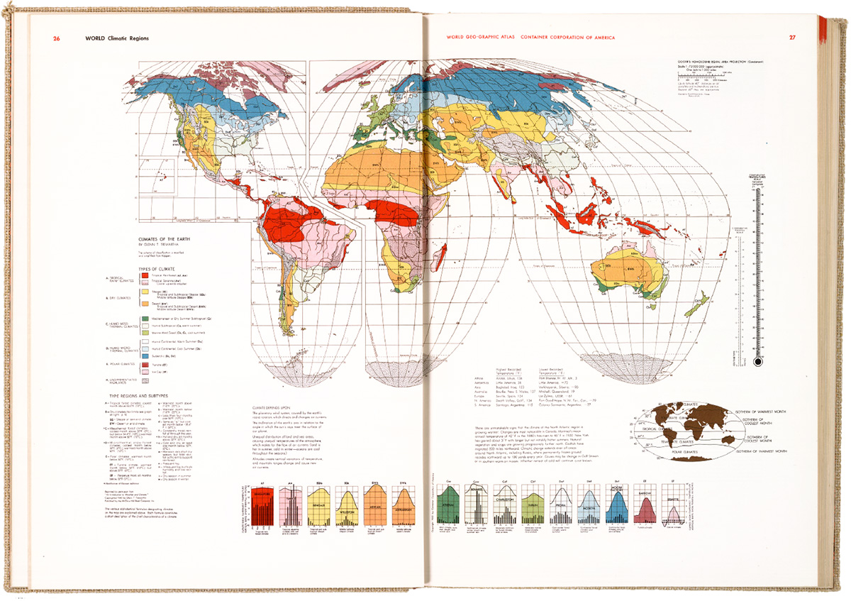
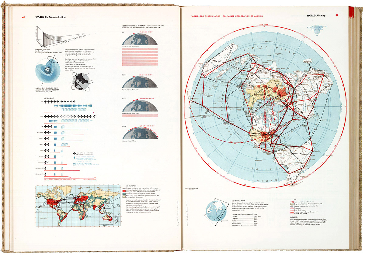
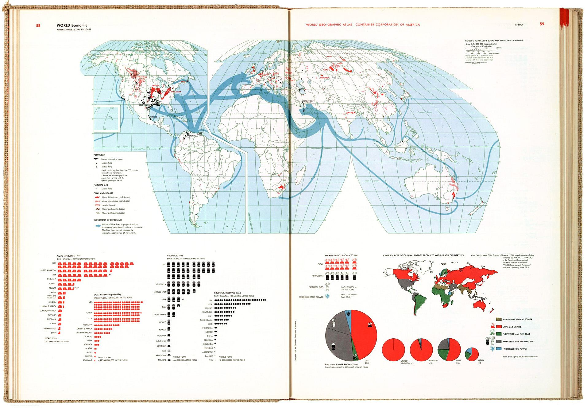
These images are from the David Rumsey Map Collection. See the full atlas in high-res there: goo.gl/gpd8nV
