THE CIRCULAR DATA VISUALIZATION CRISIS.
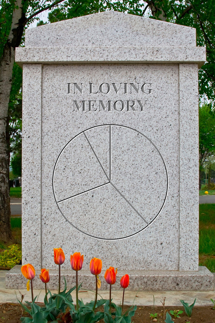
(Photograph © vician/123rf)
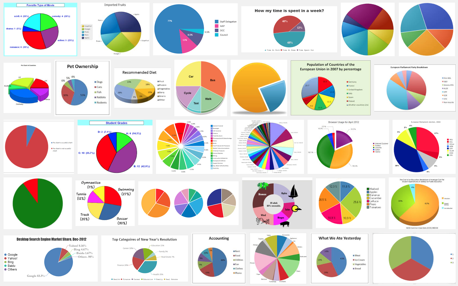
This classic charting method has taken a lot of criticism in recent years (especially from academics), perhaps because of the endless use of badly-conceived pie charts in painfully-awful business presentations. Extreme perspective, garish colors, drop shadows, multiple slices. There are millions of examples online. Below is a Google search for “pie chart”.
But when William Playfair invented the form in 1801, it was a great idea. “Honey, I’ve just invented the pie chart,” he shouted from his wood-paneled office. “That’s nice dear,” she replied, unaware of the trend that he had just started. Company reports would never be the same again. Seriously, dividing up a number into it’s component parts might be represented extremely well by the idea of cutting up a pie. And like most things, it’s not the form itself, but the misuse of that form that brings problems.
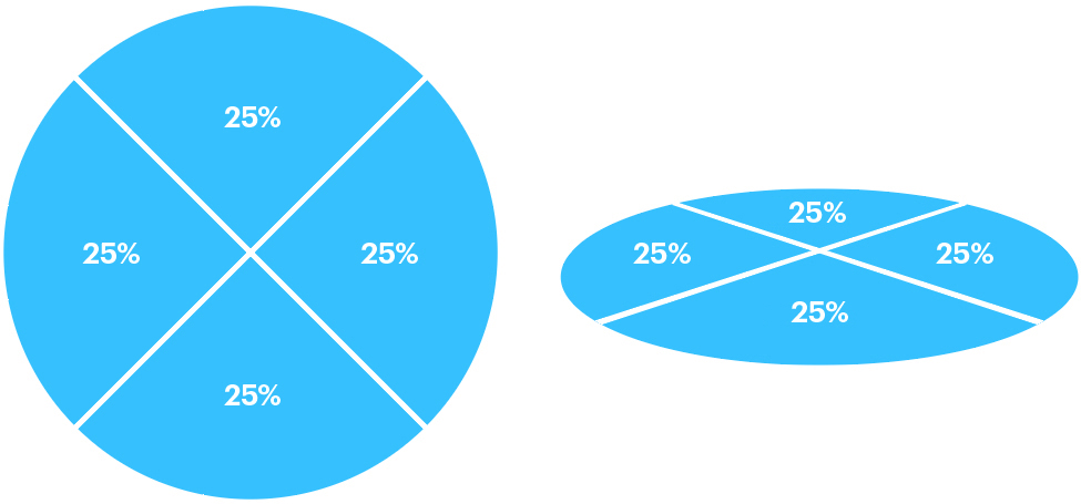
Pie charts in perspective are often very misleading as this simple graphic demonstrates.
Sometimes you will see charts were the segments add up to more than 100%. This is wrong. It’s not a good idea to have large number of slices, because meaningful comparison (and clarity) starts to disappear. Some people say that five or six should be the maximum.
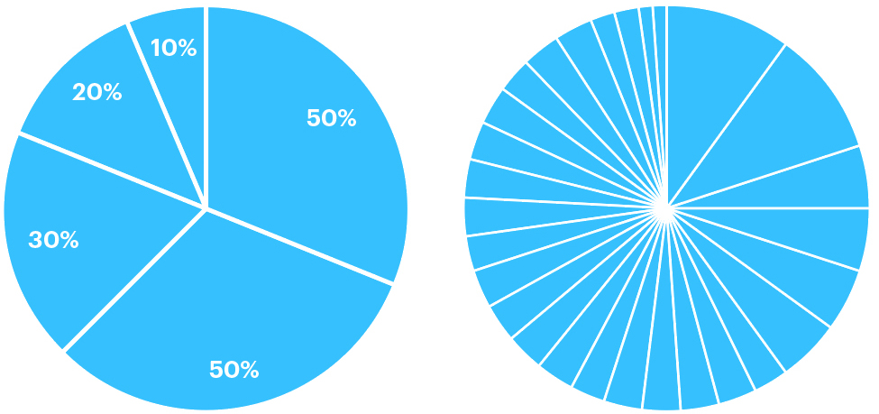
As a general piece of advice, consider carefully if the data might be better shown as bars. Fine differences are much easier to see in that form. We’re not that good at comparing different areas that start at different points. Which brings me to the proportional circle. Not a good way to compare small differences either. It is widely used in infographics, and sometimes there are even multiple proportional pie charts in a project, but it can be really hard to get a grasp on the data.
Below is a clever project by Arthur Buxton. The paintings of Van Gogh. The five most prominent colors in each painting are shown as percentages. See more of his work here: http://www.arthurbuxton.com
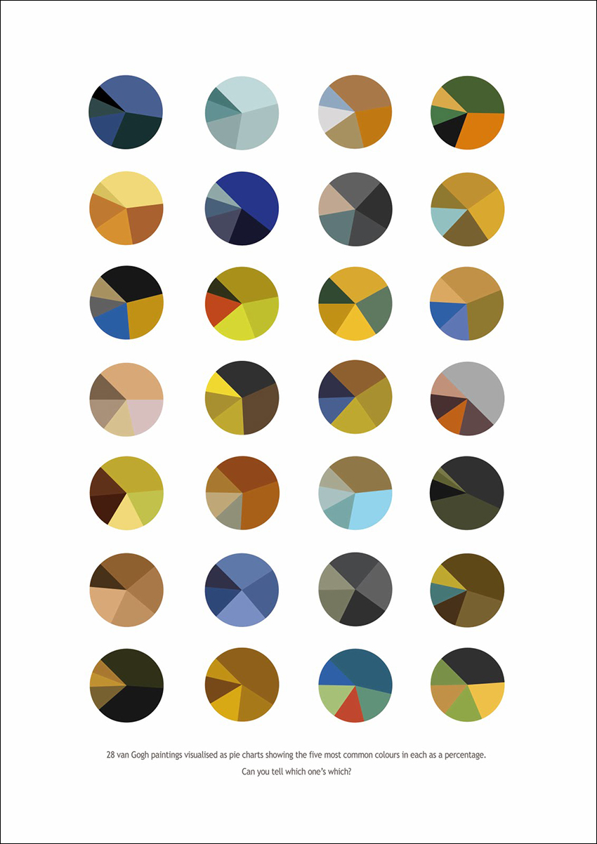
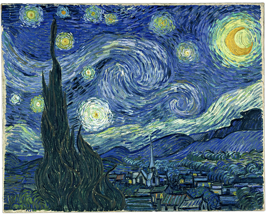
I don’t want to spoil the quiz, but the top left one is Starry Night.
There are many pie chart jokes bouncing around on social media, but this is the best one, in my opinion.
