INFOGRAPHICS USED TO MADE OF ZINC.

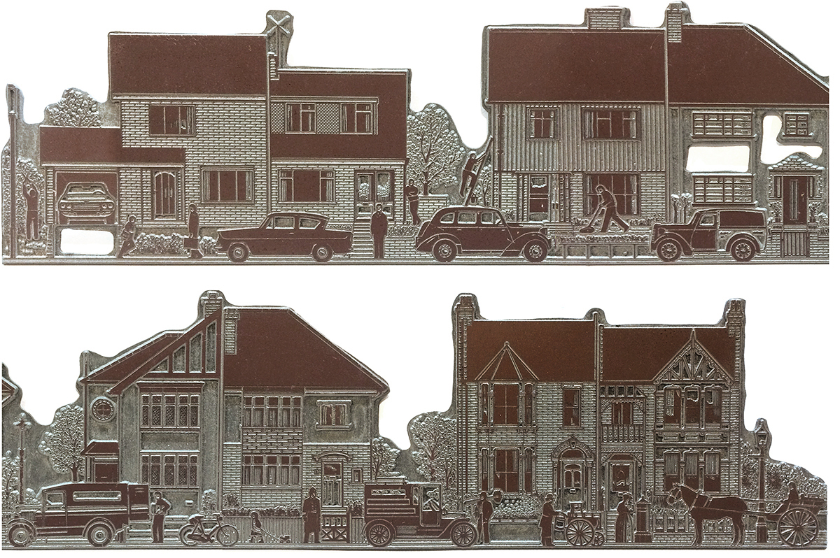
Unfortunately, I don’t have the (hand-drawn) original artwork of this graphic any more. Just the metal plate. It’s a relic of a pre-computer time, although this reproduction method is still used in traditional letterpress printing today. The plate is shown larger below to give a better idea of the details. The feature that contained this illustration was about the history of British residential architecture, and I tried to capture the different eras. From right to left in this reversed image.
THE PROCESS Artwork was drawn larger than the final size (150% or 200%). Then it was photographed with a line art camera, and that image was photo-etched out of a sheet of zinc to make the printing plate. The white areas were further removed using a router (the holes in the plate here), to make sure they would not be liable to pick up any ink during printing. In some of the indentations, you can see ink from proofs that were made directly from the plate before it became part of the page, and again after the page had been completely assembled.

HOT METAL That was the term for newspaper composition at that time. The type for the page was set on Monotype or Linotype typesetting machines, which were like giant typewriters with pots of melted lead feeding into moulds. The resulting metal type was locked together with the photographs and illustrations (mounted on blocks) in a metal frame called a chase. From that complete page, a flong (a papier-mâché mould) was made, and this was used to cast the curved printing plates that would fit onto the rollers of the huge rumbling presses down in the newspaper’s basement.


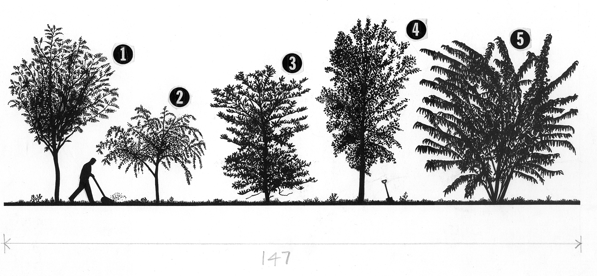
The artwork above was shown in an earlier post (https://www.johngrimwade.com/blog/2016/10/31/old-school/). As you can see, it was to be printed 147 mm wide, the dimension penciled below the art, and was drawn at 150% of the final size. It was much easier to work with pen and ink at a larger size, of course. But then again, as I said in that earlier post, “Trees are easy”.
