COMMUNICATING WITH SYMBOLS.
 This is a guest post (in three parts) by a master of pictograms, the great Nigel Holmes. Parts 2 and 3 will appear on the next two Mondays.
Linguists, designers, social scientists, teachers, and a 12th-century nun, among hundreds (yes, hundreds!) of others, have invented what they hoped would be internationally-understood languages. None have lasted. Esperanto (by Ludwik Zamenhof, 1887) came closest; Klingon (by Marc Okrand, 1984) survives as a pop curiosity for devoted Star Trek followers.
Very few of the invented languages were pictorial, and those that were have not fared any better than their purely alphabetic cousins.
These posts are not about a history of writing that starts with 30,000 year-old cave paintings then runs through Sumerian sign-writing, Egyptian hieroglyphs, Mayan calendar icons and so on, but are about how we might return to using pictographs, pictograms, pictorial symbols, icons —to mention a few of the many names for these tiny pictures—to communicate with people from countries who don’t know what you are saying when you speak or write in your native Dutch or Swahili or English (or Esperanto).
For a picture language to be universal, thousands of pictures are needed. An argument against inventing such a language (a two-way communication) is that while it might be fine for someone equipped with those thousands of pictures to “write” in that language, the average person cannot “write” it. It’s a one-way, read-only communication.
There are tons of pictures to be drawn (or somehow produced) by the “writer” of a visual language, but can we be sure that those pictures mean the same thing all over the world? A house is easy to draw. Or the sun. Or a woman with her child.
How do you picture hope, or sin, or longing, or fertility treatments, or financial backing, so that anyone, anywhere can see the precise meaning?
I’ve drawn lots of pictorial symbols, and I relish the quirks of regular spoken and written language. Against what look like difficult odds, I have often thought of trying to create my own version of a way to communicate visually. My inspirations are three picture languages that have come closest to any success in the past: Charles Bliss’s Semantography (1949; Bliss later changed the name to Blissymbolics); Yukio Ota’s LoCoS (Lovers’ Communication System, 1964); and Otto Neurath’s Isotype (developed in the 1920s). Actually, Neurath never claimed that he was inventing a total language. When he spoke about Isotype, the graphic system that he created with Marie Reidemeister (later she was his wife), and Gerd Arntz, his leading graphic designer, Neurath called it a “helping language” rather than a complete substitute for the written word. Neurath and Isotype will be the subject of the second post.

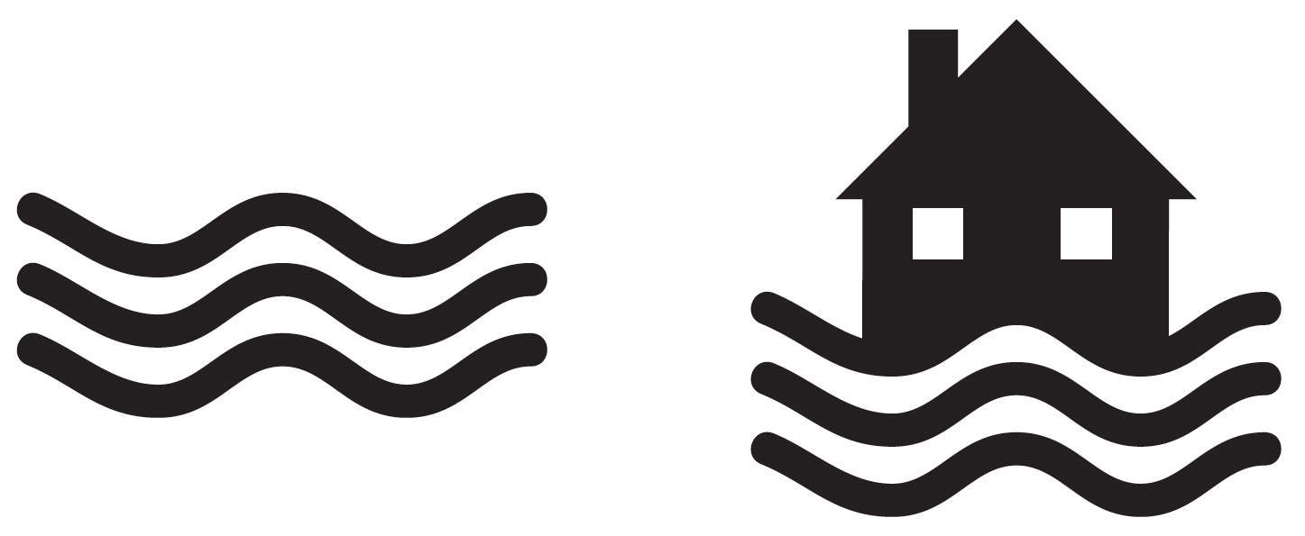
Some of the Blissymbolics and LoCoS images are understandable pictures (house, fish, car, man, woman) but many others are a vocabulary of abstract marks that the inventors have assigned meaning to, such as a wavy line (horizontal = water; vertical = smoke), that can be combined with pictorial symbols to make “words” (house + horizontal wavy lines = flooded house; although it could also be houseboat).
But what if a pictogram of a wavy line is positioned horizontally next to a factory chimney, indicating smoke? Now a horizontal wavy line means smoke, not water. Another inventor might use a teardrop shape to mean “water.” Besides, in certain contexts, Bliss used a vertical wavy line to mean fire. Weather maps today use three wavy horizontal lines to mean fog.

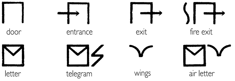
When it comes to completely abstract marks—those which don’t look like anything we know—there’s a bigger river of meaning to cross. We have to learn what the inventor intends these marks to mean, in the context they are used. Many of them act like accents common to written languages. They also address the question of grammar in language. (For instance, a mark might let readers know whether a pictorial icon is a noun or a verb.) But the use of such modifying marks means that pictorial languages that include them aren’t truly visual. If you can’t read a text until you have learned how to read the marks, it’s just another language to learn, not one you can “read” by looking at the pictures. And that’s the point of an international picture language. It’s easy to read. By anyone.

In fact, are there any marks that are truly universal? You’d have thought that some, such as up- and down-arrows are. They mean up and down, right? But do we all agree on what that means? For Bliss, a picture of a heart with an up-arrow meant happy. A heart with a down-arrow meant sad. So he was using “up” and “down” as figures of speech. But in American Indian picture-writing the arrow looked like an archer’s arrow with feathers at one end and a sharp point at the other, and it meant “protection.” We can’t even assume that a simple thing like an arrow means the same thing to everyone.
So before finishing the design of any pictogram, designers should ask themselves and others—non-designers, if possible—this question: what else could this pictogram mean that I haven’t thought of? And if the image is part of a proposed universal language, designers must ask that question all over the world before claiming it has universal meaning.
In 1961, IBM introduced The Selectric typewriter with its revolutionary, interchangeable “golf ball” printing element, that replaced a normal typewriter’s basket of spidery arms with characters on the end of them that sprang up to hit the page. If you typed too quickly, the arms got tangled up. Initially there were 64 characters on the golf ball; later, the ball had 96 characters. Before the age of the computer, Bliss saw the possibility of a typewriter golf ball with his symbols on it.

Now his language could be typed —“written”— by anyone. Typewriter companies were already making machines with letters and numbers and also with a range of symbols for scientific communication. Mathematical, chemical, biological, astronomical and other symbols were available. Bliss’s golf balls were never made, but his idea that anyone could simply type his pictograms on paper was way ahead of its time. Of course, to come up with a set of pictograms that would fit on the ball was difficult. Bliss had to simplify everything pictorially, and the result looked somewhat like written words—a string of marks—except that they weren’t actual letters of the alphabet. He wrote long tracts about how to combine his pictogrammic marks to extend the range of possible “words.”
The icons in Yukio Ota’s elegant visual language, LoCoS, are designed in a way that could be written, with practice. But like Blissymbolics, LoCos combines simplified pictures with abstract marks that have to be learned.
 Any picture language excludes the blind—you can’t speak it or hear it—but perhaps we could consider a kind of braille version. Deaf people do have their own visual sign system, and there’s plenty of signage in airports, hospitals, zoos, at the Olympics, on the road—but that’s wayfinding, not a language. I hope we don’t give up on trying to design a whole universal pictorial language.
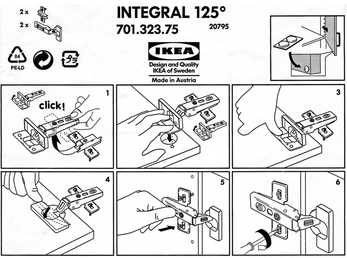
Ikea, the Swedish furniture store, hasn’t given up. They’ve attempted to make the instructions for their build-it-yourself items internationally understandable, eliminating multiple translations. However, it is good to know that for a modest sum, they will deliver the bits and pieces to your home and assemble them for you, thus preserving your sanity and fingers, and limiting the screaming of obscenities at the visual instructions. One day I may have the guts to show you my language. Then you can scream at me.

Worth reading: “In the Land of Invented Languages,” by Arika Okrent, 2009.
Next Monday: The Isotope revolution.

2 comments
Comments are closed.