COMMUNICATING WITH A PICTORIAL FONT.
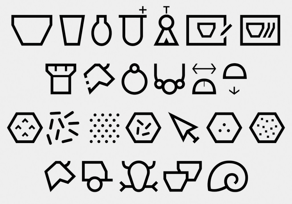
Fabienne Kilchör designed the font, Diglu, to help communicate archaeological information to a target audience. The project is supported by the Swiss National Science Foundation.
As a graduate student at Bern University, Fabienne began the development of the font as a research project for her Ph.D thesis. She approached the Archeology Department because she felt that data visualization is too often directed at scientific communication, and she wanted to contribute to humanities and cultural studies. Two other factors: Fabienne has a personal interest in archaeology, and archaeologists have plenty of data to work with.
After an initial discussion with a professor, she identified areas where information graphics could possibly make a difference. Then she started looking for new methods to visualize archaeological data.
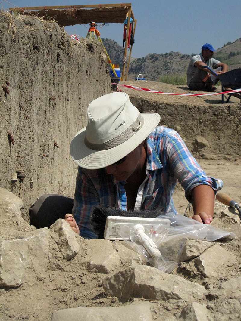
Starting the process The first stage was to interview archaeologists and to analyze numerous reports and publications, looking for places where difficulties in communication could be improved with a visual tool. There were two weeks of field research in Turkey, working with archaeologists. (Photograph by Susanne Ruthishauser)
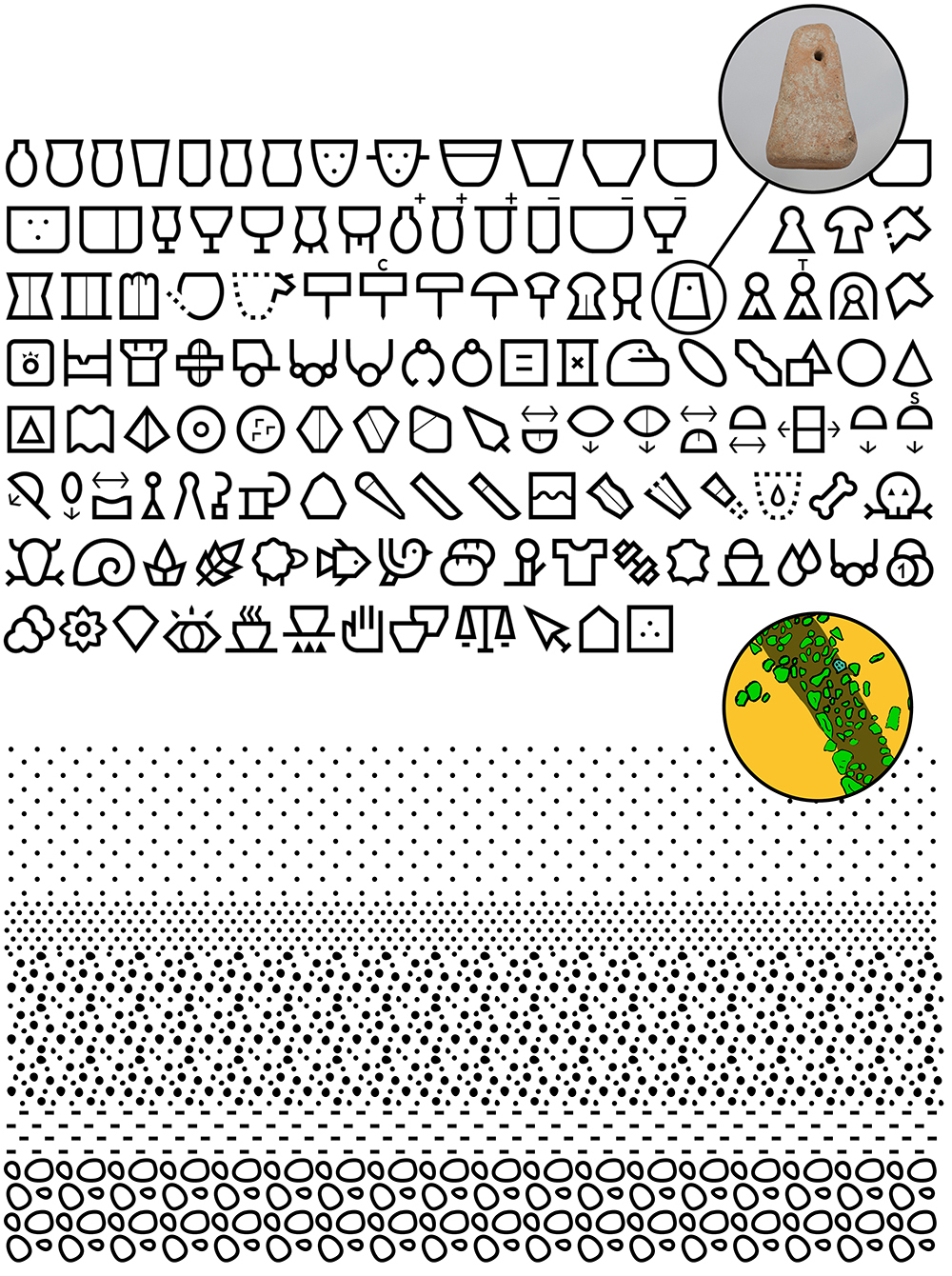
Back in Berne, Fabienne began making rough sketches from photographs and archeologists drawings, before moving to Illustrator to create the vector images. Using variable widths, she designed two or more different pictograms. After presenting the different variations to an archeologist (the end-user), one was chosen, and that design was refined further. An exhaustive criteria-grid helped to decide the ideal pictograms. Criteria like “recognition” or “degree of differentiation” were very important. The result of all this development was a pictorial font, Diglu, that could be used in reports, books, presentations, maps, charts and diagrams. It’s really a system of mini-infographics.
Reducing complexity, and creating a unified set of symbols, in terms of gray value and spacing, were key parts of the overall design.

Consistency across text characters and pictograms was a priority.


The font comes in a full range of weights.
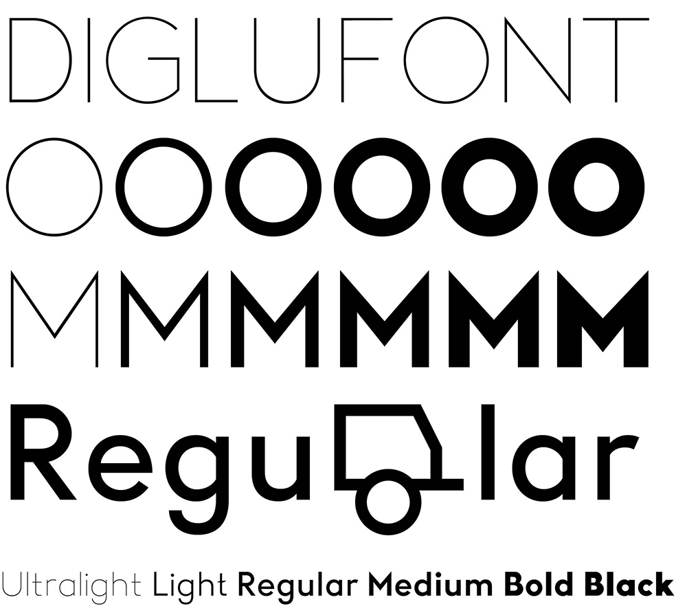
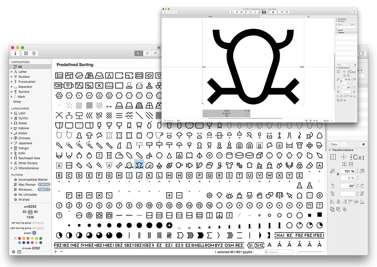
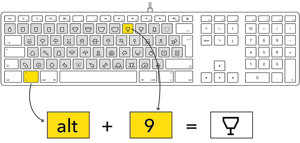
Key point Fabienne not only used the principles of font design, but also the principles of information design. The Diglu font is a hybrid of both those worlds.
Diglu is intended to be a uniform visual language. Typography meets information, design meets science.
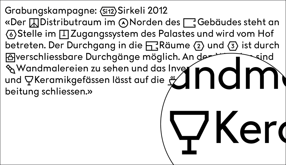
Use in text:
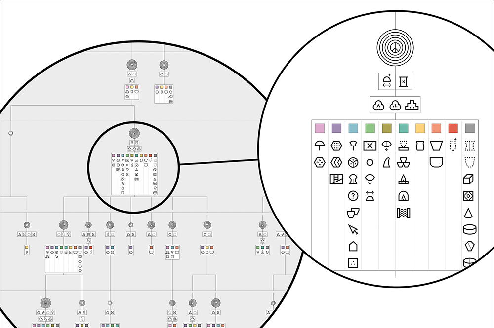
Use in diagrams:
The font will be available in June here: https://extraset.ch/
Work by Emphase, the studio that Fabienne runs with Sébastien Fasel in Lausanne, Switzerland, can be seen here: http://emphase.ch
