ELEANOR LUTZ TURNS ON THE LIGHT.
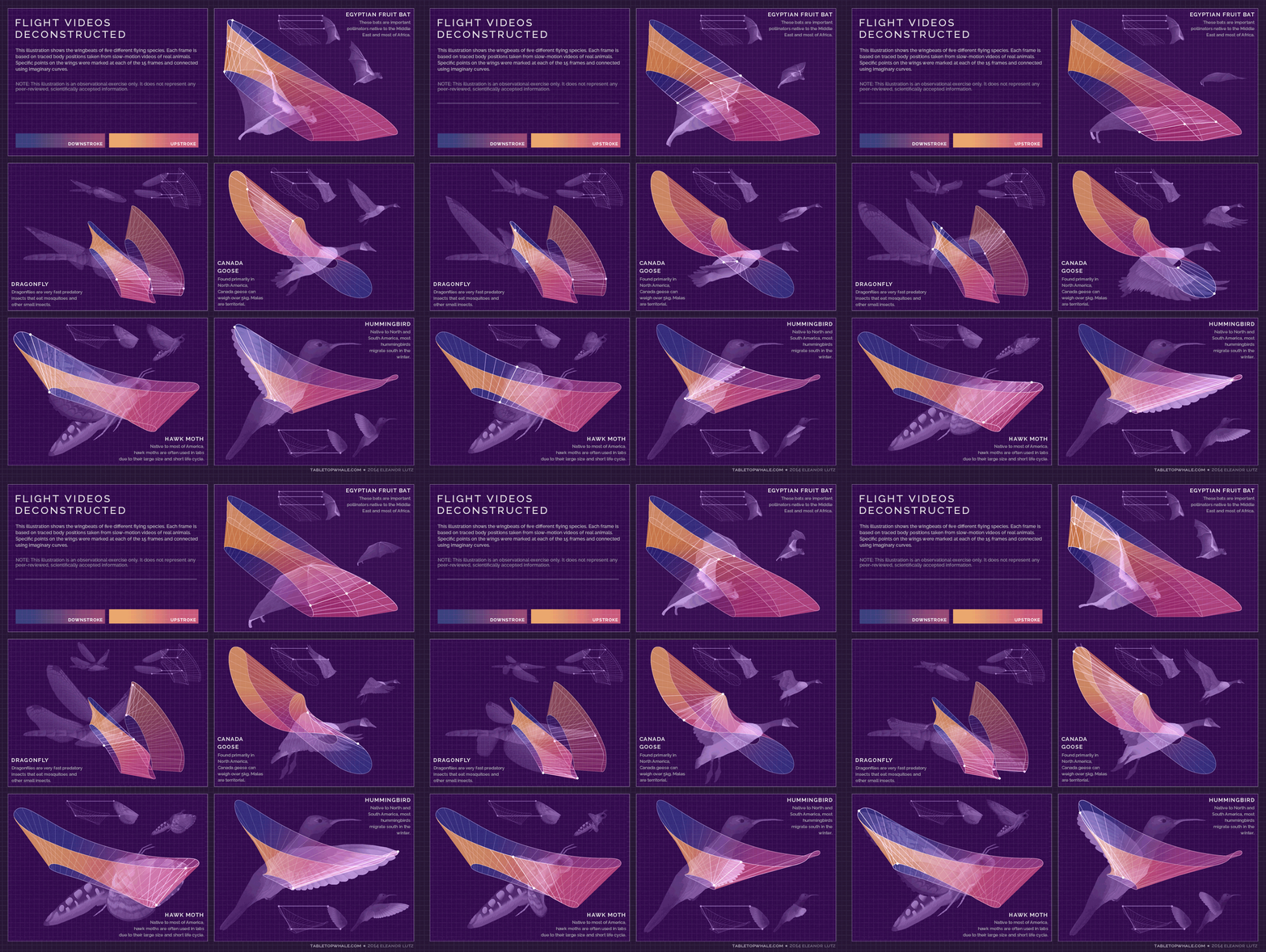
“For science infographics, I try to find a visual story that I can use to make the information more engaging. For example, I’ve used burning paper sculptures to talk about forest fires, or architectural drawings to talk about human spines. It’s important to make sure the visual wrapper doesn’t affect the information inside the infographic, but I think there’s a fairly wide range of styles that can fit that requirement.”
This is “Science for the People”. Superb visualizations that explain complex subjects clearly and concisely. See a lot more at Eleanor’s website: tabletopwhale.com
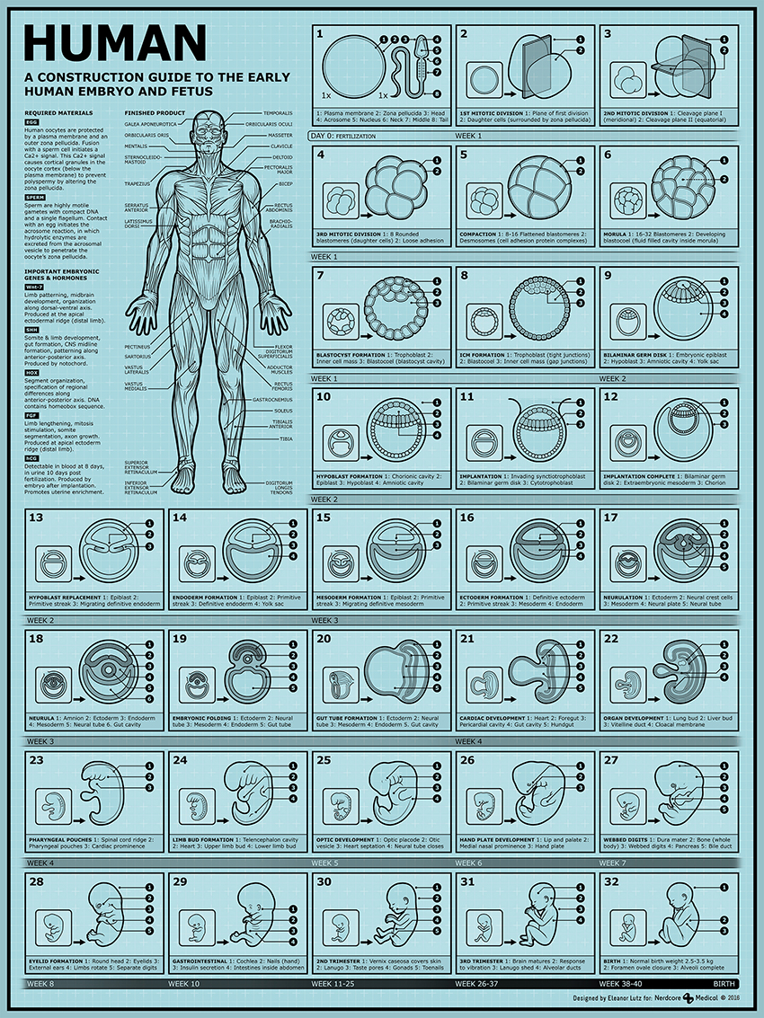
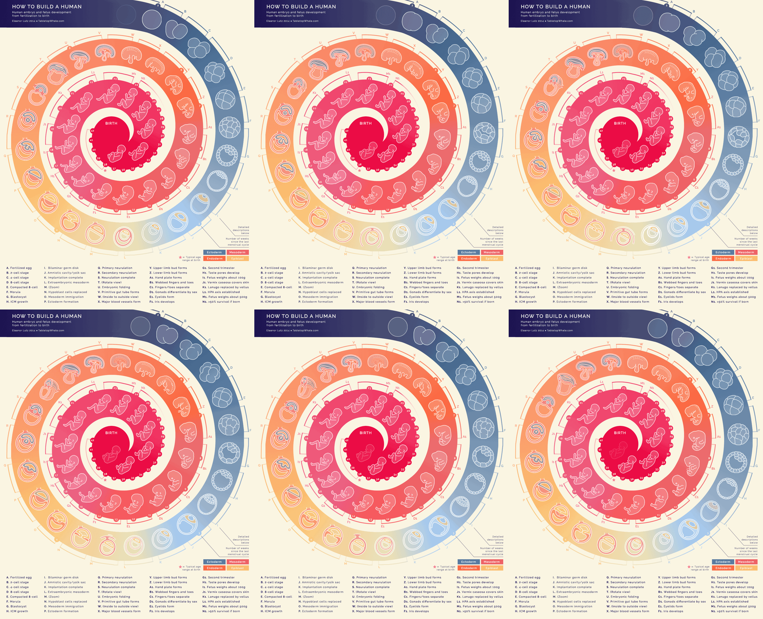
Below, embryo development in the style of a furniture assembly guide. (Click on the image for a higher resolution version.)
The mechanics of breathing.
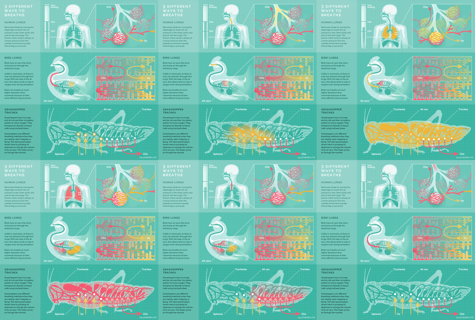
The motion here is not necessary for informational reasons but, in terms of engagement, it works superbly.
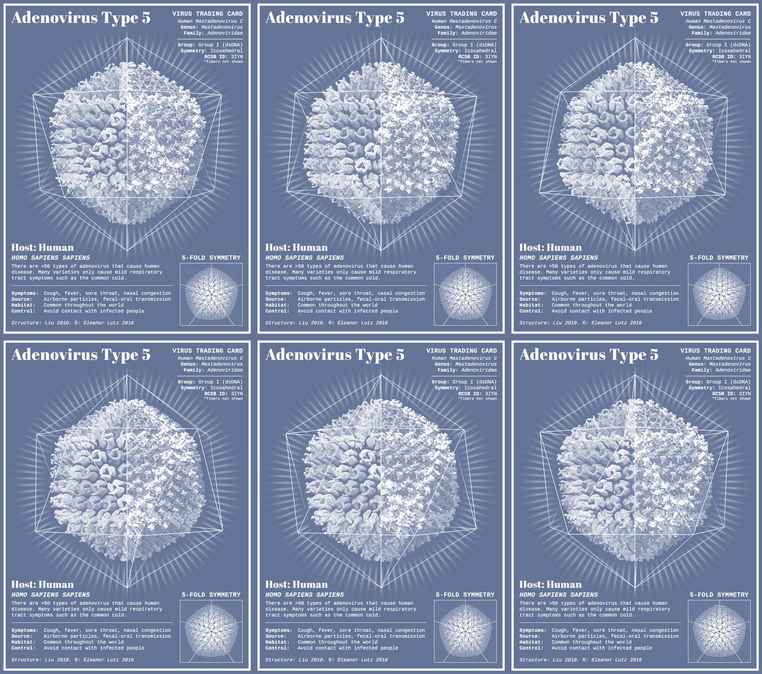
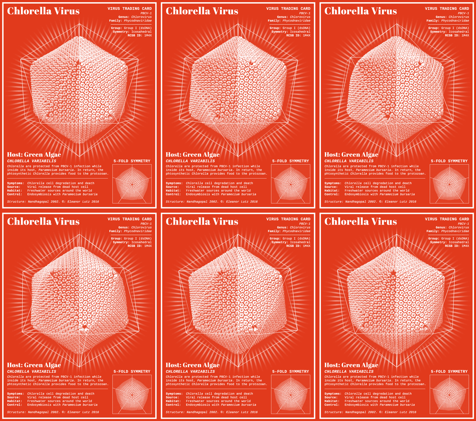
From a set of virus trading cards. Definitely not what we want to be exchanging.
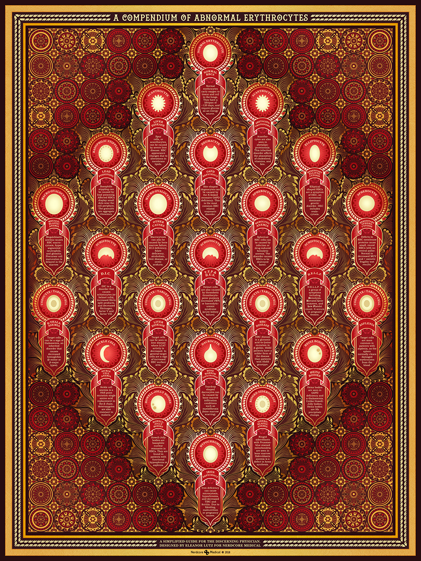
Red blood cell disorders. The decorative style is inspired by hand-woven rugs and Rococo stucco work. (Click on the image for a higher resolution version.)
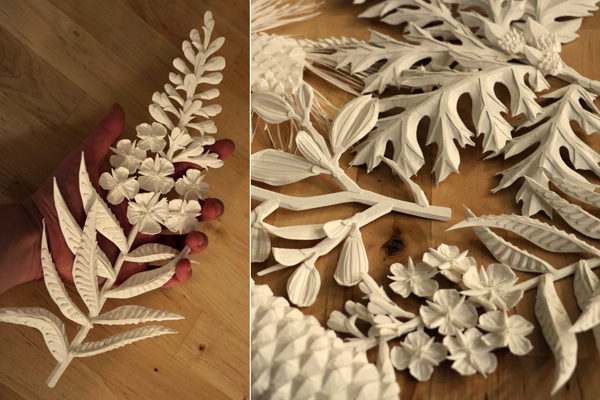
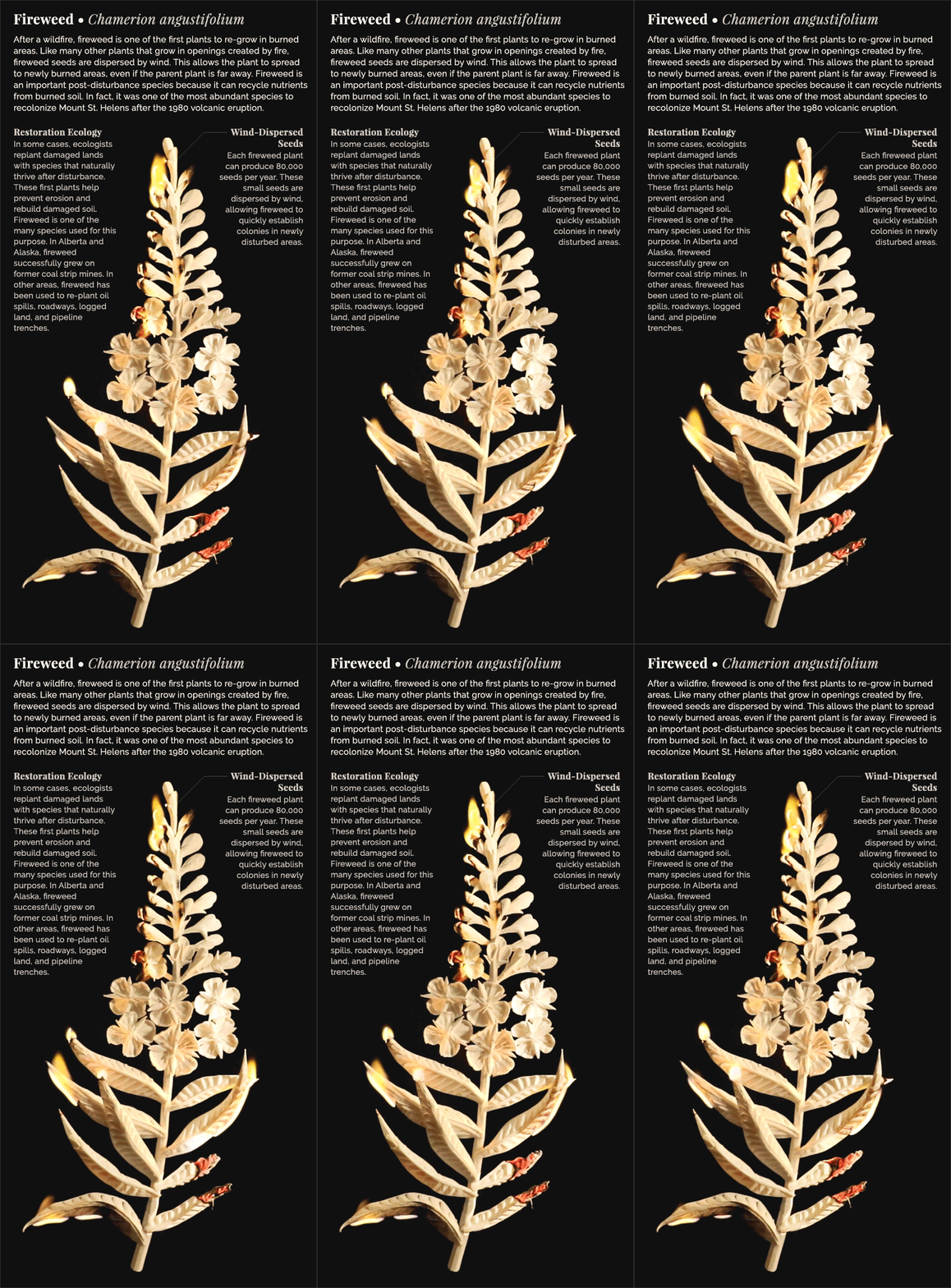
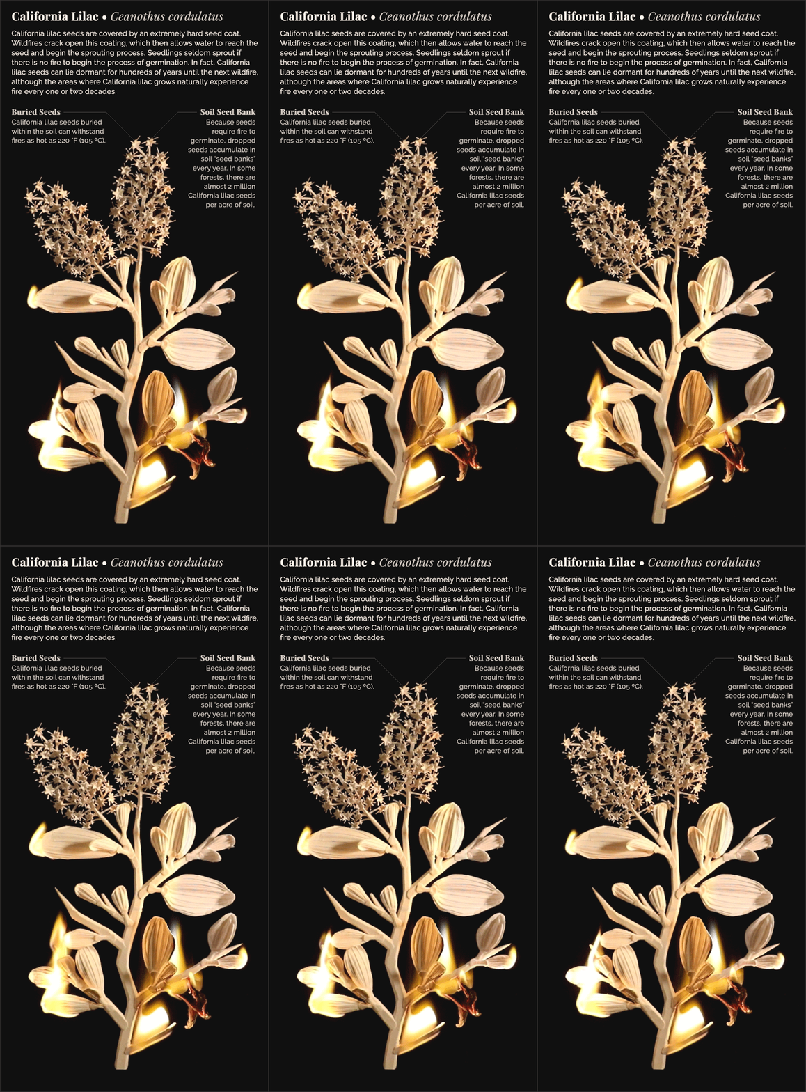
Eleanor made plants from paper for a set of six graphics about species that have adapted to fire-prone conditions. Two are shown here.
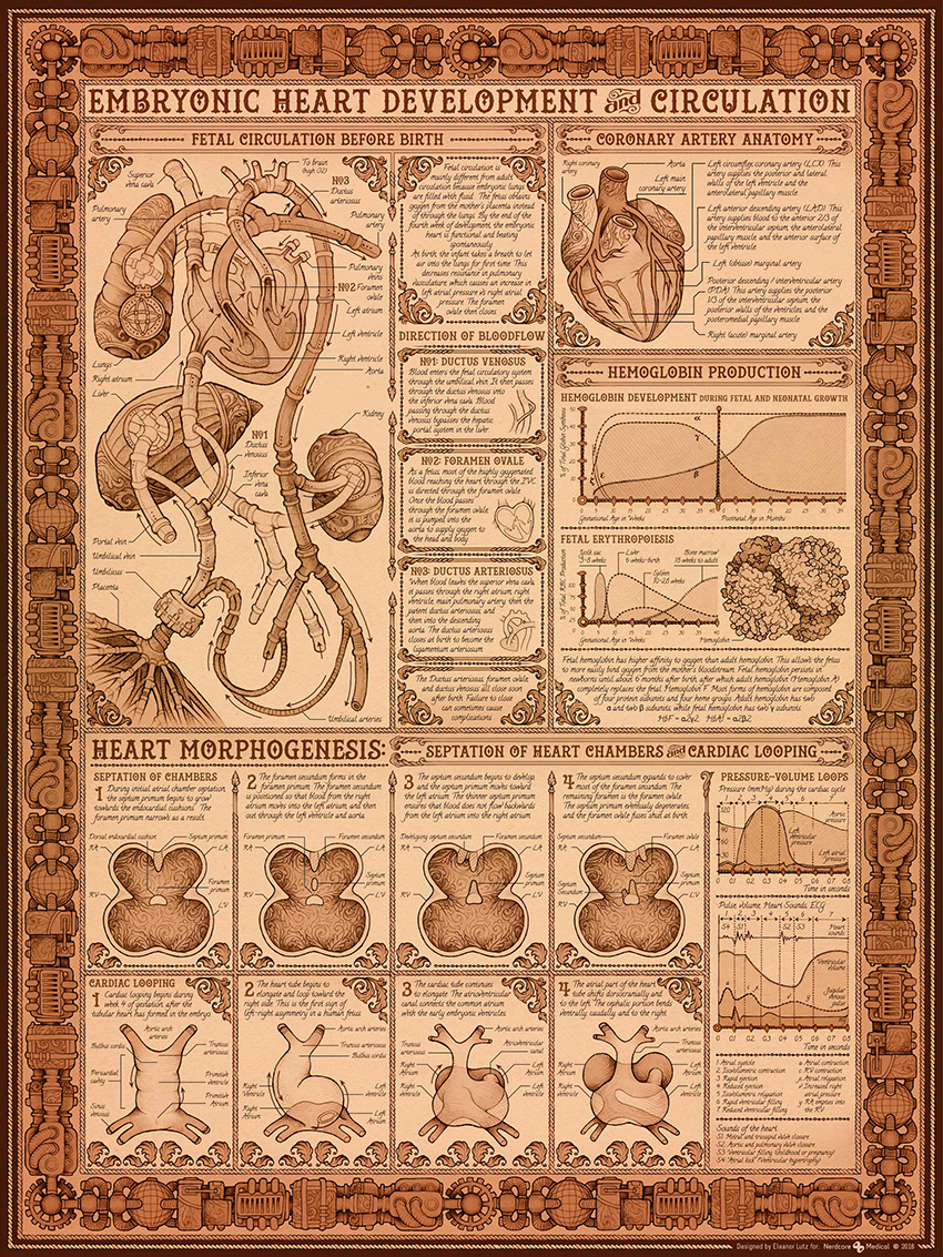
A Victorian steam-punk approach to baby heart development. (Click on the image for a higher resolution version.)
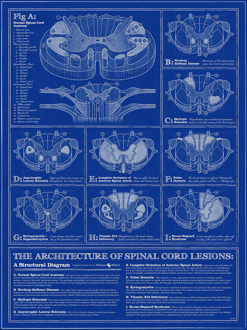
The spinal cord explained in an architectural style. (Click on the image for a higher resolution version.)
I’ve shown this graphic in two previous posts, but I’m showing it again. Just nine frames, and I love it!
Eleanor is studying for a PhD in Biology at the University of Washington.

