BEHIND-THE-SCENES OF A 3D ARCHITECTURAL INFOGRAPHIC.
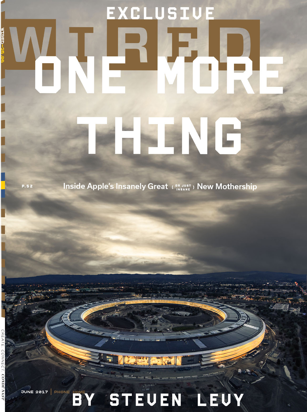
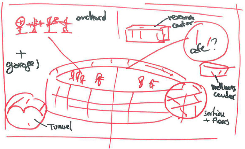
David Moretti and Anna Alexander, of Wired magazine, asked Bryan Christie Design to work on a diagram of Apple Park for the June issue. They sent a rough sketch showing their concept for the illustration, and some reference images.
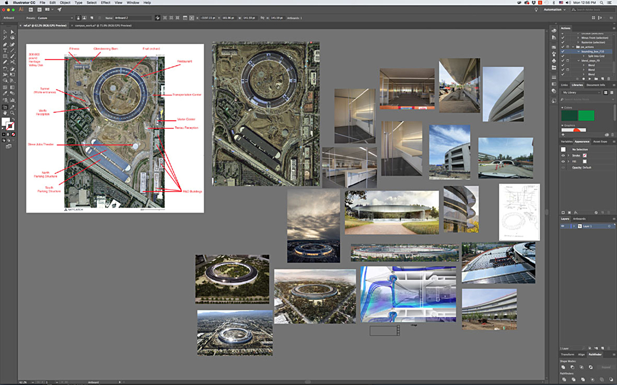
The first step was to draw a map of the campus.
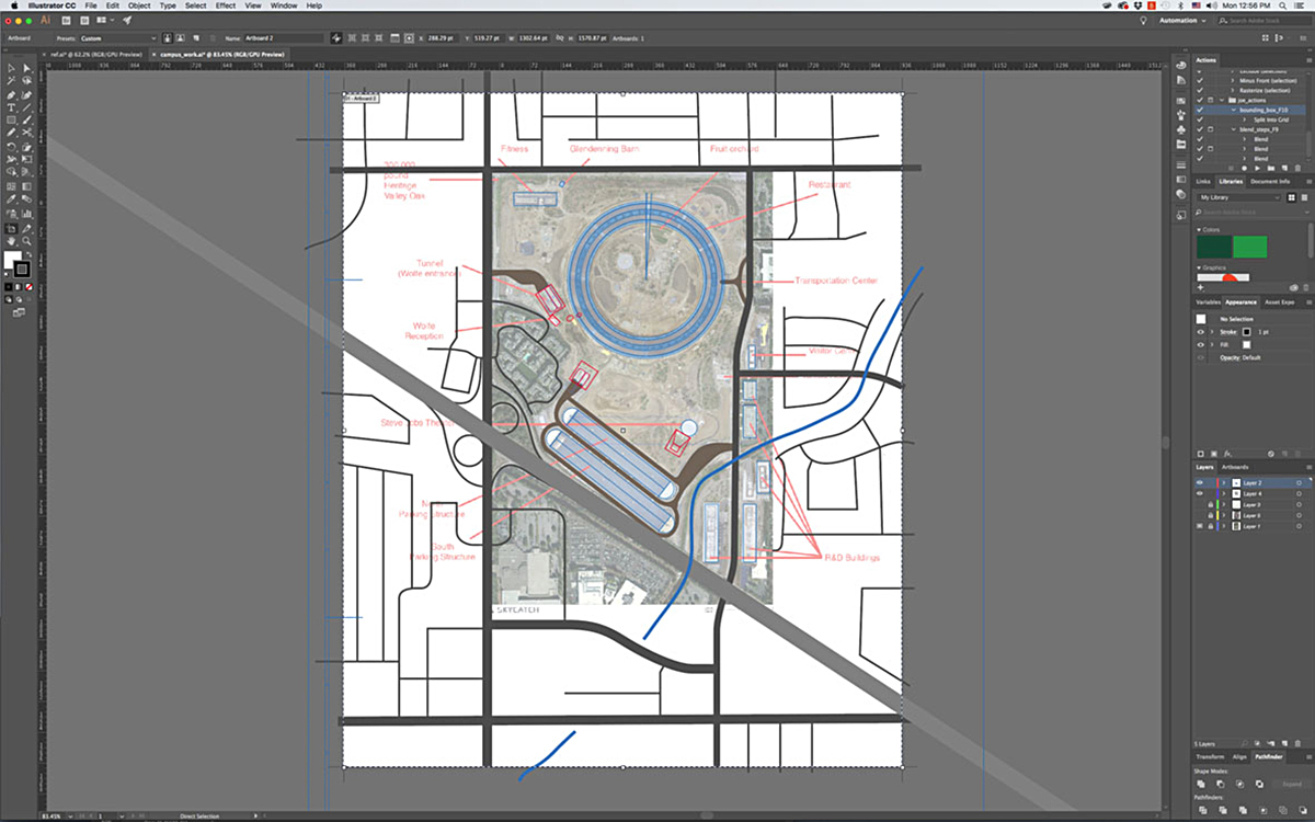
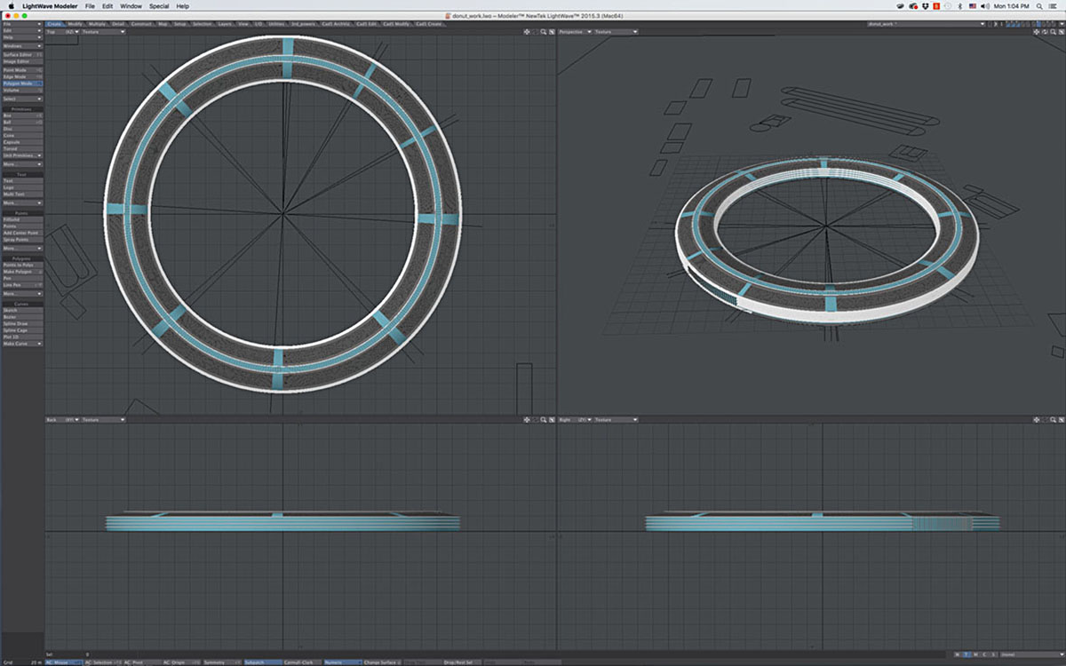
The map was imported into 3D software (Lightwave), and used as a guide to create the 3D objects. There are many ways to approach the 3D modeling process. In this case, 2D shapes created in Illustrator were extruded and rotated to make the buildings.
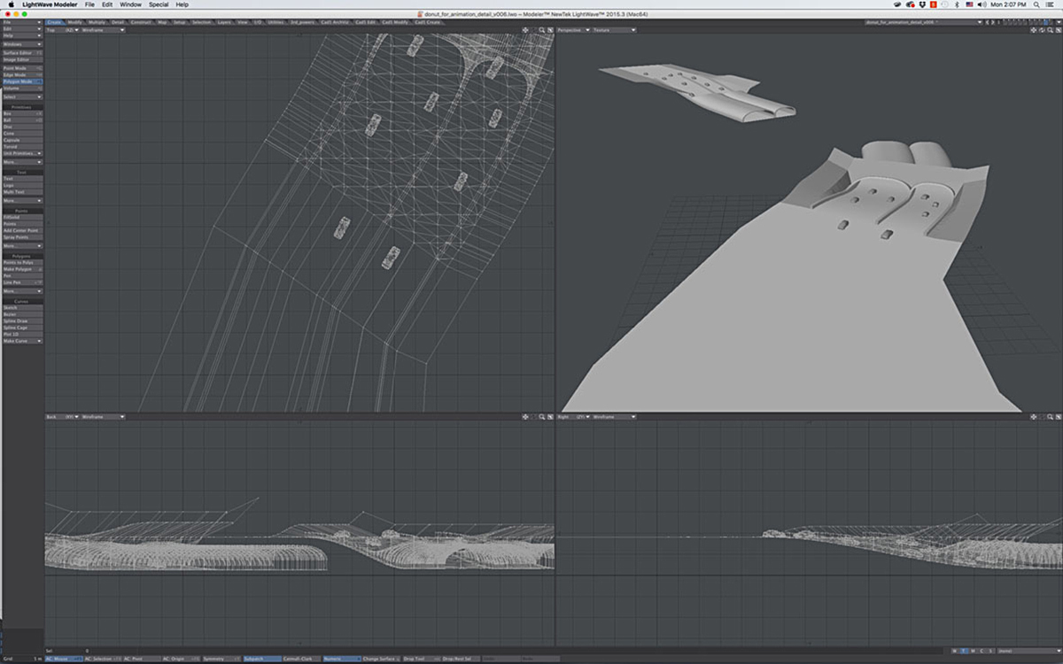
Some extra elements were made, such as the tunnel entrance shown here, to be used in insets on the diagram.
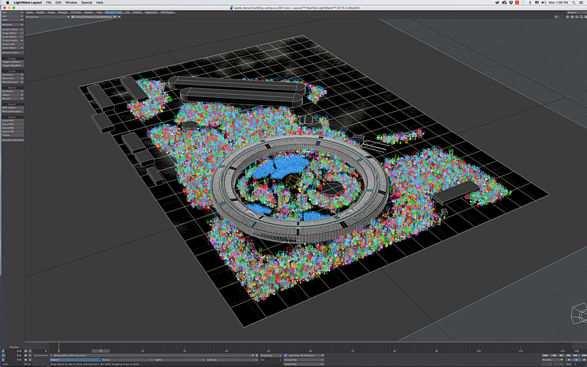
Trees and people were added to the scene using a technique called instancing that distributed them in selected areas of the model. The colored areas in this image represent the locations of tree instances.
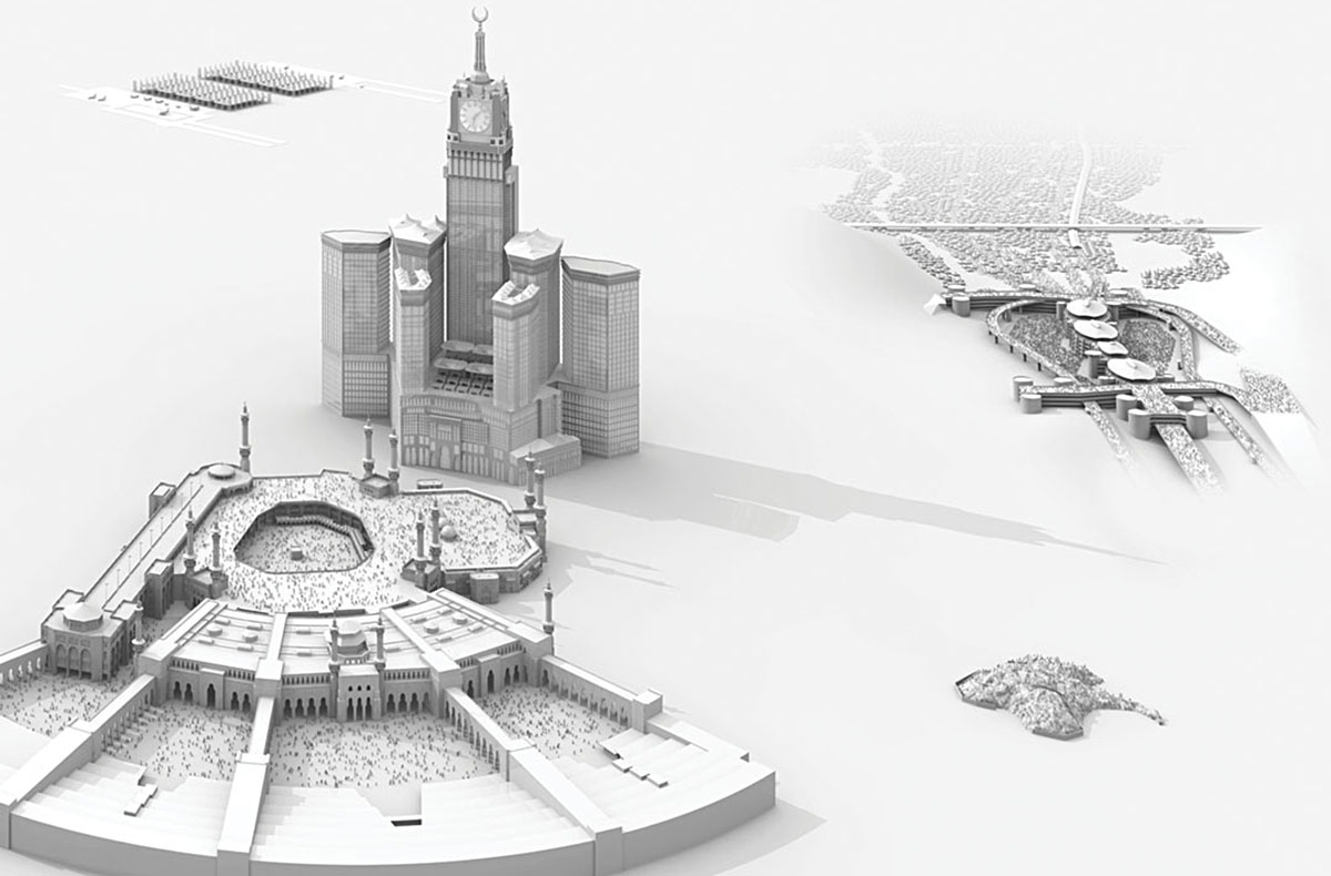
Below is a previous project that the studio had produced for WIRED. The designers suggested that this could be the inspiration for the rendering style of the Apple headquarters.
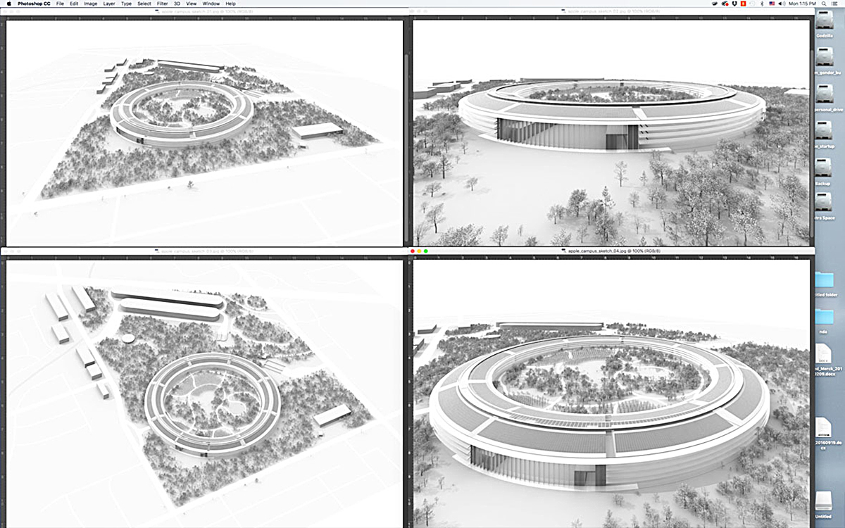
Once a rough version of the model was made, the art was framed using virtual cameras. Four initial sketches were sent to the designers, who selected the one in the bottom right, which was most like their initial concept.
In Lightwave, the lighting and texturing of the image were developed.
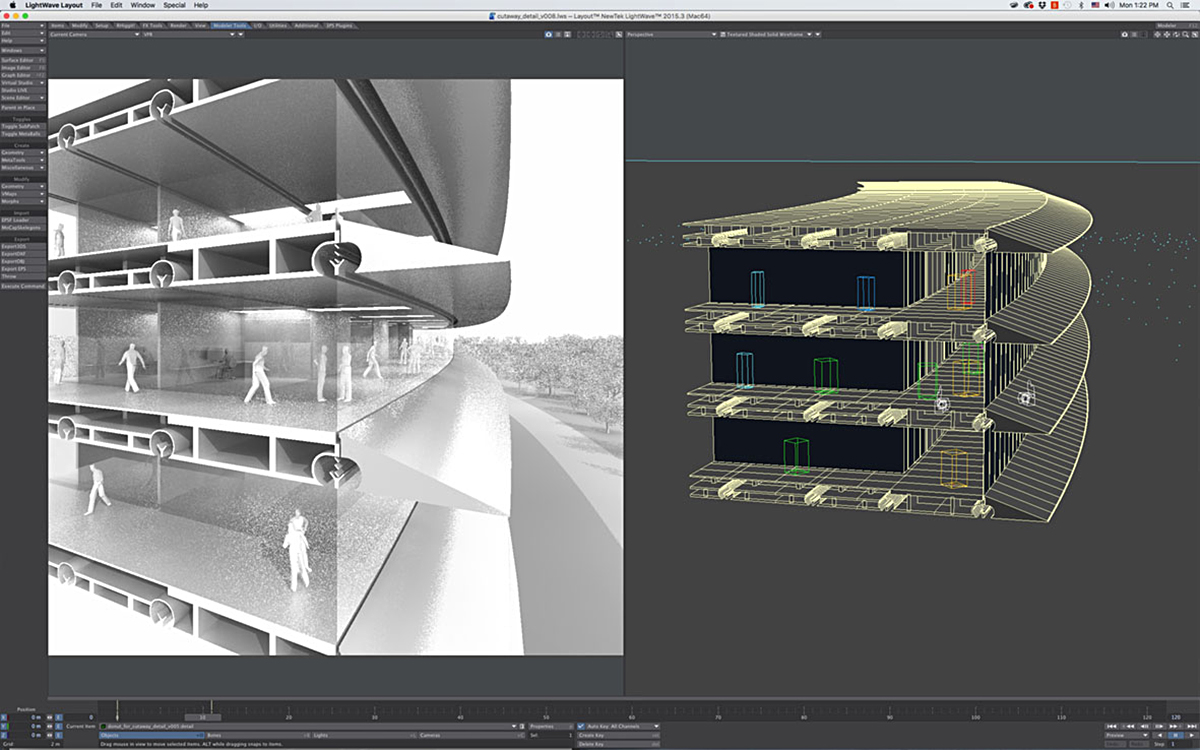
Separate scenes were set up to render each of the details.
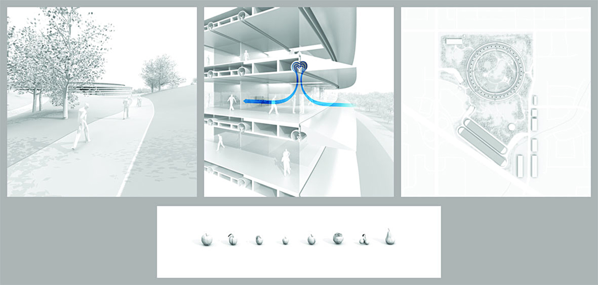
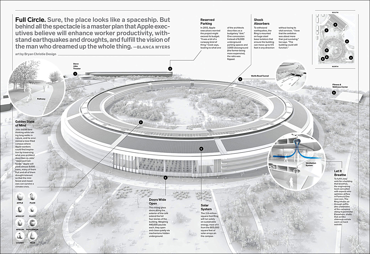
After refining the art based on feedback from the designers, the final details were fixed. This is how the graphic appeared in the magazine. Click on the image for a larger version.
Bryan Christie Design: http://bryanchristiedesign.com
Their work has featured in two previous posts:
https://www.johngrimwade.com/blog/2016/11/07/anatomical/ https://www.johngrimwade.com/blog/2016/09/19/three-dimensional/
