A BATTLE BETWEEN TWO HIGHWAY TYPEFACES.

There are countless signs in the U.S. National Highway System, and the typeface that is used on them is the subject of a long-running argument about the attributes of two informational fonts.
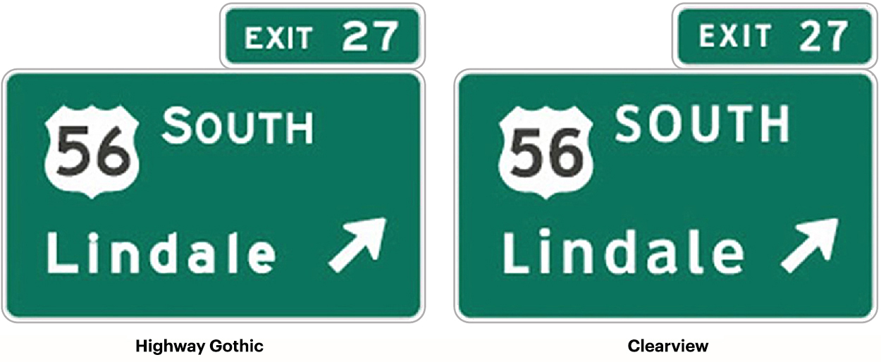
Typeface upgrade In the 1990s, Clearview (or ClearviewHwy) was designed to replace the existing road sign typeface, the Standard Highway Alphabet (or Highway Gothic). That font dates from the 1940s. Initial testing showed Clearview to be 2 to 8 percent more legible. A later test showed an improvement of as much as 12 percent. Unfortunately, further testing suggested that it might not be as effective at night as the original signs, despite the fact that a goal of the new design was to reduce excessive glow on reflective signs.
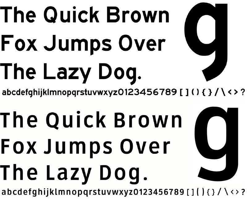
Upper and lower The existing road sign typefaces were used in a system where originally almost every word was capitalized. Clearview was designed to address the use of uppercase and lowercase characters with larger counter spaces and increased x-height. The space inside letters like “e,” “a” and “d” is much larger. The overall effect is intended to be increased legibility. Below, Highway Gothic and Clearview alphabets compared.

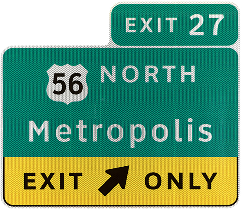
On and off In 2004, Clearview was provisionally approved by the Federal Highway Administration for use on positive signs (light characters on a dark background). But it was never approved for black on a light background, although some agencies used it this way. By 2014, there was a government-level move to stop using it, and by 2016 it was deauthorized. However, a bill was introduced in April this year asking Congress to approve Clearview for positive contrast signs.

In 2011, Clearview became the first digital font to be made part of the Cooper Hewitt, Smithsonian Design Museum. It has had some non-highway use, such as AT&T corporate applications and advertising, and signs at Dallas-Fort Worth International Airport.
Mixed signage Some states use Clearview and some states don’t. Ohio, where I live, had switched a lot of signs to Clearview, and now it’s started switching back to Highway Gothic (a process that will take decades). Many states have some signs in each font, due to the replacement of signs during different stages of the Clearview approval/non-approval process.
Money Clearview, unlike Highway Gothic, is not free. It’s licensed to state agencies. Is this a factor in it’s difficult path to acceptance? It’s been suggested that it might be the case.
Clearview was designed by Meeker & Associates and Terminal Design: http://www.terminaldesign.com/fonts/clearviewhwy-complete-family/

