A PICTOGRAM’S ROLE IN SOCIAL CHANGE.

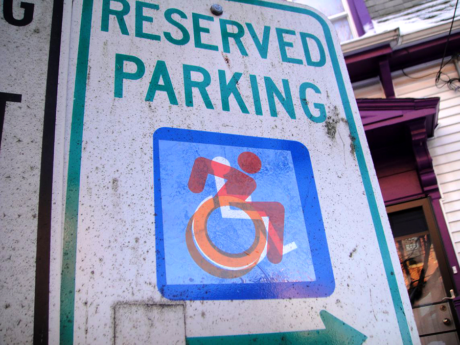
Sara Hendren and Brian Glenney started altering the icon that marks wheelchair-accessible parking spots in 2009. They put stickers on signs around Boston to make the standard symbol look more active. The International Symbol of Access was designed in the 1968 by Susanne Koefoed, in a competition organized by the United Nations. It’s promoted by the International Organization for Standardization (ISO).

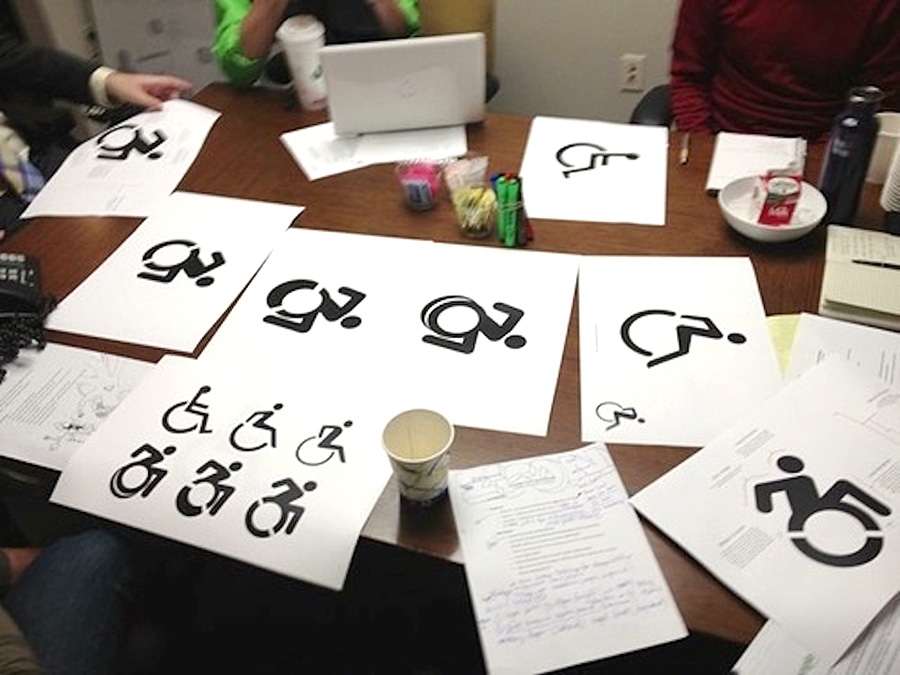
The Accessible Icon Project grew from these initial attempts to promote change. A team of interested people worked with a designer, Tim Ferguson Sauder, to finalize a new icon. The cutouts in the wheel make it easy to stencil and emphasize movement. The other improvements speak for themselves. When the design was finalized, it was put into the public domain.

Events around Boston, in cooperation with Triangle Inc’s community service organization, gave the new icon more visibility. And now it’s really taking off.
![]()
It’s on my phone.
![]()
MoMA has added it to their permanent collection.There’s a modified version on wheelchair-accessible New York taxis.

This pictogram is one part of a movement to encourage a more positive perception of people with disabilities.
Truly, it represents “Infographics for the People.”
![]()
