CREATIVE VISUAL SOLUTIONS BY ADONIS DURADO.
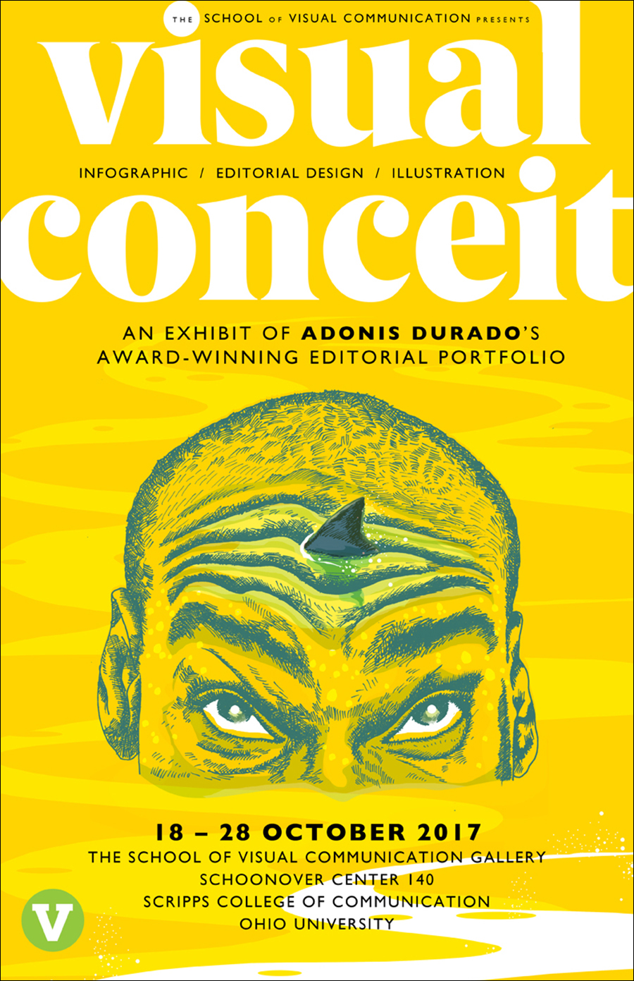
We’re very fortunate that our Knight Fellow for this academic year is Adonis Durado, whose design and infographics work at the Times of Oman, and several other publications, is widely admired. He currently has a terrific exhibition in our gallery called “Visual Conceit.” Here’s some examples from the show, along with his comments. The selection here has an infographic bias that does not reflect the balance of the show, and of course that’s because it’s on this particular blog.
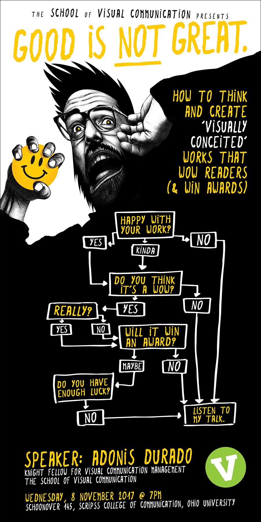
Adonis is talking about his work on Wednesday in our auditorium (poster shown above). This is a terrific opportunity for our students to learn from a world-class designer.
SOME OF HIS INFOGRAPHICS…
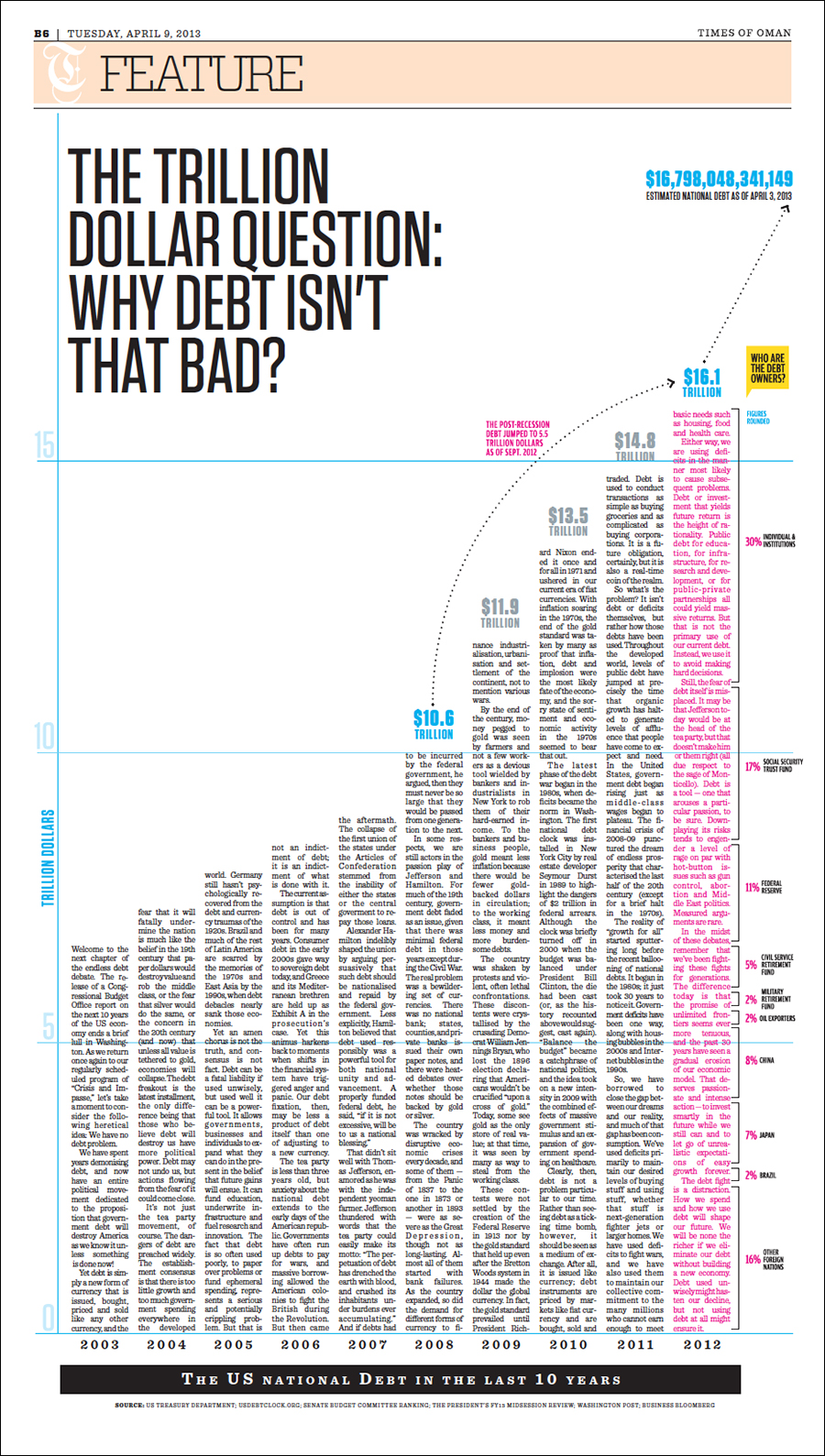
Mega-debt “My conceit here is to use the bars in the chart as body text columns, giving the page an organic or architectonic quality. It’s possible to read the article and the graphic at the same time. This is arguably the biggest bar chart ever published in a newspaper.”
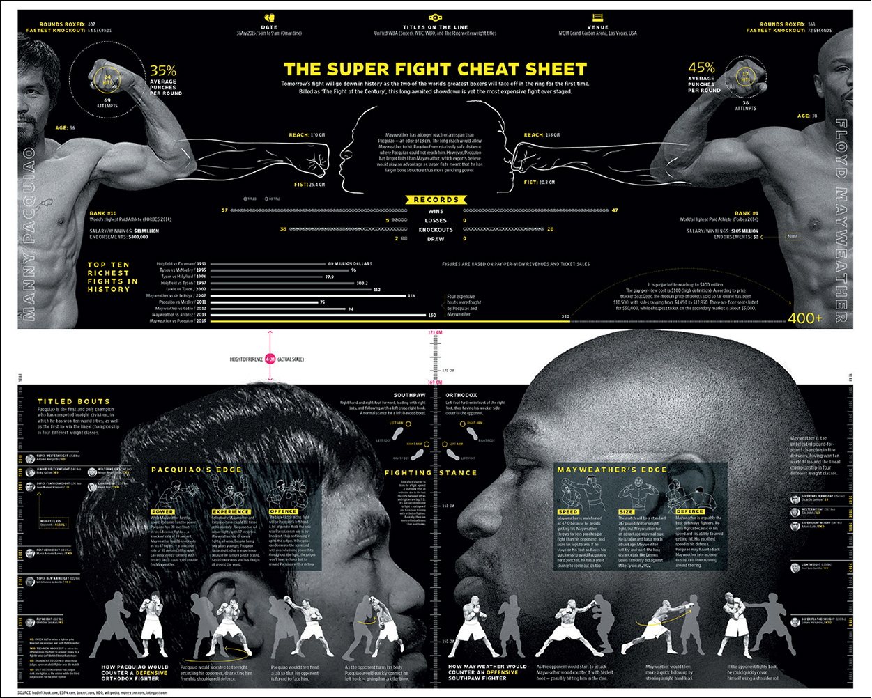
Boxing matchup “This preview presents, at actual scale, the height difference between the two boxers, which is shown as a white strip that runs across the spread. Height difference matters because a taller boxer has longer limbs, giving him a reach advantage.”
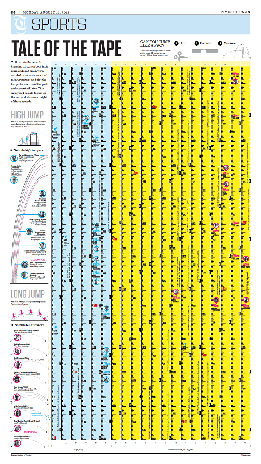
Olympic records “An infographic about the record-breaking history of the Olympic long jump and high jump. To add fun and interactivity, I invited readers to cut up the page and transform it into a measuring tape, then see for themselves if they can jump like a pro.” (Click on the image to see a detail.)
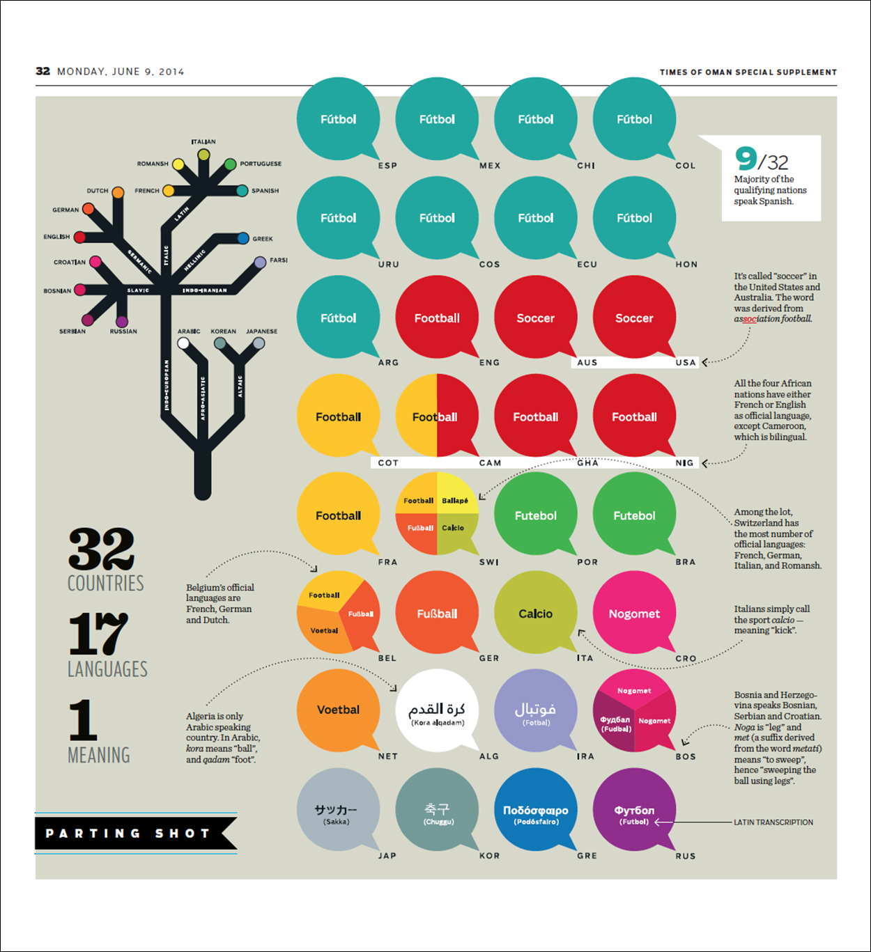
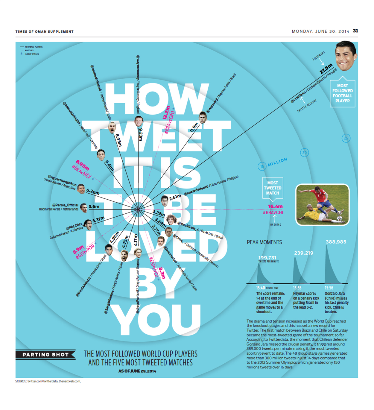
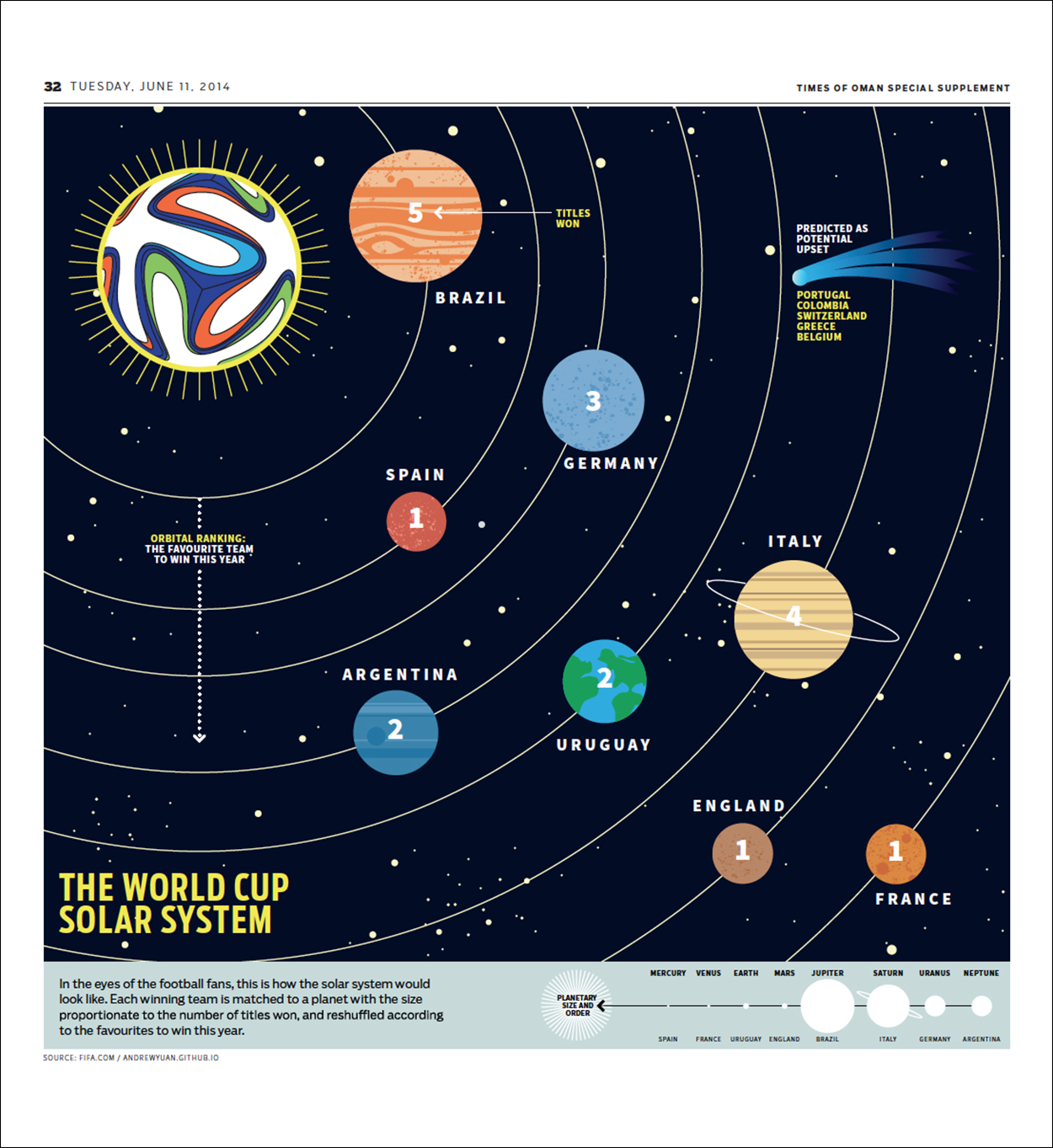
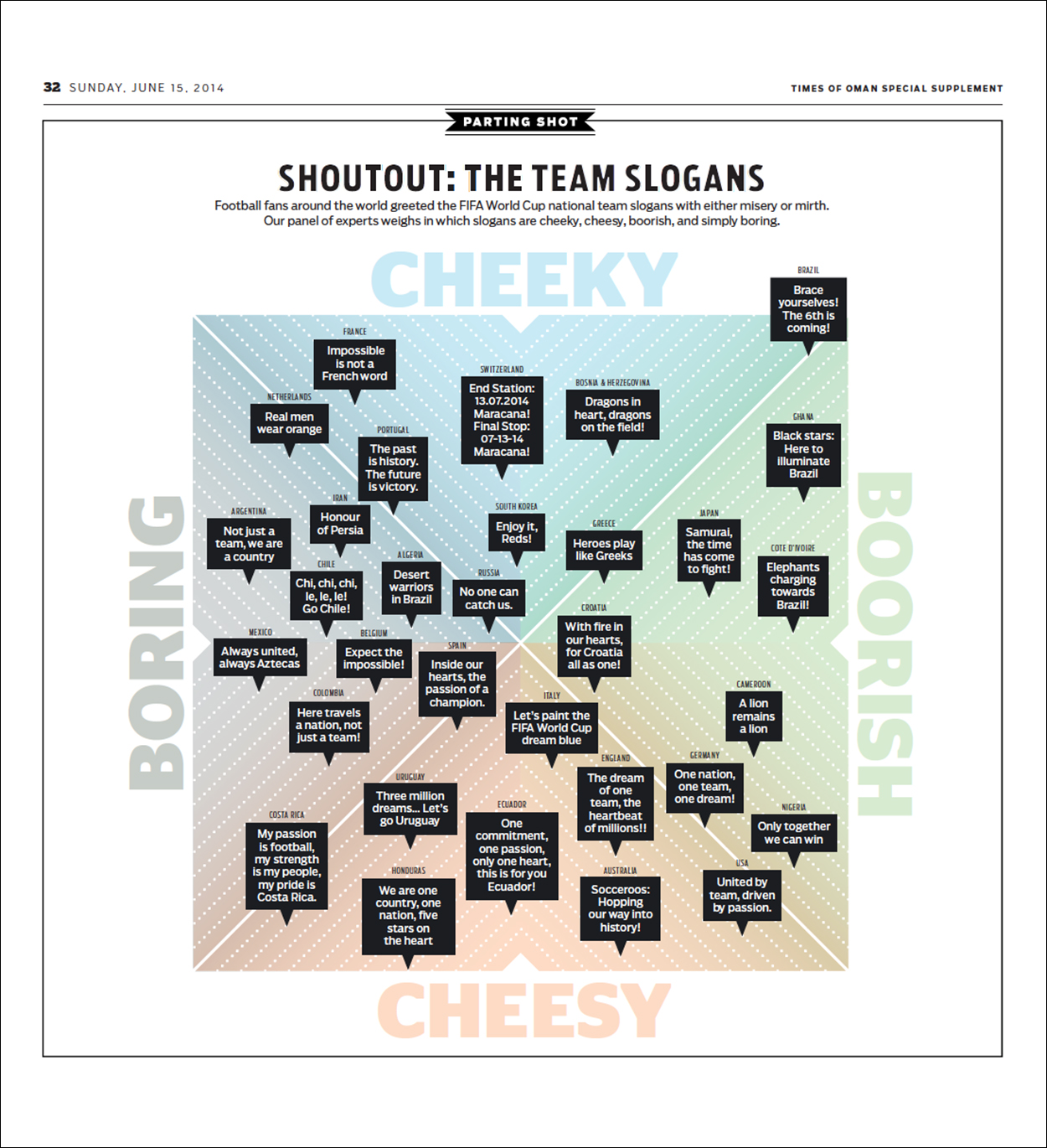
World Cup insights “A series of infographics that were published in the back of our World Cup supplement. In this section, called “Parting Shot,” we tried visualizing content that is considered non-serious or off-beat.”
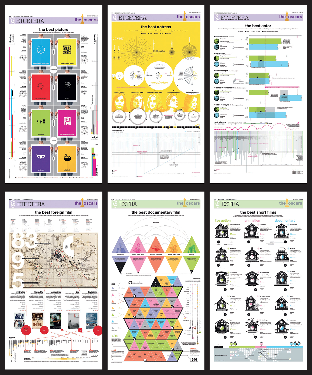
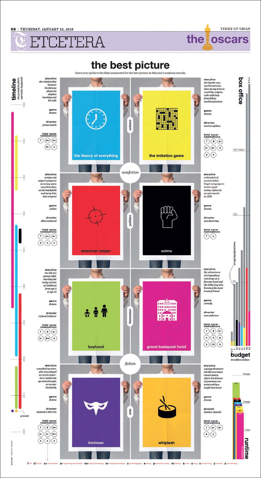
The Oscars “A series of infographics published daily leading up to the Academy Awards ceremony. I employed a variety of conceits for each category page. For example, in “The Best Picture,” I asked myself: Would it be possible to make the graph’s color legend the most dominant element of a page? The legend is a discreet element in all graphics, but not in this case.”
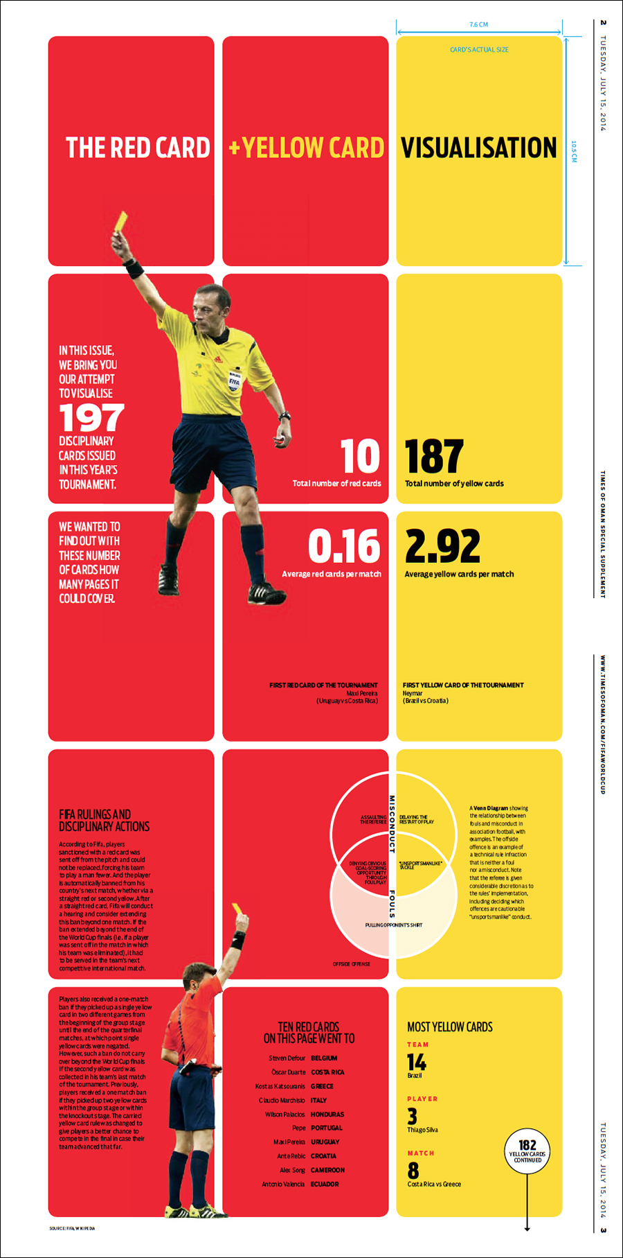
Soccer discipline “Another World Cup graphic. I began the design by considering if it’s possible to visualize a dataset that can occupy the entire issue of the magazine. These are all the red card and yellow cards issued during the tournament.”
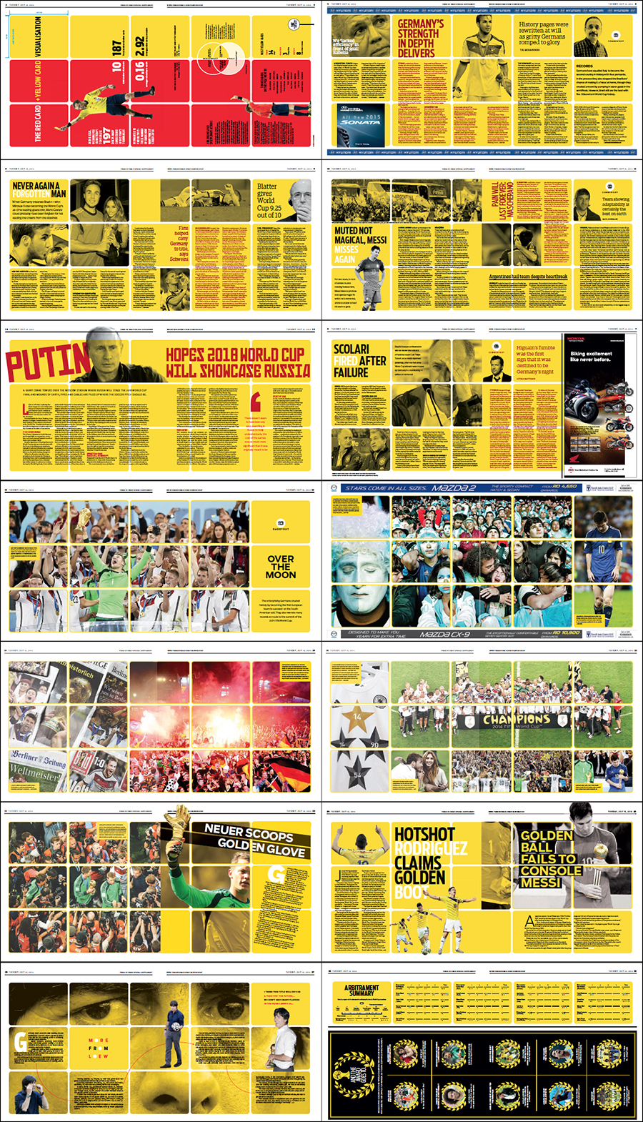
The first spread (rotated).
… AND SOME OF HIS PAGE DESIGNS
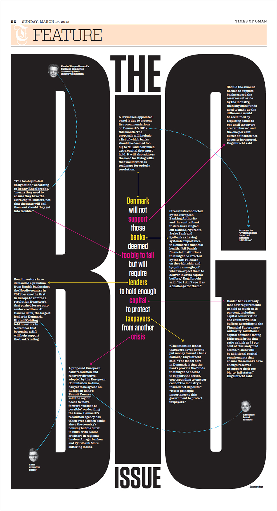
Danish banking “This page started with the conceit of “type attack,” where the headline serves as the dominant element of a page (or the text becomes art in itself). I ended up deconstructing the body text as well, and came up with a treatment that mimics the concept of intertextuality. Notice that the lead paragraph contains keywords that link to pieces of related information.”
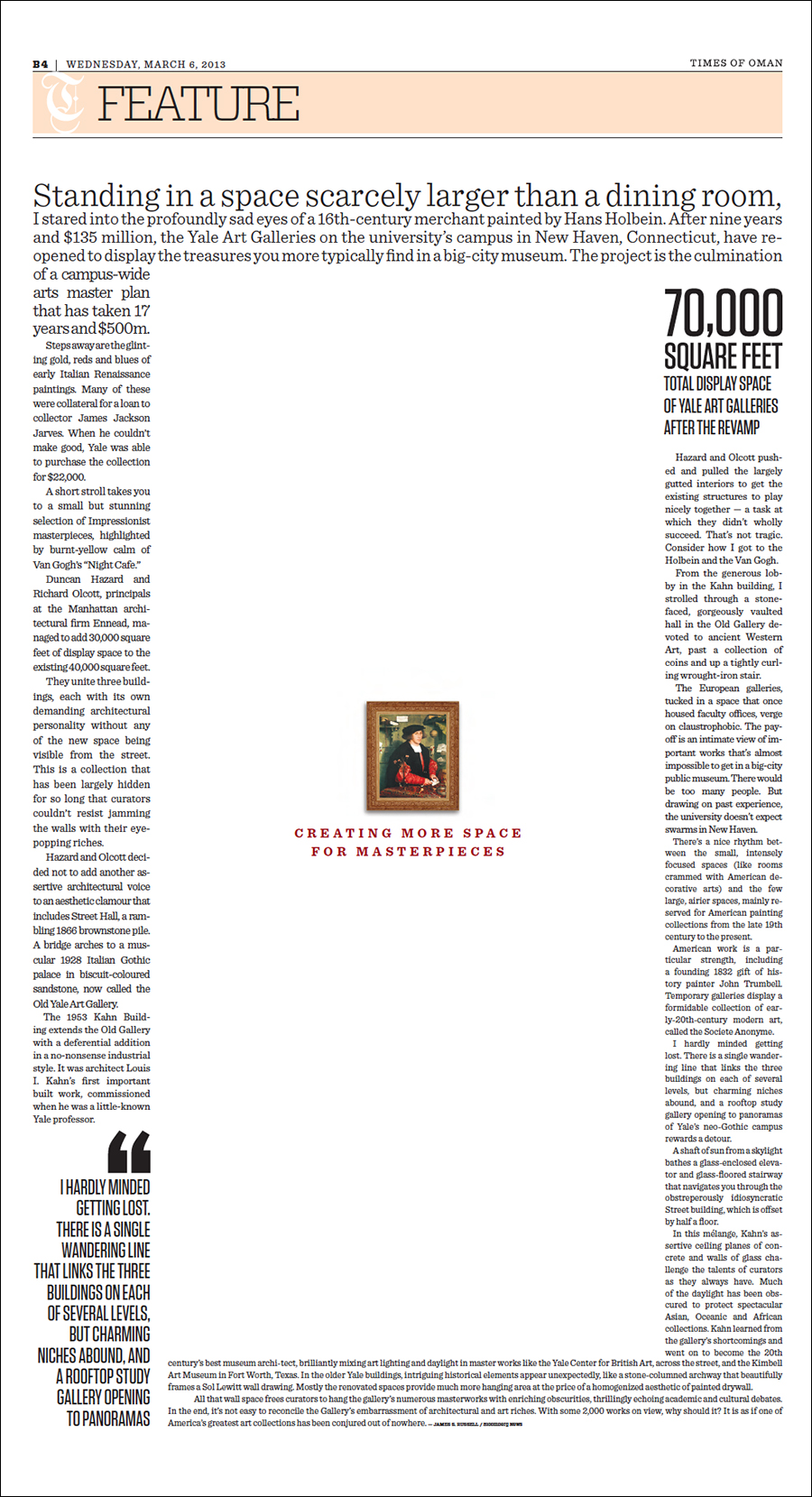
Gallery space “My solution to a challenge that I set myself: Is it possible to design a page where the white space is an illustration in itself, and is an element that will help visualize a story?”
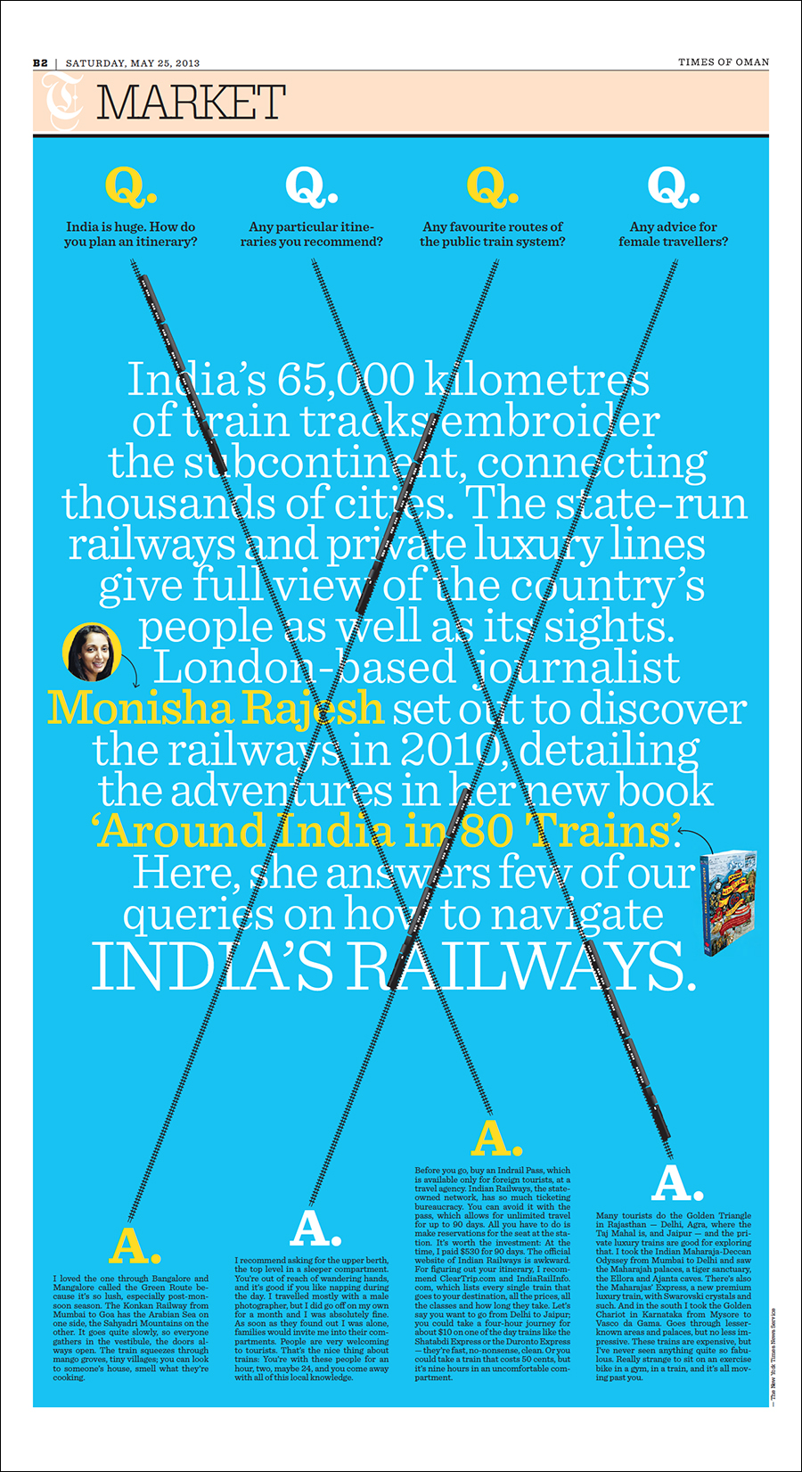
India by train “Perhaps here I was just too tired of the regular Q&A format. This playful treatment defies convention, and I even let the headline and the intro merge into each other.”
The poster for the gallery show.
