IMPRESSIVE EXAMPLES FROM THE LAST CENTURY.
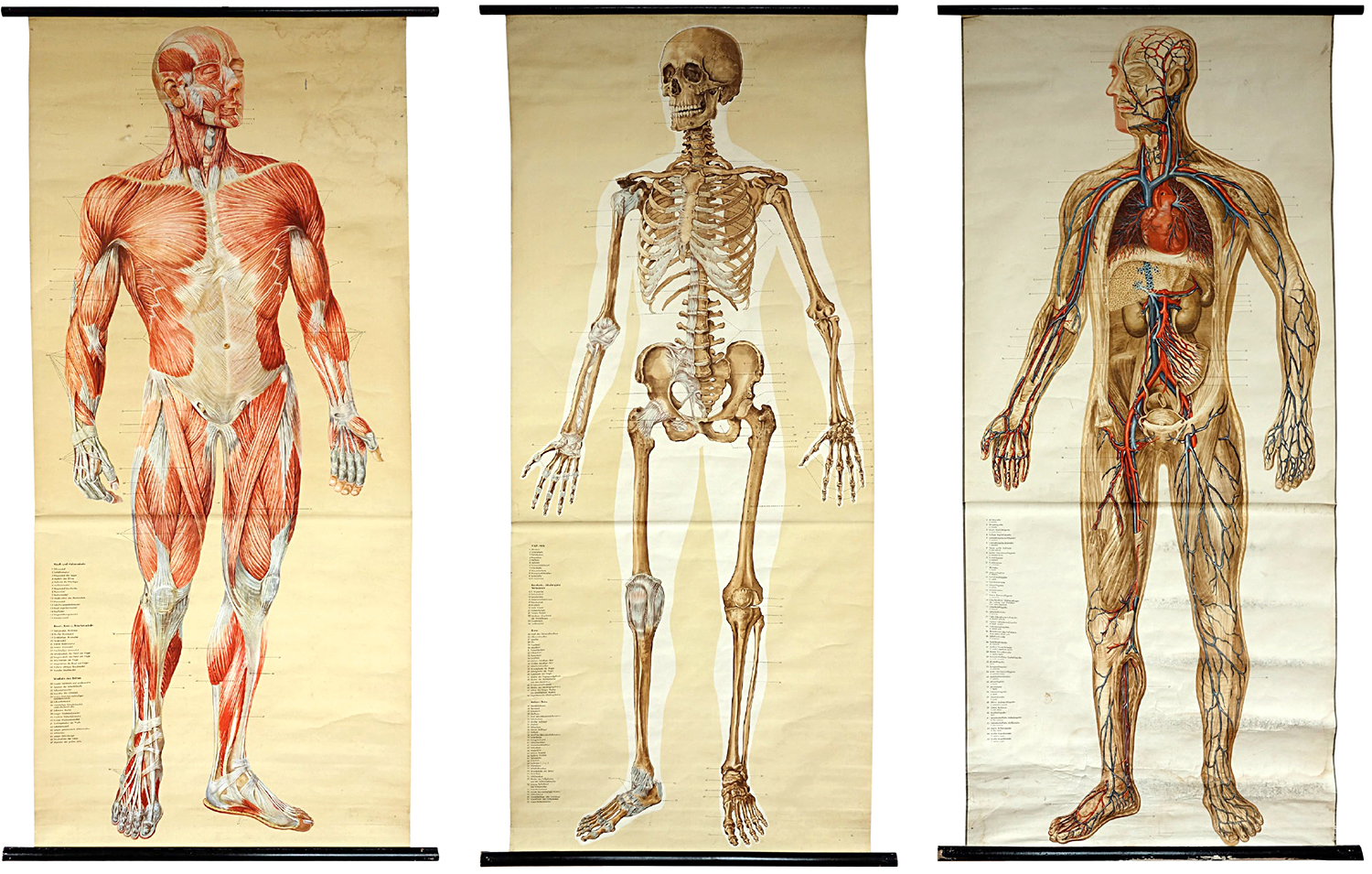
It’s time for another visit to Michael Stoll’s superb collection of historical graphics. Before the computer, these big infographics were essential teaching aids. Of course, their (mostly inferior) descendants are common in classrooms today. I asked Michael for his general thoughts about this genre and some comments about these examples.
“Wall charts are a dying species in an era where everything is digitized and online. This is a shame, because having something physically present in a classroom and encouraging a conversation about it, makes more of an impression than a screen, especially as these charts are so large.
I remember being sent by a teacher to the wall chart room at our school to get a particular example. I spent more time just looking at the other charts (there were a huge number of them) instead of concentrating on the task. As a teacher myself, I often wonder how other teachers used these charts to explain things to their pupils. A wall chart can be seen as a didactic element. It emphasizes visualization over explanation. Wall charts were also used as promotional material by companies, that wanted to enable deeper understanding of their products, or provide background information.”
Anatomy (Shown above) Naturalien und Lehrmittel, Anatomie, Biologie Tanck & Wegelin, Hamburg Altona. c.1950
“These are considered to be the most accurate anatomical charts. While each one will work on its own, I love the effect of the series. The reader can jump between them and make comparisons or draw conclusions.”
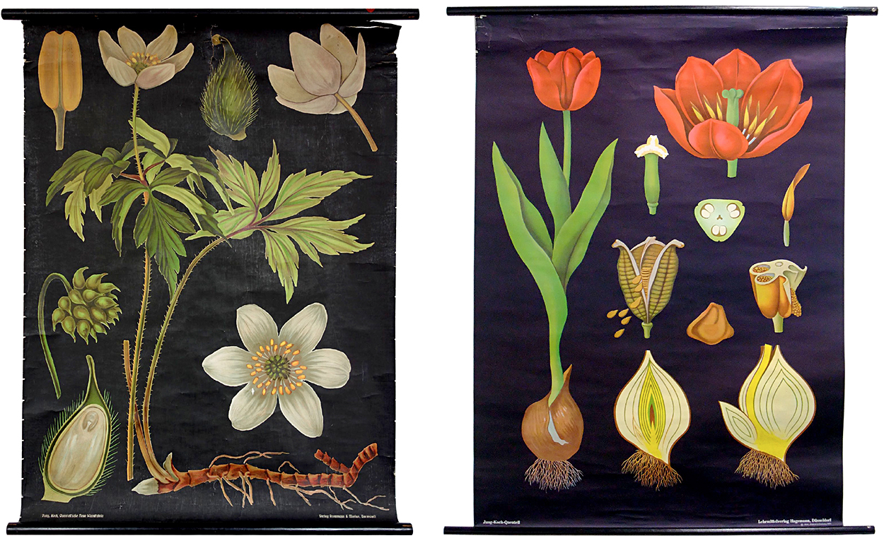
Botany (Shown below) Jung, Koch, Quentell—Lehrmittelverlag Hagemann, Düsseldorf. c.1963
“Two rather old examples from the world-famous publisher. While the newer ones are offset printed, the older ones were produced using lithographic printing, which provides a lot of detail. The arrangement is fascinating, in that the chart still works although the parts of the plants are not to scale. This is called adaptive scaling. And the items stand out clearly against the black background.
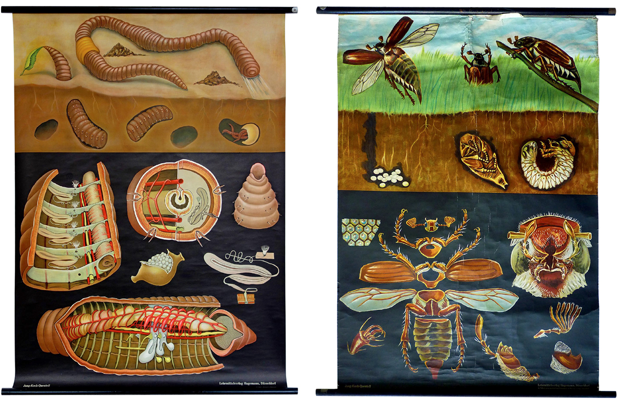
Insects Jung, Koch, Quentell. c.1963
“The layout is set up in three logical stages: what we normally see (which references what the reader recognizes), what is going on hidden from the human eye (which connects this information to what we normally see), and a very detailed deconstruction of the animal (which has the highest density of information).”
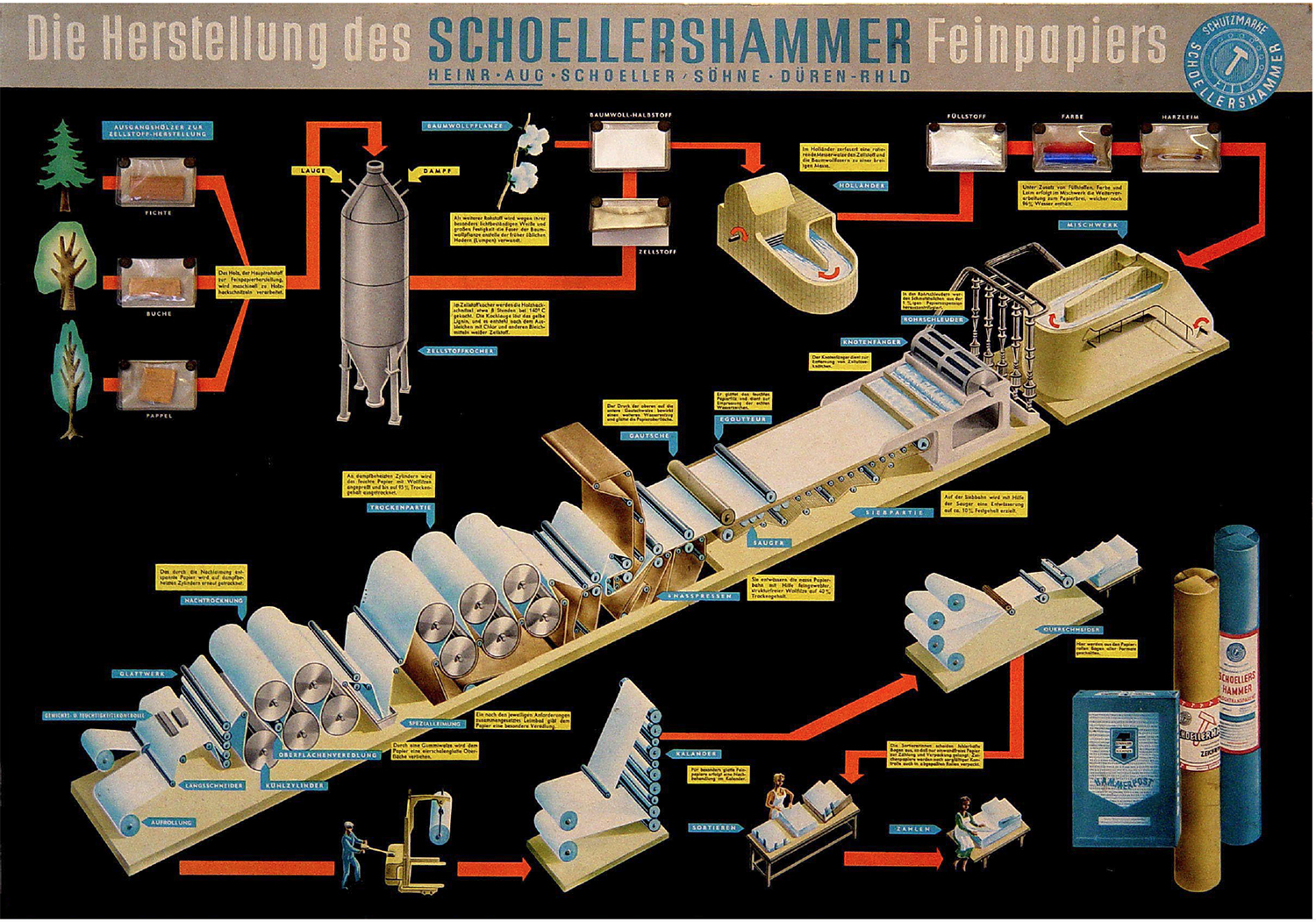
Paper production “Mounted onto stiff cardboard, this chart takes one further step: there are samples of real wood, chemicals and colors sealed in small plastic bags which are attached to the poster.”
(Editor’s note: I’ve used the red line a lot in my graphics: http://wp.me/p7LiLW-IP)
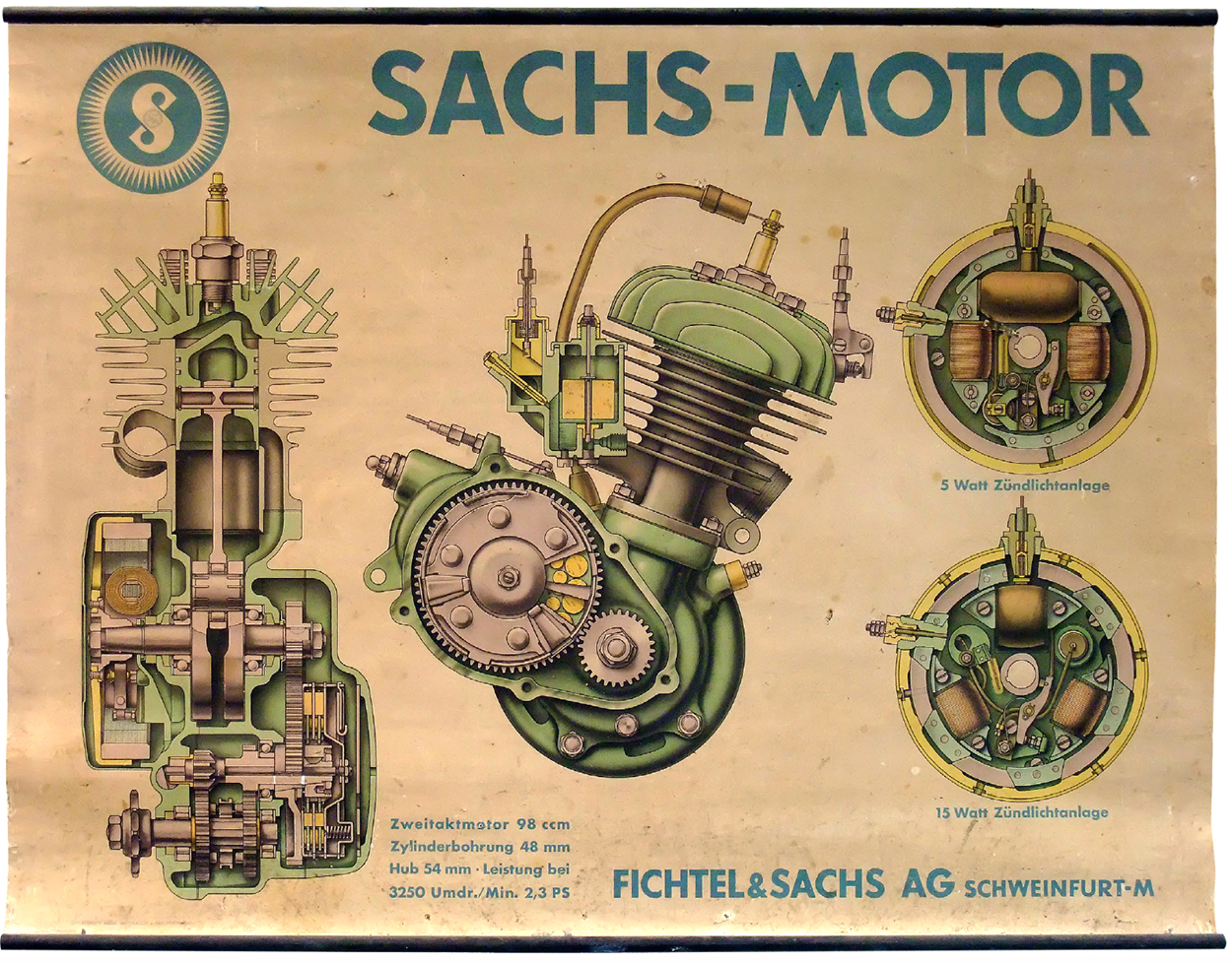
Engine Beautifully rendered, lithographic printing. Larger than actual size. This scaling allows more detail.
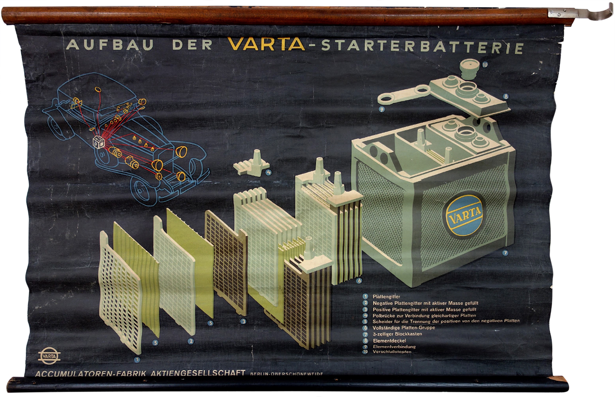
Battery “Also printed using the lithographic process. The car diagram shows the relevance of a battery like this. This chart is a visual depiction of how important electricity was for cars back then.”
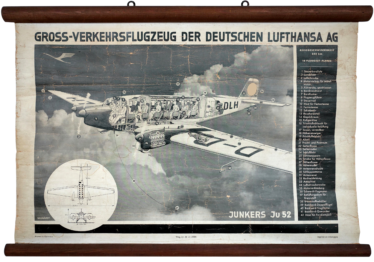
Aircraft “The chassis of this plane was made entirely from aluminum. I followed this example on eBay, and the price skyrocketed. I eventually bought it, but wondered about the high price. So I contacted the manufacturer, and found out that these charts were delivered with the aircraft. And there were only two models with these engines delivered.”
Detail.
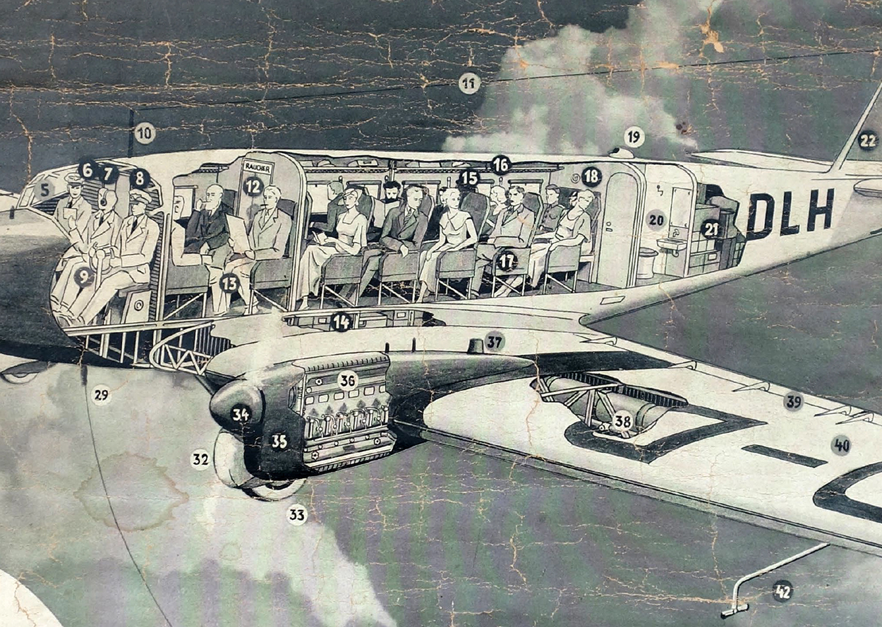
The much more common Ju52/m3.
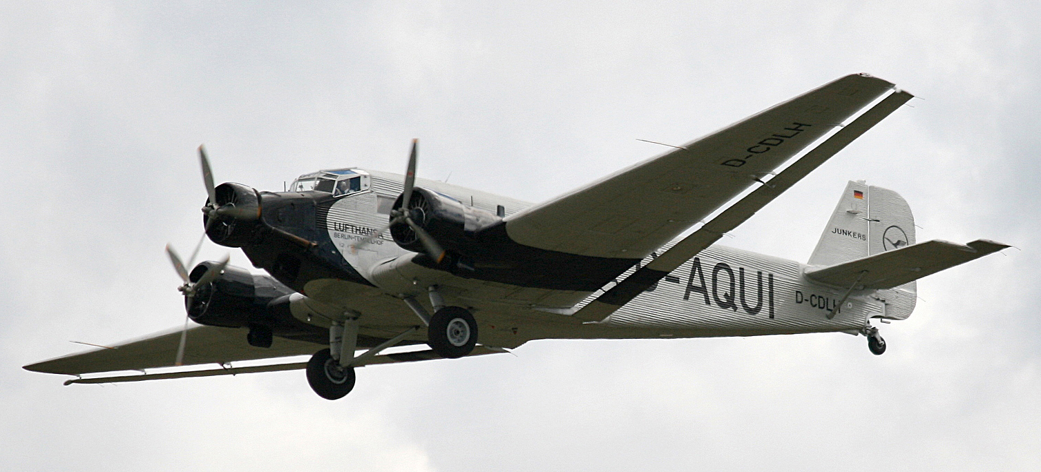
Photograph by Rror.
Previous posts from Michael’s collection:
Eye model: http://wp.me/p7LiLW-1yx
Flap books: http://wp.me/p7LiLW-IV
Flight thru Instruments: http://wp.me/p7LiLW-Rr
Herbert Bayer’s Geo-Graphic Atlas: http://wp.me/p7LiLW-xO
The Atlas to Alexander von Humboldt’s “Kosmos”: http://wp.me/p7LiLW-jO
Michael Stoll teaches media theory and infographics at the Augsburg University of Applied Sciences, where he is head of the information design study track in the Department of Design.
