FIVE FONTS WE DON’T LOVE.
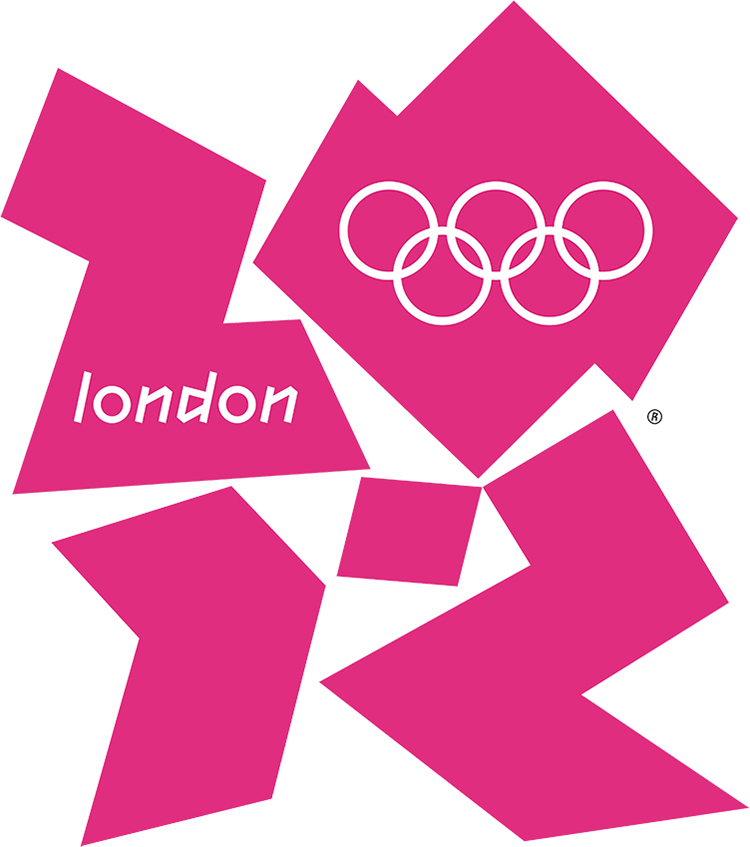
Above, the ugly London Olympic logo, which contains a sample of the world’s worst typeface. More about that later.
The following ranking is from Simon Garfield’s book, “Just My Type,” which is an insightful and fun read for anyone who cares about typography: goo.gl/fX9nni
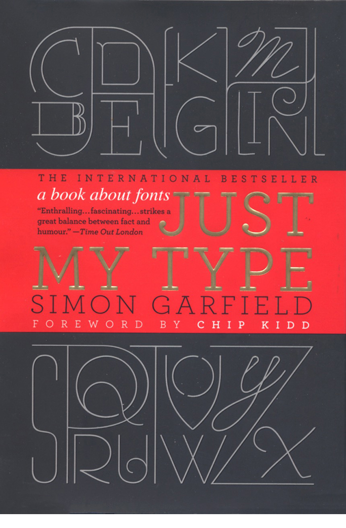
THE WORST FIVE (IN REVERSE ORDER)
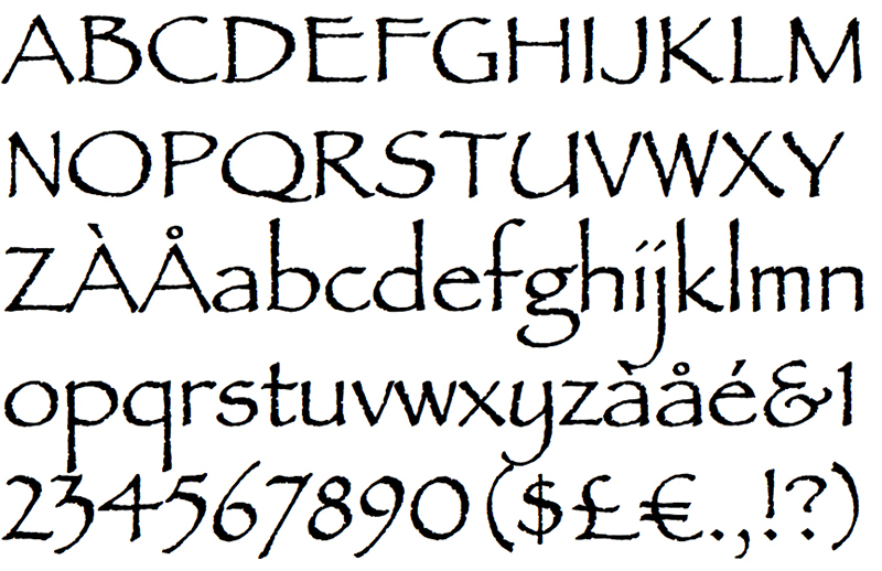
5: Brush Script My students know that I’m not a fan of fonts that mimic handwriting. To be fair, there are some good ones, but many are badly designed, and will devalue any infographic they’re slapped onto. Not exactly the language of credibility when used in a serious visual explanation. Simon: “…if you ever even momentarily considered putting Brush Script on any document at all, even in an ironic way, then you should immediately relinquish all claims to taste.”

4: Papyrus Simon: “Papyrus is the font you use to spell out the the word Egypt.” A modified version is used on this Avatar poster, but it appears in it’s standard form in the Na’vi subtitles. Recently panned by “Saturday Night Live.” goo.gl/wwPBa3
![]()
![]()
© 20th Century Fox
Simon: “Avatar cost more to make than any other film in history, but it did its best to recoup whatever it spent on 3-D special effects and computer-generated blue people by using the cheapest and least original font it could find.”
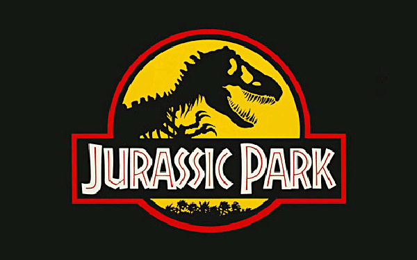
3: Neuland Inline Jurassic Park was ahead of it’s time, but the font it used was not. Simon: “It is a dense and angular type, suggestive of something Fred Flintstone might chisel into prehistoric rock.”
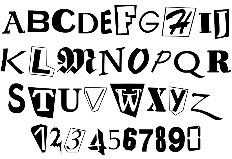
2: Ransom Note. Simon doesn’t feel that this font is any good for ransom notes. Having none of “…a genuine ransom note’s sweat, glue, and menace…”
1: The London Olympic 2012 typeface It’s official name is 2012 Headline. The font is intended to be edgy (I suppose), but that’s always a dangerous path to negotiate. It ended up being downright awful, and became dated in a very short time (maybe a couple of weeks). Simon: “…the worst new public typeface of the last hundred years.”
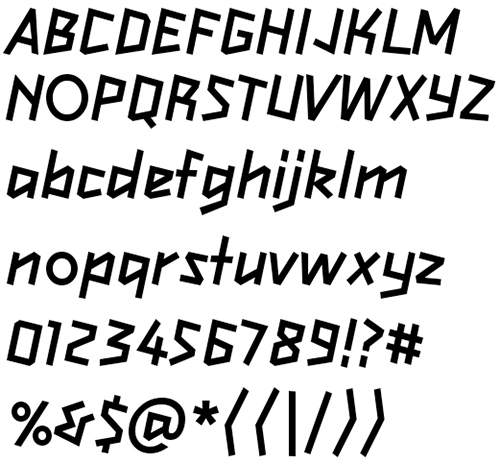
From the book: In the International Herald Tribune, Alice Rawsthorn observed that “it looks increasingly like the graphic equivalent of what we Brits scathingly call “dad dancing”—namely a middle-aged man who tries so hard to be cool on the dance floor that he fails.” And finally, my personal comment on the London Olympic logo:


2 comments
Comments are closed.