USING PROPORTIONAL CIRCLES.
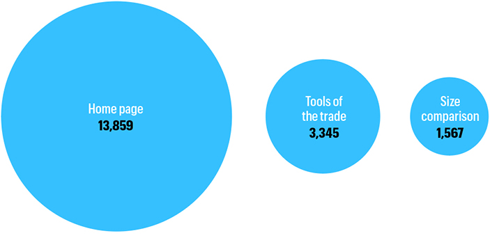
In this most basic use, the relative size of circles represents different values. These are numbers of views of this blog.
Circles can be effective in many situations, especially when comparing very large and very small numbers.

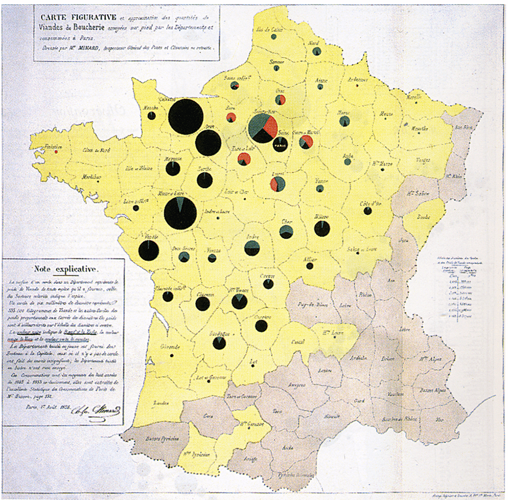
Divided proportional circles are proportional pie charts. This is a classic map-based example by Charles Minard, from 1858.
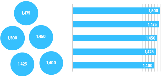
A few years ago, circle-mania hit the infographic world. It seems to have calmed down now, but for a while it seemed like circle plots were used for everything. And today, they are often used when another method to present the data would be clearer. An underlying issue is that we’re not good at comparing areas, so fine differences are not visually reinforced. The comparison below shows how a bar chart can be more immediate that clusters of circles. Very fine differences are immediately visible without reading any numbers. Placing the circles in ascending or descending order, and on the same base line, would help make the left-hand chart clearer, although the differences will always be more difficult to see than if bars are used.
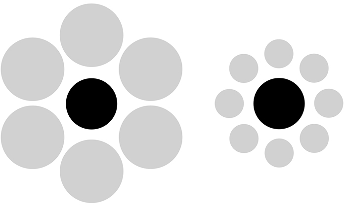
Another concern is that the proximity and the size of shapes can confuse us. Here the black circles are the same size.
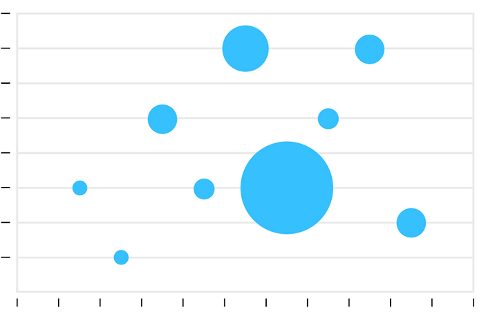
A bubble chart is a scatter plot that uses proportional circles to represent a third level of data.
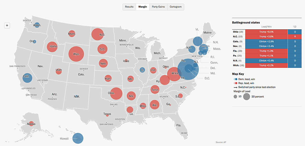
And the bubble map is always worth considering. We get a good visual impression of the states with a large margin of victory in this 2016 Washington Post interactive election map. https://goo.gl/eDgpPs
Try the margin data at the state level.
Sometimes the use of circles in charts and maps makes data difficult to comprehend because there is a lot of overlap in congested areas of the visualization. But by far the most common problem with proportional circles is incorrect plotting. As this is an area comparison, using diameters will produce a greatly exaggerated result. The square root of the values should be calculated to get the correct ratio of the sizes. Here’s an example of the problem. The original graphic and the subsequent correction. We should applaud “Good” magazine for doing the right thing and (prominently) fixing this. Most people don’t bother.
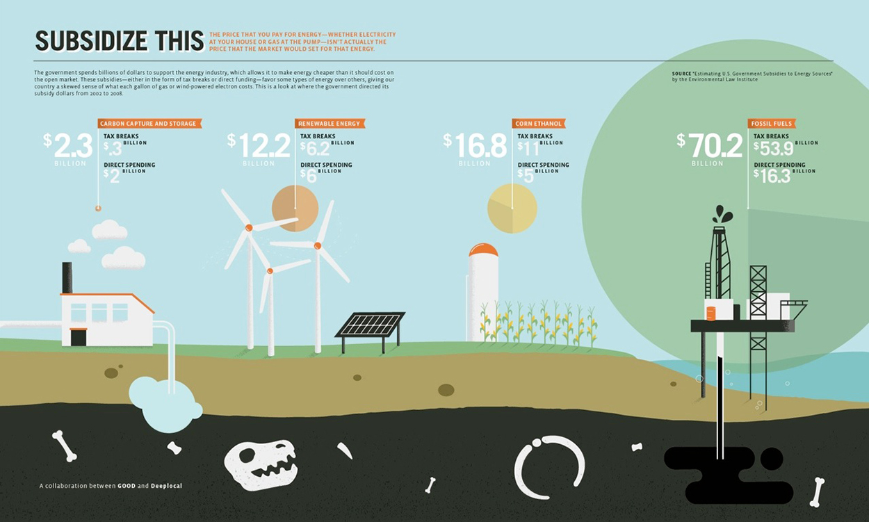
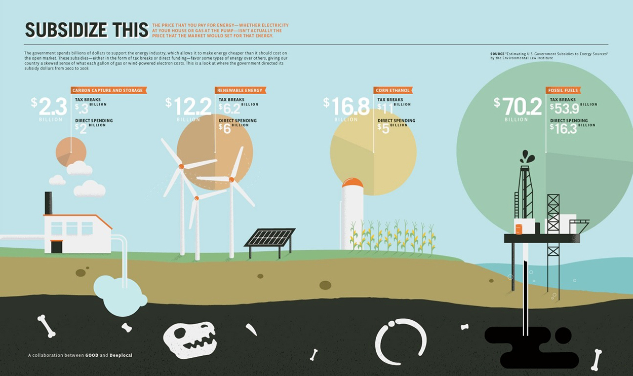
To be fair, anyone can make a mistake. And I have certainly made my share during my long career. (But for some reason, I’m not showing any of them here!) So use circles, but like everything else in our data viz toolkit… use them wisely.

One comment
Comments are closed.