Category: Data visualization

Communicating science visually

A PRACTICAL GUIDE.


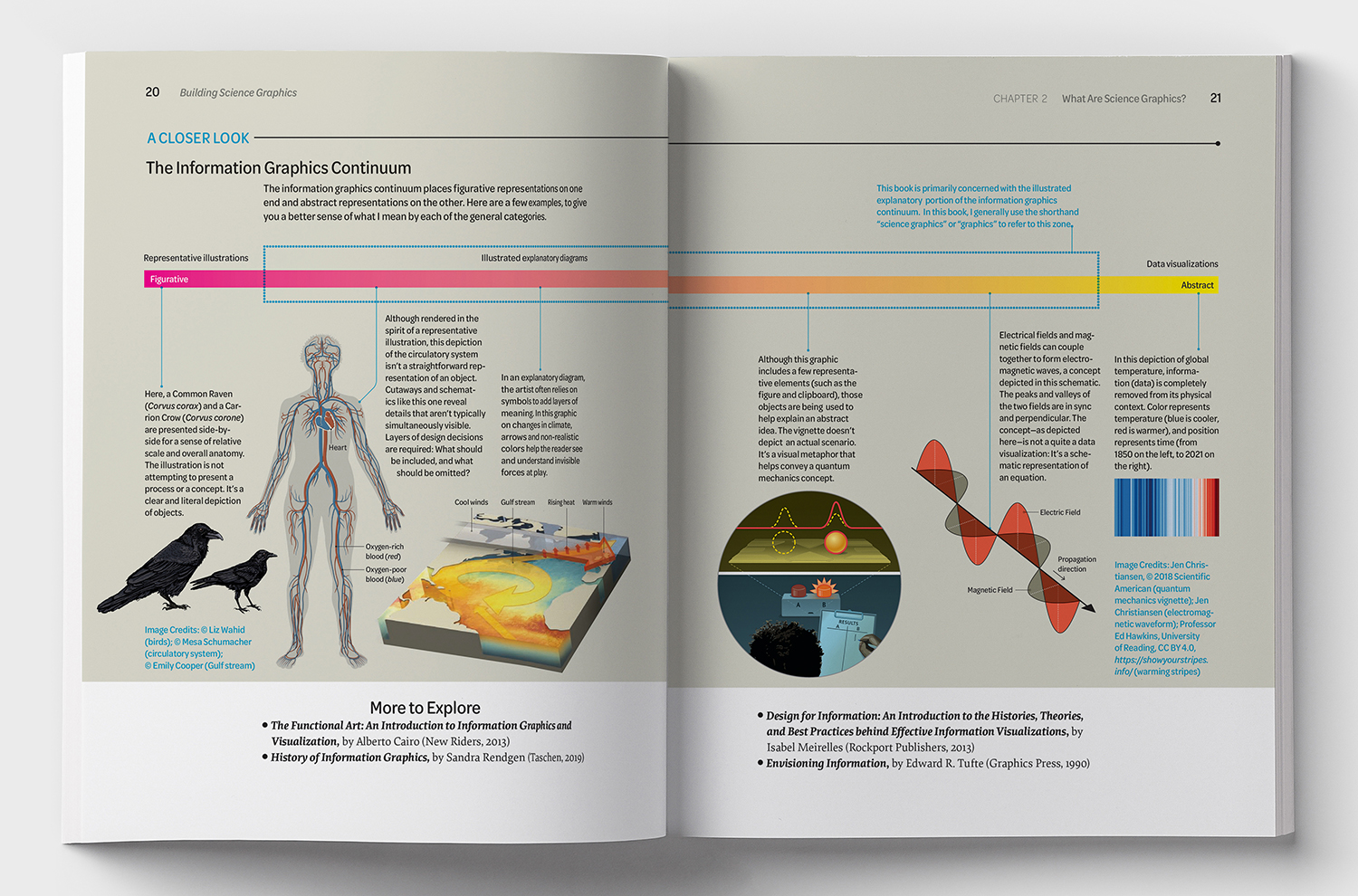
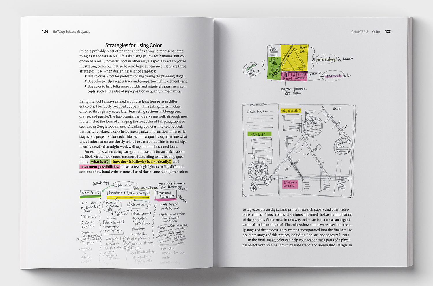
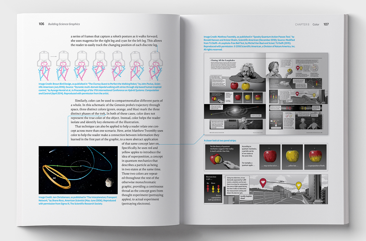
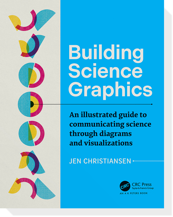
This newly-published book is written from the perspective of a designer who works nearly exclusively with scientific content. It’s aimed at a broad audience of students, scientists, science communicators, and fellow designers.

In Jen’s words: “The book reflects what I’ve learned from collaborating with scientists and artists while creating science graphics for Scientific American, National Geographic, and textbook publishers for over 25 years. It’s a practical guide for anyone interested in creating static scientific illustrated explanatory diagrams.”

There’s more information about the book, including the table of contents and a list of “More to Explore” links (for those who want to dive into specific themes in more depth) at BuildingScienceGraphics.com.

Buy it here: https://bit.ly/3kc68I8

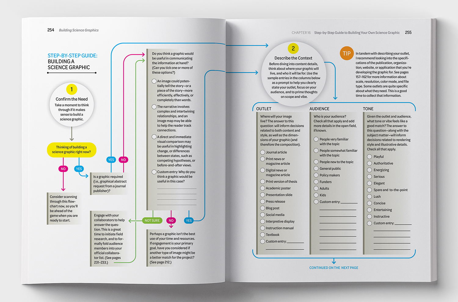
The heart of the book is composed of two step-by-step graphical worksheets, developed to walk both novice and experienced designers through the process of conceptualizing and building a science graphic. Here’s the first spread from one of them.
Click on the image for a larger version.

Below, more example spreads from the book.

Close to home
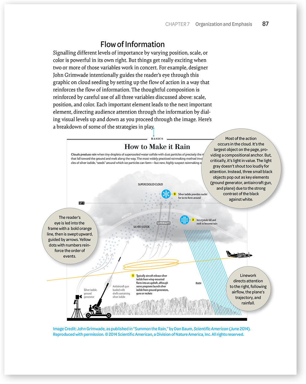
A graphic of mine with insightful comments by Jen. Click on the image for a larger version.

The AK Peters Visualization Series editors are Alberto Cairo and Tamara Munzner.

Infographic warmth

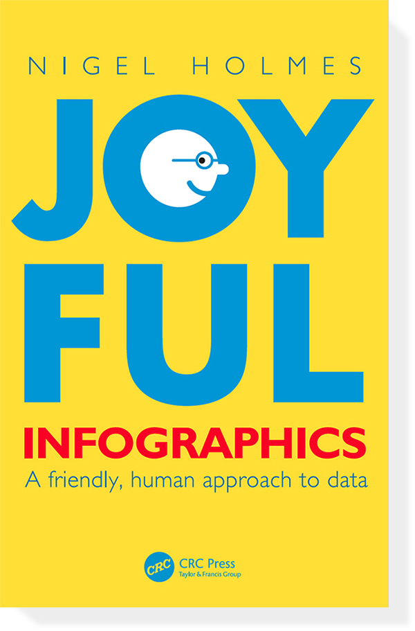
A NEW BOOK FROM A MASTER OF VISUAL EXPLANATION.


Nigel Holmes is a brilliant designer of infographics, but it’s his inherently human approach that makes his work so effective. It’s as if a friend is guiding us through the information. Indeed, many of Nigel’s graphics contain illustrated people pointing out, or discussing, key details.

Obviously, there are various degrees of warmth and humor that can be applied to visual communication, and where we position the fun dial depends greatly on the type of information and the intended audience, a point that Nigel clearly makes in this book. I know one thing for certain: In a sometimes cold and alienating world of infographics, there’s plenty of room for the Nigel Holmes approach.

Published today. Website that supports the book (and has links to buy it): www.joyfulinfographics.com

Humor post
A previous (and much-viewed) post by Nigel about the use of humor in infographics: https://wp.me/p7LiLW-iZ

From the book
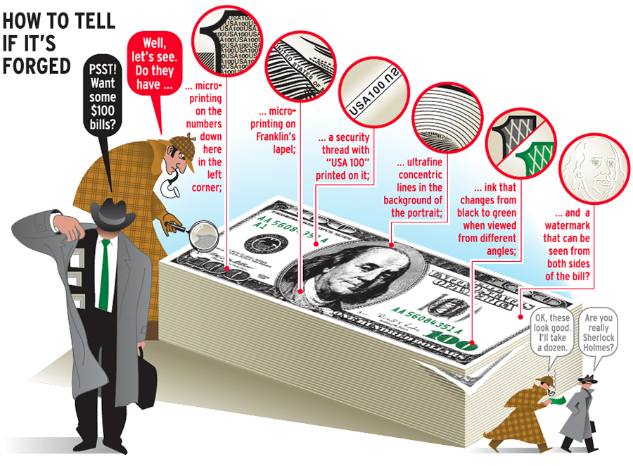
Below, a typical Nigel Holmes graphic: solid information, engaging presentation. For Attaché magazine.

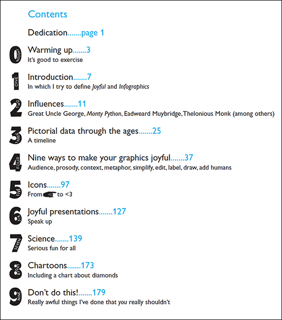
Nine (or ten) chapters
On one level this is an infographic autobiography. We find out why Nigel thinks about graphics the way he does. The influences, the development of his approach. It’s also a seminal book on how to add warmth to our work.
Here’s the list of contents which, by the way, uses numbers inspired by those on British raffle tickets from long ago.

More examples
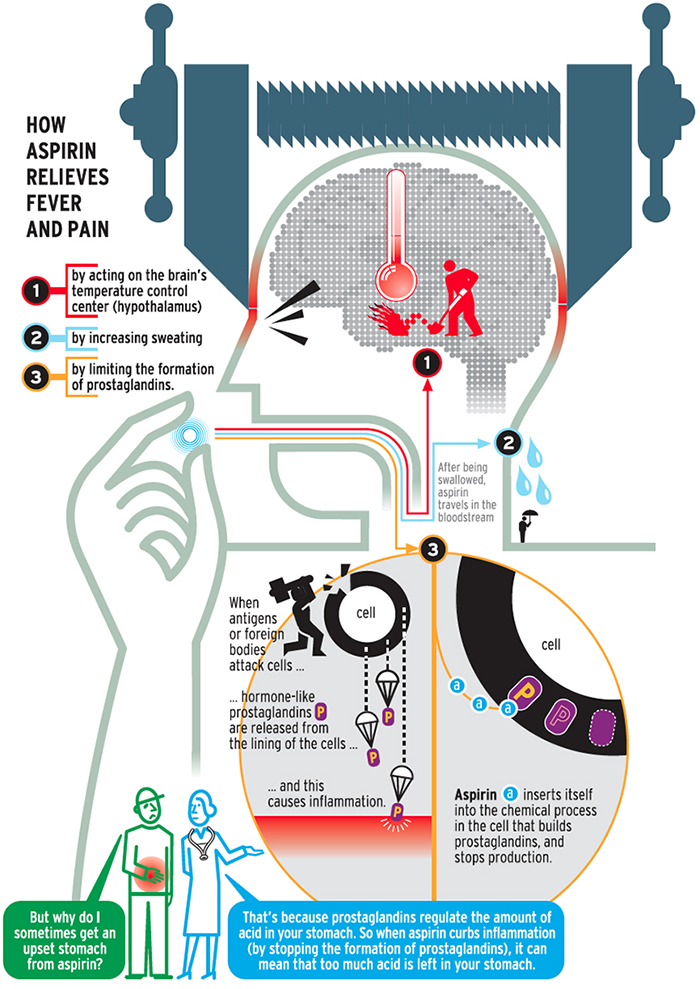
Nigel calls the people commenting at the bottom of the graphic, “the Greek chorus.”
For Attaché magazine.

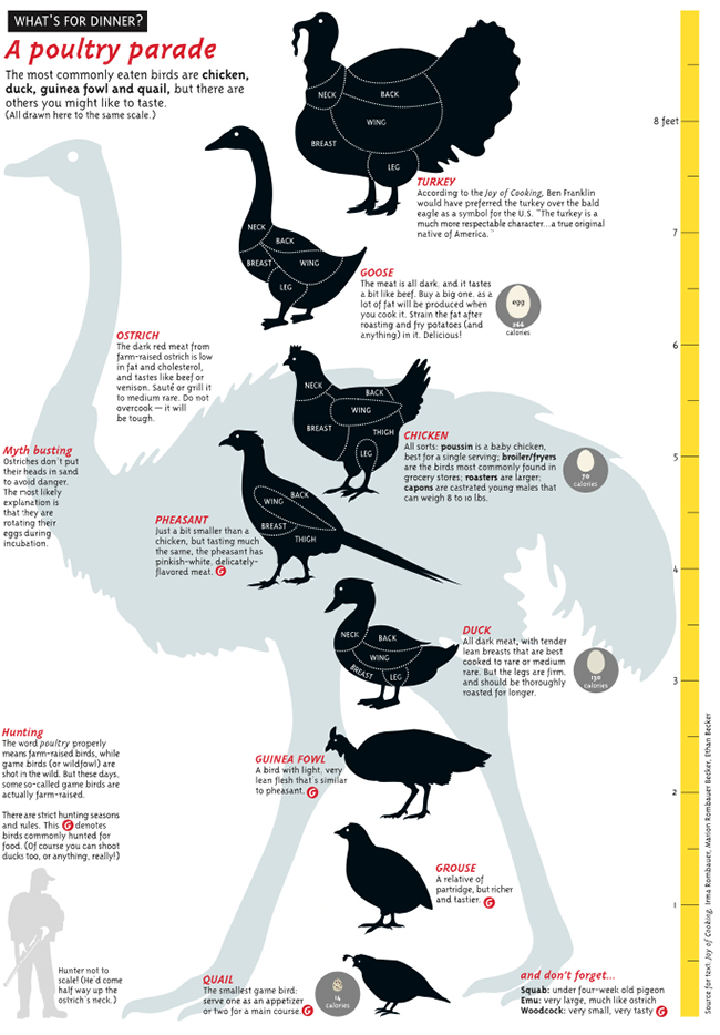
A size comparison of eaten birds for Taschen’s “Food and Drink Infographics.”

How the book began
Nigel explains: “Alberto Cairo*, my editor, came up with both the idea for the book and the title. I was initially concerned that my work, and the way I would write about it, might not be a good fit for an academic publisher. But Alberto assured me that I should just go ahead and write it the way I wanted to, and that the publisher wasn’t expecting a textbook. The more I wrote, the less like an academic book it became. I wondered if it was too much like a memoir—even further away from the kind of book that the publishers typically produced. But they said I’d been around long enough in the field to be a little indulgent about my infographic influences and early life.”

Below, an early (1967) illustration for the Observer Magazine.

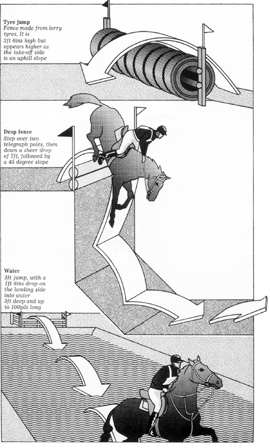
Steeplechase obstacles for the Radio Times (1972).

Designing for an audience
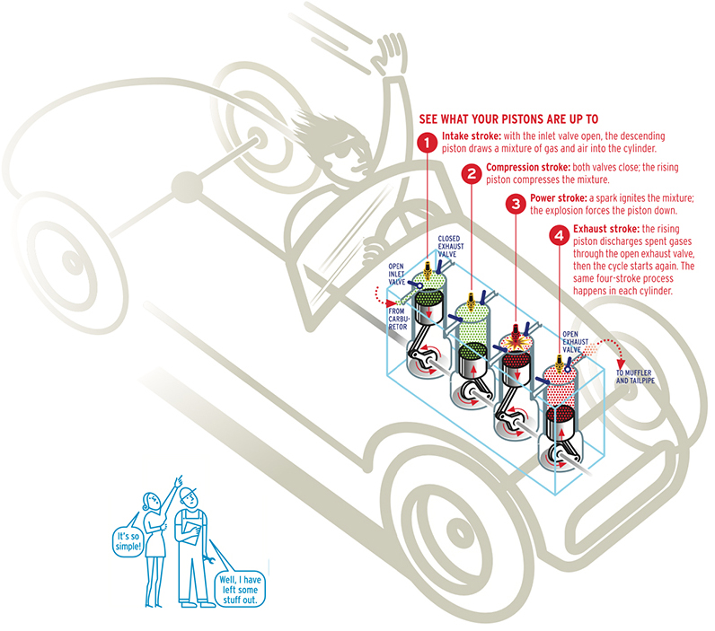
Matching the approach to the people viewing the explanation is crucial.
This Attaché magazine graphic is intended for casual readers as opposed to car enthusiasts.

Icons, icons, icons
Nigel has made a crazy number of icons during his long career.
Here’s a complete set for the Billion People Project. And how they look in use.

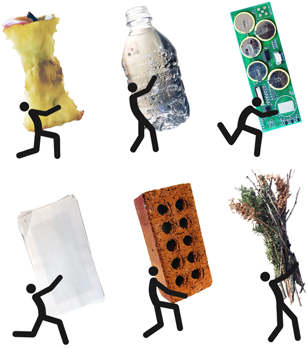
For a recycling feature in Stanford magazine.

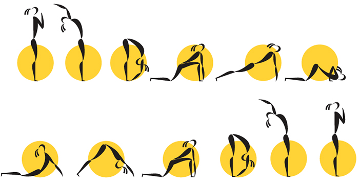
Yoga sun salutation. Unpublished.

For Smithfield Farms.

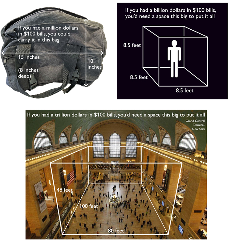
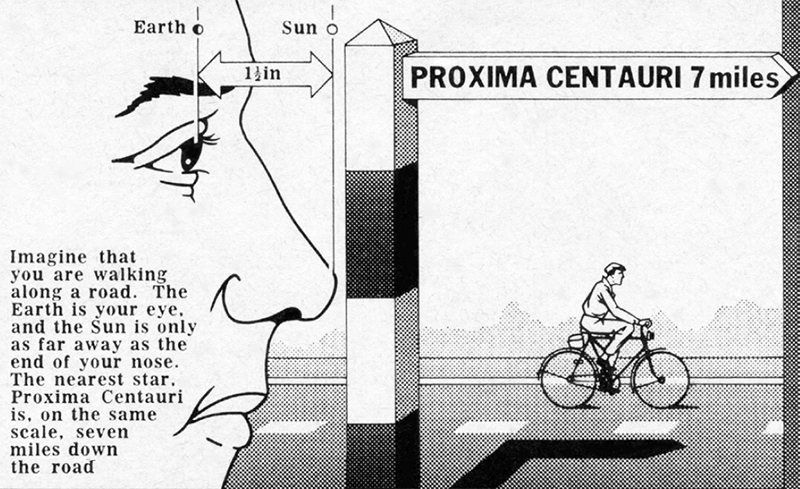
Big metrics
Nigel has often tackled the task of explaining large (and frequently misunderstood) numbers and distances.
This size-of-money explanation was made for a presentation.

How far to the nearest star? From the Radio Times, 1974.

Wait for the hardback
A note from Nigel: “If you’re tempted to buy the hardback version, don’t do that yet; the publisher made a mistake and applied their generic book cover, not the custom yellow one you see on various sites. The problem will be fixed in a few weeks. Meanwhile, the paperback is fine (and costs about a quarter of the hardback price!)”

* Alberto Cairo is the Knight Chair in Visual Journalism at the School of Visual Communication of the University of Miami. He’s the author of three infographic/data visualization books, and he’s working on a fourth.


Visualizing the invisible

MAPS POWERED BY DATA.
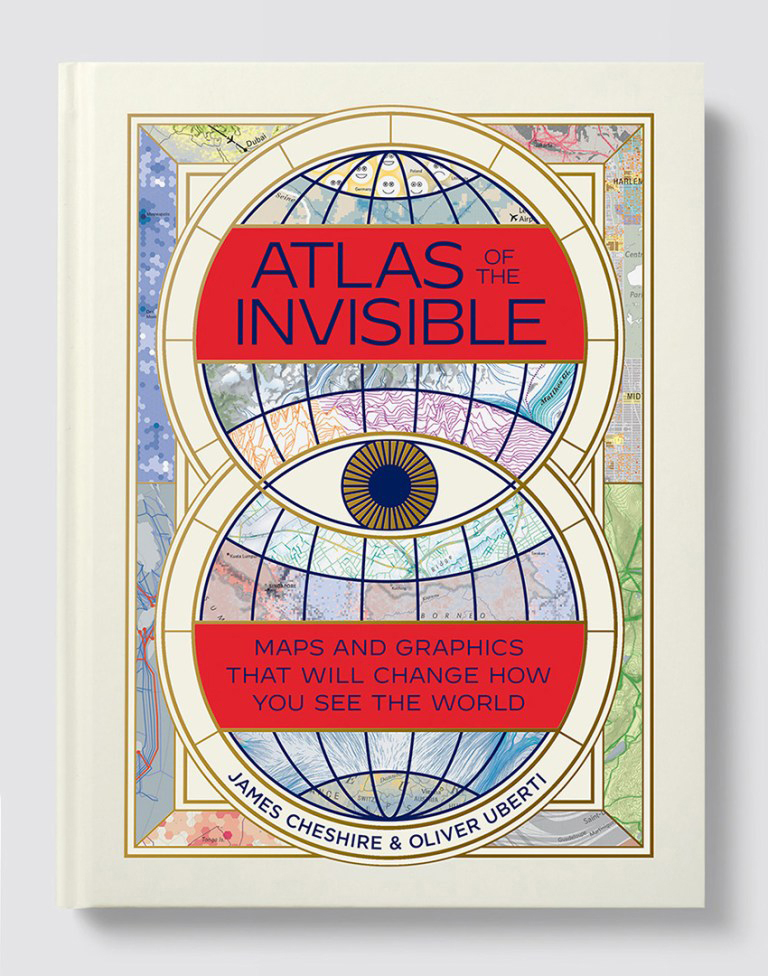
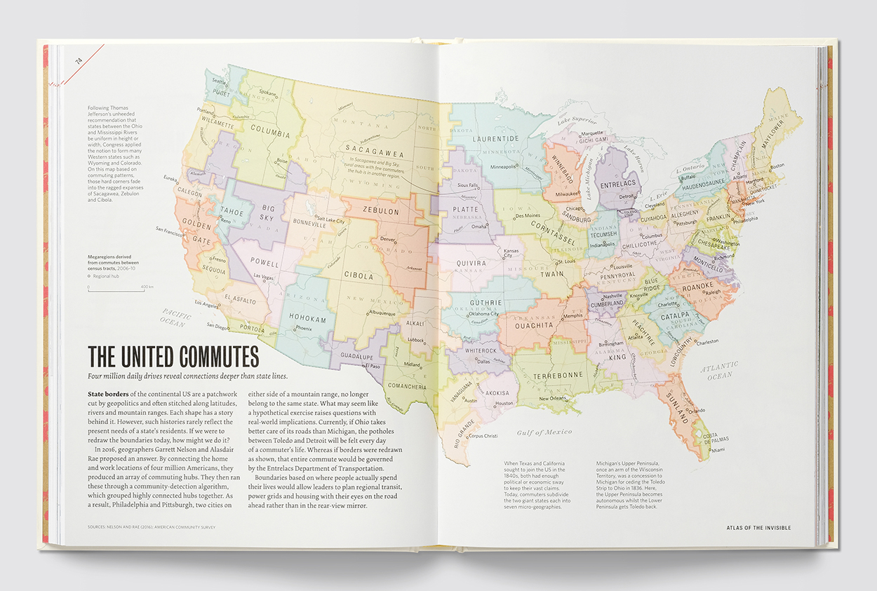
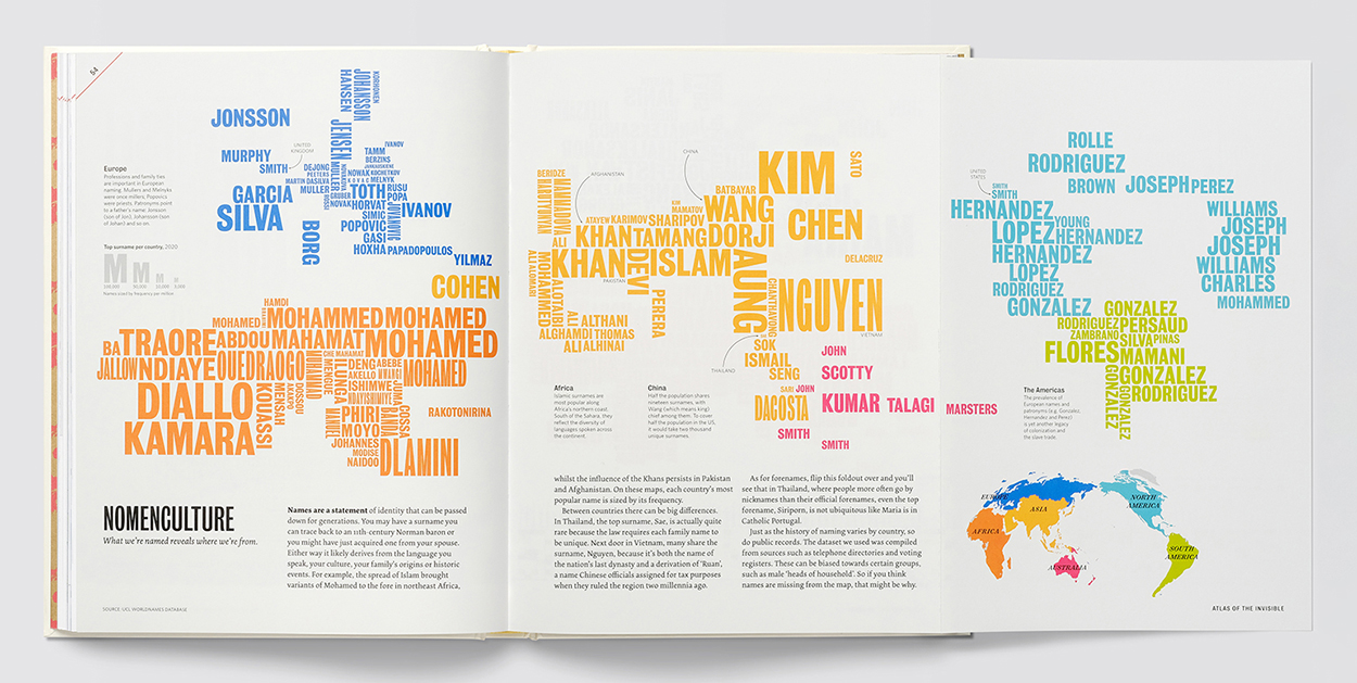
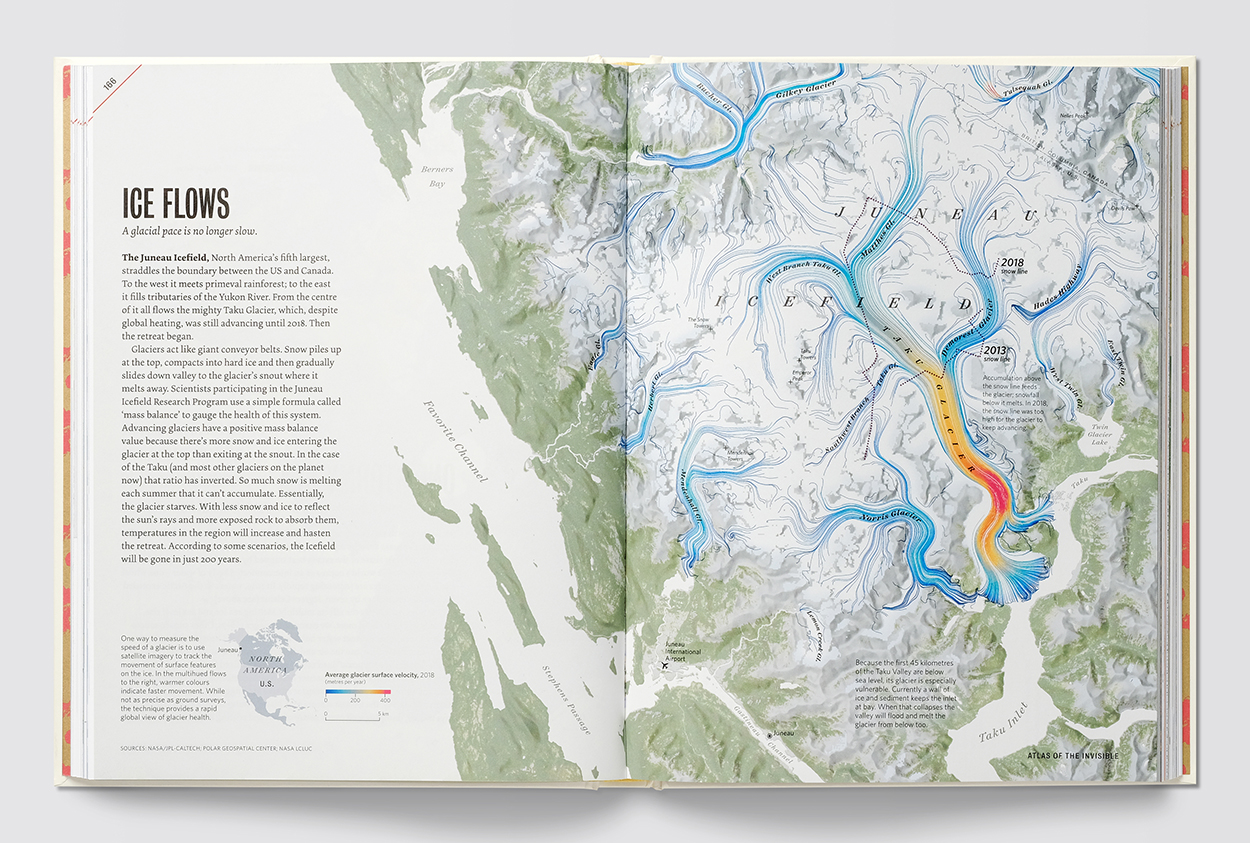
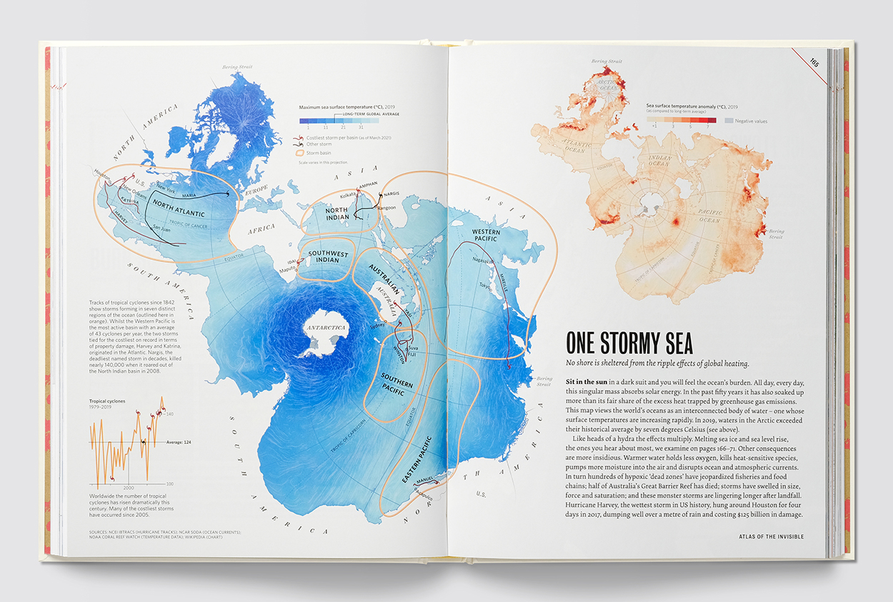
James Cheshire and Oliver Uberti’s latest book doesn’t follow the traditional idea of an atlas that depicts visible geographical features. This collection of maps, developed using large datasets, reveals hidden patterns that tell a specific story.
The U.S. and U.K. editions are available here: https://www.atlasoftheinvisible.com

Below, boundaries based on commuting.
Names by continent.
Glacial movement.
The world’s oceans connected.
MAKING DATA-DRIVEN MAPS
I asked Oliver and James about the way the ideas were developed. This is very much a geographer (James) and designer (Oliver) collaboration, from ideas to initial plots, back and forth (through GitHub) looking for a strong story before moving towards the final visuals. They describe this sequence as “topic/data/angle/form.” It’s a rigorous process: around 50% of the initial ideas for the Atlas didn’t make it into the book. Overall, they’re trying to avoid being too generalist, and instead hone in on a focused narrative. A clear primary takeaway, followed by secondary and tertiary information.

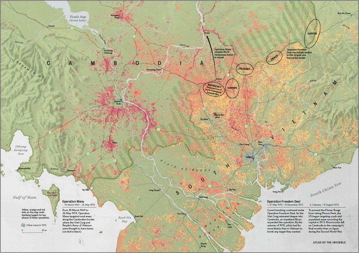
Here’s the process for two aircraft-related maps that had different developmental approaches. Carbon Overhead is a visualization that evolved toward greater simplicity, Bombshell Reports was more about wrangling added complexity. In both cases, the formal choices were in response to the angles Oliver and James had chosen for each topic.

An editor’s note here about the importance of words: In both the examples below, and throughout the book, the use of carefully-crafted text (written by the authors) introduces and supports the graphics.

CARBON OVERHEAD
TOPIC: Flight data
ANGLE: Choosing to fly is one of the most carbon-intensive choices an individual can make.

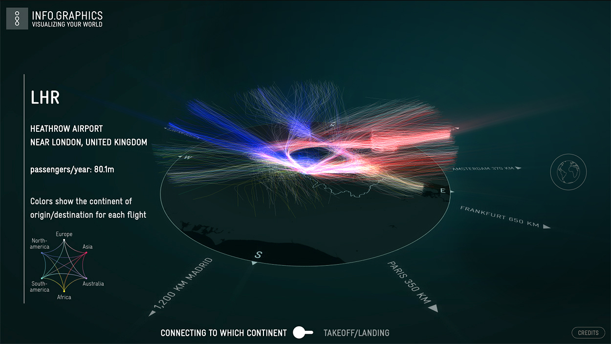
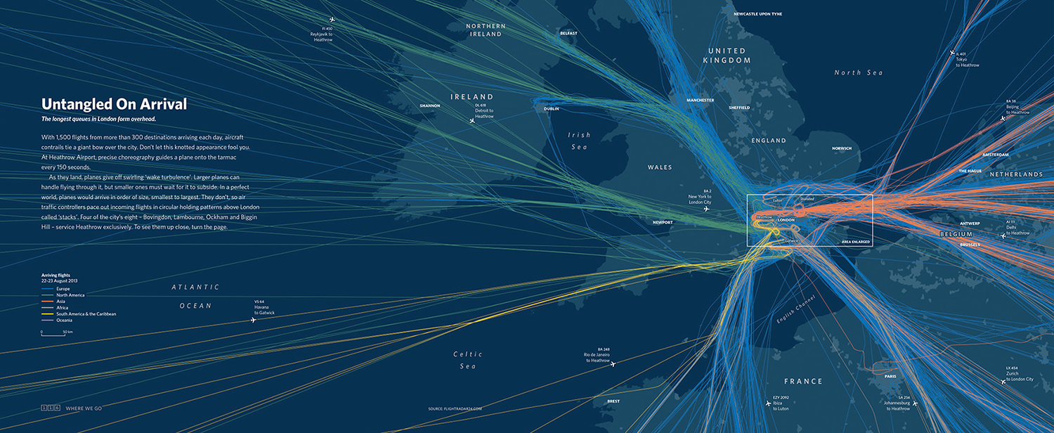
The carbon idea was originally inspired by this graphic from one of their previous books, “London: The Information Capital.” Incoming flights to London’s airports were colored by their continent of origin.
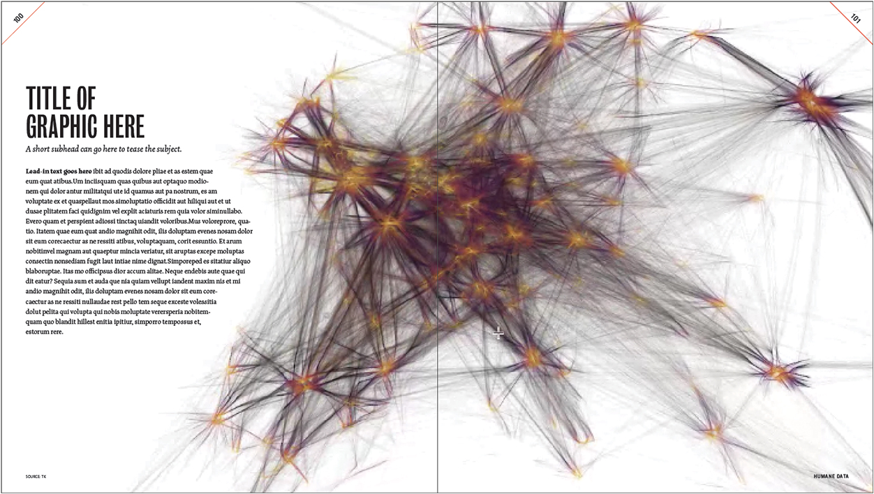
The first step for the new graphic was to see what the flight data looked like plotted across all of Europe. In this complex tangle of lines, blue indicates low altitude where planes take off and land.

Next, James began to clean the data, while Oliver dropped a recolored plot into a layout to begin thinking about the overall spread design. (It was not ideal to have the book’s gutter bisecting the continent.)
Note that they don’t wait until the end of a project to put things into a layout. They test layouts early: 1) to ensure the exports will work on the page, and 2) because when they don’t, that discovery often informs new approaches.
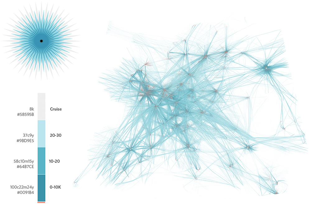
Oliver began to explore whether a celestial color palette might better suit the density of lines at different altitude levels.
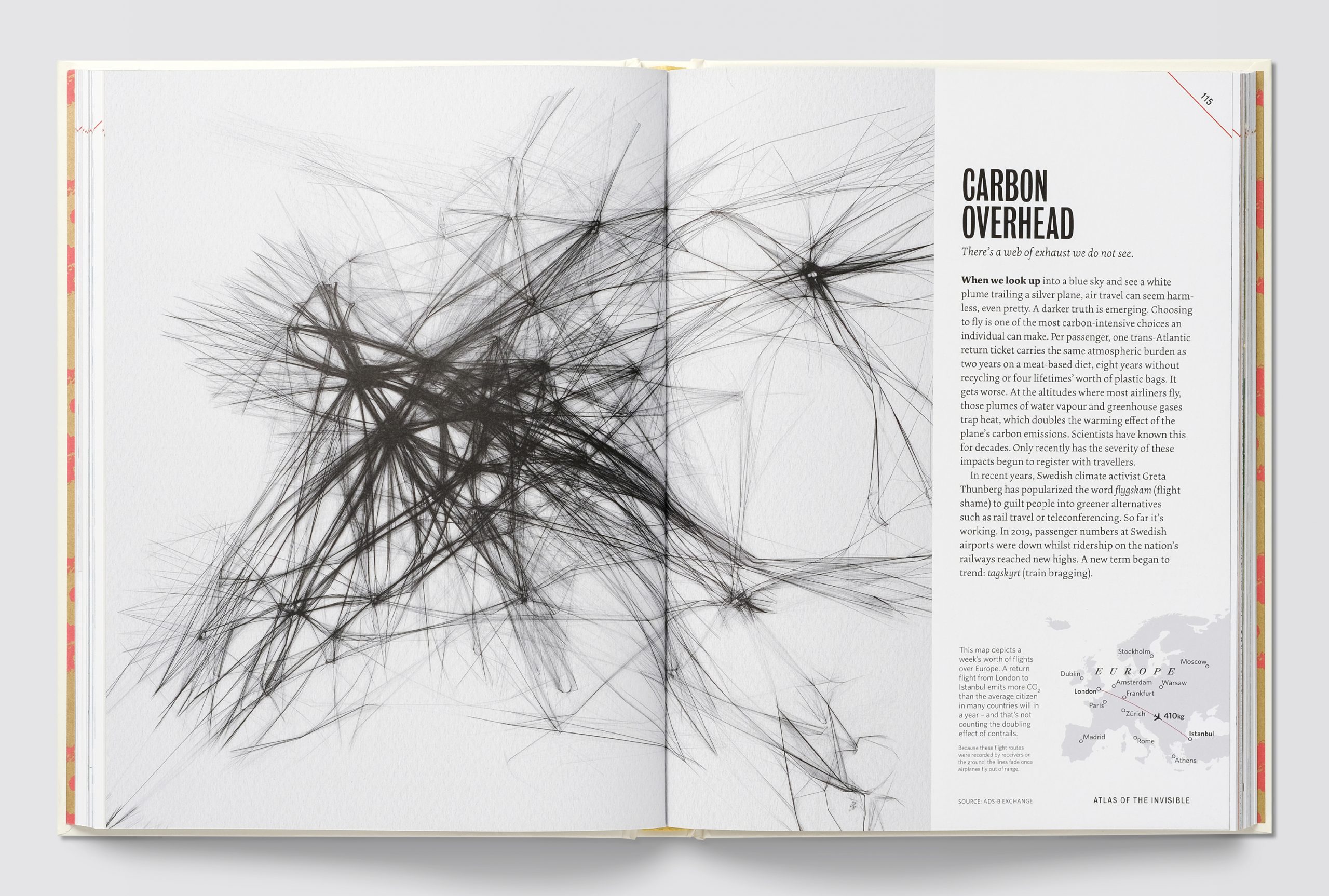
Ultimately, they realized that for a story about the impact of airplane emissions, it was clearer and more appropriate to reduce the color scheme to black lines only. Oliver shifted the text to a righthand panel to allow the gutter to fall in a less intrusive area. A locator map orients readers since James and Oliver chose to keep labels off the main image, which resembles a charcoal drawing.
BOMBSHELL REPORTS
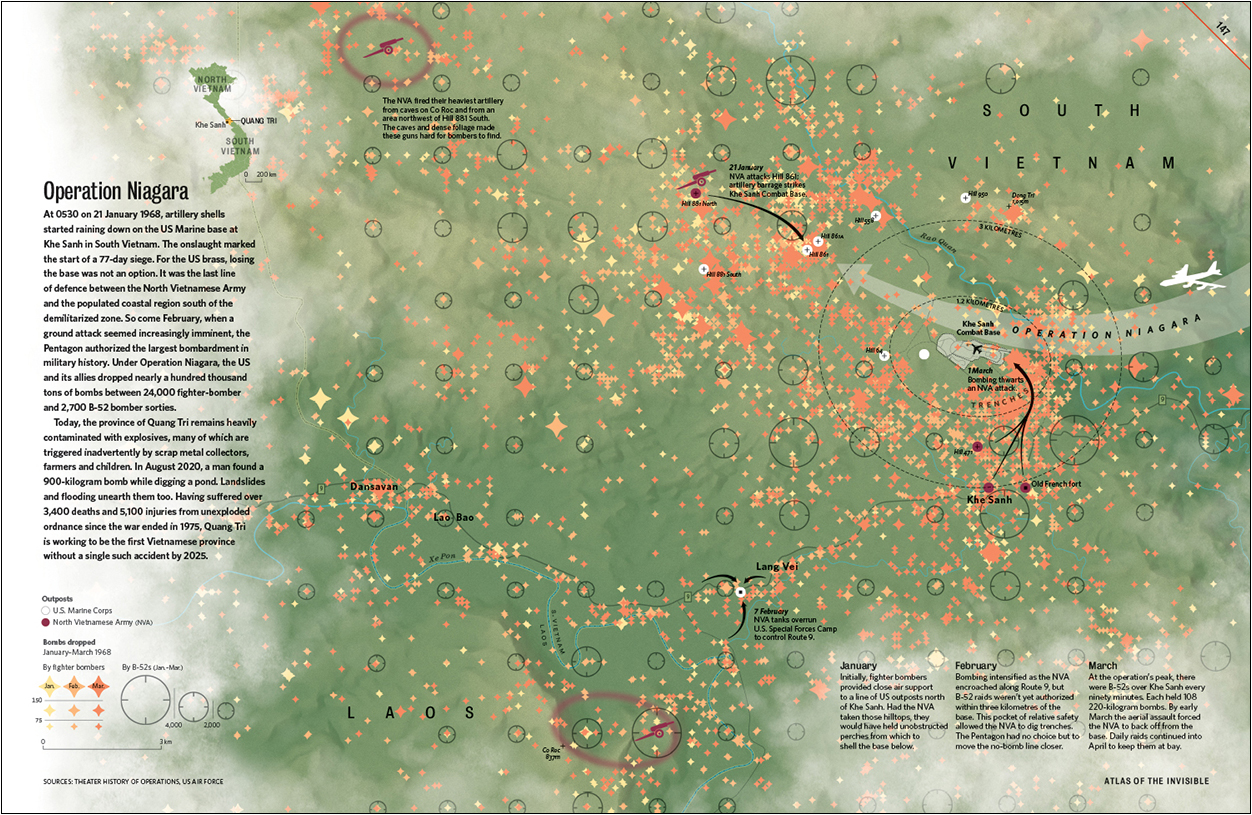
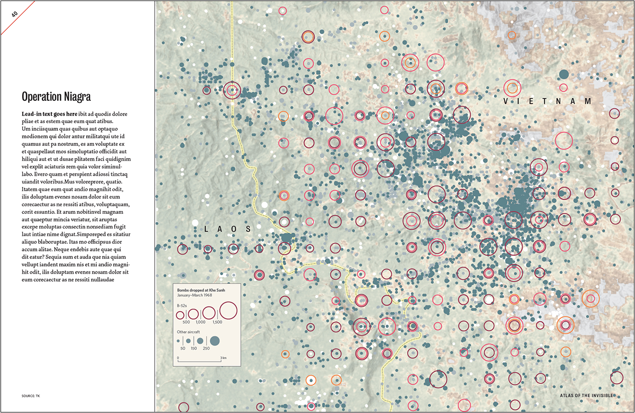
TOPIC: Declassified data on the secret bombing of Cambodia and Laos during the Vietnam War, plus the largest bombardment in military history (Khe Sanh).
ANGLE: Knowing where bombs fell helps nonprofit groups locate and defuse these lethal remnants of war.

Here, Oliver was using James’s initial exports to block out how a three-part story might be arranged across multiple pages: a) bombing in a region; b) bombing in one country; c) bombing in one particular battle.

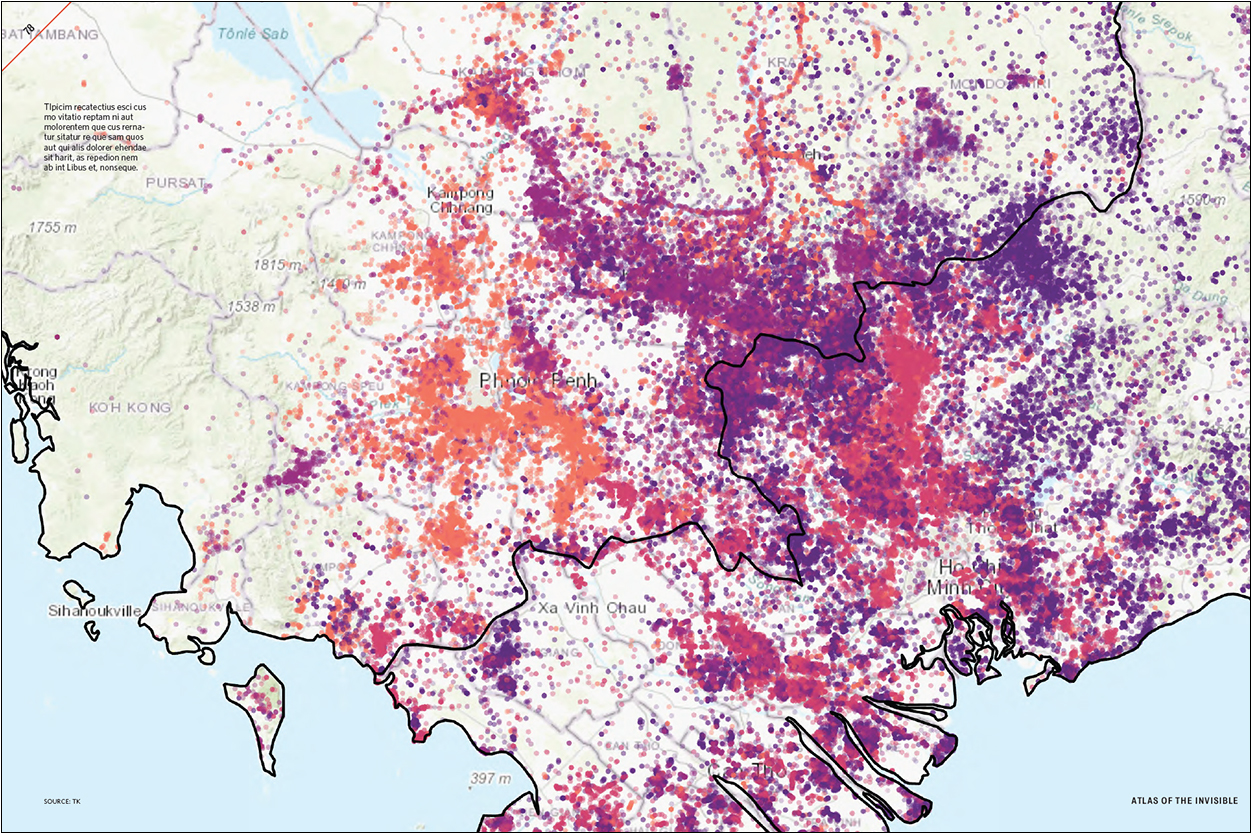
More-developed rough spreads: On the Cambodia map, data is colored by year. On the Operation Niagara map, data is sorted by aircraft type and colored by month. Oliver and James realized that there was too much going on.
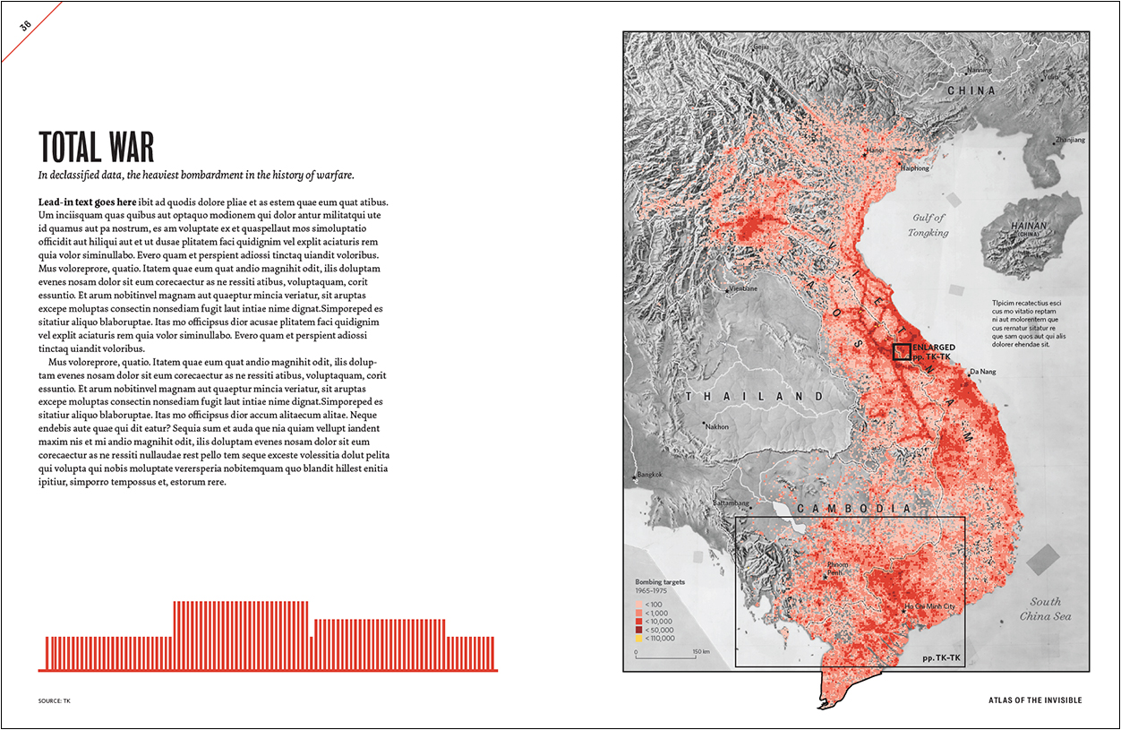
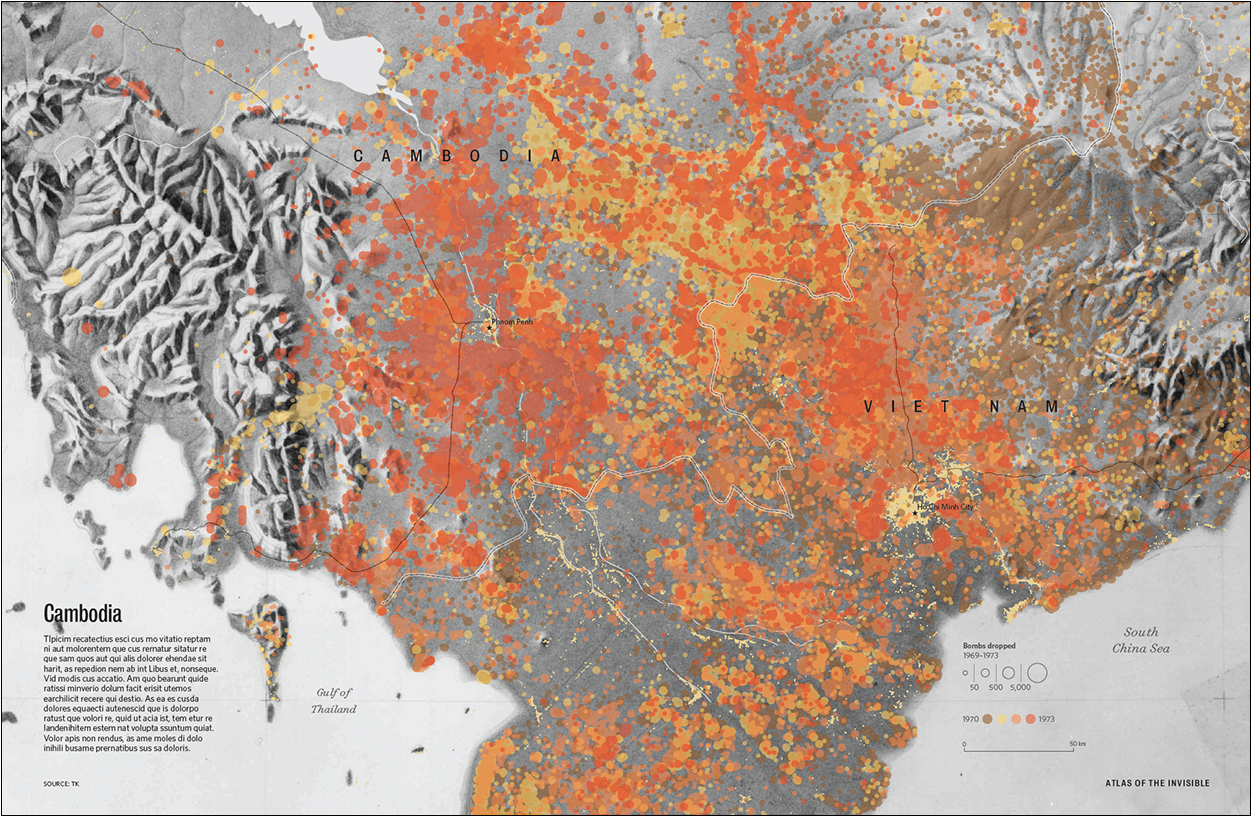
At this point, the basemaps were being revised to show Cambodia and South Vietnam’s roads, rivers, railways and urban areas in 1975. On the Khe Sanh map (below), the elevation and vegetation basemap were recolored to reduce visual noise.
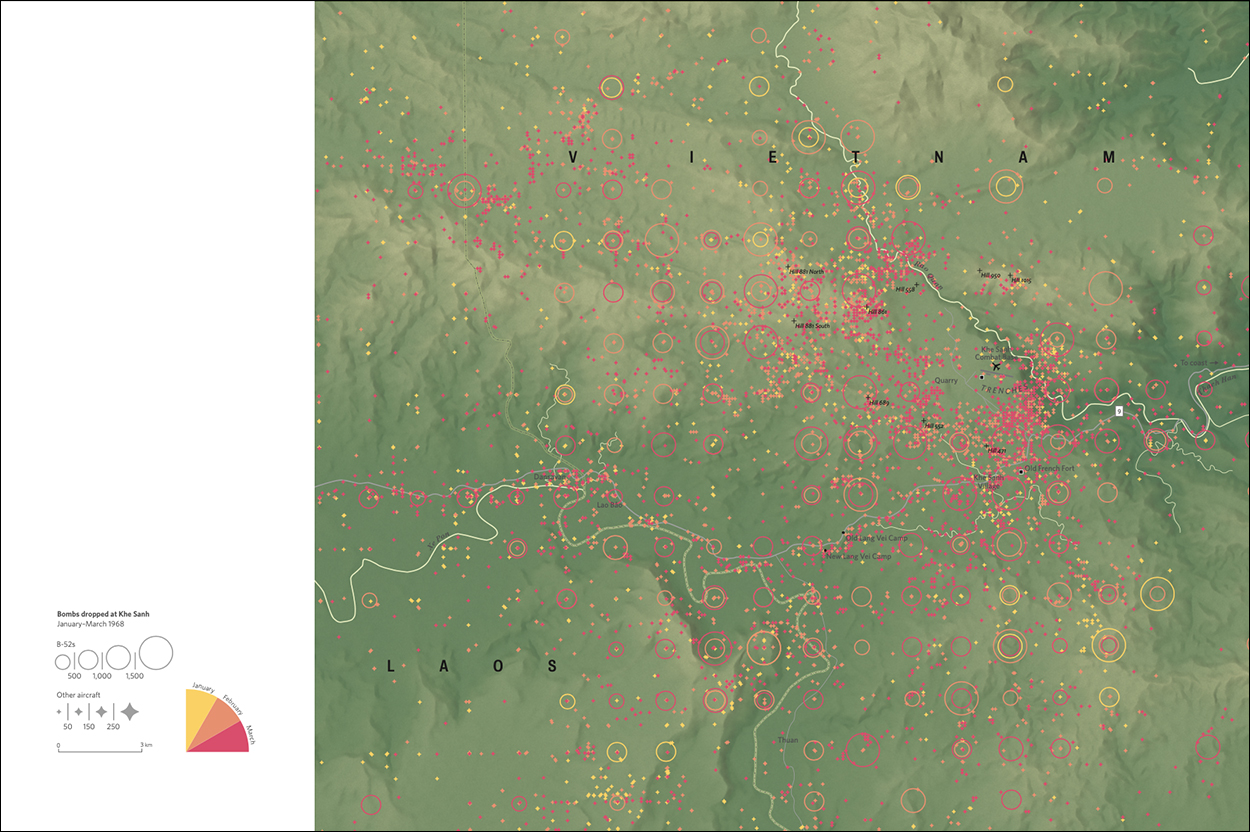
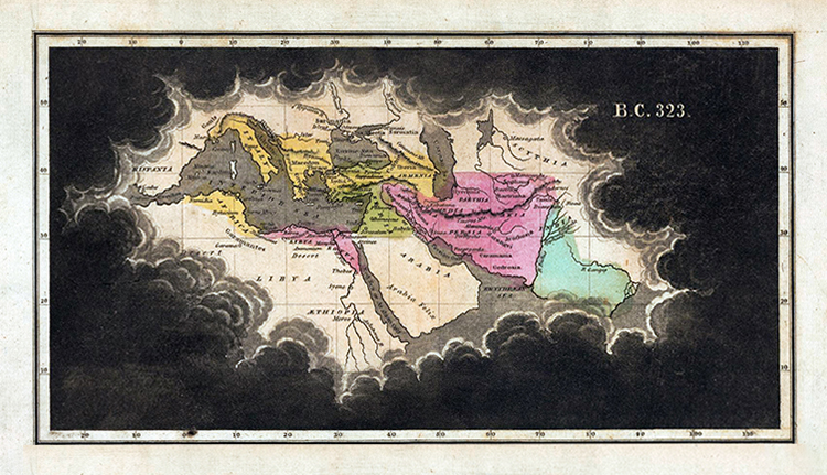
For the Operation Niagara map, Oliver needed a place to put the text, captions and locator map. Then he remembered a map James once showed him by Emma Willard (1836, from the David Rumsey Map Collection) that isolates a geographic area through a gap in the clouds.
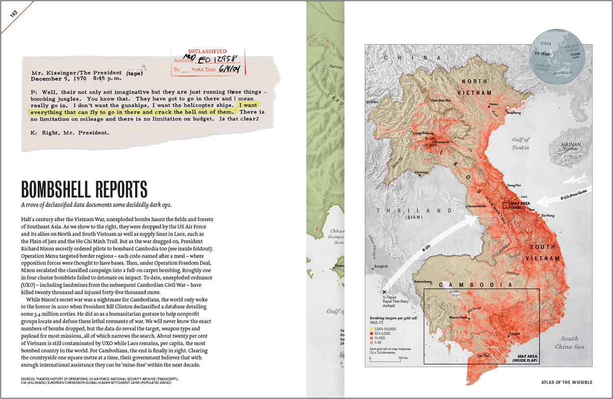
The final pages (below) have a right-hand gatefold. The data on the Cambodia map was regrouped and recolorized into three missions instead of five years. James and Oliver also did away with graduated quantities in favor of targets. That made it easier to see the change when Nixon ordered bombings—illegally— across the border in Cambodia. On the Khe Sanh map, all B-52 bombs were grouped together, and the month-by-month color coding was reserved for fighter bomber sorties only. For greater clarity, the bombs-dropped quantities in the key were regrouped from four bins to three.
The authors
James Cheshire is a Professor of Geographic Information and Cartography at University College London.
https://jcheshire.com
Oliver Uberti is a freelance map and infographic creator, and a former senior design editor for National Geographic.
https://www.oliveruberti.com

Previous collaborations
Where the Animals Go (2016): https://www.oliveruberti.com/where-the-animals-go
London: The Information Capital (2014): https://www.oliveruberti.com/the-information-capital
Universal facts

OPENING A WINDOW TO THE WONDERS AROUND US.

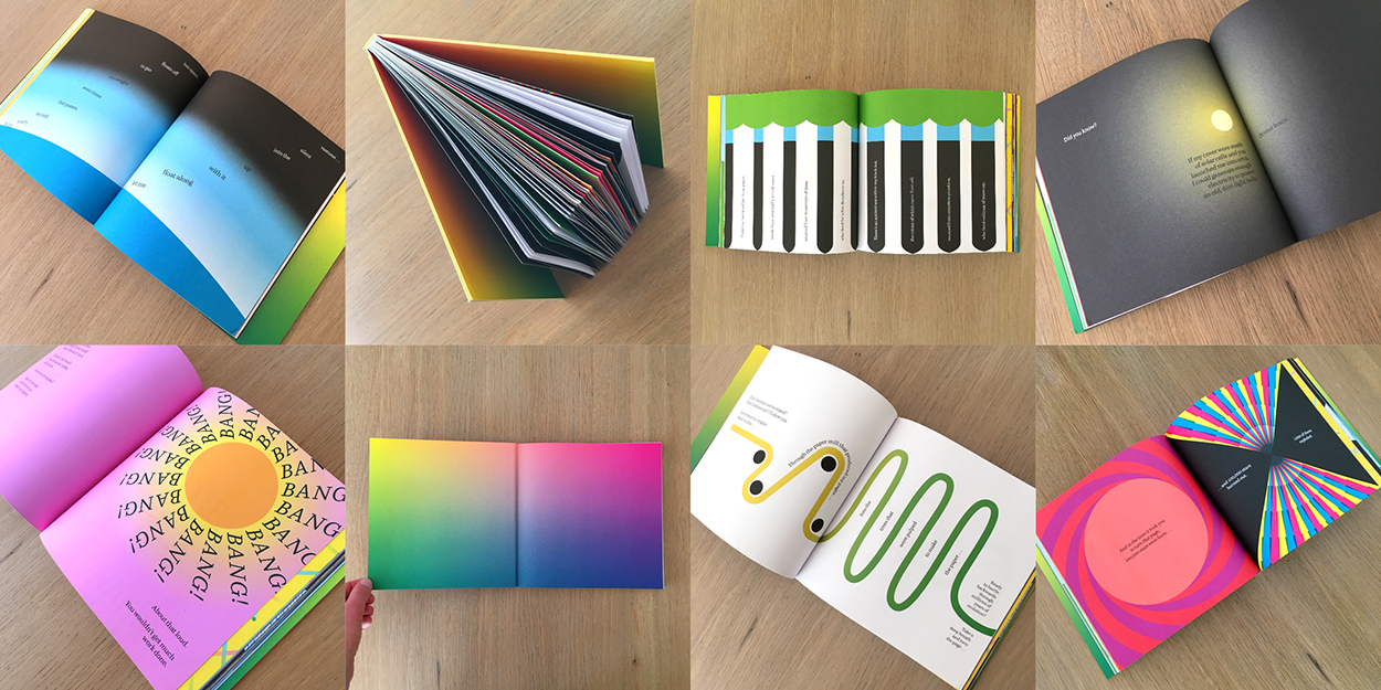
This intriguing book by Stefanie Posavec and Miriam Quick was published in the U.S. at the beginning of the month. It introduces scientific facts by relating them to the metrics of the book. So the book itself is the constant frame of reference.

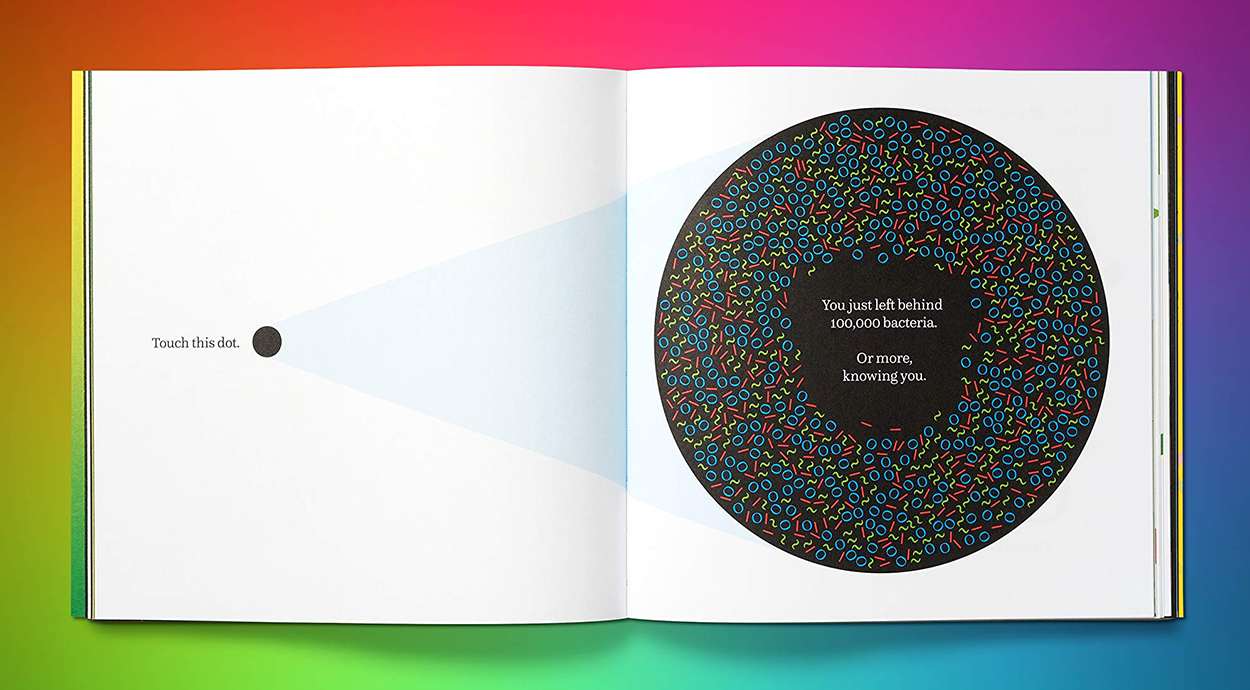
In the book’s own words: “I am not a book of infographics. I am an informative, interactive experience, in which the data can be touched, felt and understood, with every measurement represented on a 1:1 scale. Every one of my measurements—from the size of my pages, to the height of my type, to the noise I make when slammed shut—embodies a fascinating fact about the universe, down from the very largest scales to the very smallest.”

From Stefanie: “Our overall aim was to create an accessible book that would explain fundamental facts about our world (and universe) to a broad, all-ages readership that might be put off by a book with the words science or data on its cover. We’re proud to have created a data book that only uses the word data twice (in our bios), where it couldn’t be helped!”
And it’s one of the Financial Times’ Best Books of the Year 2020 (Children and Young Adult).

Buy it here: https://amzn.to/2QQ6FAS

A previous post about two of Stefanie’s other collaborative data viz projects, with Giorgia Lupi: wp.me/p7LiLW-2Ip

Seeing color differently

COLOR-VISION DEFICIENCY.

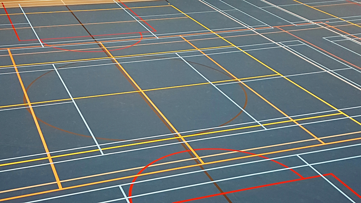
Frédérik Ruys (an infographics friend) took this photo at his local sports center in Utrecht, the Netherlands. A multi-use floor can be a visual challenge when it has markings for korfball,* volleyball, badminton, baseball and soccer. Frederik says he can’t properly watch his children play korfball because of a color-vision condition that makes it difficult for him to separate the relevant set of court markings from the others.
(I suspect it could be quite hard work for me too.)

*A non-contact sport, similar to netball and basketball, but with four female and four male players in a team.

Testing
Some example images from the well-known Ishihara 38-plate test (which was first published in 1917). The numbers in the circles are repeated at the bottom of this post.
You can take it, and other vision tests, here: https://www.color-blindness.com/color-blindness-tests/

Numbers and variants
Around 1 in 12 men and 1 in 200 women have a color-vision deficiency of some form. Approximately 300 million people worldwide are affected. So this is clearly a topic that all information designers should consider. Deuteranomaly is the most common type of red/green color deficiency, and is mild. Many people are not even aware they have this condition, unless they take one of the tests. This is the one that affects Frédérik.

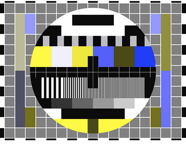
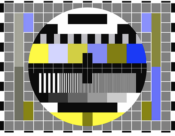
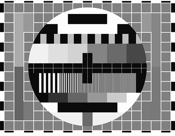
Below, a TV test card seen through a color blindness simulator, which can be downloaded here: https://colororacle.org
First, the original image.

Protanopia: Relatively common.

Deuteranopia: Relatively common.

Tritanopia: Rare.

Achromatopsia: Extremely rare.

Eyewear
EnChroma makes color-recognition-correcting glasses. I don’t have any information about how effective this technology is, but it’s an area worth investigating. https://enchroma.com

Resources
Adobe Illustrator and Photoshop have built-in proofing for protanopia and deuteranopia available under View > Proof Setup > Color Blindness. And there are other online resources, like this: https://bit.ly/3eFML2a

Editor’s note: “Color blindness” could perhaps imply a complete lack of color recognition, so I’ve tried to avoid that term here, although it is still widely-used to describe color deficiency.

(The sample Ishihara test numbers are 12, 8, 5, 2, 26)

Planetary motion

GEARED MODELS OF THE SOLAR SYSTEM.

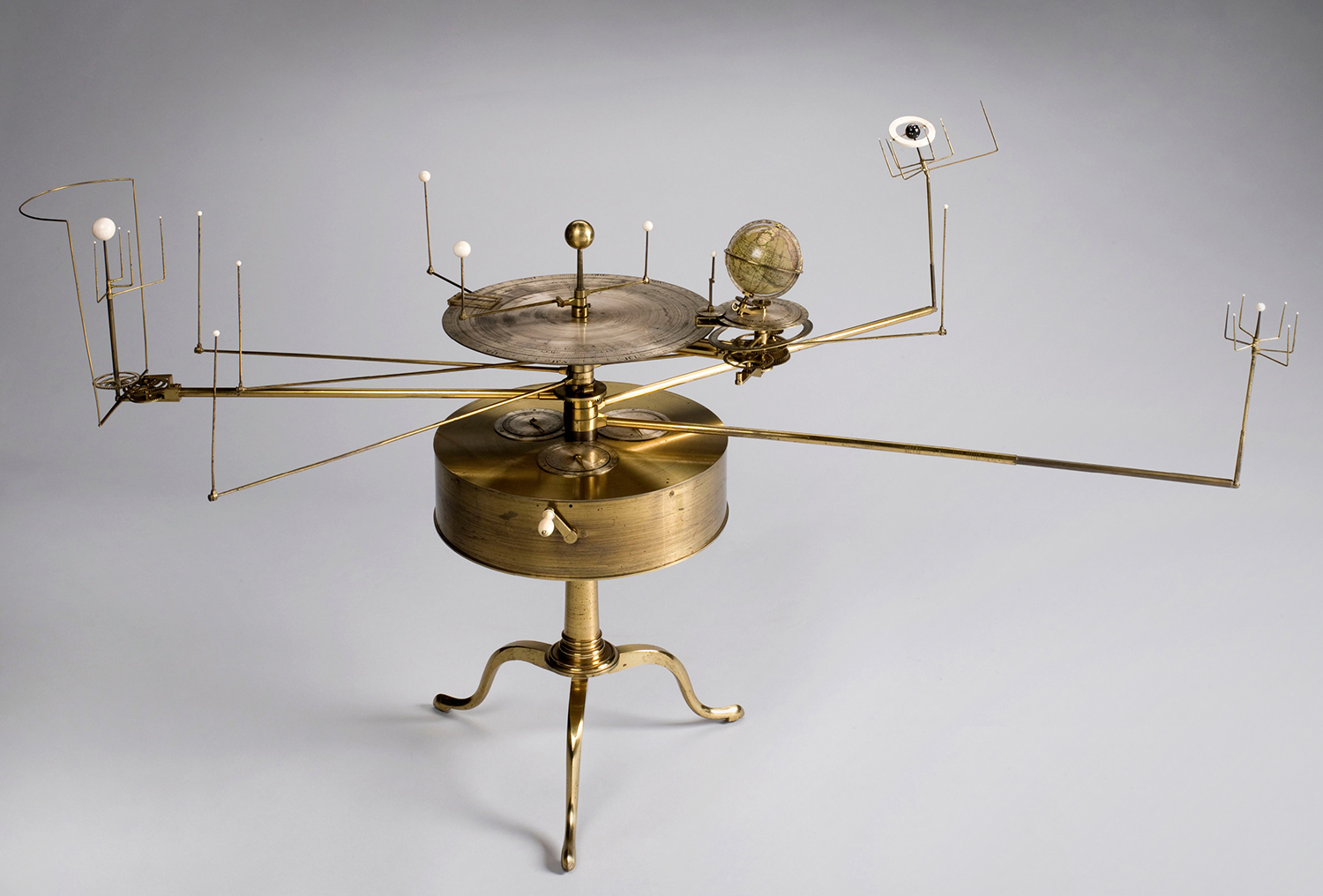
An orrery represents the relative positions and motions of the planets. It’s named after the Earl of Orrery, who commissioned one of the earliest mechanical planetary models in 1713. The example shown here is turned with a hand crank that, through a complicated set of gears, moves the planets and moons. It was designed by William Pearson in 1813, and constructed sometime in the following nine years by Robert Fidler.
Photograph: Science Museum Group Collection ©The Board of Trustees of the Science Museum

The model is obviously not to scale. The Earth would be tiny, and a huge distance from the Sun. This earlier post was about the scale of the Solar System: https://wp.me/p7LiLW-A8

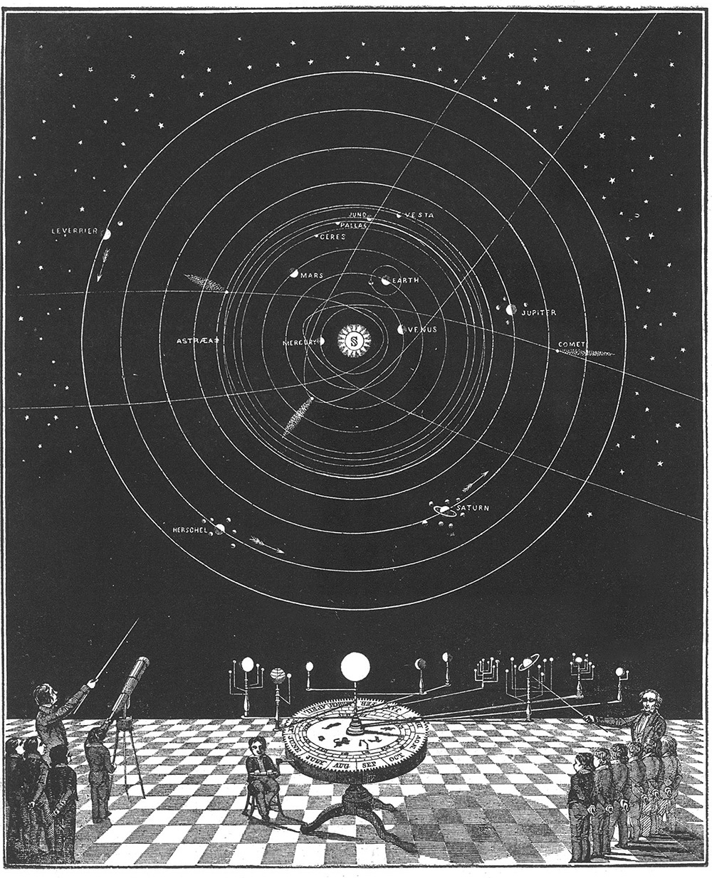
Below, an image from Smith’s Illustrated Astronomy (1850) with an orrery in front of a diagram of the planets and their orbits.

This 1776 painting by Joseph Wright of Derby shows a lecturer discussing an orrery. There’s a lamp in place of the Sun.

A tellurion (or tellurium, or tellurian) shows the Sun and the Earth. This one was made in 1776.

Photograph: Sage Ross

Build your own tellurium. A wooden kit: https://bit.ly/3dLiuhN

It’s hell out there
The planets look benign in planetary models, but in reality they’re hostile environments, to put it mildly. For example, Venus (shown below) has a toasty average temperature of 870°F (466°C), and Neptune is somewhat cold at -350°F (-212°C), plus it has brisk winds in excess of 1,200 mph (1,931 kph).

NASA/JPL-Caltech

Small

THE MICRO WORLD.


Micrographs
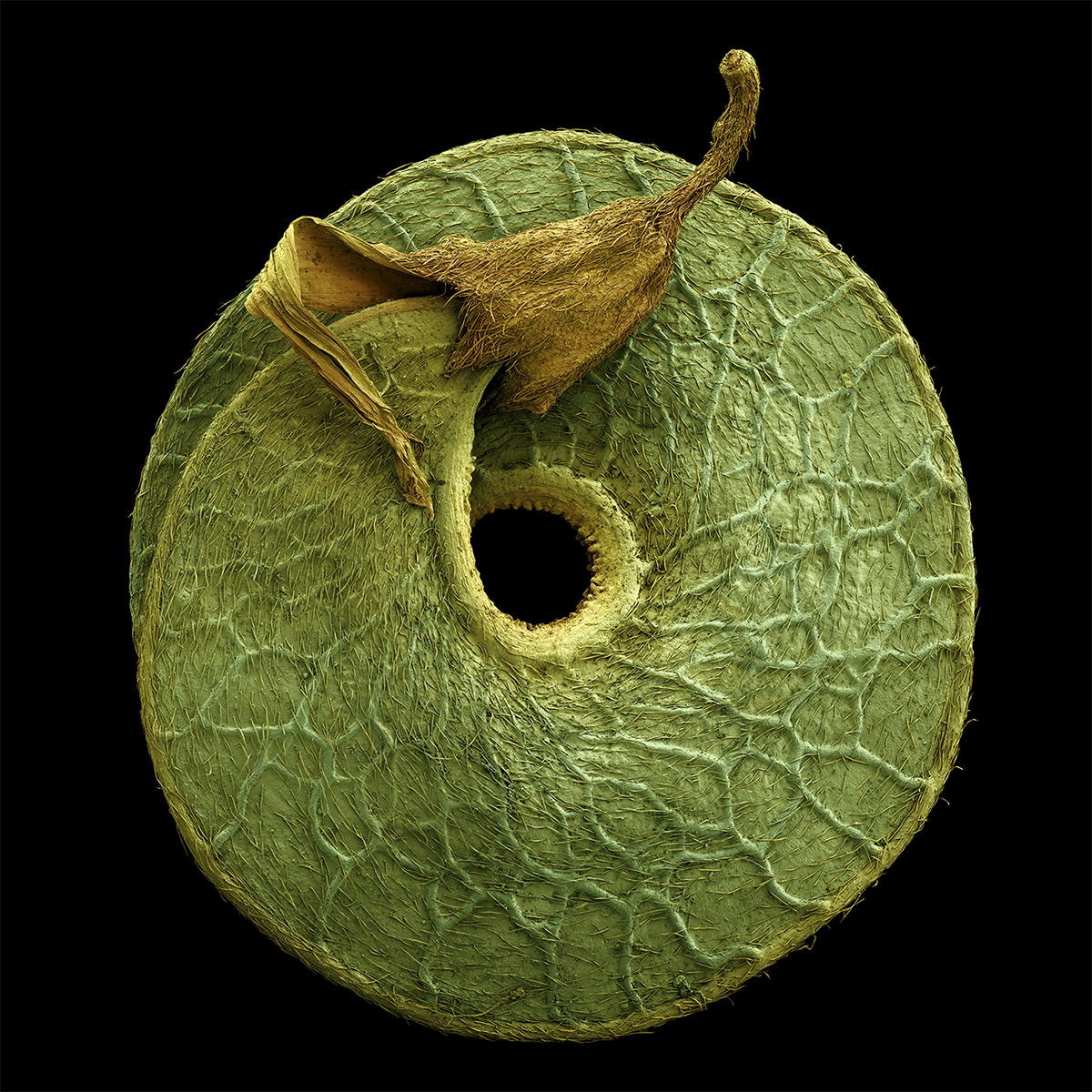
Rob Kesseler reveals the unseen world of plants in the “PHY-TOPIC” series. Using a range of complex microscopy processes, he creates composite images, adding many subtle layers of color that reveal functional and structural characteristics. Rob’s work combines science and art in the tradition of visual scientific discovery that goes back centuries. He is a Professor of Arts, Design & Science at Central Saint Martins, London. See more work here: http://www.robkesseler.co.uk

Above, Daucus carota. Wild carrot. Fruit. (From “Fruit, Edible, Inedible, Incredible” by Rob Kesseler and Wolfgang Stuppy. Published by Papadakis.) https://bit.ly/2SW7aYS

Medicago arborea. Tree medick seedpod.


Salix caprea.
Goat willow, collection of pollen grains.


Santolina chamaecyparissus.
Cotton lavender, pollen grain.


Stellaria media.
Chickweed, pollen grain on anther.


Viburnum.
Stellate leaf hairs.


Westringia.
Coastal rosemary, pollen grain.

All images © Rob Kesseler


Recognizing viruses
Unseen invaders, by Bryan Christie Design. This illustration is from 2009, which explains the influenza virus being swine flu. Today that would, of course, be COVID-19, which has turned our world upside down.


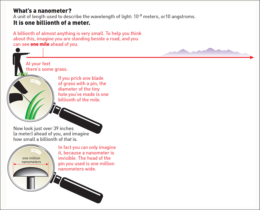
Nanometer
Nigel Holmes explains a measurement that’s used for very small items. An example: DNA is about two nanometers in diameter.


The head of a pin
In 1959, physicist Richard Feynman challenged scientists to find a way to inscribe a book page 25,000 times smaller than in it’s regular printed form. 25 years later, Tom Newman used a beam of electrons to etch the first page of Charles Dickens’“A Tale of Two Cities” on a piece of plastic 200 microns* square. At this scale, the entire Encyclopedia Britannica would fit on the head of a pin (which was the original challenge).
* 1 micron = 1,000 nanometers.

Someone once told me that my knowledge of mathematics could be written on the head of a pin with a sledgehammer. I made a few bad numerical errors in infographics earlier in my career, so that statement was not entirely off the mark.
The counterpoint to this post, “Big numbers:” https://wp.me/p7LiLW-2Wk

A related post about scale, “Powers of Ten:” https://wp.me/p7LiLW-21z

Airways

THE EVOLUTION OF THE AIRLINE ROUTE MAP.

They’re mostly found near the back of in-flight magazines, along with profiles of jets and lots of aircraft manufacturer metrics that probably only appeal to about one person per flight, maximum. (Yes, I’m that person. I want to know the wingspan of an Airbus 320.) You can find some network information in these spider-web extravaganzas, but it’s quite hard work, especially in areas where there’s lots of flights. The one above shows Delta’s US network.

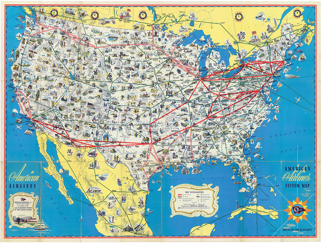
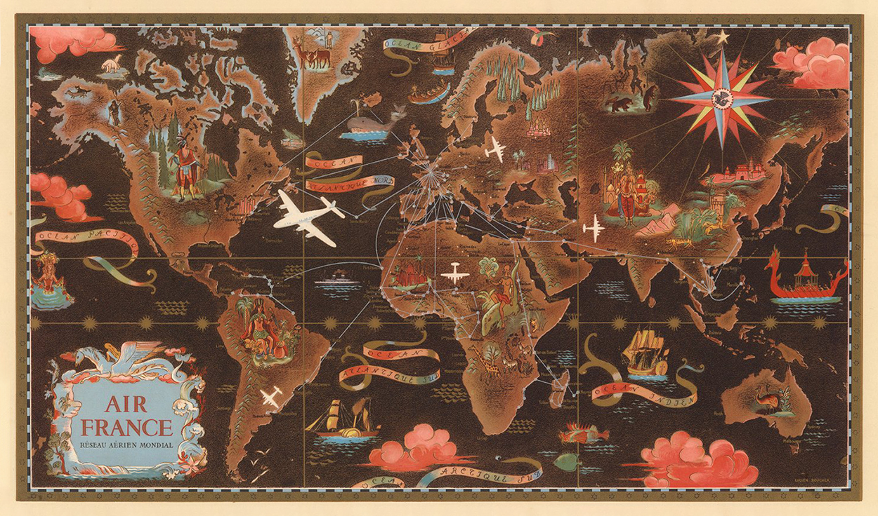
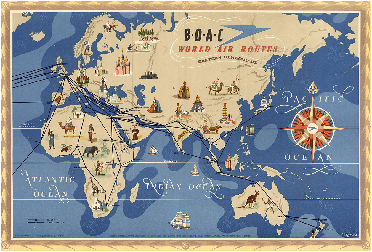
Of course, this type of map grew in route complexity as commercial air travel expanded. Early maps were pictorial and rather engaging. These historical examples, with easily defined routes, are all from the 1940s. Jet-powered airliners didn’t come into service until the 1950s, with the consequent dramatic expansion of flight networks.
Below, American Airlines, 1945. Click on the image for a larger version.

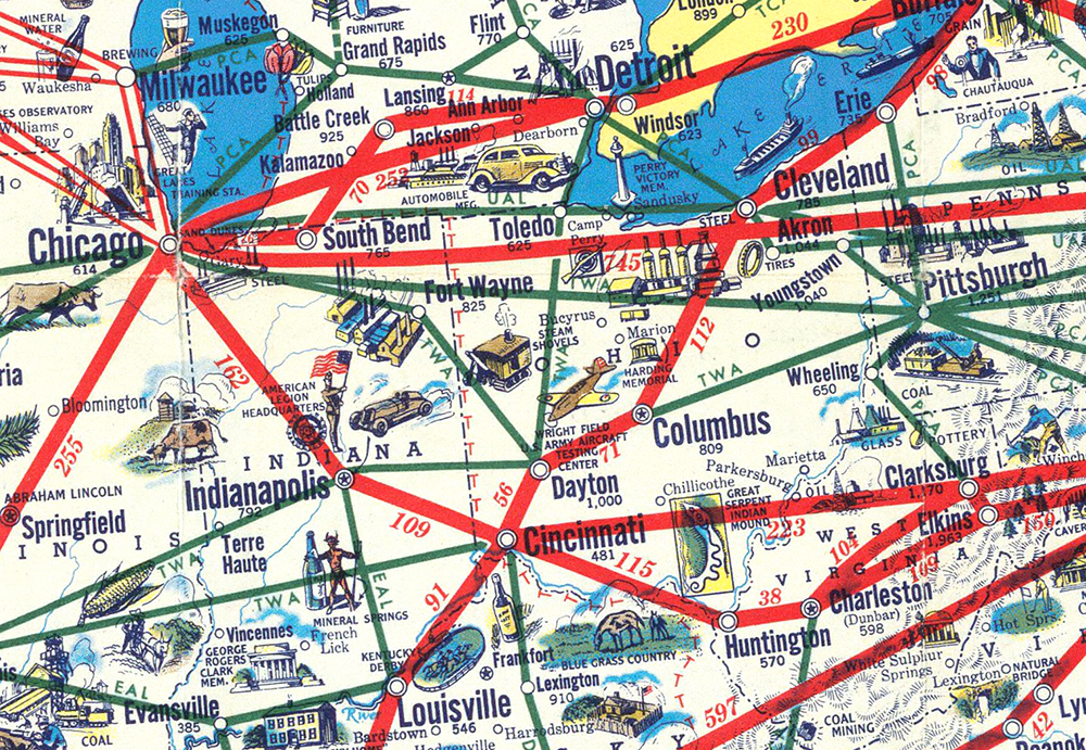
A detail. “Oh look, there’s a steam shovel down there, just like on the map!”

Delta Air Lines, 1946.

Air France, 1948.

BOAC, 1949.

The historical images above can be  downloaded in high resolution from the David Rumsey Map Collection. https://www.davidrumsey.com

Talking of BOAC (British Overseas Airways Corporation), I saw this 747 decked out in retro (and excellent) livery at Heathrow Airport last summer. It was painted to celebrate British Airway’s 100-year anniversary.

BA’s current look.

Photographs © British Airways.

The maps gradually outgrew their format as air travel expanded. With no possibility to isolate and examine a single route, they’re of marginal effectiveness in print. Obviously the lines are not flightpaths. So an airline route map is more a diagram than a map, with the lines arcing farther in an attempt to avoid all the other lines.

Pure flight
Airline routes drawn from data, by John O’Sullivan.

By Aaron Koblin. See an animated version, with a flight count, here: https://bit.ly/31QuBWf

Interactivity
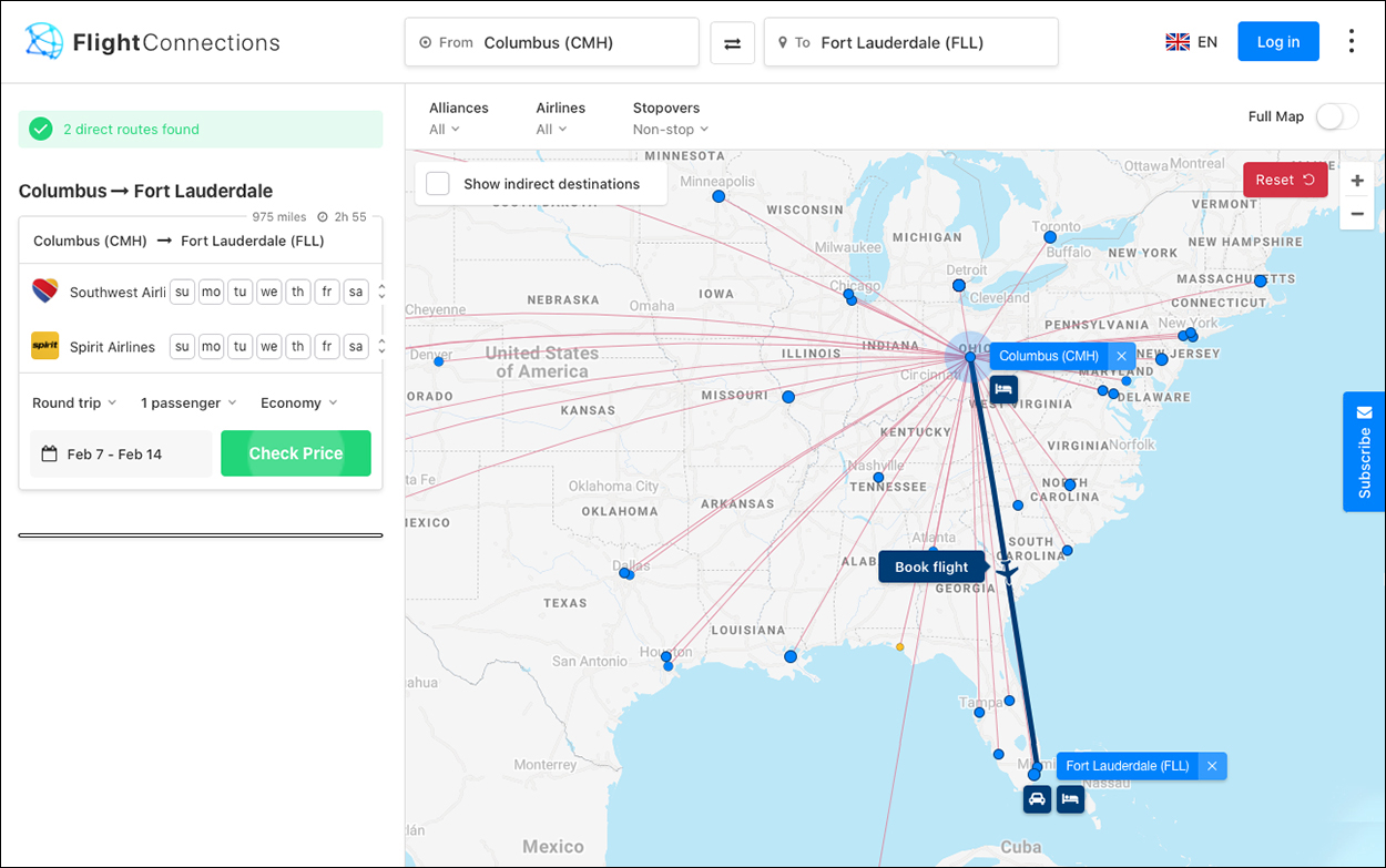
Opens up a lot of possibilities in terms of exploring route data. Here’s one example.  https://www.flightconnections.com/

And finally… interactive airport flightpaths from Infographics Group. Explore it here: https://flight-patterns.igg.solutions/

Making better data viz

ACKNOWLEDGING OUR MISTAKES, AND LEARNING FROM THEM.

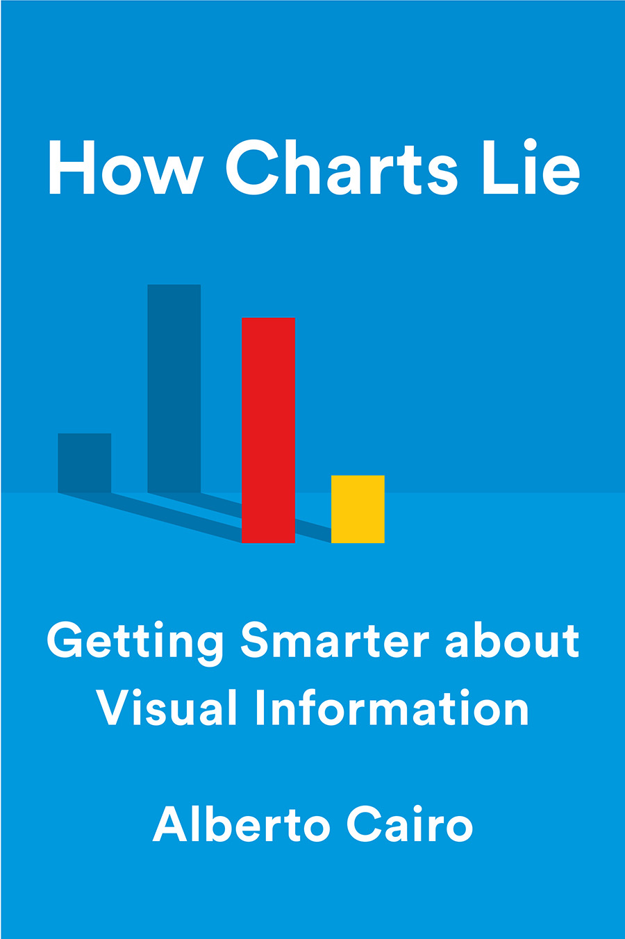
I’m a bit late getting to this, as the book was published on October 15, but that’s not in any way an indication of my feelings about the latest excellent tome from my friend, Alberto Cairo (Knight Chair in Visual Communication at the University of Miami). In my opinion, everyone who is visualizing data needs to read it.

Here’s what Alberto told me last week about his main reason for writing the book:


I’ve been designing infographics for more than twenty years, and writing books about them since 2012. Recently, I’d been thinking about their common themes, and the driving forces behind them. I realized that I wrote them as if I were telling readers, “Here, these are the things that I’ve learned through study, practice and, more importantly, trial-and-error, so you don’t have to.”

“How Charts Lie,” in particular, contains tons of examples of erroneous or commonly misinterpreted graphics, and in the book I say that I think I’ve made most of the mistakes that I describe. So I know where they come from. This isn’t false modesty, but plain truth.

We celebrate our successes, so why not do the same with our fumbles? As a consequence, the book is a playful overview of graphical disasters, but also a celebration of the power that graphics have to illuminate complex information.

Below are a few of the many examples of data visualization that Alberto analyzes in detail:

A 2016 election map with results by county. Territorial voting results do not show us how many people voted for each candidate. This one is on it’s way to be hung on a White House wall. The photograph was taken by Fox News Foreign Correspondent, Trey Yingst. (@TreyYingst) https://bit.ly/34nfh3O

Photograph by Trey Yingst. @TreyYingst


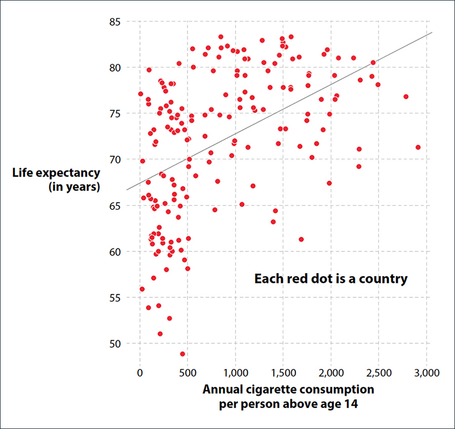
Corellation doesn’t equal causation.
Does more smoking make you live longer?


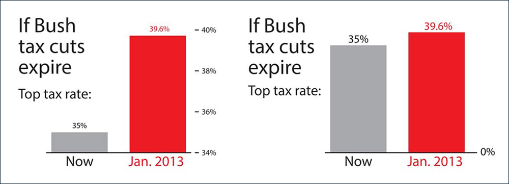
A baseline set at zero
gives a clearer impression of the difference in the numbers.


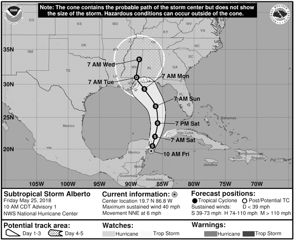
The cone of uncertainty is a frequently-misinterpreted storm warning. This is the predicted track of the aptly-named Subtropical Storm Alberto, which crossed the Gulf of Mexico in May 2018.

Buy the book: https://amzn.to/34nSEwg

A few corrections for the first edition are here: http://www.thefunctionalart.com/2019/10/how-charts-lie-few-corrections.html


History lessons

TWELVE CENTURIES OF INFOGRAPHICS.

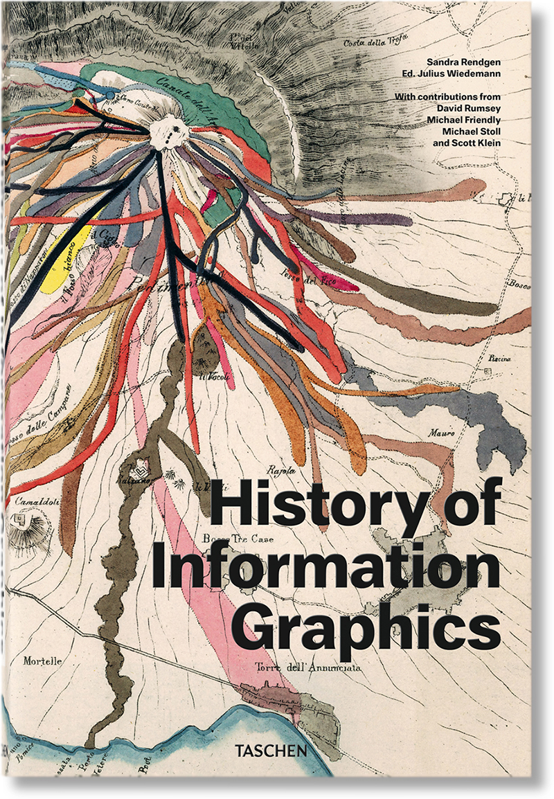
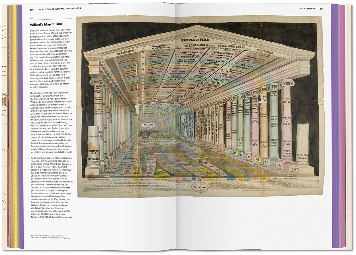
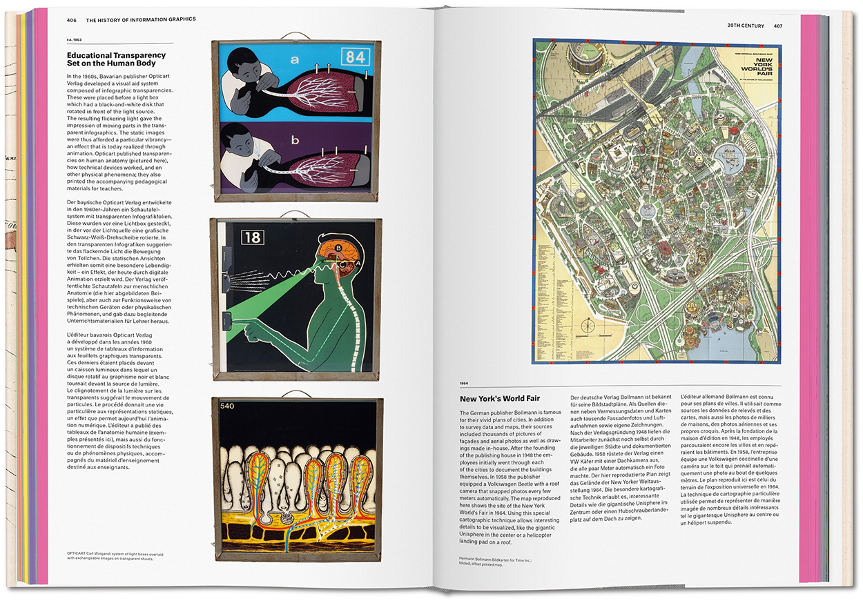
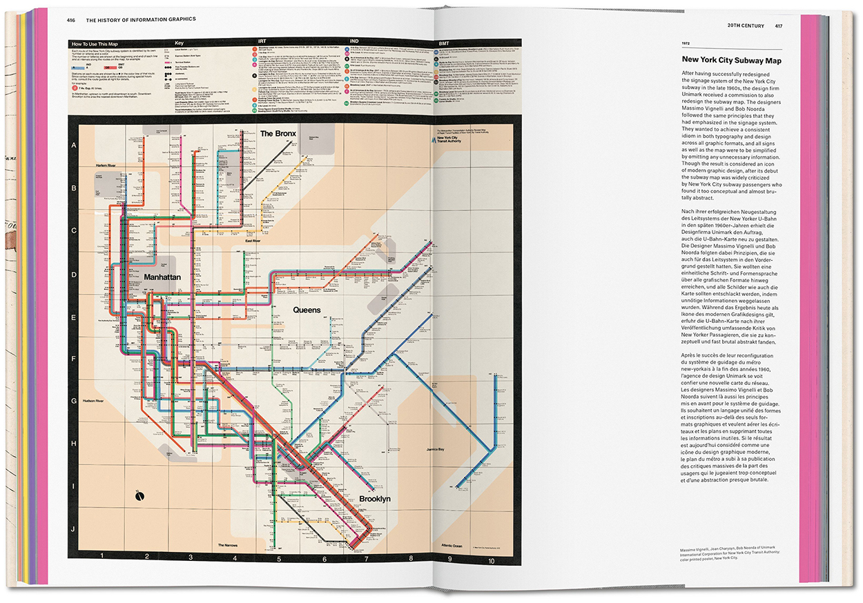
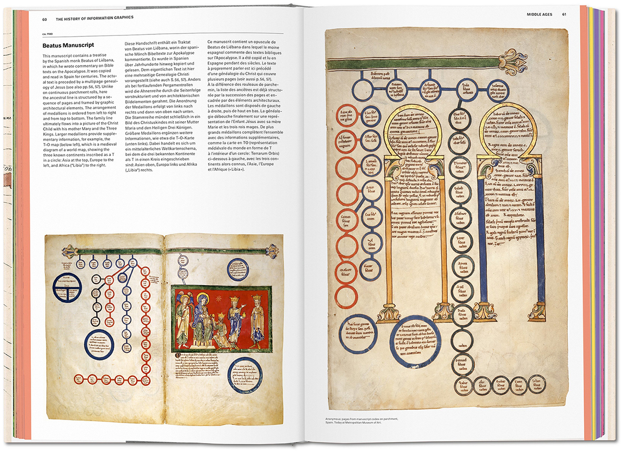
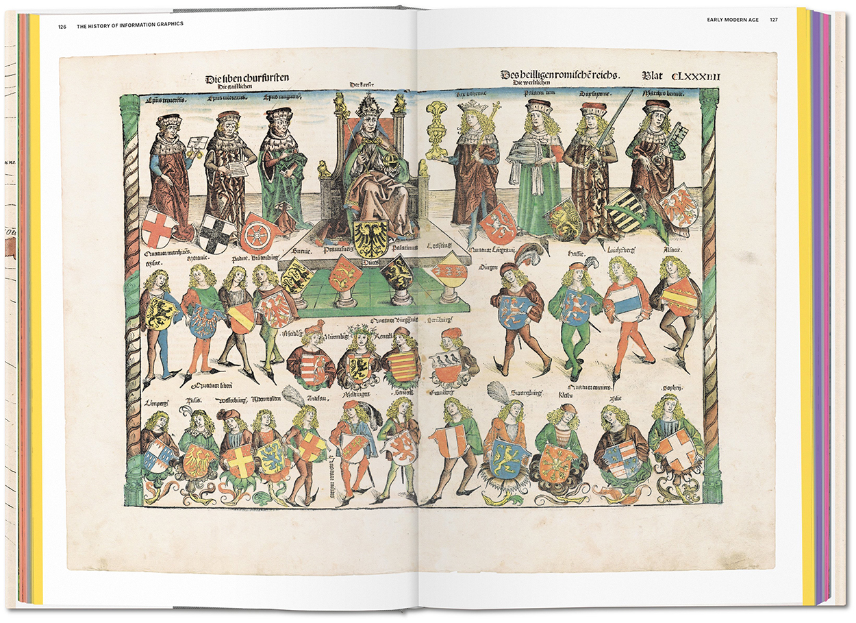
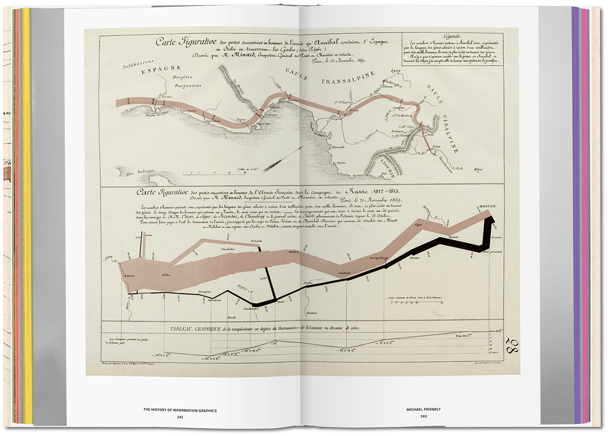
This impressive guide to historical graphics, curated by Sandra Rendgen and edited by Julius Wiedemann, was published last month. It’s big and heavy, in the Taschen tradition, and packed with around four hundred examples that track the development of information graphics from the Early Middle Ages to the end of the twentieth century. The historical progression is punctuated by separate sections that feature the collections of David Rumsey, Michael Friendly, Michael Stoll and Scott Klein. This is essential reading for people in our field.
Here are some sample spreads. Click on the images for larger versions.

Below, Beatus of Liébana, ca.1180.

Hartmann Schedel and Michael Wolgemut, 1493.

Charles-Joseph Minard, 1869. (From Michael Friendly’s collection.)

Emma Willard, 1846.

Left, Carl Weigand, ca. 1963. Right, Hermann Bollmann, 1964.

Massimo Vignelli and Bob Noorda, 1972.

Taschen’s website: https://bit.ly/2Z7pdiD

Transparency
I have a graphic in the twentieth-century section, but I’ve tried my best to be objective about the book. If you get a copy, you’ll see what I mean about there being a lot to learn from these pages.

35,000 years ago
The first post on this blog (in August 2016) was a very short history of infographics: https://wp.me/p7LiLW-9C