Category: Design

Retro tech

REMEMBERING THE GEAR WE USED TO LOVE.

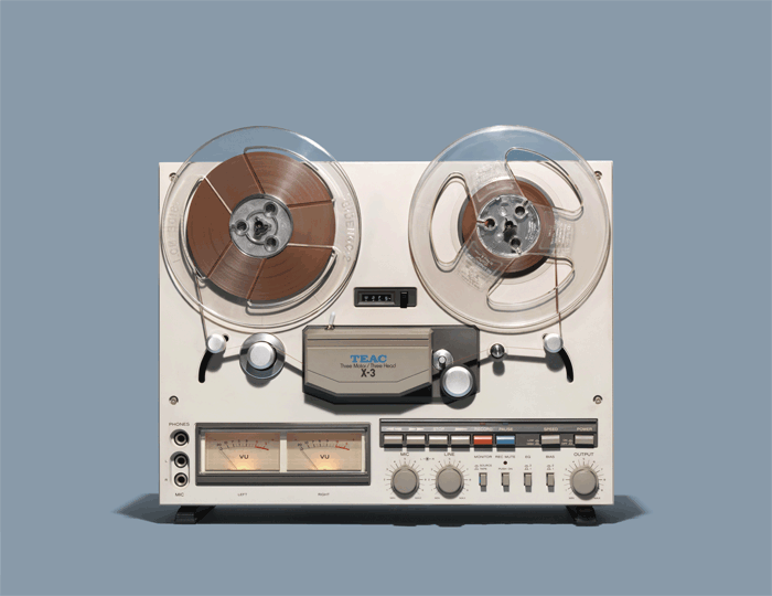
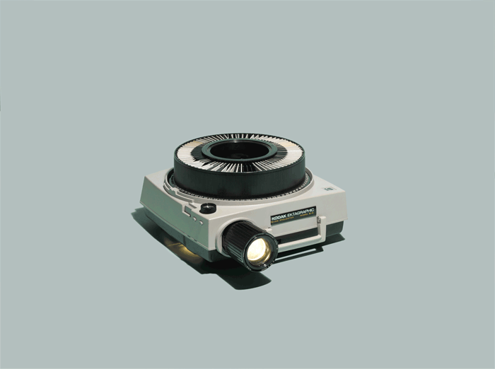
Everyone had a tape recorder, and presentations were on slides, in a carousel. Jim Golden made these GIFs.
See more of his bygone technology images here: https://goo.gl/JX1pzT

Early cellphones were bulky.

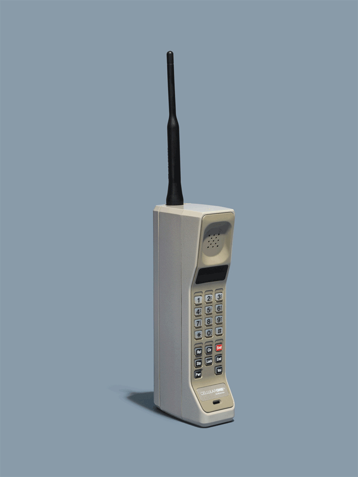
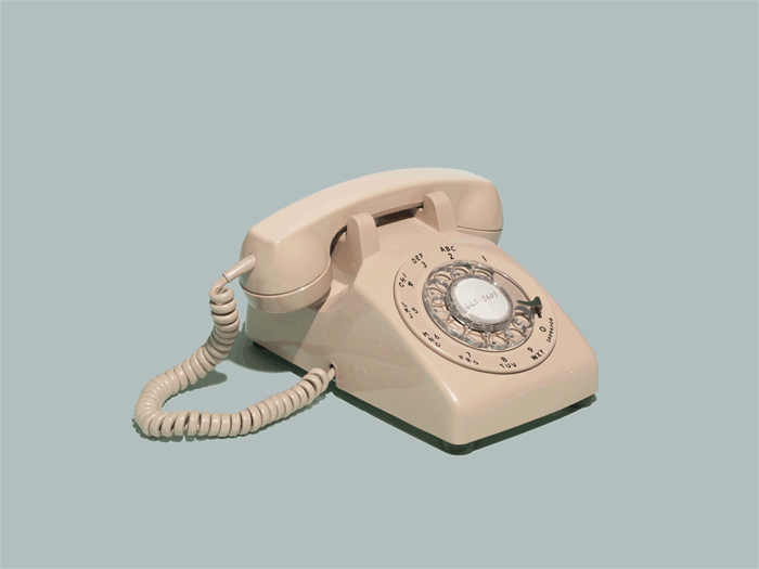
It was the beginning of the end for the conventional telephone.

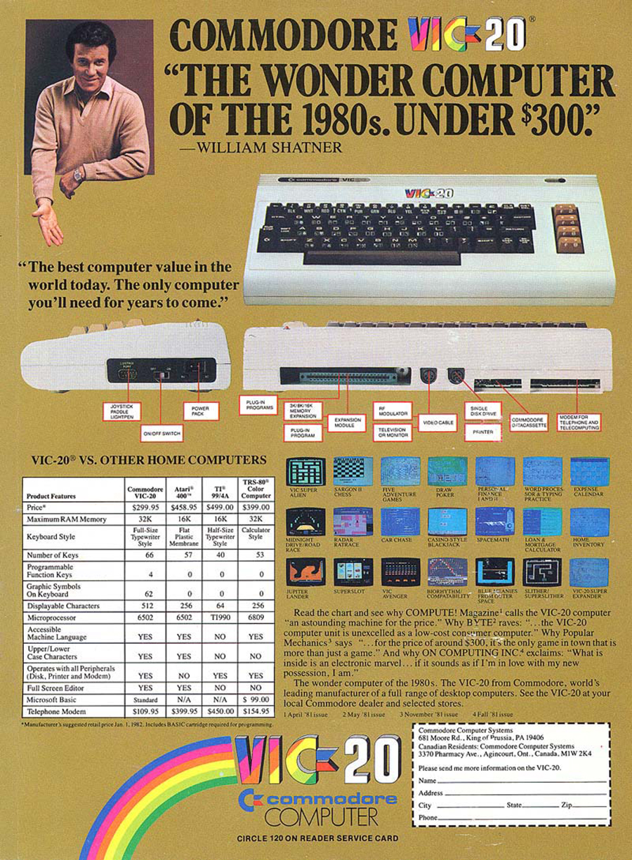
William Shatner presents the latest in computers in an early 1980s advertisement.
The Commodore VIC 20 was the best selling model of it’s time.

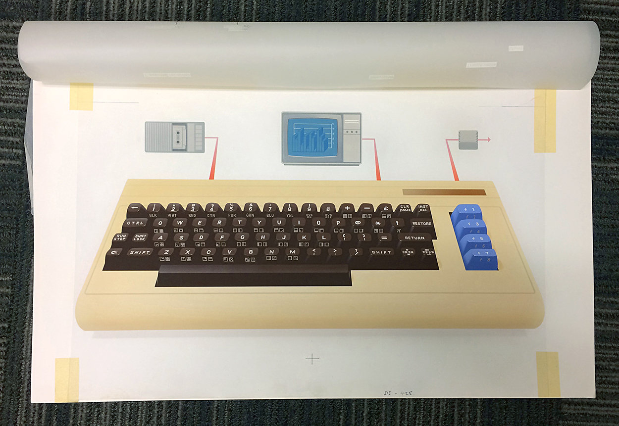
I was lent a Commodore 64 to illustrate it for a magazine. I even tried to use it. End of story. Below, the airbrushed illustration. The overlay which carries the labels is rolled back.

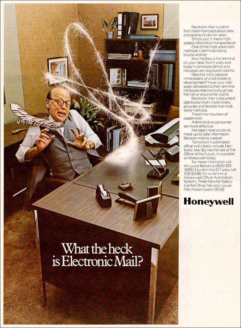
Email was new and mysterious in 1981.

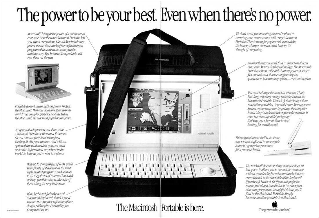
The Macintosh Portable (1989 to 1991) had a fabulous two megabytes of RAM, and a black and white screen. Weighing in at 16 pounds (7.2 kilograms), it was not exactly lightweight. The cost: $7,300 (more than $14,000 in today’s dollars).

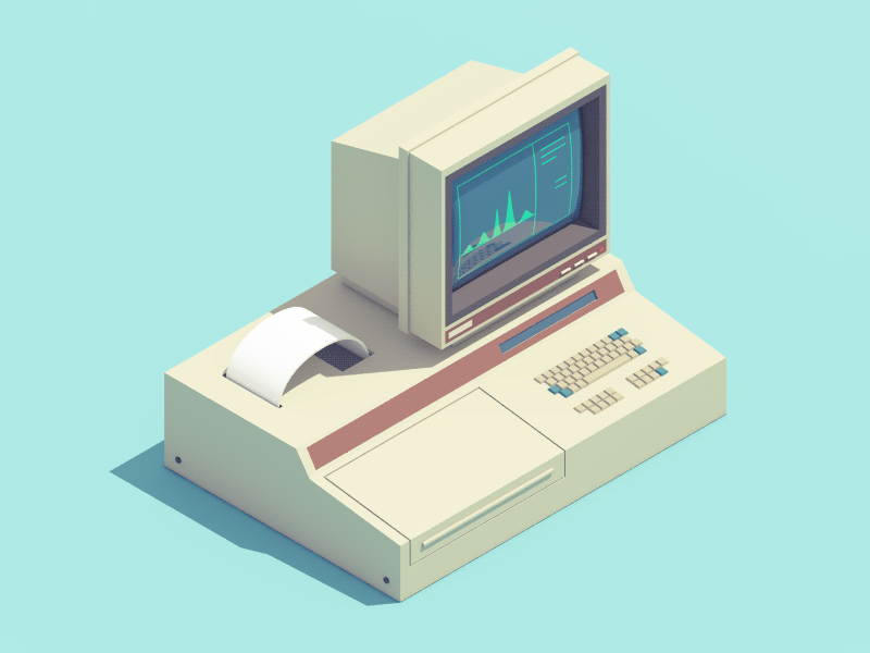
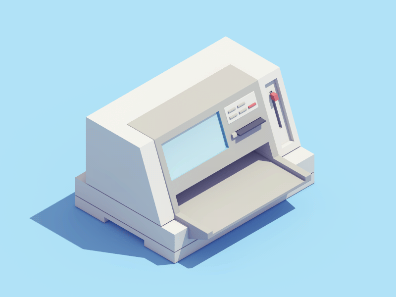
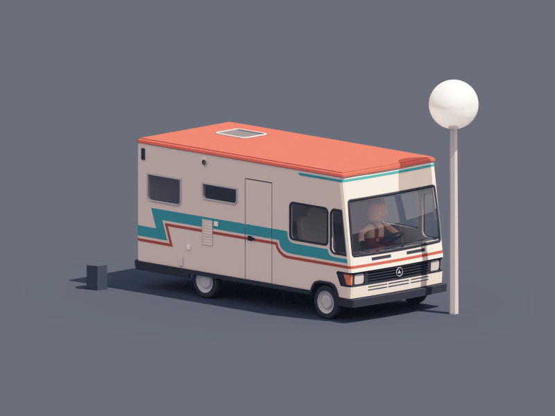
Retro tech by Guillaume Kurkdjian. He featured recently in a blog post: https://wp.me/p7LiLW-2dz
His website: https://guillaumekurkdjian.com

Below, a Minitel terminal.

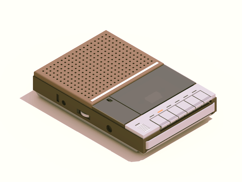
“Piano key” cassette player.

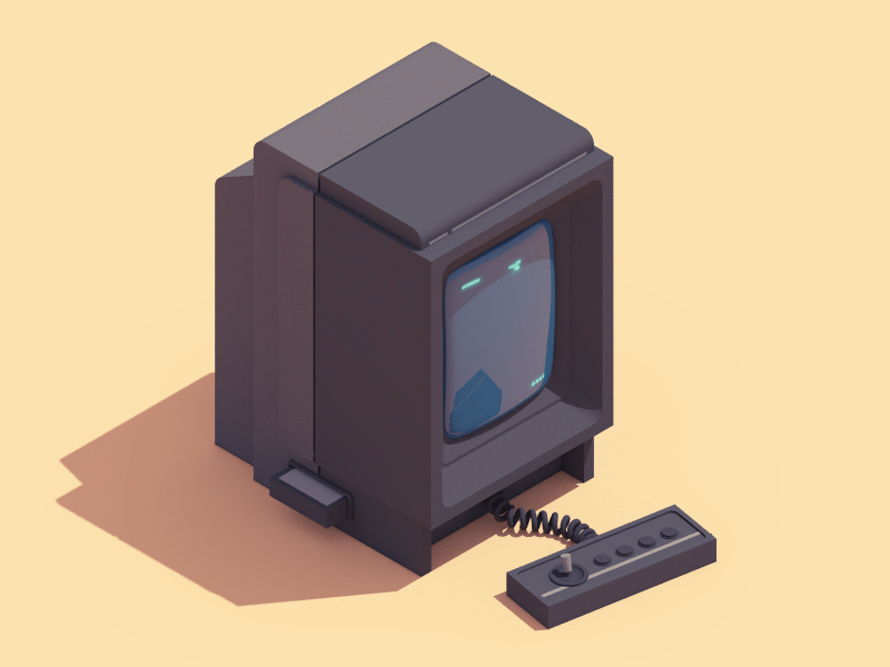
Vectrex video game console.

Trylon and Perisphere

NEW YORK ICONS.

These simple geometric shapes were the centerpiece of New York’s 1939 World’s Fair in Flushing Meadows Park, Queens. The 610 ft high (186 meters) Trylon was attached by a walkway to the 180 ft diameter (55 meters) Perisphere.

Inside the Perisphere was a diorama by Henry Dreyfuss called “Democracity,” a vision of a city of the future.

Of course, there were many Trylon and Perisphere souvenirs. Pass the salt and pepper, please.

The World’s Fair site.

A promotional poster.

The Trylon Theater on Queens Boulevard was showing movies until 1999.

Tiling below the ticket window.

The Unisphere (from the 1964 World’s Fair) stands on the same site today. I featured it here: https://wp.me/p7LiLW-3D
This is a souvenir model.

Cinematic

GRAPHIC DESIGN BY SAUL BASS.

Many iconic movies of the mid-twentieth century featured the work of this legendary graphic designer. Like these three Hitchcock movies.

He also designed many well-known American logos.

A Google Doodle, lovingly-made by Matthew Cruickshank, celebrated Saul’s birthday. See the animation here: https://goo.gl/yjCZrK
Matthew’s website: http://yecrookedlegge.com

Illustrator/animator

GUILLAUME KURKDJIAN’S WORK IS TONS OF FUN.

These graphics feel like breath of fresh air, coming straight from Paris. In terms of engagement, they hit all the right notes. See a lot more on Guillaume’s website: https://guillaumekurkdjian.com

Below, some retro tech animations.

Icons for La Poste, the French postal service.

For Welcome to the Jungle, a French recruitment company.

Problems parking the camper van.

Another animation for Welcome to the Jungle.

Cityscapes of New York and Philadelphia for NRG Energy, a U.S. power company.

Animated icons for Le Tank, a coworking space in Paris.

Unusual advertising

TWENTIETH-CENTURY PERSUASION.

It was a different world back then. Everyone smoked, even astronomers in the observatory.
“Have I discovered a new galaxy, or is it just the smoke from my cigarette?”

Your doctor would recommend his favorite brand of cigarettes.

Even Santa liked a few puffs before getting on his sleigh.

Airline food in the 1950s.

The modern reality.

Cars clearly were glamorous. It’s a shame that they would only go a few miles on a gallon of gasoline.

“Flight-Sweep Styling.” Chrome-cleaner anyone?

In those days, babies drank soda.

Targets

DESIGNS TO AIM AT.

Abstract shooting targets.

Vintage hunting practice.

Crosshair bomb target in Nevada. Northwest of Las Vegas.

Reminds me of the registration marks we used in mechanical artwork: https://wp.me/p7LiLW-Mw

The mysterious Nevada Desert Triangle, which is nearby. These targets are about 60 miles (97 km) from Area 51.

And one in Xinjiang, China.


Images from Google maps.

From Wikipedia: “Darts is the sport in which small missiles are thrown at a circular dartboard fixed to a wall.”

Archery has a very long history, and it became an Olympic sport in 1900.

Not a real target, but a very well-known logo. One of the largest retail store companies in the U.S.

Colors of cars

THE PATTERNS IN OUR CHOICE OF PAINTWORK.

The second of two posts that show creative video. The first one, about Black Sheep Films, is here: https://wp.me/p7LiLW-2aZ

Cy Kuckenbaker (based in San Diego) uses special effects to give us an idea of the relative numbers of various car colors. This seems connected visually to the “Rush Hour” video in Monday’s post, except that these really are the numbers of cars that drove past. Five minutes of footage is reorganized to put some order into the chaos. I wish I could see the world everyday with this kind of infographic vision.
The video: https://vimeo.com/82038912

More about car colors.

The 1996 Volkwagen Golf Harlequin gave owners four colors in one model.

Photograph: iStock.com/Artem Konovalov

A color chart from 2012, but the numbers may not be much different today. My car is silver (I’m sure you were desperate to know that.)

Ursus Wehrli rearranges a parking lot to reveal some color data. See more of his work in this post: https://wp.me/p7LiLW-Z4

Video dreams

ALTERNATE REALITY FROM BLACK SHEEP FILMS.

This week’s posts both feature creative video. Fernando Livschitz, who is based in Buenos Aires, uses special effects to create these dream-like videos. The fantasy elements are set against everyday urban backgrounds.

These are three of my favorites.

Giant tin toys (above and below)
Wind up Bots: https://vimeo.com/86907417

Warped transport
Perspective: https://vimeo.com/224876461

Traffic nightmare
Rush Hour: https://vimeo.com/106226560

Fernando’s website: https://www.bsfilms.me

As a footnote, I just happen to have one of those rockets (in the tin toys video) on a shelf in my house.

Camouflage

DESIGNED TO CONFUSE.

Dazzle painting (or razzle dazzle) was a World War I invention that was all about visual deception. Colors, patterns, lines and curved shapes were painted on ships to confuse enemy submarines. The effects were tested using models which where viewed from every angle, including through a periscope, to get an idea of how submarines would see them. The intention was to confuse attackers enough to make them miss, or to not even fire a torpedo at all. The 1918 painting above is by Burnell Poole. Picasso claimed that Cubists had invented dazzle camouflage, but the credit belongs to Norman Wilkinson, a British marine artist.

The photographs of these designs are all, of course, in black and white, but some strong color was often used.

Each ship had a unique scheme so that the enemy could not identify it by type.

I just had an idea. (Editor’s note: This doesn’t happen often.) Today, we might consider painting ships with some of those multi-colored pie charts from business presentations. They can confuse anyone.

Dazzle ferry
“Everybody Razzle Dazzle, 2015,” a design created by Peter Blake as part of a program to mark the centenary of World War I. A bold new look for the Mersey ferry “Snowdrop.”

Photograph: iStock.com/Alan Morris

The project includes an app so that we can make our own dazzle patterns.

Pixelated
The Canadian armed forces were the first to use computer-generated camouflage, the Canadian Disruptive Pattern or CADPAT, which works well at different distances. There are three types: Temperate Woodland (TW) which is shown below, Arid Region (AR) and Winter/Arctic (WA).

OCP
The Operational Camouflage Pattern is now the official combat design for U.S. soldiers.


Photograph: U.S. Army

If you want to know more about this subject, try the encyclopedia of camouflage (yes, there is one): http://camopedia.org/