Category: Design

Money

THE DESIGN OF CURRENCY.

Cash illusion
Nigel Holmes’ radical redesign of U.S. banknotes makes our money look like more than it is.
And instead of presidents, we have people who robbed banks.

Coin mania
There are millions of coin collectors in the U.S., and consequently several cable T.V. shows that just sell coins. This is a 2018 Proof Silver American Eagle that uses the classic 1916 “Walking Liberty” design by Adolf Weinman.

Infographic coins
Mac Funamizu explored the idea of coins being designed to be more informational and represent their relative value.

More bang for your buck
Another rethink of US currency by Nigel Holmes.

Euro architecture
The buildings on Euro notes are generic so that they are not specific to any country in the European Union. There are seven fictional bridges used on various notes. Robin Stam had the idea of creating real versions, and a housing development in Spijkenisse, which is near Rotterdam, offered to build all of them.

Big money
High-denomination U.S. notes have not been printed since 1947. The low number still in existence are owned by collectors and museums.

This valuable item appeared in a previous post about Eight by Eight magazine. I adapted it from the polymer £5 note. (Australia had the first plastic money back in 1988.) The largest U.K. note is £100, issued in Scotland and Northern Ireland only.

Hyperinflation
During November 2008, inflation in Zimbabwe is estimated to have hit 80 billion percent. By 2009, all printing of currency was stopped.

The world’s worst typefaces

FIVE FONTS WE DON’T LOVE.

Above, the ugly London Olympic logo, which contains a sample of the world’s worst typeface. More about that later.
The following ranking is from Simon Garfield’s book, “Just My Type,” which is an insightful and fun read for anyone who cares about typography: goo.gl/fX9nni

THE WORST FIVE (IN REVERSE ORDER)

5: Brush Script My students know that I’m not a fan of fonts that mimic handwriting. To be fair, there are some good ones, but many are badly designed, and will devalue any infographic they’re slapped onto. Not exactly the language of credibility when used in a serious visual explanation. Simon: “…if you ever even momentarily considered putting Brush Script on any document at all, even in an ironic way, then you should immediately relinquish all claims to taste.”

4: Papyrus Simon: “Papyrus is the font you use to spell out the the word Egypt.” A modified version is used on this Avatar poster, but it appears in it’s standard form in the Na’vi subtitles. Recently panned by “Saturday Night Live.” goo.gl/wwPBa3


© 20th Century Fox

Simon: “Avatar cost more to make than any other film in history, but it did its best to recoup whatever it spent on 3-D special effects and computer-generated blue people by using the cheapest and least original font it could find.”

3: Neuland Inline Jurassic Park was ahead of it’s time, but the font it used was not. Simon: “It is a dense and angular type, suggestive of something Fred Flintstone might chisel into prehistoric rock.”

2: Ransom Note. Simon doesn’t feel that this font is any good for ransom notes. Having none of “…a genuine ransom note’s sweat, glue, and menace…”

1: The London Olympic 2012 typeface It’s official name is 2012 Headline. The font is intended to be edgy (I suppose), but that’s always a dangerous path to negotiate. It ended up being downright awful, and became dated in a very short time (maybe a couple of weeks). Simon: “…the worst new public typeface of the last hundred years.”

From the book: In the International Herald Tribune, Alice Rawsthorn observed that “it looks increasingly like the graphic equivalent of what we Brits scathingly call “dad dancing”—namely a middle-aged man who tries so hard to be cool on the dance floor that he fails.” And finally, my personal comment on the London Olympic logo:

Plan view

LOOKING STRAIGHT DOWN.

Drone photography of New York landmarks by Humza Deas: https://humzadeas.myshopify.com

Above, the Statue of Liberty. Below, the Unisphere. Featured in a post here: https://wp.me/p7LiLW-3D

Columbus Circle.

Stuyvesant Town.

The Chrysler Building.

Carpets made using Google Earth imagery by David Hanauer: http://www.davidhanauer.de/index.php/project/worldwide-carpets/

Cruise ships by Jeffrey Milstein: http://jeffreymilstein.com

A previous post about Bernhard Lang’s overhead photographs: https://wp.me/p7LiLW-1UM

The $2,850 crayon set

A GIFT FOR THE CREATIVE PERSON WHO HAS EVERYTHING.


I’m hoping to get this as a gift over the holiday period, but I doubt that I will.

“KARLBOX” was designed by Karl Lagerfeld, and contains 350 Faber-Castell drawing and painting items in a beautiful black wooden cabinet, arranged in removable drawers by color. It was produced in a limited edition of 2,500.

Buy one at the MoMA store: goo.gl/nXEASo

KARLBOX website: http://www.colours-in-black.com/#en

This post is a companion to an earlier one about the $1,280 paintbrush: https://wp.me/p7LiLW-1M5

Next post: January 8. I’m taking a rest from blogging. Thanks for following. Enjoy the holidays!

Eight by Eight: Issue 12

THE BEAUTIFUL GAME IN PRINT.

Time for another issue of Eight by Eight magazine, full of great content for the football (soccer) fan. Design and illustration of peerless quality is expected now, and here it comes. Below, some spreads from the issue. Subscribe here: https://shop.8by8mag.com/collections/subscribe

Below is a very big bar chart about the best supported teams in Europe that I put together for this issue. (A thank you to the super-talented Grace Lee for design improvements.)

Professor Grimwade, from the University of Eight by Eight, doing his teaching thing. Pay attention, no cheating!

Aerial visions

BERNHARD LANG REVEALS THE PATTERNS WE MAKE.

With their straight-down viewpoints that create almost two-dimensional scenes, Bernhard’s photographs reveal surprising insights about our effect on the planet. Above, Adria, an Italian beach resort. Below, fish farms in Greece.

Suburban houses in North Rhine-Westphalia, Germany.

The “Mar de Plástico,” a massive greenhouse complex in southeastern Spain.

Rowers near Munich, Germany.

Industrial storage in North Rhine-Westphalia.

Miami, Florida.

A marble quarry in Carrara, Italy.

Tulip fields in the Netherlands.

See many more images on Bernhard’s website: http://www.bernhardlang.de

Instagram: https://www.instagram.com/blangphoto/

Facebook: https://www.facebook.com/Photography-Bernhard-Lang-251075035099935/

All photographs © Bernhard Lang.

Color wheels

TRADITIONAL THEORY FOR ARTISTS AND DESIGNERS.

Above,“Farbkreis” from “The Art of Color” (1961), by Johannes Itten, a Swiss painter and theorist who taught at the Bauhaus. This 12-hue circle is made up of three primary, three secondary and six tertiary colors.

“The Color Star” (1986) has eight disks with cut-outs that can be rotated over Itten’s star to compare colors.

Now we have so many excellent digital color aids, like Adobe Color: https://color.adobe.com/create/color-wheel/

But… I still remember art theory classes way back in art college. They were not that easy (we used to moan about them), but in retrospect, it was important knowledge. The basic concepts: primary, secondary, and tertiary colors (primary and secondary mixed). Hue, saturation, temperature, and so on. I know I sound like a dinosaur (and I do certainly fit that description), but I wish my students had a color theory class. These are valuable lessons to learn.

Color Wheel 101: Complimentary colors are opposite each other. Analagous colors are next to each other. White, which represents all color, is in the center.

Some historical examples:

From “The Natural System of Colors” by Moses Harris, 1776.

From “Theory of Colors” by Johann Wolfgang von Geothe,1810.

From “The Principles of Harmony and Contrast of Colors” by Michel Chevreul, 1839. A 72-part circle.

“Color Panel” by Wilhelm von Bezold from “The Theory of Colors in Arts and Crafts,” 1874.

There are many online color wheels like this one, in RGB: goo.gl/xeK49A

And analog ones are available, like this: goo.gl/CQjvDd

A previous post about the color books used to choose CMYK colors in the pre-computer era: https://wp.me/s7LiLW-cmyk

Pop-up

MASTERFUL PAPER ENGINEERING BY PETER DAHMEN.


Above, a promotional piece for Lexon, a creative printing company. (Graphic design by Bigwave Media. Image courtesy of Highcon.)

Peter starts working with rough prototypes as he develops these precise folding designs. “Don’t give up if you fail. I fail a lot of times.”
And it’s all about the reveal of the design: “I’m most interested in the movement. Make the movement the beautiful thing. I call it the magical moment.”

Below, six personal projects.

Flower & Crystal. The client was Highcon for the trade show Print China 2015.

A color version for the trade show DRUPA 2016 in Düsseldorf.

Also for Highcon.


For Volksbank Vorarlberg.

“For Iggesund Paperboard, I created a greeting card, which is also a foldable decoration. It can be used to create thousands of different snowflake images. In total, 44,716 different snowflakes. (If you are interested in the mathematics behind this project, you can download a PDF file with the exact calculations here: https://peterdahmen.de/wp-content/uploads/2016/12/snowflake-calculations.pdf.)”

Peter’s website has many examples, and tutorials if you want to try making something yourself: https://peterdahmen.de/en/

A video interview: https://vimeo.com/98760774

Visual Conceit

CREATIVE VISUAL SOLUTIONS BY ADONIS DURADO.

We’re very fortunate that our Knight Fellow for this academic year is Adonis Durado, whose design and infographics work at the Times of Oman, and several other publications, is widely admired. He currently has a terrific exhibition in our gallery called “Visual Conceit.” Here’s some examples from the show, along with his comments. The selection here has an infographic bias that does not reflect the balance of the show, and of course that’s because it’s on this particular blog.

Adonis is talking about his work on Wednesday in our auditorium (poster shown above). This is a terrific opportunity for our students to learn from a world-class designer.

SOME OF HIS INFOGRAPHICS…

Mega-debt “My conceit here is to use the bars in the chart as body text columns, giving the page an organic or architectonic quality. It’s possible to read the article and the graphic at the same time. This is arguably the biggest bar chart ever published in a newspaper.”

Boxing matchup “This preview presents, at actual scale, the height difference between the two boxers, which is shown as a white strip that runs across the spread. Height difference matters because a taller boxer has longer limbs, giving him a reach advantage.”

Olympic records “An infographic about the record-breaking history of the Olympic long jump and high jump. To add fun and interactivity, I invited readers to cut up the page and transform it into a measuring tape, then see for themselves if they can jump like a pro.” (Click on the image to see a detail.)

World Cup insights “A series of infographics that were published in the back of our World Cup supplement. In this section, called “Parting Shot,” we tried visualizing content that is considered non-serious or off-beat.”

The Oscars “A series of infographics published daily leading up to the Academy Awards ceremony. I employed a variety of conceits for each category page. For example, in “The Best Picture,” I asked myself: Would it be possible to make the graph’s color legend the most dominant element of a page? The legend is a discreet element in all graphics, but not in this case.”

Soccer discipline “Another World Cup graphic. I began the design by considering if it’s possible to visualize a dataset that can occupy the entire issue of the magazine. These are all the red card and yellow cards issued during the tournament.”

The first spread (rotated).

… AND SOME OF HIS PAGE DESIGNS

Danish banking “This page started with the conceit of “type attack,” where the headline serves as the dominant element of a page (or the text becomes art in itself). I ended up deconstructing the body text as well, and came up with a treatment that mimics the concept of intertextuality. Notice that the lead paragraph contains keywords that link to pieces of related information.”

Gallery space “My solution to a challenge that I set myself: Is it possible to design a page where the white space is an illustration in itself, and is an element that will help visualize a story?”

India by train “Perhaps here I was just too tired of the regular Q&A format. This playful treatment defies convention, and I even let the headline and the intro merge into each other.”

The poster for the gallery show.


Fernando Baptista in Ohio

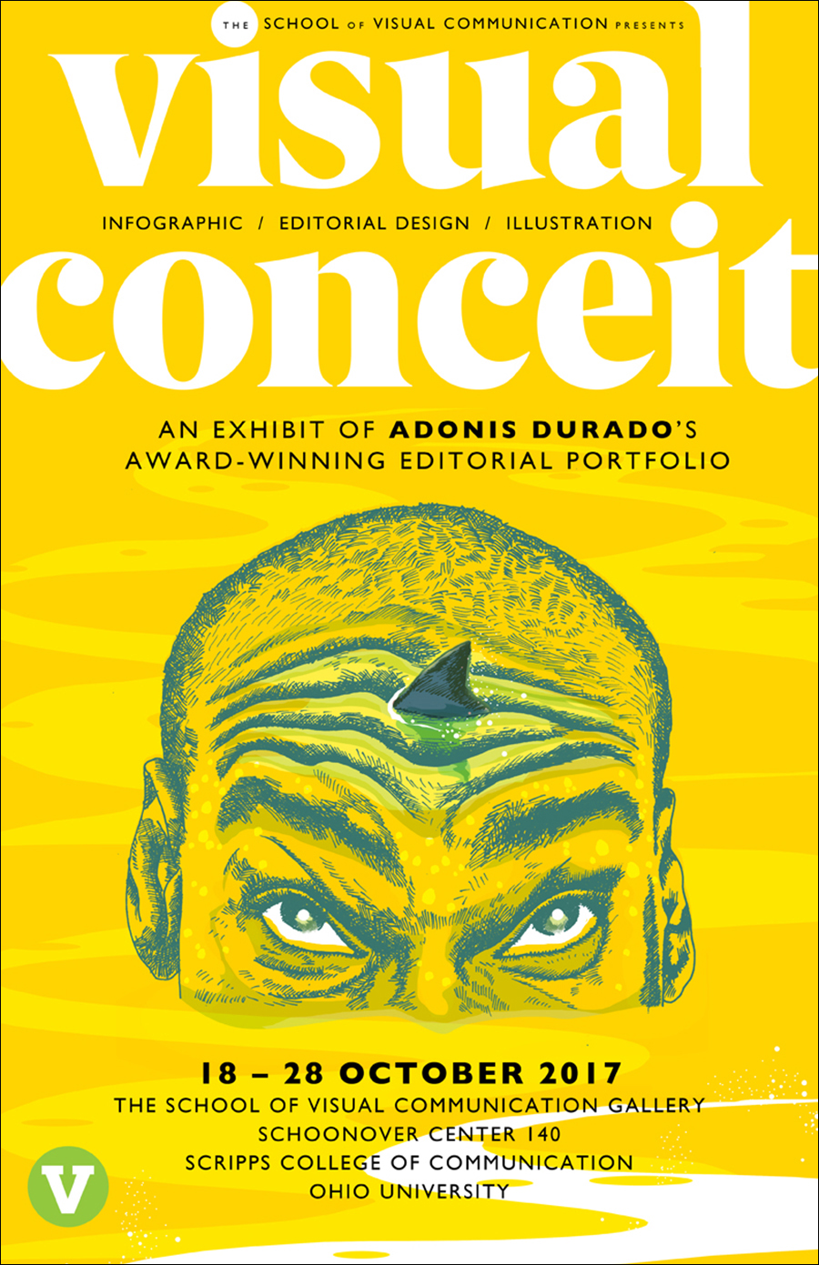
A SCULPTURE AND INFOGRAPHICS WORKSHOP.

Last week, Fernando Baptista visited Ohio University. He gave a presentation to a packed auditorium, and the following day he began a two-day workshop for twenty students from the School of Art + Design and the School of Visual Communication. The group used the same methods that Fernando uses to make his superb illustrations for National Geographic magazine. Undergraduates and graduates worked together in a studio that is used for art and design classes. Countries (apart from the U.S.) that were represented: China, India, Iran, the Philippines and Spain.
Photograph above by Kisha Ravi (a VisCom photojournalism student).

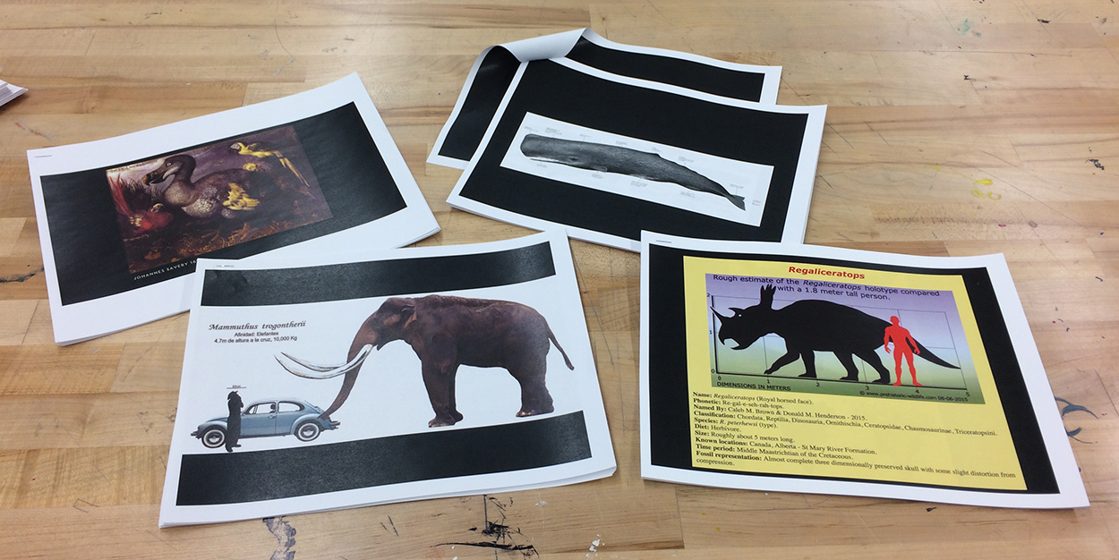
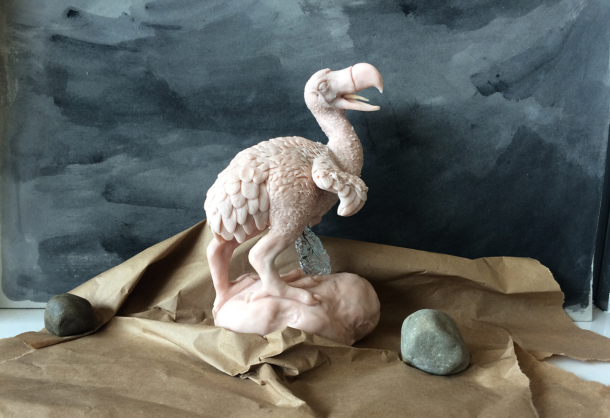
Day One The reference material. Students chose one of four subjects: mammoth, sperm whale, dodo or triceratops.

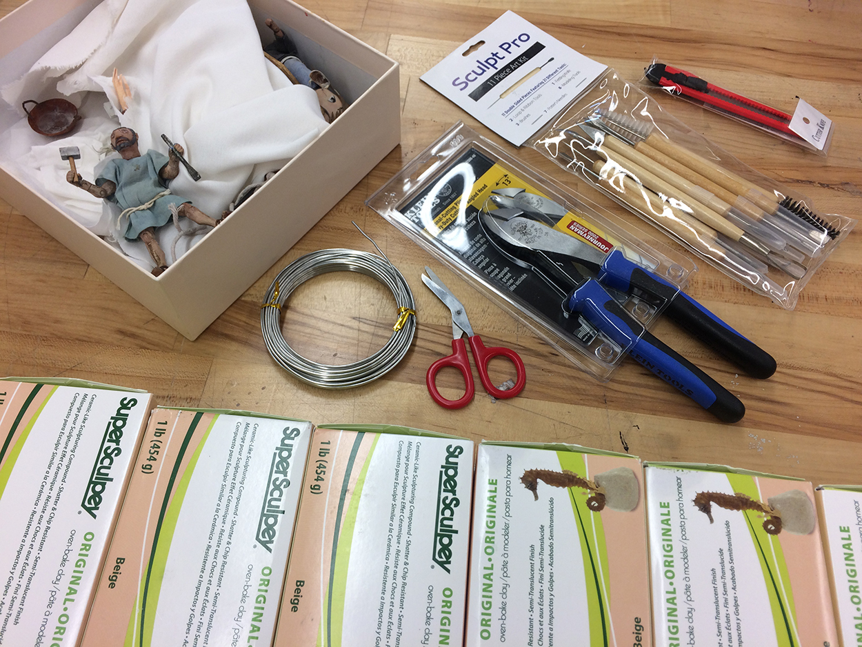
The equipment. Notice the figure from an animation about Trajan’s Column, who happens to be on the table. See the video here: goo.gl/jhqbkb

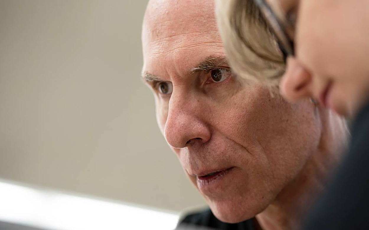
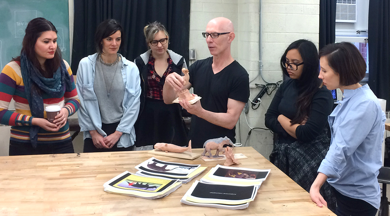
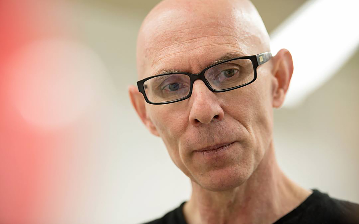
Fernando explains his process. Like all great professionals, he’s keen to share the lessons he’s learned during his career.

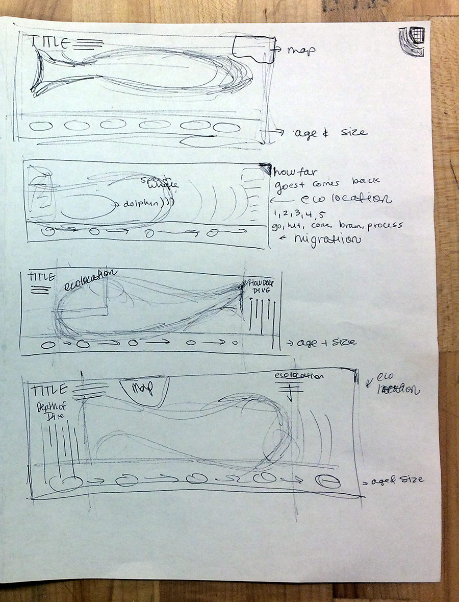
The first stage was to rough out ideas for an infographic. One student’s plans for a sperm whale graphic.

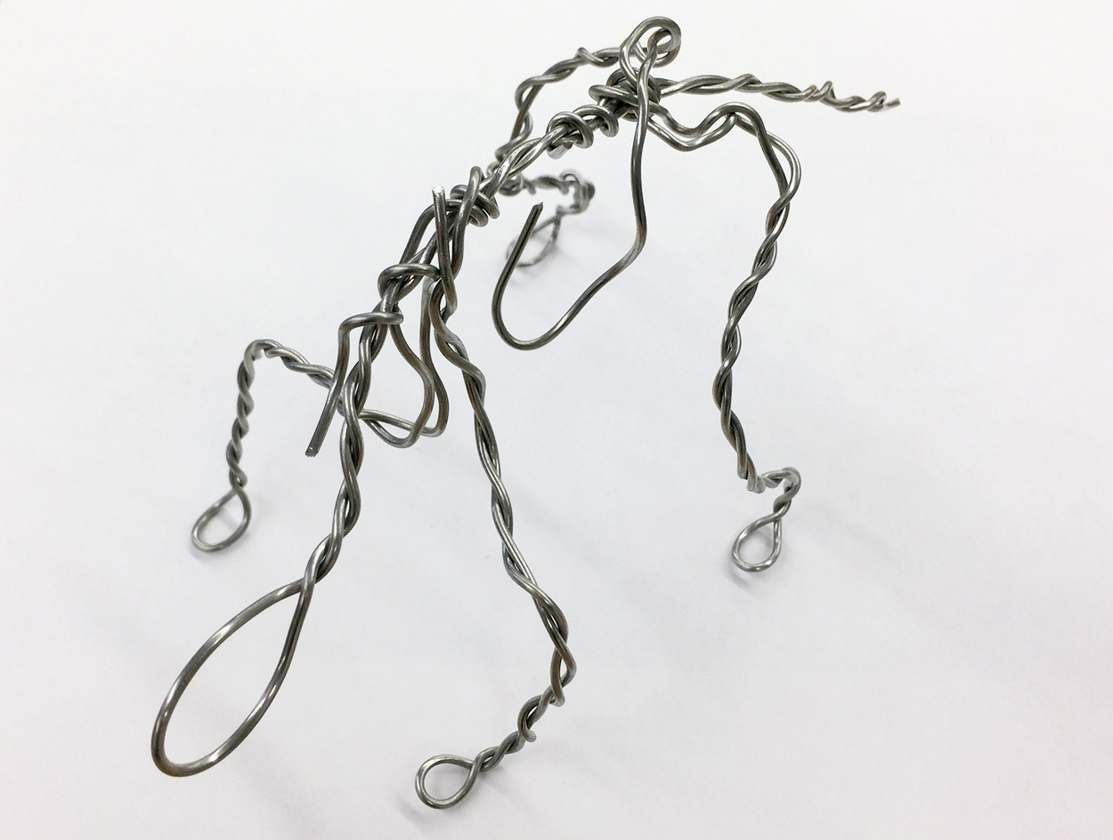
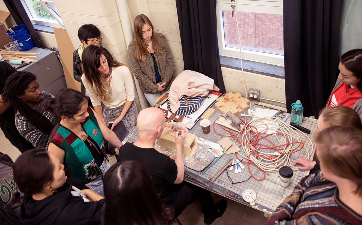
A wire armature was made to closely match the skeleton of the animal. In this case, a triceratops.

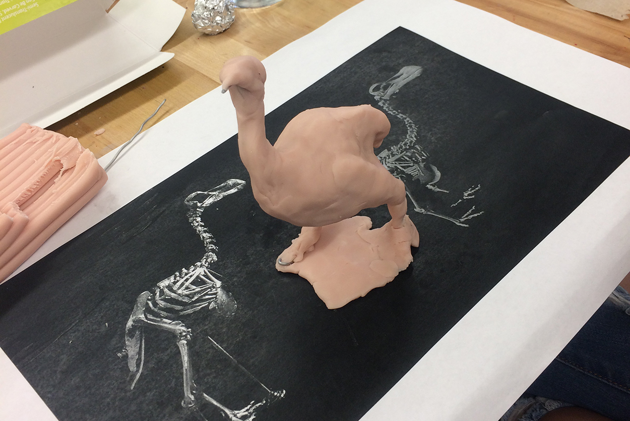
Aluminum foil was used to fill out the form (here, a dodo) before layers of Super Sculpey, a polymer modeling clay, were applied.

Adonis Durado, who was making a video of the workshop, modeling an impromptu portrait of Fernando.

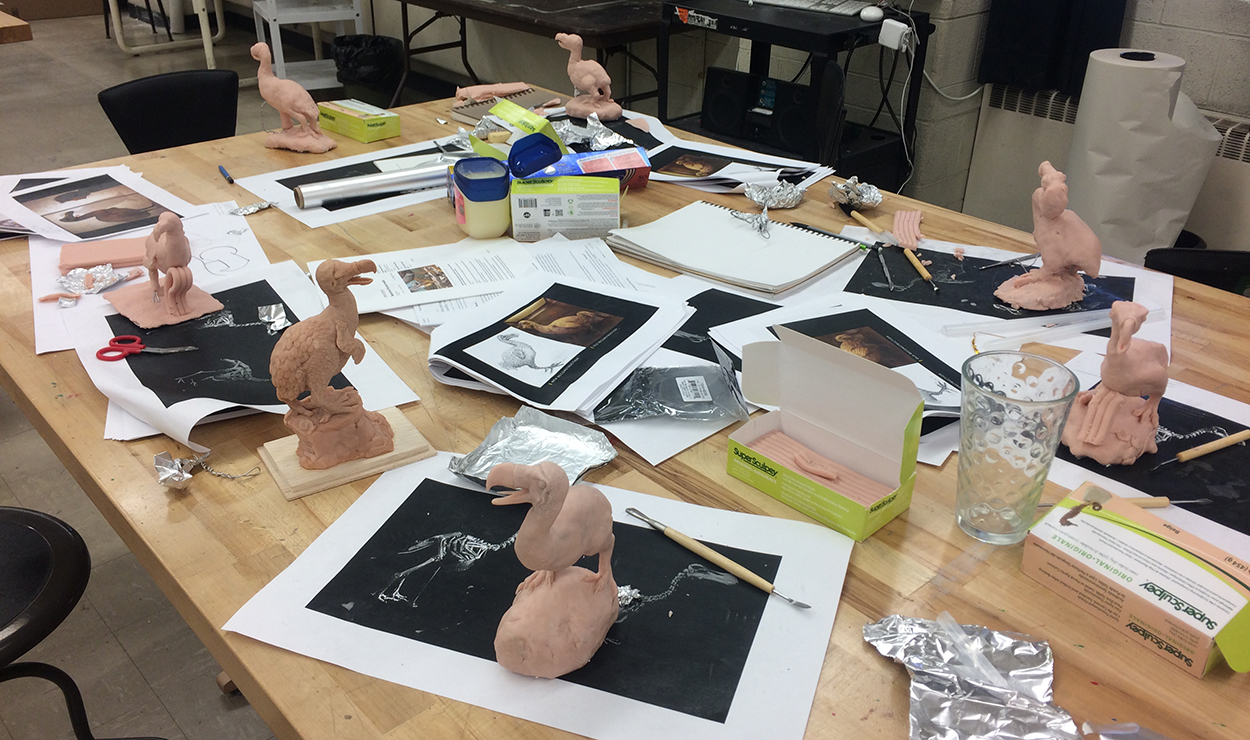
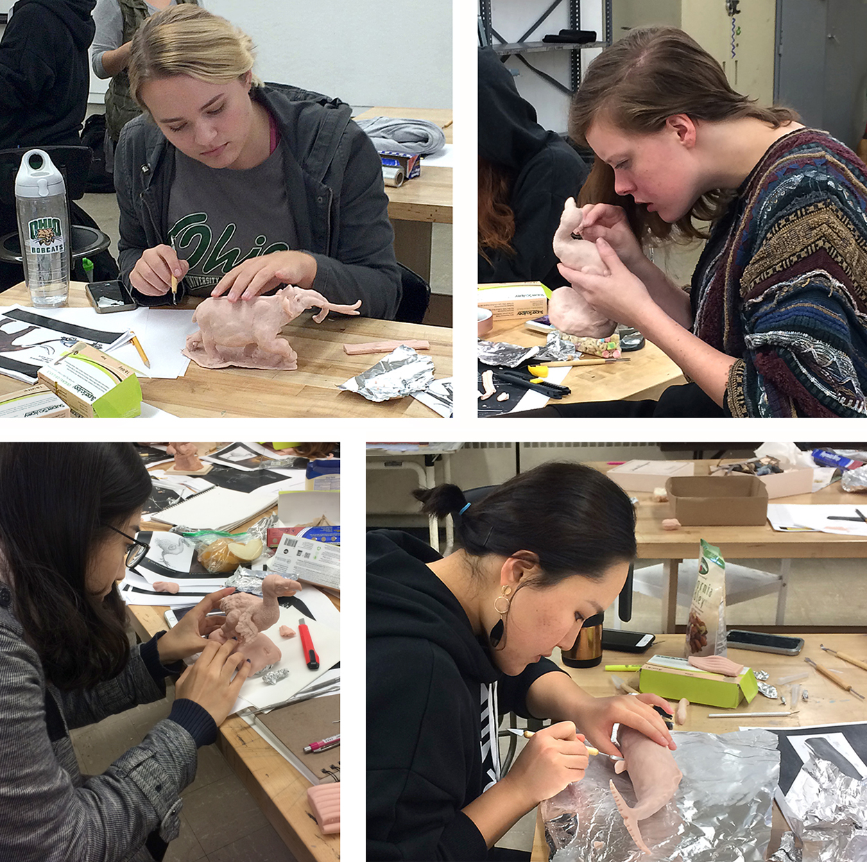
At the end of the first day, the creatures were really starting to take shape. I don’t often see a table of dodos on the campus.

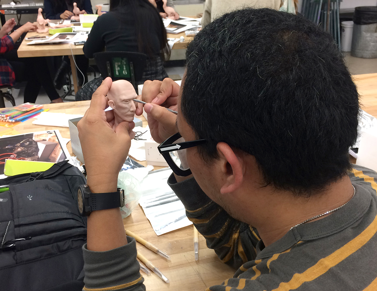
Day Two Refining the models. Adding the fine detail needed some serious concentration.

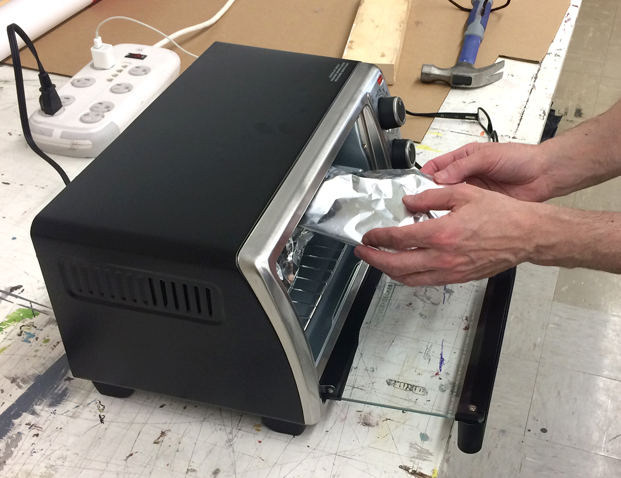
Small parts, like teeth and horns, were placed into a toaster oven to make them firmer, and easier to apply to the sculpture. The complete model would be hardened later this way.

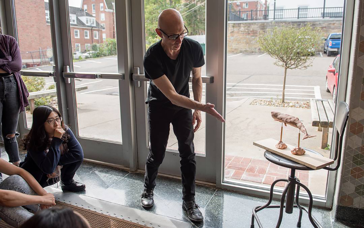
Fernando showing how to use natural light to bring form and effect to a sculpture.


Photograph by Kisha Ravi.

A painted background, and some crumpled paper that will later become a rocky area in Photoshop.

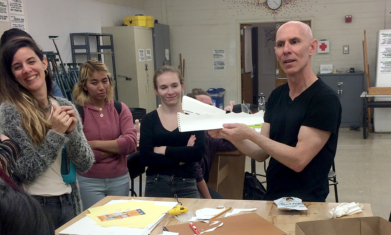
Fernando tells us how a stop-motion animation of a whale can be created with simple paper shapes.

Students watch the master using his painting technique. There wasn’t enough time to paint the models, but color will be applied, either manually or in Photoshop, after the workshop. Several students told me that they intend to carry on with the projects, and develop them for their portfolios.

Photograph by Kisha Ravi.

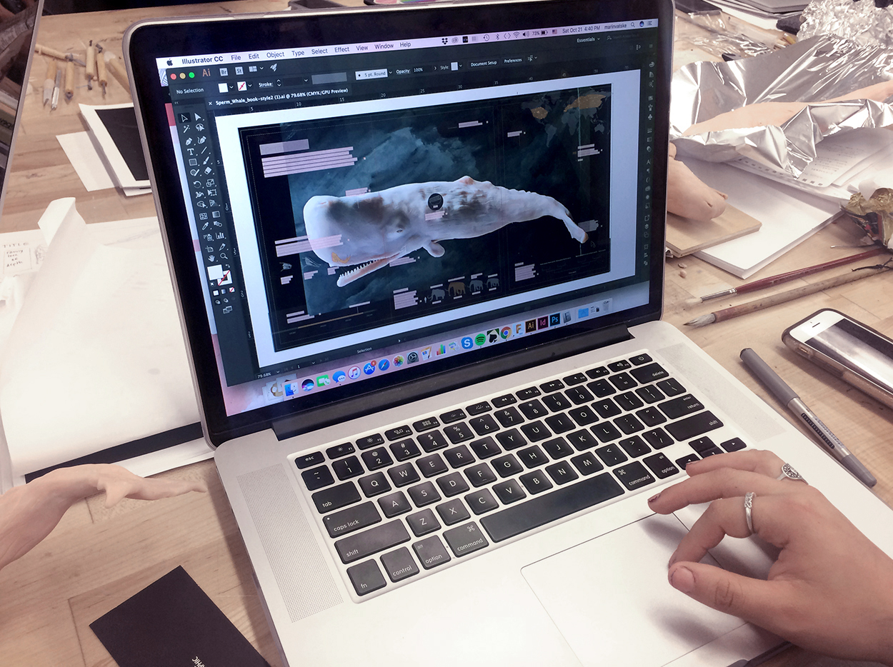
Starting to build a computer version of an infographic.

The workshop was a huge success. In no small part because Fernando put enormous effort into working with each student to help them move forward. It was tiring for me just to watch him assisting all those students for hour after hour. Thank you, Fernando!

Photograph by Kisha Ravi.

My overall impression: This is one of the best creative experiences we’ve ever offered our students. Fernando is a craftsman with a passion for information and explanation. And one of the nicest people in our entire field.

The School of Visual Communication: https://www.ohio.edu/viscom/
The School of Art + Design: https://www.ohio.edu/finearts/art/

VisCom on Instagram: https://www.instagram.com/viscomohiou/
Kisha Ravi on Instagram: https://www.instagram.com/kisharavi/