Category: Design

Today

HISTORICAL EXAMPLES FROM ERIC BAKER’S COLUMN.

Once a week for several years (ending in 2010), Eric Baker had an inspiring column called “Today” that appeared on the DesignObserver site. It was a set of carefully selected historical design images. Sometimes on a theme, sometimes not. Anyway, I really looked forward to seeing the latest cornucopia of imagery. So in the spirit of looking back for inspiration to our illustrious past, here’s a selection of 50 examples from those posts. Many of these are infographically-inclined, but that (of course) is because of the person selecting them.

Outside the box

MAKING INFOGRAPHICS AND ILLUSTRATIONS ON THE OTHER SIDE OF THE GLASS.

Weather An engaging prototype app by Sunny Park, designed while she was a student at SVA NYC (She’s now a UX designer at Microsoft). Sculpey clay stands in for ice cream.

Data viz For the Ablynx 2013 annual report, Soon (a studio based in Belgium) went out to the fields with sticks and colored ropes to visualize the data. They used black sand to make the backgrounds.

3D-printed Another Soon project. The Ablynx 2015 annual report.

Black cloud One day’s CO2 emissions made real by Ogilvy/Bejing.

Sarah Illenberger Creative use of everyday objects to make other everyday objects. Beautifully styled.

And paper-made illustration.

Educational challenge The number of students that dropped out of U.S. high school in 2012 averaged 857 per hour on every school day. The College Board visualized it by putting that number of desks around the Washington Monument.

Cardboard car Shannon Goff made this replica of a 1979 Lincoln Continental as a tribute to her grandfather (who owned one), and to her hometown: Detroit, the “Motor City.”


And…
This is (incredibly) my 100th post, so to mark this earth-shattering occasion, here are a few “one-hundreds.”

I have a fake wad of $100 bills (with a belt clip) that I bought in a Halloween store. In case I want to look like I have some cash.

Neutra house numbers from Design Within Reach: goo.gl/gQ149C

Typeface by Sawdust: http://www.madebysawdust.co.uk

62.1 miles per hour.

Metrics Over 30,000 views of the blog so far. The most viewed post is “Tools of the trade”: https://www.johngrimwade.com/blog/2017/01/09/tools-of-the-trade/

Thank you for reading the blog. I appreciate it. Happy Infographics!


Kraftwerk

INFOGRAPHICS FOR MUSIC.

Perhaps the closest thing to an infographic musical performance is a concert by the German electronic band, Kraftwerk (which means “power station”). Graphic visuals have always been an integral part of their shows, and now they’re in 3D. If you ever get a chance to go to a performance, I highly recommend it.

Above, an animation from “The Robots”. Below, my set of 3D glasses for a show at the United Palace Theater in New York City, April 2014. The numbers 1 to 8 refer to Kraftwerk’s eight classic albums. At selected venues, Kraftwerk play a complete album on each of eight separate nights. They used this format at MoMA (New York) in 2012, the Tate Modern (London) in 2013, and they’ve taken the iconic music/design experience to several other high-profile cultural venues around the world.

These photographs (by Jan Schwochow) are from a 3D performance at the Neue Nationalgalerie in Berlin, January 2015.
Below, “Aéro Dynamik.”

“Autobahn.”

“Radioactivity”.

“Vitamin.”

“The Man-Machine”.

“Computer Love”.

“The Robots”.

“Numbers”.

“Techno Pop”.

“Tour de France”.

This is all about the combination of music and visuals, so here’s a small clip from “Vitamin.” Click on the image to see the video.

And a segment from “The Robots.” Click on the image to see the video.

In May, “3-D The Catalogue” was released. It documents the shows of recent years. Available in several combinations of Blu-ray, DVD, CD, vinyl and a printed book. http://www.kraftwerk.com/catalogue/index-BLUray.html

A trailer for this set: goo.gl/8A5aGM

Atomic

DESIGN IN THE NUCLEAR ERA.

The atomic age lasted through the 1950s and 1960s. It was a time of two opposite dynamics: there was the promise of unlimited power, and the threat of world destruction.

The dream Some examples of atomic optimism. Does the dog look worried?


Nuclear playtime
An atomic lab in your child’s bedroom? Why not?

5,000 miles per charge The 1958 Ford Nucleon was a prototype car that would be powered by a small nuclear reactor. Perhaps.


Atomium
Built in Brussels for the 1958 World’s Fair, this is a very large model of the unit cell of an iron crystal (magnified 165 billion times). It’s 335 feet tall (102 meters).


(Photograph: Mike Cattell)

Inside the top sphere there’s a restaurant with a panoramic view of the city.


World War III
There was a very real worry that buttons might be pushed. Hence the fallout shelters all over the place.

You might want to build your own in the back garden.

It looks like fun.

Some light reading before bedtime.

Tempus fugit

VISUAL DISPLAYS OF TIME.

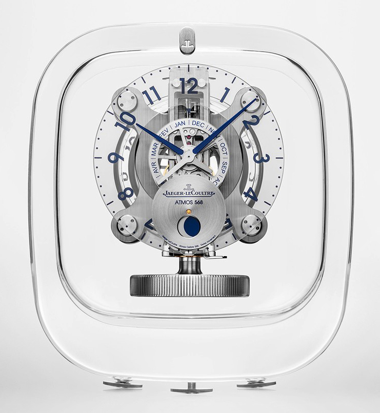
Luxury clock The expensive Atmos 568 ($27,000+tax) tells the time, the month and the phase of the moon, and is powered by a gas-filled capsule. It’s close to perpetual motion, as just a one-degree temperature shift can drive it for two days. Designed by Marc Newson, who is part of Apple’s design team.

Sundial Often seen in gardens. Obviously not very effective on cloudy days. This one is indicating 3:15.


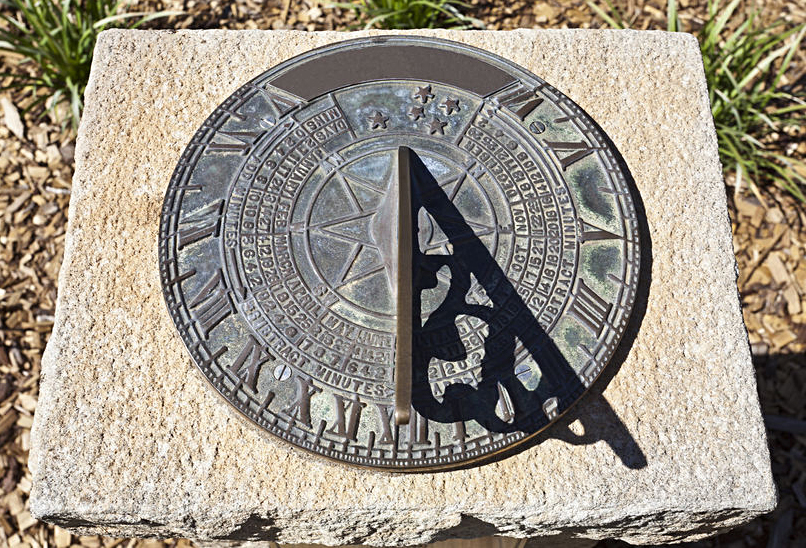
(Photograph © Antonio Ribeiro/123rf)

They are sometimes much larger and more elaborate, like this one in London. It was designed by Wendy Taylor, a sculptor.


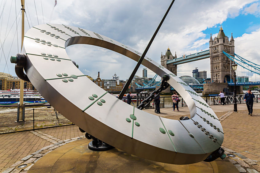
(Photograph © Christian Mueller/123rf)

Of course, any tall object is potentially a gnomon (the center part of a sundial), and the Washington Monument is a good possibility. Some numbers on the ground are all that’s needed to convert it into a very large clock.

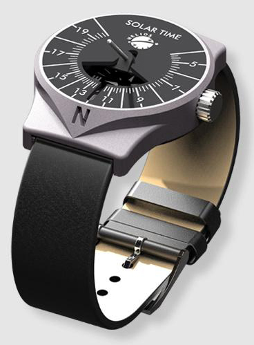
Or go smaller and get a sundial wristwatch: https://www.helios-sonnenuhren.de/en/helios-watch

Hourglass There’s something compelling about watching falling sand indicate the passing of time. No idea why.


(Photograph © stokkete/123rf)

Swiss simplicity This classic clock was designed in 1944 by Hans Hilfiker, who worked as an engineer for the Swiss Railway.


(Photograph: Daniel Sparing)

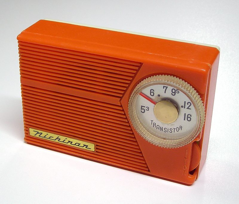
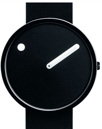
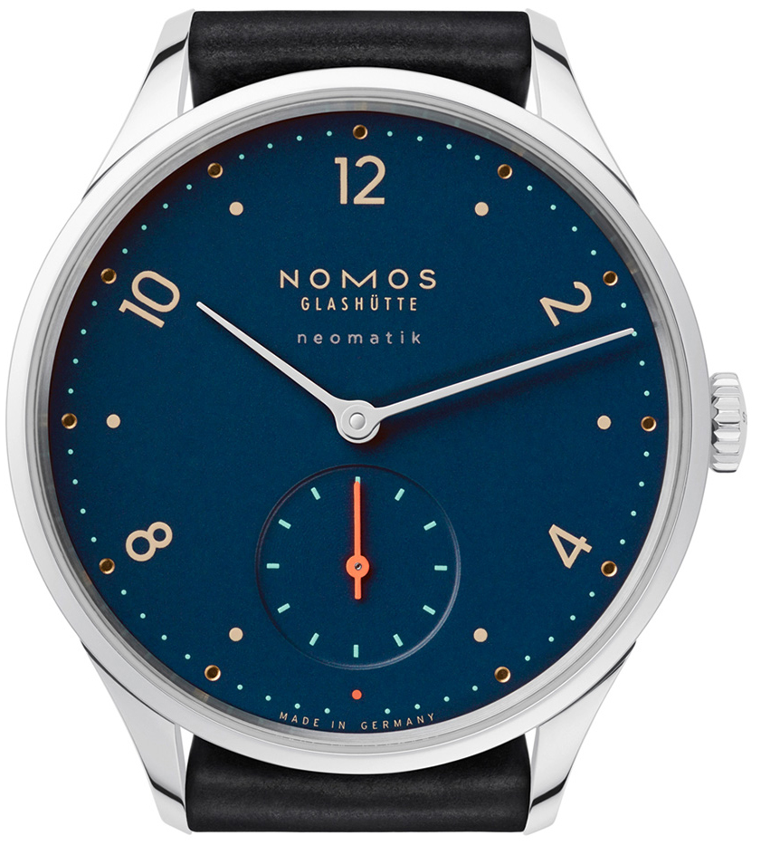
Personal time Juan Velasco, the infographics maestro, once described his watch as his favorite infographic. I’ve made it clear in previous posts that I love a good watch. I can’t afford this one, but I want it.

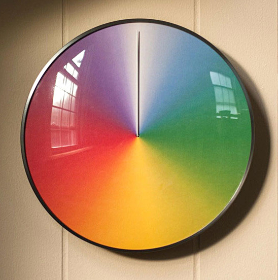
One year “The Present” tracks the seasons. Not sure why this is particularly helpful, but it looks good on the wall. “Oh look, we’re halfway through winter!” If you’re interested, you can get it here: goo.gl/qKdr9A

10,000 year clock The first prototype of “The Clock of the Long Now” is in London’s Science Museum. It’s eight-feet-tall (2.4 meters). The full-size clock will, in theory, be able to operate for 10,000 years, with proper maintenance. That 200-feet-tall (61 meters) version is being built inside a mountain in Texas on land owned by one of the project’s backers, Amazon’s Jeff Bezos.


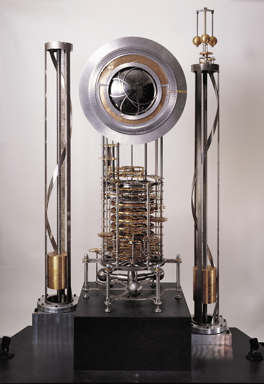
(Photograph: Rolfe Horn)

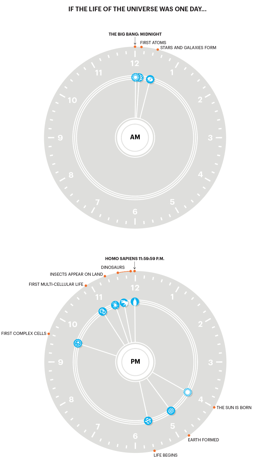
The big picture An infographic that I made for “In Graphics” issue 5 contained my take on an old schoolroom favorite: Our entire history as if it happened over a 24-hour period.

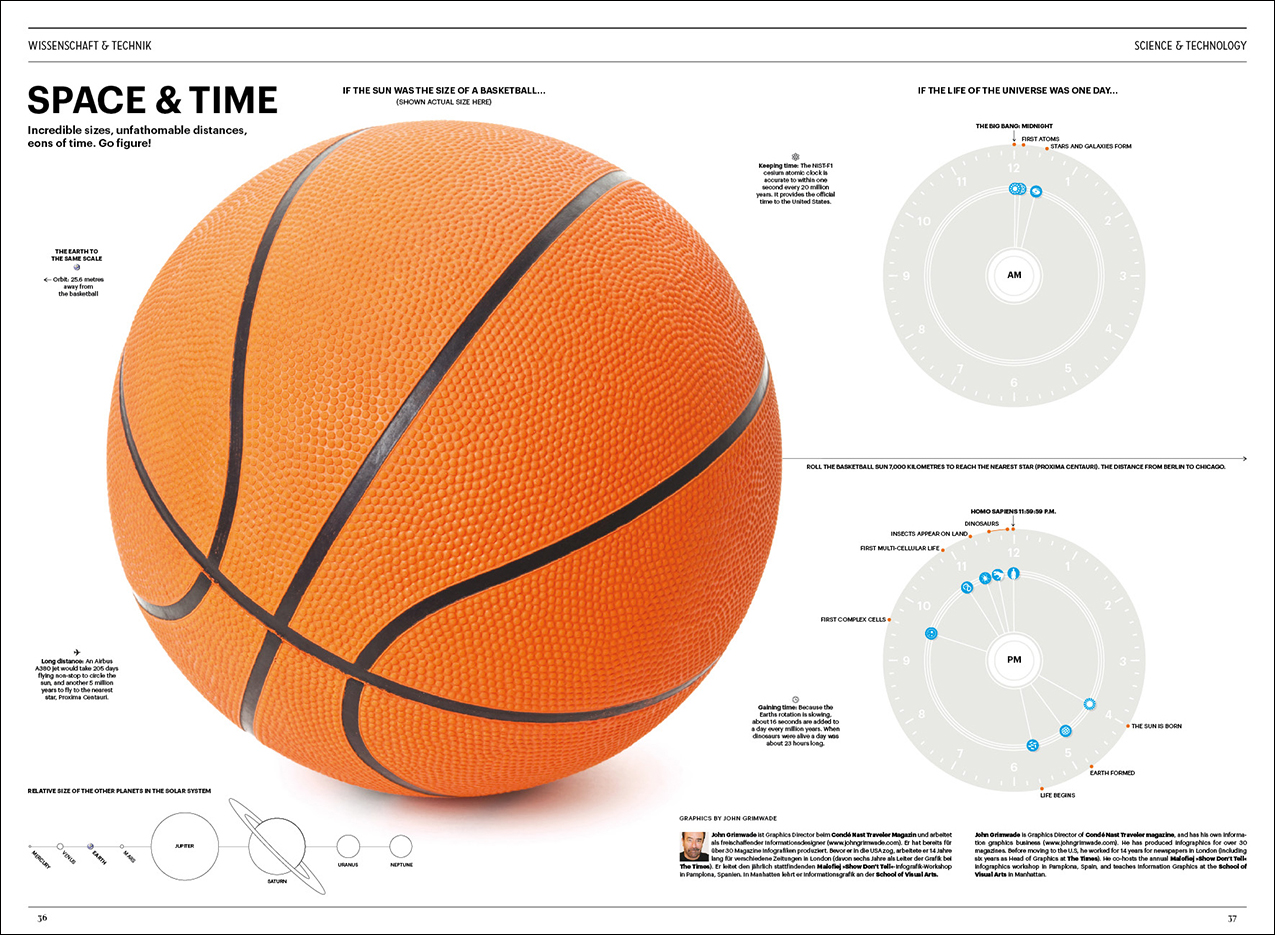
The time section is shown below. Note how the dinosaurs were around a lot longer than we have been (so far).

See a preview of “In Graphics” issue 10 here: https://www.johngrimwade.com/blog/2017/07/06/in-graphics-2/
Example spreads from the first nine issues are here: https://www.johngrimwade.com/blog/2017/07/03/in-graphics-1/

Painting by numbers

RECREATING A MASTERPIECE, THE EASY WAY.

Years ago, before cellphones and computers, this was one of our pastimes. The current enthusiasm for adult coloring books seems to be closely related. Art made relatively easy using a simple system. It’s a low-stress activity with tangible results. Here are a couple of sets I purchased recently on eBay.

Mona Lisa (Shown above.) This one is on canvas for complete authenticity. Note the handy reference pic. Everything needed is here: A numbered keyline to follow, paintbrushes, and a set of acrylic paints with corresponding numbers. I need to start filling in the areas, but it looks quite challenging. The estimated value of the original painting is $1.5 billion. My Mona Lisa cost just $16.59 (with free shipping).

The Starry Night I’m going post-impressionist with this one.

Lines on a board, ready to become art. Presumably, this is not how Van Gogh planned the painting.

A detail. For areas with two numbers, the colors have to be mixed together. Fortunately, blending between the color areas is not suggested. Some sets that I had years ago (with oil-based paints) offered that additional task. The edges that were to get a smooth transition were indicated by dashed lines.

The required paints. Reeves has a numbered system that works across all their painting by numbers sets. No number one (lemon yellow) here.

In the gallery Andy Warhol’s 1962 “Do It Yourself” series is a tribute to the “painting by numbers” craze.

COMING NEXT WEEK: Two posts about In Graphics, a brilliant magazine where all the pages are infographics. Below, staff at Infographics Group in Berlin review proofs of the new issue (number ten).

Graphic novel

CHRIS WARE: COMIC BOOK GENIUS.

Building Stories (2012) is a creative visual storytelling statement. A big cardboard box contains fourteen elements: books, booklets, magazines, newspapers and pamphlets. All the various parts work together to tell the story of the residents of a Chicago apartment building. It can be read in any order.

The superbly crafted illustrations are often almost infographic in style. Below, the back cover index.

A poster-sized spread.

Other examples from the book.

Available on Amazon: goo.gl/AjocuU

Chris also produced a limited edition “Multi-Story Building Model” to accompany “Building Stories”. Several sheets of card that can be cut up and assembled to make a detailed 3D version of the building. You can see it assembled in the Chris Ware section of the Adam Baumgold Gallery’s website: http://adambaumgoldgallery.com

Some other work by Chris. Below, “Leftovers” from the New Yorker, 2006. Click for a larger version.

Examples of Chris’s New Yorker covers.

Simplicity

WHEN LESS CAN OFTEN BE MORE.

The Picto watch (designed in 1984) takes timekeeping down to the minimum.

Softer Than Steel chair by Nendo for Desalto. Nendo’s simple and elegant work: http://www.nendo.jp/en/release/2017/

Chocolatexture by Nendo for MAISON&OBJET. Chocolates as representations of Japanese words for texture.

Symbols can say a lot with an economy of image. Like this classic atomic icon.

Swiss graphic design has an inherent simplicity: goo.gl/yJTXcS

Camera designed by Jonathan Ive and Marc Newson.

Album covers The Dark Side of the Moon, Pink Floyd, 1973.

Coexist, The xx, 2012.

Words of wisdom Some well used quotes, but they’re still worth revisiting:

“Simplicity is the ultimate sophistication.” Leonardo da Vinci

“Everything should be made as simple as possible, but not simpler.” Albert Einstein

“The ability to simplify means to eliminate the unnecessary, so that the necessary may speak.” Hans Hofmann

John Maeda’s book is a thought-provoking read: goo.gl/rhd5CY