Category: Infographics

The red line

FOLLOWING AN INFOGRAPHIC PATH.
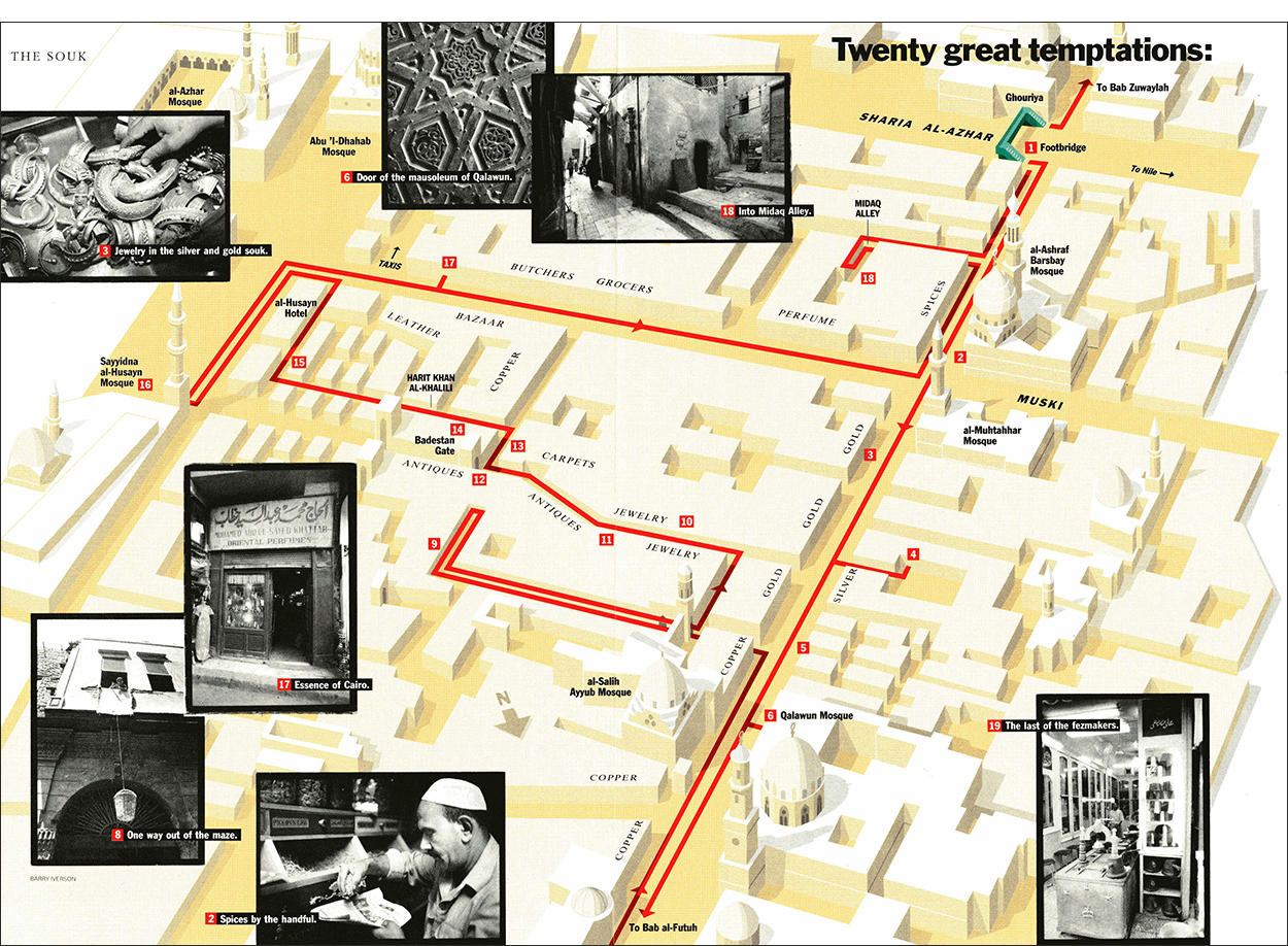
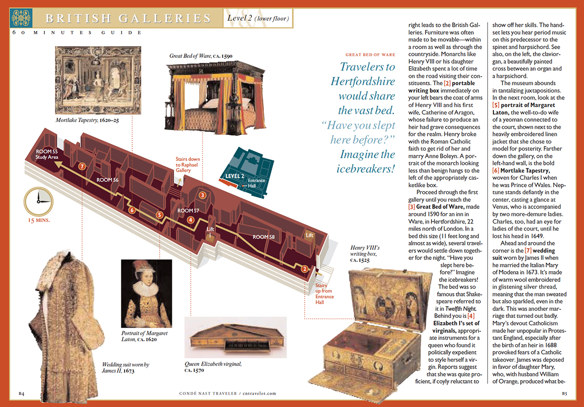
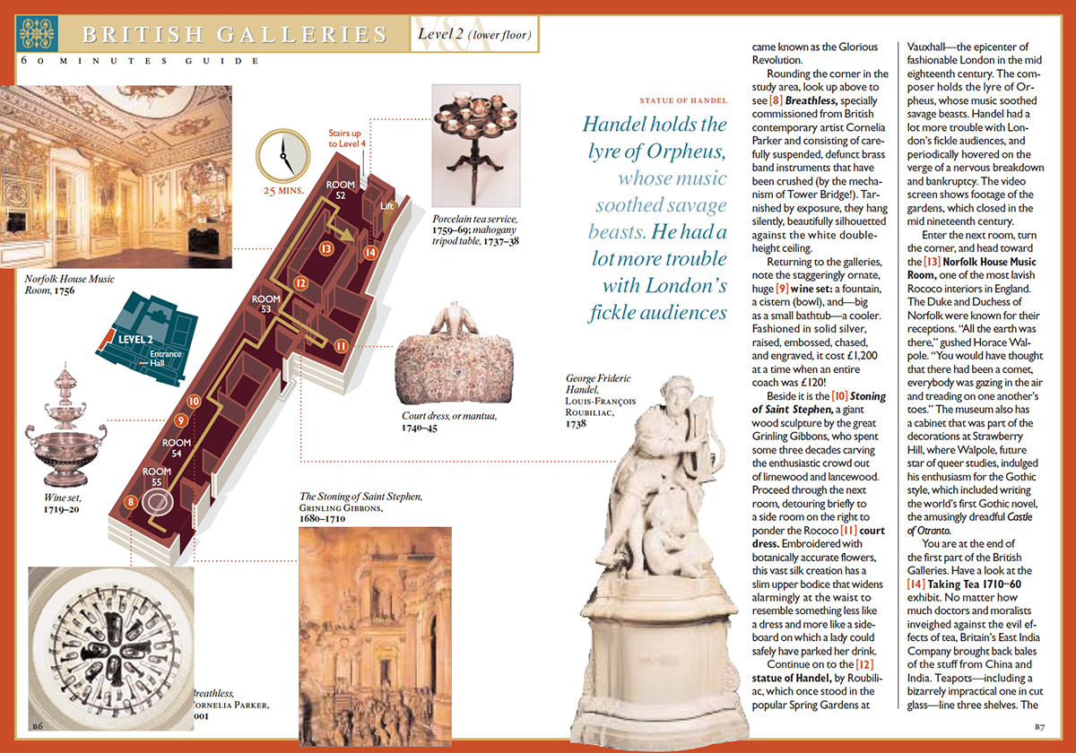
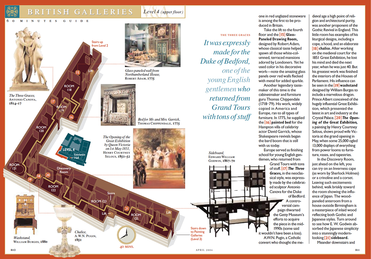
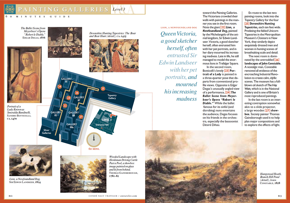
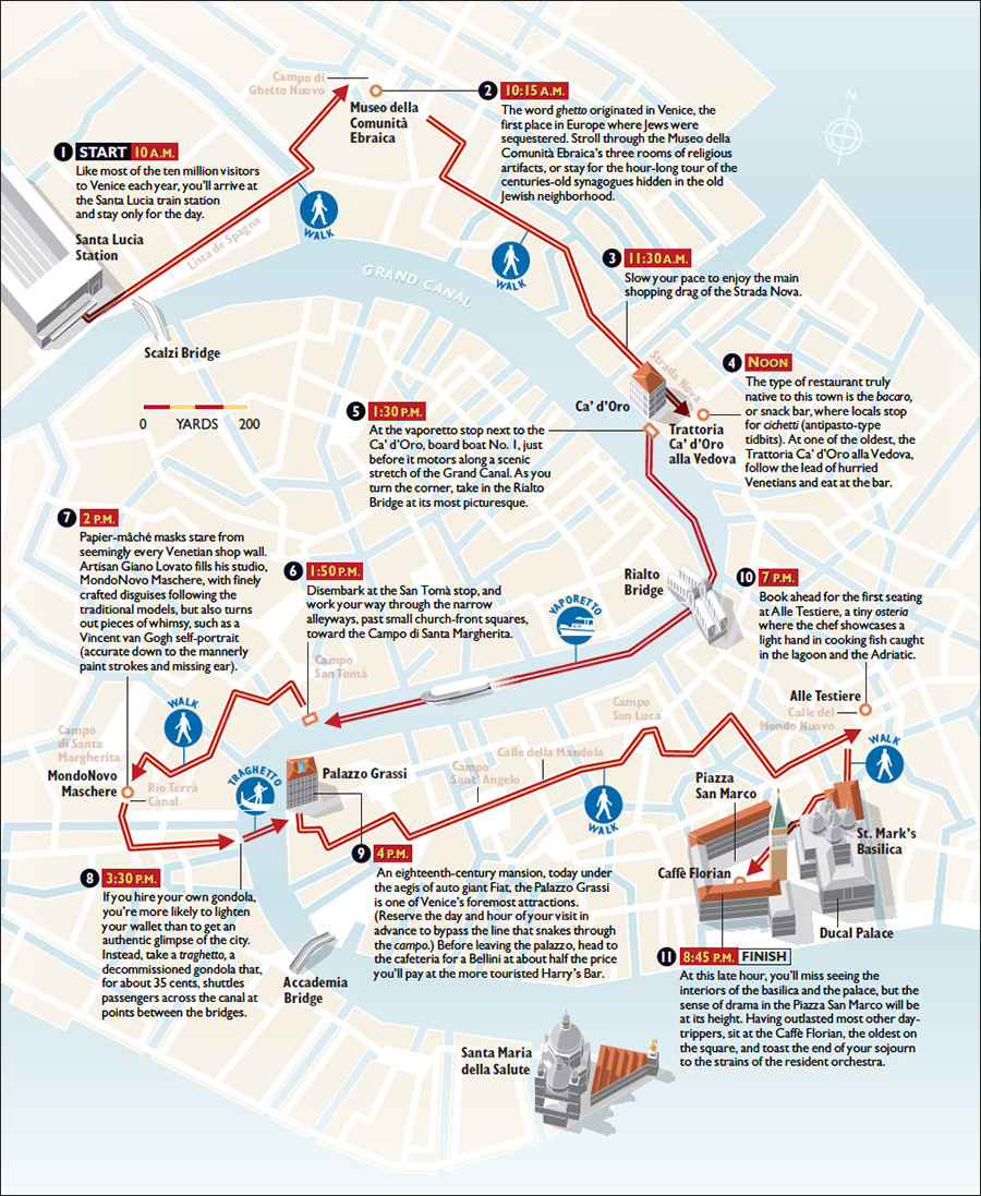
How do you make complex locations easier to navigate? At Condé Nast Traveler magazine we often gave our readers a fixed path, that was carefully chosen by our writers. The aim was to show the user, as clearly as possible, how to get to the selected highlights. Of course, this line didn’t need to be red (and often wasn’t), although red is good for grabbing attention. Remember that this was all before we could track our position accurately on smartphones. I’m not sure that location technology renders this kind of presentation obsolete, although it could definitely augment it.

Cairo’s Khan-al-Khalili souk is a challenging, but rewarding, place to visit. Very crowded, and not easy to see where to go next. We felt that the red line could really help here. The text starts with an instruction to look for the green pedestrian bridge, so I the only place in the graphic that I used green is there. Monochrome photographs separate strongly from the color of the map.

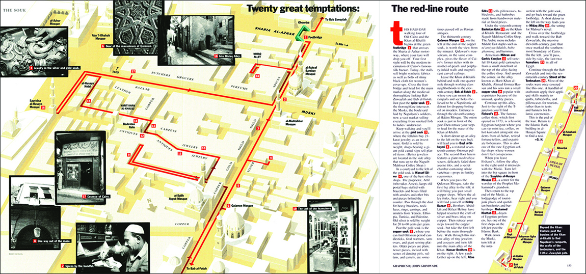
The complete gatefold is shown below.
The Victoria and Albert Museum in London is a maze of levels and additions, containing millions of objects in 145 galleries, and it is consequently quite difficult to find your way around. So this little booklet was very popular. Brilliantly written by Manuela Hoelterhoff, who also selected the essential exhibits. You would have to keep up a very brisk pace to get round this track in 60 minutes, but the title is fun, like the text, and is really an attention-grabber. (It was part of a series that included the Louvre and New York’s Metropolitan Museum). The series name is more an indication of the fact that it’s possible to see the best parts of a collection in a relatively short time, and not have an exhausting, and unsatisfying, afternoon slogging around looking for the best things to see. Self-contained spreads lead the user from one location to the next. It’s not really necessary to know where you are in the entire museum, but it’s shown with a locator inset.
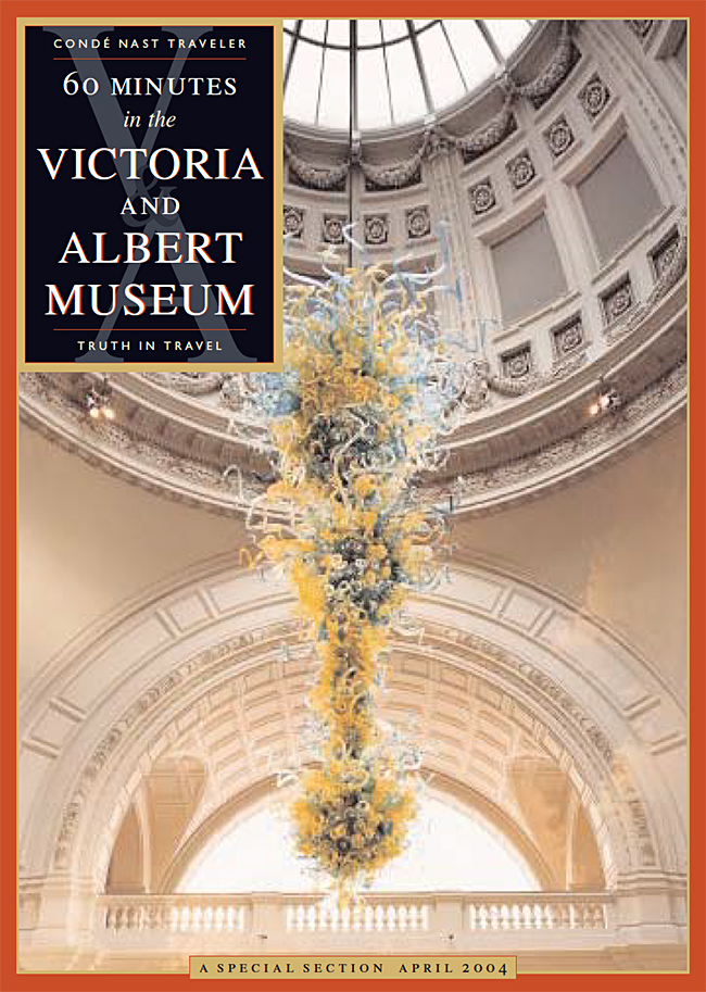
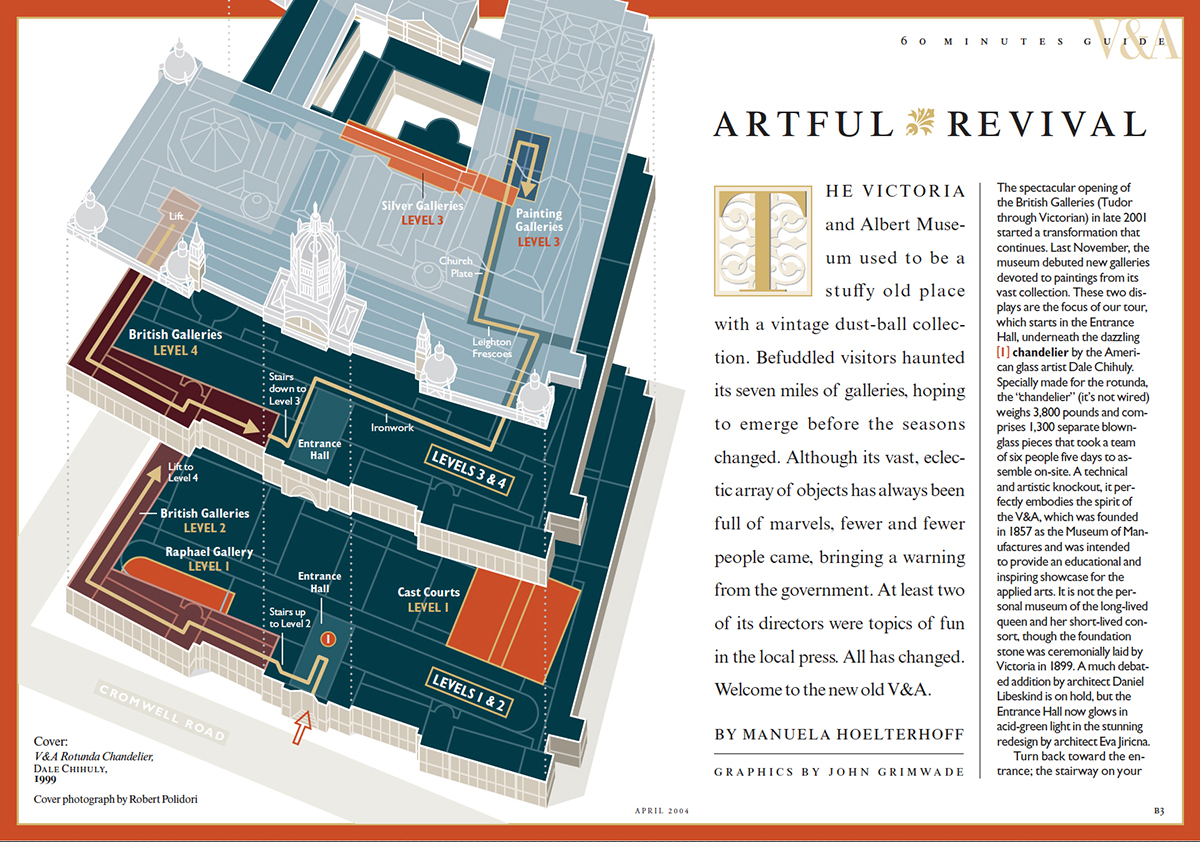
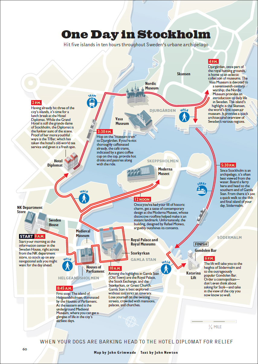
I produced numerous city guides using the same idea. A writer would research the locations and the path to connect them. I would make a graphic of it. Mine was the easy part, I think.
Reality It might be hard to believe, but I didn’t know about Boston’s Freedom Trail before I started using the red line approach. (Let’s face it, it wasn’t likely to be an idea that no one had thought of before.) I soon discovered that the idea had been made reality way back in 1951. There’s a red brick line that runs through downtown Boston for 2.5 miles (4 km), and leads visitors past 16 significant historical sites. I’d somehow always imagined that there really was a red line in the places that I was drawing, so this just confirmed my delusion.

(Photograph © sam74100/123rf)
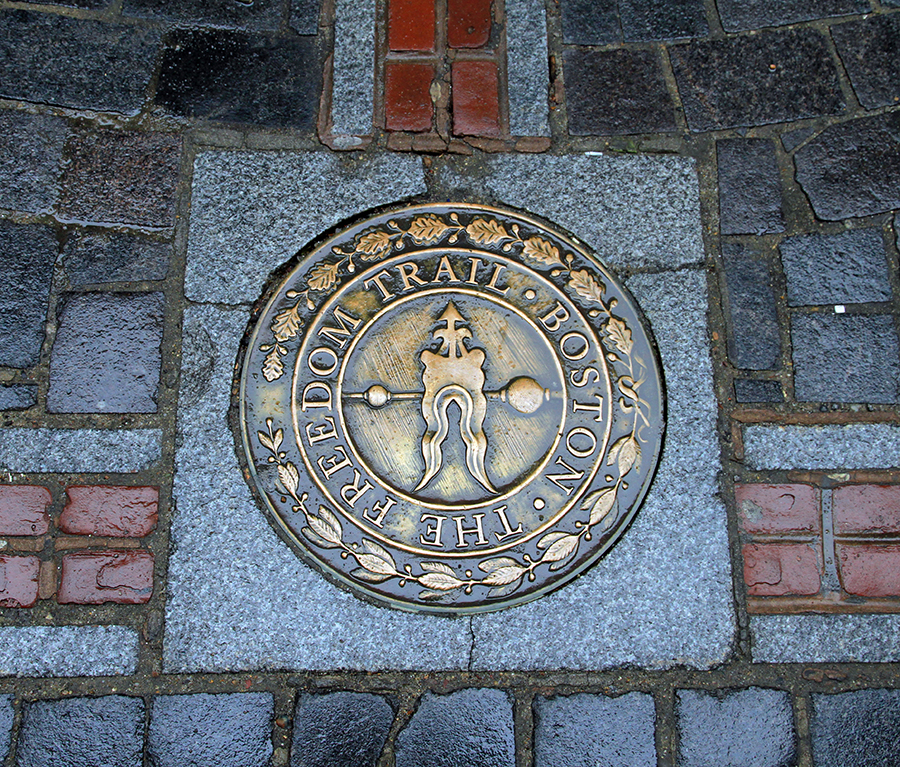
(Photograph by Ingfbruno)


Infographics made easy

MANAGEMENT’S DREAM.

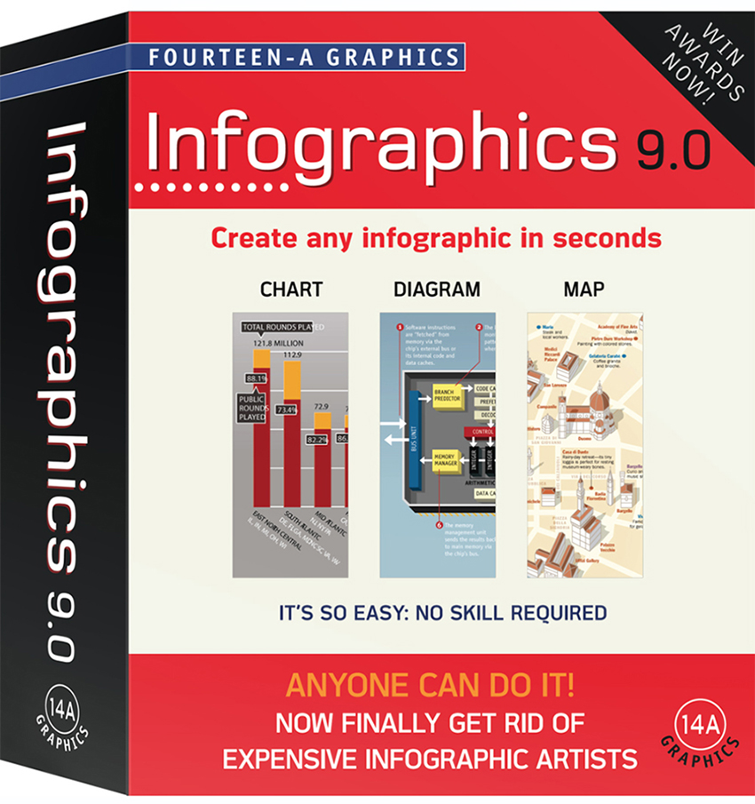
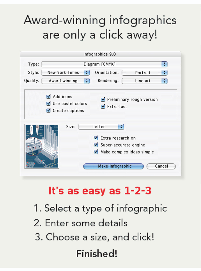
Most of us have come across some annoying attitudes towards infographics. Like: “Isn’t it all done by your computer?” or “Are you still working on that?” Several years ago (when software was still sold in boxes), I decided to create a make-believe program that would make the bosses very happy. In the future, our replacements might be robots, or androids, but fortunately for us, the companies will probably not contemplate that kind of huge investment in infographics. (Although now I think about it, some of the people that I’ve worked with might have been androids.)

Fast forward There are many resources online for making a quick and easy “infographic,” and plenty of stock infographic elements available to help us bash together something that looks like it might be informational. All of this is cause for considerable concern. You can see the damage all over the place.

I really wish I could say that the “infographics are a luxury” attitude has disappeared since I made this spoof software, but in the last few years there have been numerous examples of it still existing, and it is often followed by the dreaded cutbacks.

Anyway, to those organizations that realize the value of our craft, and support us, I say a big thank you.

Footnote: “Fourteen-A Graphics” is a reference to how many “A”s were needed at the time to get to the top of the phone directory listings.

Tools of the trade

INFOGRAPHIC GEAR BEFORE THE COMPUTER.

Need a circle? Use this.

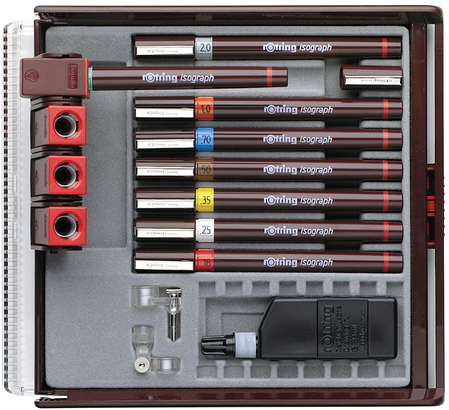
When I started making infographics, every freelancer in the business carried a briefcase everywhere they went. It was filled with all the equipment needed to make artwork. You needed technical pens, french curves, ellipse templates, compasses, ruling pens, paintbrushes, a craft knife, and so on. We spent a lot of time in art supply stores, buying designer’s colors and inks and everything else. I still love those places more than any other shops, although there are a hell of a lot less of them around now.

There were some problems that we don’t have today. If you ran out of ink on a Sunday, you were finished. Stores were closed for the day back then. Then there were the accidents: cuts from very sharp knives, bottles of ink knocked over onto elaborate artwork, airbrushes suddenly spitting paint over beautiful backgrounds.

Yes, it was stressful, but it was also a craft, and it felt like one. Like making furniture or pottery, or something arty. We were artists, or at least we thought we were. After all, we used some of the same gear, just no beret or white smock.

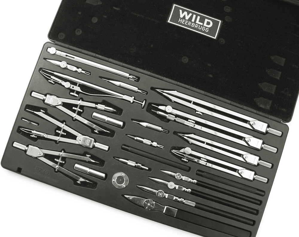
This compass set once belonged to Peter Sullivan, and was used to create numerous classic infographics. It is Swiss-made and is wonderful to use. It contains ruling pens and compasses of various sizes, including a drop-bow compass for very small circles, and an extension bar for large ones. Notice the small circular stand that lets you draw a circle without the compass point making a hole in the artwork.

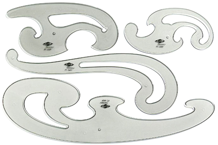
French curves were essential. I had some wooden ship curves for long, gentle arcs, and a difficult-to-use Flexicurve (a plastic bendable rod).

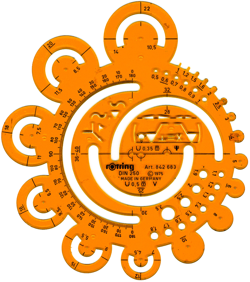
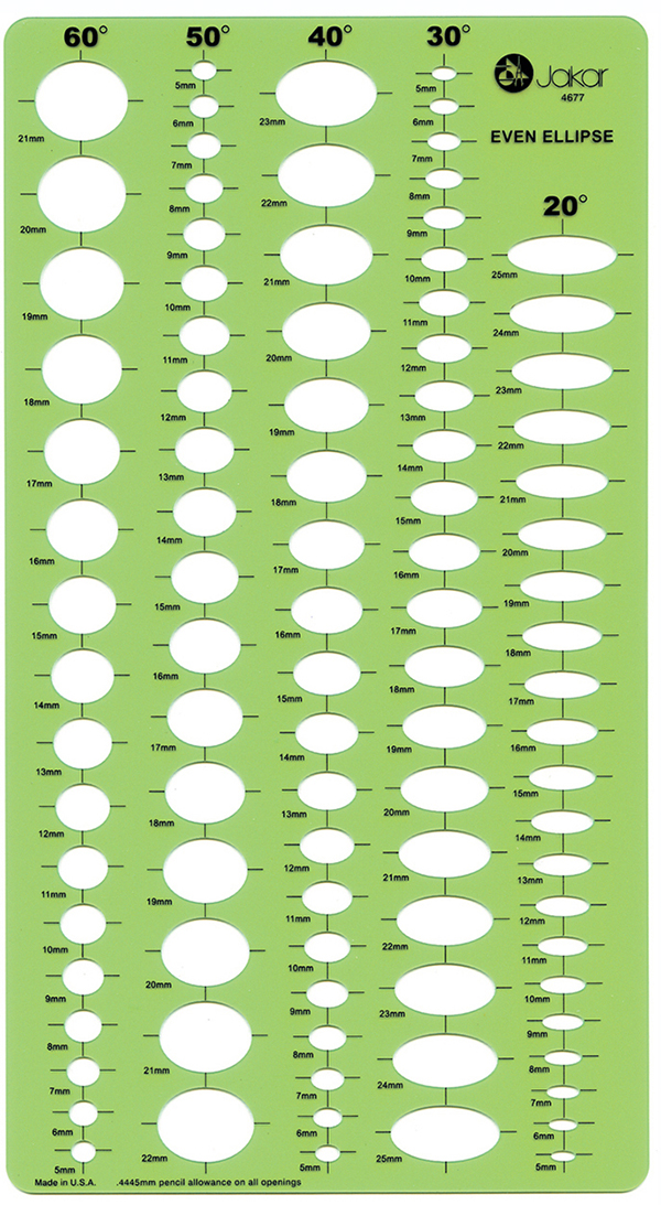
Ellipse templates were needed in multiple degrees and sizes to draw all the perspective circles in a piece of art. In a rough drawing, I would note the ellipses needed for the artwork, otherwise it meant painstakingly matching them up to their respective templates again. I had many of these crammed into my briefcase.

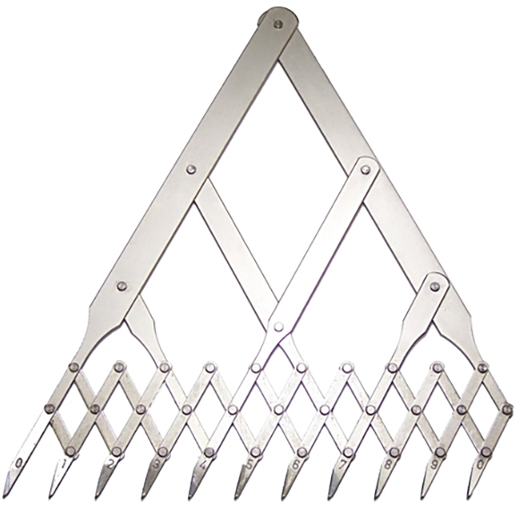
A more exotic instrument. The eleven-point divider was used for division of a line into up to ten equal sections, such as a scale on a chart. I never really used it, I just liked opening and closing it.

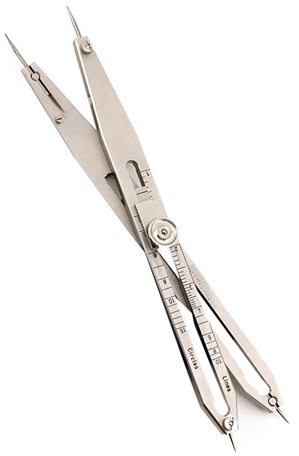
Below is a proportional divider. Used for transferring dimensions from one scale to another, or for dividing up lines equally.

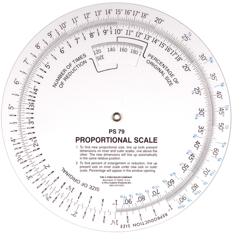
A proportional scale for working out scaled sizes was a staple of design departments back in the dark ages.

Little gems

A VERY CLEAR STATEMENT CAN BE MADE IN A LIMITED SPACE.

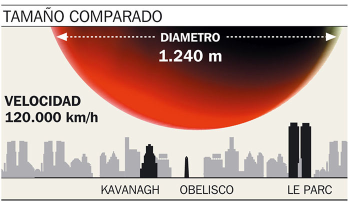
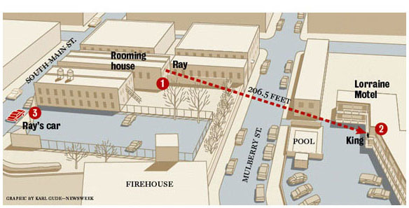
I’ve often been given a lot of room for my infographics, and I admit it, I have not always used that luxurious amount of space wisely. So let’s give a hand to the hard-working small graphic that makes a simple point, and makes it clearly. It is the polar opposite of the mega-graphic, but is just as important. Here are two excellent examples.

How big is that asteroid? A comparison to Buenos Aires landmarks. By Alejandro Tumas for Clarín.

The shooting of Martin Luther King. A reduced palette aids a crystal-clear explanation. By Karl Gude for Newsweek.

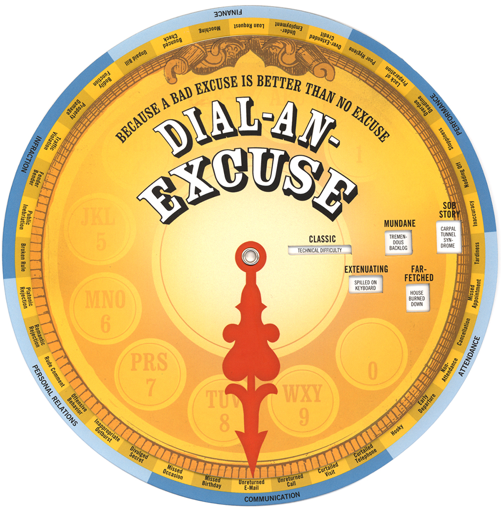
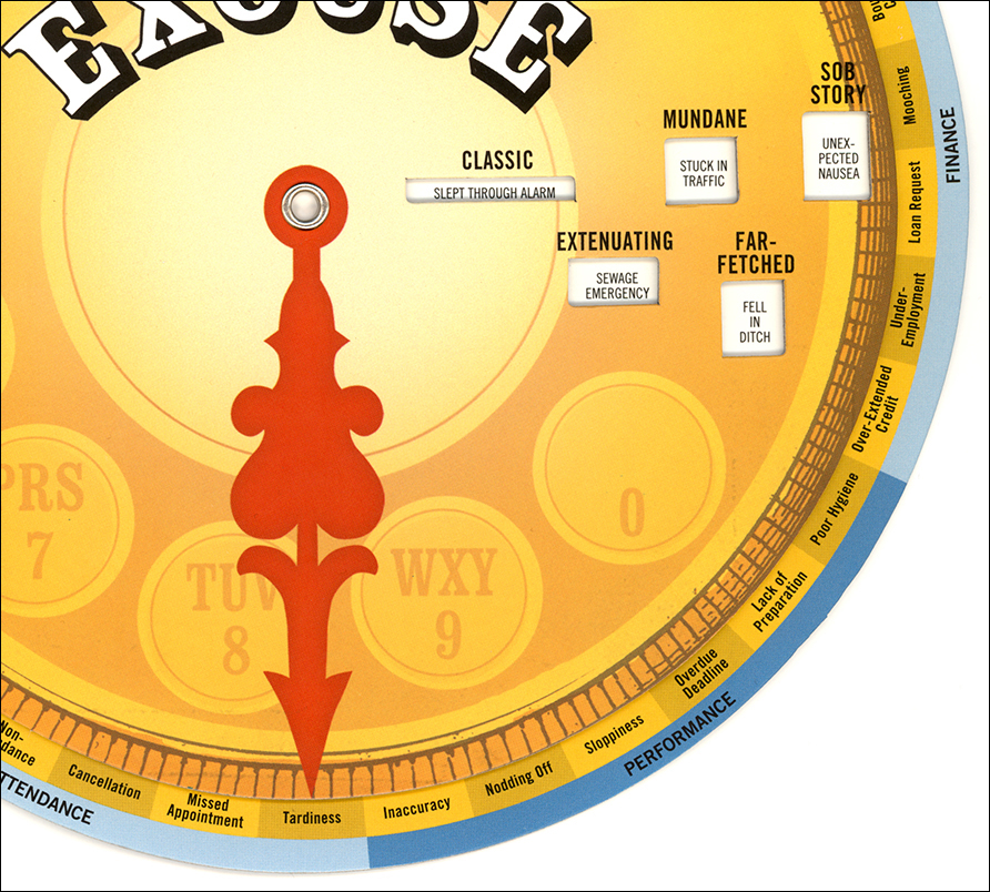
Wheel of excuses

EXPLAINING AWAY VARIOUS PROBLEMS.

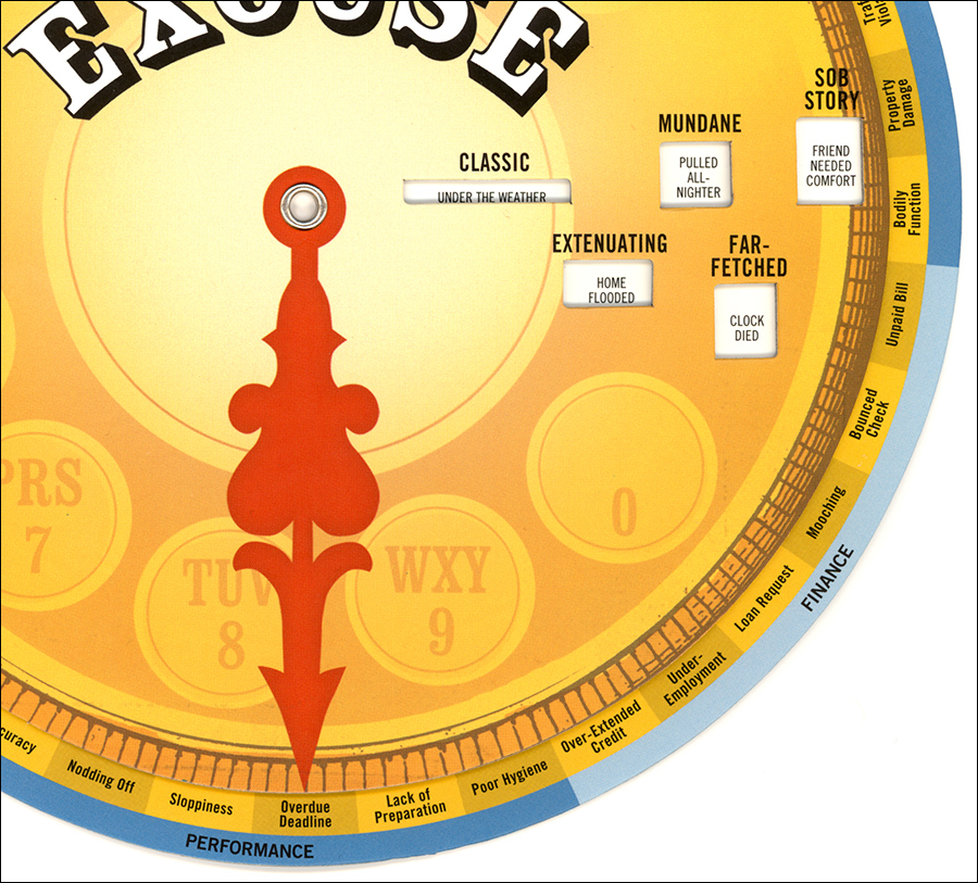
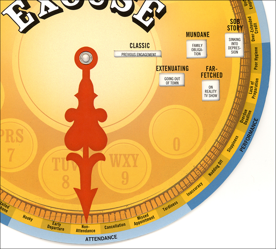
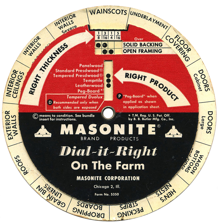
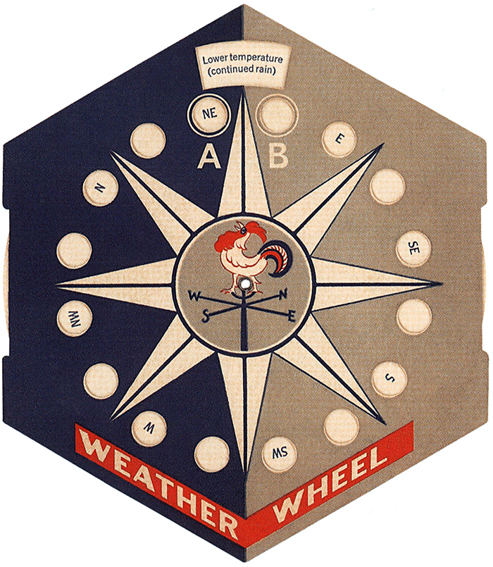
In 2017, dialing up some useful excuses could come in handy for freelancers, professors, students, and everyone else. I’ve often needed something creative to calm down an anxious client. Unfortunately, this wheel doesn’t seem to be available right now (except perhaps on eBay), but when it reappears, you might want to get one. No batteries required.


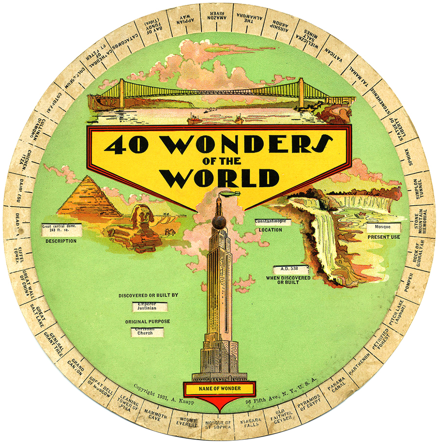
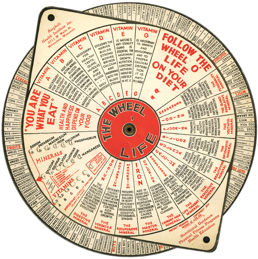
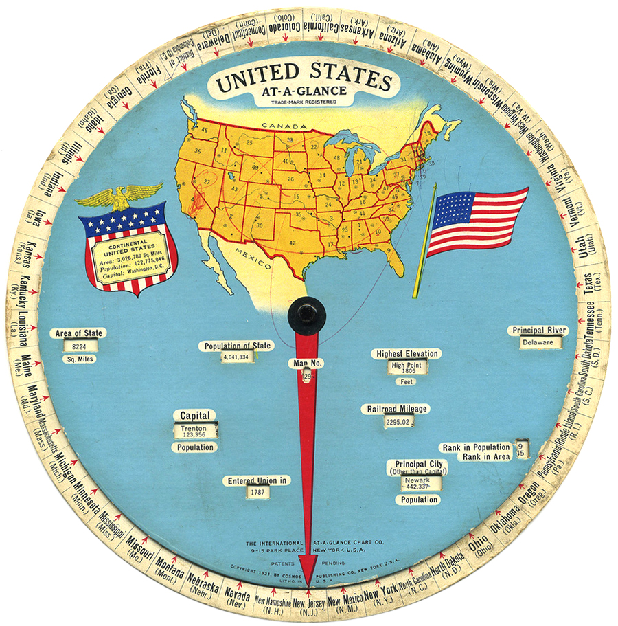
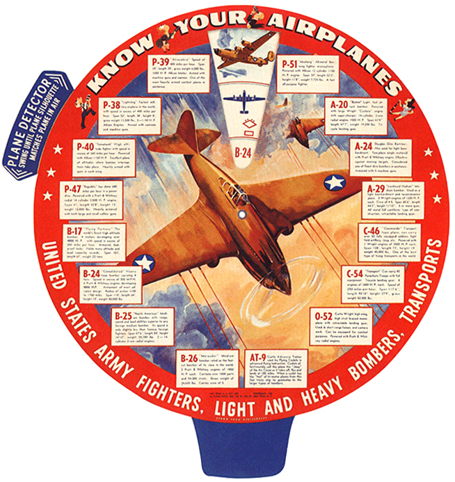
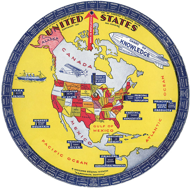
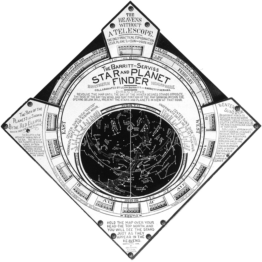
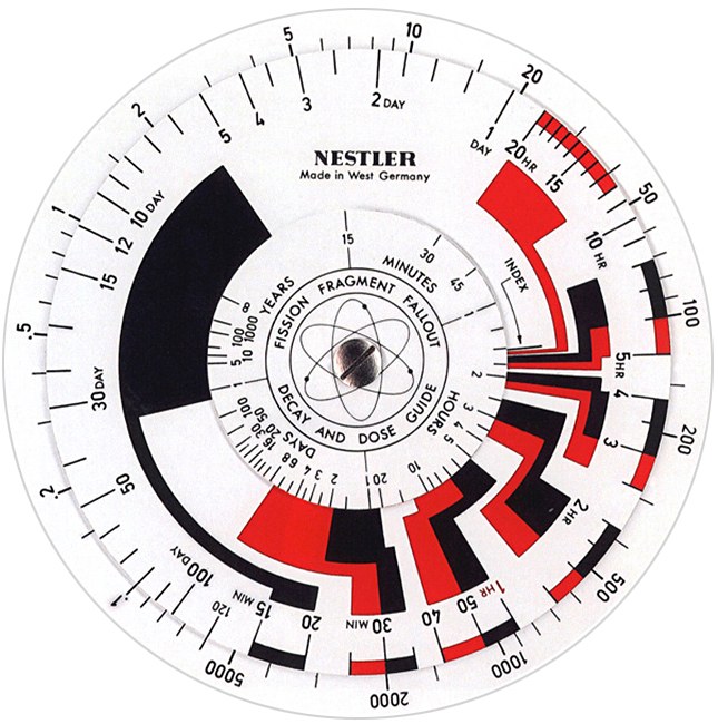
CARDBOARD INTERACTIVES (PART 2)

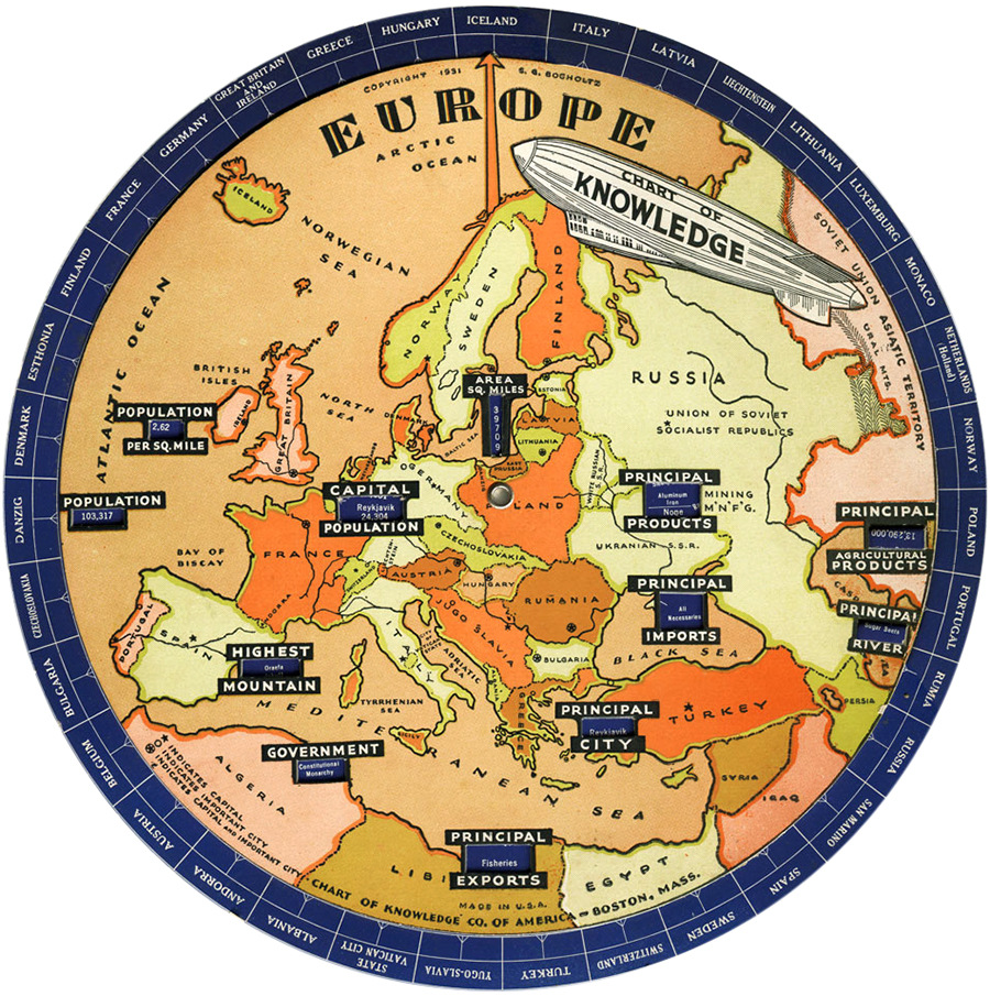
On a more serious note, this is the second part of a wheel charts post that I ran last week. The first part is here: https://www.johngrimwade.com/blog/2016/12/26/cardboard-interactives/

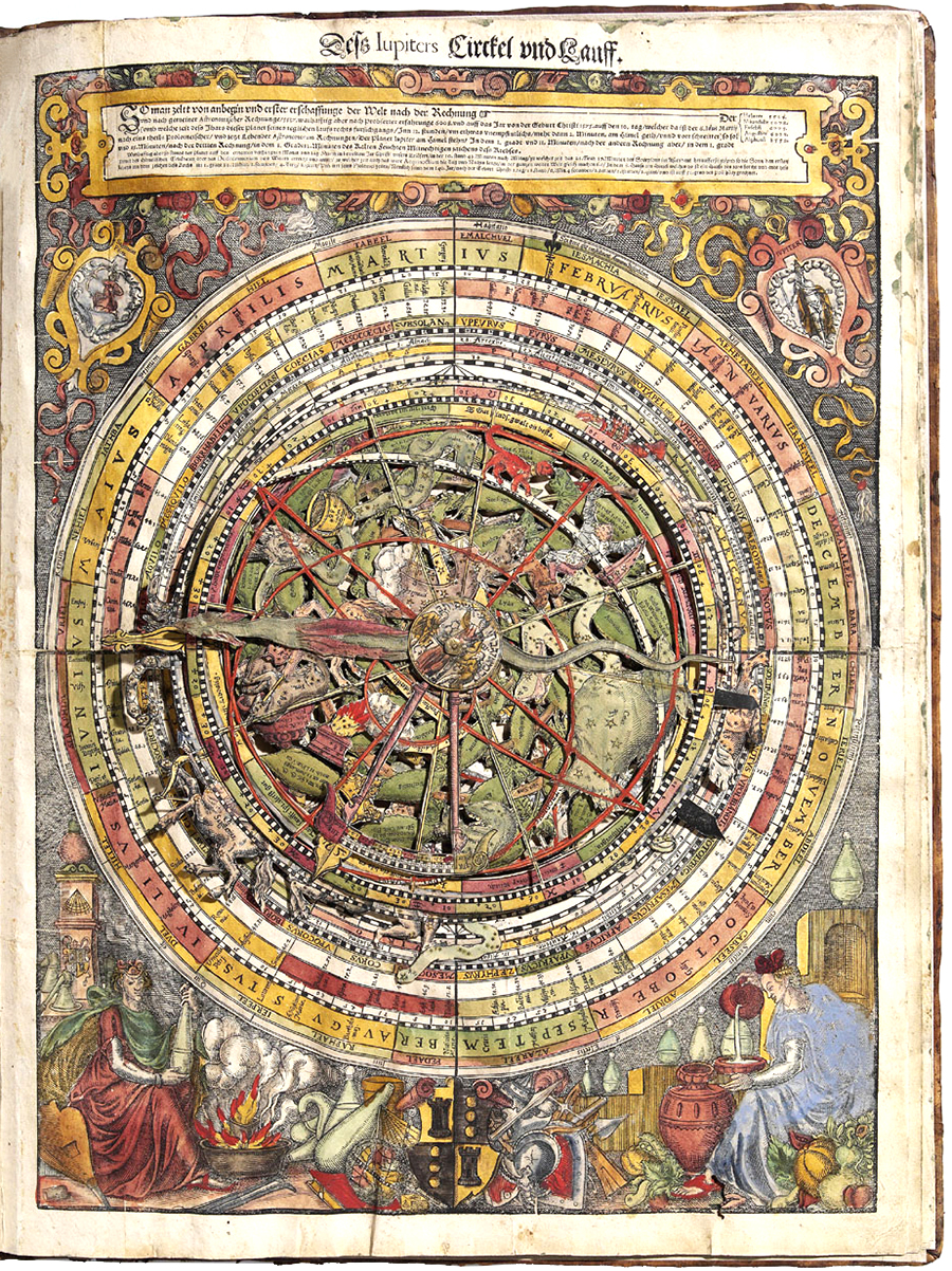
An astrolabe (astronomical calculator) from 1575.

A question of scale

SHOWING INFORMATION LARGE ENOUGH SO THAT WE CAN SEE IT.

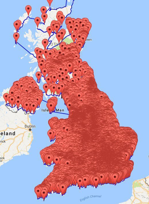
I’ve been caught in this dilemma on numerous occasions, so I’m not pretending that I know the answer. It’s an issue as old as infographics itself. Perhaps there is no answer. Anyway, here are some examples that show the effect of using a reasonably-sized symbol to mark something that is really small.

PUB LAND This was going round on social media recently. A group of mathematicians plotted a shortest-distance tour of 25,000 British pubs, as a project. It’s a lot of fun (and that’s the point here), but it demonstrates what happens when you put a pointer at every location. It’s correct in terms of GPS coordinates, but the visual impression is greatly exaggerated. Britain has a lot of pubs, that is true, but it’s not a solid mass of pubs with no space between them. (Image: University of Waterloo, Canada)


AIR TRAFFIC There are thousands of flights in the air over the U.S. at any one moment. However, the visual impression of the density of that traffic depends on the size of the aircraft icon used. The bigger the symbol, the more crowded the airspace becomes. In a satellite photo, they would not be visible, although that’s not much use as an informational graphic. (Image: ATCSCC)


SPACE JUNK There’s a lot of junk orbiting the Earth, but there’s a lot of space between it too. You wouldn’t see any of it at all from this viewpoint. Here it looks like aliens can’t avoid banging into an old satellite as they maneuver their plasma-powered spacecraft in for a first contact landing. (Image: NASA)


GALAXY The ultimate example. It contains billions of stars, but the distances are so great compared to the size of the stars that two galaxies could pass through each other without any of the objects colliding. Of course, here we’re looking at light from stars, dust and gas. We’re not seeing the scale of individual stars at all. They are mostly blurred together into a smooth distribution of light at this resolution. The bluish-white dots that we can see are individual stars that are much more luminous than the Sun. By the way, this is the Andromeda galaxy, and it will collide with our own Milky Way in several billion years time. (Image: NASA)

Thanks to Ryan Chornock, a professor in the Department of Physics & Astronomy at Ohio University, for help with the space examples.


Cardboard interactives

BEFORE THE INTERNET, WE HAD ROTATING INFORMATION INTERFACES.

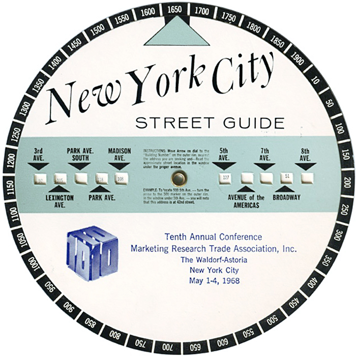
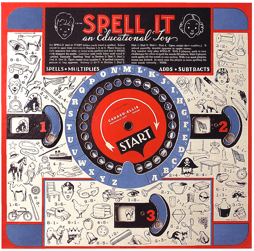
Long before online interactivity, there were rotating wheels (known as wheel charts, or volvelles). They often contained a lot of information and delivered it in small, user-controlled amounts. Isn’t that exactly what we’re trying to do today? There are several examples in Jessica Helfand’s excellent book “Wheels of Invention”: goo.gl/QrLZNx

HISTORY

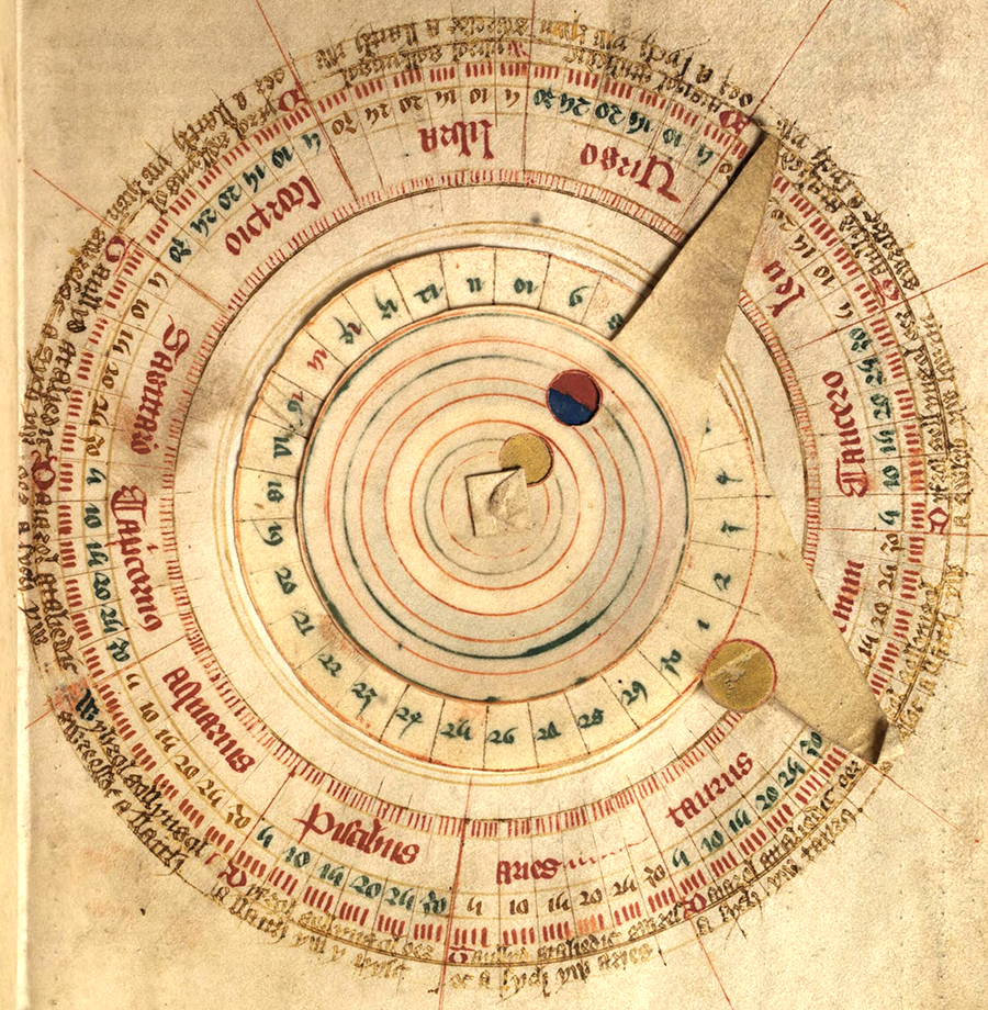
Wheel charts have been around a very long time. This one, from the 15th-century, is for determining the position of the Sun and the Moon in the zodiac.

(National Library of Wales)


The Eagle

A GROUND-BREAKING ILLUSTRATED CHILDREN’S COMIC.


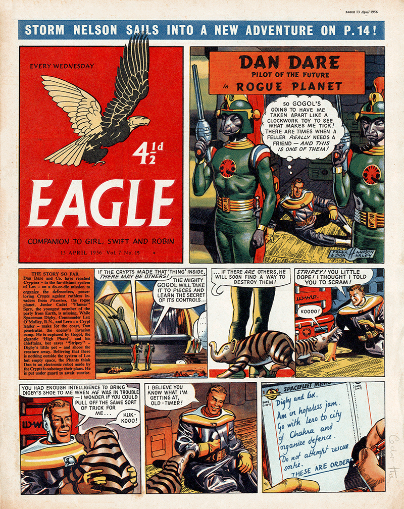
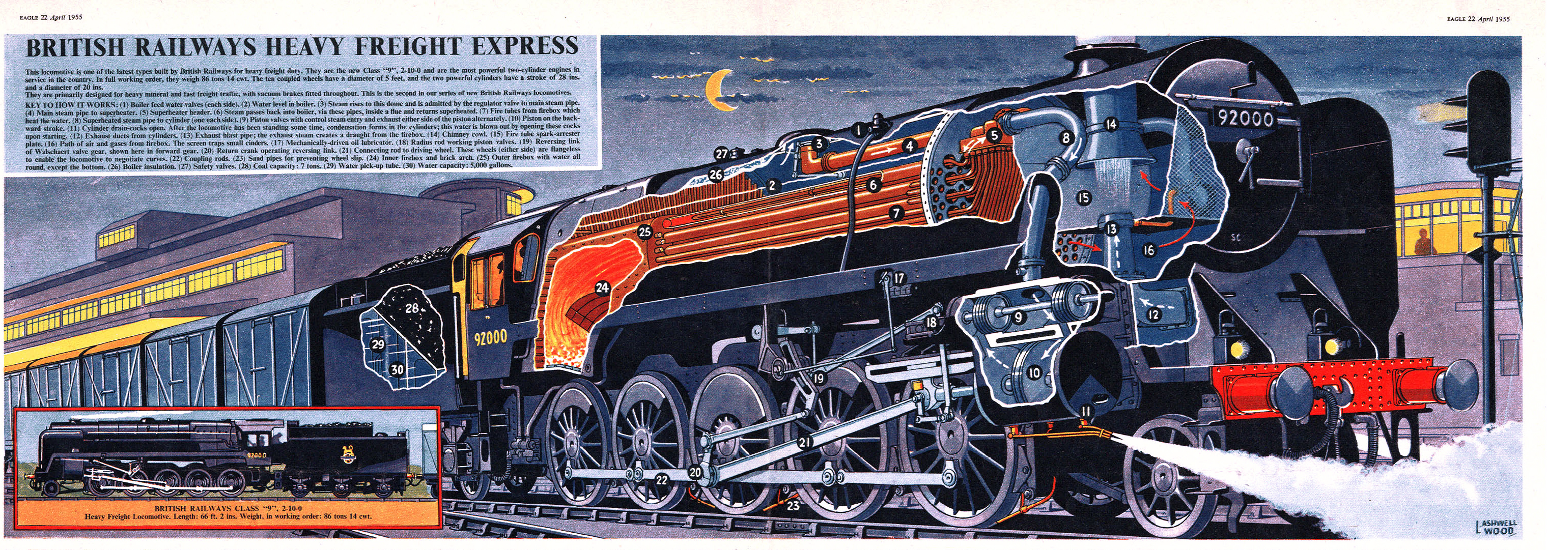
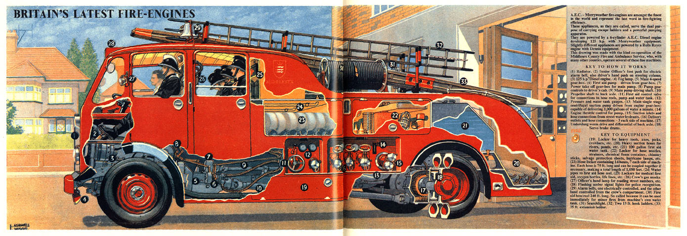
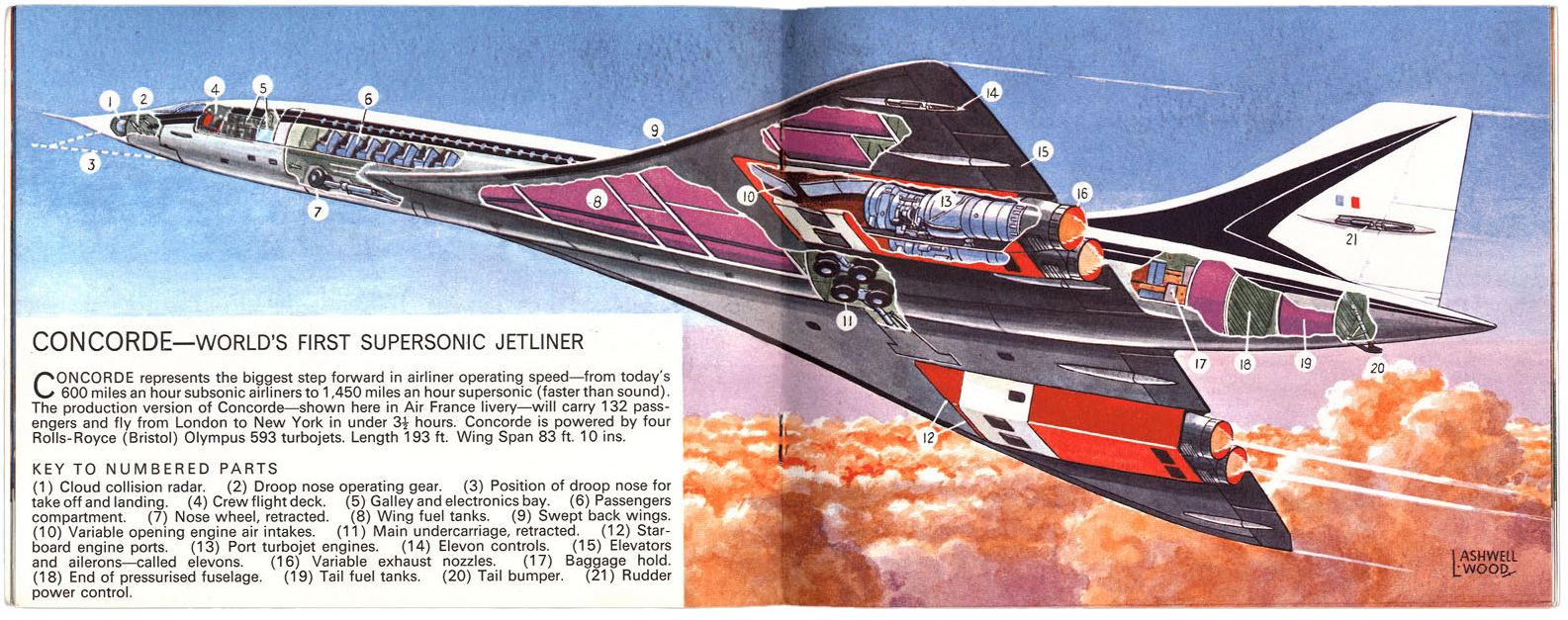
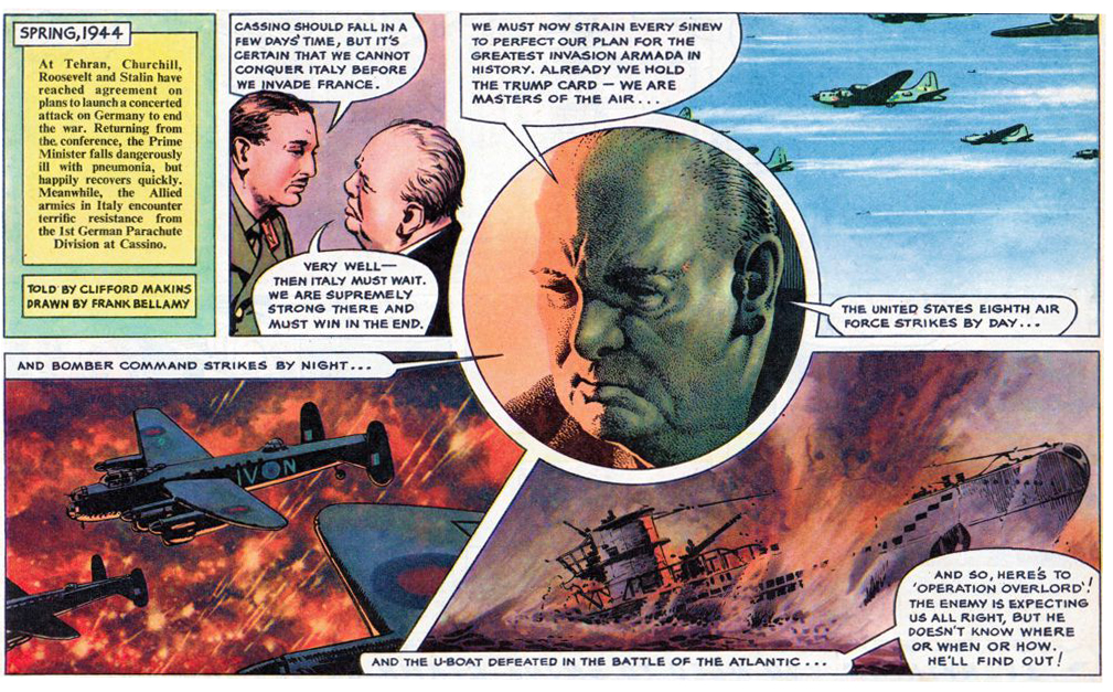
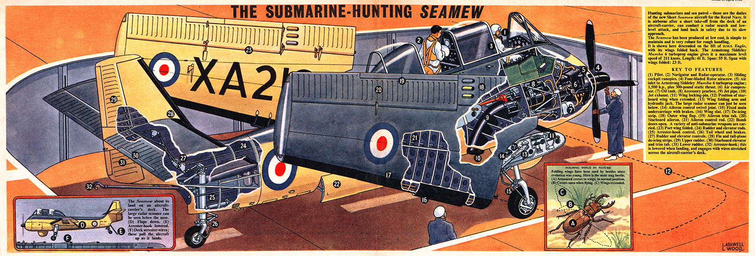
Published between 1950 and 1969 in it’s original form, the Eagle was probably quite influential on a couple of generations of potential British graphic artists. It was really successful, the first issue sold out the print run of 900,000 copies. Always beautifully illustrated throughout by a roster full of talent. As far as I’m concerned, three illustrators stand out. Frank Hampson, who drew the Dan Dare cover feature, L.Ashwell Wood, who illustrated the cutaways that were in the center of every issue, and Frank Bellamy, with his powerful use of color and space. Bellamy eventually took over the creation of the Dan Dare strip.

Below, cutaways by L.Ashwell Wood.

The Happy Warrior: The Life Story of Sir Winston Churchill by Frank Bellamy (dandare.org).

More Eagle here: http://www.dandare.org


Metal

INFOGRAPHICS USED TO MADE OF ZINC.

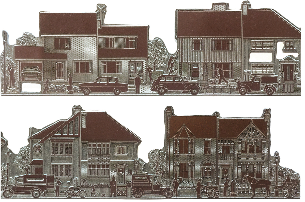
Unfortunately, I don’t have the (hand-drawn) original artwork of this graphic any more. Just the metal plate. It’s a relic of a pre-computer time, although this reproduction method is still used in traditional letterpress printing today. The plate is shown larger below to give a better idea of the details. The feature that contained this illustration was about the history of British residential architecture, and I tried to capture the different eras. From right to left in this reversed image.

THE PROCESS Artwork was drawn larger than the final size (150% or 200%). Then it was photographed with a line art camera, and that image was photo-etched out of a sheet of zinc to make the printing plate. The white areas were further removed using a router (the holes in the plate here), to make sure they would not be liable to pick up any ink during printing. In some of the indentations, you can see ink from proofs that were made directly from the plate before it became part of the page, and again after the page had been completely assembled.

HOT METAL That was the term for newspaper composition at that time. The type for the page was set on Monotype or Linotype typesetting machines, which were like giant typewriters with pots of melted lead feeding into moulds. The resulting metal type was locked together with the photographs and illustrations (mounted on blocks) in a metal frame called a chase. From that complete page, a flong (a papier-mâché mould) was made, and this was used to cast the curved printing plates that would fit onto the rollers of the huge rumbling presses down in the newspaper’s basement.

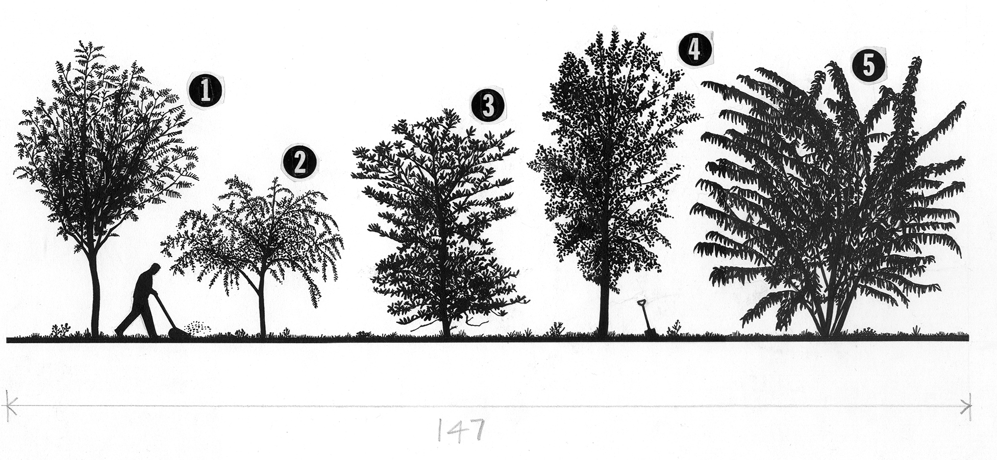
The artwork above was shown in an earlier post (https://www.johngrimwade.com/blog/2016/10/31/old-school/). As you can see, it was to be printed 147 mm wide, the dimension penciled below the art, and was drawn at 150% of the final size. It was much easier to work with pen and ink at a larger size, of course. But then again, as I said in that earlier post, “Trees are easy”.


Everyday symbols

WE TAKE THESE KEYBOARD CHARACTERS FOR GRANTED, BUT WHERE DID THEY COME FROM?

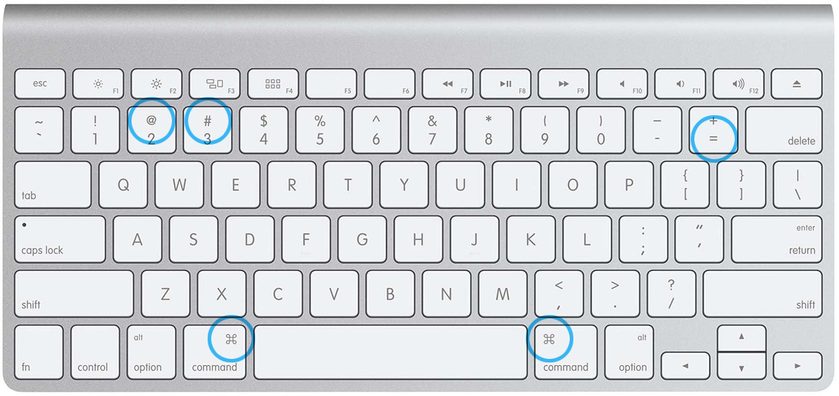
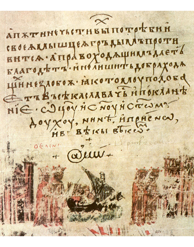
AT SIGN This email staple goes way back. It appeared in a 1345 Bulgarian translation of the Manasses Chronicle, although presumably not in connection with email.
 

More recently it was used in commercial and shipping documents meaning “at the rate of”. In 1971, Ray Tomlinson invented email, and decided to use the symbol in email addresses to separate names of people from their machines. Thus starting the path for it to become perhaps the most commonly used icon in the world.


HASHTAG
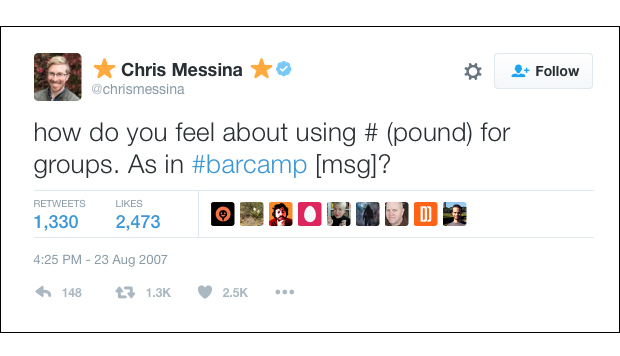
Chris Messina, at one time a Google designer, came up with the very first hashtag on Twitter. In 2007, he posted the hashtag #barcamp. It had previously been used mostly in information technology to denote a special meaning, especially in the programming language C. Twitter initially rejected the idea, but well, you know the rest.

EQUALS SIGN Perhaps the ultimate minimalist piece of historical information design is the equals sign. Two parallel lines of equal length. “And to avoid the tedious repetition of these words “is equal to”, I will substitute, as I often do when working, a pair of parallels or twin lines of the same length, thus: = , because no two things can be more equal.” The words of Robert Recorde, a Welsh physician and mathematician, who invented the symbol in 1559.

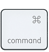
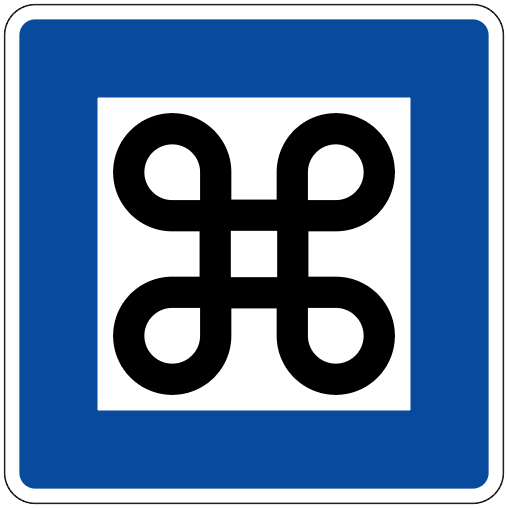
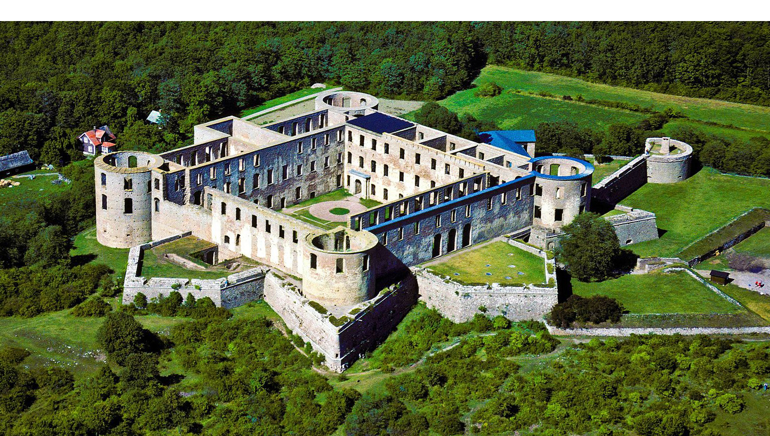
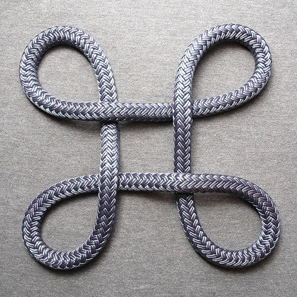
APPLE COMMAND KEY Susan Kare, a designer at Apple in the 1980s, was looking for something to replace the Apple logo (which had been on the command keys of early models) as the command symbol for the new Macintosh. Steve Jobs felt it would be too much to continue using the Apple logo and thus have it on all the shortcut menus. So Susan chose this geometric shape from a symbol dictionary, unaware of its use on Swedish road sign H22, which indicates national heritage sites.

The symbol is perhaps derived from the plan of Borgholm Castle.

(Photograph: L.G.foto)
Then there’s the Bowen knot, of Welsh origin. And on we go…

(Photograph: David J. Fred)