Category: Infographics

Test card

THE PATTERN THAT SETS THE STANDARD FOR TELEVISIONS.

phillips1

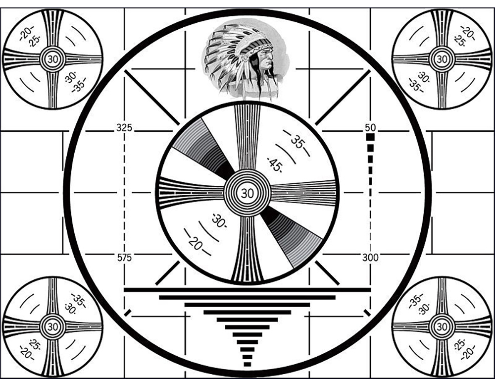
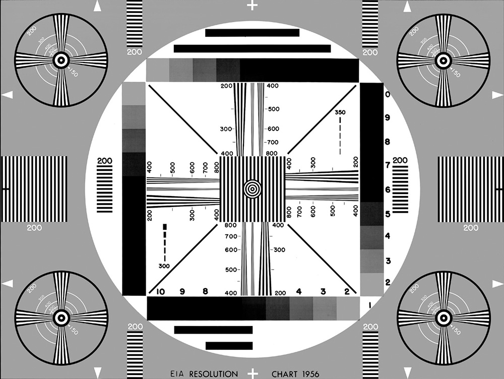
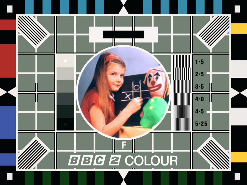
In the earlier days of television, when the cathode ray tube (CRT) was king, broadcasters would put up a test pattern when there was no programming (which was quite often). It was a reference point to help engineers and technicians tune in cameras and tvs, adjust aerials etc. It was called a test card because it really was a card that a camera was pointing at. Later it became know as a test pattern. The geometry of the earlier versions is there to help adjust CRTs. Not needed with modern plasma and LCD sets. The patterns are still around today in digital form for equipment adjustment, but there is no downtime on television channels, so we don’t see them on our sets. I’ve always liked them as simple, functional pieces of information design.

Below, a 1939 Indian-head pattern. Used up to 1970.

indianhead2


eia


bbc2


telefunken


oud

They were (and are) accompanied by music, or a sine wave tone, for checking sound reception.

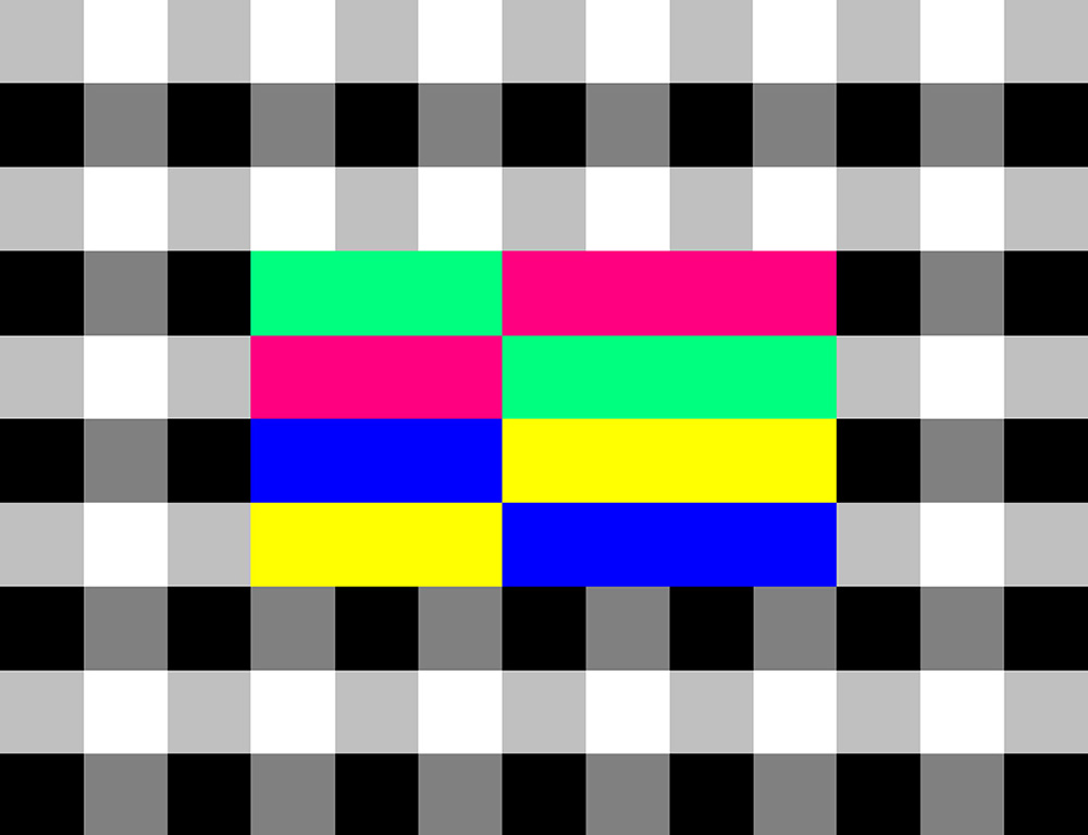
The SMPTE bars are the most common test screen today in the North American region (NTSC standard). Used frequently in video production and transmission, this is a known standard, meaning that people across the T.V. industry have a benchmark to match their image against. The pattern comes with a potentially mind-numbing continuous tone. Experience the joy of it here: goo.gl/JxK1gp

smptehd

And to finish, here’s a dynamic-looking T.V. from the 1950s, just because it’s…unusual by today’s standards. Not a thin black rectangle.

kubakomet1957


Informational visions

VISUAL DEFINITIONS OF THE INFOGRAPHIC CRAFT.

jg_manhattan

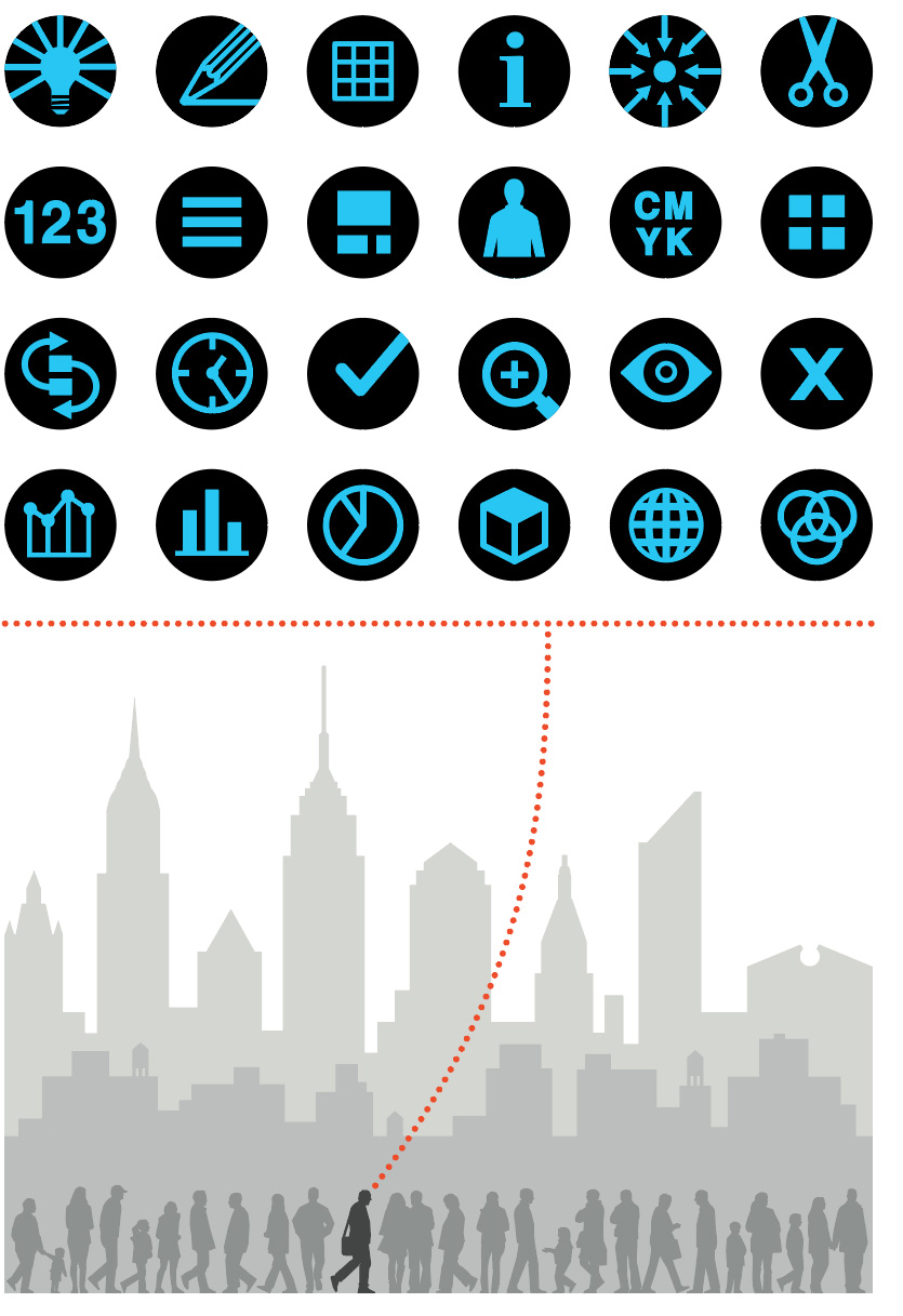
I’m walking in Manhattan (where I used to live), my head full of thoughts about making infographics. Expressed (of course) in pictograms. If you click on the image, you’ll see that I’ve decoded it. (Note: Keep your expectations reasonably low before clicking. It’s not rocket science.) This illustration originally appeared in the book “Infographics. A Visual Definition”. Eighty-one infographic designers submitted a page. It was produced to mark the twentieth-anniversary of the Malofiej conference. This year will be the twenty-fifth. More about that in later posts. The book can be purchased here: http://www.snd-e.com/es/libros/infographics-visual-definition

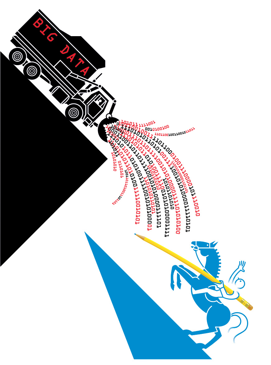
The example below is my favorite from the book. Nigel Holmes is protecting us from the onslaught of Big Data with a pencil. For some of us, it’s a mouse or a stylus, but the role of the designer in a world of ever-increasing information has never been more valuable. In a best-case scenario, that data is analyzed, and the truths within it are explained with clear, concise visuals. That’s my dream.

nh_bigdata

Bayer’s masterpiece

THE 1953 WORLD GEO-GRAPHIC ATLAS.

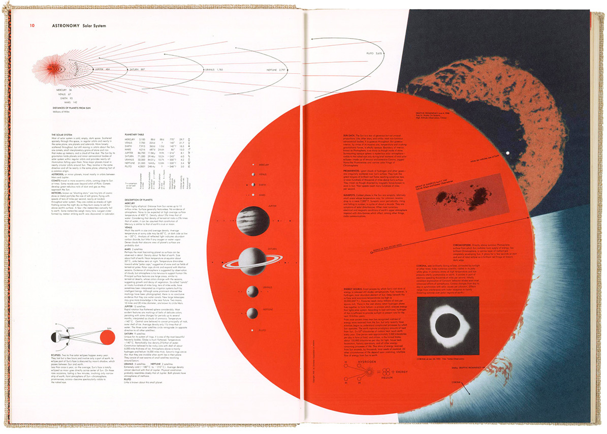
astronomy_hb1

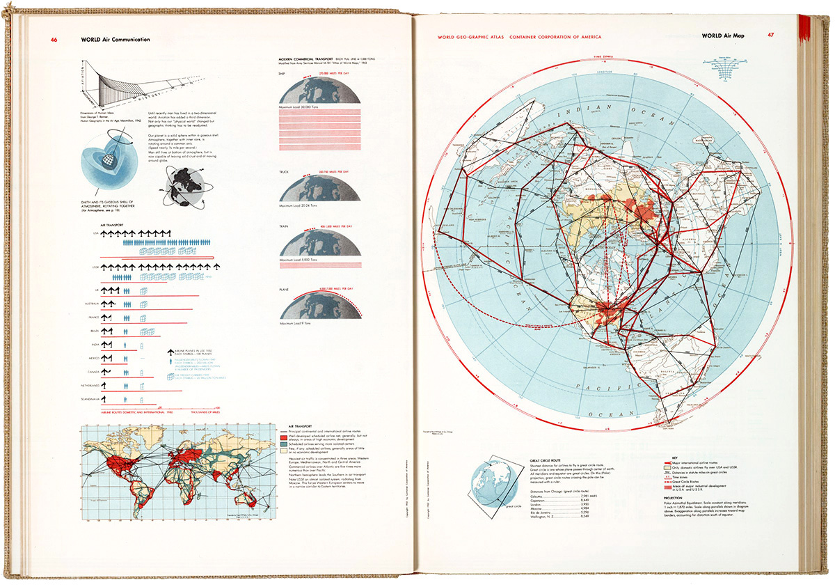
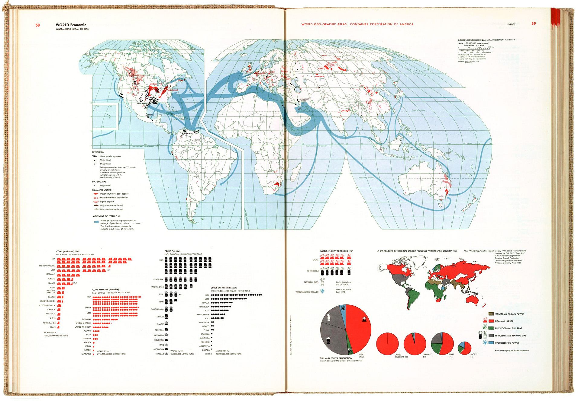
This informational gem took five years to produce and contains a few thousand infographic items. I don’t own a copy, but Michael Stoll, who I mentioned in an earlier post (https://www.johngrimwade.com/blog/2016/10/06/atlas-heaven/ ), has one (naturally) in his superb collection of historical information design. I was in Augsburg two weeks ago, and was able to examine the real thing, instead of looking at digital images. Seeing design in it’s original format, as opposed to looking at different sizes and variable image quality online (or in this blog, for that matter) is a vastly different experience. Often difficult to achieve, but worth the effort.

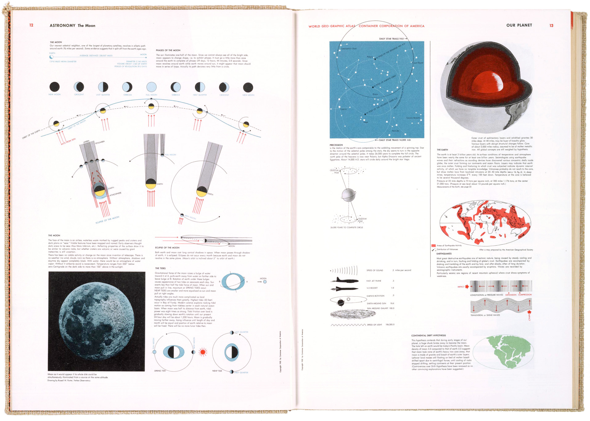
themoon_hb

The atlas was produced for the Container Corporation of America to commemorate their twenty-fifth anniversary. 30,000 copies were printed. They were distributed to customers as a gift, and given to numerous colleges and universities. It was never produced commercially, or reprinted, so original atlases in good condition are quite rare, and thus expensive to acquire.
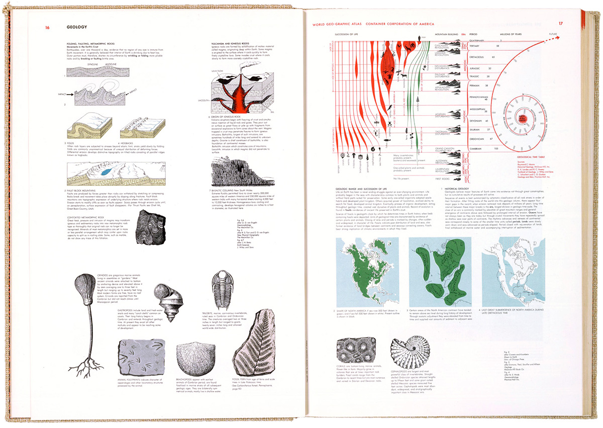
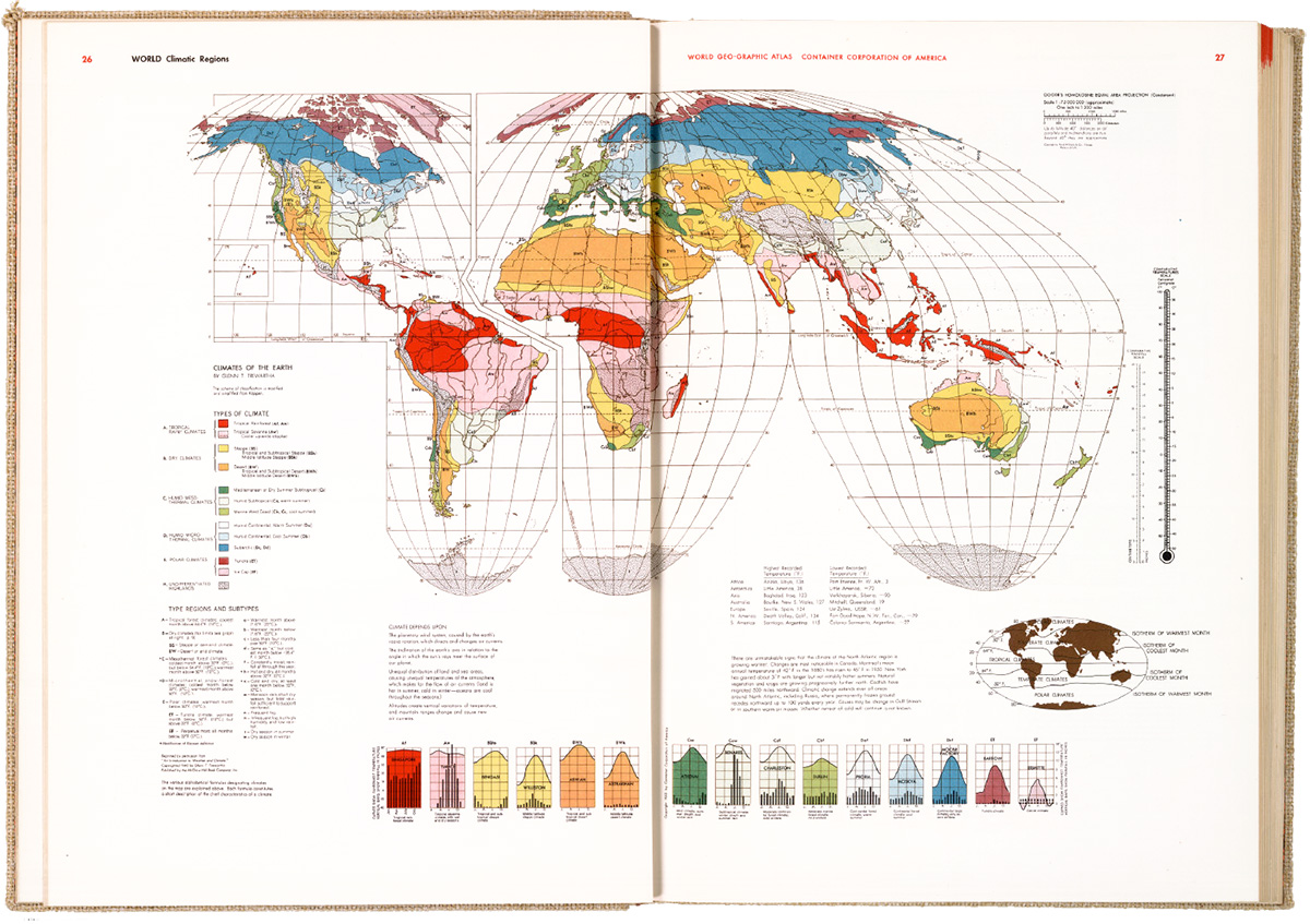
A team of three designers worked under Bayer to develop a graphic language for the book, using the color system that had been developed for CCA by Egbert Jacobsen. Bayer did his own research, traveling widely to assemble the information. There are many design influences to be seen in the pages, like the Isotype system of pictograms. I’m struck by how it looks so modern, sixty-three years after publication. It shows the staying power of precise, clear information design.

geology_hb

Herbert Bayer was a Renaissance Man. A graphic designer, typographer, photographer, artist, interior designer and architect who studied and taught at the legendary Bauhaus school. He emigrated to the U.S. before the Second World War, and produced all kinds of impressive design across many fields.

climate_hb

airconnections_hb4

economic_hb3

These images are from the David Rumsey Map Collection. See the full atlas in high-res there: goo.gl/gpd8nV

Grimwadia

THE WORLD OF TRAVEL INFOGRAPHICS.

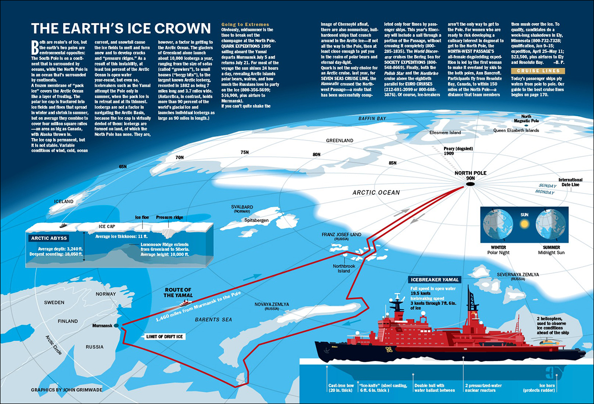
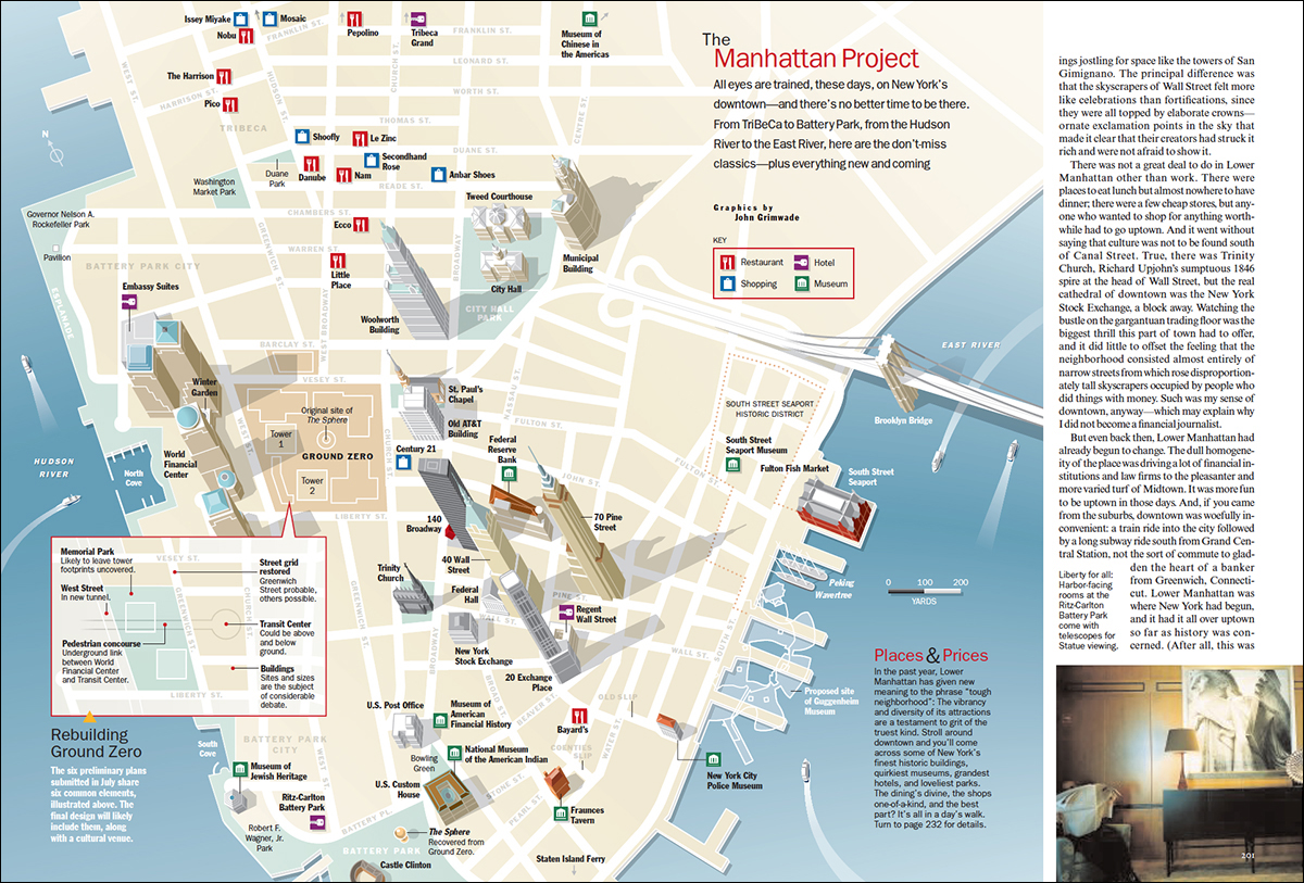
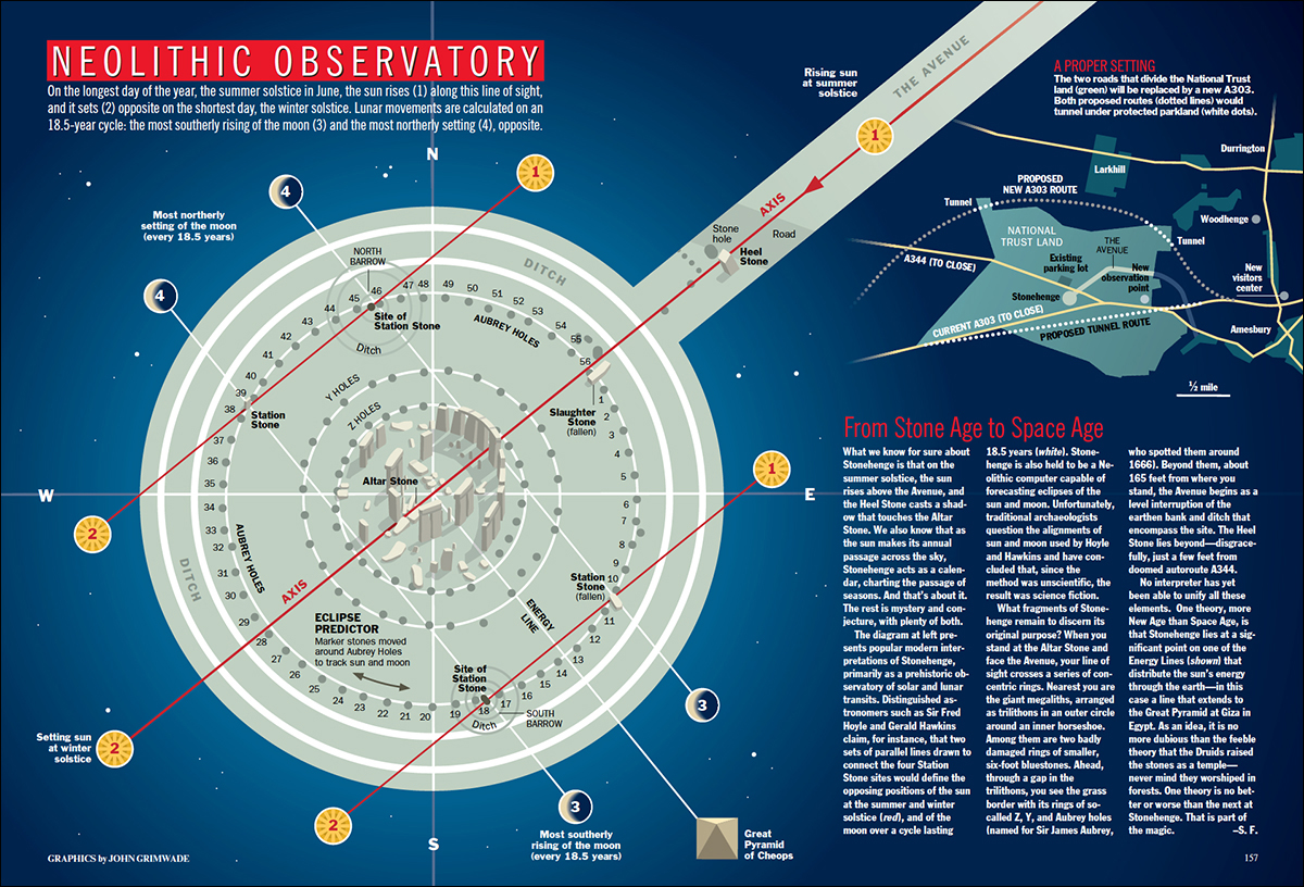
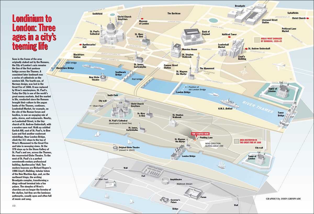
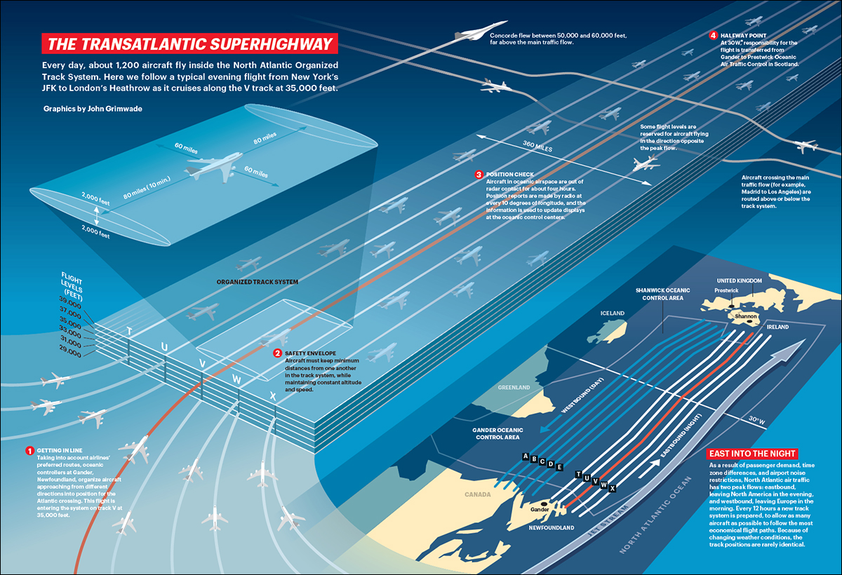
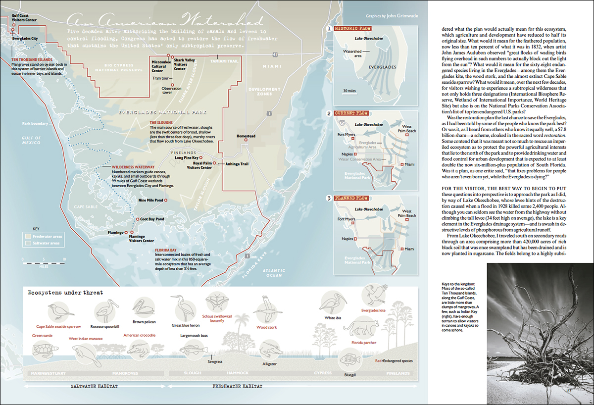
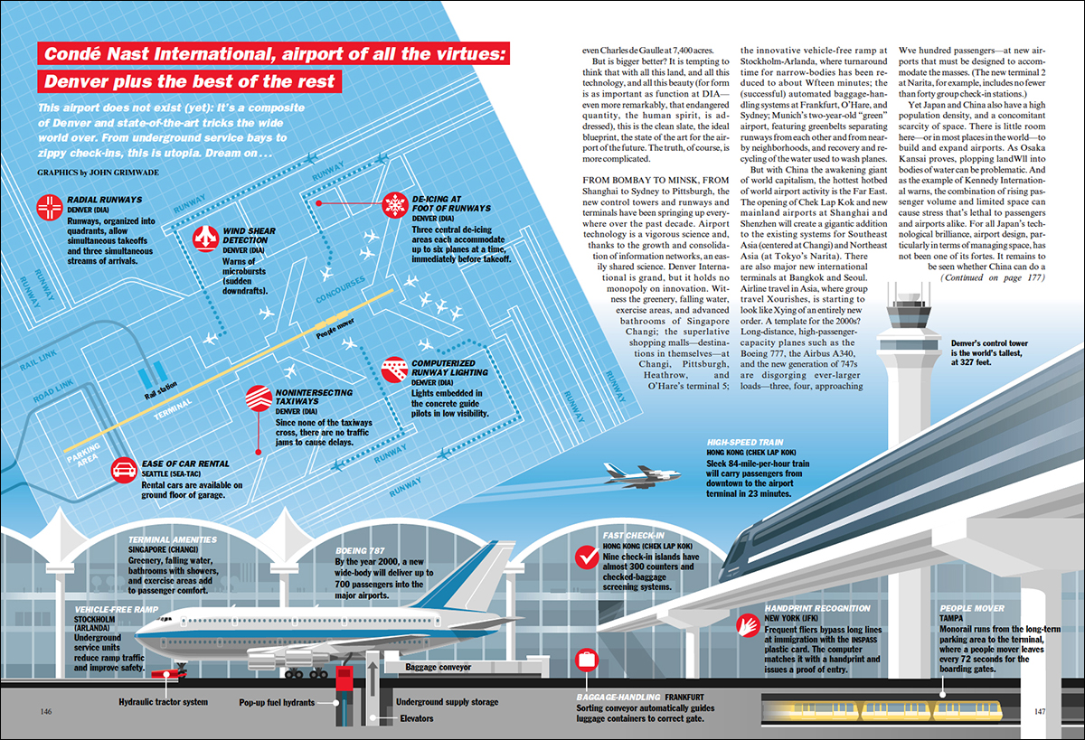
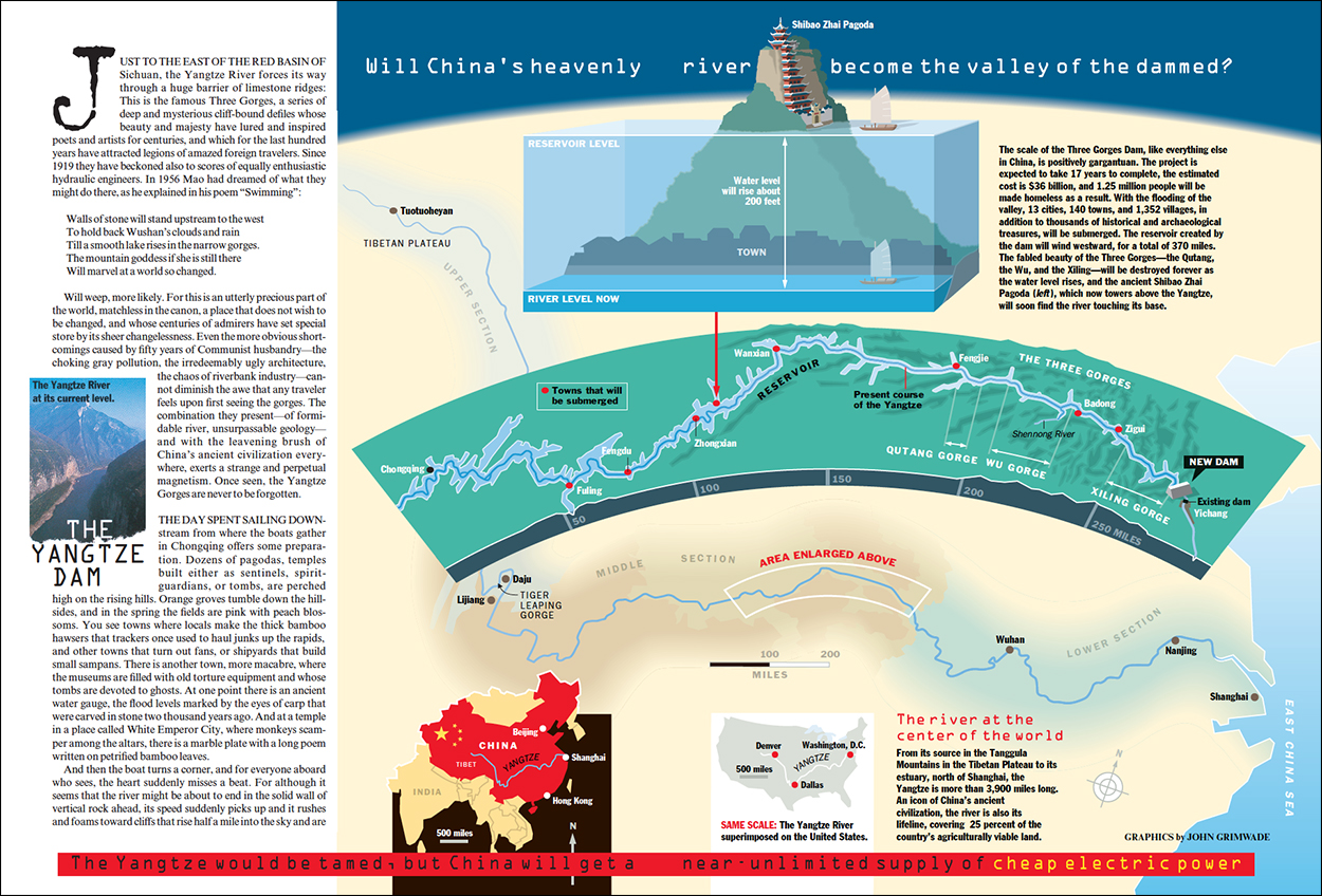
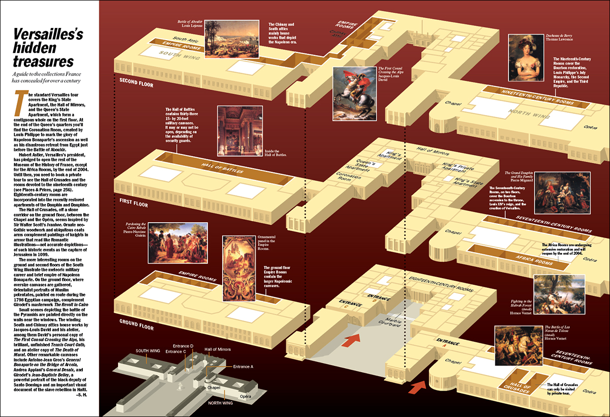
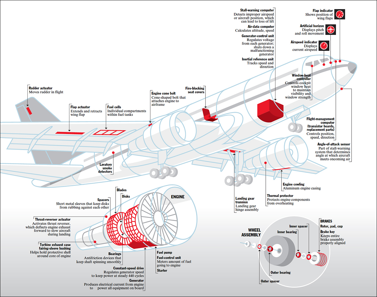
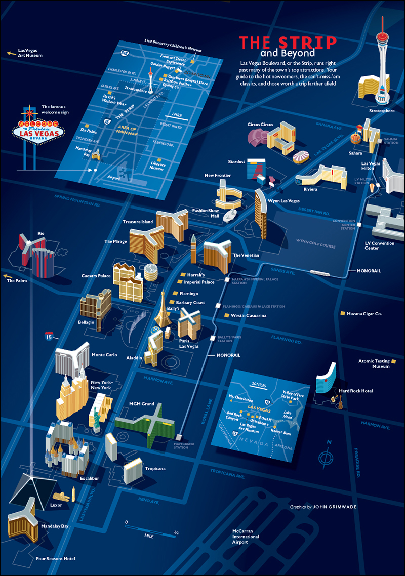
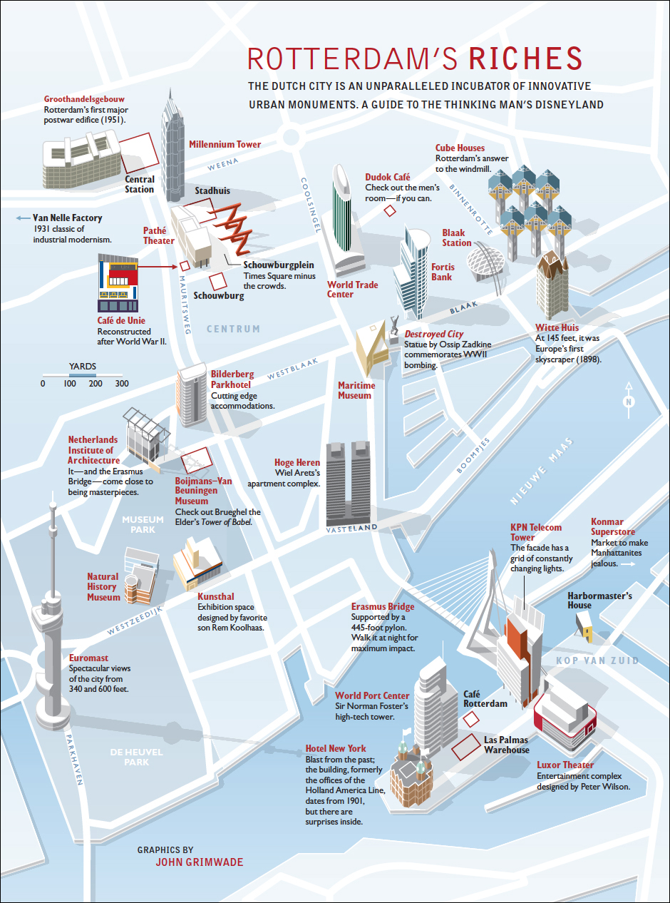
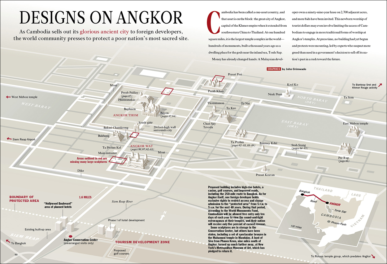
Clive Irving (who is the most infographic-minded editor I have ever worked with) coined the term Grimwadia (pronounced grim-way-dia) to describe the kind of infographics we were running in Condé Nast Traveler magazine. Soon editors there were announcing, “We need some Grimwadia in this feature,” as if that was a normal thing to be saying. I found it slightly odd, to be honest, but loved the implication that infographics had become part of the brand.

icecrown

I tried very hard to compliment the features that contained these graphics. A huge amount of work in the research and copy-editing departments, and super-smart editorial support, went into these pieces. Then there was the vital input of the design department. The people who worked with me are very much a part of this, especially Clive, whose infographic intelligence, superb crafting of headlines and text, and unfailing enthusiasm for the projects made them happen.
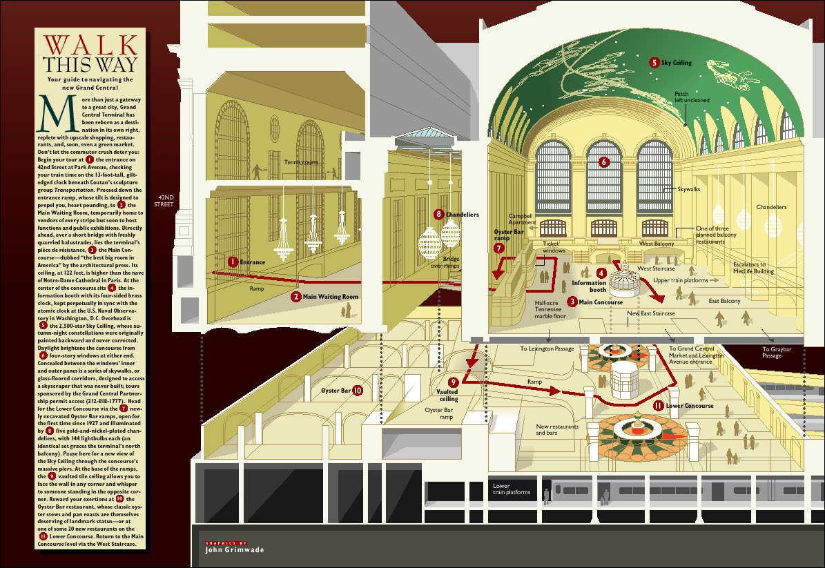
I think all people making infographics hope to find like-minded individuals on the editorial side who realize the value of visual explanation. When you have that support, everything works. When you don’t, infographics can be a big struggle.
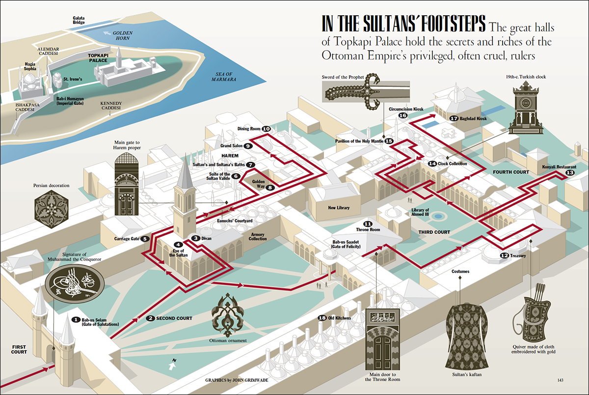
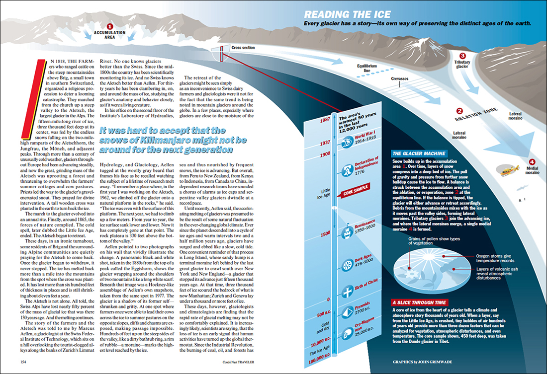
So here are some examples from that period, mostly from the 1990s and early 2000s.  Although these graphics are the rear-view mirror now, I have a soft spot for them.

manhattan

stonehenge1

london

transatlantic

everglades

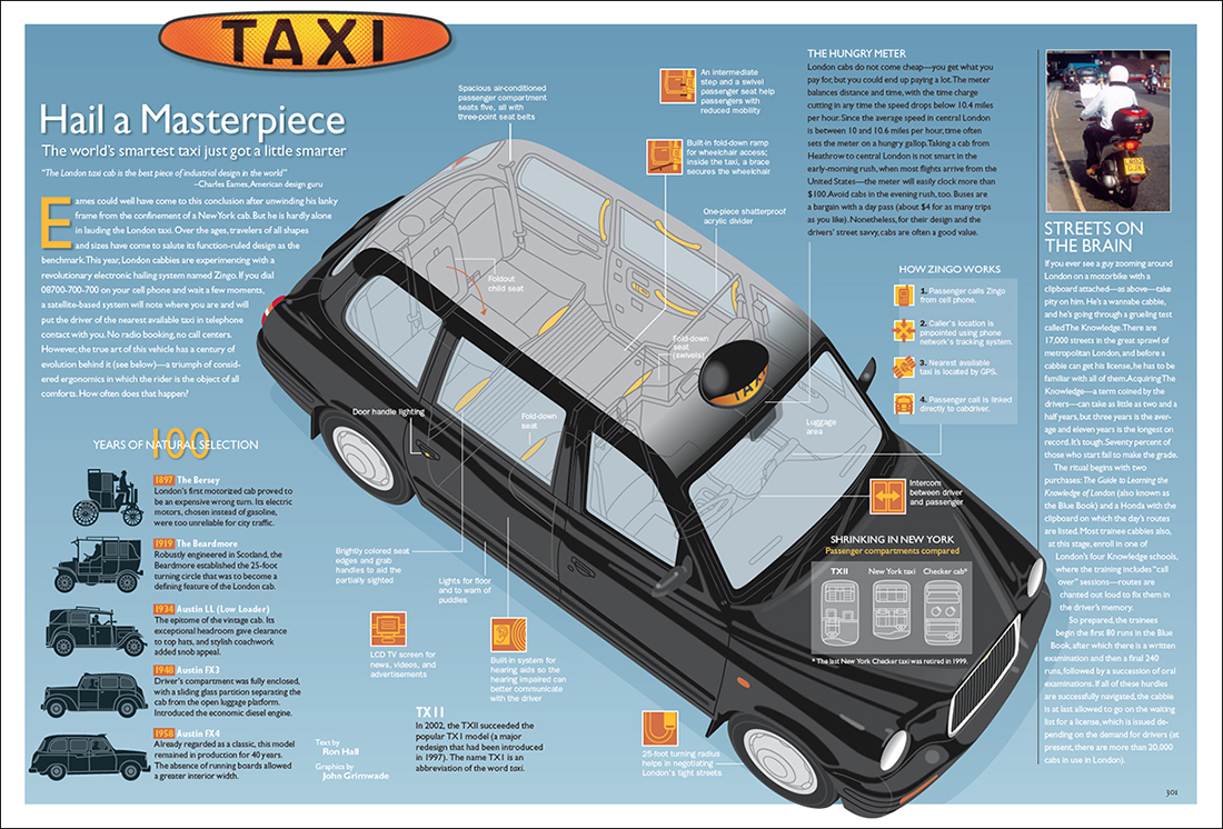
taxi1

angkorwat

grandcentral

topkapi

glaciers1

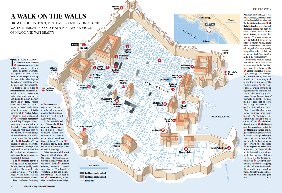
dubrovnik1

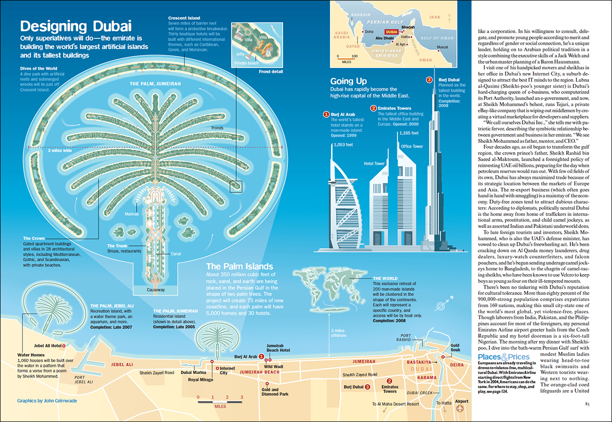
dubai

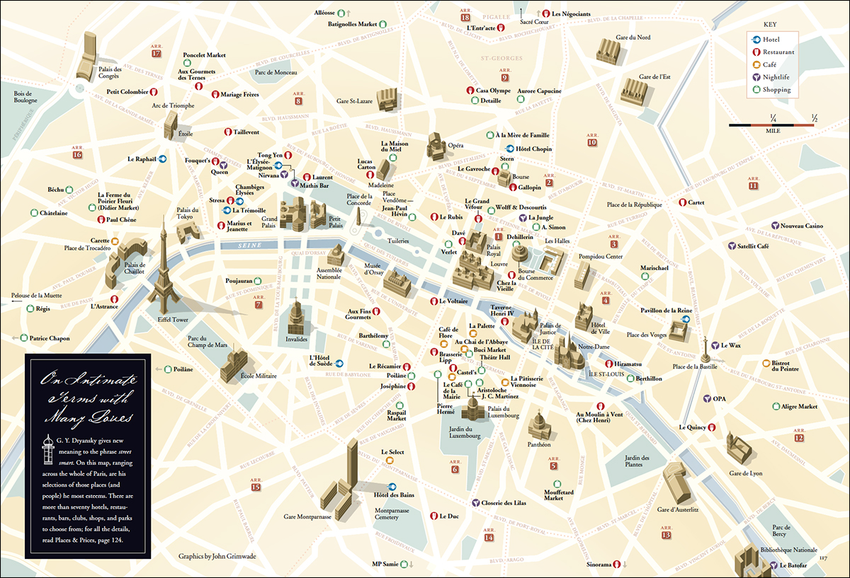
paris

airports

yangzte2

versailles

counterfeit

vegas

rotterdam1

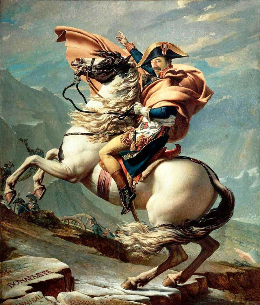
And sometimes I imagined Grimwadia as a small nation full of infographic-minded citizens. I was the king, looking something like this. Riding my faithful horse, Adobe.

napoleon1

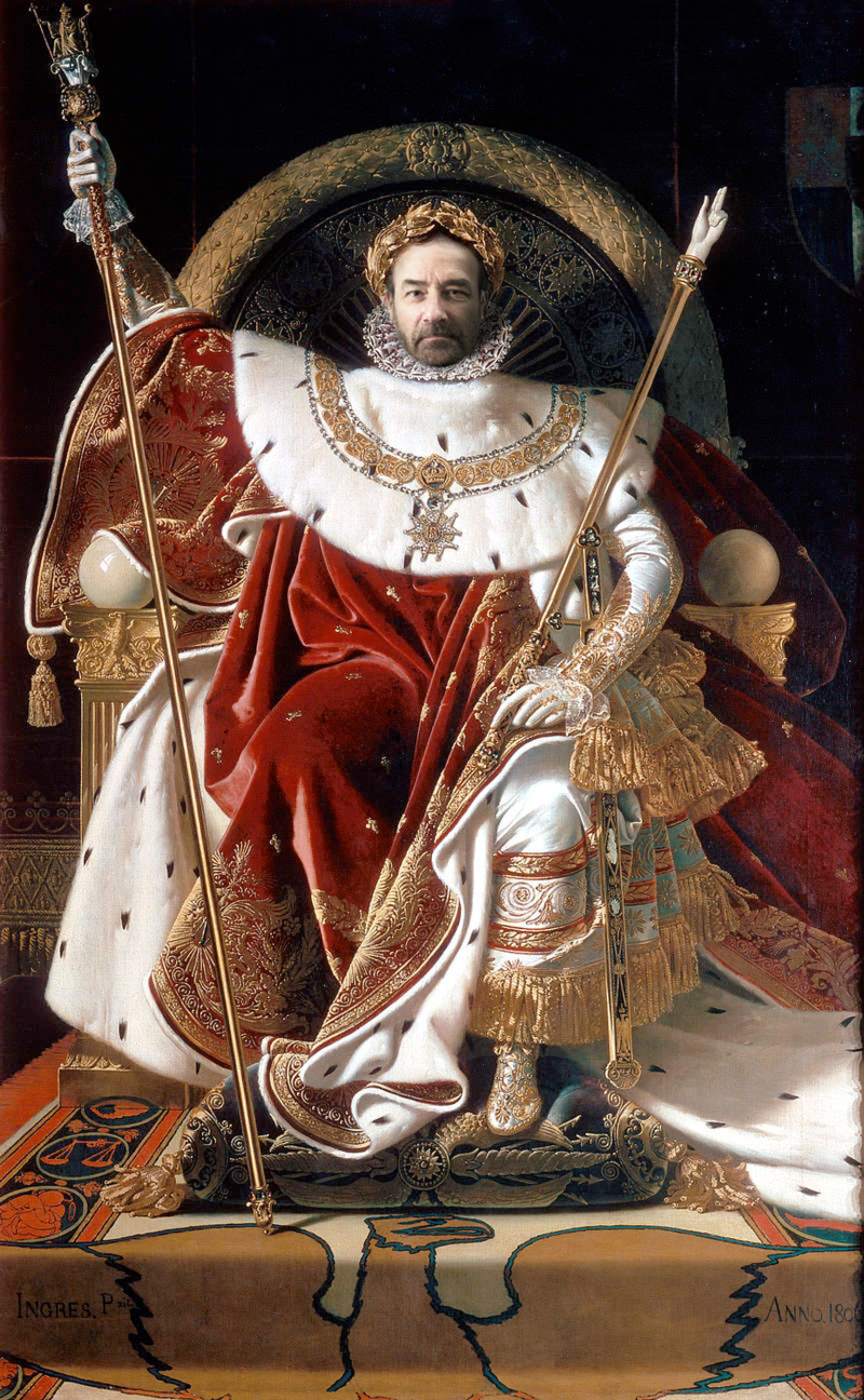
Or the emperor, on my imperial throne.

napoleon2

Anatomical

THE HUMAN BODY DIAGRAMMED.

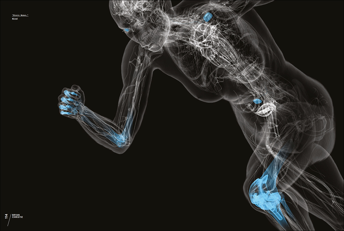
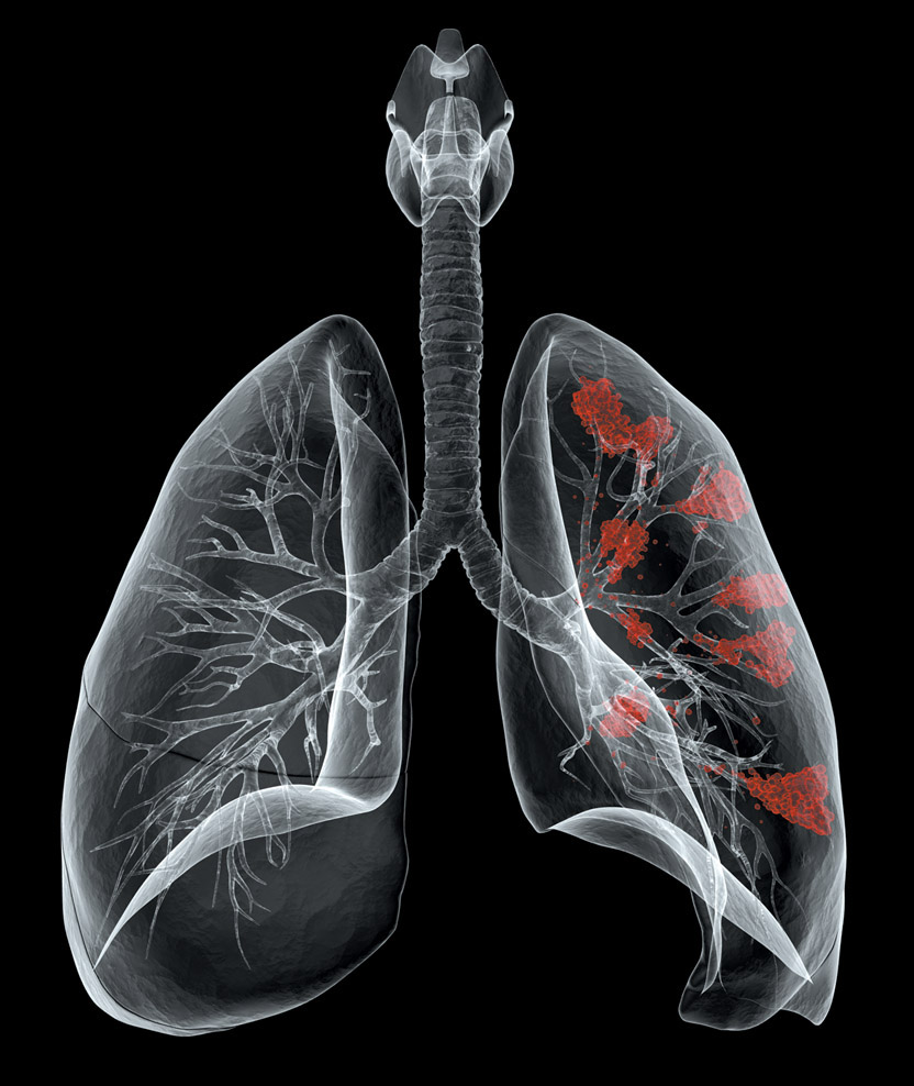
These examples from Bryan Christie Design speak for themselves. Spectacular 3D rendering. Superb control of color to highlight the featured areas. Careful viewpoint and cropping. This is the gold standard.


muscles2


lung_cancer


heart


brain_portfolio2

neurotech


shoulder


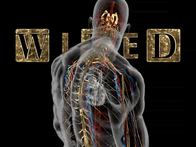
wired_cover

Click on the image to see the animation.


CLASSICAL INFLUENCE.

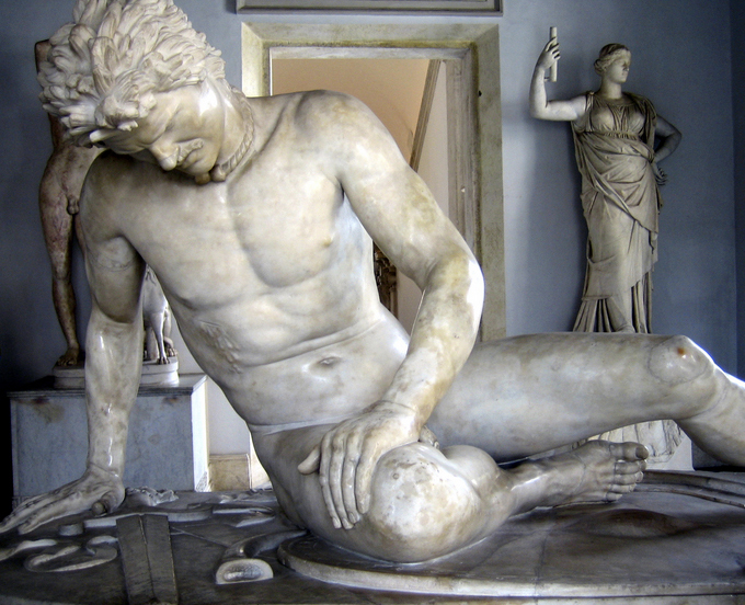
The development of a diagram for a feature on the effects of sleep deprivation on the body. It appeared in the October 2015 issue of Scientific American magazine. The pose was loosely based on the “Dying Gaul,” a Roman copy of a lost Hellenistic sculpture. Classical sources have been a considerable inspiration for Bryan in terms of deciding how to set up particular poses and viewpoints.

dying_gaul1

sleep_deprivation_01

sleep_deprivation_02

sleep_deprivation_03

sleep_deprivation_04

sleep_deprivation_05

Some areas that were not anatomically correct (circled) were fixed in the final version above.

See the studio’s portfolio at: http://www.bryanchristiedesign.com/projects


Old school

ANOTHER TRIP DOWN INFOGRAPHIC MEMORY LANE.

I’ve been looking at my old, pre-computer artwork again. All created with pens, ink, and a fair amount of white paint. In terms of quality, it’s a mixed bag. Not all greatness, by any means, but it has a certain hard-to-resist appeal.


landmark

A selection of architectural items that are protected by English Heritage. (Click on the image to see a larger version.)

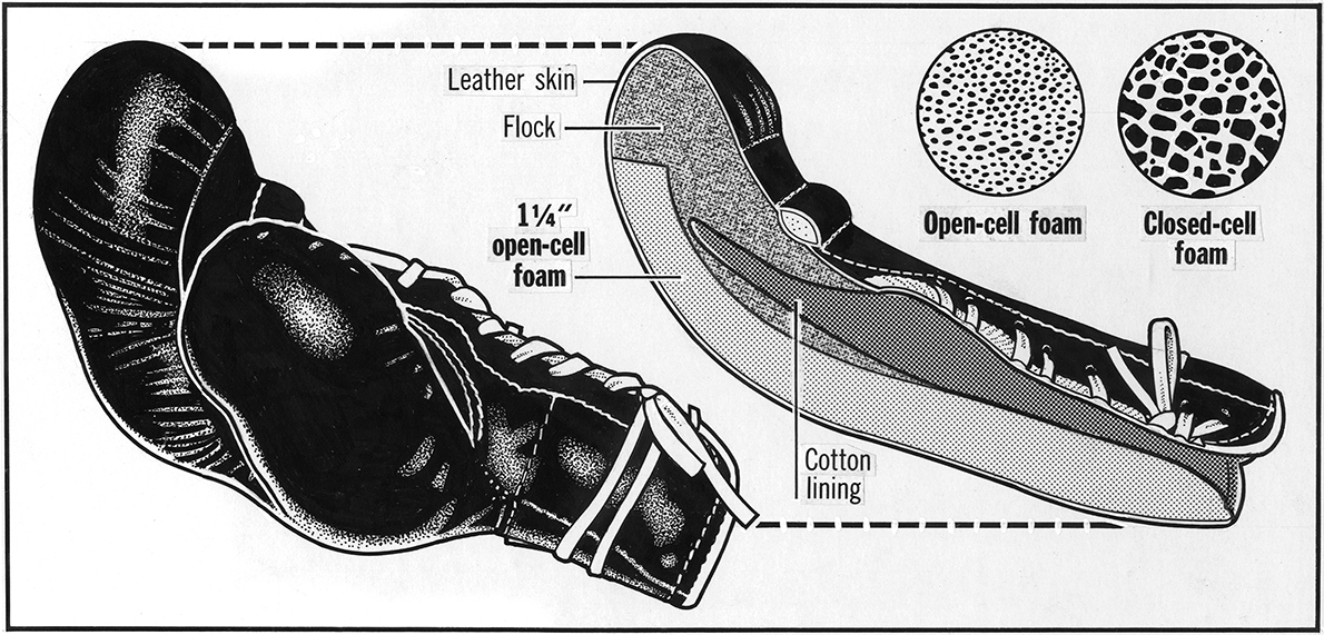
I wanted to see what was inside this boxing glove, so I cut it in half with an expensive kitchen knife, which ruined both items.

boxing_gloves

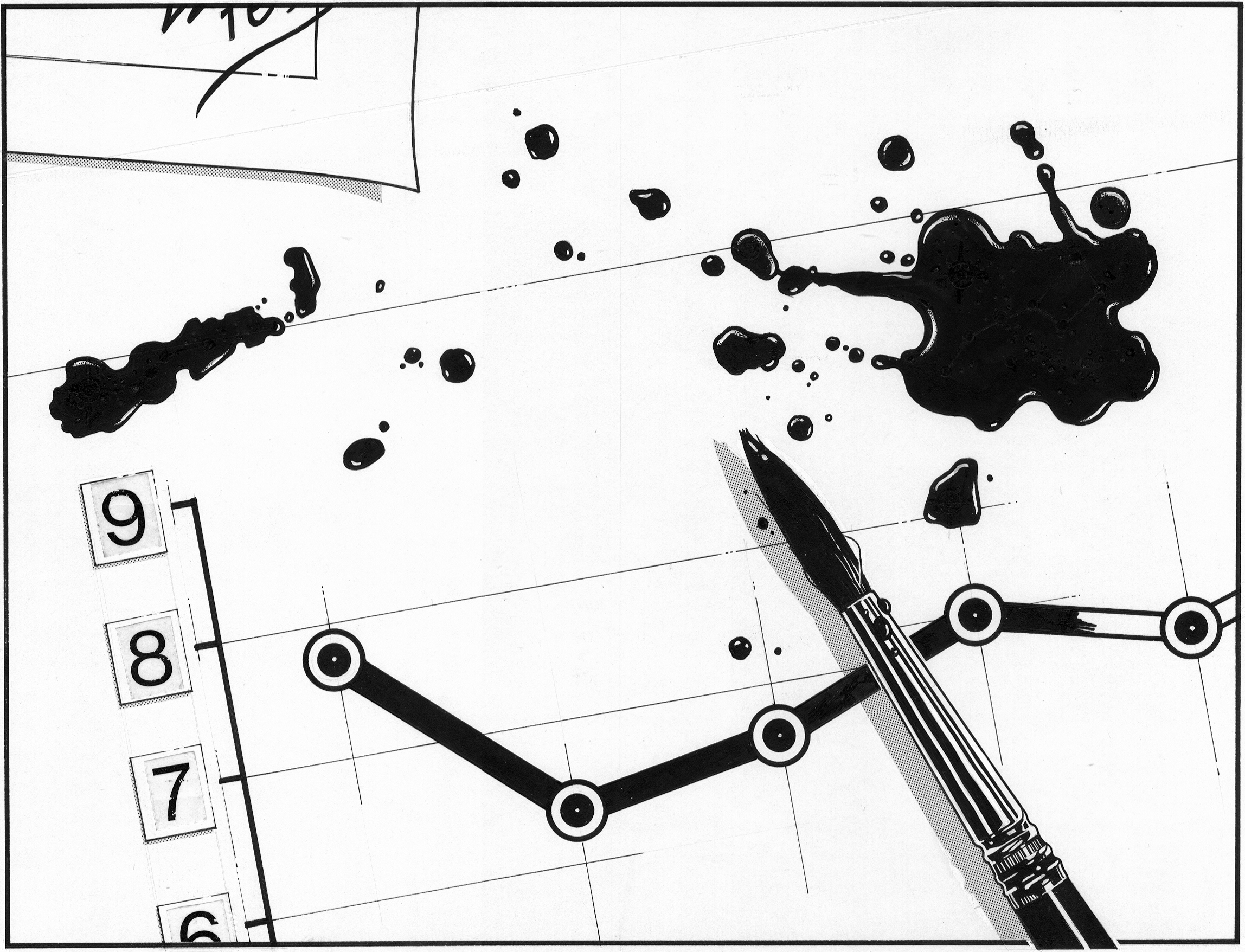
With ink around, sometimes there would be an accident. I had an unfortunate spill over a business chart, so instead of starting immediately again, I illustrated the event. And I have no idea why.

accident1

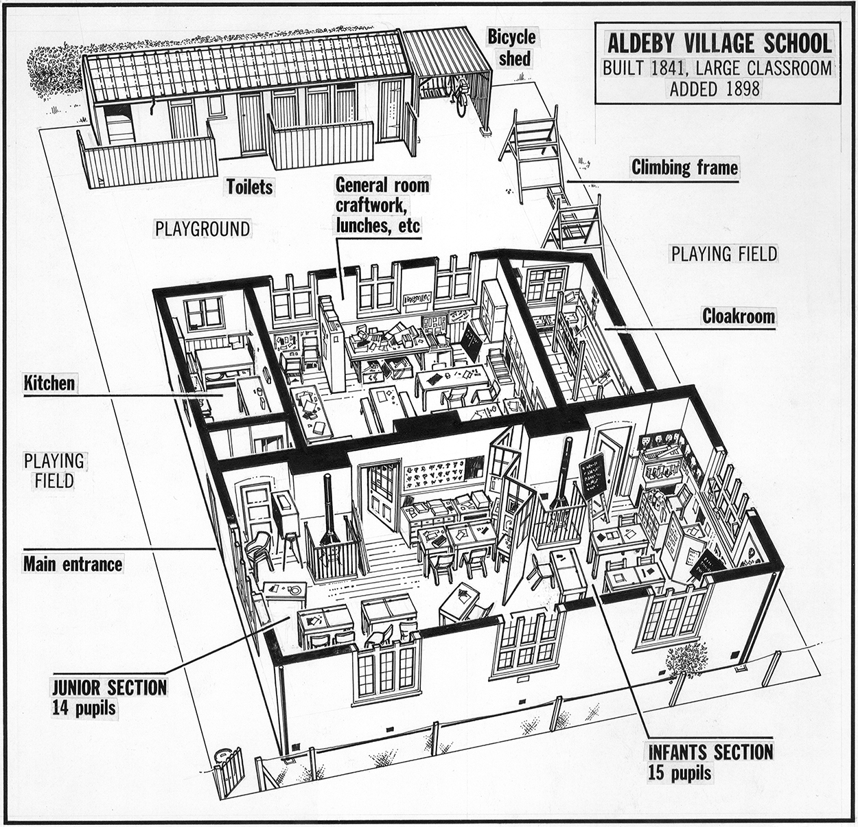
This kind of village school was disappearing. Unfortunately, it looks like all life has disappeared too. That is a problem.

school1

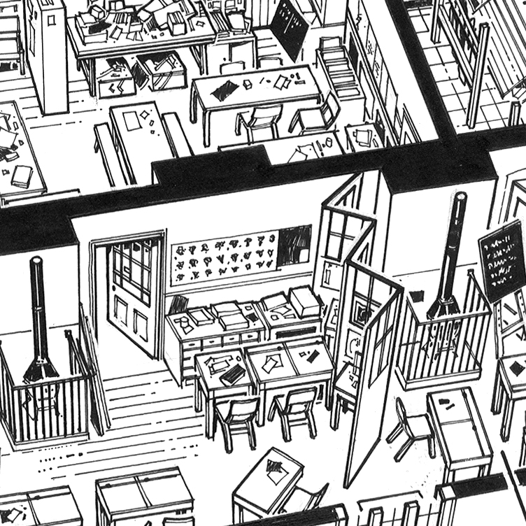
Detail.

school_detail1

cue

Snooker cue Illustration.

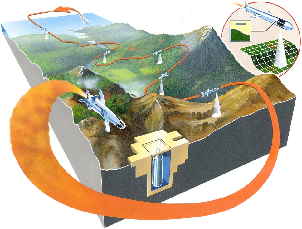
Below is a cruise missile diagram painted with gouache, and airbrushed, that seems somewhat over-worked now. But bear in mind that it was very hard to go backwards in those days. There was no “Command-Z.”

cruisemissile


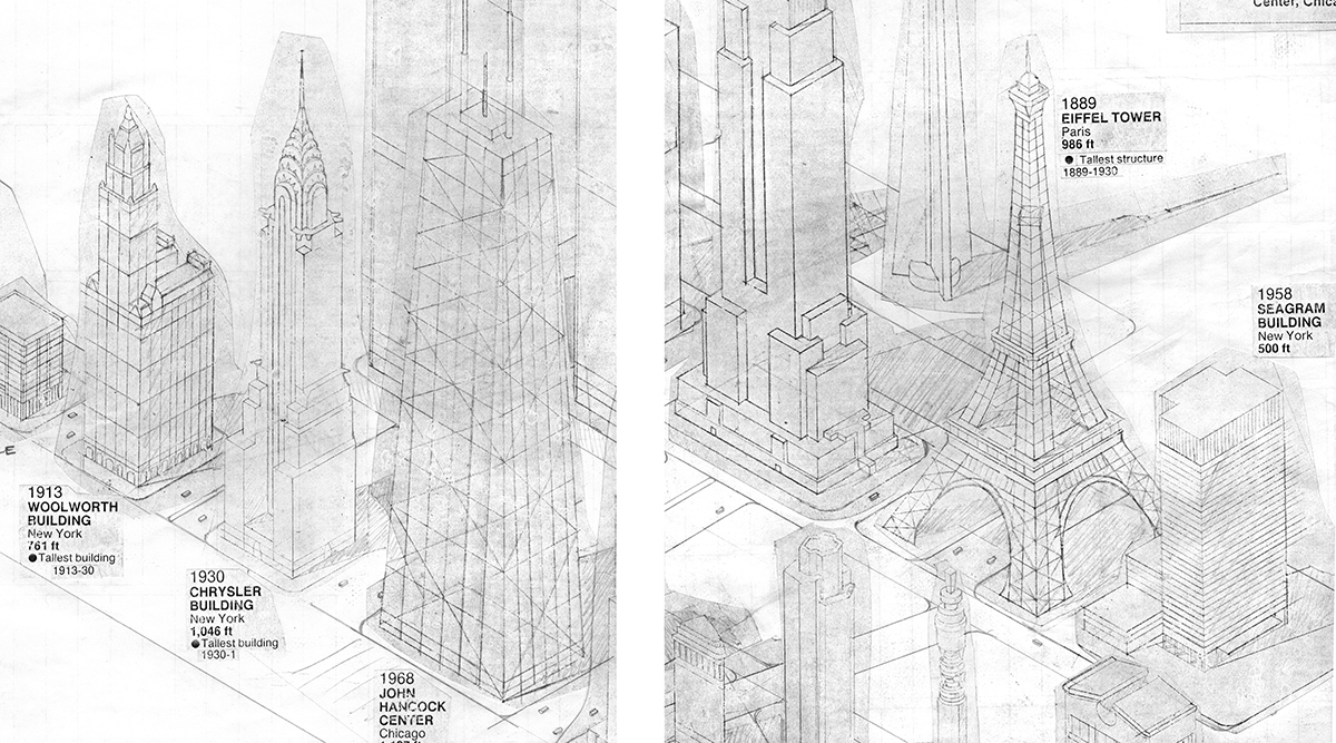
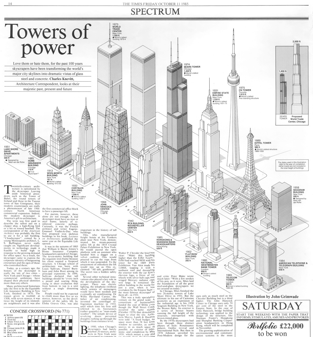
For this tall buildings page, each building was drawn in pencil separately, then xeroxed and assembled as a layout. When I was happy with that stage, I began drawing the various elements in ink.

towers_com_a

towers

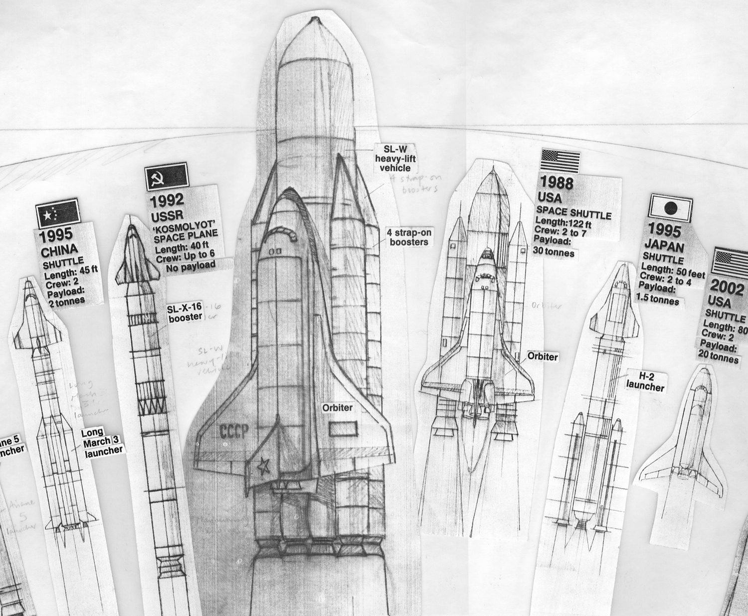
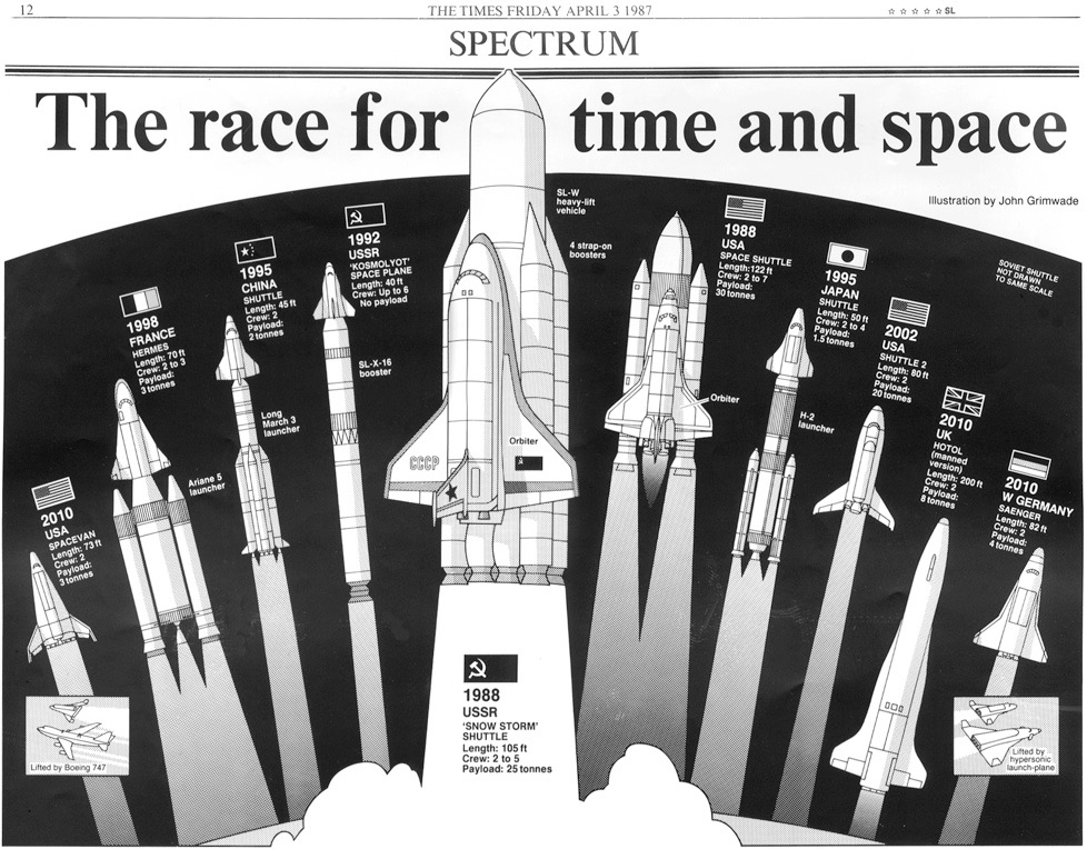
The same process was used for these space shuttle fantasies.

shuttle_comp

shuttles_a


Trees are easy. You can quote me on that.

trees

Portfolio infographics

MY FORAY INTO THE WORLD OF BUSINESS MAGAZINES.

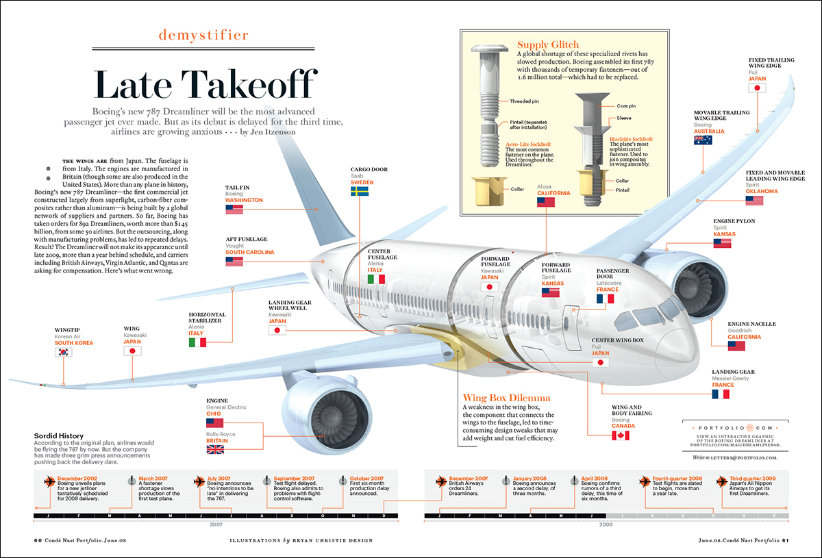
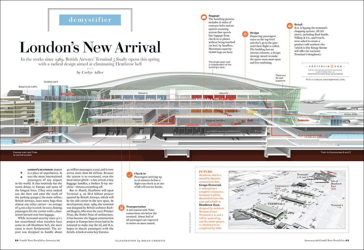
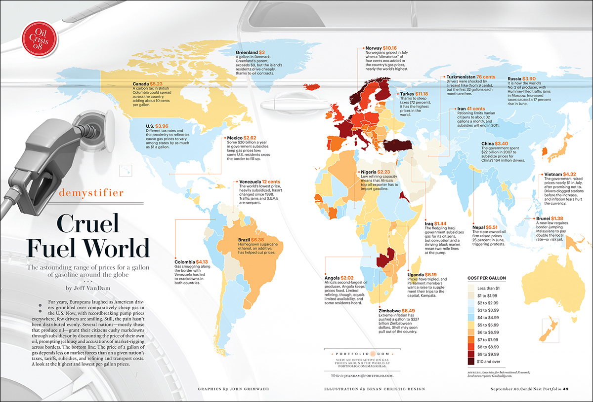
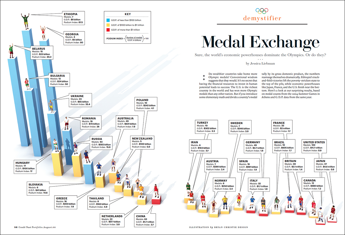
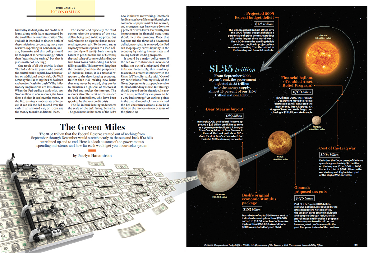
Condé Nast Portfolio lasted two years. Ironically, it was sunk by the stock market meltdown of 2008, which was it’s biggest story to cover. The subsequent recession had a huge negative effect on advertising. The magazine was designed by Robert Priest and Grace Lee (priestandgrace.com), and I was the graphics director. Previously in my career I had often created my own artwork, but here I decided to mostly just design the infographics, and then get the best possible people to illustrate them.

I designed the graphics with both business people and the general public in mind, and this lighter approach generated some criticism from the infographic police, who accused me of creating image-driven graphics without enough information per square inch. Well, this is my blog, and so here it comes: They can all go and jump in the lake. I am completely done with that argument. If it is pursued relentlessly, we will not have any audience in the future.

I feel better for getting that one off my chest. It’s just my opinion.

Anyway, here are six examples from the magazine. Most of them feature the talents of Bryan Christie (http://bryanchristiedesign.com). The Maglev train is illustrated by John MacNeill (http://www.johnmacneill.com). The art direction is by Priest and Grace, and the Portfolio design team, with some vital contributions from various editors and writers.
I’ll be showing some more in a future post. (Click on the infographics for larger versions.)

dreamliner1

maglev2

heathrow

gasprices

medals

money

As a footnote, this is the cover of the magazine’s first issue, complete with transparent cover line flap.

portfoliocover_may07

Flag-o-rama

MORE EXAMPLES FROM THE GRIMWADE SCHOOL OF VEXILLOLOGY (THE STUDY OF FLAGS).

This is my second post about flags. In the earlier one (https://www.johngrimwade.com/blog/2016/09/08/pictograms-on-poles/), I referred to my flag collection, which has long since been sold off for a vast profit (just kidding). However, my love of flags continues unabated. I own a quality Stars and Stripes, a classy Ohio University banner, and a flagpole, so all that completely qualifies me to pontificate about flags. So here goes.

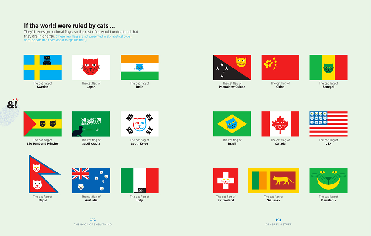
CAT FLAGS Why not show how serious I am, and start with cat flags? In his brilliant one-man show “The Book of Everything” (https://www.amazon.com/Book-Everything-Visual-Guide-Travel/dp/1742209637), Nigel Holmes made a spread of them.
“I like cats. They should have their own flags,” says Nigel (http://www.nigelholmes.com).
Fair enough.
(Click on the image for a larger version.)

NEW ZEALAND I’ve been following with interest the process of selecting a new flag for this excellent, but far-away, country. Incidentally, there is a website (http://worldmapswithout.nz) where New Zealanders can post images of world maps that have left their homeland out. One is at the UN Office in Geneva (http://worldmapswithout.nz/post/100846576379/the-world-map-logo-at-the-un-office-in-geneva).

In 2015, a referendum was held to select a finalist to compete against the current flag. These flags were eliminated in that vote.

nzflags

The finalists. The Silver Fern against tradition. In March this year, the nation voted to keep the current flag, which has the Union Jack in the corner (Go U.K!)

silverfern

newzealand

ISLE OF MAN The flag of this island between England and Northern Ireland is a triskelion, three armored legs with golden spurs. I like it.

mann

ALBANIA You can’t beat a good pictogram, as far as I’m concerned.

albania

SEYCHELLES This Indian Ocean-based one has some serious graphic punch.

seychelles

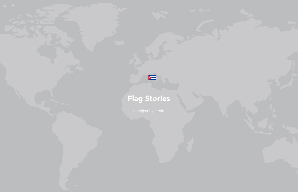
And finally… check out this ambitious piece of data visualization by ferdio, an infographic agency based in Copenhagen: http://flagstories.co

flagstories

Jaime Serra’s game-changer

TWENTY YEARS AGO, I SAW THIS MAP AND I KNEW THAT INFOGRAPHICS WERE ENTERING A RICHER PHASE.

ruanda1

Genocide in Rwanda. (Click on the image for a larger version.)

Back in 1996, when Jaime put this graphic on my desk, I could see that the gap had been bridged from the computer-generated graphics of that time back to our rich, artistic infographic heritage. Art and information were brought together in a beautiful form, with function intact. As far as I’m concerned, this is one of the milestones of late twentieth-century information design. Jaime went on to produce numerous award-winning graphics at Clarín (see below), and many of you know them very well, but this one is really where it started.

Here are Jaime’s thoughts about the graphic. Written a few weeks ago, with the hindsight of the years in-between.

“Some background to the subject: In 1994 the Rwandan government, controlled by the Hutu community, were responsible for the murder of between 500,000 and one million Tutsis, equivalent to 75% of the population of that ethnic group.

A year after the genocide, a Clarín team traveled to the refugee camps in the area. The infographic contribution to the coverage was just a small locator map. But it grew into a page in the Sunday magazine, mainly because of the graphic treatment. Pre-dating my better-known works such as “La Balena Franca” (Editor’s note: Gold medal winner at the Malofiej Awards.), this map was one of the first examples where I was able to capture my personal graphic style in a complete and radical way.

ARGENTINA

A year earlier, I had arrived in Argentina to create a graphics department at Clarín, a daily newspaper with the most readers in the Spanish-speaking world. At that time, there were no infographics in Argentine journalism, and although that was on the one hand a serious handicap, it also meant that I had the freedom to rethink the foundations on which we had built the profession in recent years.

Back then, the general style of infographics was always the same, regardless of the subject. A somewhat cold, sterile style created with vector software. I was convinced that we were wasting a primary way to attract readers—aesthetics. So ready to take some risks, I gave Clarín a complete style manual that would be rigidly applied, while also starting a concept which I called “aesthetics and ethics” for the numerous exceptions where the graphic style manual would not be used. This idea was not a style, but rather the absence of it. Each infographic would be treated according to it’s subject matter. Using this approach, the Clarín team created, more or less successfully, each individual infographic, whether it was about rubber, Houdini, or the Anne Frank House.

Looking back, I think that this was the natural evolution of my understanding of the components of infographics (illustration, information and design). Clarín was the place where my previous work and the new path came together. (Click on the infographics for larger versions.)

ballena

mate_

eureka1

annafrank

houdini_pan

A clear precursor is the double-page spread (below) on the 1992 Olympic Games for El Periódico de Catalunya (where I had worked before moving to Clarín). It won my first Gold Malofiej medal. The illustrations that explain the sports of the ancient Olympic Games are hand-drawn with a scratchboard technique, using a stroke and color inspired by images of ceramics from ancient Greece. Peter Sullivan had made the point about hand-drawn elements in his book “Information Graphics in Colour” (published by IFRA in 1993), but I don’t think that many people followed the path he was suggesting.

Doble Historica (Converted) copia

While I was using the idea of a stylebook and the option to go outside it, I had another thought that would take me further: Could I use my own style in infographics, the same as I used in my most personal work, without compromising the information, and perhaps even improve it?

So with a graphic style influenced by illustrators like Henrik Drescher (http://www.hdrescher.com/), designer David Carson’s work in the magazine Ray Gun (http://www.davidcarsondesign.com/), and Anselm Kiefer (an artist who still fascinates me today), the strong content of the Rwanda map was an opportunity to explore the answers.

NEW YORK

John remembers the time we met in his office in Manhattan. I took a trip there to get a reaction to the work I had done in my first year of Clarín. That was how I met, among others, Charles Blow, graphics director of the New York Times; Joe Zeff, graphics director at Time Magazine and John, graphics director at Conde Nast Traveler magazine.

To be honest, I had never heard of Blow or Zeff. It was how they worked that interested me. But I knew John’s work very well, although I did not really know Condé Nast Traveler, apart from the infographics. If Carson, Dresher and Kiefer were the role models for my style, Grimwade was my main reference for infographics. My objective was to apply my personal aesthetic to the communication skills that I had learned from observing how these graphics directors worked.

STILL RELEVANT TODAY

At the bottom of the Rwanda map is a hand-drawn date. It’s the year that I made it: 1996. Twenty years later, I wonder (and I asked John this recently), who would be interested in it? His answer: many people, and for me it is more than enough that he thinks it still seems relevant.

(Another editor’s note: I called this blog “Infographics for the People” to draw our attention to the need to add warmth to information presentations, and generally engage the public. Jaime was doing that decades ago.)

sketchbook_ruanda

STYLE SKETCH

In addition to making sketches to plan the layout and content of the infographic, I also made drawings to find the right tone. In my sketchbook, I made this montage with photocopies of two very similar black women. There was no racial difference between Tutsi and Hutu. They are two divisions within the Banyarwanda ethnic group. After the genocide, they were eliminated from a national document which was cut and re-joined with staples. Most of the countless murders that were documented were carried out with machetes. The geographical scale is in French: Rwanda had been a Belgian colony, and this seems to suggest the dimension of human and social costs.”

See more of Jaime’s brilliant work, and the process behind it, here: http://jaimeserra-archivos.blogspot.com.es