Category: Infographics

Pictogram story

A LEGEND TOLD WITH SYMBOLS.
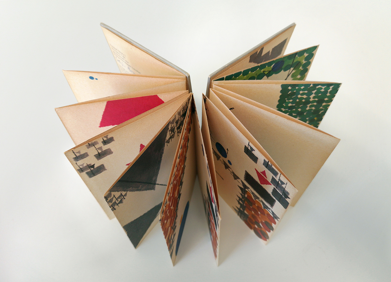
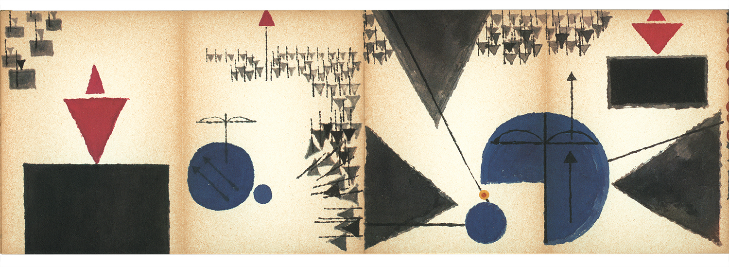
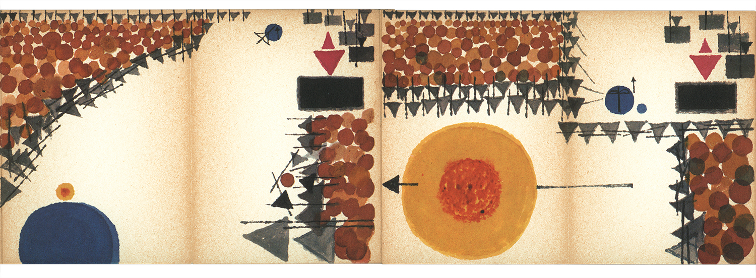
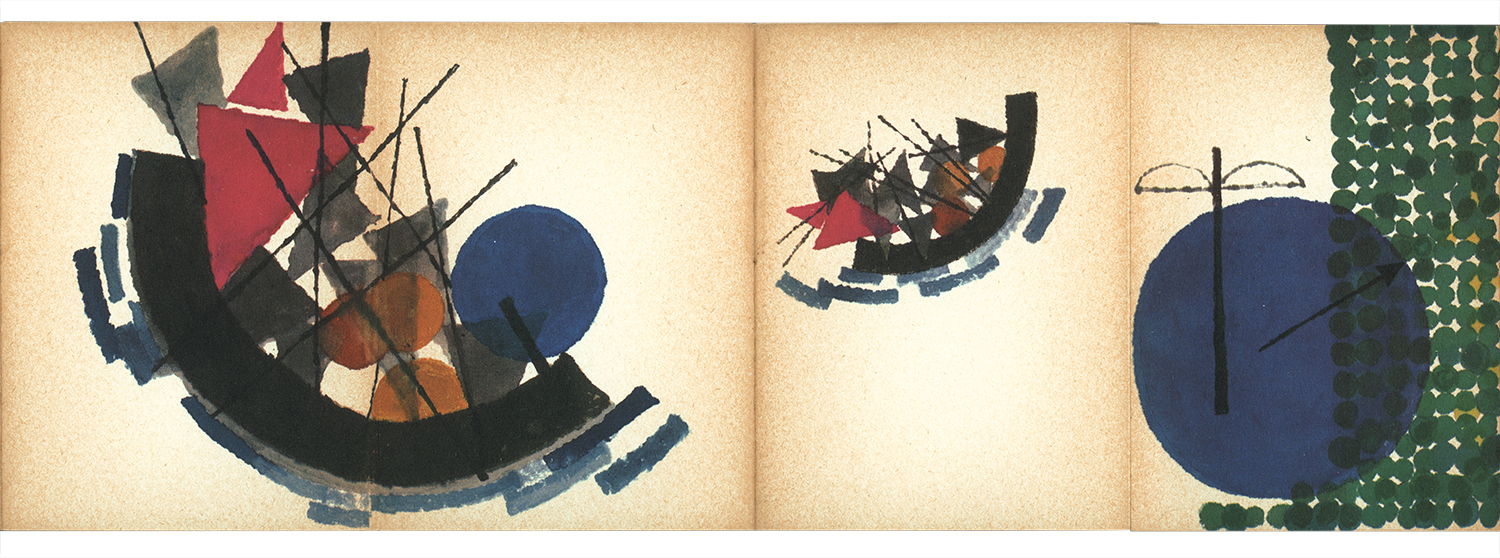
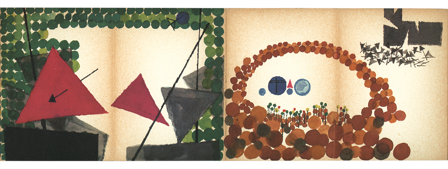
This experimental book is the work of Warja Honegger-Lavater, a Swiss artist and illustrator, who had a design career that included creating logos and trademarks. In 1962, MoMA published “William Tell” as an accordion-fold book. Warja went on to produce several books that feature classic fairy tales by Hans Christian Andersen, the Brothers Grimm and Charles Perrault.

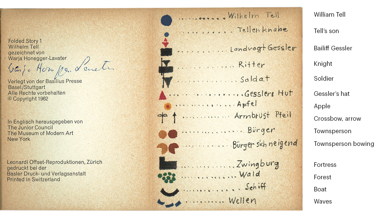
The Tell legend holds an important place in the folklore surrounding the birth of the Swiss nation. It’s told here entirely with symbols, which are explained in the key on the opening spread. The idea of communicating entirely with pictograms has been tackled by a number of people. Nigel Holmes wrote a series of excellent posts on this blog about attempts to create a language using icons. This is the first one: https://wp.me/p7LiLW-LX

Below is “William Tell” told with symbols. The icons change size based on their importance to that part of the story. (I added a translation of the key.) It‘s a fascinating and creative infographic exercise that is clearly aimed more towards adults. Although for children, the use of a symbol language softens the worrying aspects of this rather dark tale. A counterpoint to this argument: As much as I love pictograms, and the book, I’m left feeling that this ultra-graphic approach is perhaps not the most engaging way to introduce your child to the magic of storytelling.
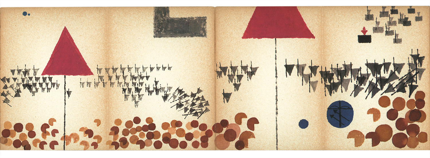
 

The legend in words
Bailiff Gessler, who was a very nasty piece of work, put his hat on a pole in Altdorf town square, and made the people bow down before it. But William Tell walked straight past, so he was arrested. Knowing that Tell was an expert marksman, Gessler ordered him to shoot an arrow (from 120 paces away) into an apple placed on Tell’s son’s head. Failure, or refusal to do it, would mean death for both Tell and his son. Of course, we all know that Tell shot the apple straight off his son’s head without harm.
However, Tell had taken a second arrow from his quiver, and when Gessler asked him what it was for, Tell replied that if his son had been harmed, he would have used that arrow to kill Gessler. The result of this revelation was that Tell was dragged to a boat in which Gessler was traveling back to his castle at Küssnacht. The general idea was that when they arrived there, Tell would be thrown in the dungeon indefinitely.
On the trip across Lake Lucerne, a strong storm sprung up and a scared Gessler was pressured by his soldiers to release Tell so that he could steer the boat to safety. Tell maneuvered the boat to land, grabbed his bow and quill and jumped out. Then he kicked the boat back out into the lake, and escaped. Tell raced to a lane that led to Gessler’s castle, and killed him with an arrow to the heart as he passed by. The people were free of the tyrant.

Tell Monument
In the market place, Altdorf.
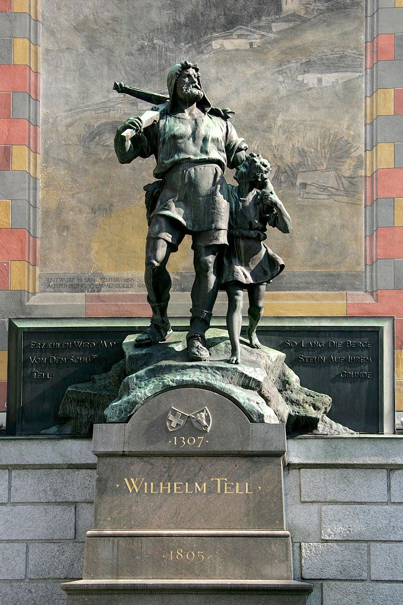
Photograph by Roland Zumbühl

The collector
I’m once again indebted to my friend, Professor Michael Stoll, who owns this signed copy of the book, and suggested the subject. There are several posts from Michael’s wonderful collection of historical information design on this blog. Of course, we can all learn a tremendous amount from the best work of the past.
Start with Michael’s amazing Cadillac: https://wp.me/s7LiLW-cadillac

Then try these:
Wall charts: https://wp.me/p7LiLW-1Sj
Eye model: http://wp.me/p7LiLW-1yx
Flap books: http://wp.me/p7LiLW-IV
Flight thru Instruments: http://wp.me/p7LiLW-Rr
Herbert Bayer’s Geo-Graphic Atlas: http://wp.me/p7LiLW-xO
The Atlas to Alexander von Humboldt’s “Kosmos”: http://wp.me/p7LiLW-jO

This year’s color

PALETTE GUIDANCE FROM PANTONE.

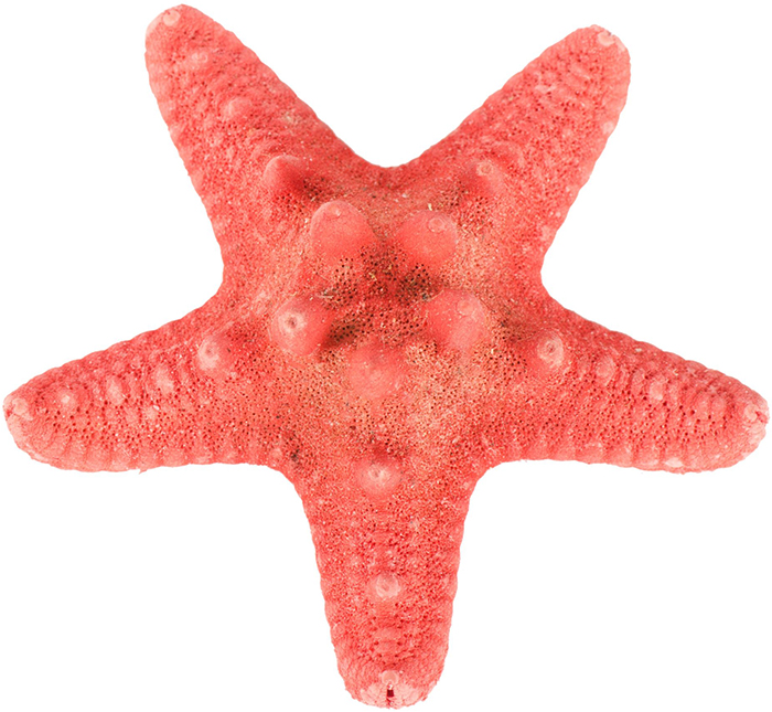
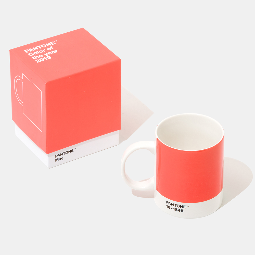
Let’s start the new year with the right color. Once again, Pantone shows us the way forward for our infographic color palette. I’m intending to get “Living Coral” into every project in 2019. And if I happen to get asked by National Geographic to make a graphic about living coral, I will be so ready.

A 2019 starfish.

Photograph © Vladimir Voronin/123rf

Color specs:

16-1546 (Fashion, home, interiors)
RGB: 255, 111, 97
HEX/HTML: FF6F61
CMYK:  65M, 54Y (estimated)

2345C (Print)
RGB: 255, 109, 112
HEX/HTML: FF6D70
CMYK:  59M, 50Y (estimated)

https://www.pantone.com

Previous Pantone posts:
Pantone 2018: https://wp.me/p7LiLW-20A
Color code: https://wp.me/p7LiLW-qq

Supersign

MECHANICAL MEETS DIGITAL.

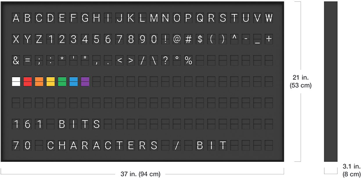
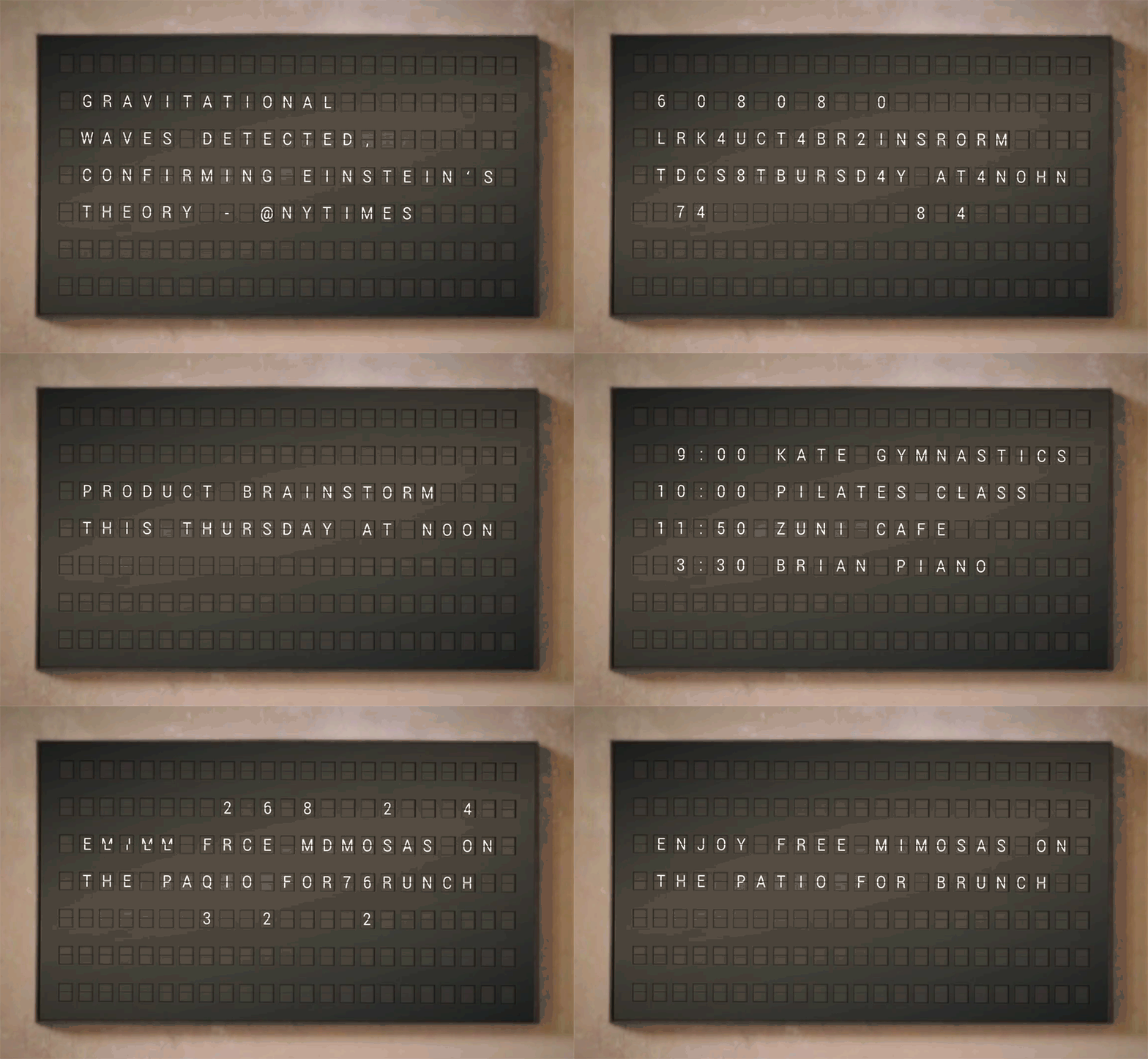
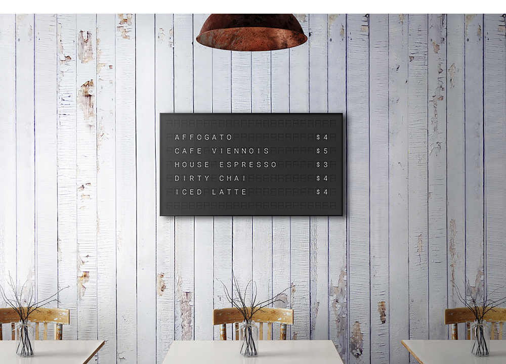
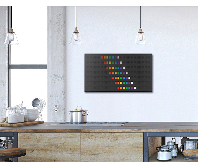
I wish I was getting one of these in my extremely large Christmas stocking. These classic mechanical split-flap information boards make a distinctive (and pleasant) clicking sound as the flaps turn over. Retro signage that is reborn in the digital age. As well as letters, punctuation and numerals, the flaps can display seven colors. Control the display from anywhere with the Vestaboard app, or connect with many other apps like Twitter and Slack. It also works with Alexa and Google Home.

The price is $2,250 in the U.S. Order one now for 2020 delivery (all units for 2019 are already sold).
https://www.vestaboard.com

Economic visuals

USING INFOGRAPHICS TO EXPLAIN GLOBAL BUSINESS.
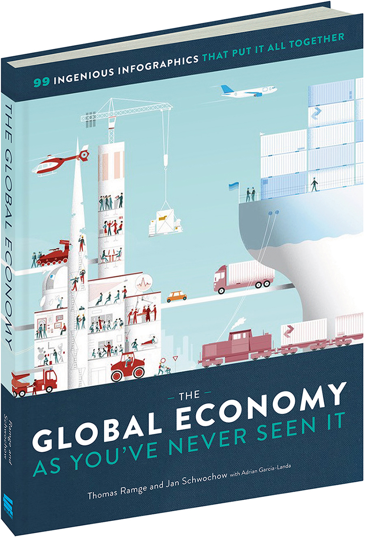
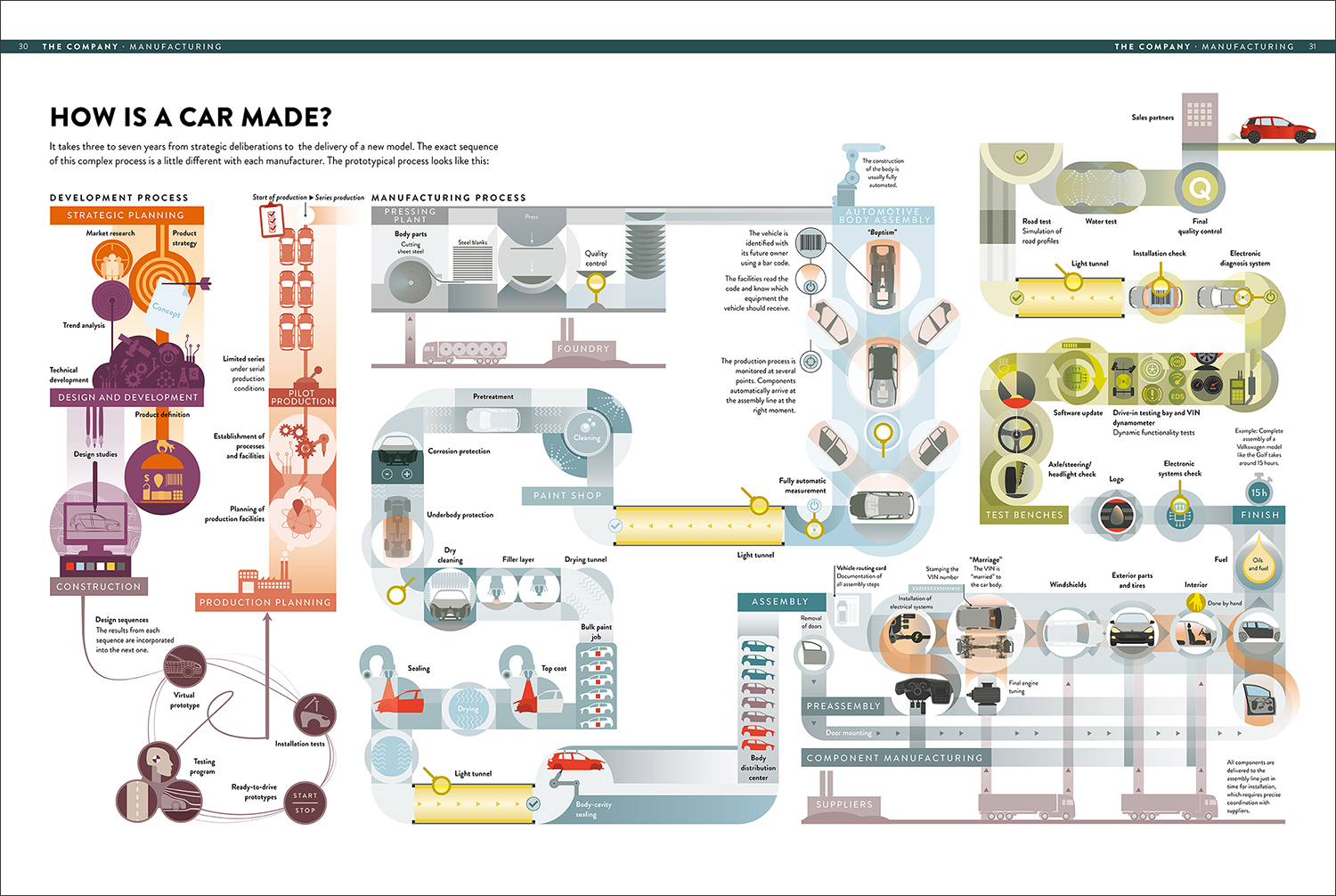
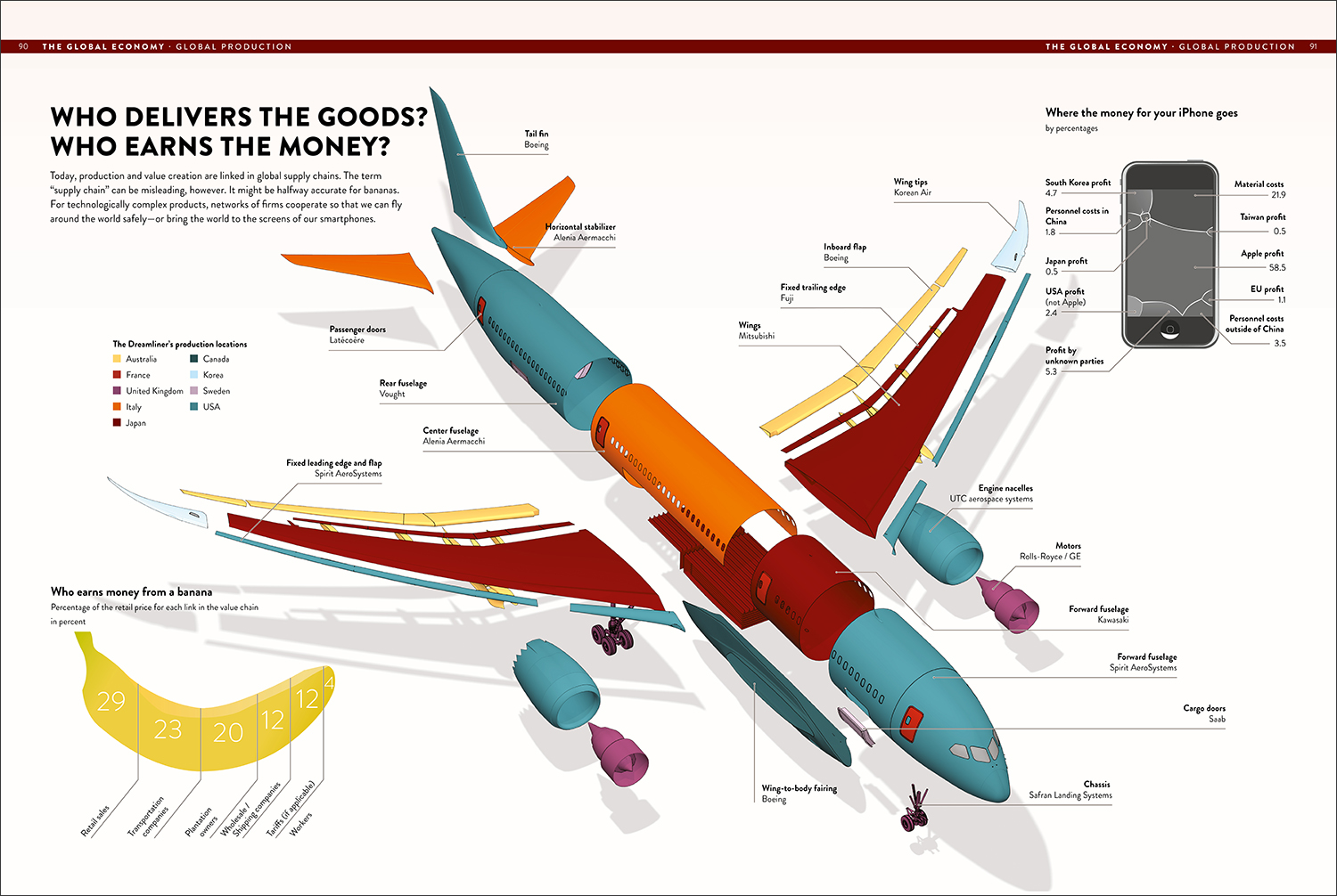
This new book by Thomas Ramge and Jan Schwochow visualizes the key components that make up our complicated international economy. It’s published by The Experiment. Buy it here: https://bit.ly/2Lf6o6o

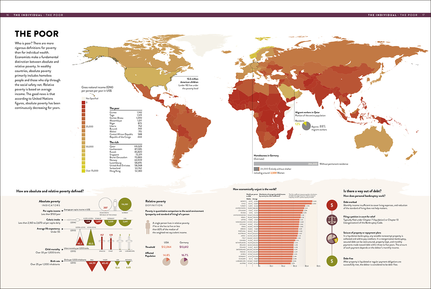
Here are three of the 99 graphics in the book. Below, worldwide poverty levels. (Click on the images to see larger versions.)

Product pipeline: The complex process of manufacturing cars.

Multi-national production, and a banana.

Some more pages can be seen on Google Books: https://bit.ly/2KSxNrQ

Thomas Ramge writes for the Economist. Jan Schwochow’s company, Infographics Group, produces the all-information-graphic magazine, In Graphics. Two previous posts about it: 

https://wp.me/p7LiLW-1mX
https://wp.me/p7LiLW-1n1

Infographics Group: https://infographics.group

Arrowmania

MORE EVERYDAY POINTERS.

Photograph © sergey novikov/123rf

Twin Arrows (below)
These 25-foot-long examples (7.6 meters) can be seen at the site of the Twin Arrows Trading Post on Route 66 in Arizona. The business closed in 1995 after Interstate 40 took away most of the passing traffic. In 2009, the arrows were renovated.

Photograph © giuseppemasci/123rf

Street direction
Frédérik Ruys, a longtime friend of mine, lives on this street in Utrecht (in the Netherlands). The traffic circle contains a large north arrow. Frédérik’s house is easy to identify, and clearly belongs to an infographics person, as it has a big pictogram of a bike on the roof.

By the way, the bike symbol contains the first initial of everyone who lives in the house (Frédérik’s family). An earlier post about an example of his visualization work is here: https://wp.me/p7LiLW-Ru

Home furnishings
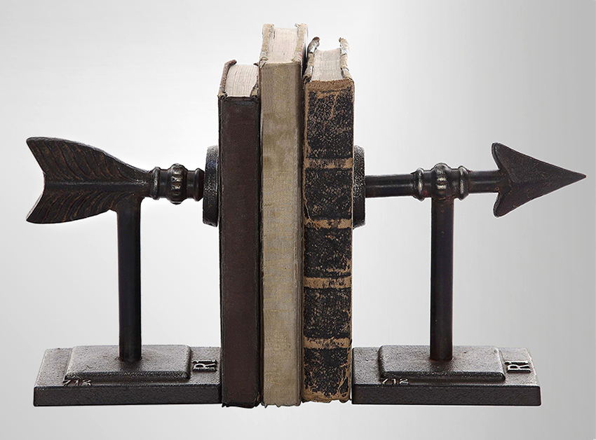
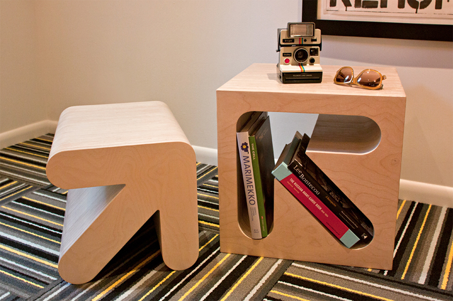
Keep your books in position with an arrow going right through them. https://bit.ly/2KpV5W1

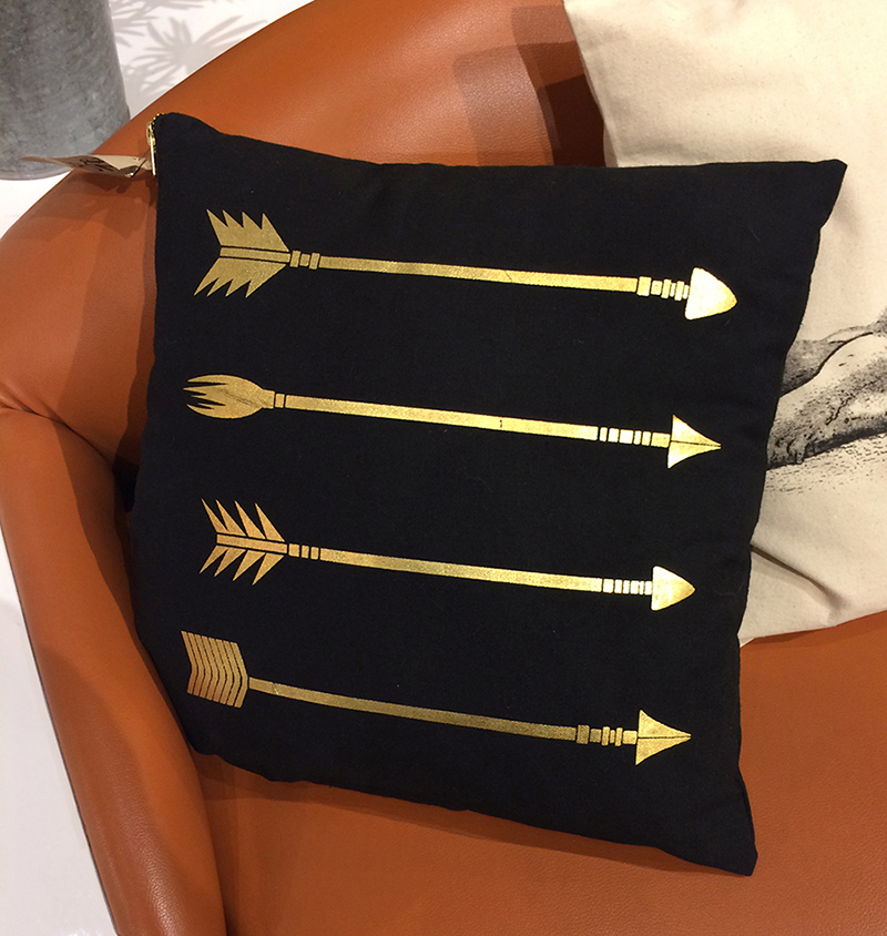
I came across this cushion in a store in Columbus (on one of my very rare expeditions away from my desk).

I need this arrow cube. It was designed by Kevin Dresser. https://bit.ly/2DVXIhP

So many variations
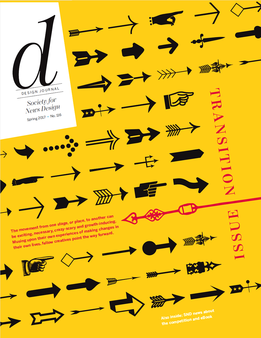
Julie Elman (a professor here in VisCom at Ohio University) used a lot of different arrow examples on this cover for Design Journal, the magazine of the Society for News Design.

Venetian arrows
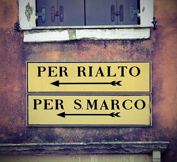
Talking of VisCom, we’ve just been on a trip to Venice. The retro signage kept us heading in the right direction. Sometimes.

Photograph © federicofoto/123rf

Orientation
Multi-directional signs to distant locations are common at tourist places. Why? Not entirely sure what the answer is to that. Anyway, this one is in the Riviera Maya, Mexico.

Photograph © czekma13/123rf

An earlier post about arrows: https://wp.me/s7LiLW-arrows

Data mapping

JOSHUA STEVENS VISUALIZES THE WORLD’S CLIMATE AND ENVIRONMENTAL DATA.

Joshua creates compelling and important visuals for NASA’s Earth Observatory, where he’s the lead for data visualization and cartographic quality. Satellites provide the data that drives an impressive range of informative visualizations. They often illuminate key issues that our precious planet faces. See many more examples at: http://www.joshuastevens.net/

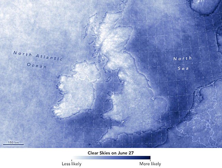
Cloud cover (above)
A subject that used to be dear to my heart: the likelihood of clear skies over the U.K. and Ireland. (I’m from England.)
https://go.nasa.gov/2CynLKv

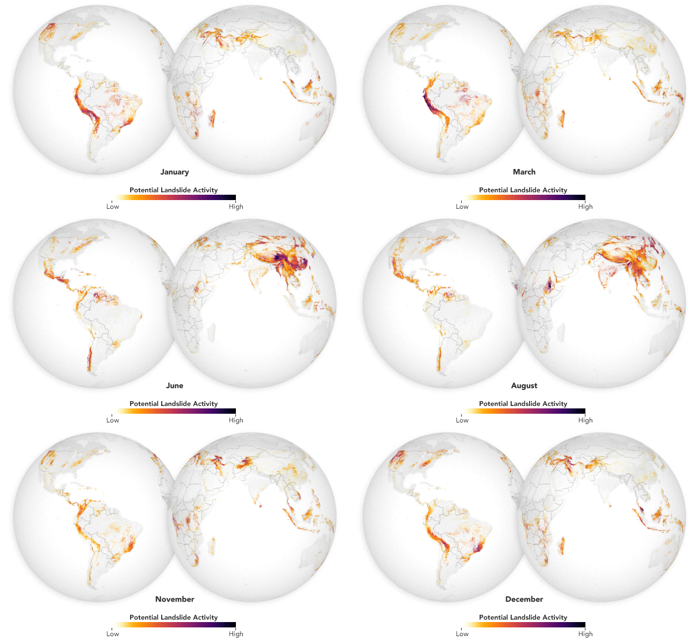
Landslides
Satellite data every thirty minutes gives new insights into long-term patterns. https://go.nasa.gov/2yYaibh

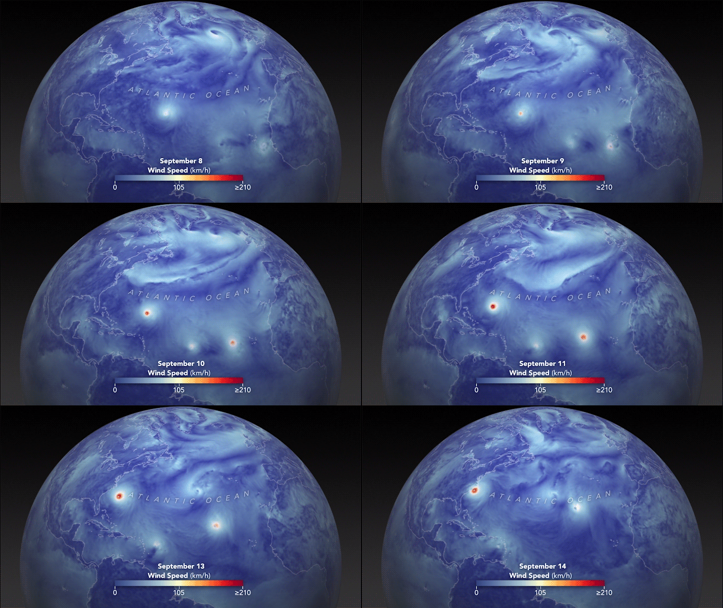
Hurricane effect
Wind speeds as Florence churned across the Atlantic. See the full animation here: https://go.nasa.gov/2T1MAUS4g

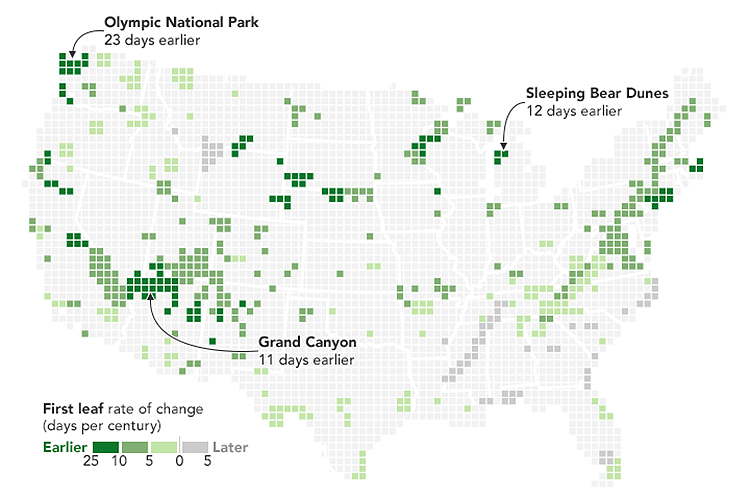
Early spring
Climate change is bringing an earlier end to winter. https://go.nasa.gov/2PegKFj

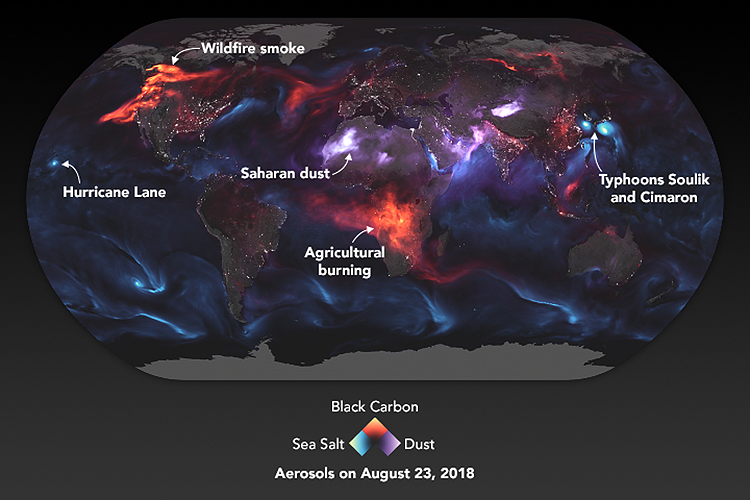
Aerosol earth
Our fragile atmosphere faces many challenges. https://go.nasa.gov/2MsyDQl

Cyclone menace
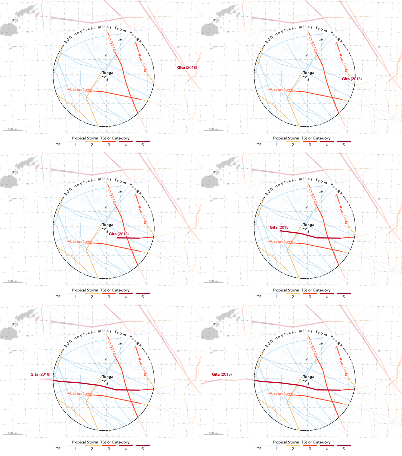
The path of Tropical Cyclone Gita, which hit Tonga with winds of up to 145 miles per hour (233 km).
https://go.nasa.gov/2JbEVPp

Shrinking glaciers
A dramatic decrease in the size of tropical glaciers. https://go.nasa.gov/2yWp6Yh

Joshua helps to run the subreddit, dataisbeautiful: https://www.reddit.com/r/dataisbeautiful

Personal data viz

ANALOG WAYS TO SHOW THE PATTERNS IN EVERYDAY DATA.

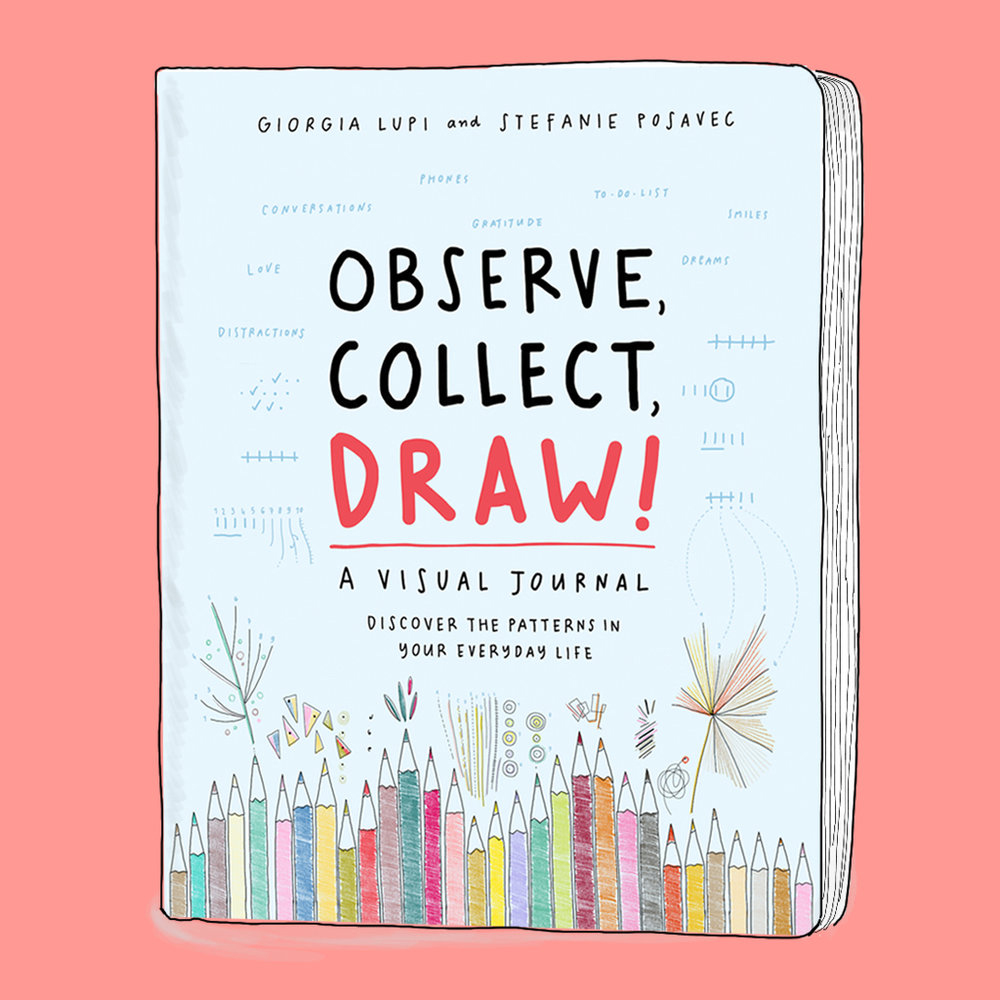
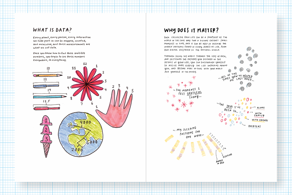
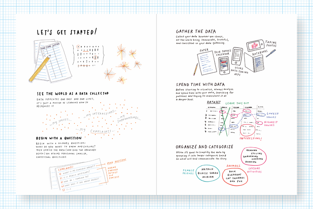
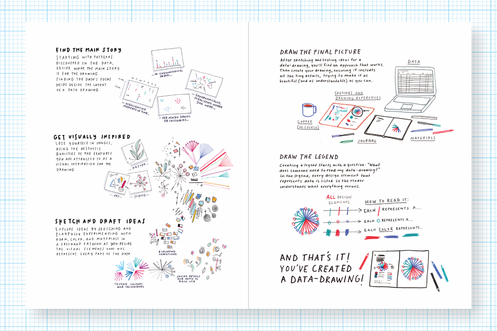
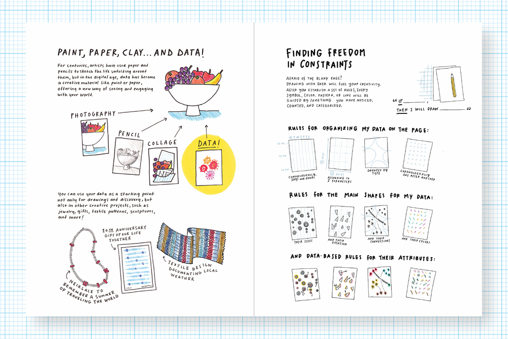
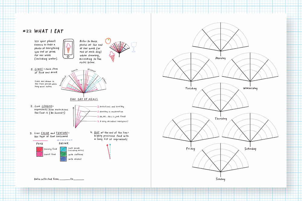
Giorgia Lupi and Stefanie Posavec’s latest collaboration is Observe, Collect, Draw!: A Visual Journal. The book shows how anyone can have fun collecting personal data, and then use a simple non-software approach to display it. This is a natural development from the ”Dear Data” project described further on in this post.
Read more here: http://giorgialupi.com/observe-collect-draw/
Buy the book: https://amzn.to/2Op4C4S

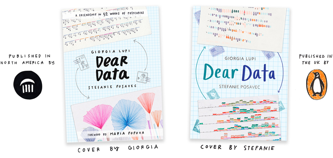
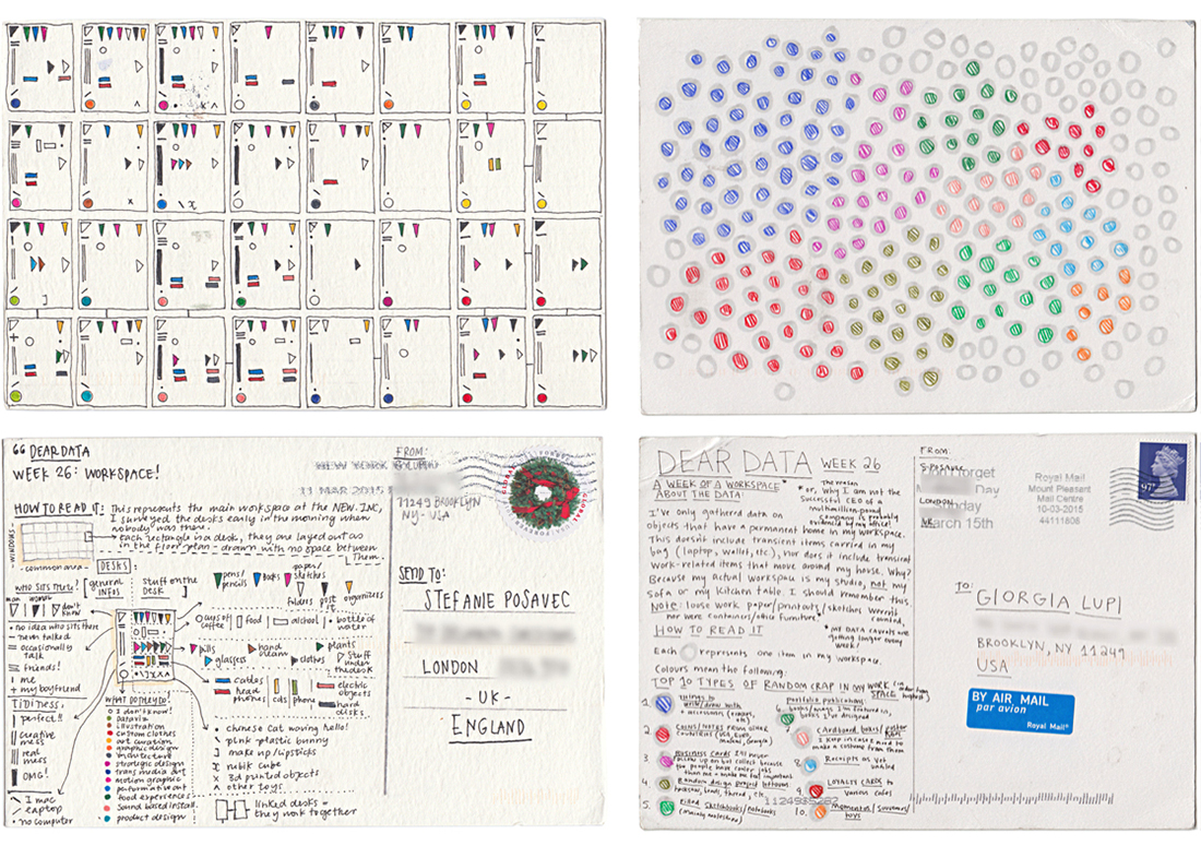
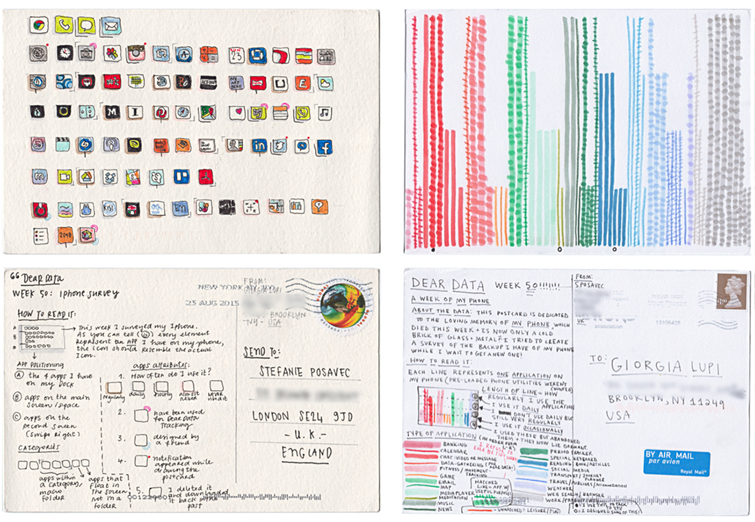
Dear Data was a year-long analog exchange of ideas. Stefanie (London) and Giorgia (Brooklyn) mailed each other weekly data viz postcards. On the front was a hand-drawn visualization of an aspect of personal data. On the back was an explanation, and a key to understand the data. The project later became a book. Below, the covers from the U.S. and the U.K.

A few of the 104 postcards that crossed the Atlantic. Below, Week 26.

The cards from Week 50.

Read more here: http://www.dear-data.com/theproject/
Buy the book: https://amzn.to/2ynXmMx

The infographic family

VISUAL EXPLANATIONS FROM 5W INFOGRAPHICS.

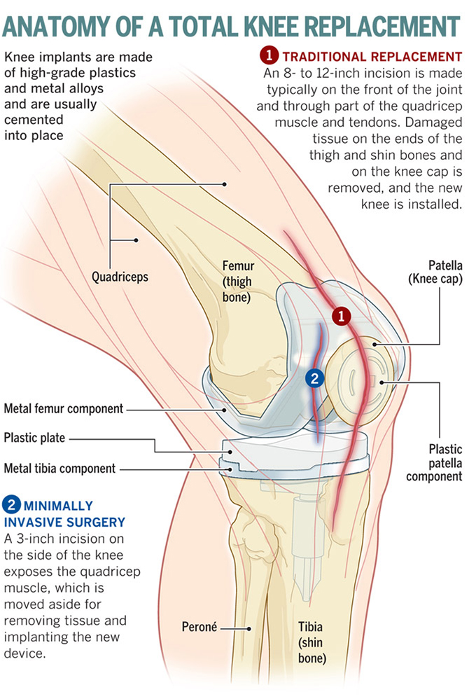
The Velasco brothers (Juan, Samuel, Pedro and Martín) combine their talents to make clear and engaging infographics and data visualizations. Here’s some examples of their work. See more at: http://www.5wgraphics.com 
Their blog: https://5wvelascoblog.com 

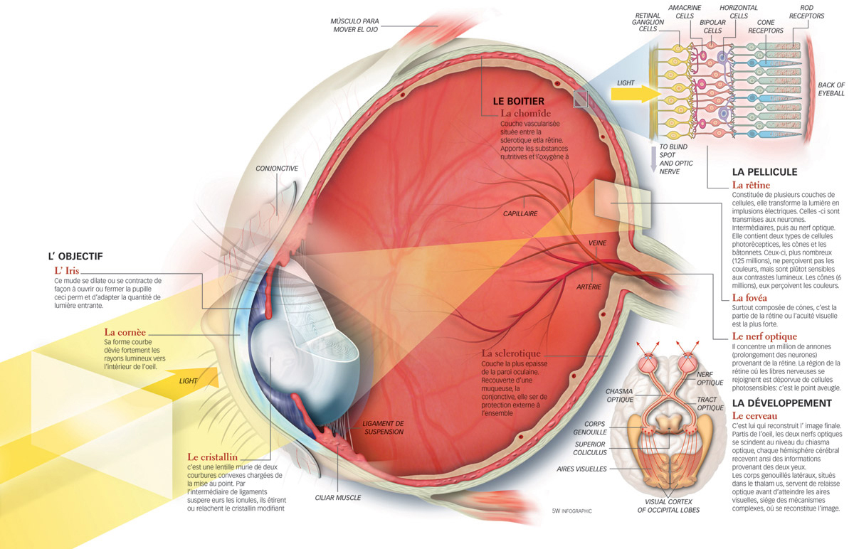
Above, American Museum of Natural History. Below, Science & Vie magazine.

Nuclear Energy Encyclopedia. (The Emirates Nuclear Power Corporation.)

Reader’s Digest magazine.

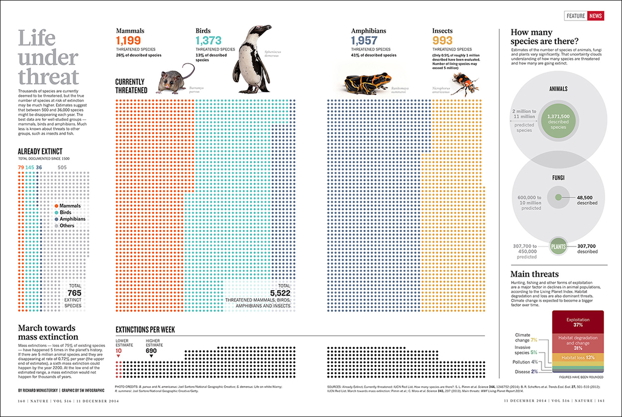
Nature magazine. Click on the image for a larger version.

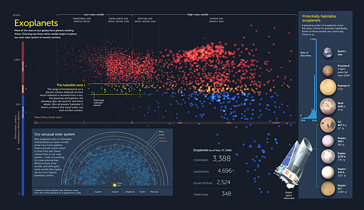
From a Scientific American book: The Zoomable Universe. https://bit.ly/2EfkySK

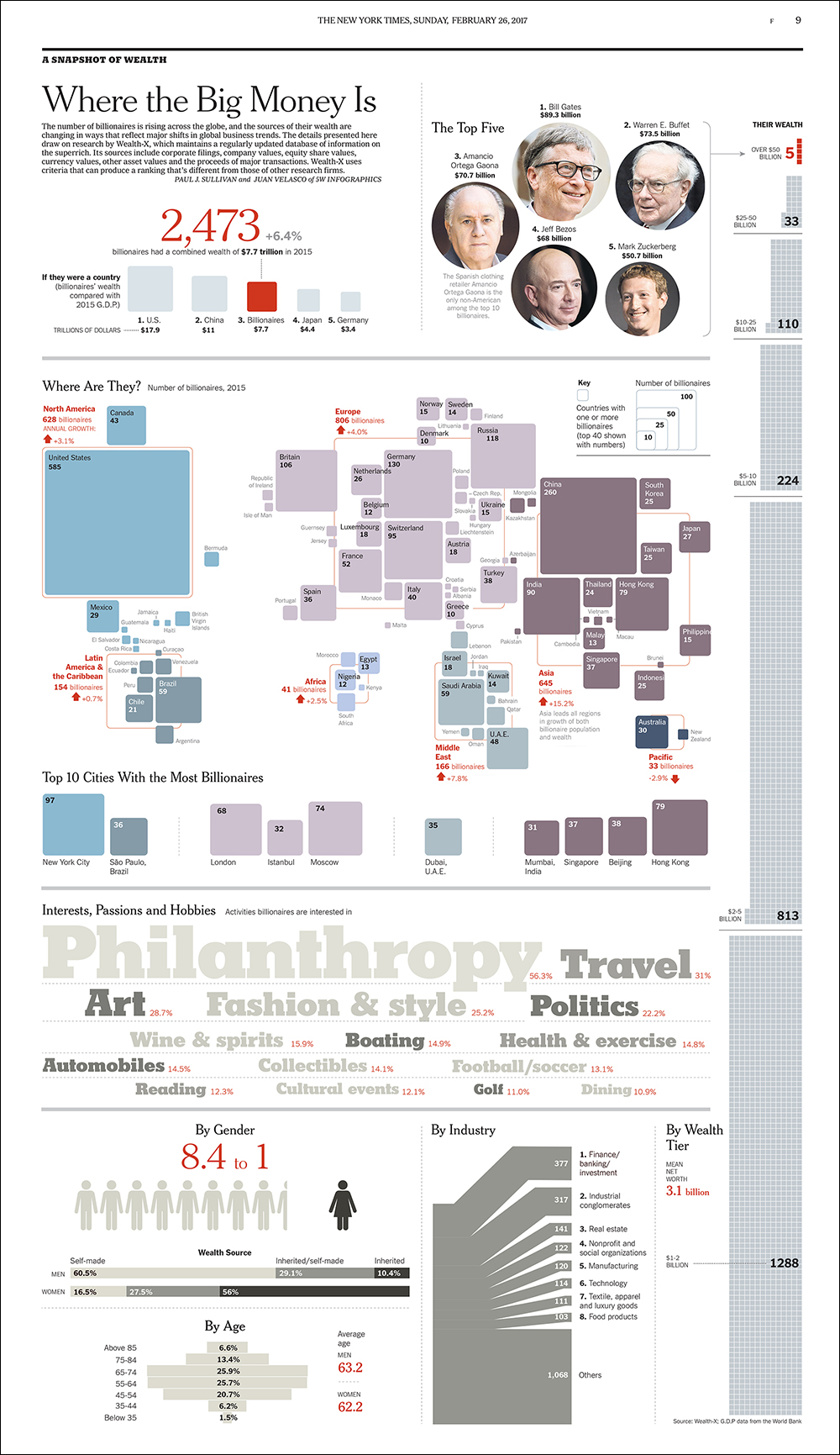
The New York Times.

Sukle Advertising & Design, for Esteem Hearing.

AARP The Magazine.

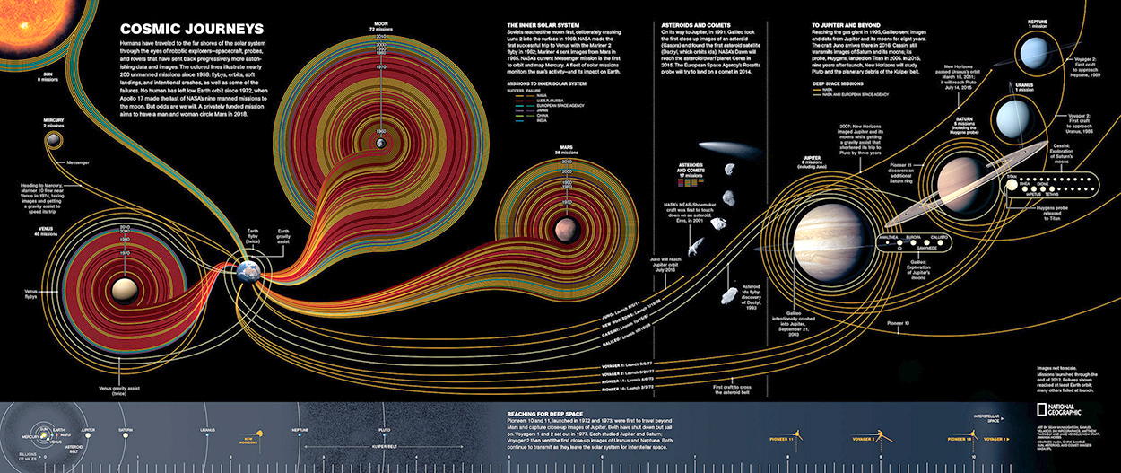
This space exploration timeline for National Geographic appeared in an earlier post about timelines: https://wp.me/s7LiLW-timeline
Click on the image for a larger version.
(By Sean McNaughton, Samuel Velasco (5W Infographics), Matthew Twombly, Jane Vessels and Amanda Hobbs.)

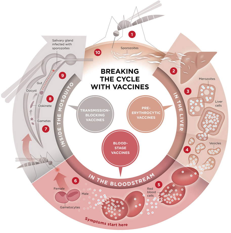
Malaria Vaccine Initiative.

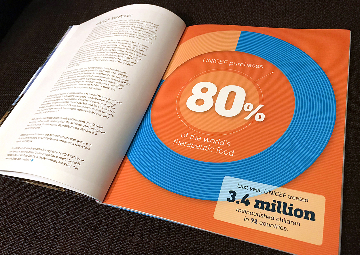
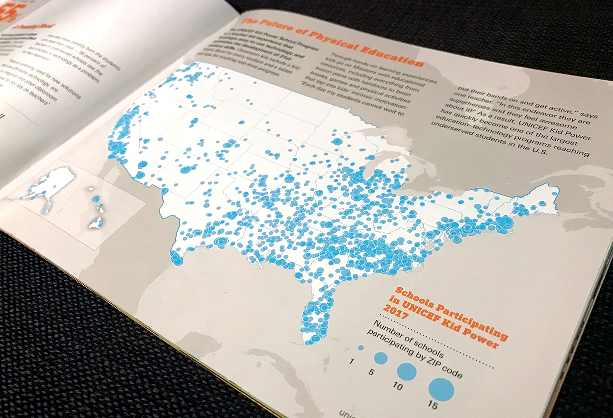
UNICEF.

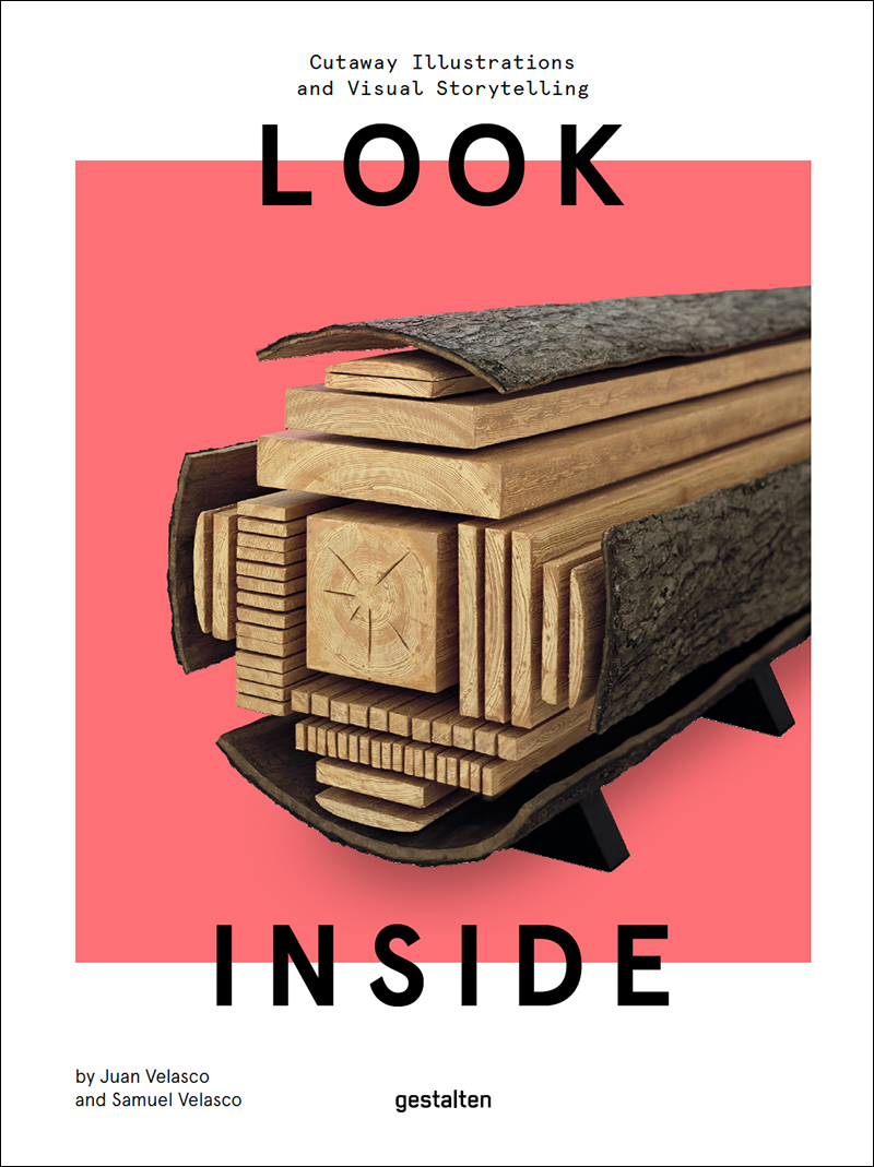
Juan and Samuel produced this superb book of cutaways for Gestalten: https://wp.me/p7LiLW-qF

Learning experience
Juan has led three excellent workshops for Ohio University students. I highly recommend the 5W professional workshops: http://www.5w-consulting.com

Arranged

ORDER FROM CHAOS.

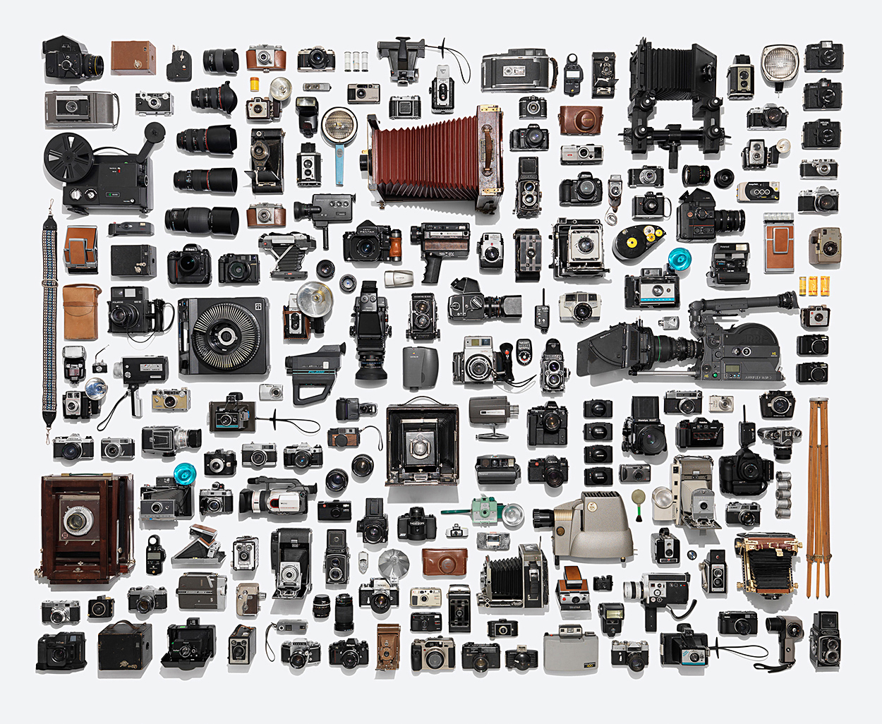
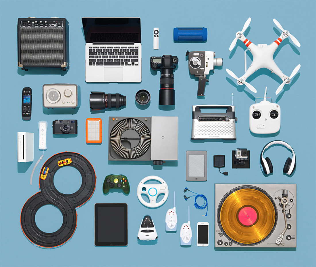
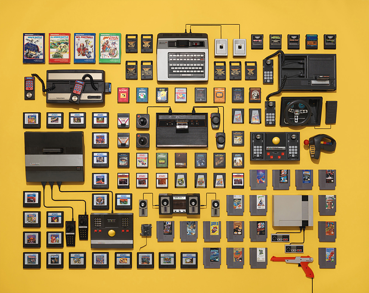
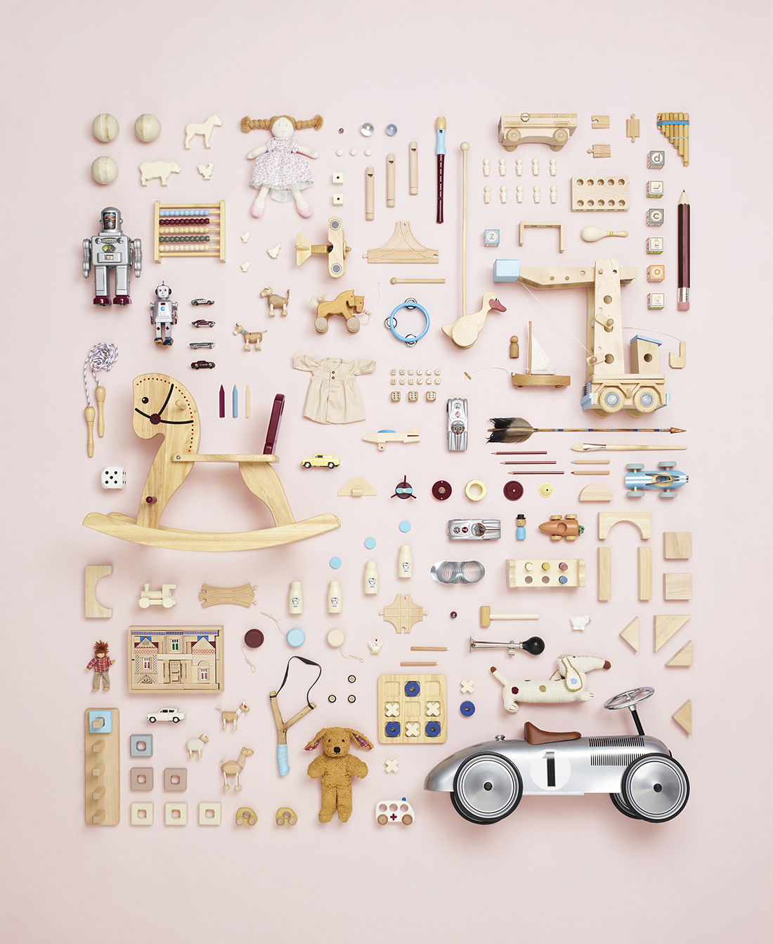
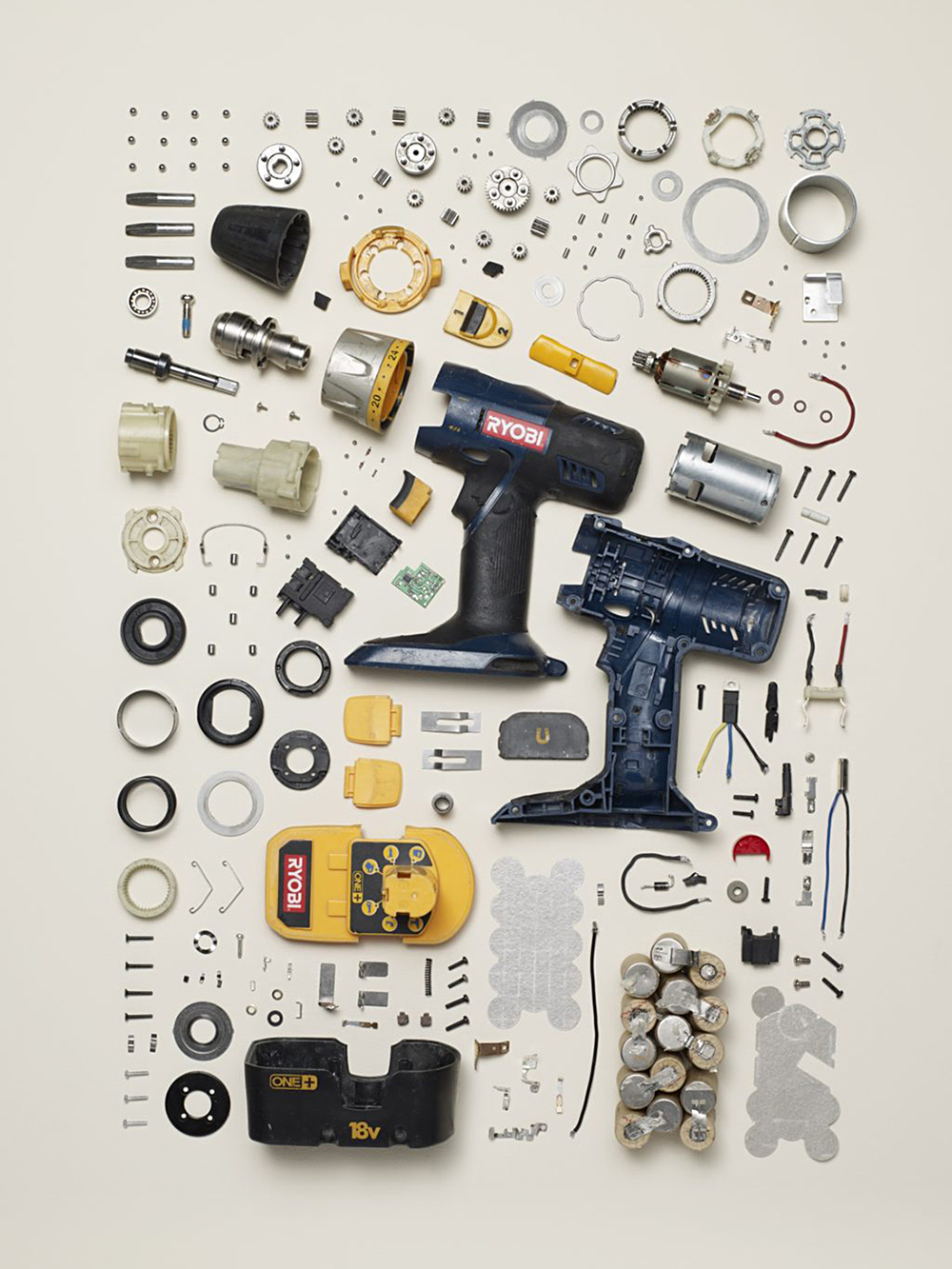
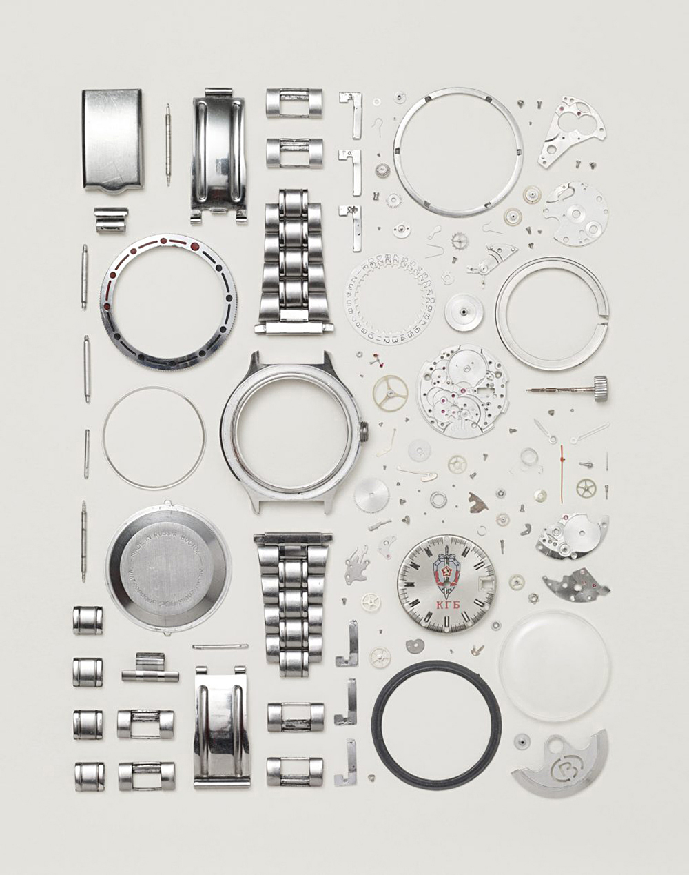
The process of information design often involves applying hierarchy and order to complex subjects, and at a simple level, the careful arrangement of objects mirrors this approach. These examples are by Jim Golden: https://jimgoldenstudio.com 
Jim’s animations of old technology were featured in this post: https://wp.me/p7LiLW-2fR

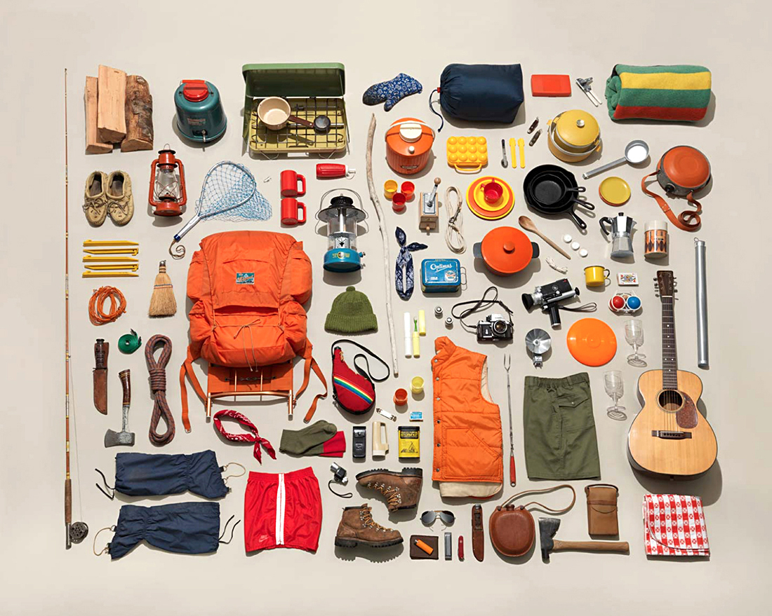
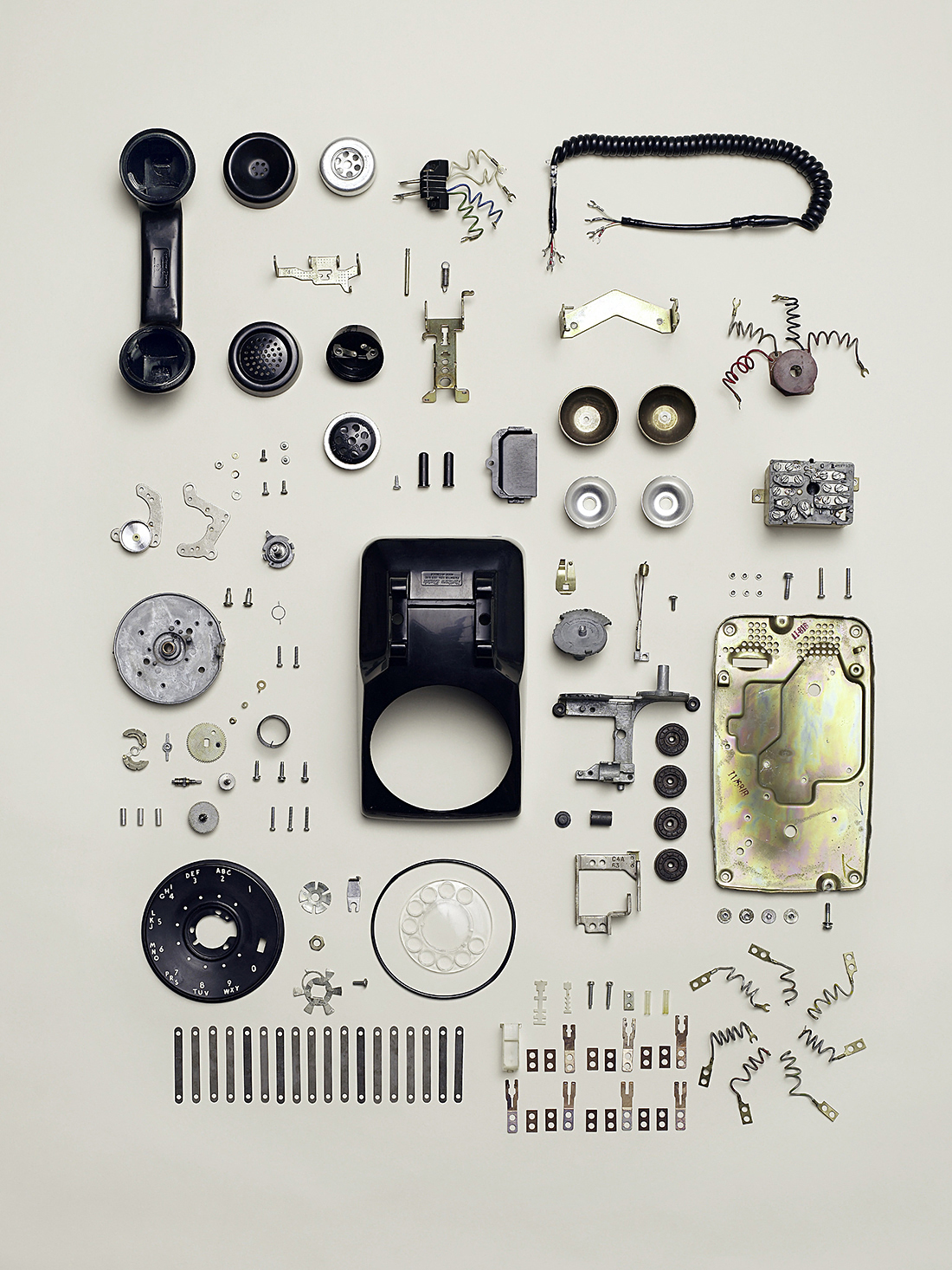
Todd McLellan’s arrangements of everyday things. https://www.toddmclellan.com
Some other examples of Todd’s work in a previous post: “Organized:” https://wp.me/p7LiLW-Z4

Todd has made many deconstructions of commonplace items, including a book “Things Come Apart.” https://amzn.to/2zQlBnJ

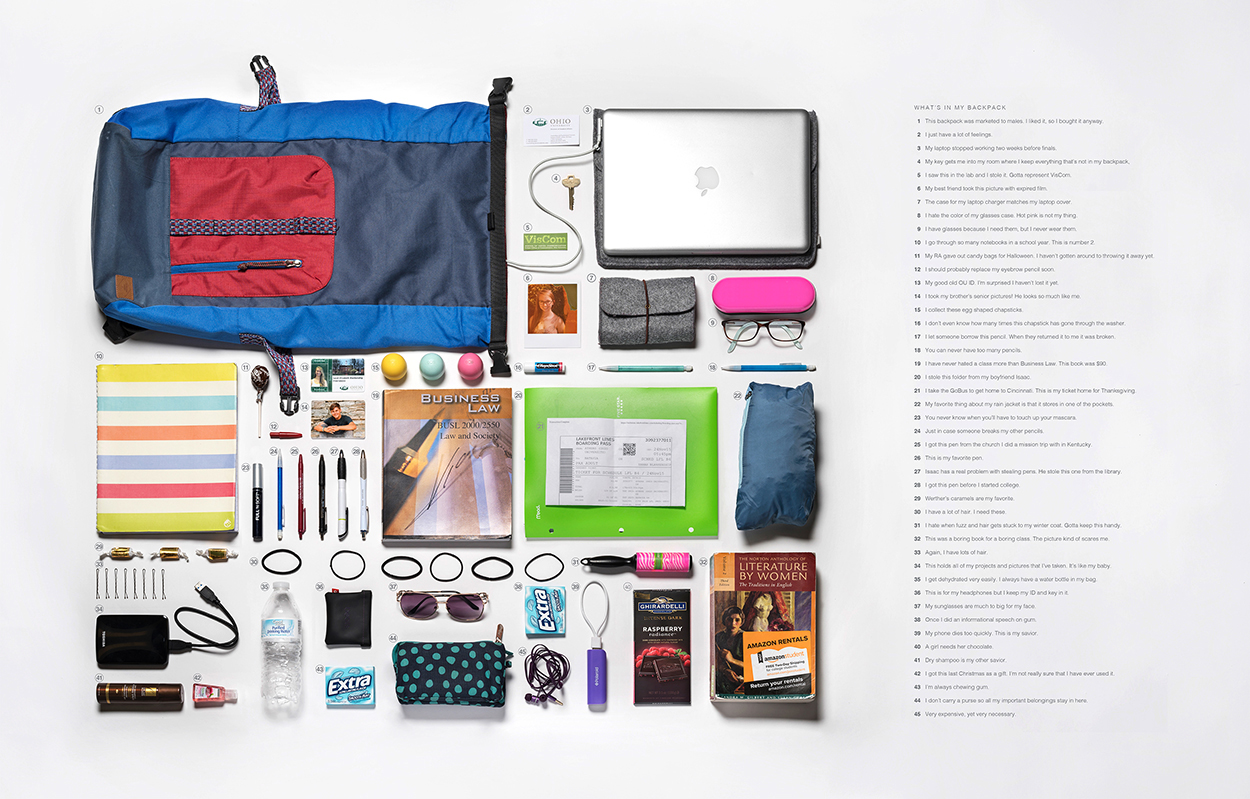
Life in a backpack. A student project by Sarah Blankenship, one of our VisCom graduates. The descriptions are both informative and fun. The annotation component takes the project to another level. (Click on the image for a larger version.)

https://seblankenship.myportfolio.com/

Infographic therapy

VISUALIZING OUR CREATIVE HANGUPS.

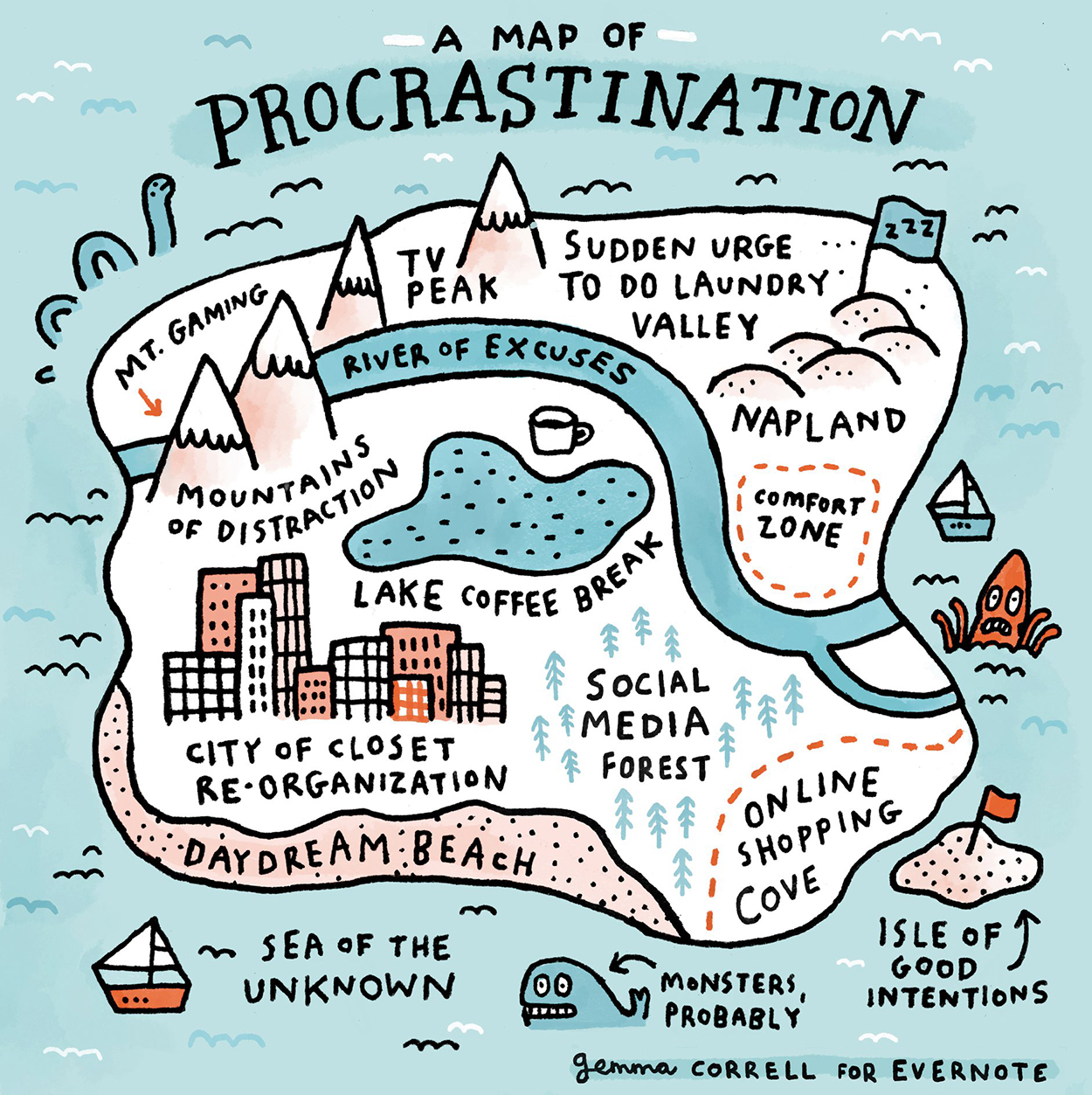
I’m a procrastinator, so this map by makes so much sense to me. (Now, why don’t I finish this post tomorrow?)
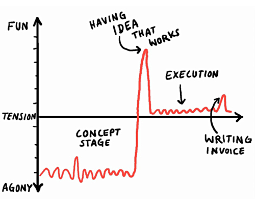
Below, the angst of being creative, by Christoph Niemann.

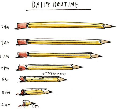
Wendy MacNaughton’s working day.

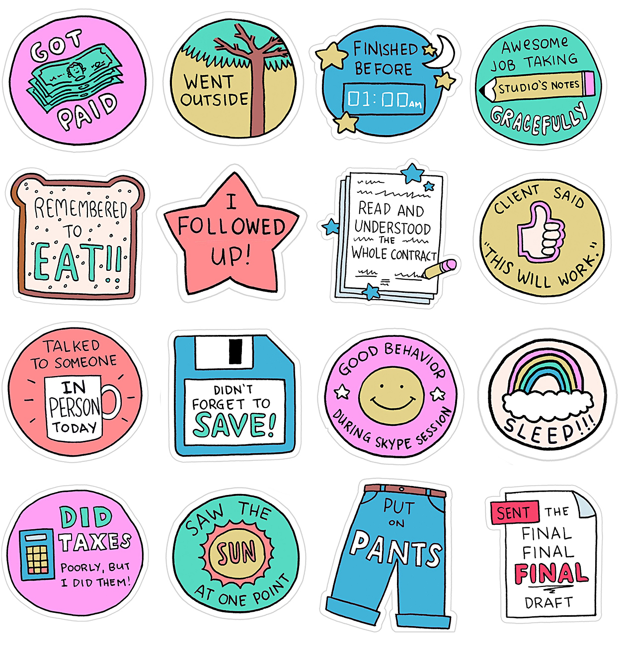
Jeremy Nguyen’s imagined a set of freelancer stickers (for the New Yorker). Anyone who has done freelance work can identify with these.

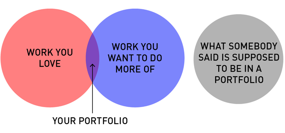
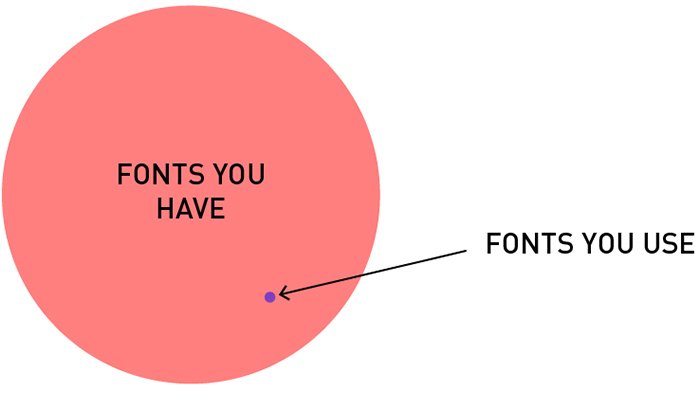
Portfolio dilemma, and font overload by Mitch Goldstein. See more designer and design-student insights at: http://www.ahelpfuldiagram.com

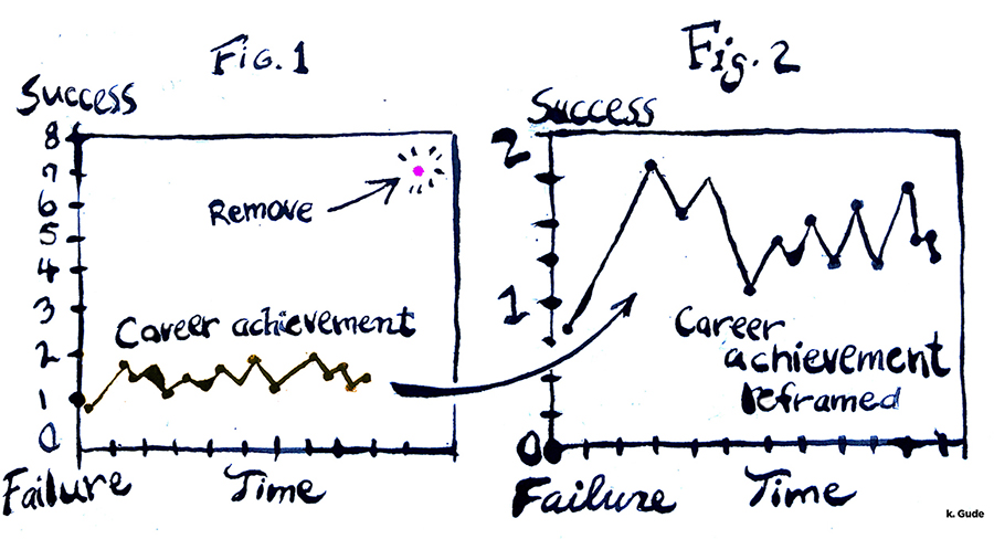
Karl Gude highlights our tendency to define ourselves as under-achievers because of one super-successful outlier. Remove it, and suddenly we’ve been more successful than we imagined.