Category: Infographics

Wireframe

DEFINED BY LINES.

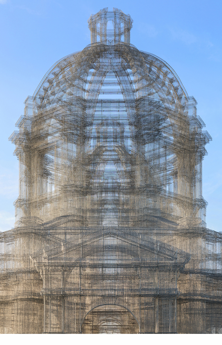
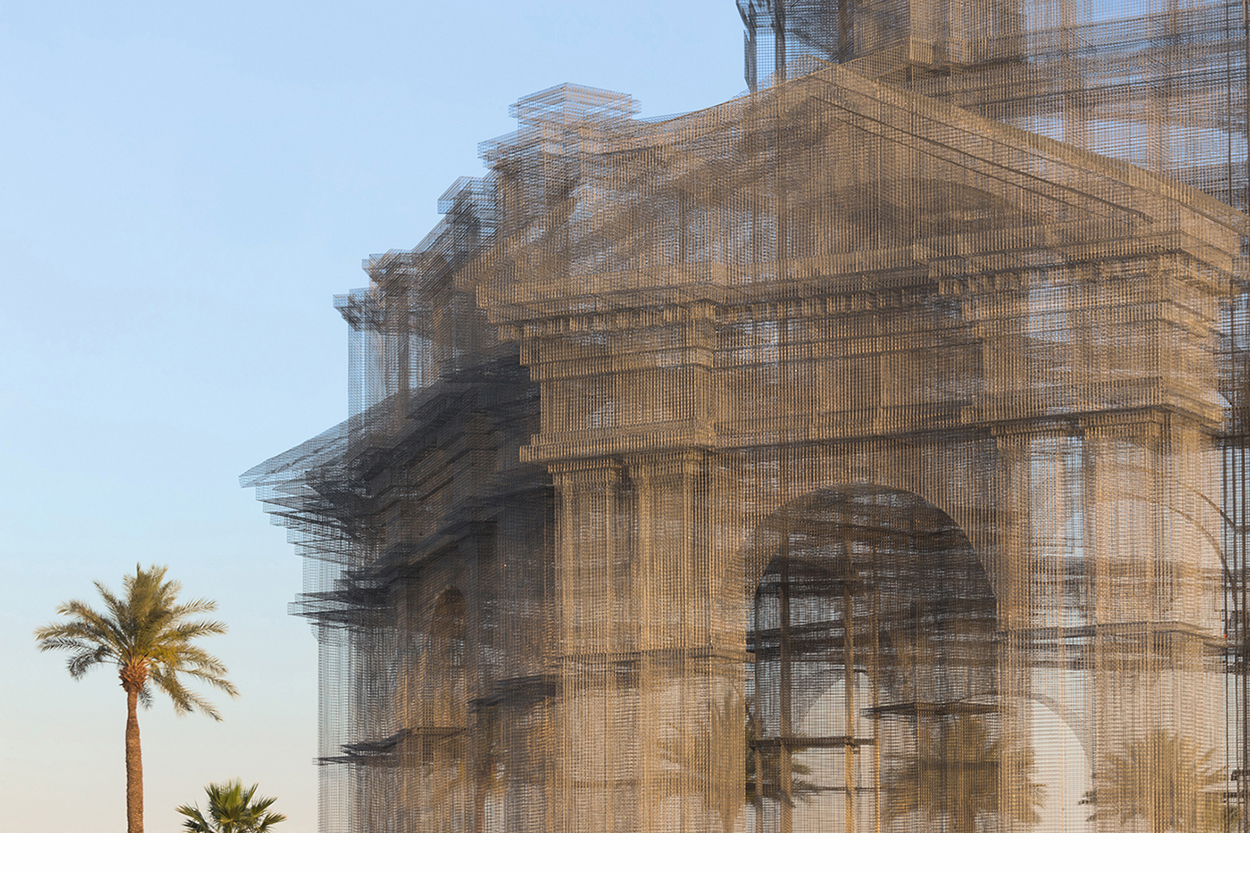
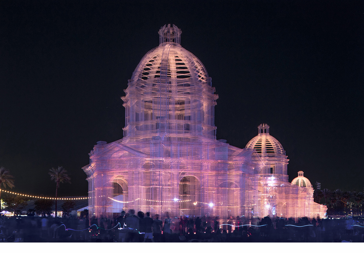
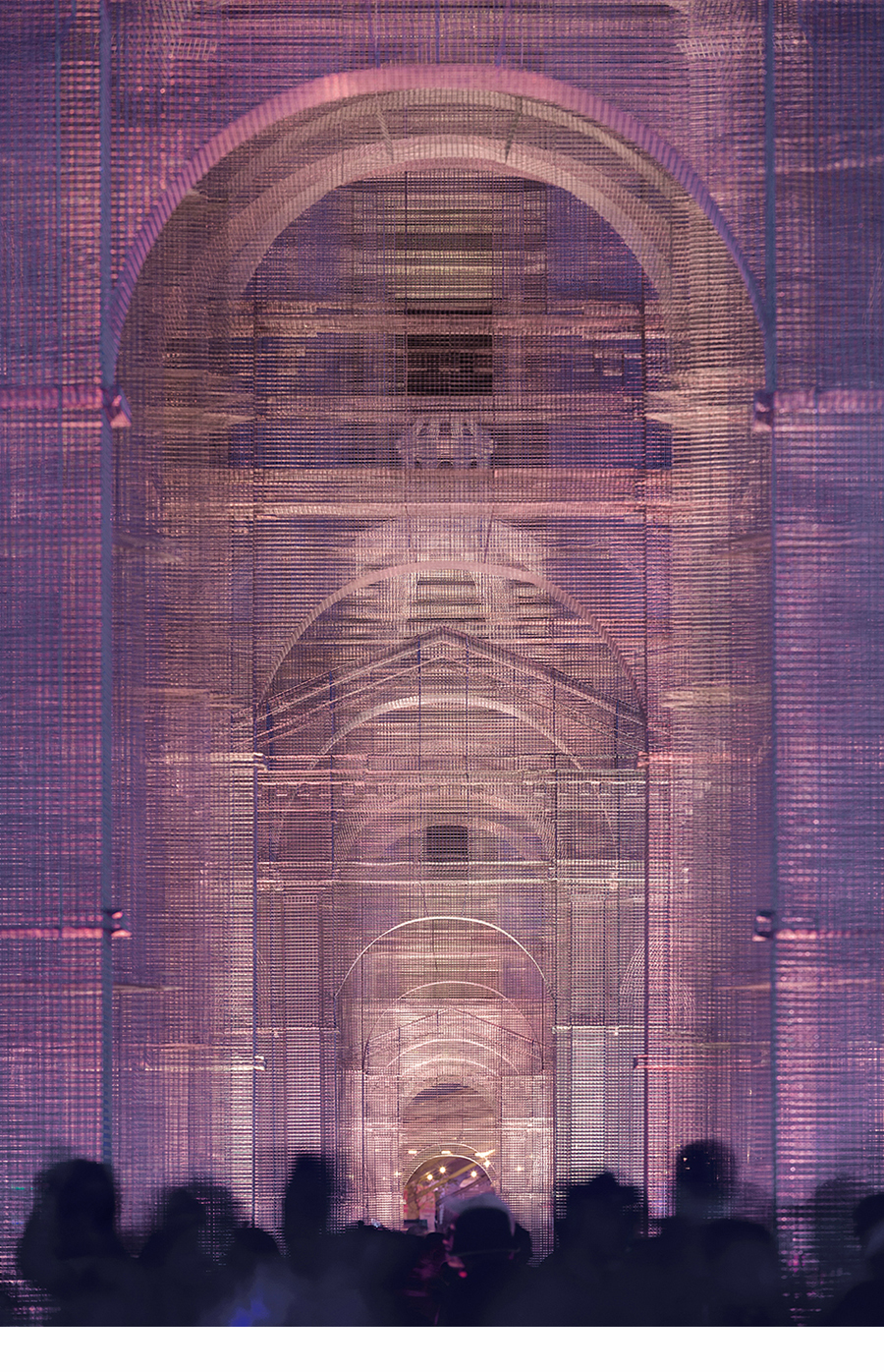
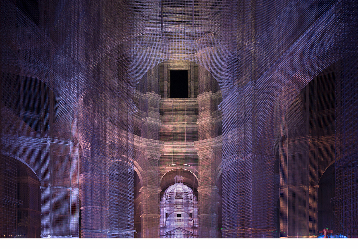
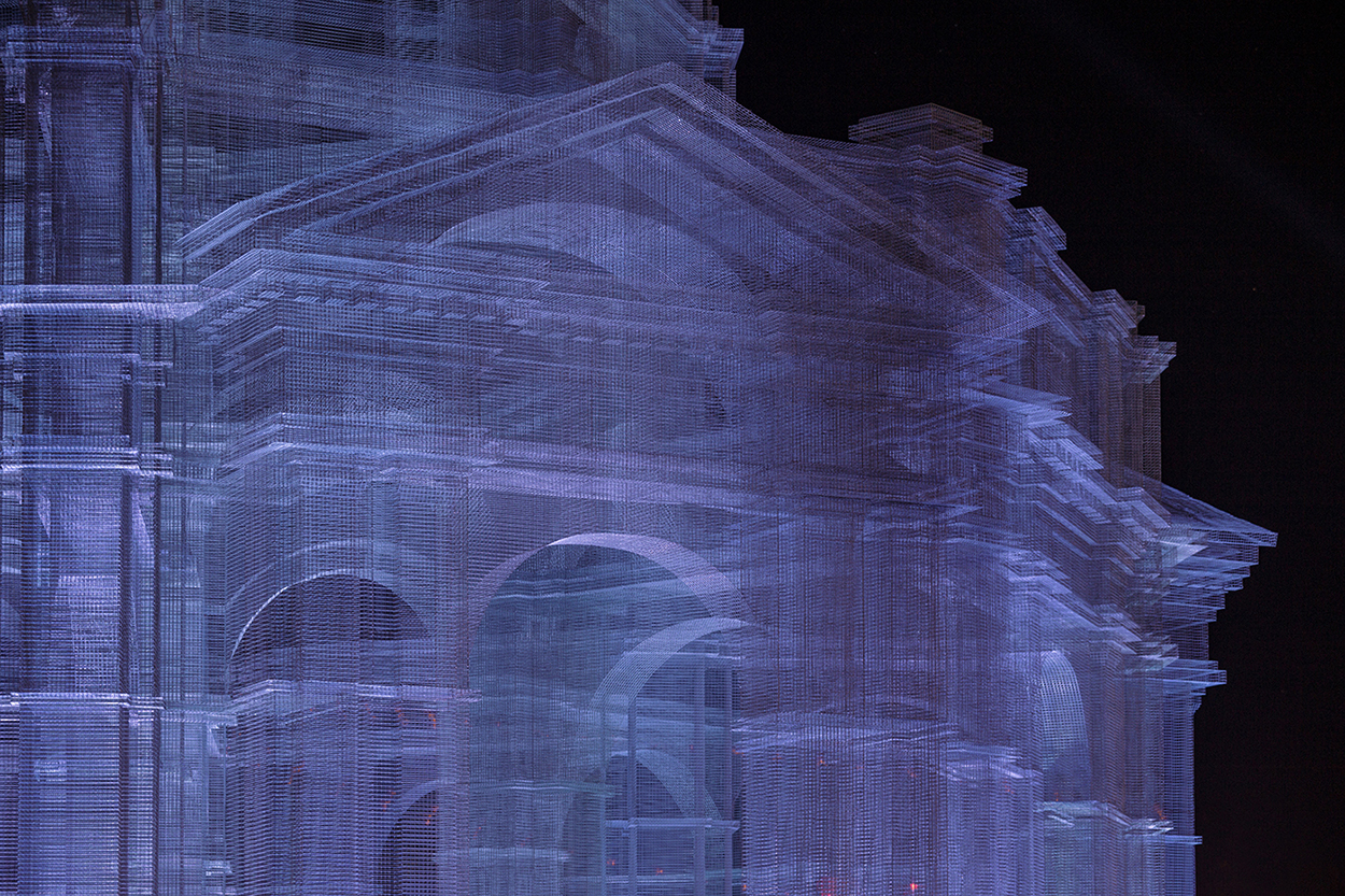
“Etherea” was an installation by Edoardo Tresoldi at the 2018 Coachella Valley Music and Arts Festival in Indio, California. A transparent building (inspired by Neoclassical and Baroque architecture) was constructed from wire mesh in three different sizes.
The structures were 36, 54 and 72 feet high (11, 16 and 22 meters).

https://www.edoardotresoldi.com

https://www.instagram.com/edoardotresoldi/

Photographs © Roberto Conte: https://www.robertoconte.net

Hands

APPENDAGE ART.


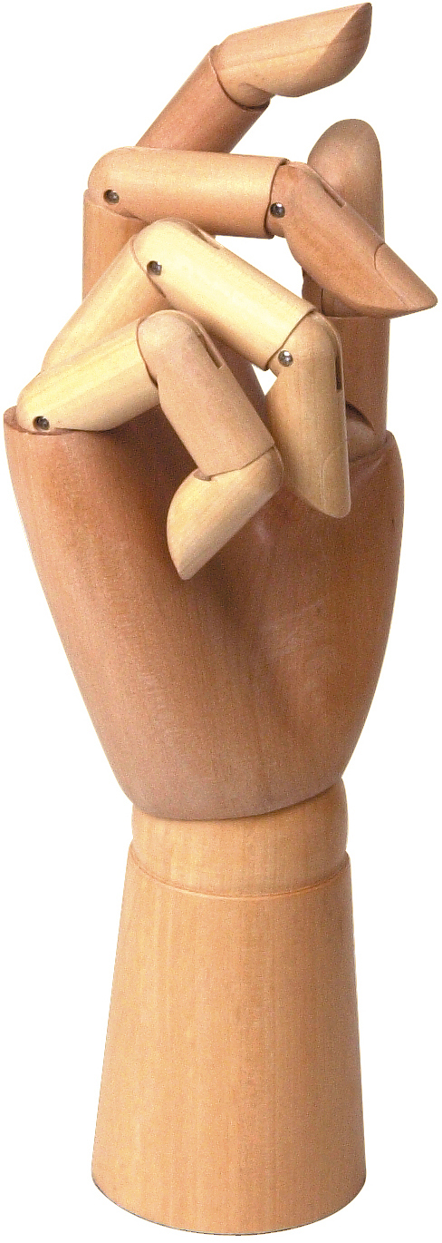
Wooden model
One like this stands on a shelf in my office. Probably a common item in artists’ studios (The ones with canvases and oil paints.)

Pointers
There are endless variants on this theme. And they’re usually the hands of men wearing a shirt and jacket.

International understanding
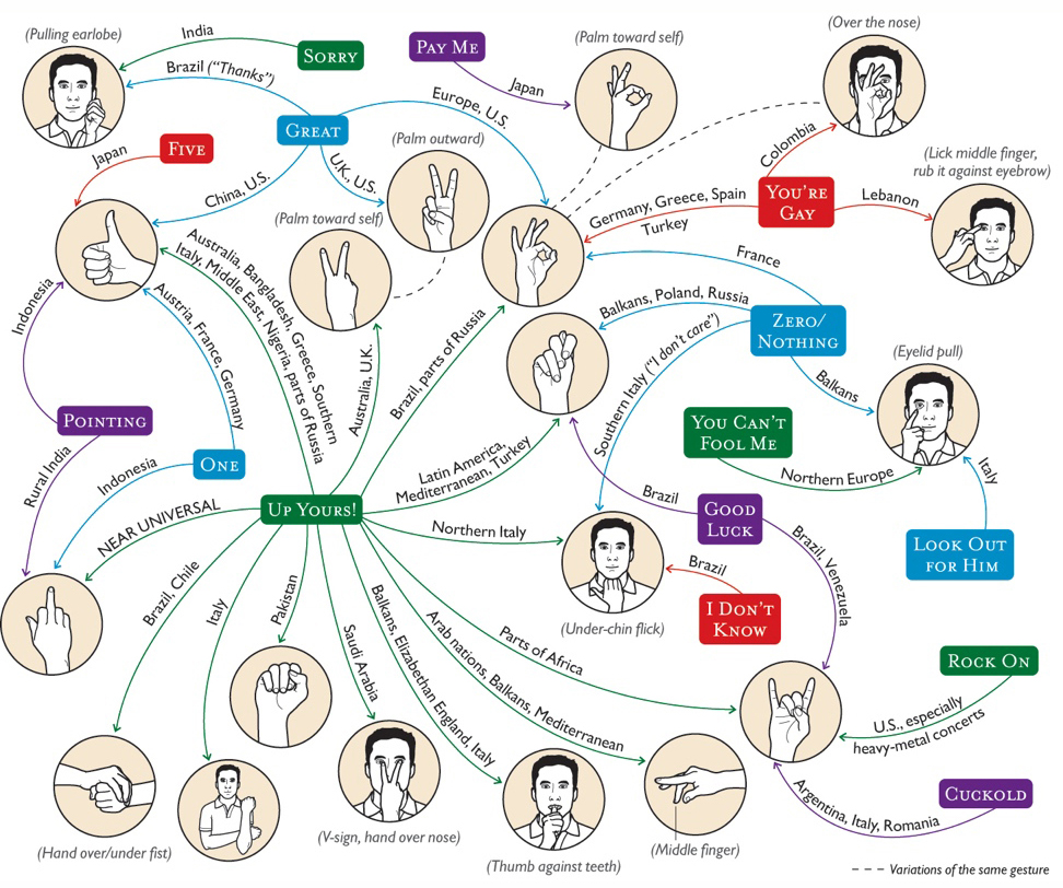
To avoid making an embarrassing social mistake, it’s good to know what various hand gestures mean around the world.
Illustration by Brown Bird Design for Condé Nast Traveler. http://brownbirddesign.com

Fortune telling
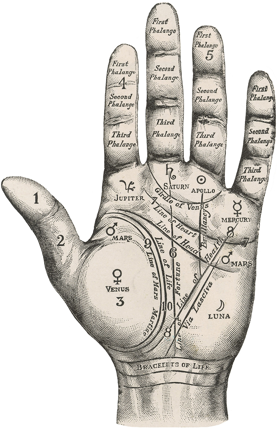
A palmistry (or chiromancy) diagram, used to unlock the secrets of our future.

Sign language
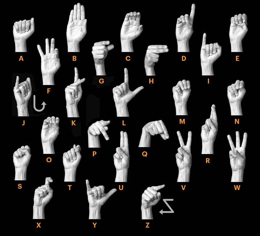
Communication through gestures. This is ASL: American Sign Language. The image appeared before in a post called “Signals”: https://wp.me/s7LiLW-signals

Realistic
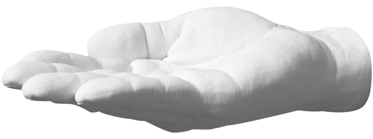
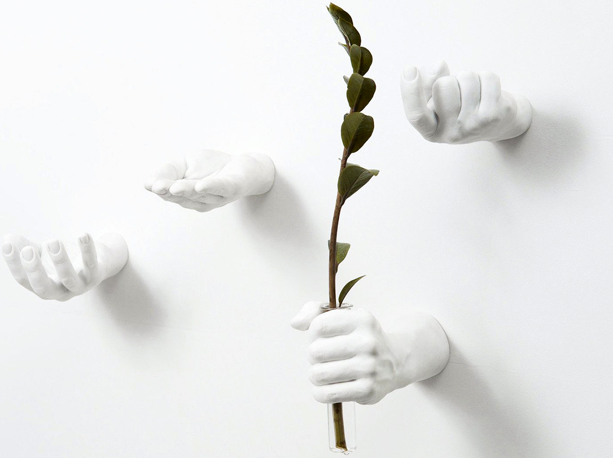
Life-like hands that act as a shelf, vase or hook: https://bit.ly/2LtVq9d


Crazy Competitions (2)

INSIDE NIGEL HOLMES’ INFOGRAPHIC MIND.
This is the second post about Nigel’s new book. The first one is here: https://wp.me/p7LiLW-2oj

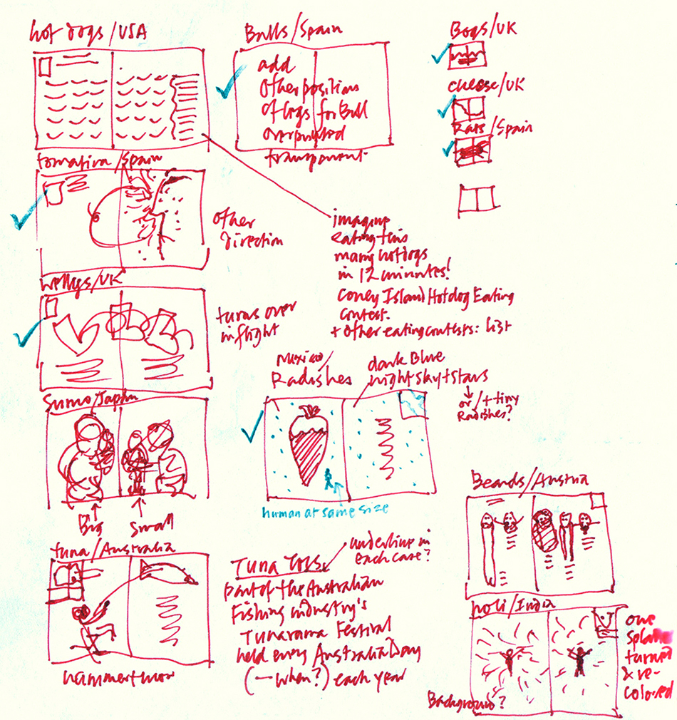
Above, from Nigel’s notebook, these are the very first (and very rough) sketches for the 12 spreads that he eventually developed and sent to Taschen to sell the book idea. He originally intended the format to be small and portrait-shaped, with very simple graphics and minimal text.

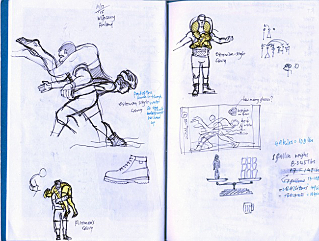
More pages from Nigel’s notebooks:
Q&A

I recently asked Nigel some questions about the book.

This is an unusual subject. In fact, the working title was “Odd.” So first, I have to ask: Why?

I really wanted to do a book that included infographics but wasn’t academic, or “how-to-do-it.” Yes, I wanted to call it “Odd” because I loved the idea of designing a cover with just that one word on it. But the sales people overruled me! Actually, the title changed three times during the making of the book: “Odd,” “They Throw Dead Rats in Spain,” and “Wow!” before “Crazy Competitions.” I argued against the final title, first because the events aren’t all competitions, and also the word crazy might offend the sensibilities of participants taking part in the many religious-festival-based events. But this was the only point of contention in the entire job. Like myself, Taschen really wanted the book to be fun, accurately-researched and approachable.

It’s one thing to have a creative book idea, and another thing to get it published. (Especially by such a prominent publisher.) How did you that happen?

I met Julius Wiedemann, the senior editor at Taschen at a graphics conference some 10 years ago, and we kept in touch. At lunch in June 2015, I casually mentioned the idea of a small graphic book about weird events, and he was interested. He suggested I do ten of them and he’d see if the idea would fly with his boss, Benedikt Taschen. To my surprise, the boss said yes! But he would like it to be a collection of 100! Again to my surprise, it was easy to find that many. Julius has been a wonderful partner in the project. He told me just a couple of months ago that he had miscalculated the amount of time the translations would take. (Taschen typically publishes everything in English, French, and German.) Also the sales team at the head office in Germany were not sure about how they’d sell the book; in fact they were rather against publishing it. Julius got Benedikt to say he wanted the book to be done, and that was that.

Although the approach, in terms of visual explanation, is unquestionably very “Nigel Holmes-like,” you use several different styles of illustration. Was this a deliberate decision to make the spreads more varied visually?

I treated this book more like a series of magazine pages than traditional book pages—after all, most of my career has been in magazines. So yes, it was a very deliberate decision to give readers a variety of things to look at, rather than setting everything in a strictly formatted approach. (The color bars on the edges of each page and the two outside columns were a kind of recurring format, and that was enough.) Also, frankly, I wanted to amuse myself for the year-plus it took to draw and write everything, and in any case, many of the events were difficult to portray as “proper” information graphics. So I used freehand drawing for the real action events; I think a freely drawn line has much more energy and life than my rather stilted vector illustration. (An aside for computer nerds: the vector program I used for the whole book (text and art) was Freehand MX. I saved my files in Illustrator format for the production guys in Germany.)

Can you detail the process of creating the graphics? From idea to finished spread.

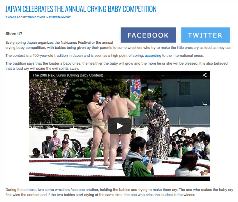
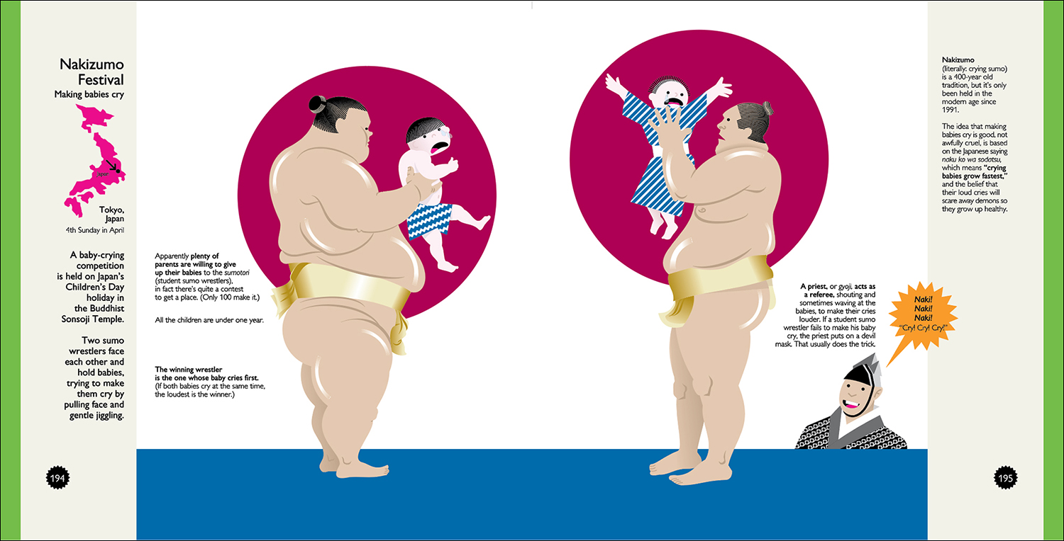
This event is the Nakizumo Festival (Sumo wrestlers making babies cry. No babies are harmed!) I worked with Chris Mizsak, a researcher in England, to find the best reference. Where possible, we used the official websites of the events, but sometimes I had to rely on press reports, both for specific details and pictorial reference. The example below is from the Tokyo Times.
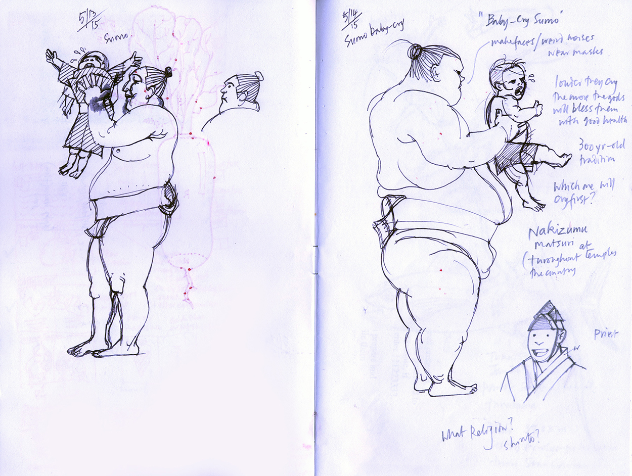
The first step for me in almost any information graphic is drawing by hand, even if it’s hand-plotted numbers for a chart. In this case, the end result was pretty much just a large illustration of two big sumo (student) wrestlers holding the hapless toddlers, so the actual drawings were key. (You can see a radish showing through on the left-hand page. That’s from the Night of the Radishes event!)
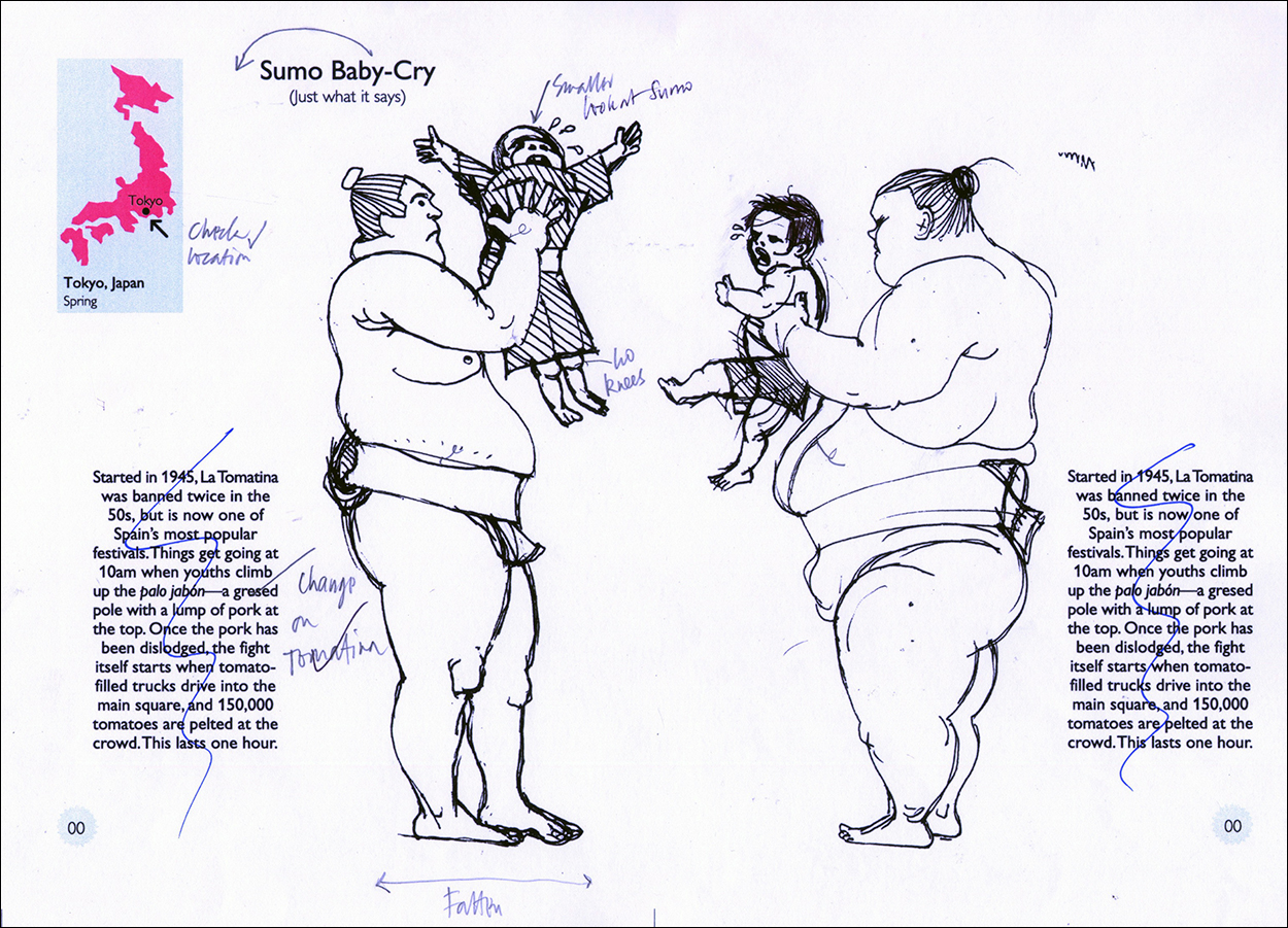
The drawings were scanned, flipped right to left, and placed into a spread. It’s still in the original portrait format, and has dummy type.
This is how the spread looked, with real type, but still in the old format, when sent to Taschen. Based on this and 11 other spreads, I got the go-ahead to do the whole book, but they wanted it to be square, and bigger. I showed them several of the original spreads in three different larger sizes, and they went with the biggest one (7.5 x 7.5 inches, 19 cm x 19 cm). At this time I decided to include two outer columns; on the left for the locator map and general introduction, and on the right for interesting trivia.
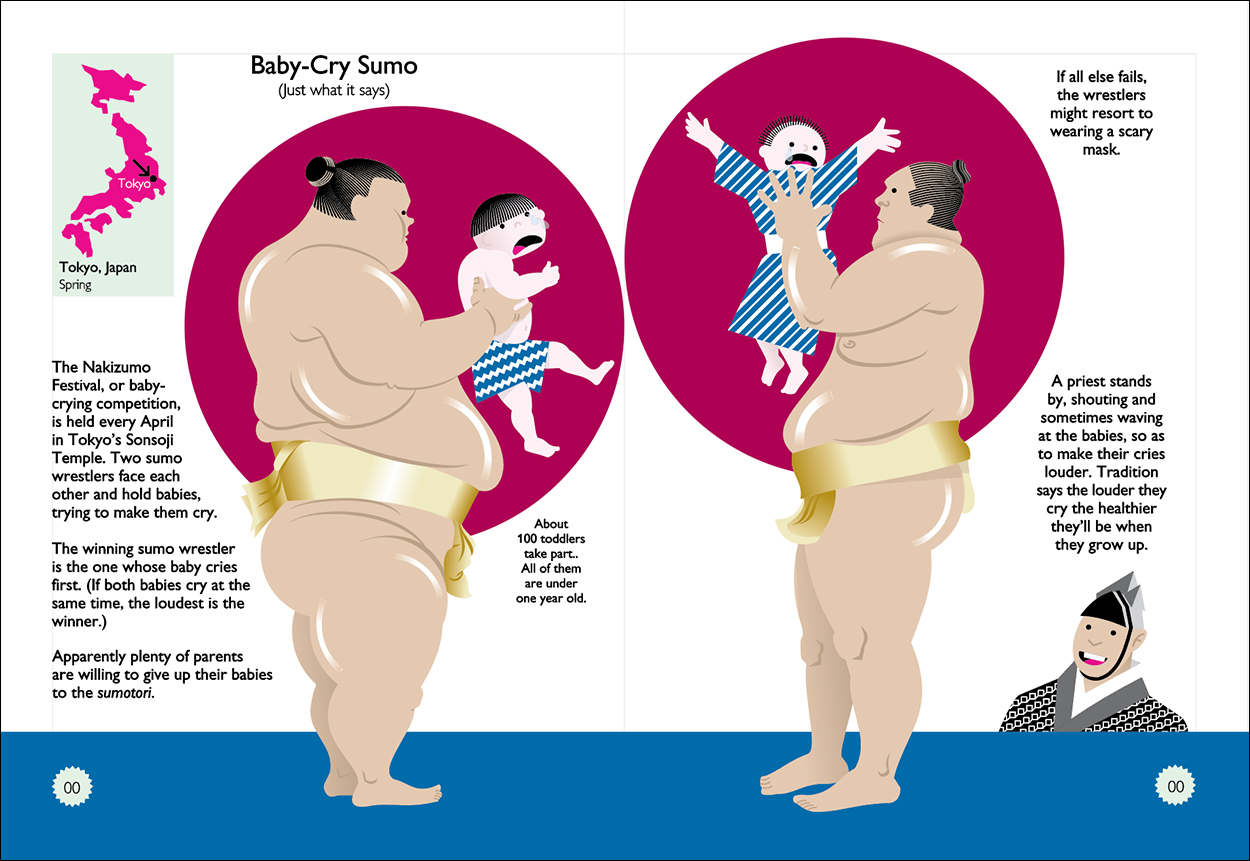
The final as it appears in the book. Since there were over 200 pages, I had to leave a fairly big gap in the center of each spread so stuff didn’t disappear into the gutter. It was easy to open up the sumo event, but some of the images in the book go right across the spread, and in retrospect I should have left more space in some cases. Oh well!
Click on the image for a larger version.
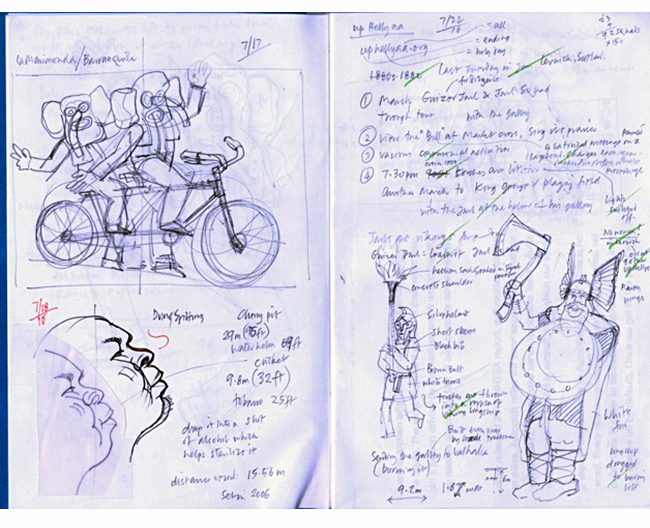
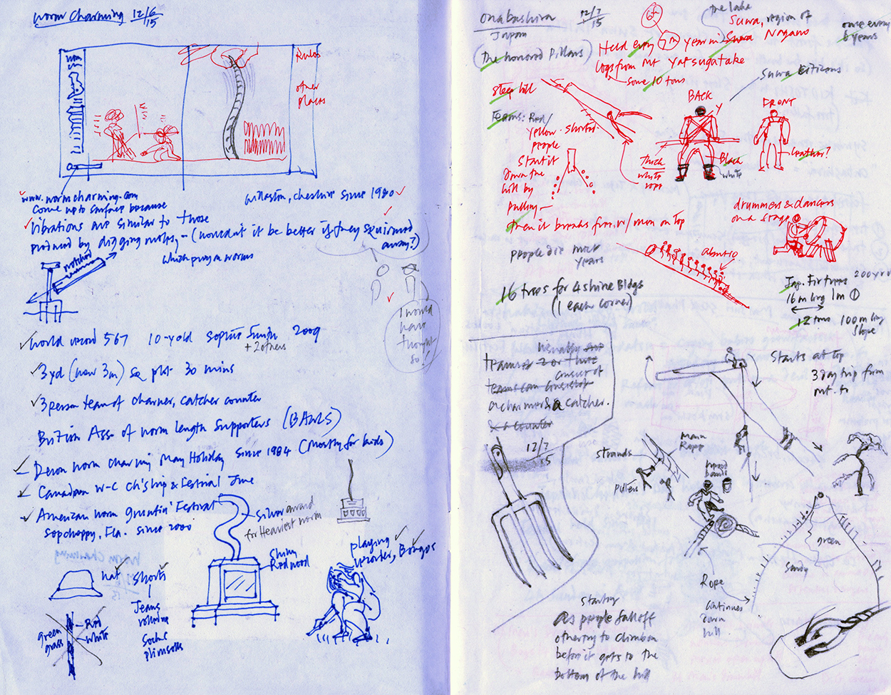
A typical spread from my notebook is often a hodgepodge of text ideas, reference notes and small drawings. Here are my notes for wormcharming (very safe, but wiggly!), and a particularly dangerous log-riding event held in Onbashira, Japan, which has resulted in the death of several participants over the years. Taschen never saw sketches; I always sent them final files, and all they did was to edit my text lightly for consistency. It was the best working relationship I’ve ever had.
We probably all have a competition or two that we find the most interesting (for various different reasons). For example, I used to think I had Olympic-level potential in stone-skimming. Do you have a favorite?

Two favorites: Kudu Dung Spitting, because it’s the most disgusting thing I can imagine! And, though it’s not a competition at all, the Twelfth Night Holly Man, because it came out the way I visualized it, and that didn’t happen every time!

Buy the book here: https://bit.ly/2LaKxJE
Crazy Competitions (1)

THE LATEST TOUR DE FORCE FROM NIGEL HOLMES.

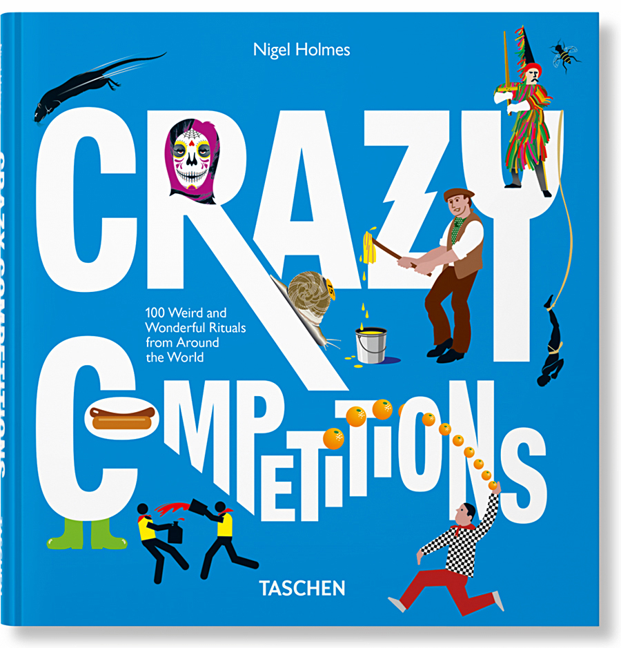
Nigel’s new gem is an infographically-driven book (published by Taschen) that explains 100 strange rituals from around the world.
We soon learn that people do some really weird stuff to pass the time. Like snorkeling in a peat bog, throwing dead rats, and rolling big cheeses down a steep hill. There’s even a Night of the Radishes.

The book contains a lot of information and explanation, but this is the work of Nigel Holmes, so naturally there are humorous insights (and outright jokes) running through the pages. One of the spreads in the book is completely fake. Sorry, no clue to which one here.

My advice: Get the book, and see how engaging infographics can be when the joy of explanation runs free. Buy it here: https://bit.ly/2LaKxJE

Below are five of the 100 spreads, with comments by Nigel. Click on them to see larger versions.

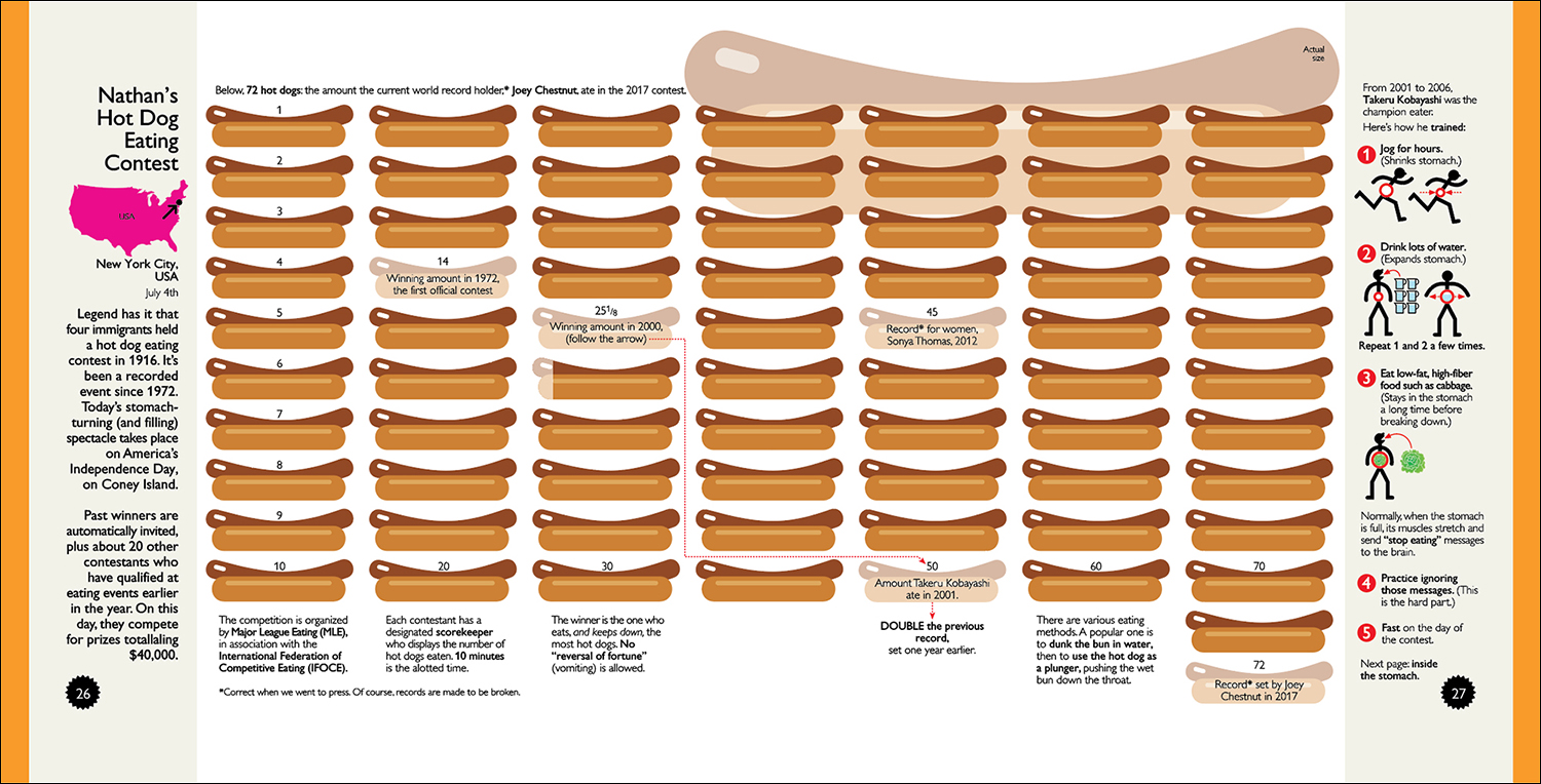
Nathan’s Hotdog Eating Contest
This stunning, if rather disgusting, event had intrigued me for years; it was the original impetus for the book, and the only one of the 100 that I actually attended. The contest organizers feel they should entertain the crowds for an event that only takes 10 minutes, so there are hours of pre-main-event sideshows while we wait in the boiling sun!
In many of the spreads in the book, I’ve included something that’s shown at its actual size. Here, the hot dog itself was a no-brainer.

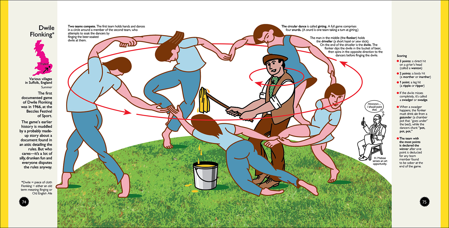
Dwile Flonking
One of the silliest English examples in the book—the odd names for everything, for a start—straight out of Monty Python. My oddly-shaped dancers are based quite closely on a famous Henri Matisse painting (La Danse, 1909–10; Google it, you’ll see). That’s why the painter is sitting there having a thought about doing a painting of the event.

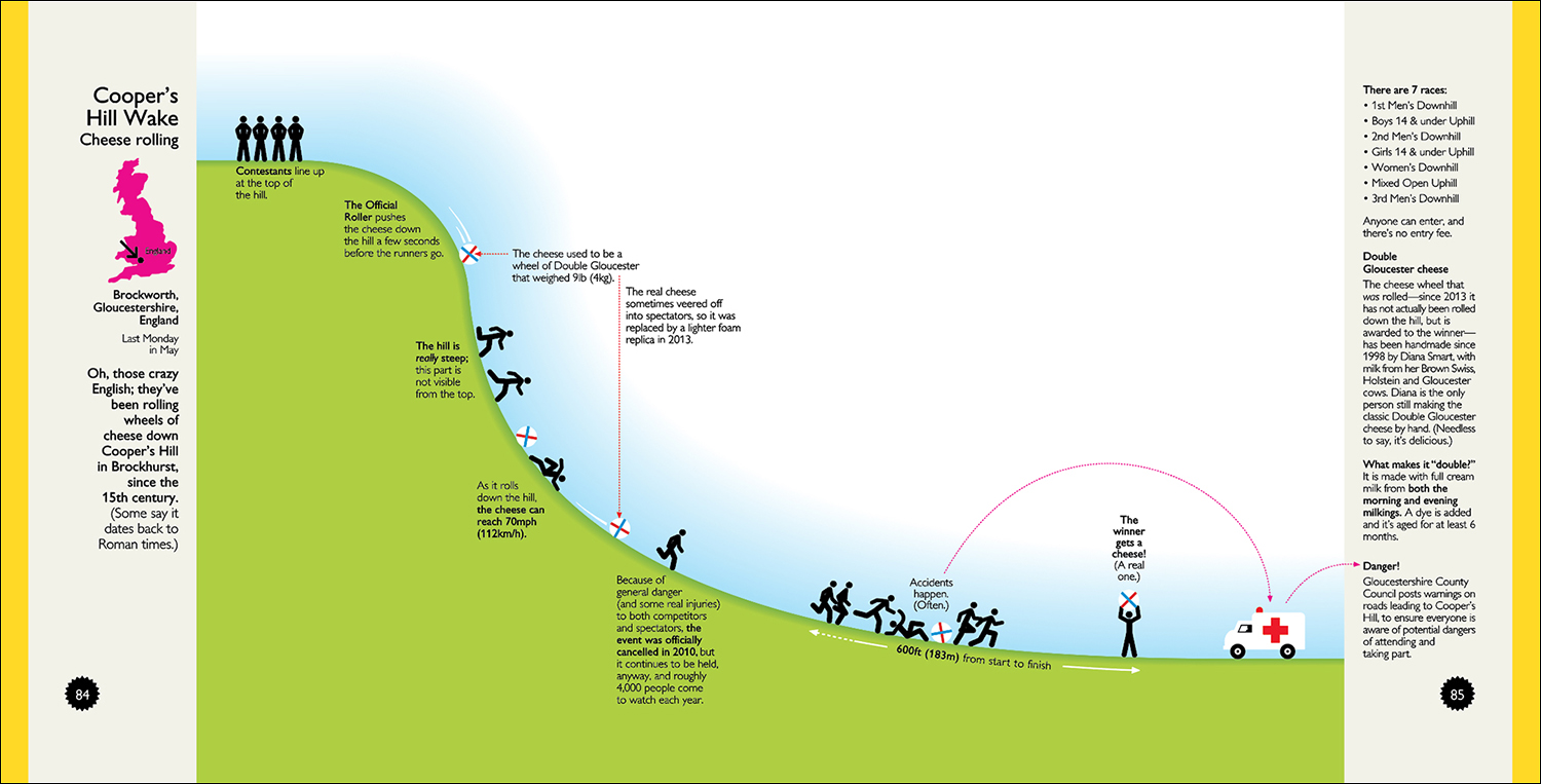
Cheese Rolling
I adapted this from my book Instant Expert, adding extra details. I was happy to leave a big white space on the right-hand page, and Taschen never questioned that kind of design choice. But they did want a worldwide collection, even though this could have been a whole book just devoted to UK silliness (with Spain as a close second). I’m constantly amazed at the odd things people do all round the world.

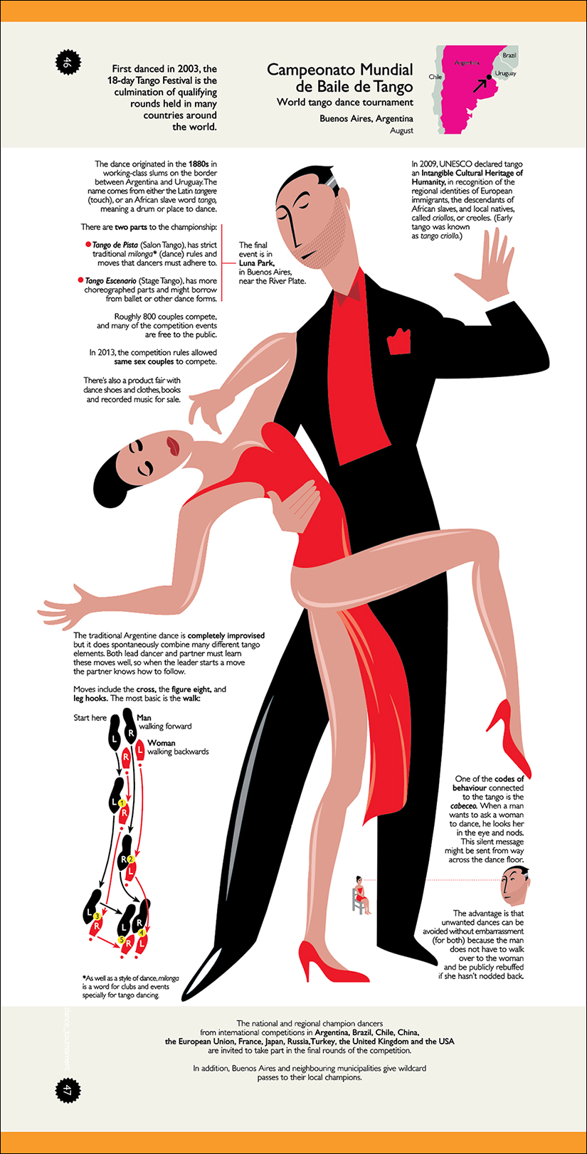
Tango
For events that seemed more natural in an upright shape, a few of the spreads are turned sideways. Like some other spreads, the Tango is really just a big illustration, with text explanations. But it was an obvious chance to include a diagram of the most basic move (color-coded to the dancers, of course!), and another little piece about how male dancers can “ask” for a dance (and how female dancers can avoid them!).

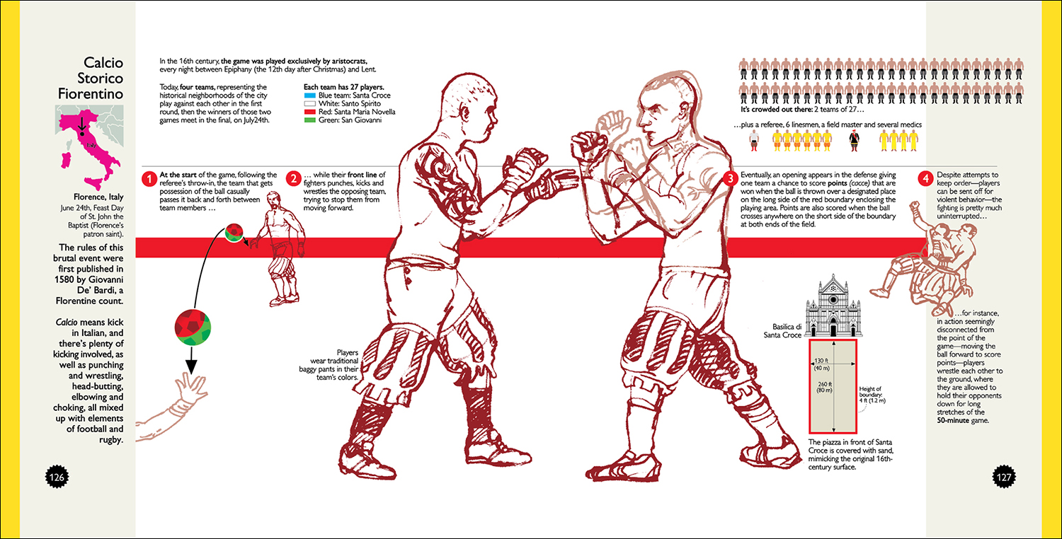
Calcio Storico
An Italian “sport” that mixes up wrestling, boxing, soccer, rugby elbowing and head-butting. The graphic is an example of mixing traditional infographics with freehand hand drawing on one spread. There’ll be more about the different styles used throughout the book (and about the almost extinct Freehand as my drawing program of choice) in the next post.

Next post: The process behind the infographics.

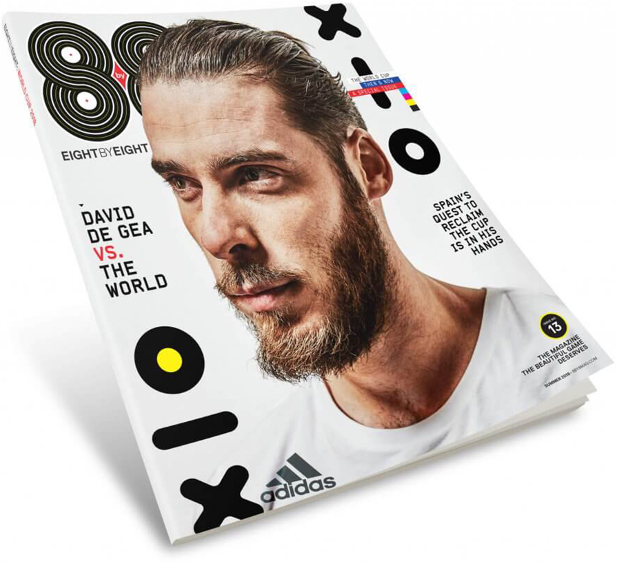
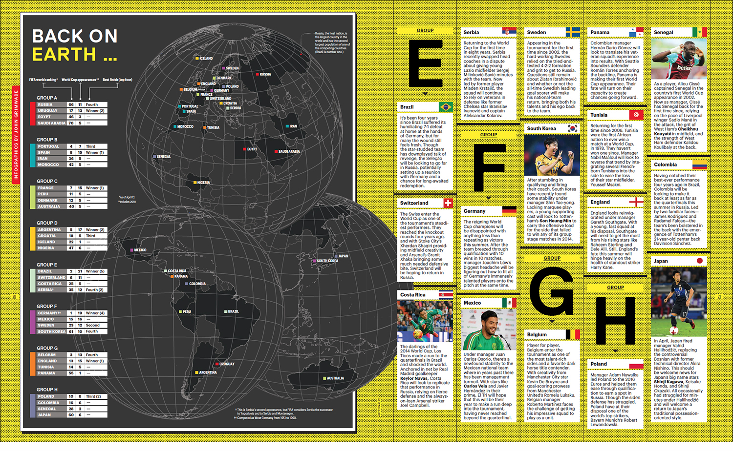
Eight by Eight: World Cup Issue

THE GLOBAL GAME.
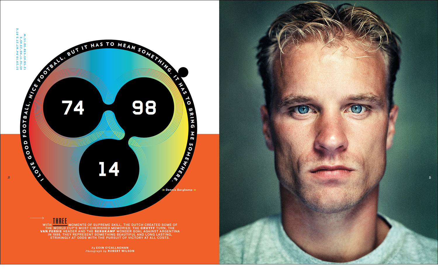
Soon 32 nations will compete to see who’s on top of the pyramid for the next four years, and Eight by Eight is on the case. The latest edition of the best football (soccer) magazine has just been published.*

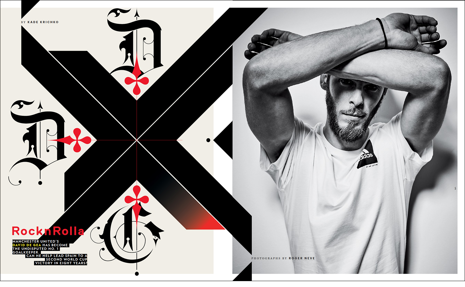
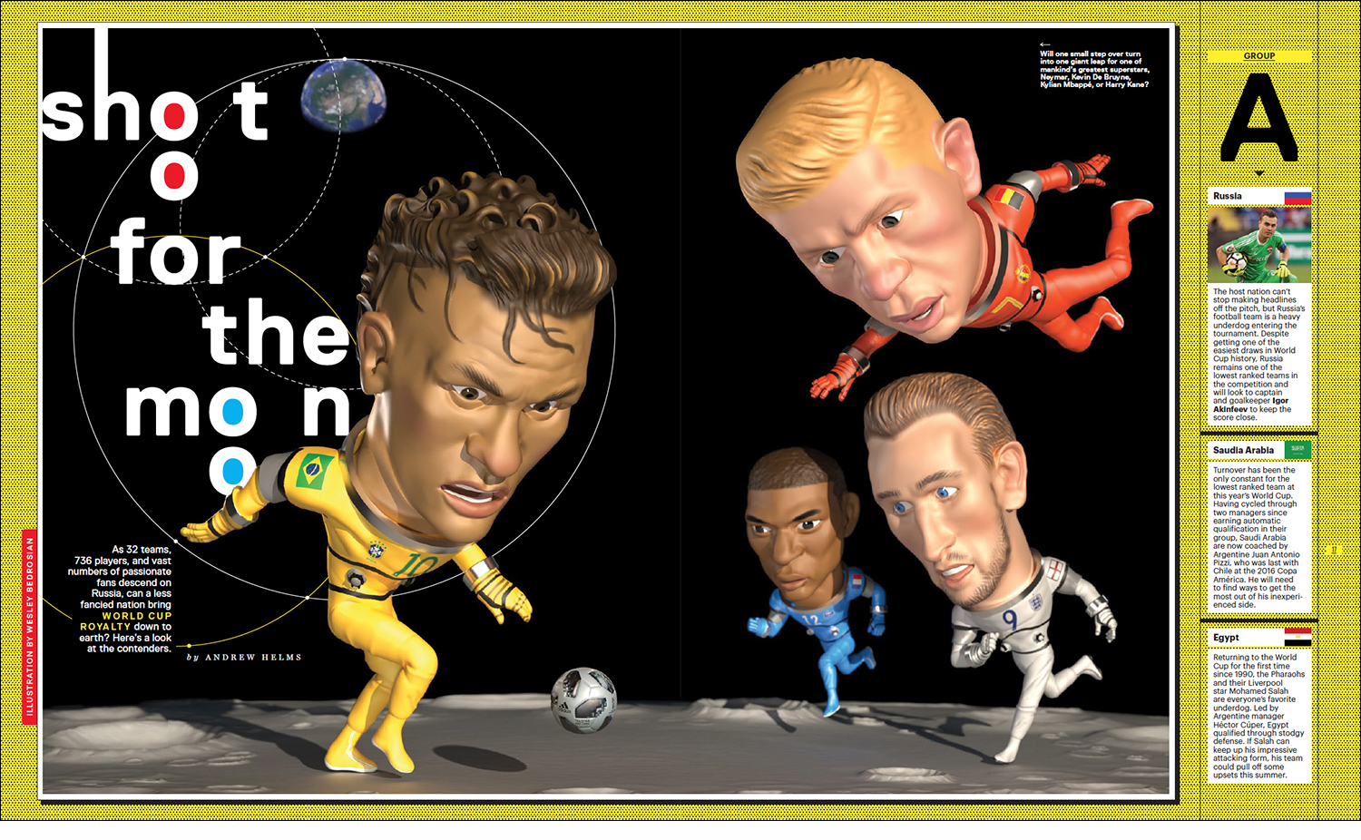
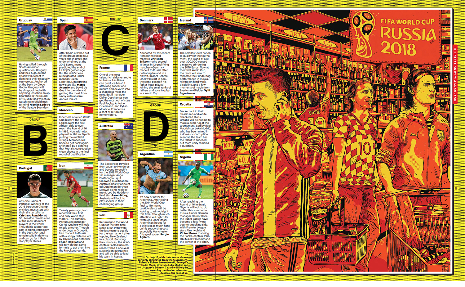
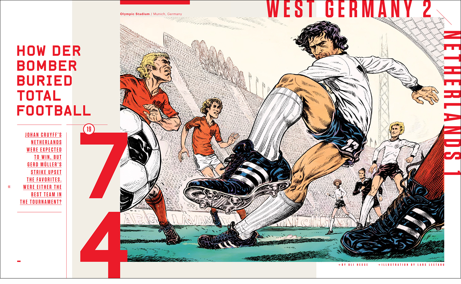
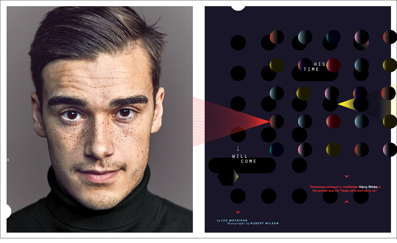
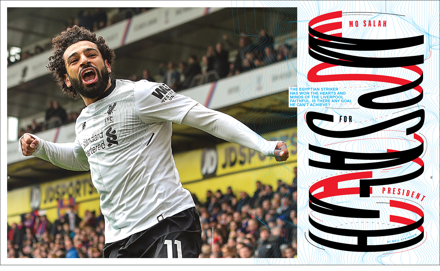
The World Cup, Then and Now, Special Issue is the usual mixture of insider insight coupled with stunning design, illustration and photography. The driving force behind all this is the team of Robert Priest and Grace Lee. Same pages from the issue are shown below.

Subscribe here: https://shop.8by8mag.com/collections/subscribe

Local team
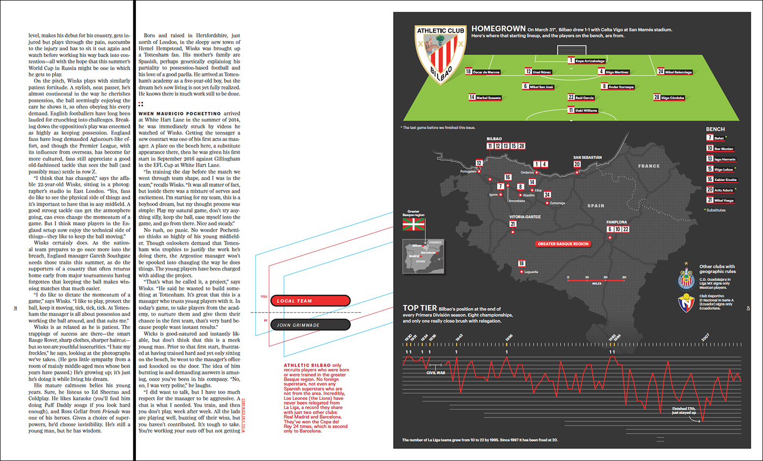
When Fernando Baptista visited Ohio University** he mentioned that his local team, Athletic Bilbao, only signs players from the Greater Basque region. Below is my attempt to show that by looking at the starting lineup for one La Liga game. Click on the graphic for a larger version.

Choose the champions
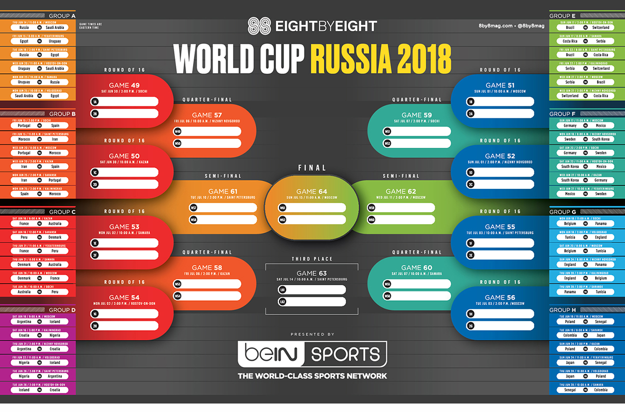
If you want to make your own World Cup predictions, or just track all the results, download Eight by Eight’s bracket: http://bit.ly/2khDJ12

*Full transparency: I’m the infographics director.

**Fernando in Ohio: https://wp.me/p7LiLW-1O0

Sky

LOOKING UPWARDS.

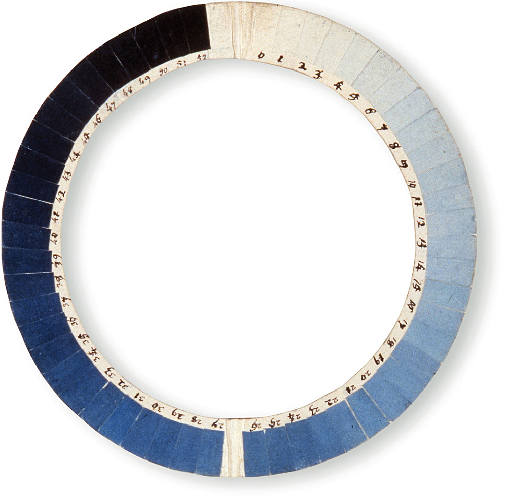
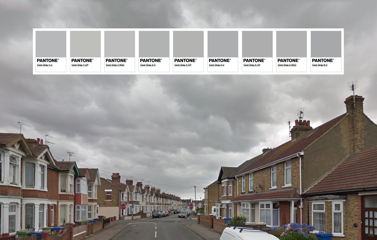
I grew up in the U.K., and there were a lot of gray days. I guess that’s why I didn’t really need a cyanometer (above), which measures the blueness of the sky. It was invented by Horace-Bénédict de Saussure. This one is from 1789, and is in the Bibliothèque de Genève, Switzerland.

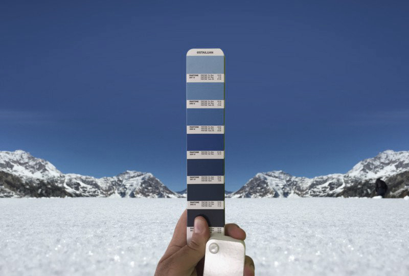
Why not take a Pantone swatch book outside and see which color is currently being used by Mother Nature? Like Andrea Antoni is doing here. He matches Pantone colors to all kinds of scenes. On Instagram: https://www.instagram.com/stailuan/

Inspired by this, I tried to do a similar thing with the sky over the street where I was born. (On the Isle of Sheppey.)


Image from Google Street View.

Clouds
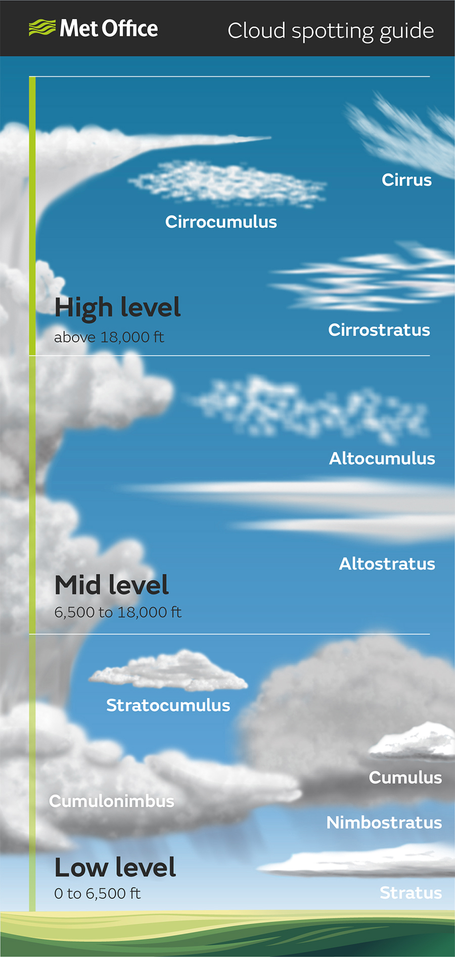
Here’s a handy cloud identification guide. I’ve been using it to sound like a meteorologist: “Oh, look everyone, there’s some altocumulus and cirrostratus around this morning.”

I like looking for shapes in clouds. An unusual hobby, but so is bus-spotting (collecting the registration numbers of public buses), and I used to do that too. Anyway, the United States might come floating past my window…

… or perhaps a roast chicken.

You never know.

Emoji design

EVERYDAY PICTOGRAMS ELEVATED.

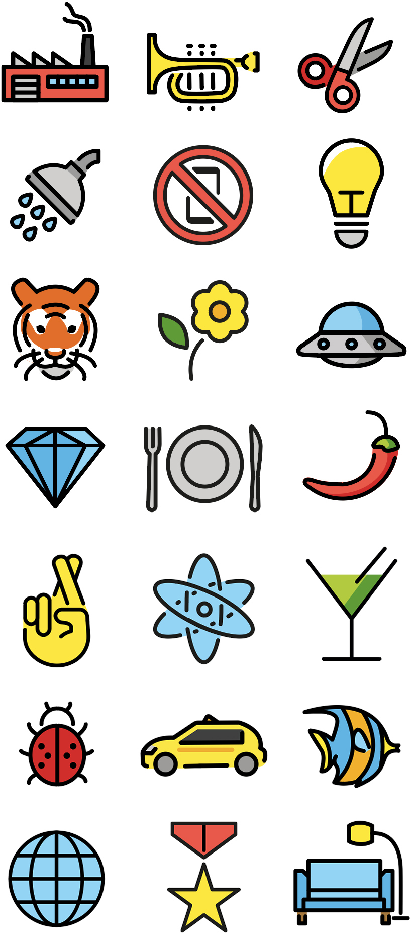
OpenMoji was started by Interaction and Communication Design students at the The University of Design Schwäbisch Gmünd in Germany. It’s an open-source emoji library created from a designer’s point of view. A welcome move towards a more unified set of icons.

Here’s a sample of the emojis. Everything on the site is available for download in SVG and PNG formats. http://openmoji.org/index.html

Whether we like using them or not, the fact remains that emojis are the most popular item (in terms of sheer quantity) in the visual communication universe.

A previous post, “Emojis and beyond” by Nigel Holmes: https://wp.me/p7LiLW-OG

And one from World Emoji Day: https://wp.me/p7LiLW-1so

X-ray

THE UNDERLYING STRUCTURE REVEALED.

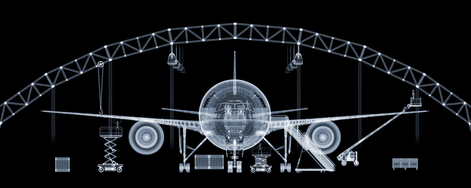
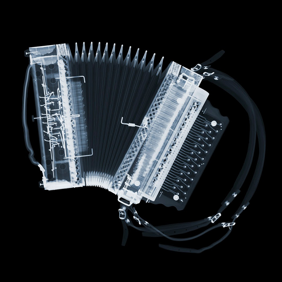
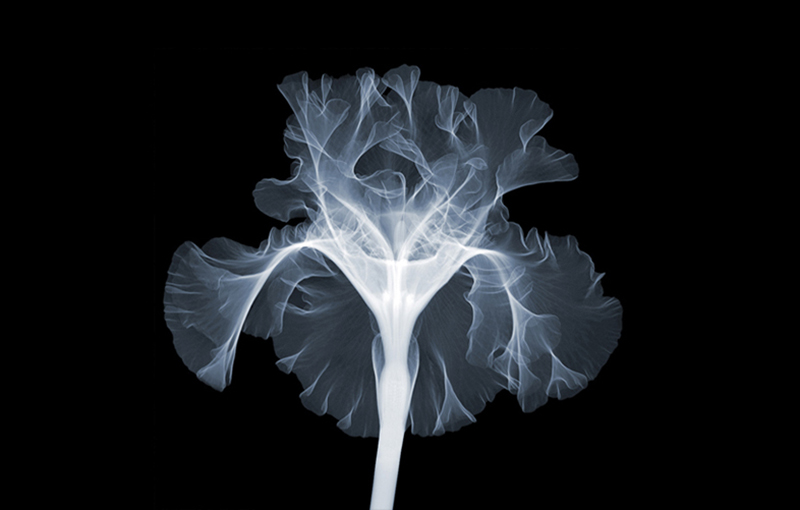
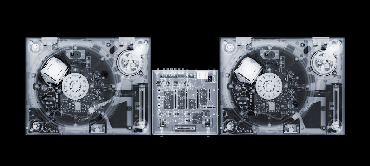
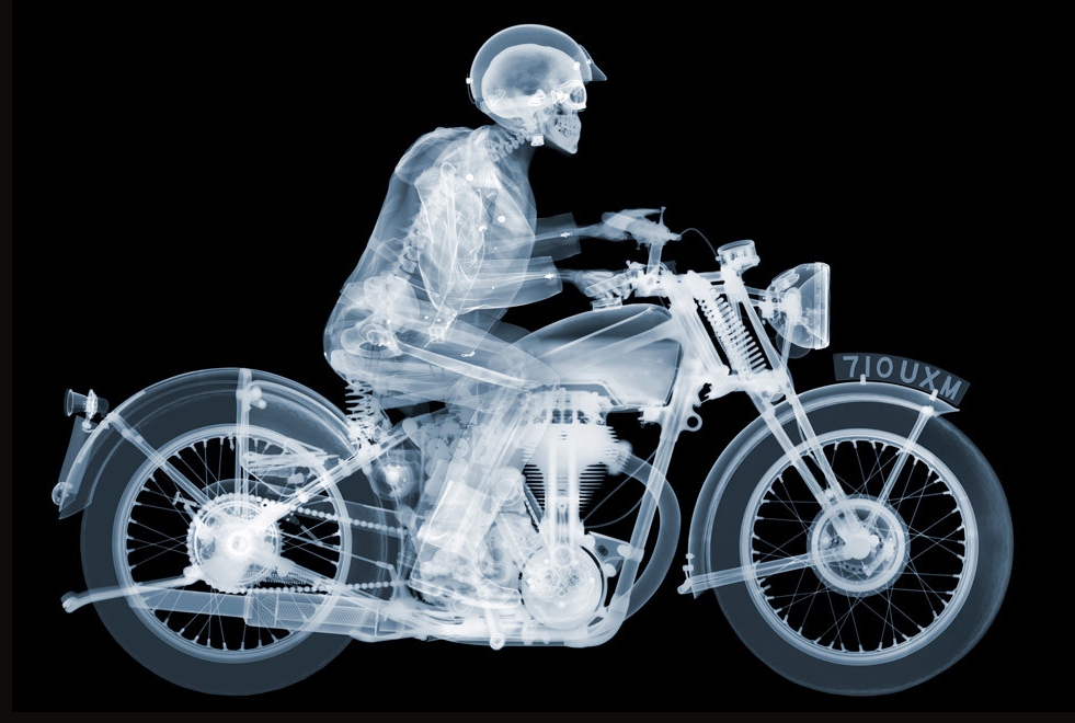
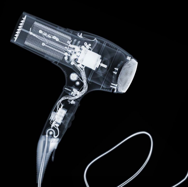
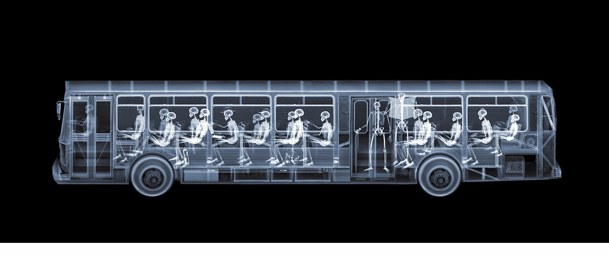
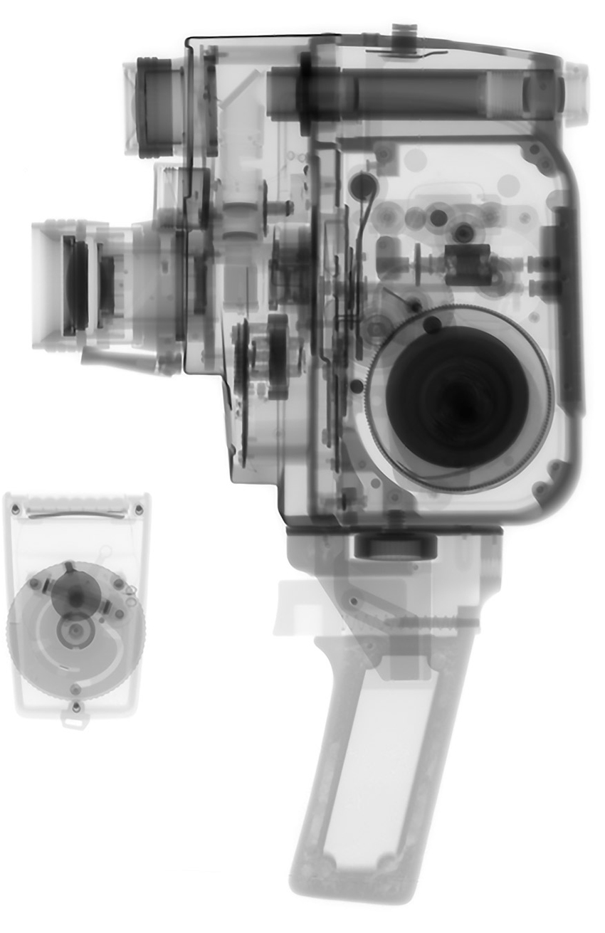
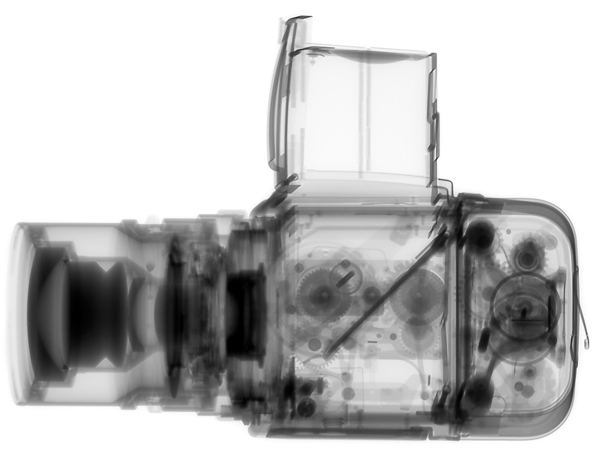
Nick Veasey makes X-rays of various objects in his custom-built studio, which has thick concrete walls and a heavy lead and steel door. Because of the limits of the size of X-ray film, Nick assembles the images of larger objects from separate scans. He also takes the items apart to scan each piece and get a level of internal detail that would otherwise be impossible. For the Boeing 777 shown above, he made approximately 500 scans of individual components. Click on the image for a larger version.
A skeleton that was used for training radiologists, is the source of the human elements. Some Photoshop composition and manipulation is part of the process. http://www.nickveasey.com

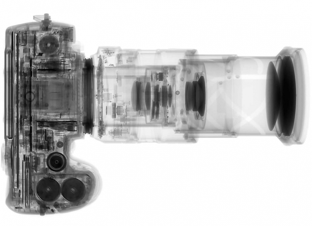
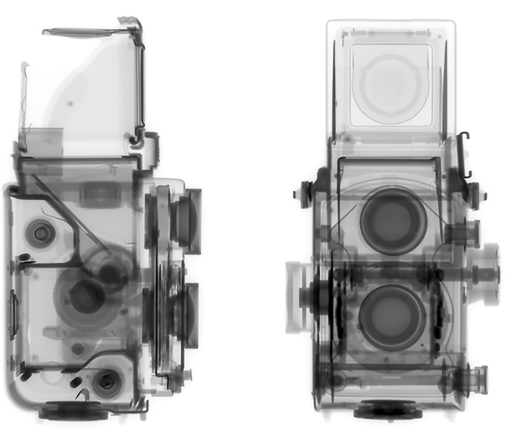
Kent Krugh X-rayed cameras for “Speciation,” a photography project. http://www.kentkrugh.com/portfolios/speciation/

Line art

INFORMATIONAL VECTOR-BASED ILLUSTRATION BY JOSH MCKIBLE.

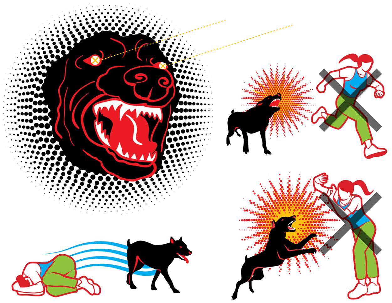
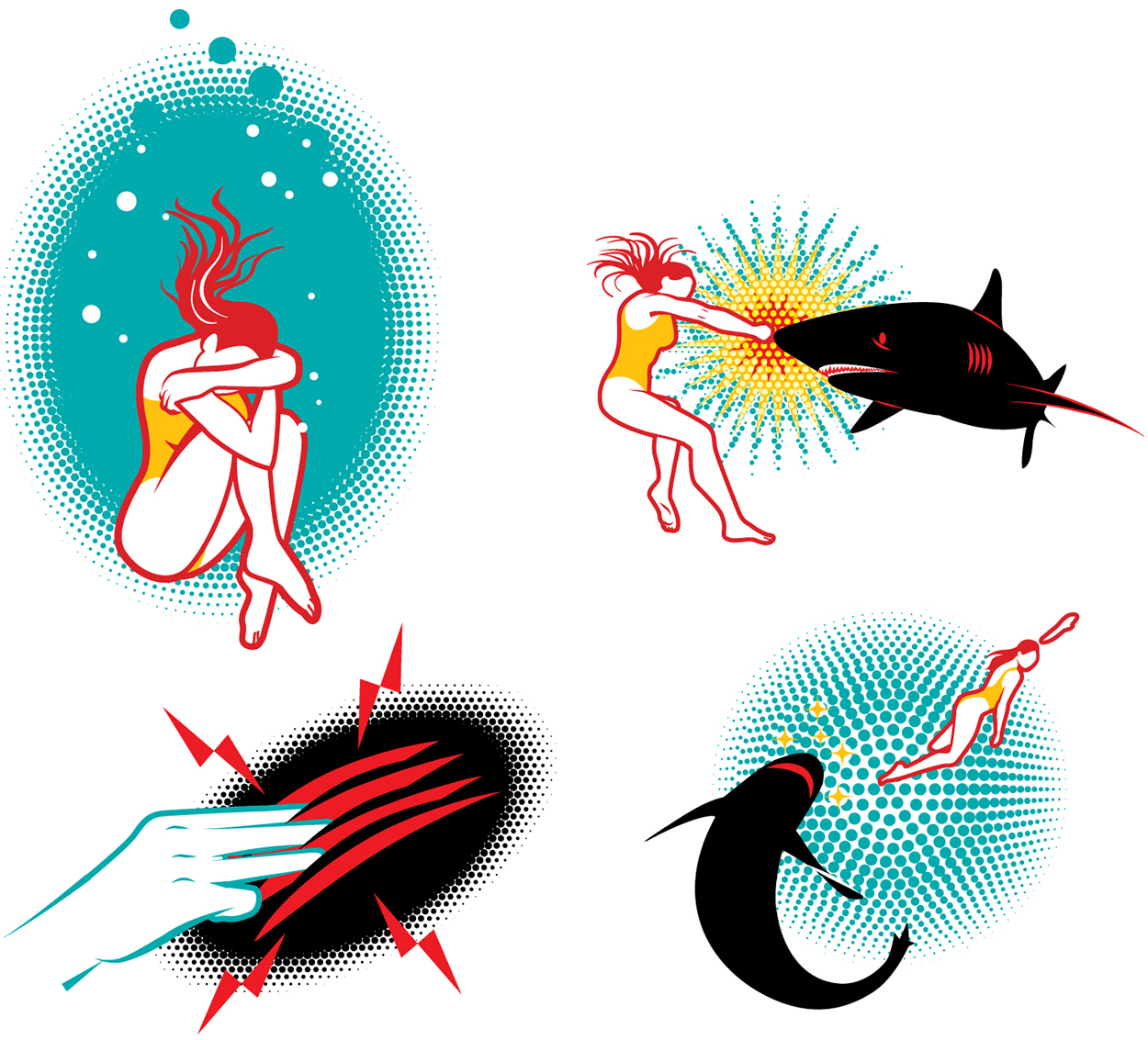
MCKIBILLO is the professional name of Josh McKible. It’s a combination of McKible and illo (illustration). I’ve always admired Josh’s stylish, and carefully considered line art style. The use of strong color and simple patterns. It’s the graphic language of information. A modern version of the illustration used in the workshop manuals, and all kinds of how-to instructions, that I grew up with in the last century.

Above, the nuclear cycle, from mining uranium to spent fuel. Below, dealing with an aggressive dog…

…and surviving a shark attack.

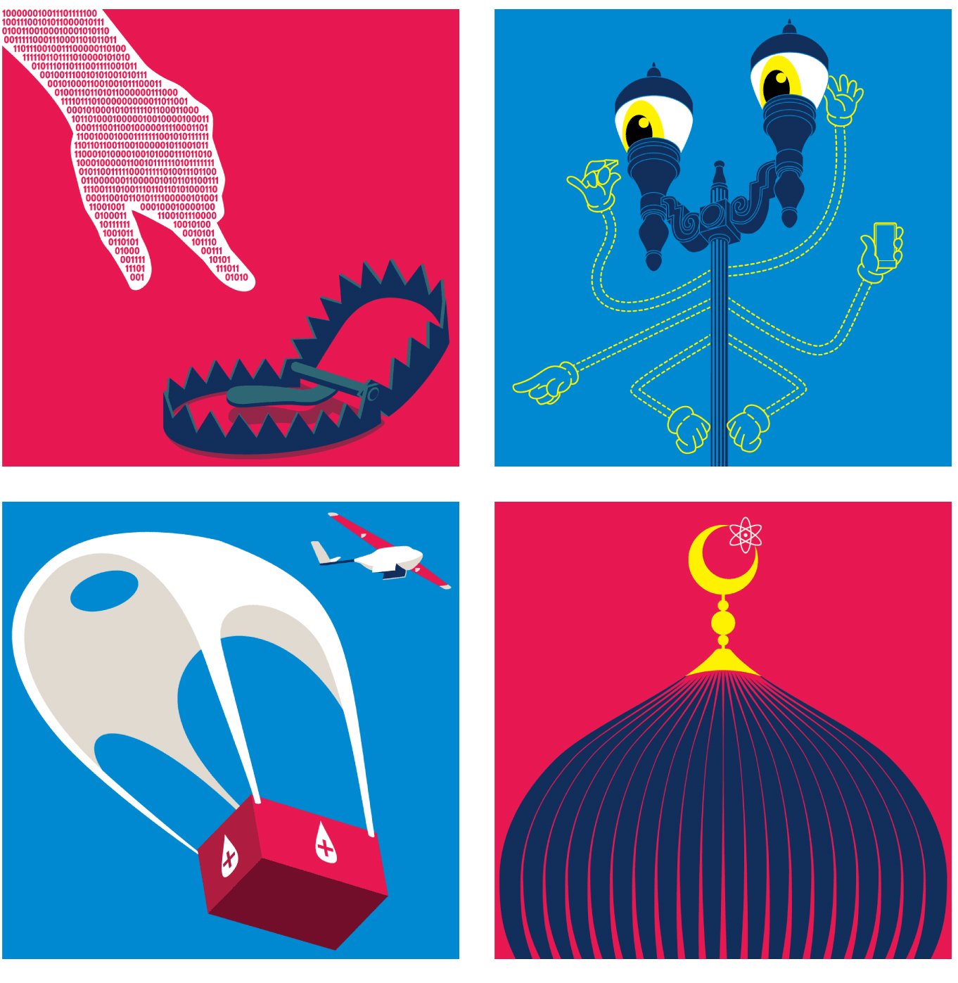
Illustrations for an article on emerging technologies.

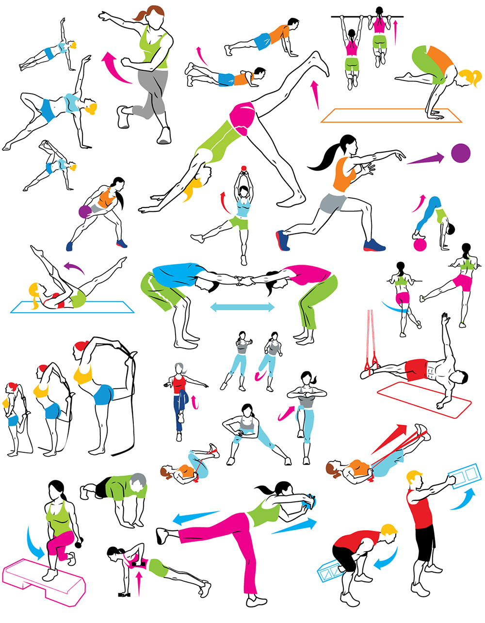
Josh has made workout graphics for several publications.

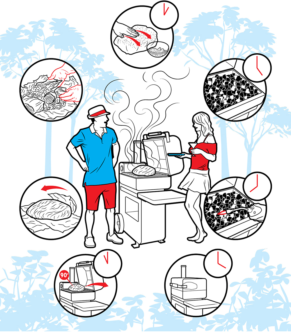
How to make pulled pork on a barbecue.

A camper van that has features normally found on a full-sized recreational vehicle.

Future spacesuit.

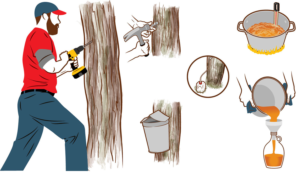
The process of tapping syrup.


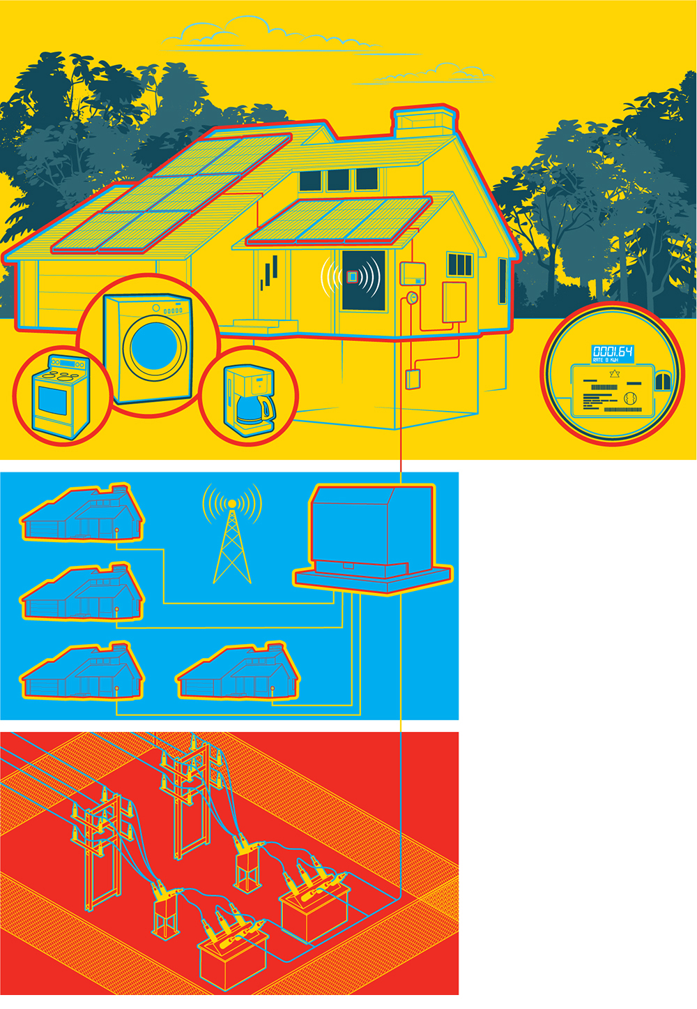
A smart home energy system that connects to the grid.

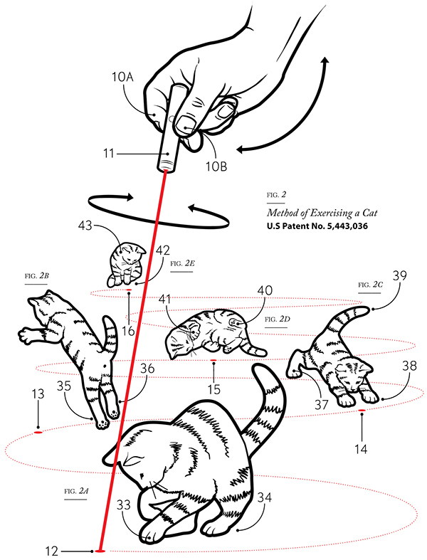
Cat exerciser. (Yes, this is a real approved patent.)

Website: http://mckibillo.com

Behance: https://www.behance.net/mckibillo

Instagram: https://www.instagram.com/mckibillo/

Chess

DESIGNS FOR A CLASSIC GAME.

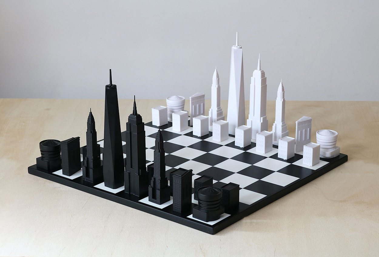
New York City
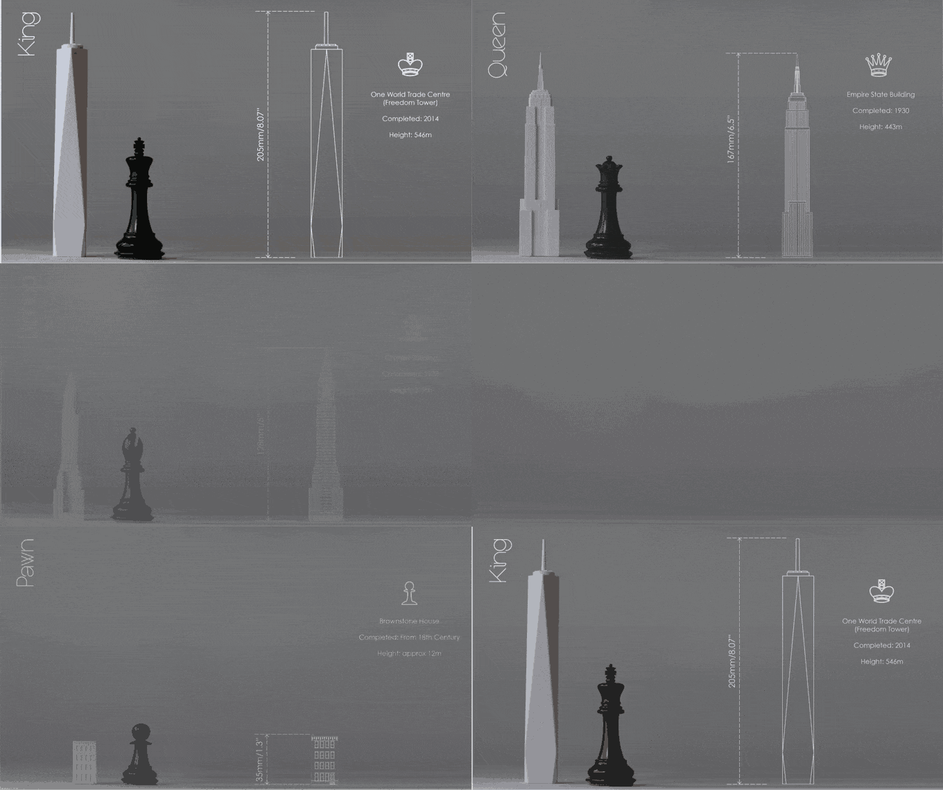
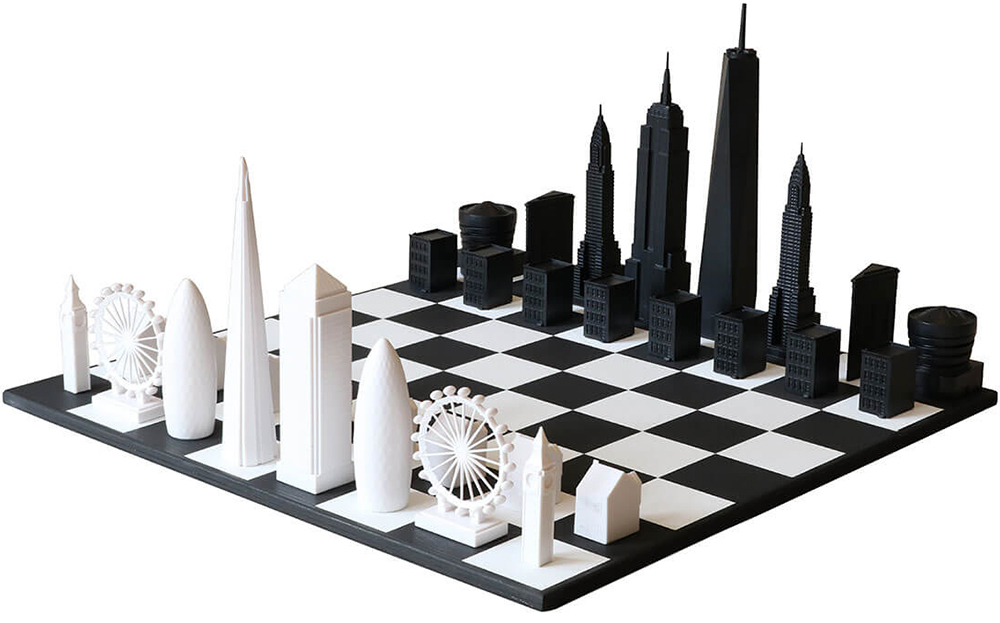
Skyline Chess (architects Ian Flood and Chris Prosser) used a Kickstarter campaign to develop a 3D-printed set of iconic NYC architecture pieces. Available in black, white or metal.

They started with a London version. So now the two cities can be battling each other. https://skyline-chess.co.uk/

Bauhaus
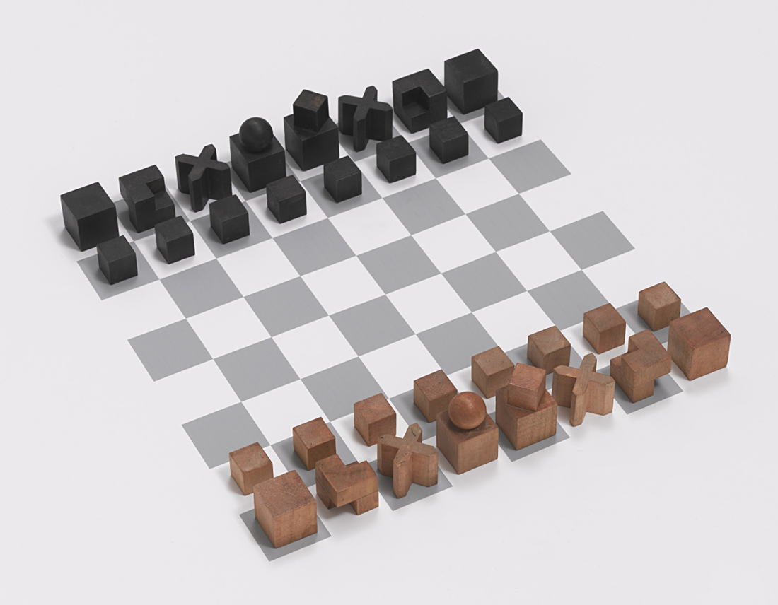
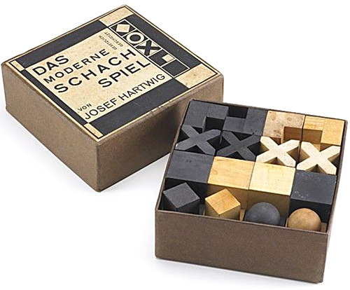
This simple geometric set was designed in 1923–24 by Josef Hartwig. The form of each piece suggests how it can move on the board.

Packaging by Joost Schmidt.

World Chess
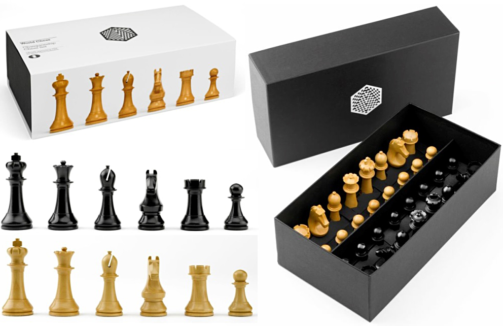
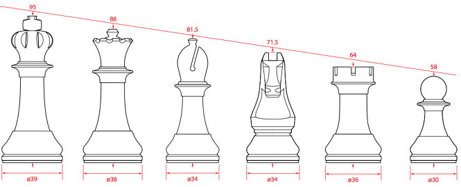
David Weil of Pentagram designed the World Championship Chess Set. The pieces are inspired by the friezes on the Parthenon. The set was first used at a tournament in 2013.

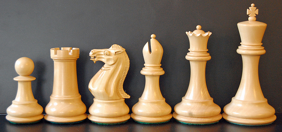
The new set is a development of the Staunton set (below) that has been standard since 1849, and referenced neoclassical elements.


Photograph by Bubba73.

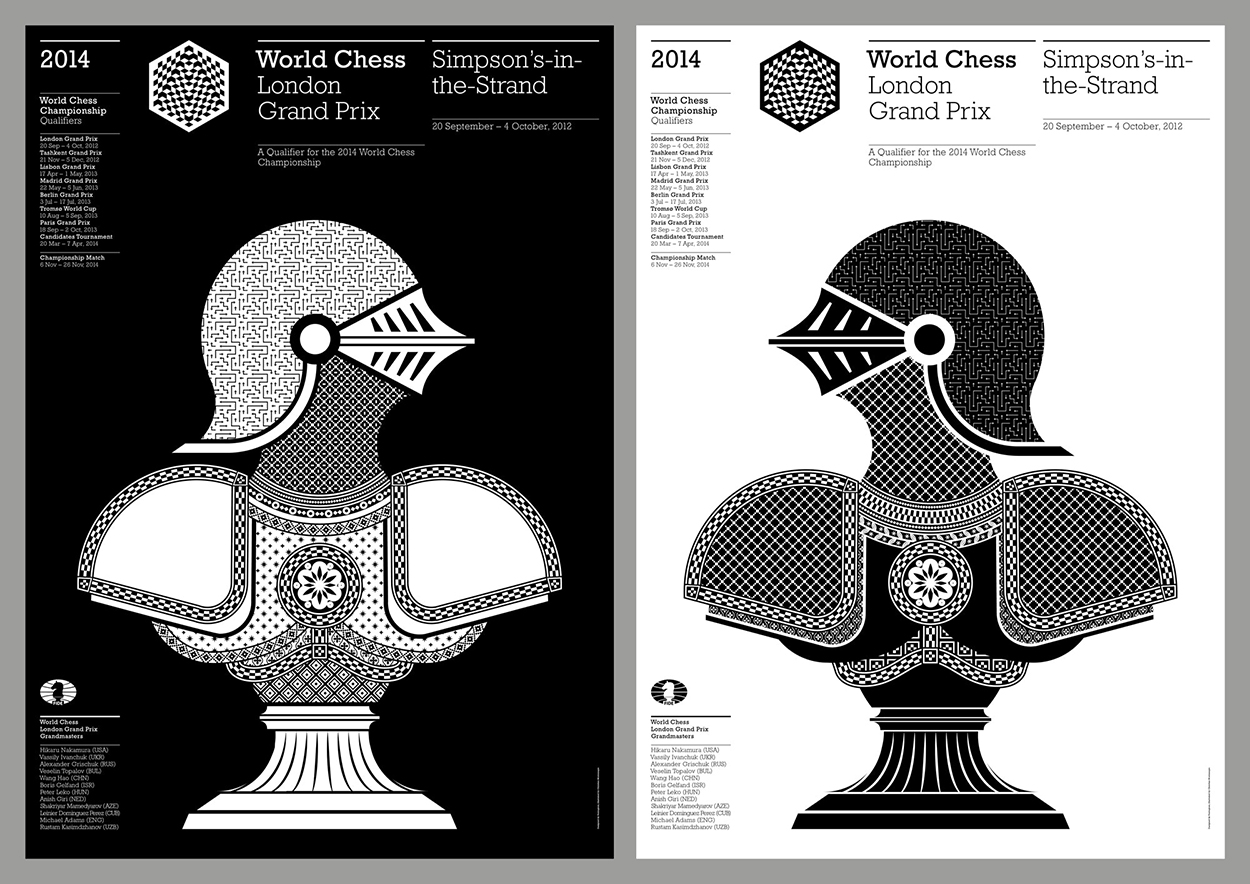
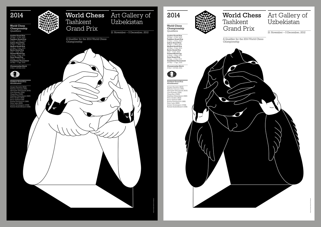
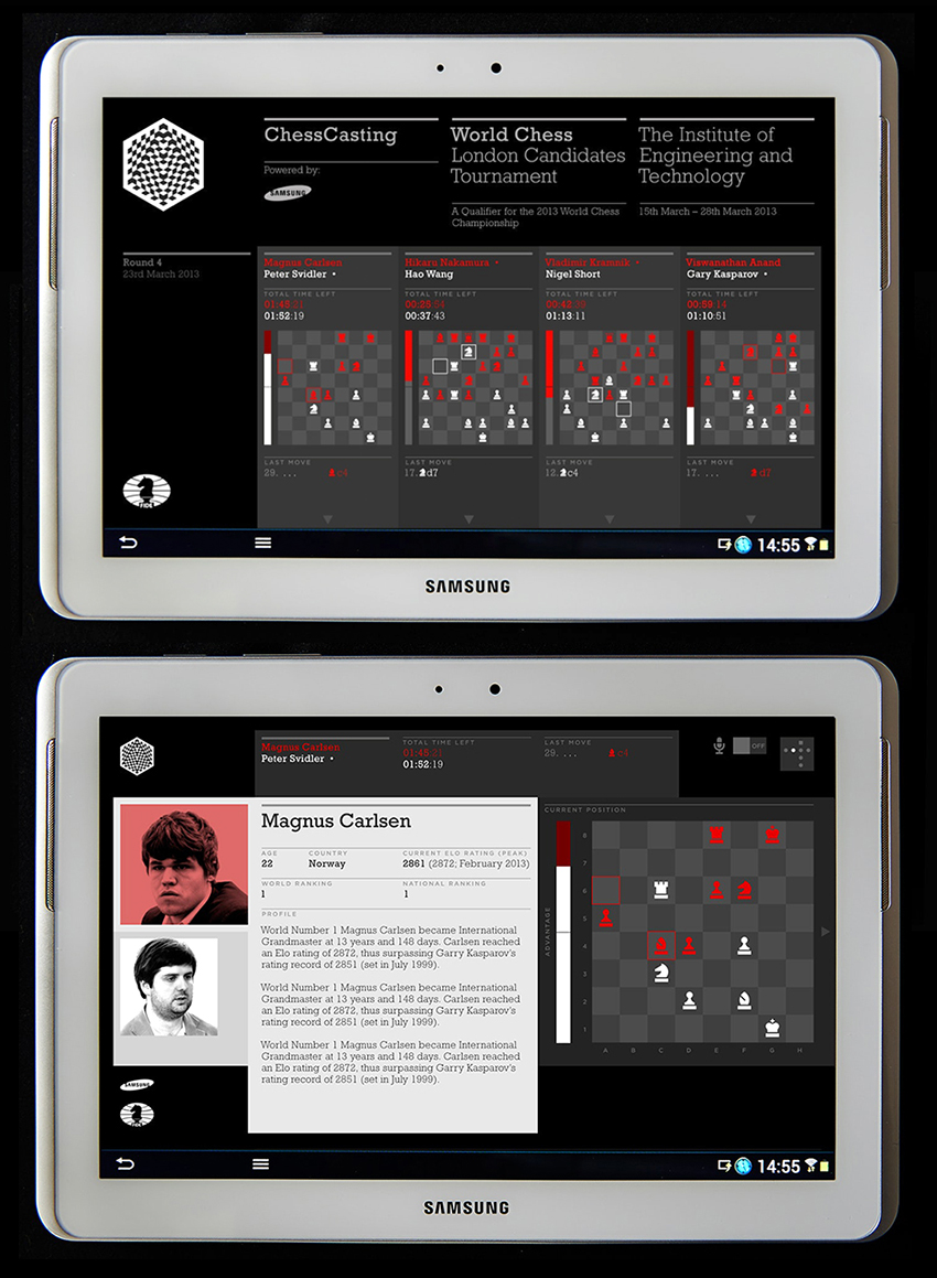
It was part of a full redesign of every aspect of the World Chess Championship, including posters and an app to track the matches.