Fake data viz

INSTANT VISUALIZATIONS.

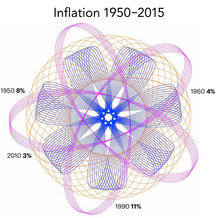
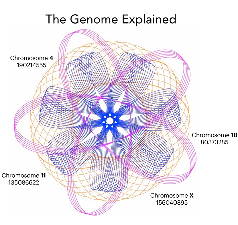
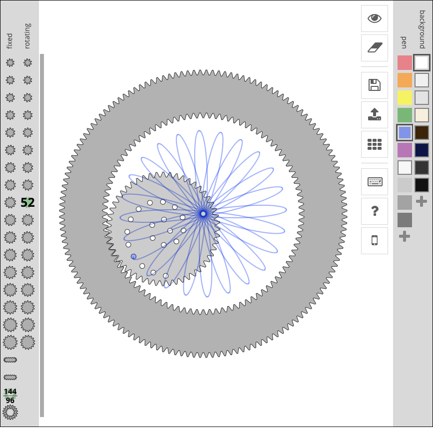
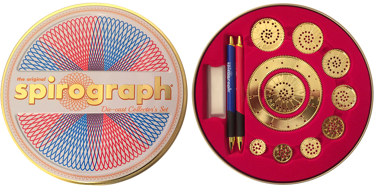
If no one looks too closely, you might get away with this approach. Buy a Spirograph (my set is shown above), select some wheels, and start drawing. Then add a headline and some informational-looking labels. You’ve created an image that looks something like a real data display, and it might even be the equal of some of them, in terms of being informative.

You can always use the same image for something else, and finish work early. With any luck, no one will ever notice.

An online generator: http://nathanfriend.io/inspirograph/

I recently received this diecast anniversary souvenir version as a gift. No need for data viz software. Here I come!


Organized

THE ART OF ARRANGEMENT.

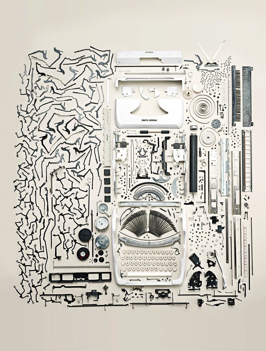
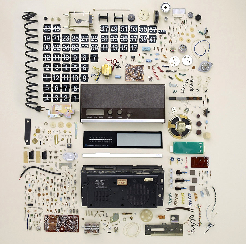
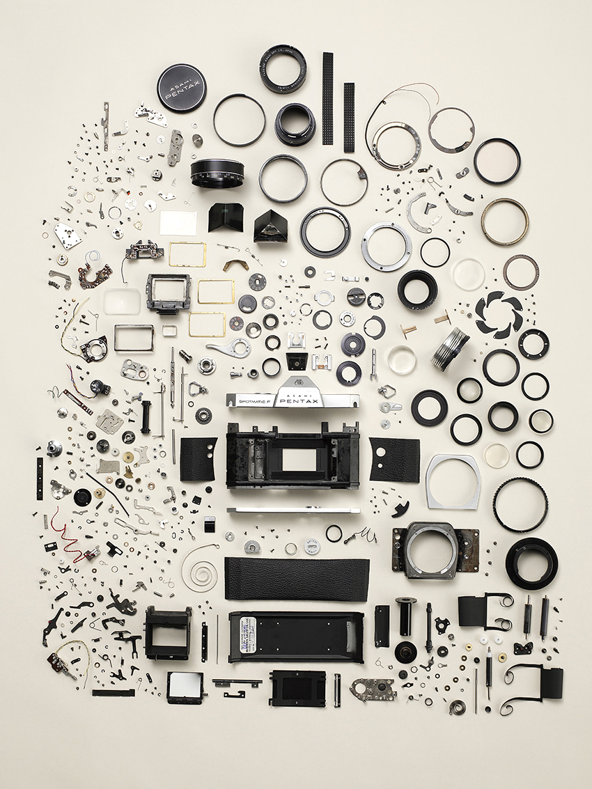
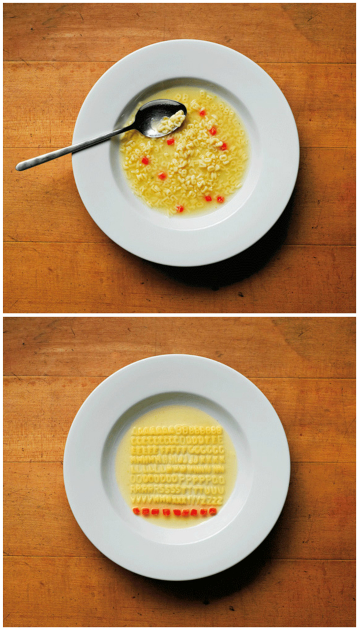
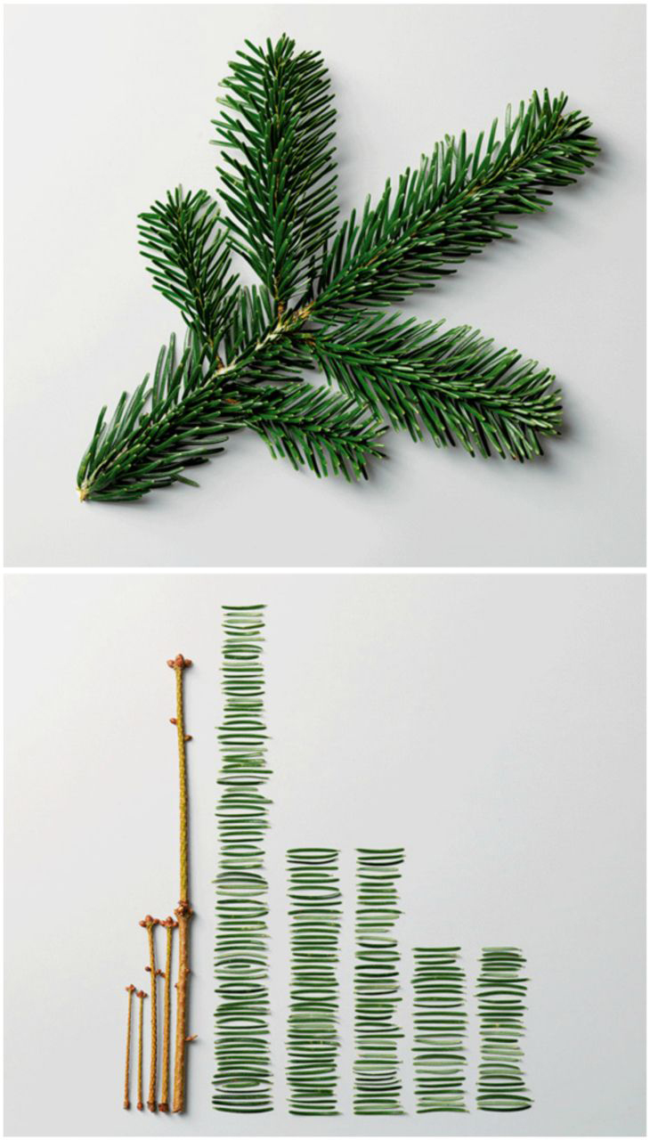
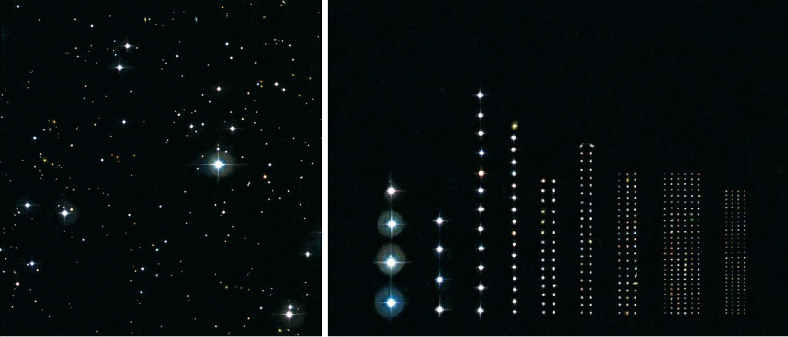
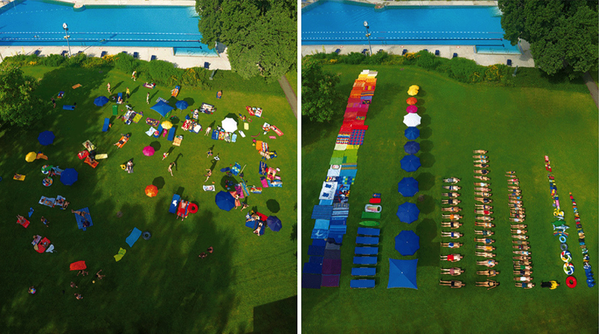
Order applied to chaos is a main principle of information design. Todd McLellan is a master of the craft of careful positioning. His book “Things Come Apart” has many great examples. https://amzn.to/2zQlBnJ

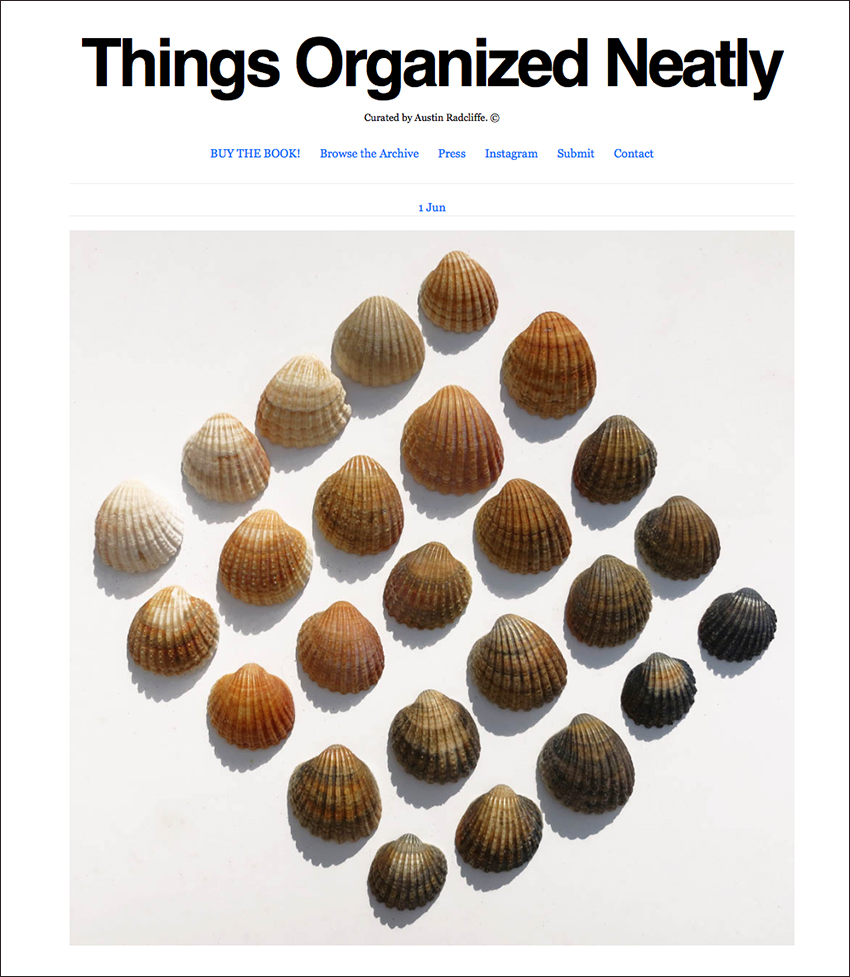
A blog for people who like to see things arranged in an ordered way.
(http://thingsorganizedneatly.tumblr.com)

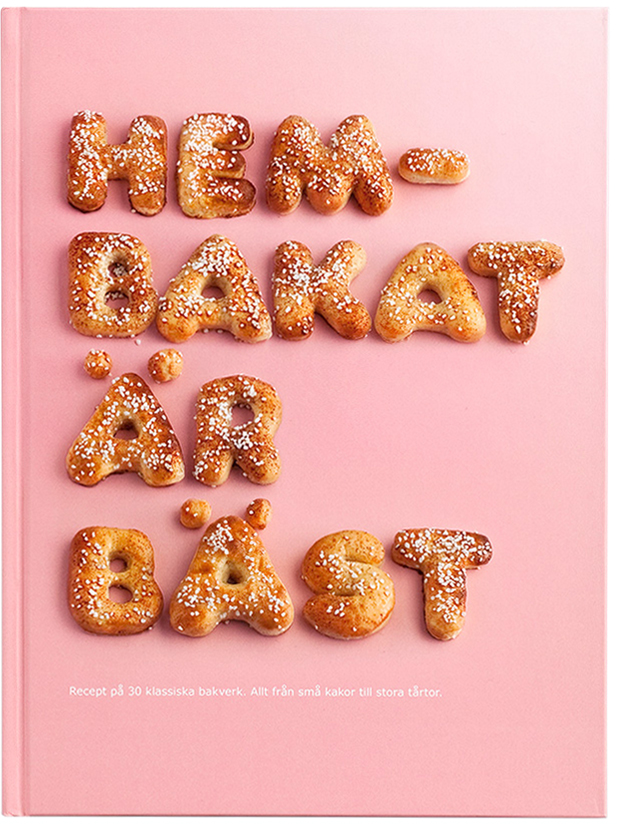
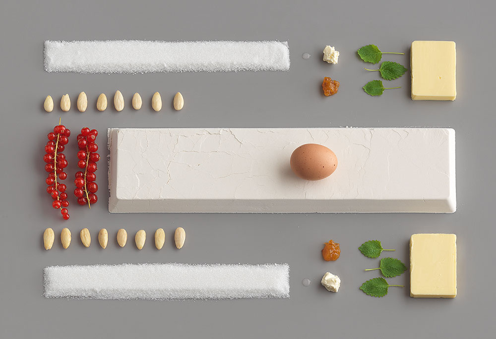
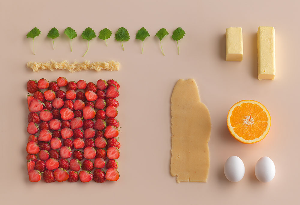
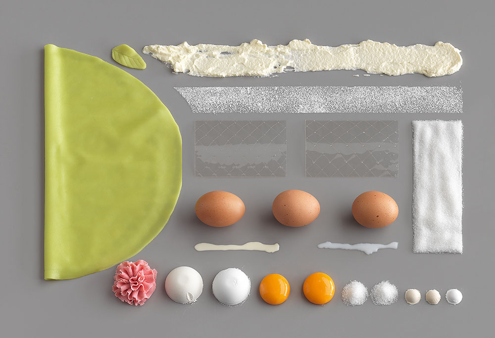
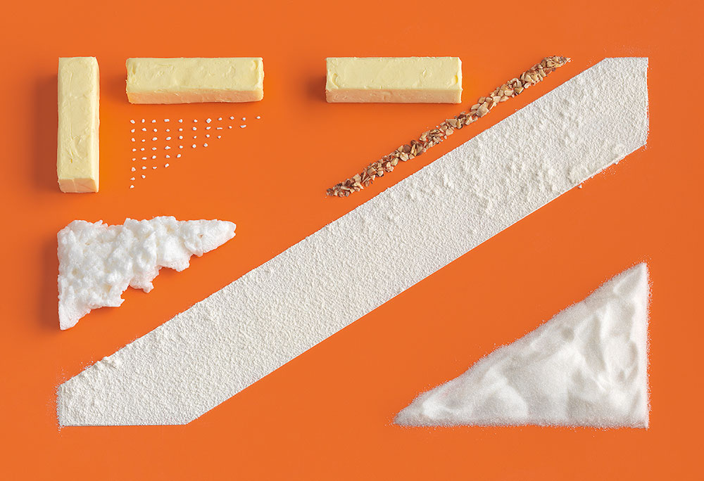
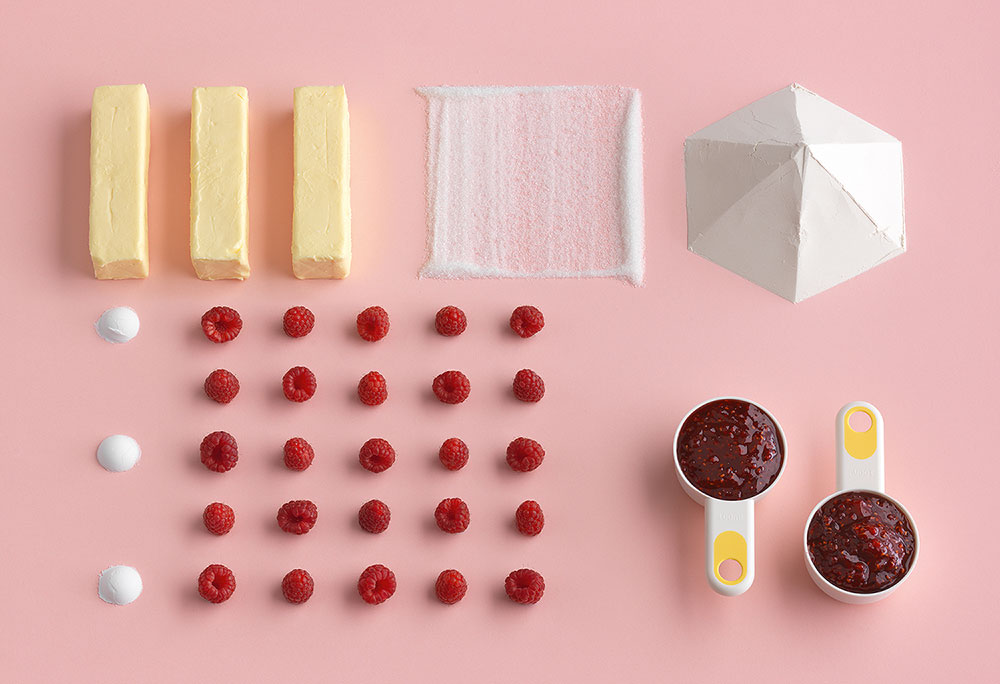
This IKEA cookbook cleverly uses the same principle.
(http://www.ikea.com/us/en/catalog/products/70251599/)

Ursus Wherli is a Swiss genius who wants to tidy up everything.
(https://www.amazon.com/exec/obidos/ASIN/1452114161/braipick-20)

Low-res

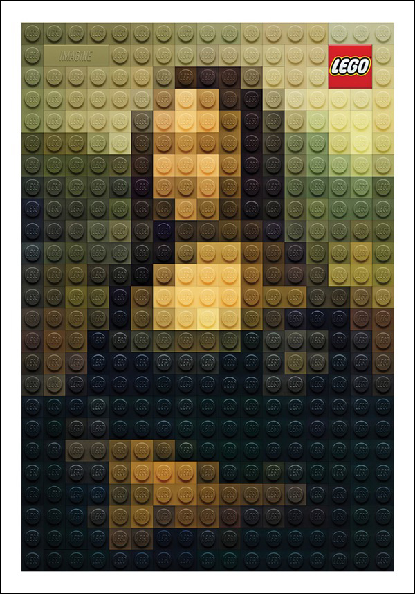
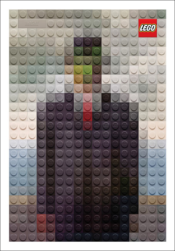
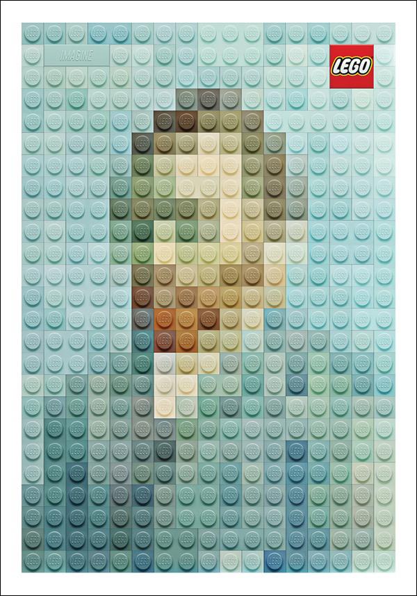
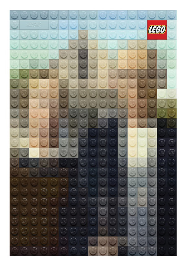
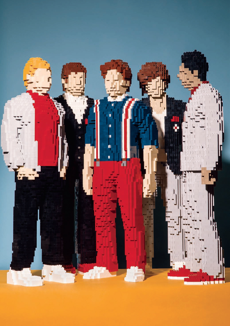
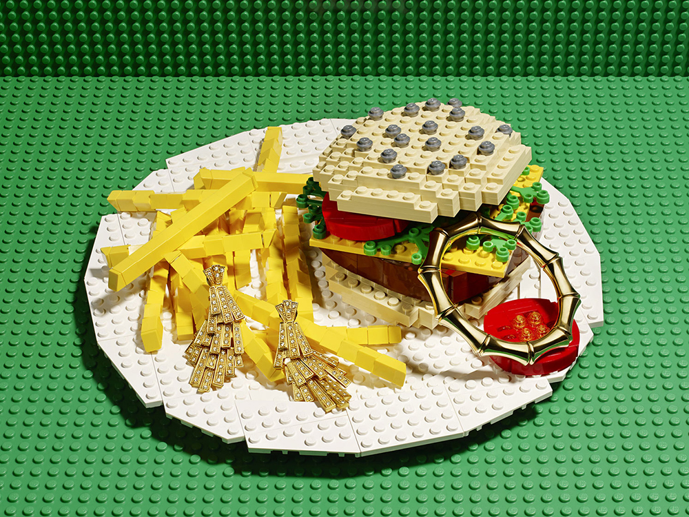
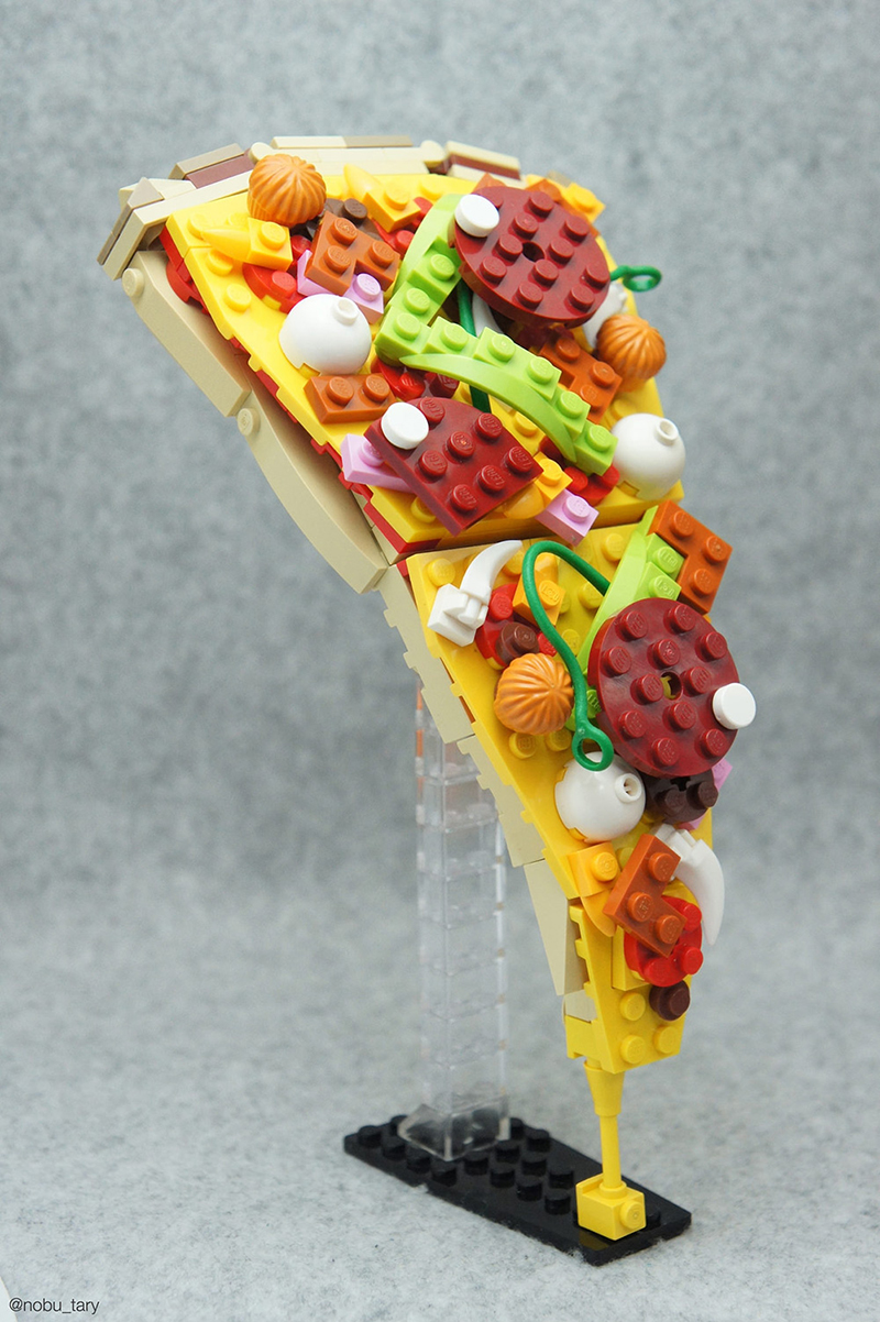
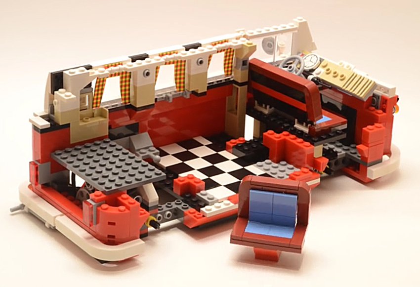
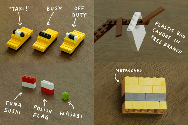
USING LEGO PIECES TO BUILD ILLUSTRATIONS AND INFOGRAPHICS.

Famous paintings reduced to their essence for an advertising campaign by Ogilvy and Mather, Hong Kong. Might be best seen from the other side of the room.

Portrait of One Direction by Nathan Sawaya (from The New Yorker).

Plastic that is good enough to eat, by Fabrice Fouillet.

Pizza by Tary.

Time-lapse of building a Lego van: https://www.youtube.com/watch?v=5Xn4VMCEB3A
O
r click on the image.

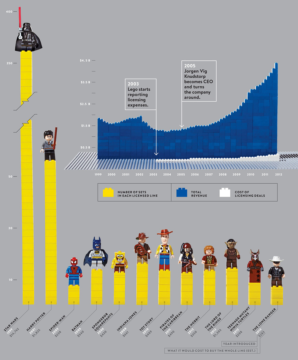
Most popular Lego characters, from Wired magazine.

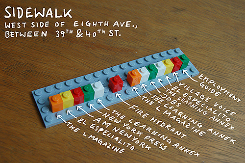
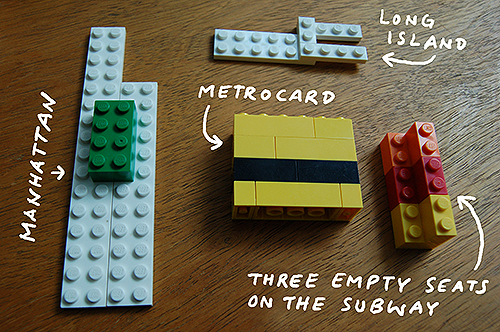
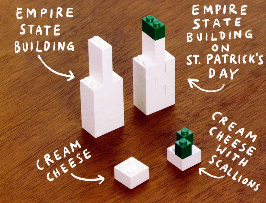
And finally, the great Christoph Niemann, from his book, “I Lego N.Y”.
https://www.amazon.com/I-Lego-N-Y-Christoph-Niemann/dp/0810984903


Moving borders

CLIMATE CHANGE ALTERS THE EDGE OF ITALY.

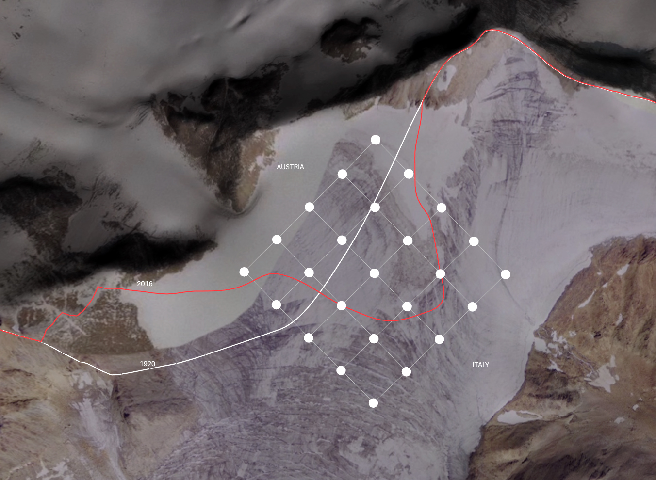
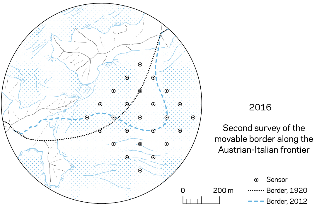
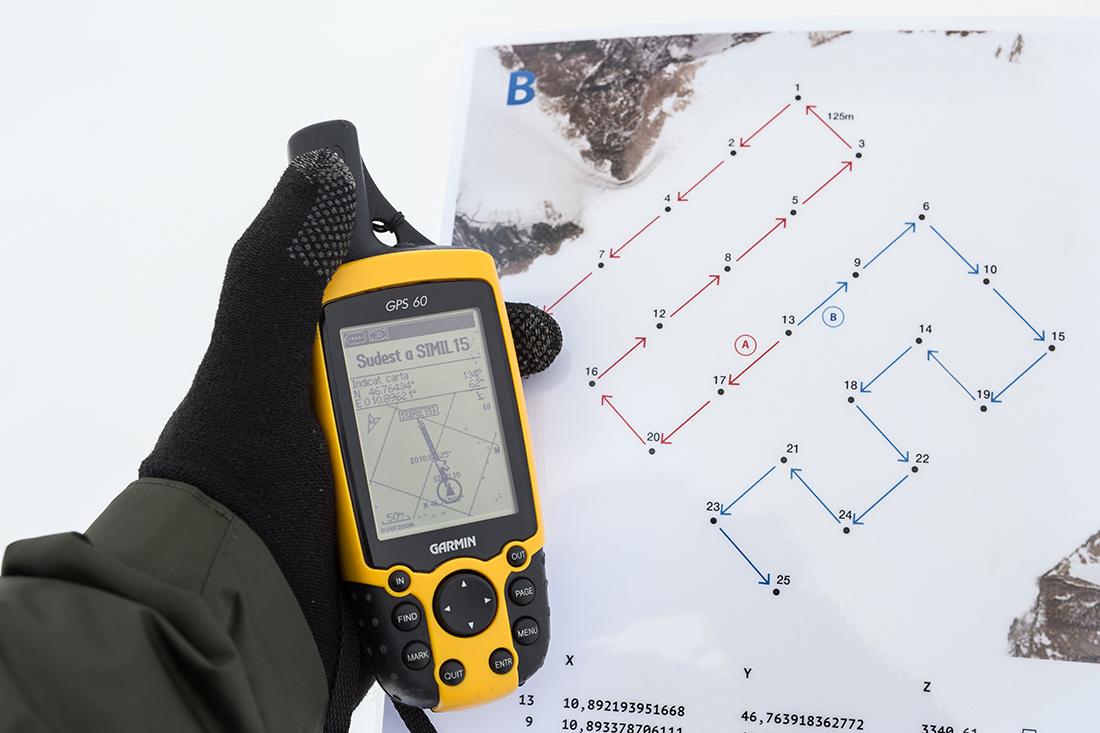
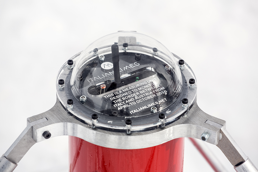
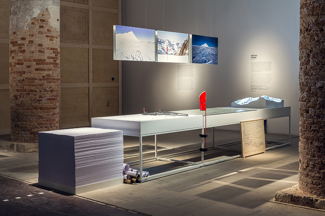
The border between Italy and it’s neighbors in the Alps is not fixed. It depends upon the position of glaciers, and they’re shrinking. Our dependence on fixed printed maps, like those in atlases, is challenged by this data visualization. Using ultra-precise GPS sensors, the border can be seen moving in real time.

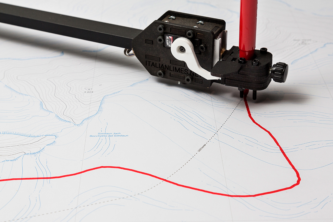
The “Italian Limes” project was originally designed for an installation at the 2014 Architecture Biennale in Venice, by Studio Folder. The focus is the Grafferner Glacier that borders Austria.

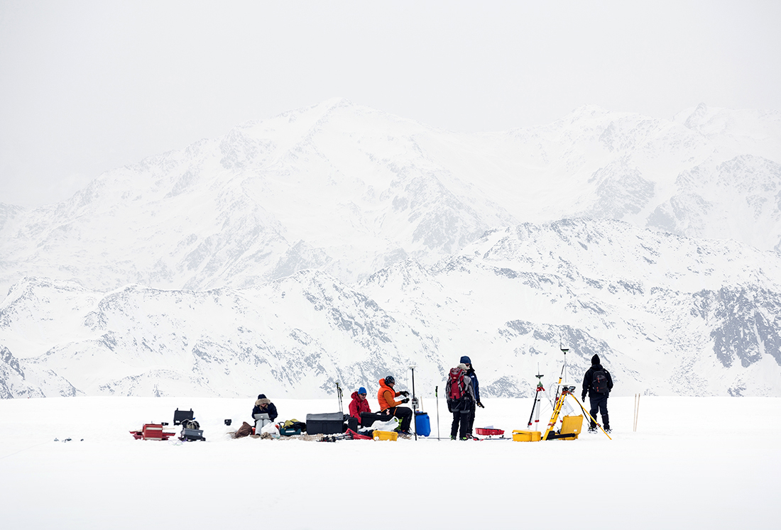
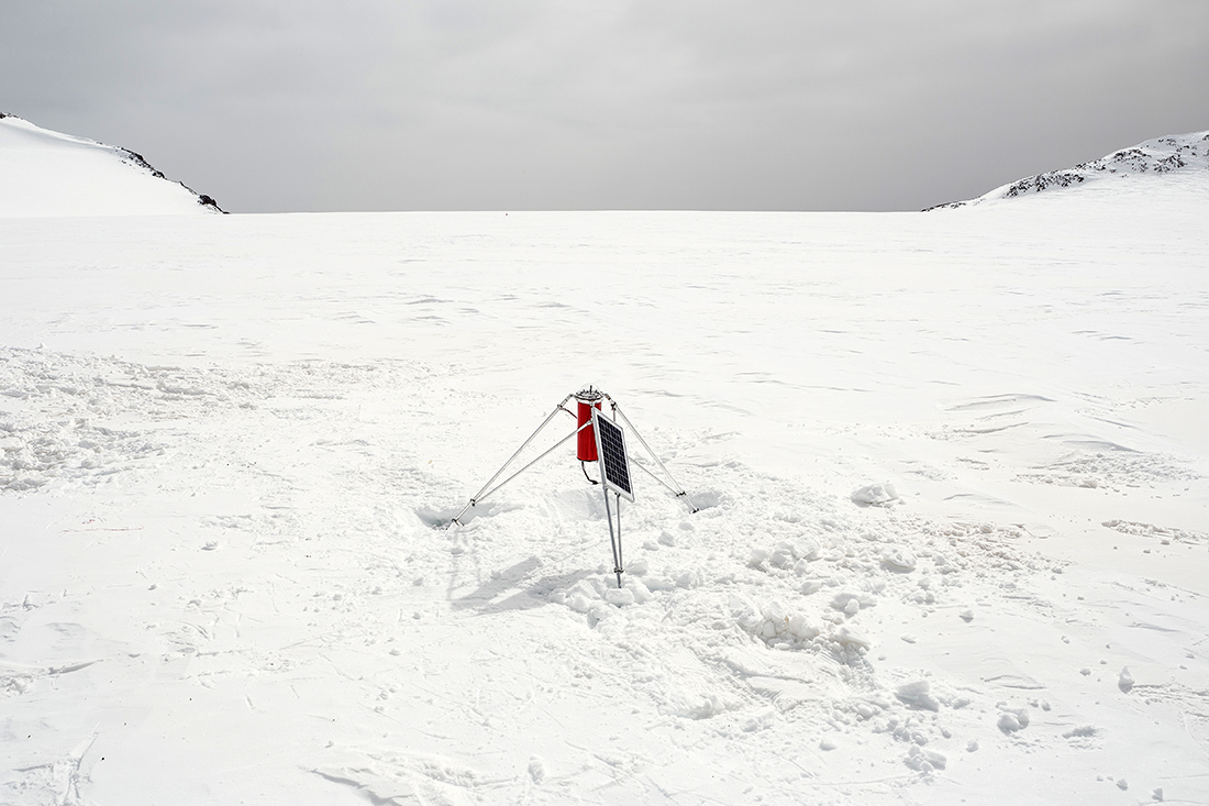
Installing new solar-powered sensors in April 2016 at the base of Mt. Similaun, which is 3,300 meters (10,800 feet) above sea level.

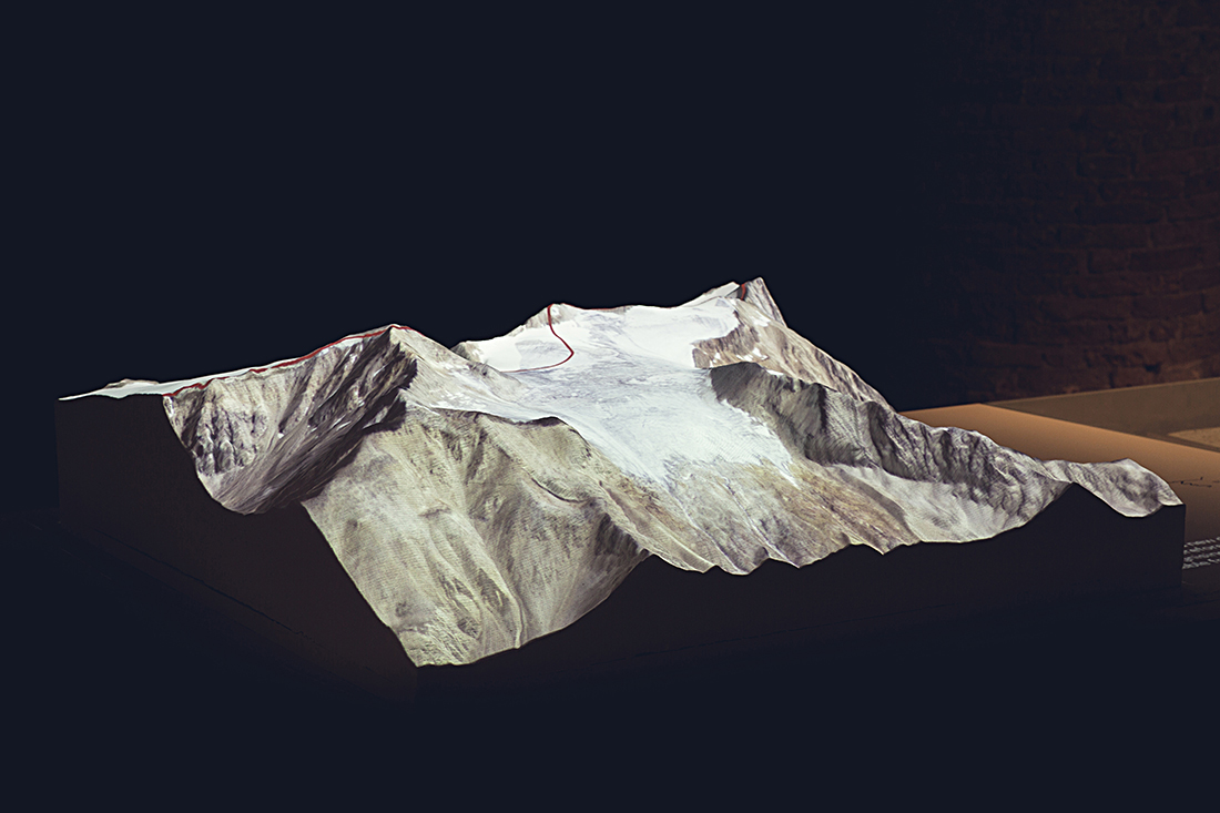
At the installation, changes in the boundary are projected onto a 3D model.

An automated pantograph, controlled by an Arduino board and programmed with Processing, translates the coordinates received from the sensors on the glacier into a real-time representation of the shifts in the border. It produces a real-time map that visitors can take away.

http://www.italianlimes.net

Italian Limes is an ongoing project by Folder (Marco Ferrari, Elisa Pasqual), Delfino Sisto Legnani, Pietro Leoni, Alessandro Mason, Angelo Semeraro, Livia Shamir. All photos are by Delfino Sisto Legnani.

The dataviz album cover

AN ASTRONOMICAL GRAPHIC BECAME A CLASSIC DESIGN.

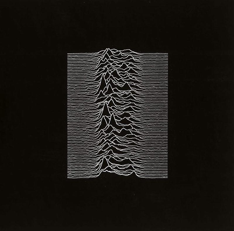
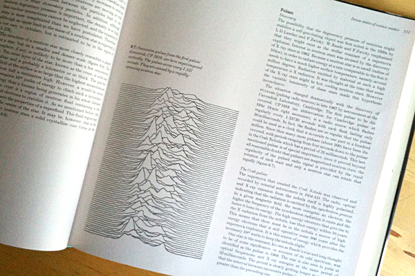
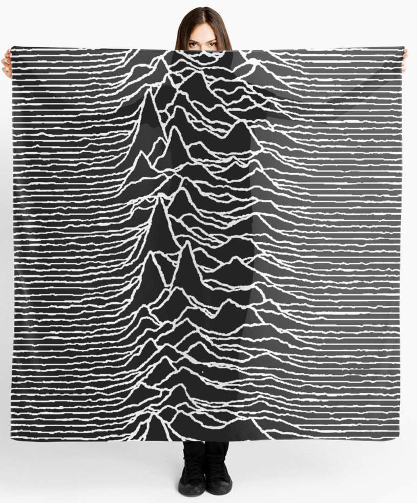
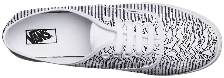
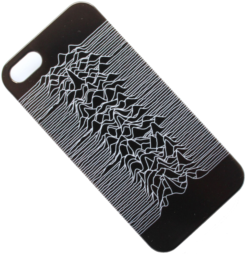
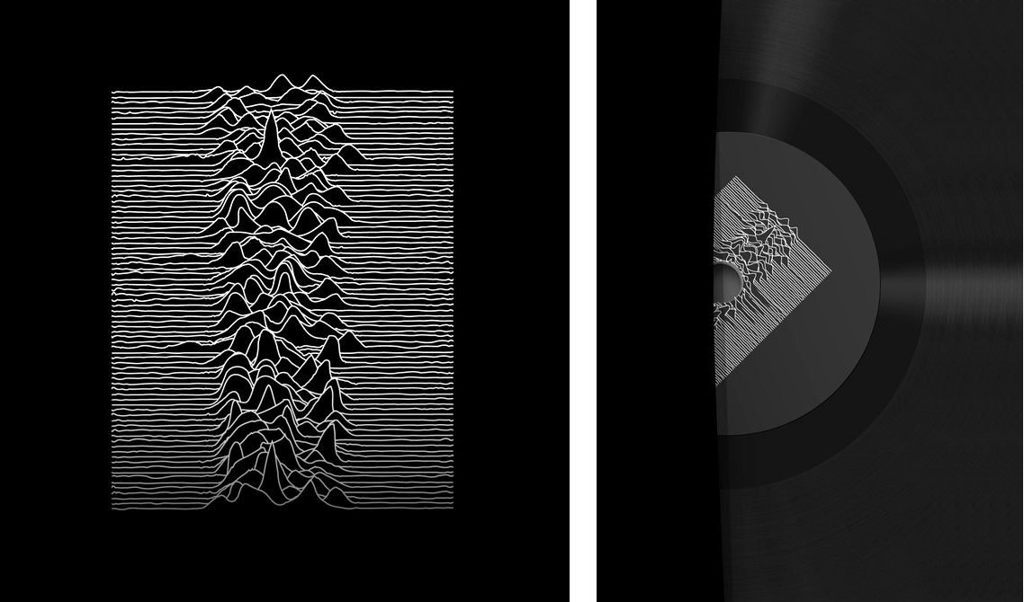
The iconic art for Joy Division’s Unknown Pleasures (1979) was designed by Peter Saville. The source was a stacked plot in the Cambridge Encyclopedia of Astronomy (1977) that shows pulses from the first pulsar to be discovered, CP 1919.

The image remains very popular today. I wonder if many people know where it comes from?

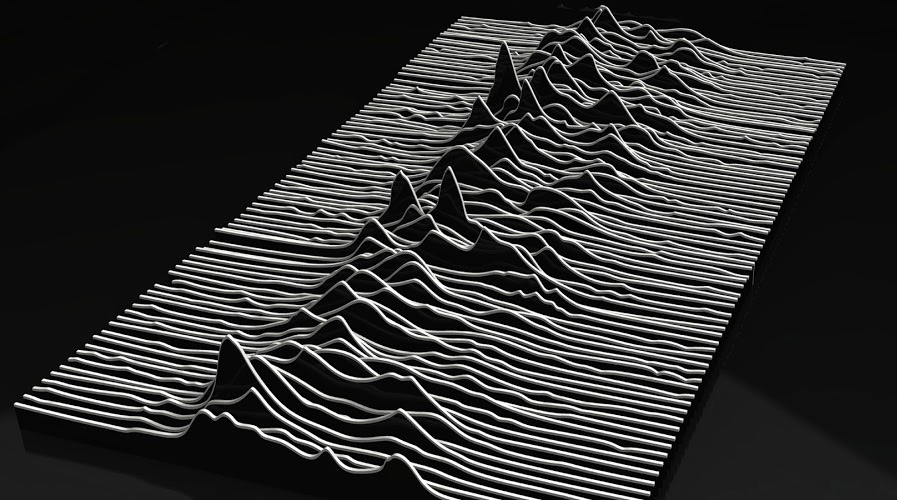
3D version by Marvin Bratke.

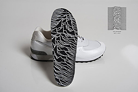
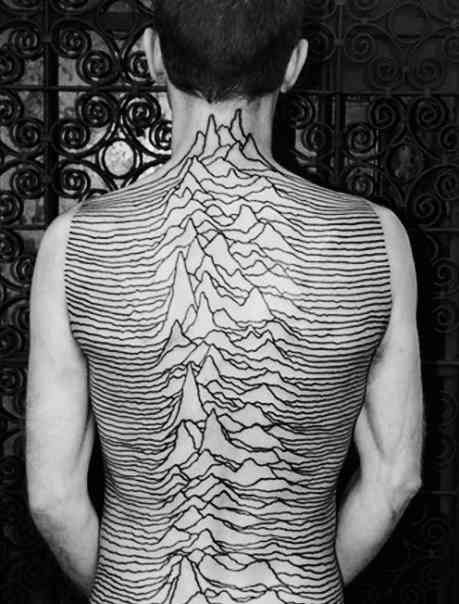
The Unknown Pleasures image has been the source for many tattoos. Below is an extreme example.

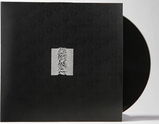
The vinyl version is a packaging gem.

Details below.


Jen Christiansen’s excellent blog has two posts about the scientific background:

https://blogs.scientificamerican.com/sa-visual/pop-culture-pulsar-origin-story-of-joy-division-s-unknown-pleasures-album-cover-video/
https://blogs.scientificamerican.com/sa-visual/pop-culture-pulsar-the-science-behind-joy-division-s-unknown-pleasures-album-cover/

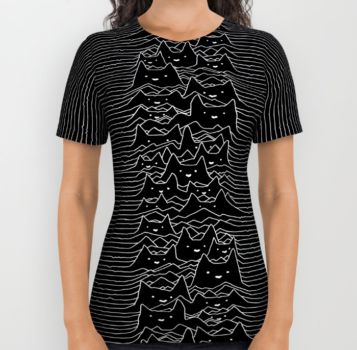
Jen told me that when she wears her cat lovers’ shirt (designed by Tobe Fonseca), a lot of people ask about it.

https://society6.com/product/furr-division-cats_all-over-print-shirt?#s6-2093436p44a57v420

Tools of the trade (2)

MORE EQUIPMENT FROM THE DARK AGES.

My first tools post is the most popular of the 65 posts that I’ve made so far. So following the Hollywood tradition, there has to be a sequel. Here are some more of the common things that we used to have in the graphics studio. Thank you to everyone who gave me an idea for this. Of course, there are many more tools that I haven’t covered, so I will do yet another post about them in the future.

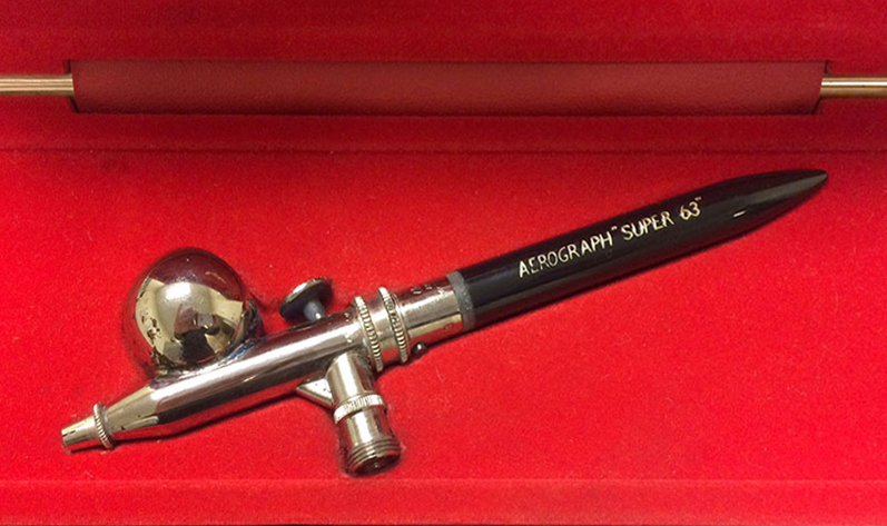
Airbrush
This is the model that I used. The DeVilbiss Aerograph Super 63. I had many exciting moments spraying paint and ink.

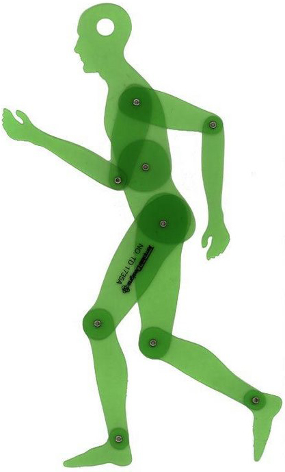
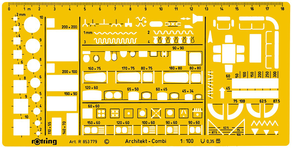
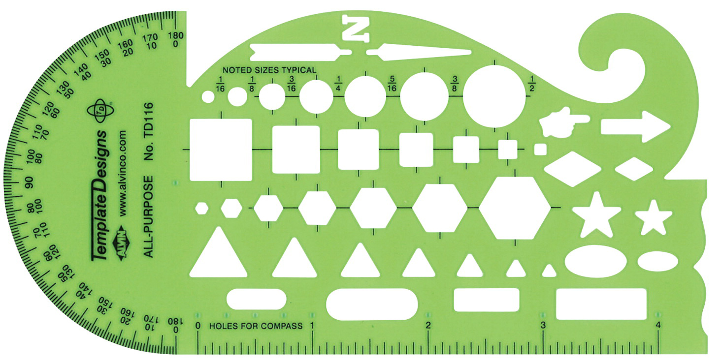
Special templates
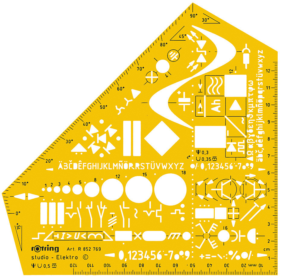
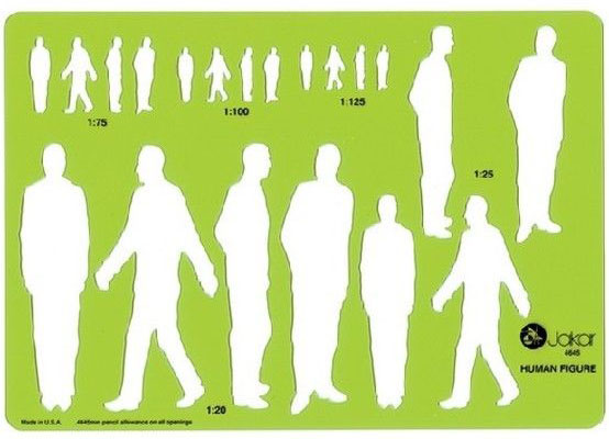
It wasn’t all about ellipses and circles. There were many other types, for specialized use.

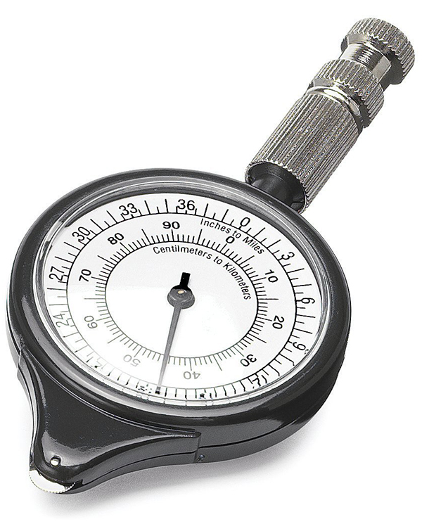
Map wheel
For measuring distances on maps. You would set the scale, and start rolling it between places. Remember, there was no internet!

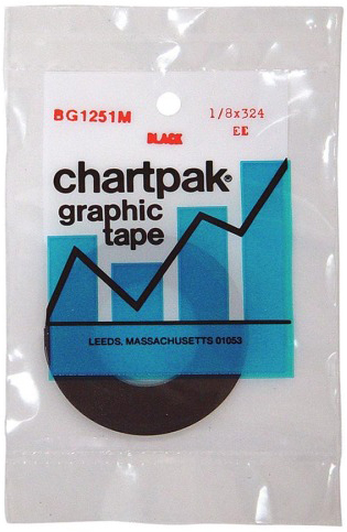
Graphic tape
Adhesive-backed tape, available in many widths and styles. We could potentially create almost perfect rules and boxes using a knife such as the one shown below.

Surgical scalpel
We were like surgeons. Well, kind of. The Swann Morton scalpel is frighteningly sharp. Of course, there were accidents. (The X-Acto knife was popular in the U.S.)

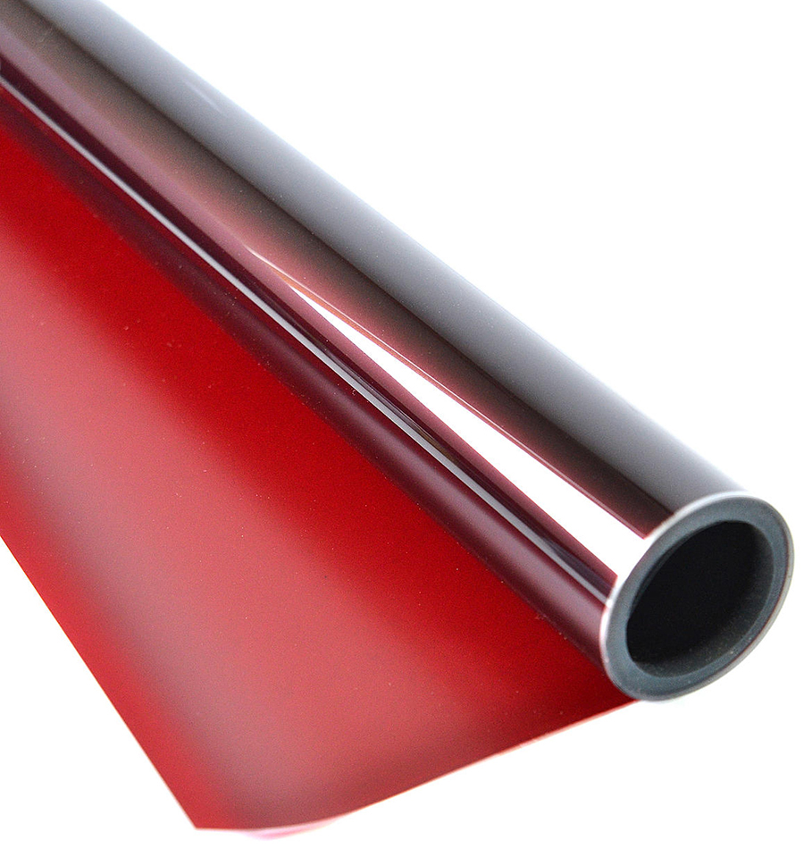
Rubylith film
Shown in previous posts about mechanical art. Essential for creating intricate overlays that would be converted to process colors for printing. I loved cutting it with the scalpel, and peeling back the red top layer. I would pretend that it was a surgical prodecure: “Hand me my scalpel!” “Yes, doctor”.

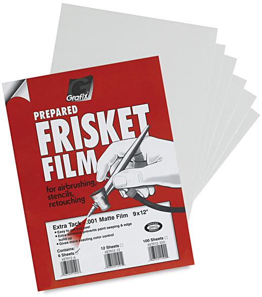
Frisket film
Adhesive film for masking when airbrushing. Did not damage the delicate paint surface.

Rubber cement
Used for sticking down anything that was on paper. Surplus glue could be easily cleaned up with a ball made from… rubber cement. In the U.K. we used “Cow Gum”. There is absolutely no connection to the large animals that we see eating grass in fields. The glue was manufactured by the F.P. Cow Company.

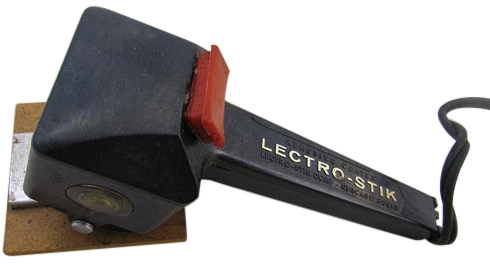
Waxer
Hot wax largely replaced rubber cement where I worked. You could reposition things easily. I love the name: ‘Lectro-Stik”.

Solvent
Good for cleaning up artwork and equipment. We used to carelessly leave the cap off, and I used to smoke. I have no idea how I avoided blowing up the graphics department.

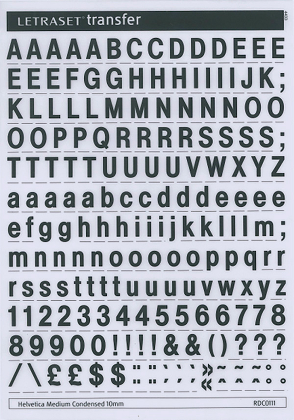
Letraset
One way to get some typesetting was to rub down each individual letter from a dry-transfer sheet. It was slow, and really only practical for headlines. We had a stack of sheets with rarely used characters on them. “Anyone have any vowels in 24 pt Helvetica?”

Railroad pen
For drawing roads. Try using this when you’ve had a few drinks.


The incredible Bollmann map workshop (2)

THE AXONOMETRIC VIEW.

(See Part 1 here: https://www.johngrimwade.com/blog/2017/03/27/the-incredible-bollmann-map-workshop-part-1/)

Perspective effect
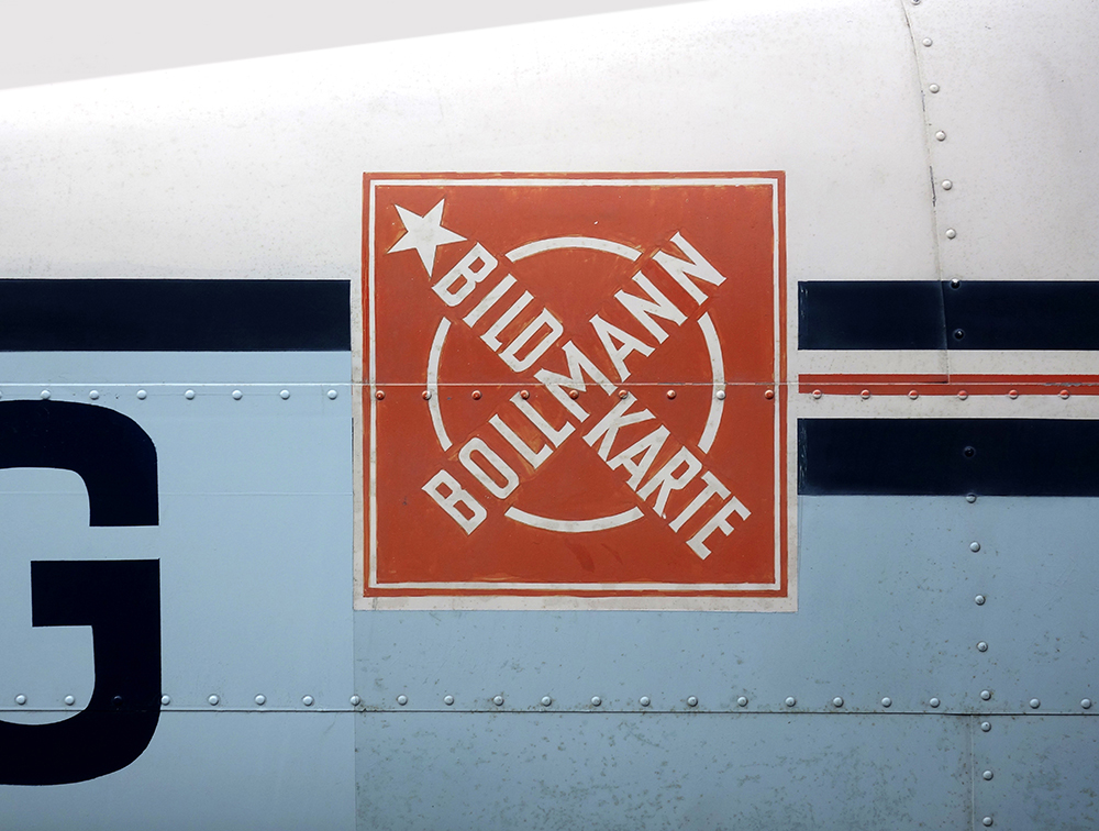
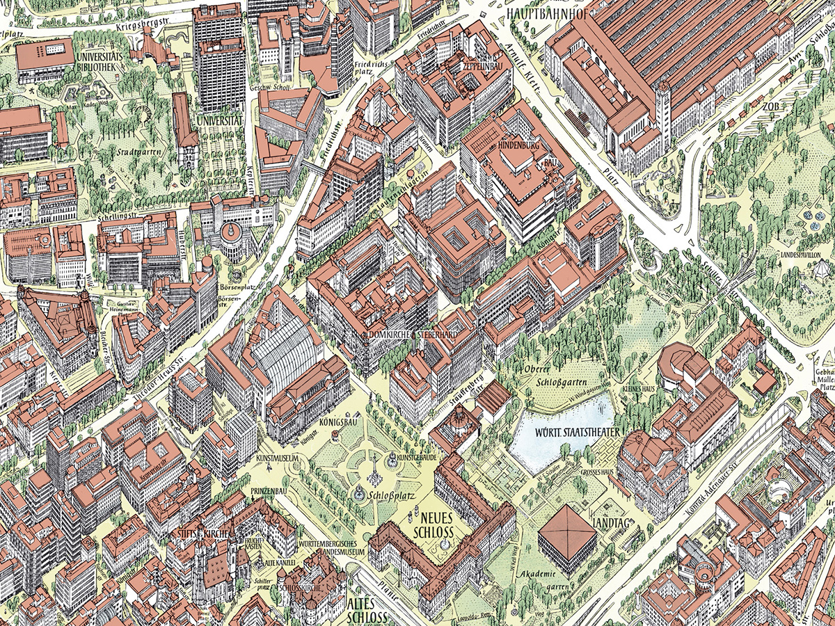
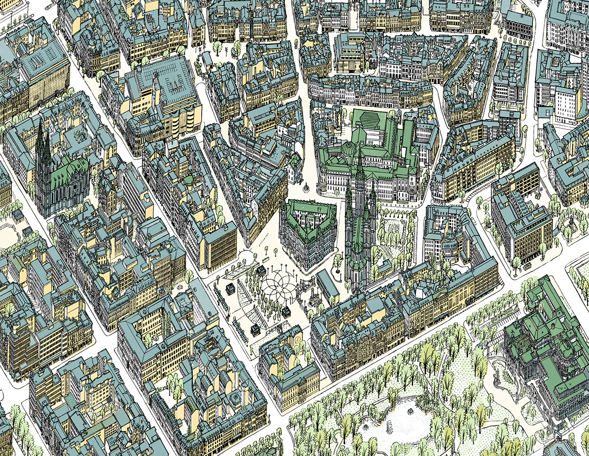
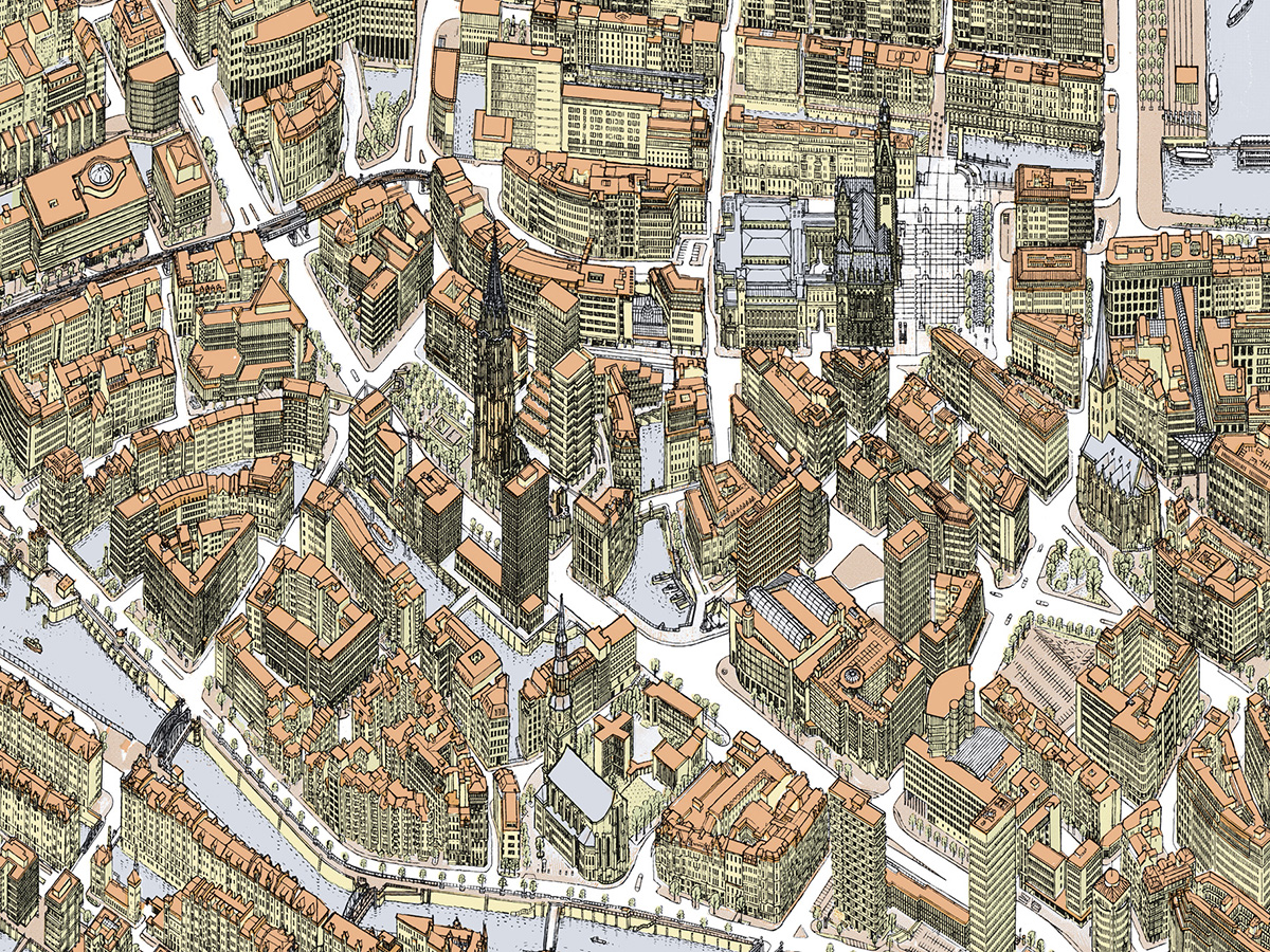
The maps are obviously not drawn in perspective. They use a modified axonometric projection, invented by Hermann Bollmann. With this kind of parallel projection, the scale is constant across the map. A 45-degree angle gives the best compromise of dimension and clarity, and each map has it’s own unique viewpoint which is chosen to best show that city. The color palette is also selected on a case-by-case basis.

Detail from the Stuttgart map.

The secret of success
Why do Bollmann’s maps seem so much more informative, in terms of being useful navigational aids, than aerial photos and 3D-rendered views like Google Earth? There is a lot of high-tech, data-driven mapping at our disposal, but it is no match for their informational artistry. A key factor is that the Bollmann maps are not drawn in an exact realistic proportion. Otherwise we would mostly see roofs with compressed facades, which would not be useful for helping navigation on the ground. Buildings are adjusted to be more visually descriptive without compromising the character of the structure. A vertical exaggeration of between 120% and 170% is applied, depending on the character of the city. Also, the streets have been considerably widened, so we can clearly see them and their labels. It’s not obvious until you compare one of these maps to an aerial photo. “We draw cities from above, as you see them from below”, says Sven. Like all good informational graphics, the interpretation enhances our understanding. A crucial point. It’s why many 3D-rendered maps are very unsatisfying. Just disappointing pieces of technical wizardry, in terms of wayfinding, without this careful infographic intervention.

Detail of the Wiesbaden map.

Detail of the Hamburg map.

Master mapmaker
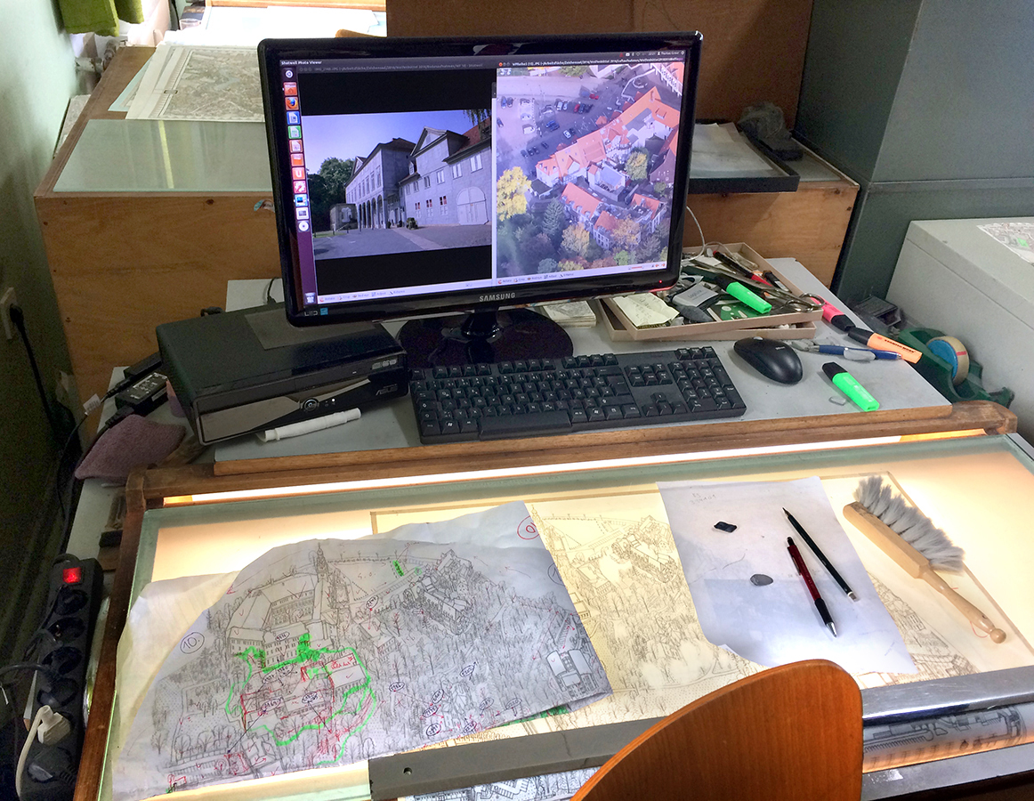
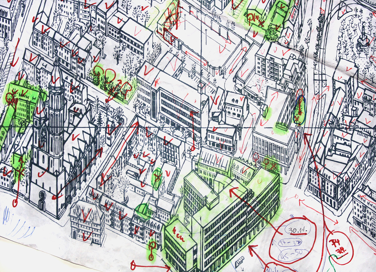
Above is Thomas Greve’s workstation, where he spends many hours making hand-drawn map corrections. It’s a mixture of analog and digital. Photos from the street, and from the air, are on the monitor. Areas needing attention are marked in green. The detail below (different from the one shown above) shows the painstaking checking and correction process.

Advertising pays the bills
90% of Bollmann’s income is from companies having their small logo placed on a map. This has been the business model since the company began. Without that source of revenue, they would not have been able to maintain their standards. Well, not without having to charge a very high price for each map. The current cost of a folded city map is 6.90 Euros (about $7.25).

New York City
I mentioned in an earlier post, the classic map of the 1964/65 World’s Fair that I have on the wall in my office:
www.johngrimwade.com/blog/2016/08/25/the-biggest-globes.
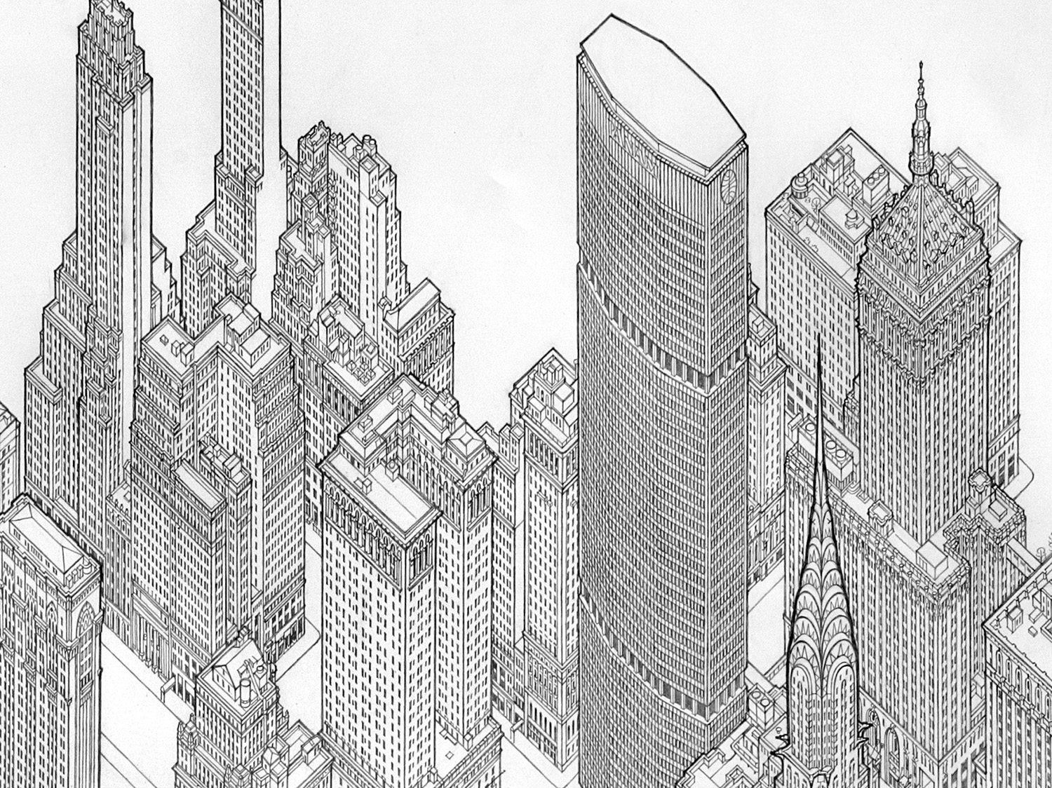
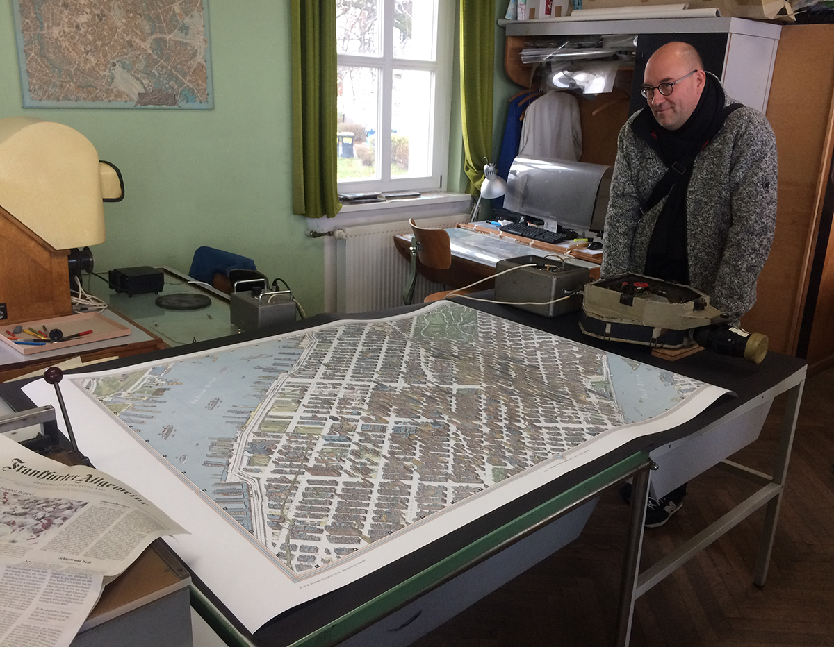
To mark my visit, the Bollmanns presented me with the best gift imaginable, a specially-printed oversize version of the classic map of New York City. This 1962 tour-de-force was based on 50,000 street-level photographs, and 17,000 from the air. The print is huge and magnificent, and framing it will cost me a very large amount of money, but I’m finding a wall and this is going on it. Here is Michael Stoll* standing near the map, and perhaps wishing it was his.

A big thank you to Sven Bollmann for his invaluable help with these two posts. And for that amazing map!

Bollmann Maps: www.bollmann-bildkarten.de

(All map images © Bollmann Bildkarten. All photographs by Bollmann Bildkarten, or Michael Stoll.)

*Professor Stoll organized this trip for myself and four of his students from the Augsburg University of Applied Sciences. Michael’s superb collection of classic information design has featured in this blog a number of times already, and will be here in the future.

The incredible Bollmann map workshop (1)

AT THE HOME OF THE MASTERS OF THE ILLUSTRATED MAP.
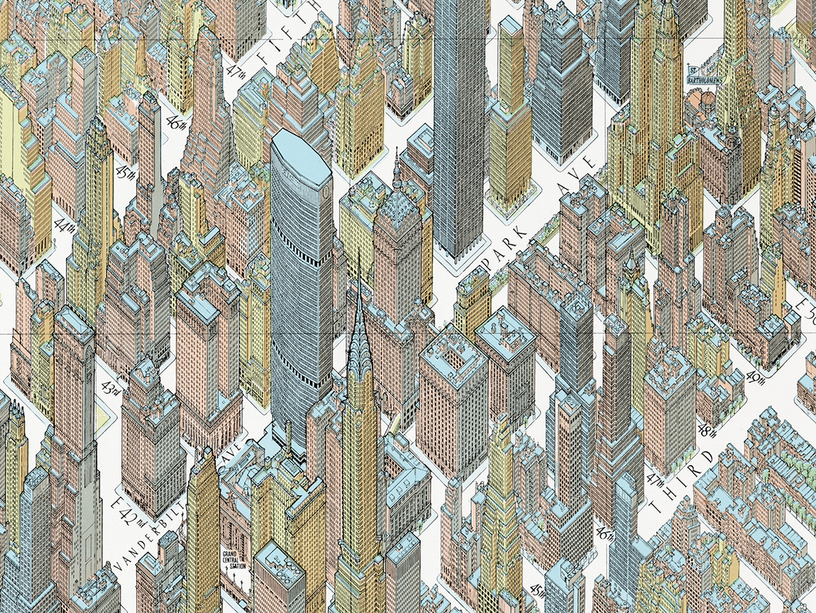
Detail from the 1962 map of New York City.

On the 18th of November last year, I stepped into a time tunnel, and stepped out into the offices of Bollmann Maps in Braunschweig, Germany. And I mean that in the best possible way. These cartographers produce all of their maps with the same methods that have been in use since 1963. Everything is hand-crafted. The production process is completely analogue. They use pen and ink on overlay film, photograph it with a classic 1950s line art camera, and print on their own 1965 printing press. (Bollmann Maps: www.bollmann-bildkarten.de)
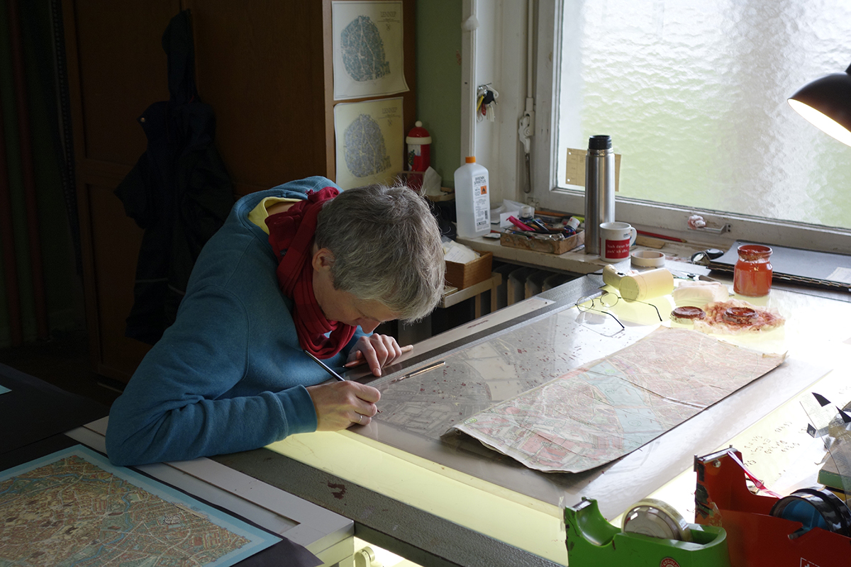
Jan at work on a set of map overlays.

Care, craftsmanship, quality. This visit was a unique and memorable experience. Sven Bollmann, and his brother Jan, showed our group around. Their pride in the work was evident everywhere, and so refreshing to see. Whatever they have achieved has been through solid, hard work and by relentlessly applying the highest standards. If I had the Grimwade Gold Award of Informational Graphic Excellence to hand out, they would be getting it by FedEx two-day express shipping.

Origins
After the Second World War, Hermann Bollmann (Sven’s grandfather) was looking to record, as part of the rebuilding process, the devastation from the Allied bombing of Braunschweig. So in 1948, he decided to make an aerial-view illustrated map. The 69-year story of Bollmann Maps began right there. The first map was made purely from street-level observations, not from aerial photographs. Today, the company has a catalogue of about 100 maps, most of which they update every five years or so. The list includes many German cities, but also Amsterdam, Copenhagen, Jerusalem, and several other international urban centers. There is a staff of 10, including three artists and cartographers. Each map takes a maximum of one year to produce (or it would be out-of-date by the time it is printed), and thousands of aerial and street-level photographs are used as references.
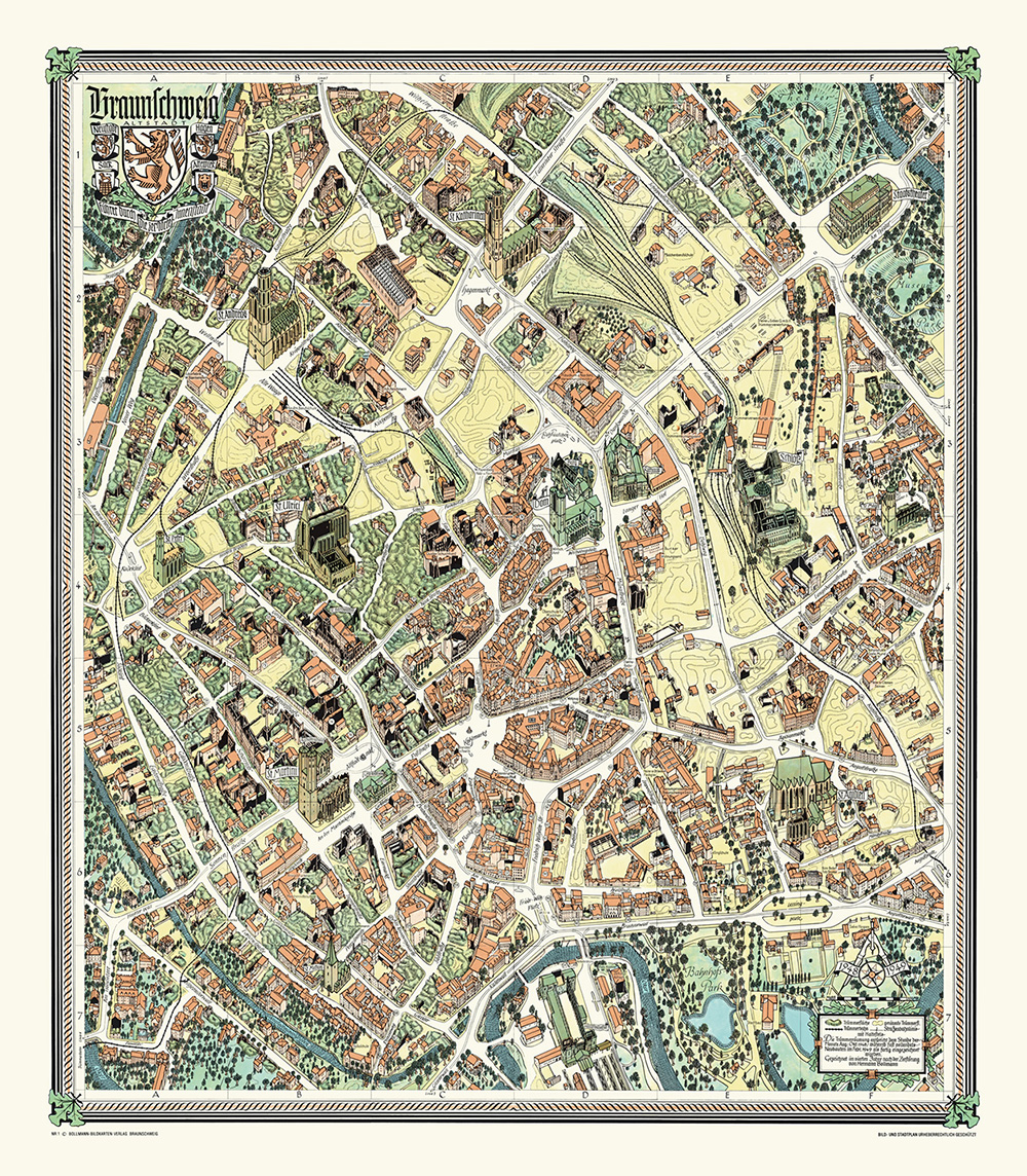
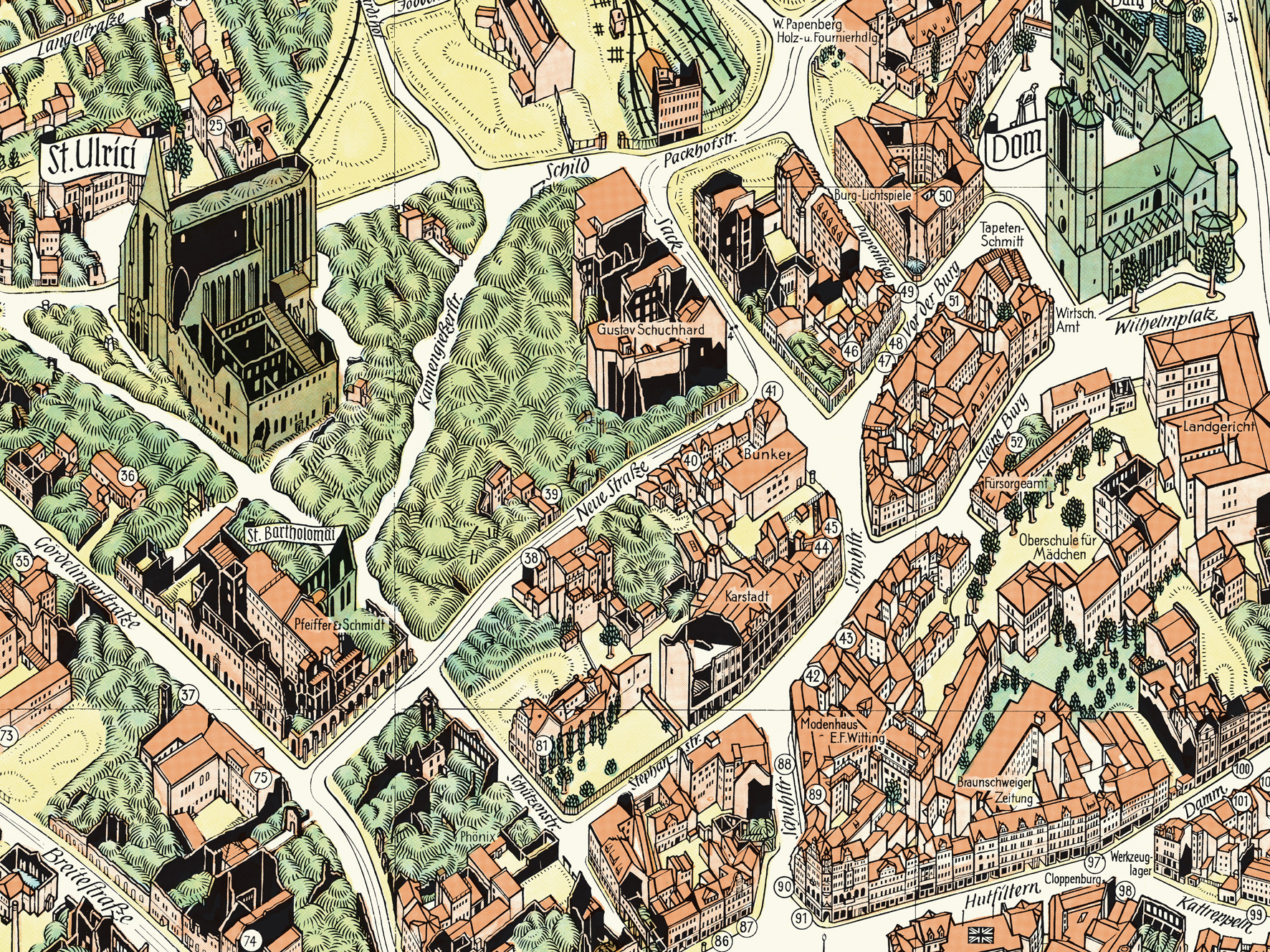
Map number one: Braunschweig, 1948. The complete map and a detail.
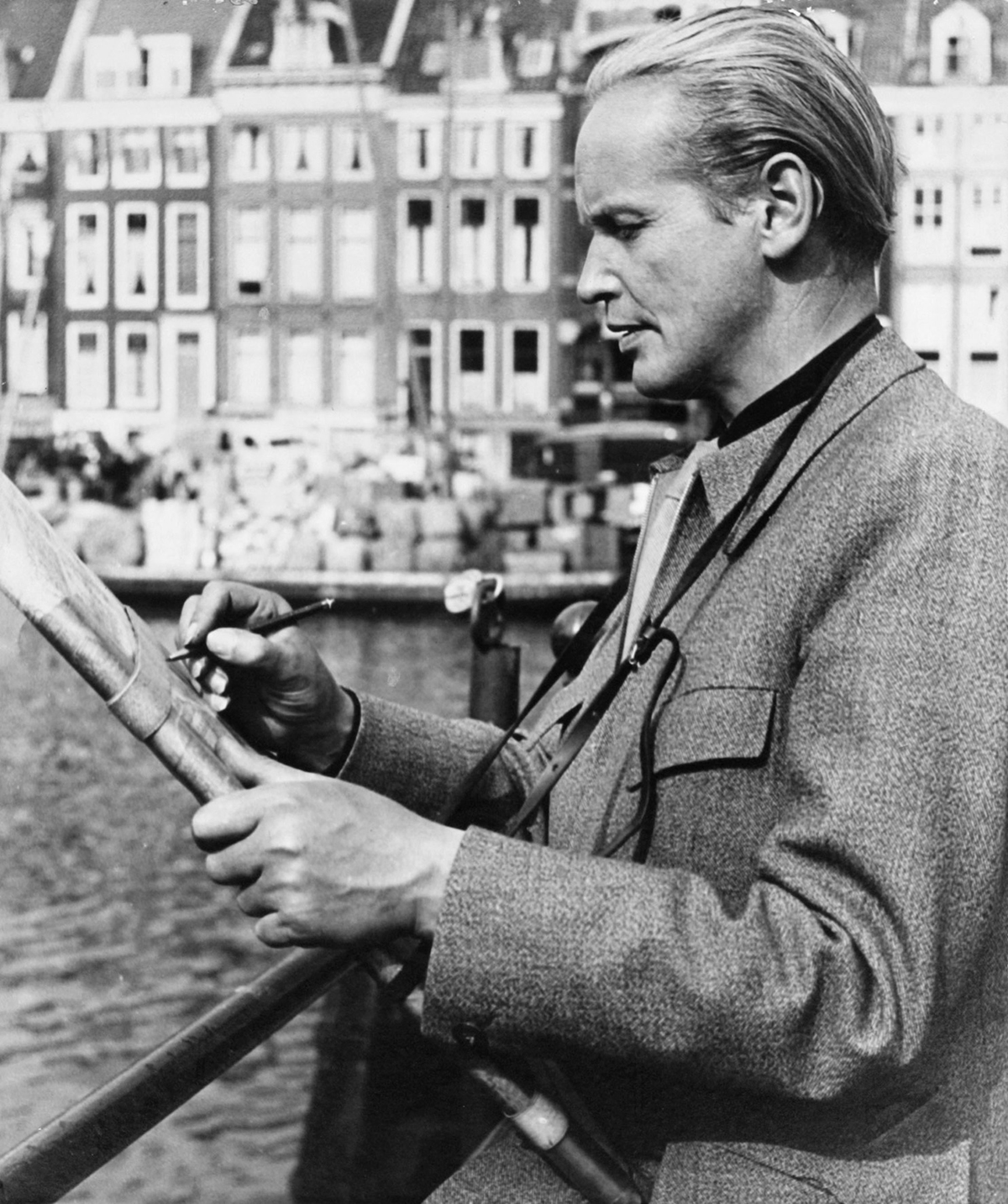
Hermann sketching on location.

The original Street View
In 1958, Hermann bought a Volkswagen taxi that he fitted with a camera, raised on a pole through the sunroof, and triggered by the revolution of the wheels so that it took a photo every 65 feet (20 meters). Now a modern small car (with a sunroof) is used.
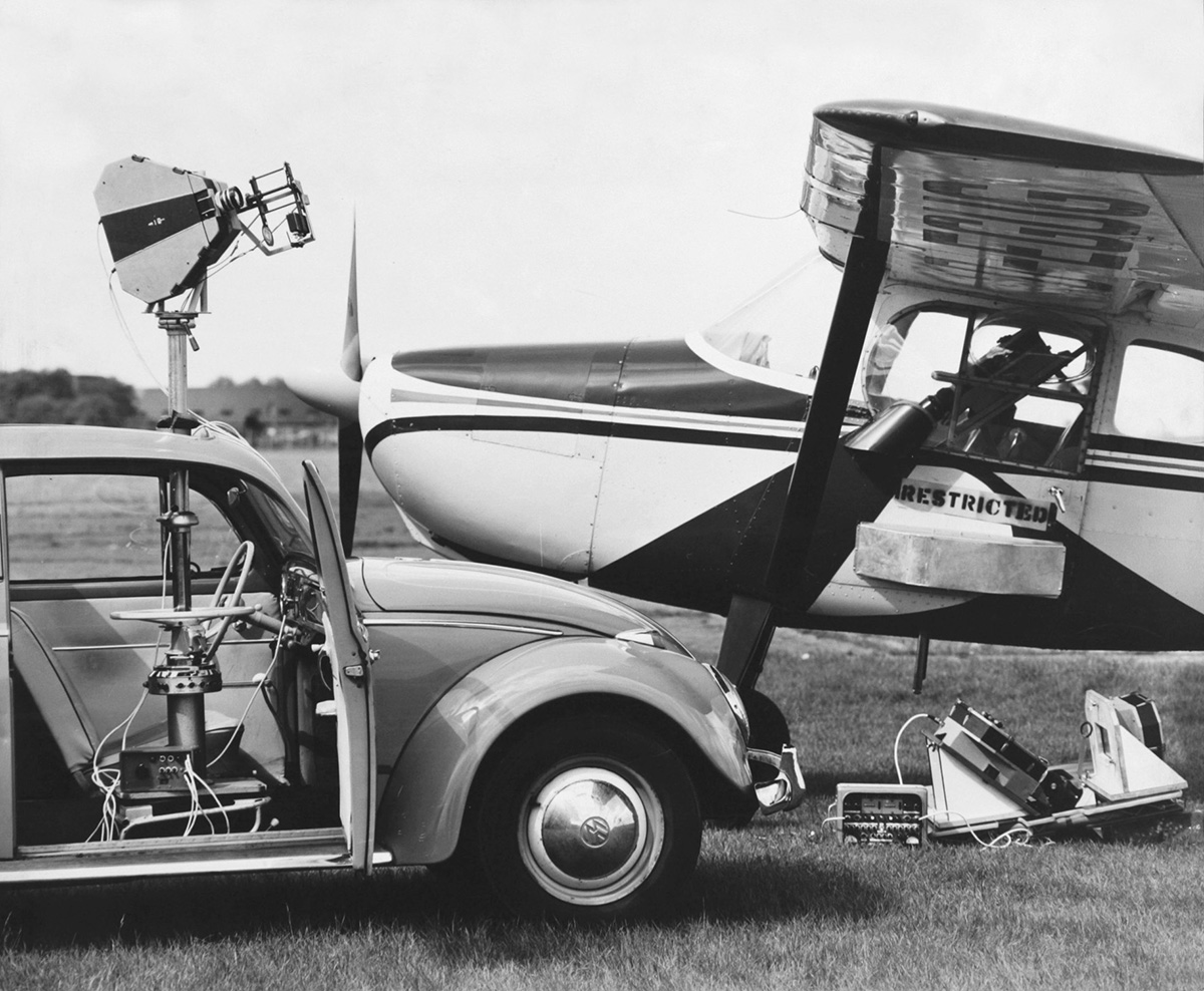
Below, the original aircraft camera with it’s model construction kit parts.
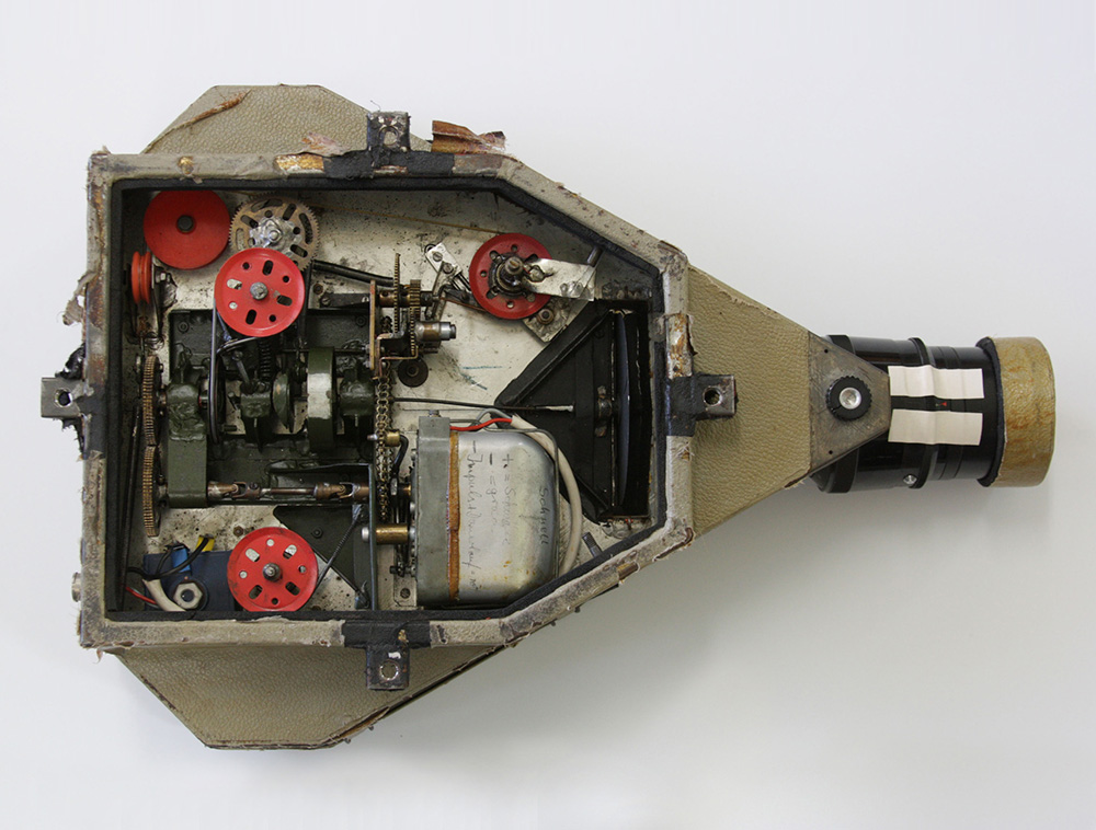
In the air and on the ground
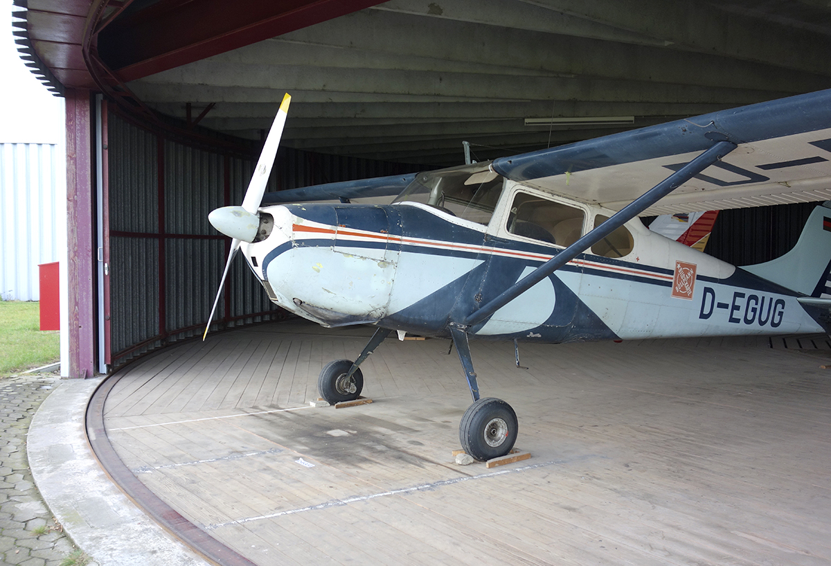
I sat in the Bollmann aircraft (shown above). A 1954 Cessna 170B that was also purchased in 1958, and is used to this day for aerial reference, and now flown by Sven. The instrumentation has never been changed, although they’ve added a radio and a transponder. It’s a three-faceted reference-gathering operation. The artists walk the streets making visual notes, with a pencil on paper, a car drives around with a camera taking continual photographs, and the plane flies overhead taking images at the angle of the illustrated maps. This combination leads to a unmatched level of mapping accuracy. As anyone who has used Google Street View for reference knows, the dates of the images are very variable, and there can often be buses, trucks and other objects blocking the view. The Bollmann approach means that they are not dependent on anyone else. In our world of infographics that are too often based on an internet search (for various complicated reasons), the integrity of their information is complete. They can approach any project with complete confidence that it is correct, and their reputation is built on that.
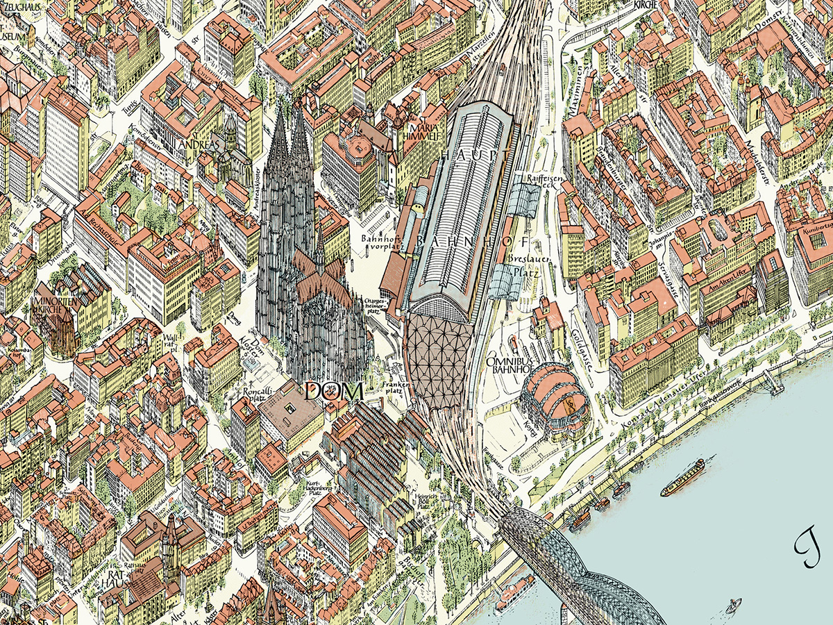
A detail from the Cologne (Köln) map.

To be continued in the next post…


(All map images © Bollmann Bildkarten. All photographs by Bollmann Bildkarten, or Michael Stoll.)
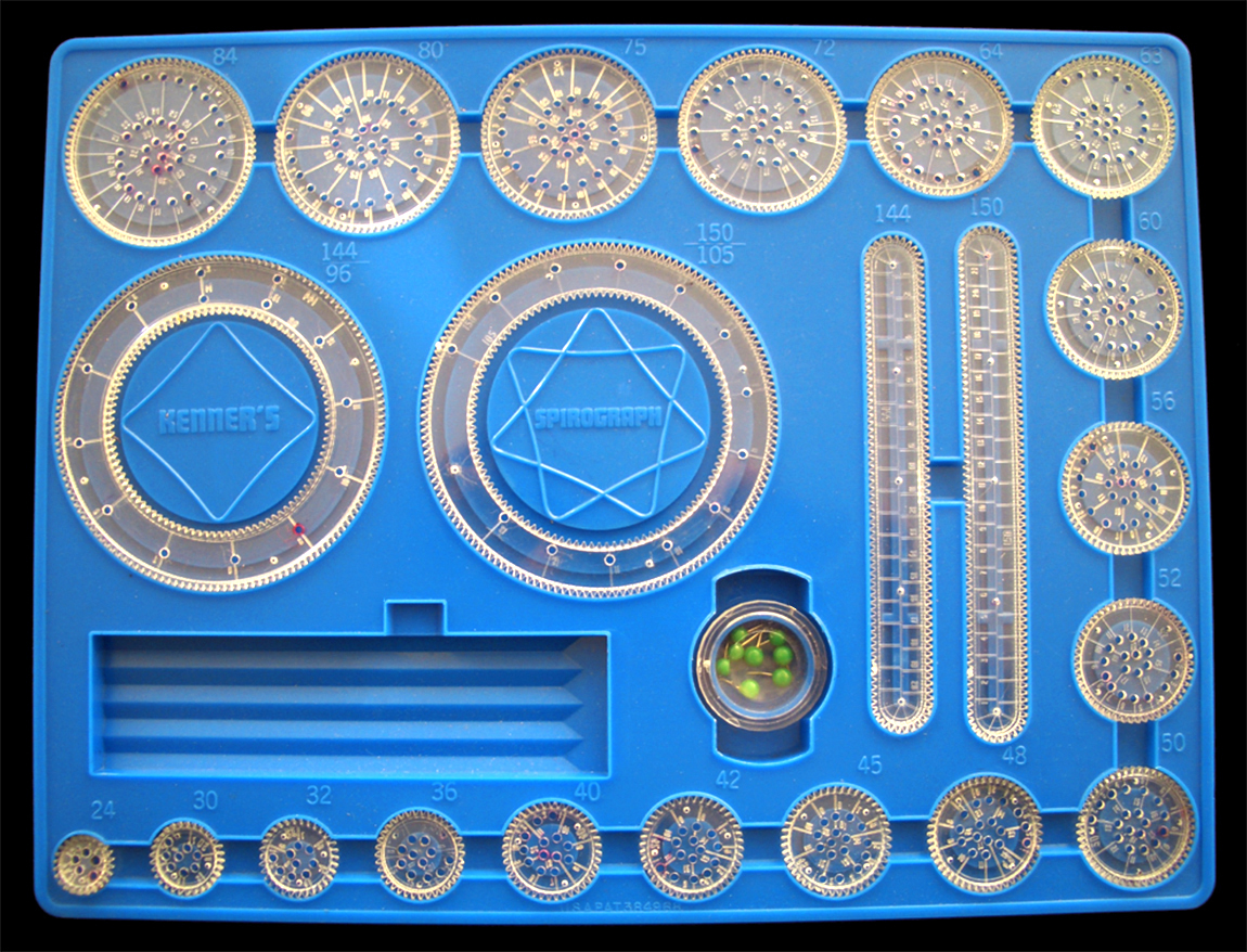
Instructional

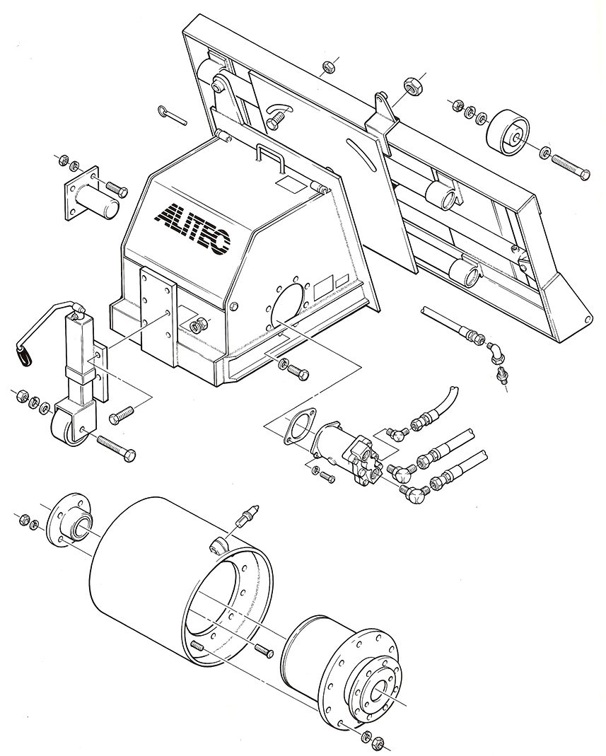
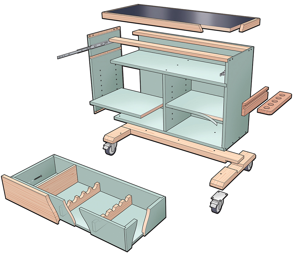
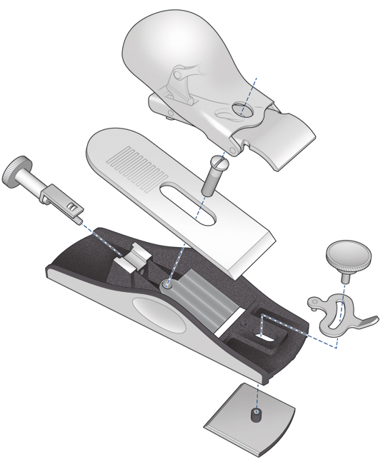
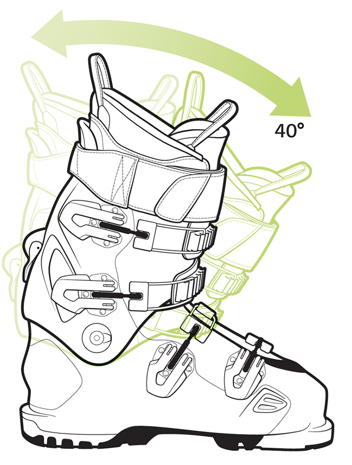
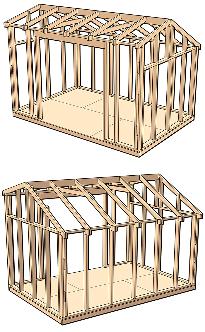
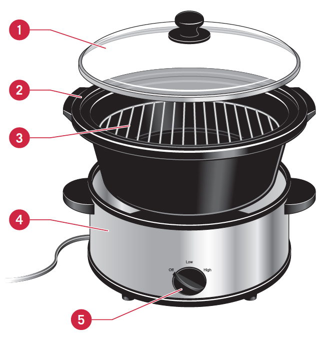
GREG MAXSON’S EXPLANATORY GRAPHICS.When I was the consulting graphics director for Popular Science back in the 1990s, I commissioned Greg to produce many diagrams. Like me, he began in the world of analog graphics, working with technical draughtsman tools, and by the 90s was, of course, working on the computer. Here are some examples of his precise, clear style. These instructional graphics help us with our day-to-day life, and deserve as much respect as the mega-graphics that frequently sweep up the prizes. See more of Greg’s work here: https://gregmaxson.com

An example below of one of Greg’s pre-computer graphics. This style was perfect for the transition to computer-based illustration.


The examples below are all digital.

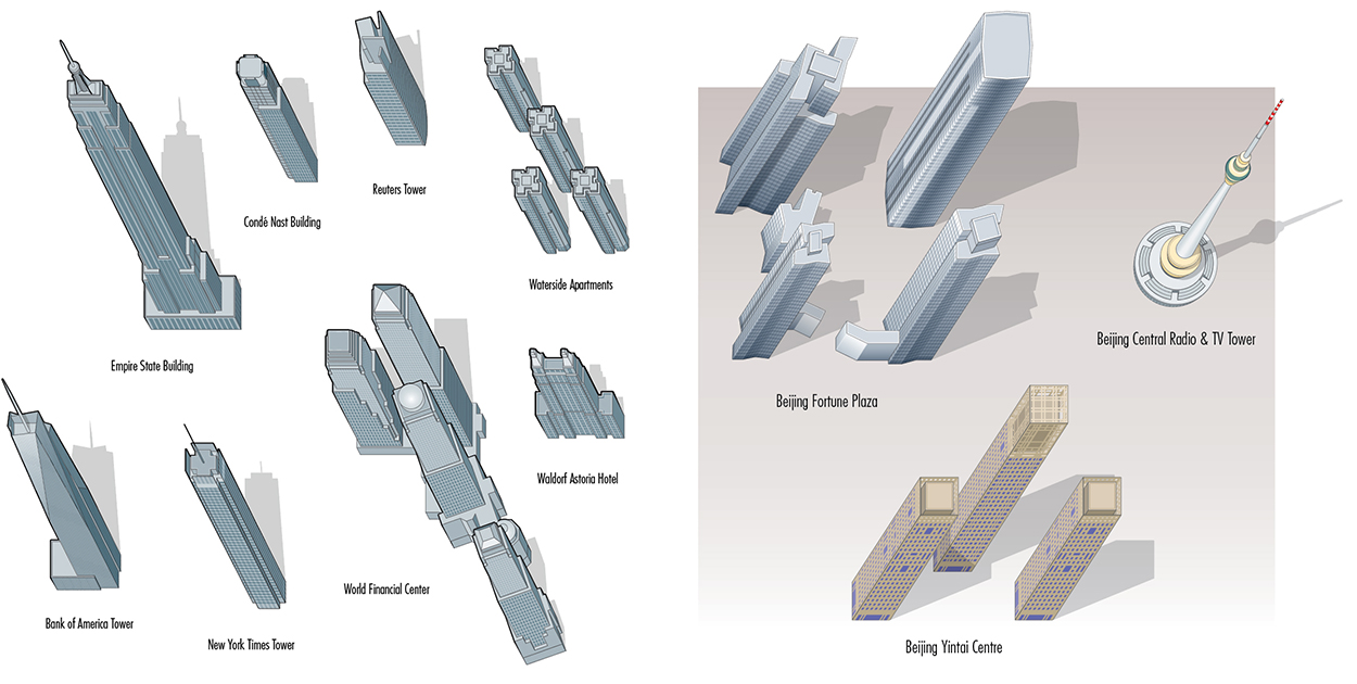
Greg has drawn hundreds of buildings for VanDam’s excellent series of maps. Some examples:

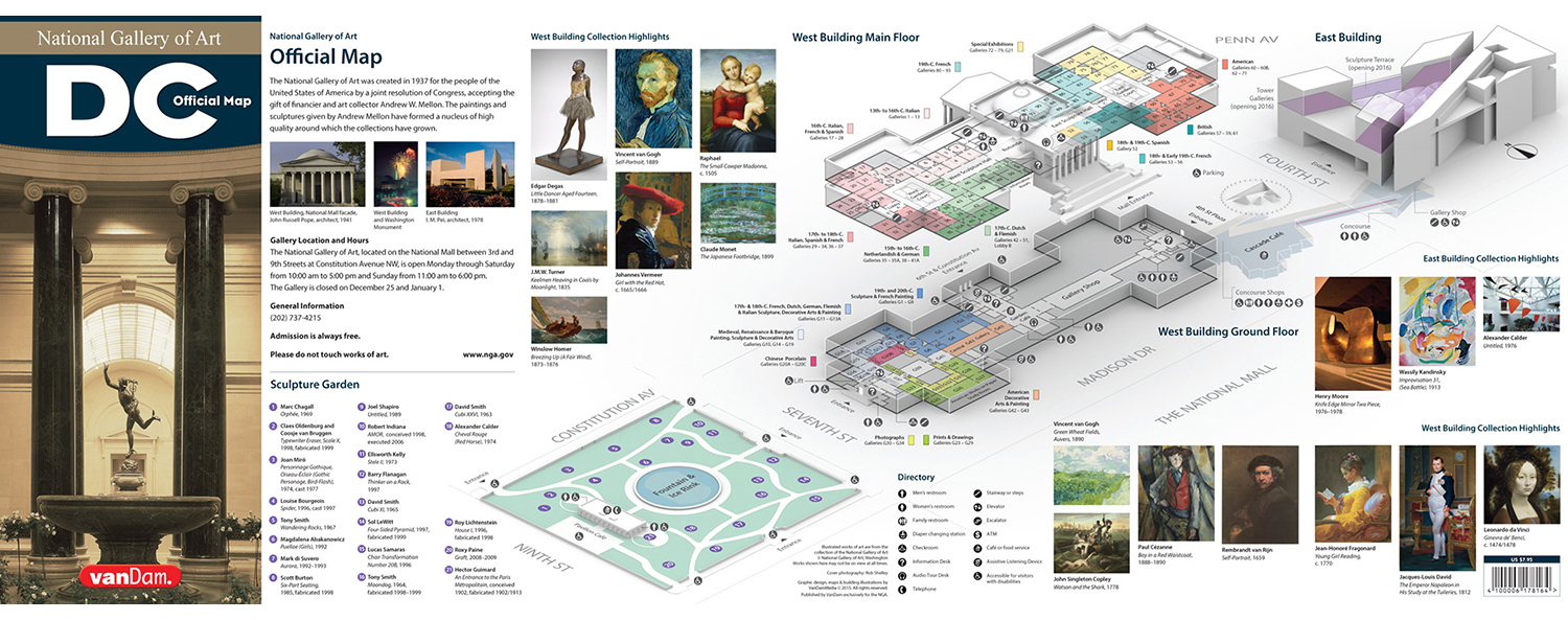
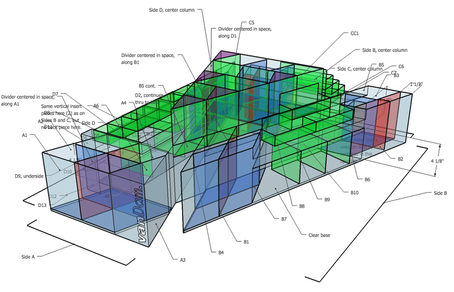
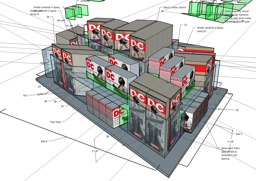
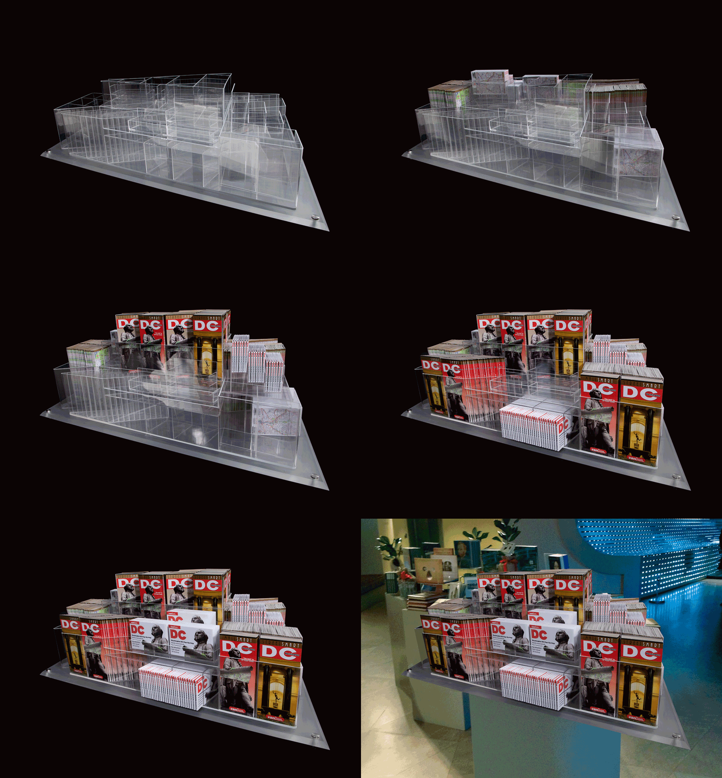
Stephan Van Dam was approached by the National Gallery of Art to create a map (for the 75th anniversary of the museum), and to build a miniature version of the East Wing as a display case. Stephan and his team collaborated with Greg on the project.

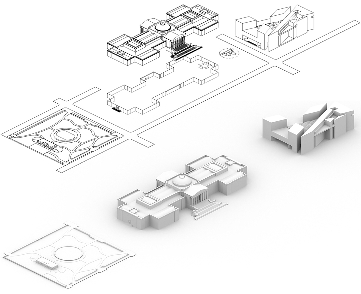
The SketchUp model, and a Shaderlight rendering for the map.

The team studied the East Wing, and determined the best way to reflect the architecture in a lucite case that would hold the maps. Using SketchUp, Greg created a 3D model of the shell. Then the dividers and pockets were designed.

Making the complex case, with it’s sharp 18-degree corners was a real challenge. Stephan wasn’t able to find a model manufacturer in the U.S., but eventually a Shanghai-based shop agreed to construct it.

See the range of VanDam maps, and buy them, here: http://www.vandam.com

(All map, building & display images ©VanDamMedia. All rights reserved.)
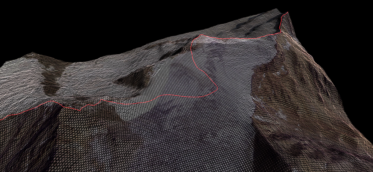
Malofiej 25

THE TWENTY-FIFTH ANNUAL INFOGRAPHICS SHOWCASE.

Next week, I’ll be in Pamplona, Spain for the Malofiej conference and workshop (M25). It’s not too late to sign up for this essential infographics and data visualization event. I’m co-hosting the “Show Don’t Tell” workshop with two super-talented and influential infographics people: Fernando Baptista from National Geographic magazine, and Xaquín González, who until very recently led the Guardian Visuals team.

Fernando: https://twitter.com/fg_baptista?lang=en
Xaquín: https://twitter.com/xocasgv?lang=en

There is no other event in the world that is entirely focused on all forms of explanatory graphics. From the workshop, to the conference, to the awards (which are judged by an impressive roster of international professionals). Then there’s the friendliness and openness of the whole thing. Ask anyone who has been there. It’s a place to learn new things, and to become part of the infographic community. Yes, I am very biased (having been there 22 times), but I highly recommend it.

See the program: http://www.malofiejgraphics.com/malofiej-world-summit-program/

Register for the workshop or conference (or preferably both) using the form here: http://www.malofiejgraphics.com/infographic-world-summit-registration/
I think of Malofiej as the United Nations of Infographics. People from all over the world seem to get on just fine. An encouraging lesson in these difficult times.

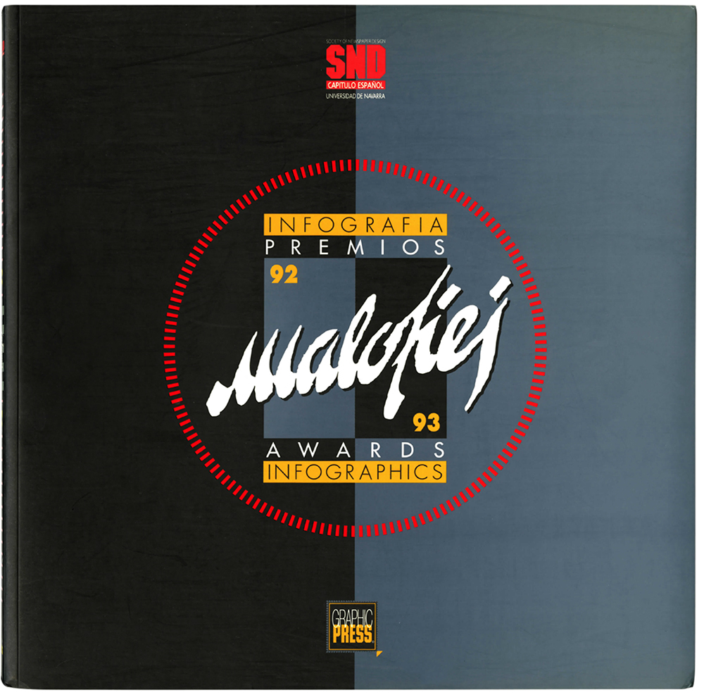
Malofiej 1

Out of interest, I’ve been looking at 1993, which was the year of Malofiej 1. The internet existed, but there was only the visually-limited (although leading edge at the time) Mosaic browser, which later became Netscape.

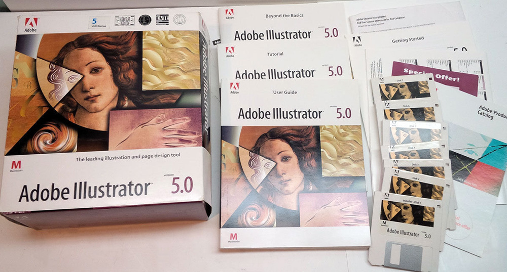
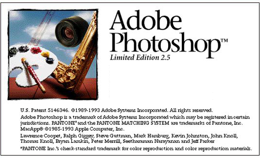
Consequently, Malofiej 1 was entirely about print infographics. Illustrator 5.0 came out that year, and finally we had layers and a preview mode. Photoshop 2.5, however, did not have layers, or multiple undos. The Mac operating system was System 7.

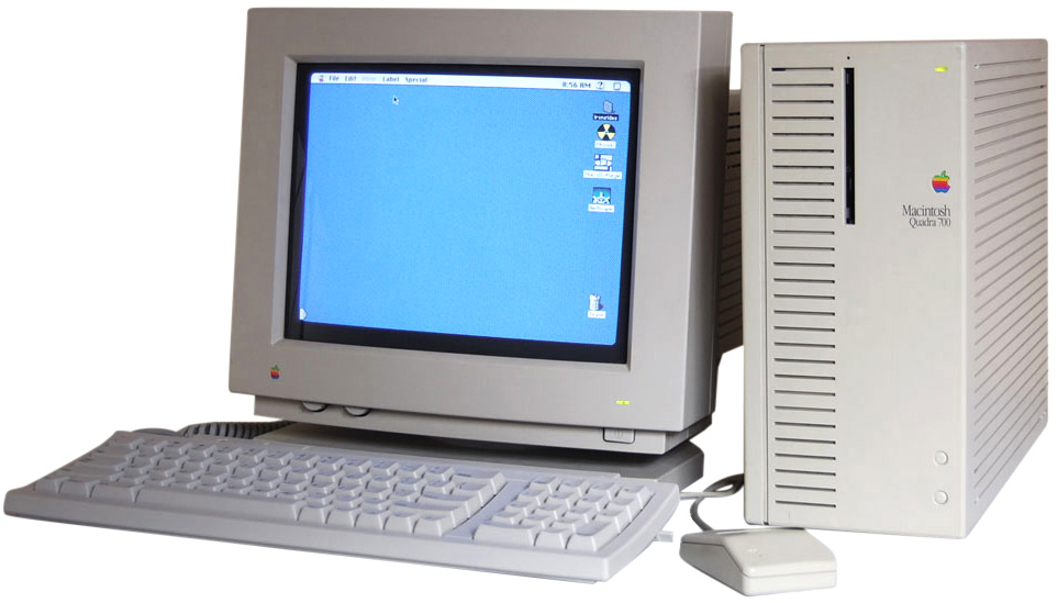
Desktop: Quadra 700 with 8 MB (!) of RAM.

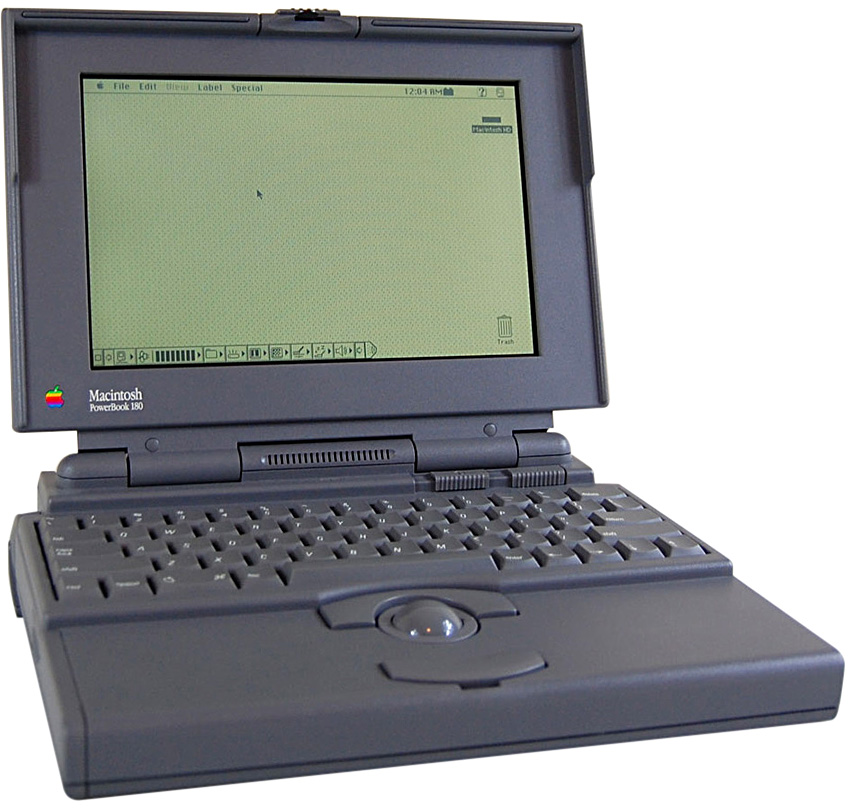
Portable: PowerBook 180c. 4-bit grayscale screen, 80MB hard drive. With a trackball.

And… I have to say that M25, for anyone British (like me), brings to mind the 117-mile (188 km) motorway that surrounds London. It’s one of the busiest roads in the U.K.