Color secrets

INSIDE OUR CHROMATIC WORLD.
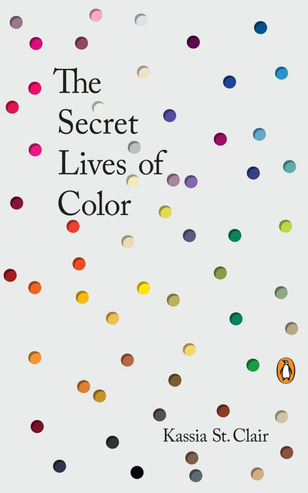
Behind the scenes
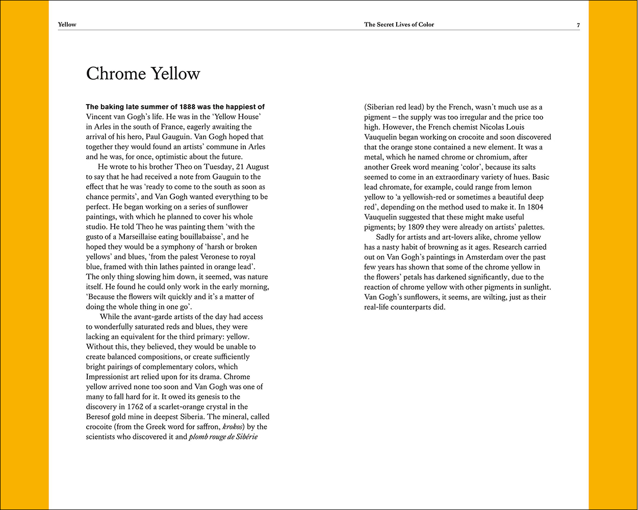
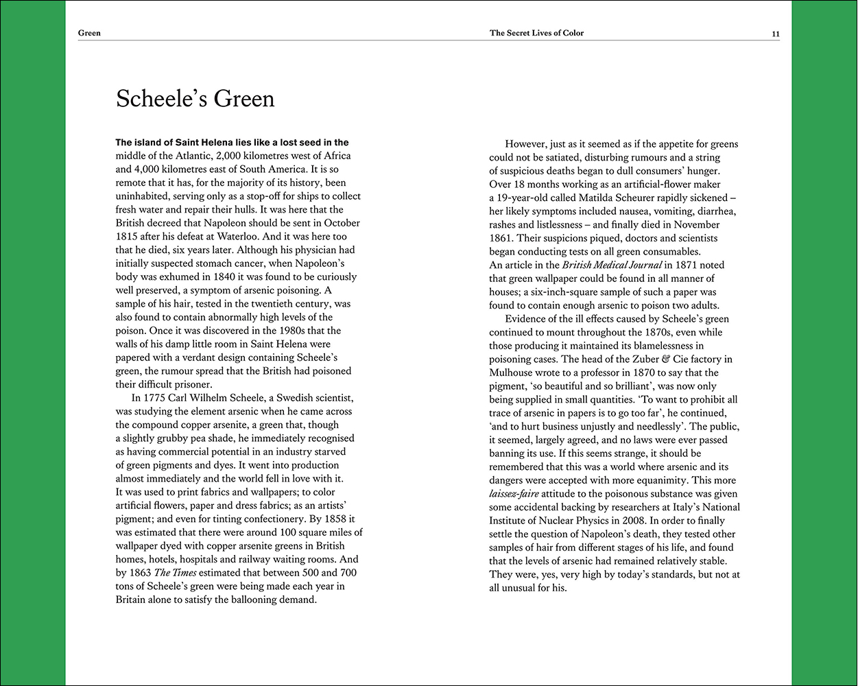
“The Secret Lives of Colors” contains the fascinating stories behind 75 colors. https://amzn.to/2pOCmNv
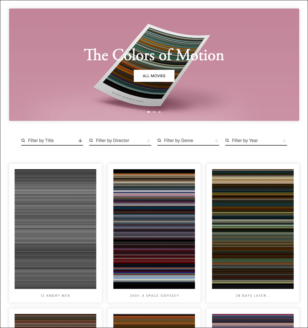
Movie colors
In “The Colors of Motion,” each line represents the average color of a single frame.
https://thecolorsofmotion.com
Black and white
VANTABLACK (Vertically Aligned Nano Tube Array)
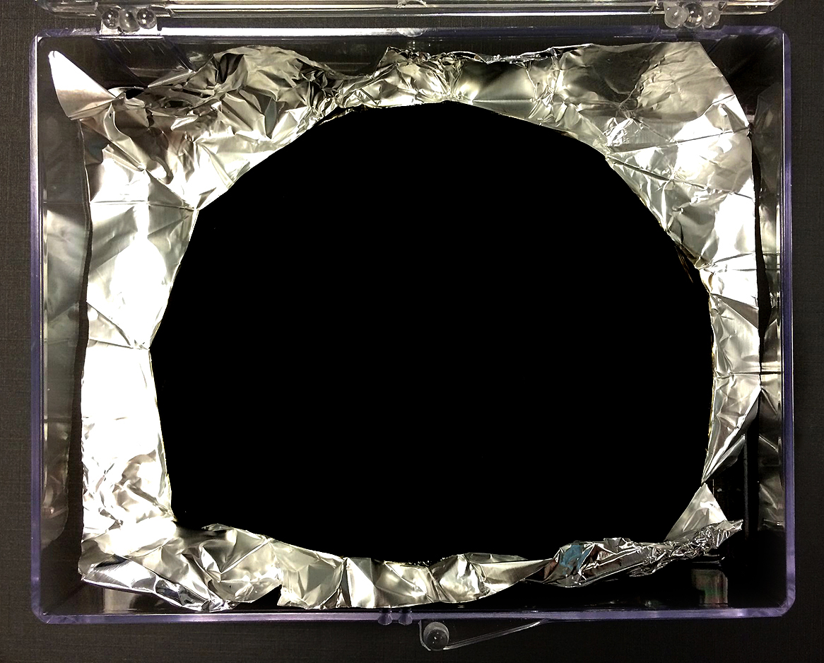
This coating, made by Surrey NanoSystems, absorbs 99.96 % of visible light. It’s intended for use where stray light needs to be suppressed, like the interior of optical equipment. Below, aluminum foil with an application of Vantablack. So much light is absorbed that three-dimensional surfaces take on a two-dimensional effect. Anish Kapoor has licensed the coating for his exclusive artistic use.
https://en.wikipedia.org/wiki/Vantablack
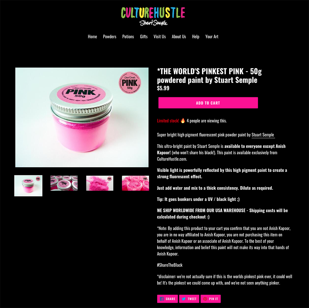
Artist Stuart Semple takes great exception to Kapoor having sole artistic rights to use Vantablack. He doesn’t accept that a pigment can only be available to one person. To make his point, Semple has produced the “World’s Pinkest Pink,” which anyone can use except Kapoor. Notice that to buy this, you have to state that you’re not Anish Kapoor, and that you will not let Kapoor get hold of this item.
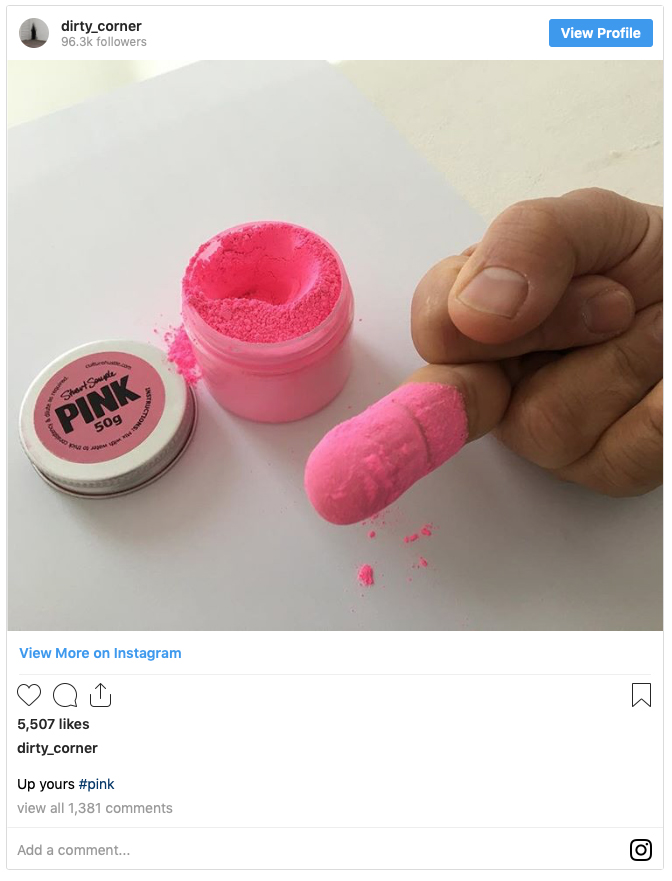
However… Kapoor managed to get some and put a confrontational photo on Instagram. (Editor’s note: I definitely do not condone this behavior by showing the gesture here, and I would not normally show an image like this. However, I work alongside a journalism school, and the full story should be told. Unfortunately, this was a development in the continuing battle over color ownership.)
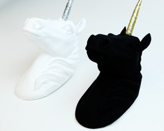
Now Semple has his own “blackest black” for anyone to use. Black 3.0 is an acrylic paint that absorbs up to 99% of light.
Here it’s applied to a sculpture. https://bit.ly/31RVtnr
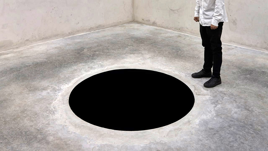
Kapoor’s installation, “Descent into Limbo,” is a concrete cube containing an eight-foot-deep (2.5 meter) hole, that’s painted with a light-absorbing black. (It pre-dates Vantablack.) Last year, despite warning signs, a man fell into the hole at the Serralves Museum of Contemporary Art (which is in Porto, Portugal).
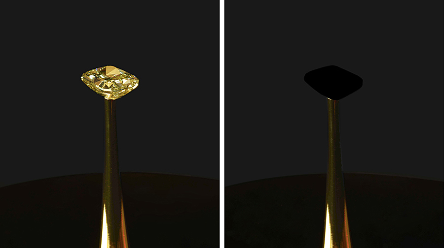
And an even-blacker black has recently come onto the scene. Diemut Strebe’s “The Redemption of Vanity” features a 17-carat yellow diamond (worth $2 million) that has been turned into a black hole by applying a carbon nanotube coating, made by MIT (Massachusetts Institute of Technology), that absorbs 99.995% of light. On view at the New York Stock Exchange until November 25 (by appointment).
And BMW displayed their 2020 X6 with a Vantablack finish at the Frankfurt Motor Show last month.

Photograph: BMW

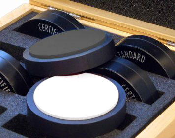
SPECTRALON
The opposite of the ultra-blacks is a fluoropolymer that reflects over 99% of visible light. Used for calibration targets and remote sensing applications. It doesn’t seem to be exclusively licensed to an artist at the moment.
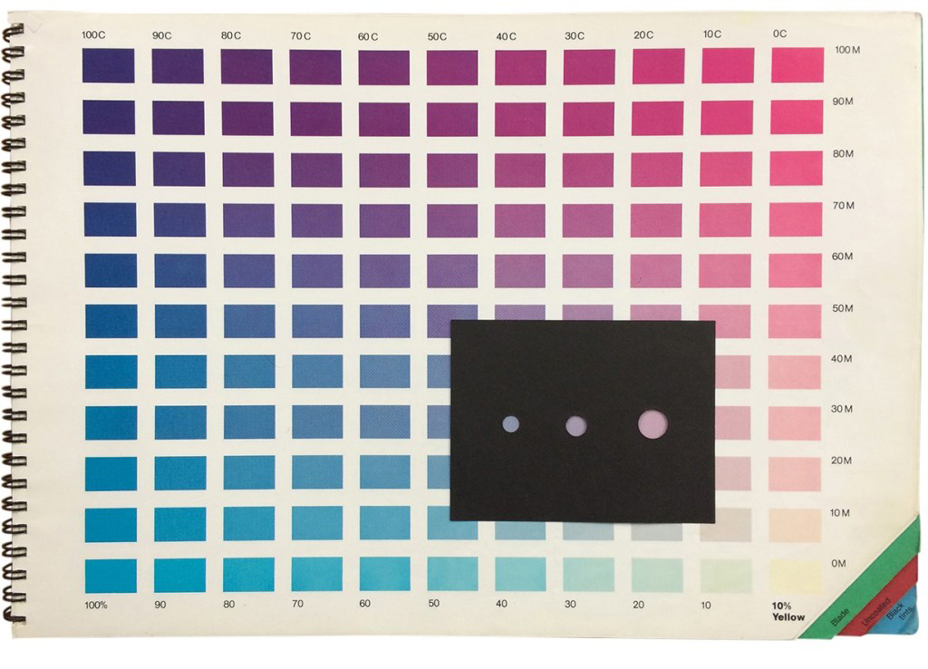
Color charts
Back at the dawn of time (when the Earth was still cooling down), graphics people all had these charts, and they needed to have good supplies of the various colors.
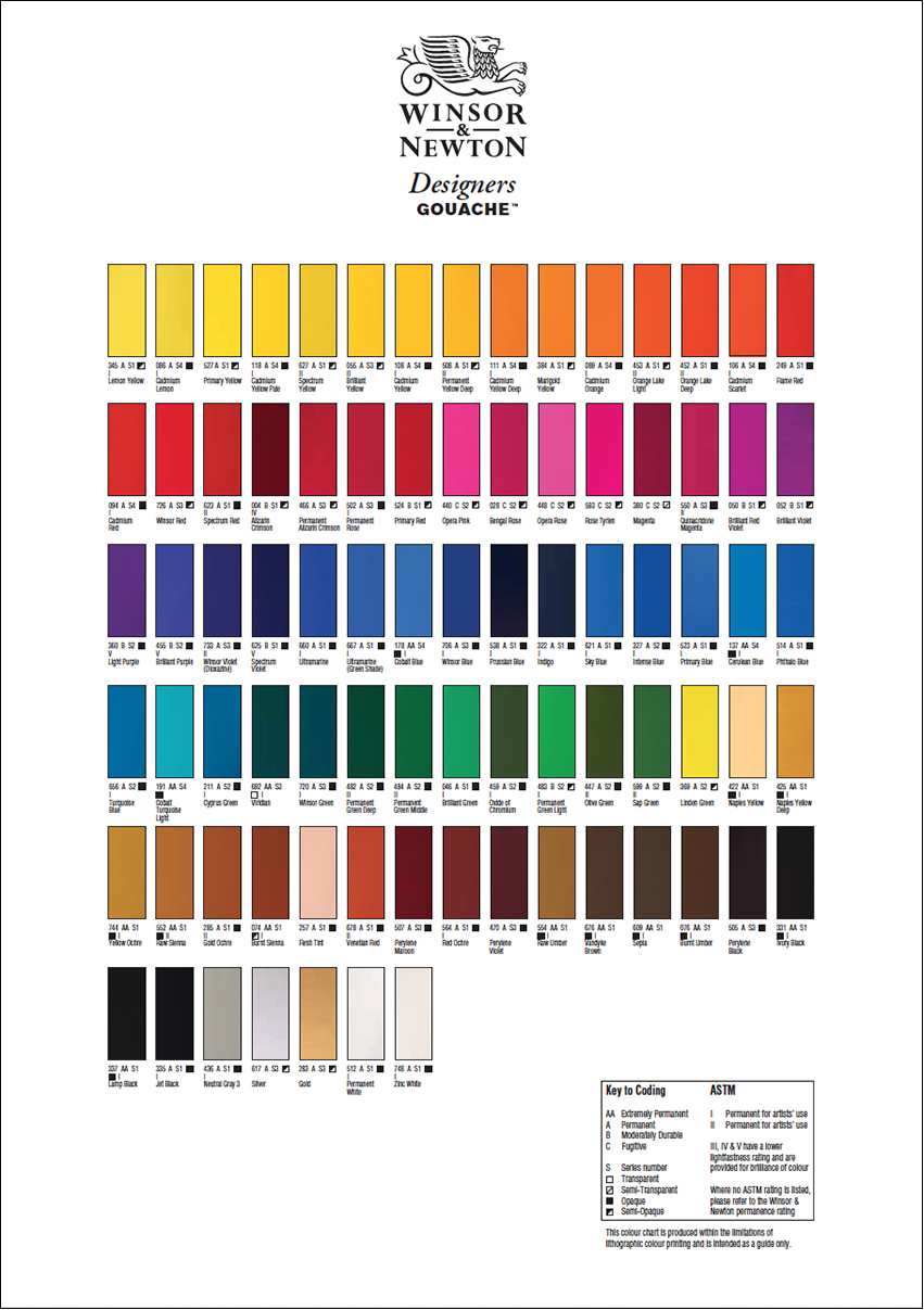
I’ve had a recurring nightmare since 1975: It’s midnight, my deadline is the next day, the art supplies store is closed, and my tube of Cerulean Blue gouache is almost empty.

Pigments
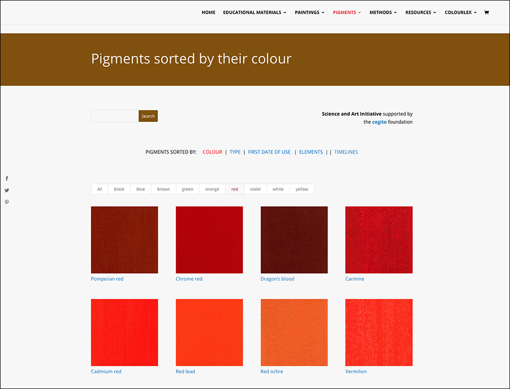
Explore the intricacies of paint pigments here: https://colourlex.com/pigments/
Safety concerns
Some paint pigments (like Cobalt Blue and Cadmium Yellow) can potentially present a health risk. It’s a complicated area to figure out, but definitely something to be aware of. This article covers some of the main issues: https://bit.ly/2HzXw7Y
Werner’s Nomenclature of Colors
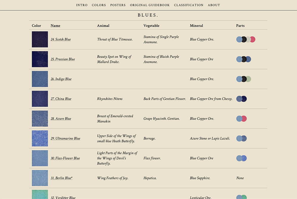
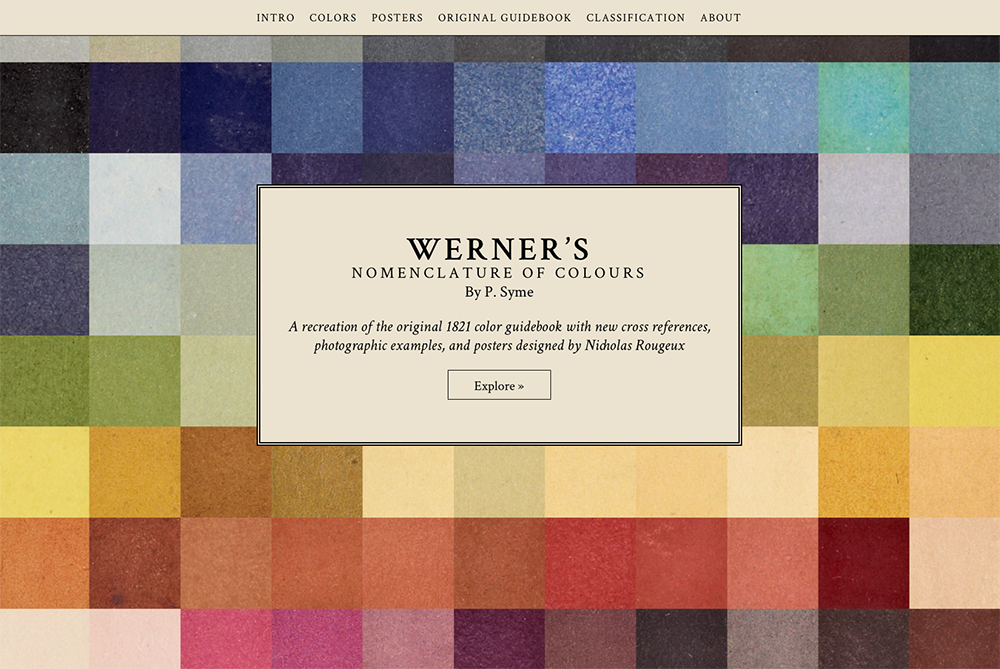
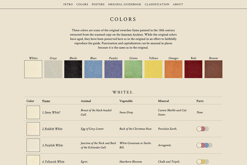
This classic color guide (from 1814) has been brought into the digital age by designer, Nicholas Rougeux.
https://www.c82.net/werner/#intro/
Zoologist

THE SCIENTIFIC ART OF ERNST HAECKEL.

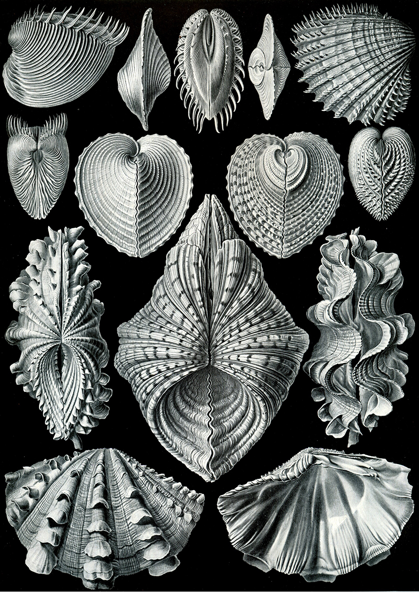
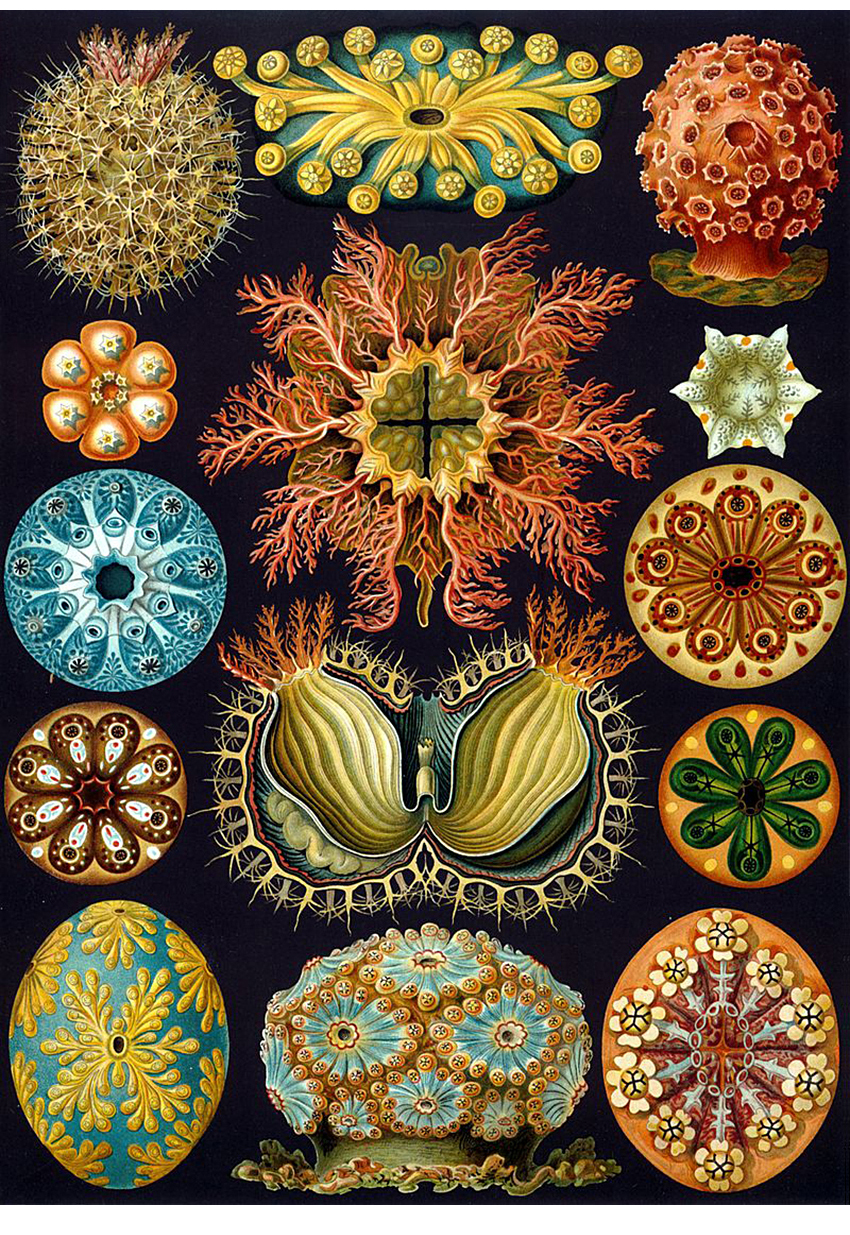
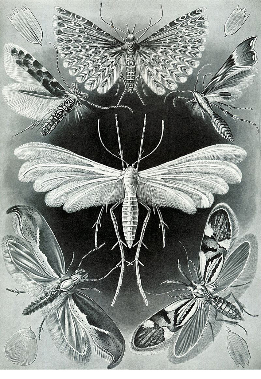
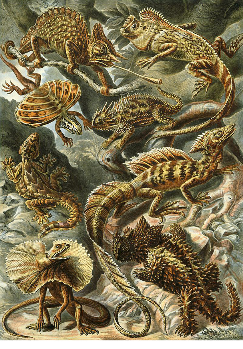
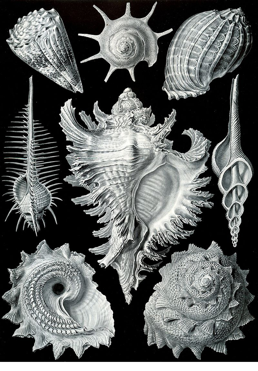
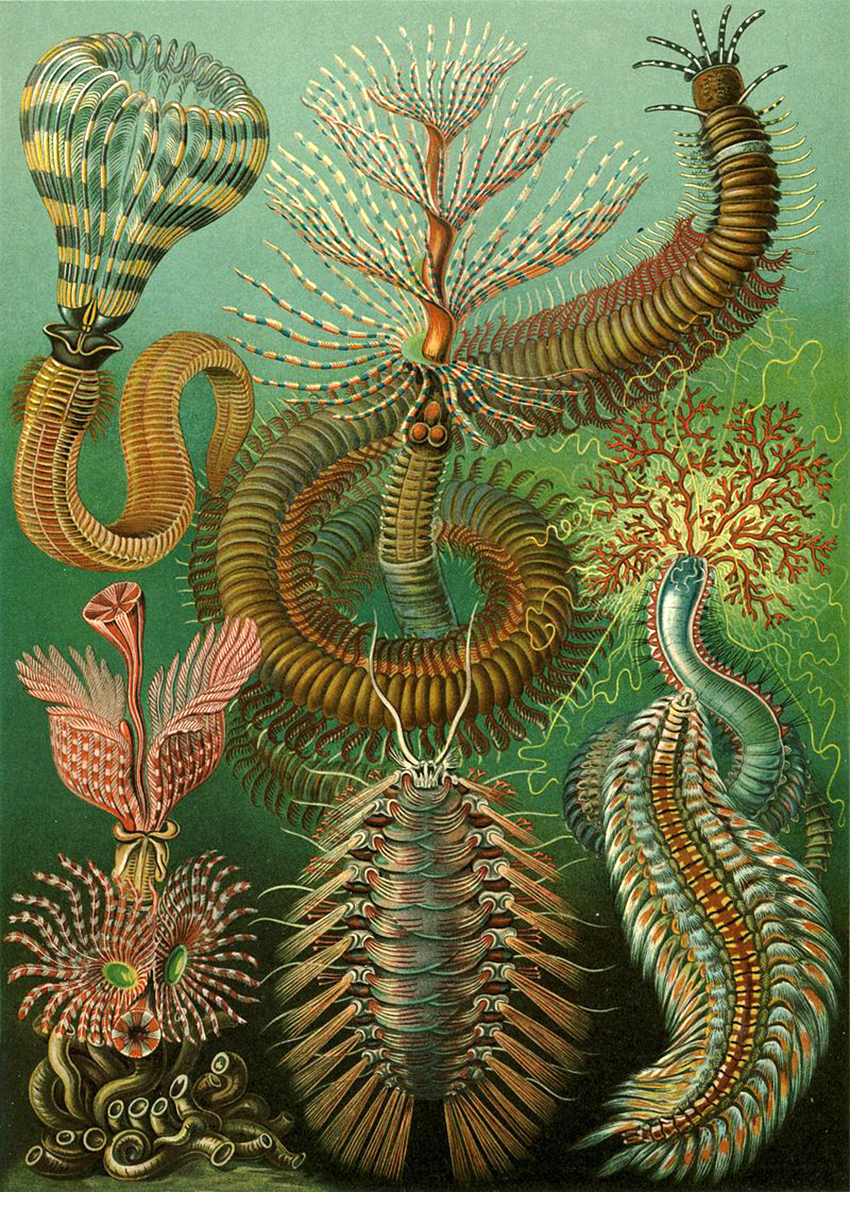
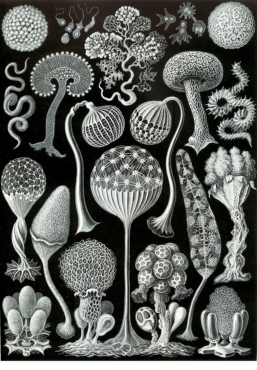
“Kunstformen del Natur” (Art Forms of Nature) is Haeckel’s masterwork. Published in 1904, it contains 100 illustrations of animals and sea-life in two volumes. The illustrations were originally published in ten sets over the previous six years.
Here are some examples of the plates. Above, bivalve shells. Below, sea squirts.

Moths.

Lizards.

Sea snail shells.

Ringed worms.

Slime molds.

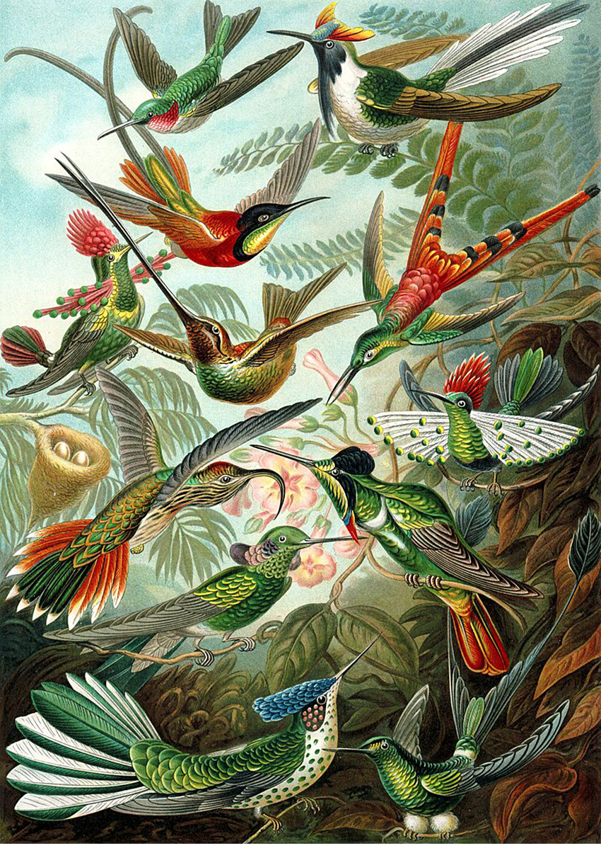
Hummingbirds.

Tree of Life
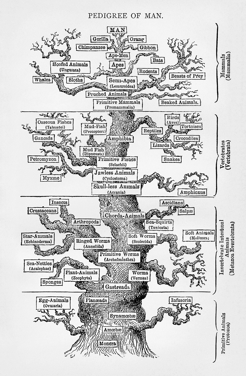
Haeckel was strongly influenced by Charles Darwin’s seminal book: “On the Origin of the Species.”
This diagram is from “Anthropogenie oder Entwickelungsgeschichte des Menschen” (Anthropogeny or the Evolution of Man), 1874.

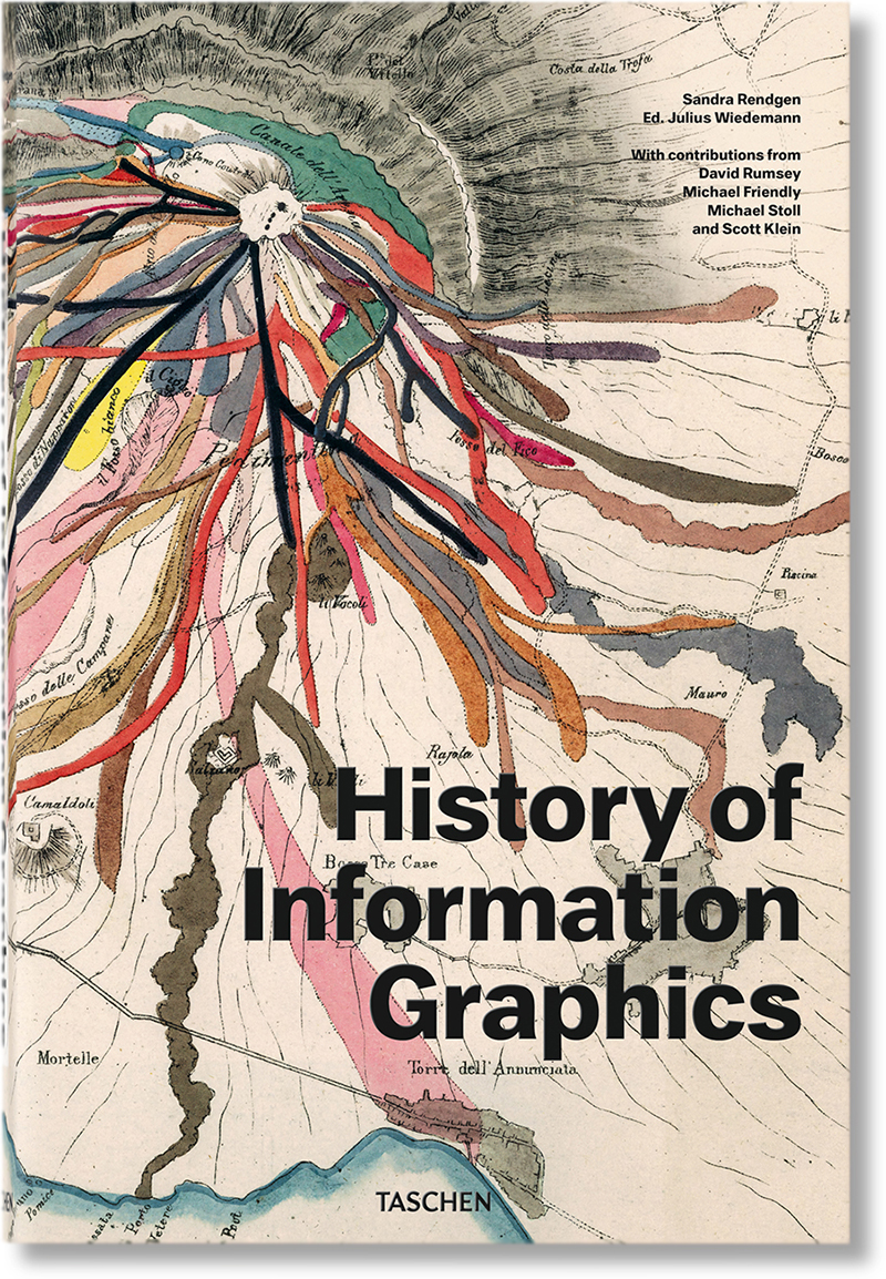
My previous post featured Taschen’s “History of Information Graphics”:
https://wp.me/p7LiLW-33l
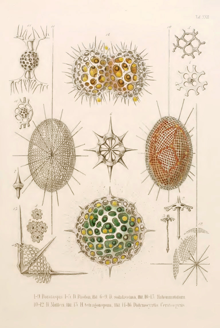
There’s a page in the book about Haeckel’s “Radiolaria.” (Protozoa with a diameter of 0.1 to 0.2 mm. They have mineral skeletons.)
Below is one of the plates.

History lessons

TWELVE CENTURIES OF INFOGRAPHICS.

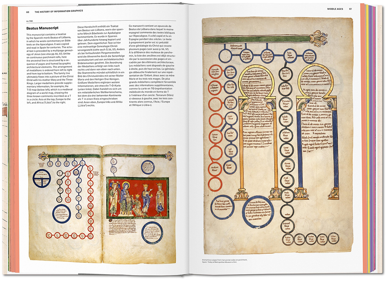
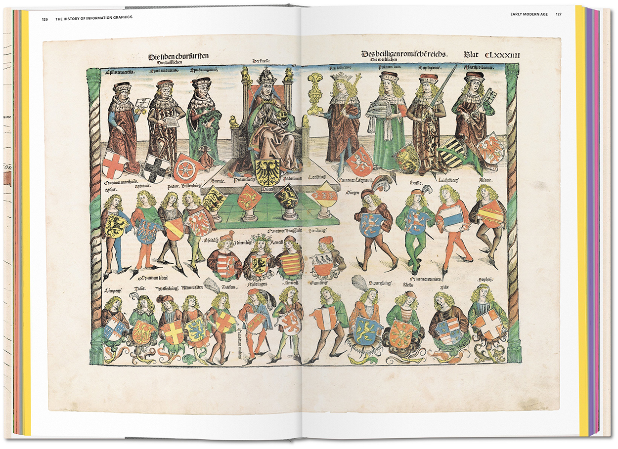
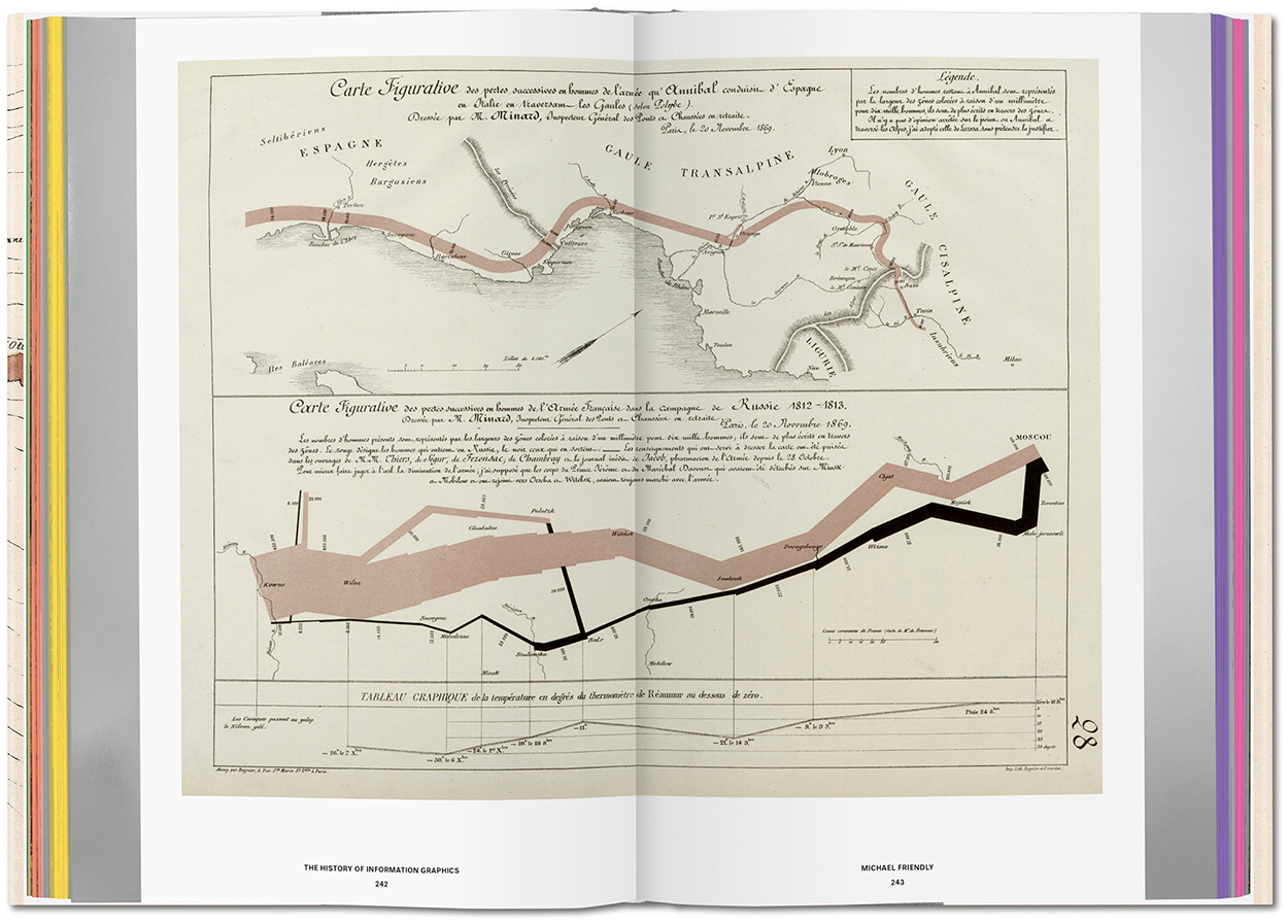
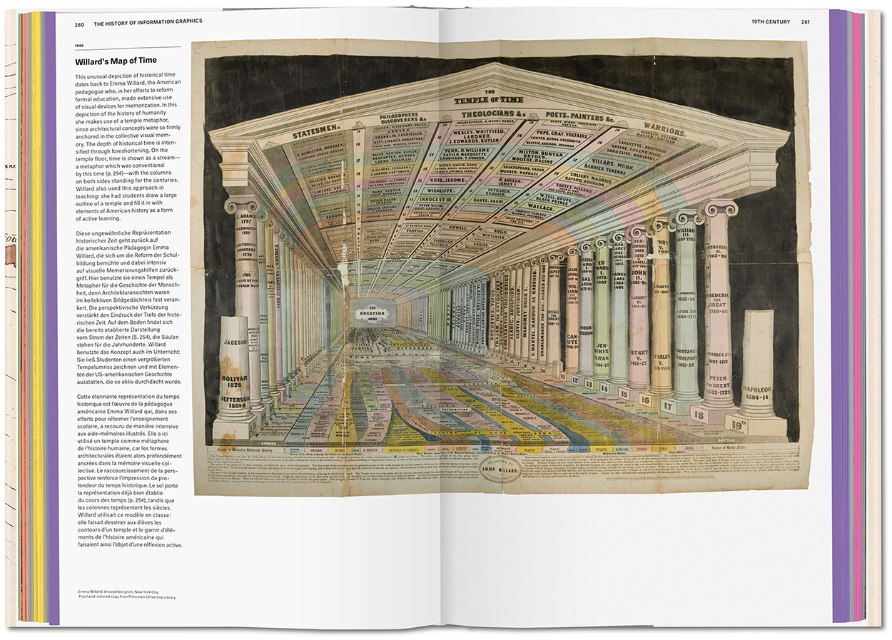
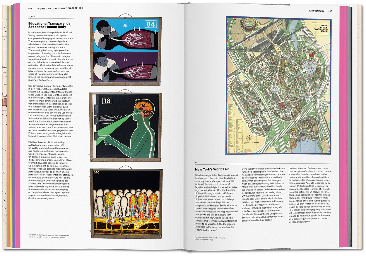
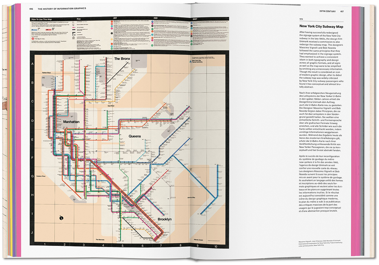
This impressive guide to historical graphics, curated by Sandra Rendgen and edited by Julius Wiedemann, was published last month. It’s big and heavy, in the Taschen tradition, and packed with around four hundred examples that track the development of information graphics from the Early Middle Ages to the end of the twentieth century. The historical progression is punctuated by separate sections that feature the collections of David Rumsey, Michael Friendly, Michael Stoll and Scott Klein. This is essential reading for people in our field.
Here are some sample spreads. Click on the images for larger versions.

Below, Beatus of Liébana, ca.1180.

Hartmann Schedel and Michael Wolgemut, 1493.

Charles-Joseph Minard, 1869. (From Michael Friendly’s collection.)

Emma Willard, 1846.

Left, Carl Weigand, ca. 1963. Right, Hermann Bollmann, 1964.

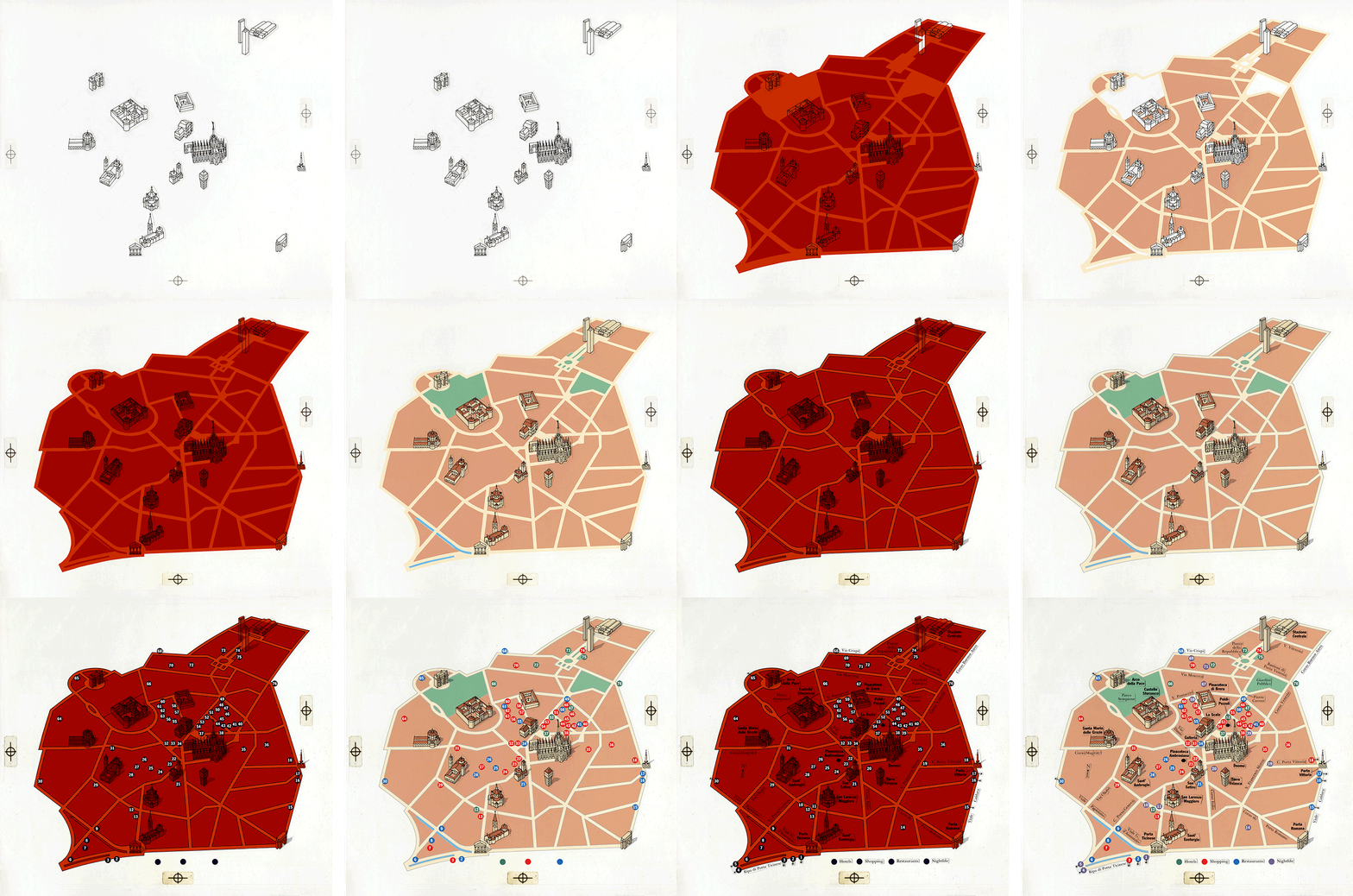
Massimo Vignelli and Bob Noorda, 1972.

Taschen’s website: https://bit.ly/2Z7pdiD

Transparency
I have a graphic in the twentieth-century section, but I’ve tried my best to be objective about the book. If you get a copy, you’ll see what I mean about there being a lot to learn from these pages.

35,000 years ago
The first post on this blog (in August 2016) was a very short history of infographics: https://wp.me/p7LiLW-9C

Pictograms revisited

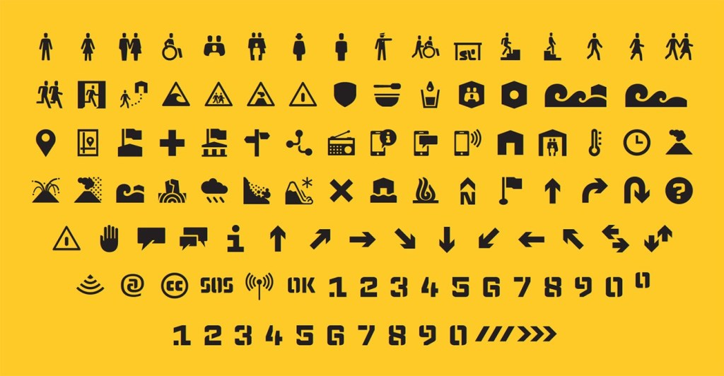
COMMUNICATING WITH SYMBOLS.

This is the final post of my recycling series. Last, but not least. The power of pictograms shouldn’t be under-estimated. They’re an important part of the infographic toolkit.

Symbol world https://wp.me/p7LiLW-1Dt

Hazardous https://wp.me/p7LiLW-1Hs


Icon invasion
https://wp.me/p7LiLW-1so


Everyday symbols
https://wp.me/p7LiLW-Aa


Picture language
https://wp.me/p7LiLW-LX

Emergency symbols https://wp.me/p7LiLW-17w


The Accessible Icon Project
https://wp.me/p7LiLW-1QI


Symbol art
https://wp.me/p7LiLW-1U3


Pictograms on poles
https://wp.me/p7LiLW-5d


Archaeological pictograms
https://wp.me/p7LiLW-V0

Last week’s post: Design revisited
https://wp.me/p7LiLW-30F

Design revisited

LOOKING AT THE BIGGER PICTURE.

Of course, good design is vital if our infographics are going work effectively (and attract attention).
Here’s some posts that look at general design themes.

Organized https://wp.me/p7LiLW-Z4

Pantone https://wp.me/p7LiLW-qq

Low-res https://wp.me/p7LiLW-Z1


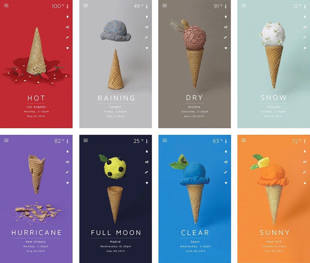
Less but better
https://wp.me/p7LiLW-13C


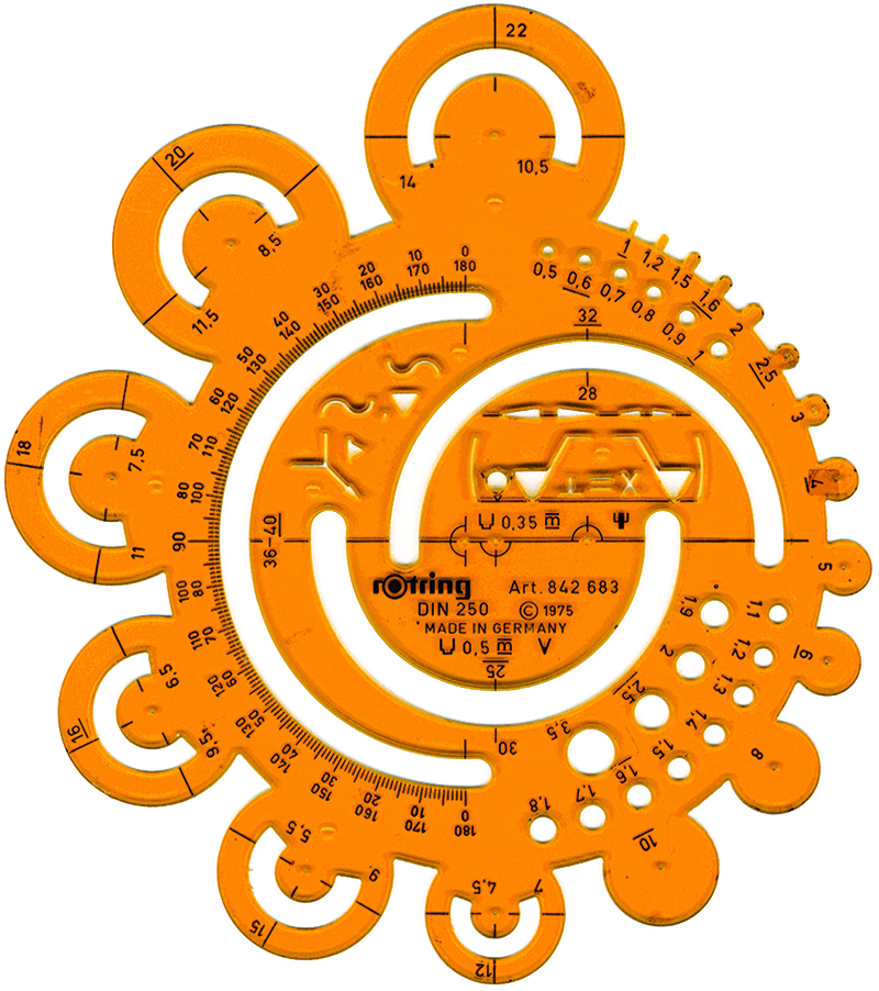
Paper graphics
https://wp.me/p7LiLW-17m


The Hollywood effect
https://wp.me/p7LiLW-5a

© Universal Pictures


Simplicity
https://wp.me/p7LiLW-17S


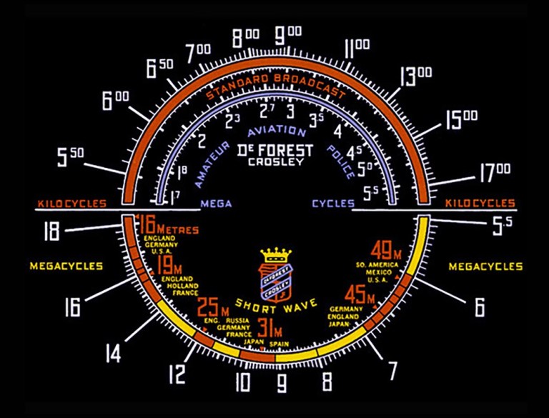
Radio displays
https://wp.me/p7LiLW-17t


Outside the box
https://wp.me/p7LiLW-1pF


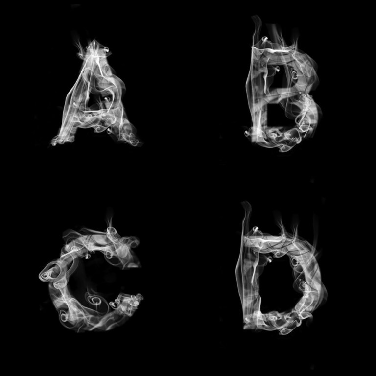
Pictorial typefaces
https://wp.me/p7LiLW-1yQ

Last week’s post: Tools
https://wp.me/p7LiLW-30D

Next week’s post: Pictograms

Tools revisited
ANALOG INFOGRAPHIC EQUIPMENT.

Once upon a time, every graphic designer needed to make regular visits to the art store. It was all about ink, paint, overlay film etc. Then along came the computer and everything changed. However, the underlying information design skills haven’t changed at all.
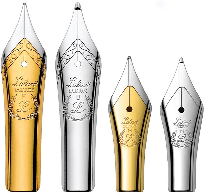
Tools of the trade https://wp.me/p7LiLW-EI

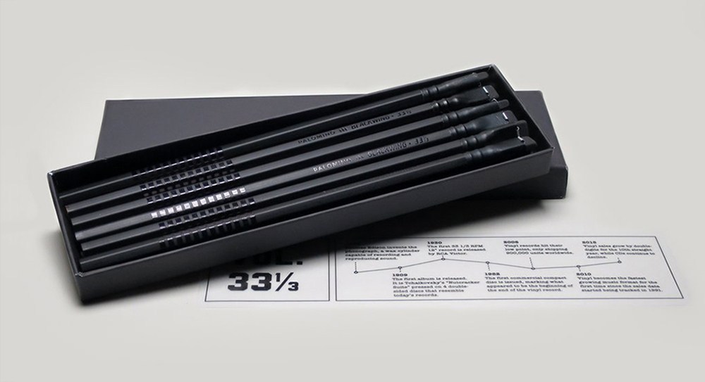
Beautiful pencils https://wp.me/p7LiLW-2GQ


Pencraft
https://wp.me/s7LiLW-pencraft


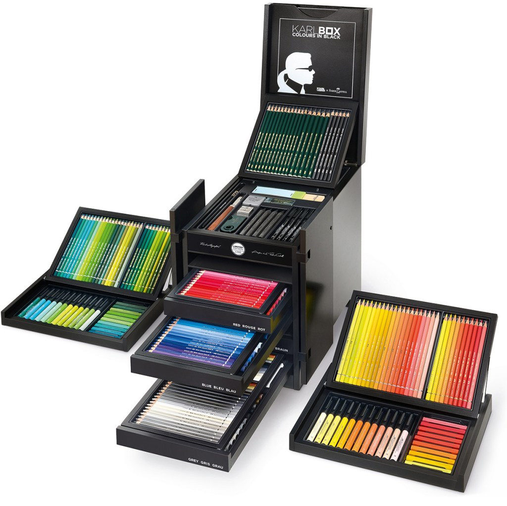
The $2,850 crayon set
https://wp.me/p7LiLW-1Wc

The $1,263 paintbrush https://wp.me/p7LiLW-1M5

Dot pattern https://wp.me/p7LiLW-Kv

The ultimate pencil https://wp.me/p7LiLW-4a

Mechanical https://wp.me/p7LiLW-Mw

CMYK https://wp.me/s7LiLW-cmyk

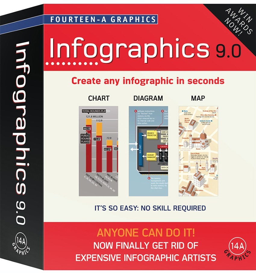
Infographics made easy https://wp.me/p7LiLW-Ic

Last week’s post: History revisited
https://wp.me/p7LiLW-302

Next week’s post: Design

History revisited

GOING BACK IN TIME.

There’s a lot to learn from our rich information design heritage. Below, links to ten historically-themed posts.

Bayer’s masterpiece https://wp.me/p7LiLW-xO

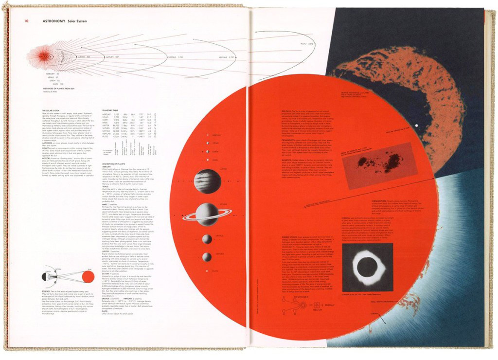
Mid-century data viz https://wp.me/p7LiLW-2AI

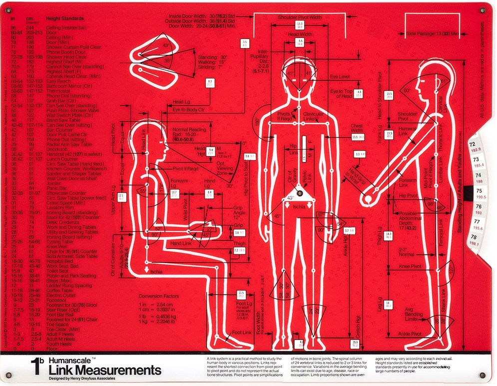
Humanscale https://wp.me/p7LiLW-1y5

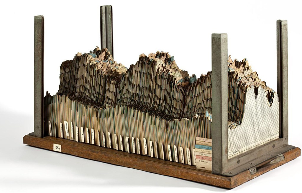
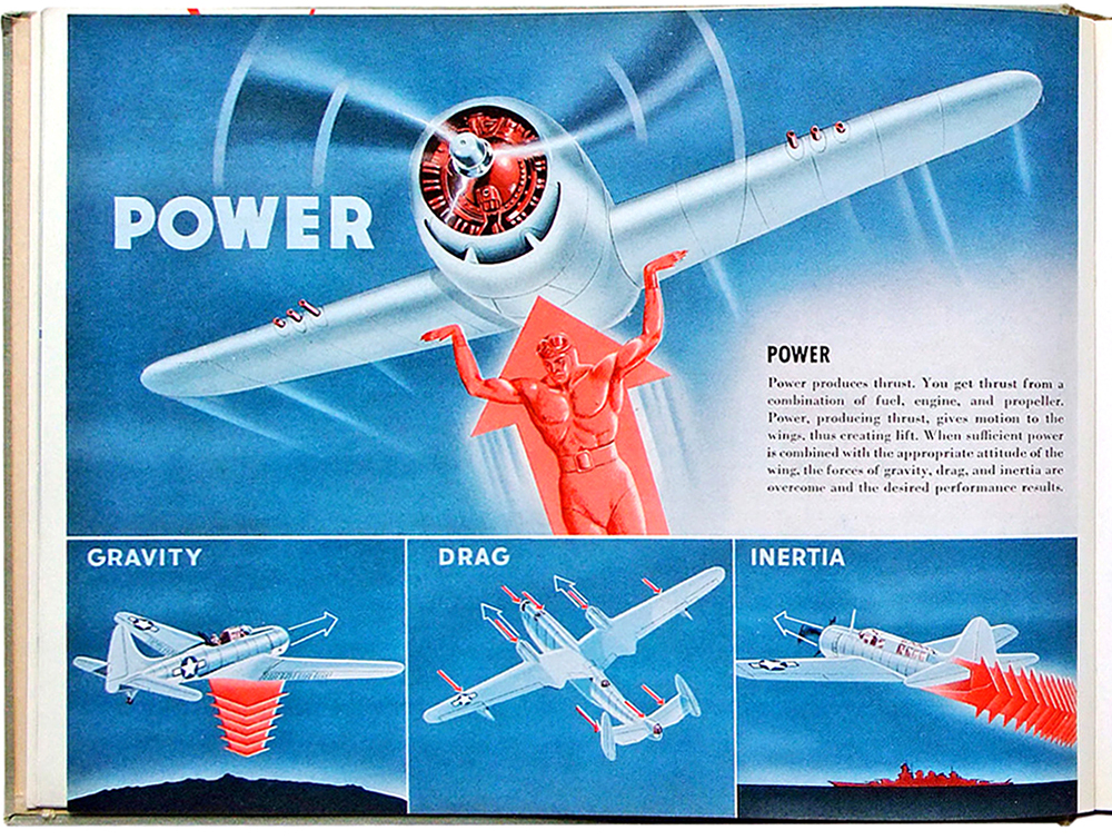
Flight thru Instruments https://wp.me/p7LiLW-Rr

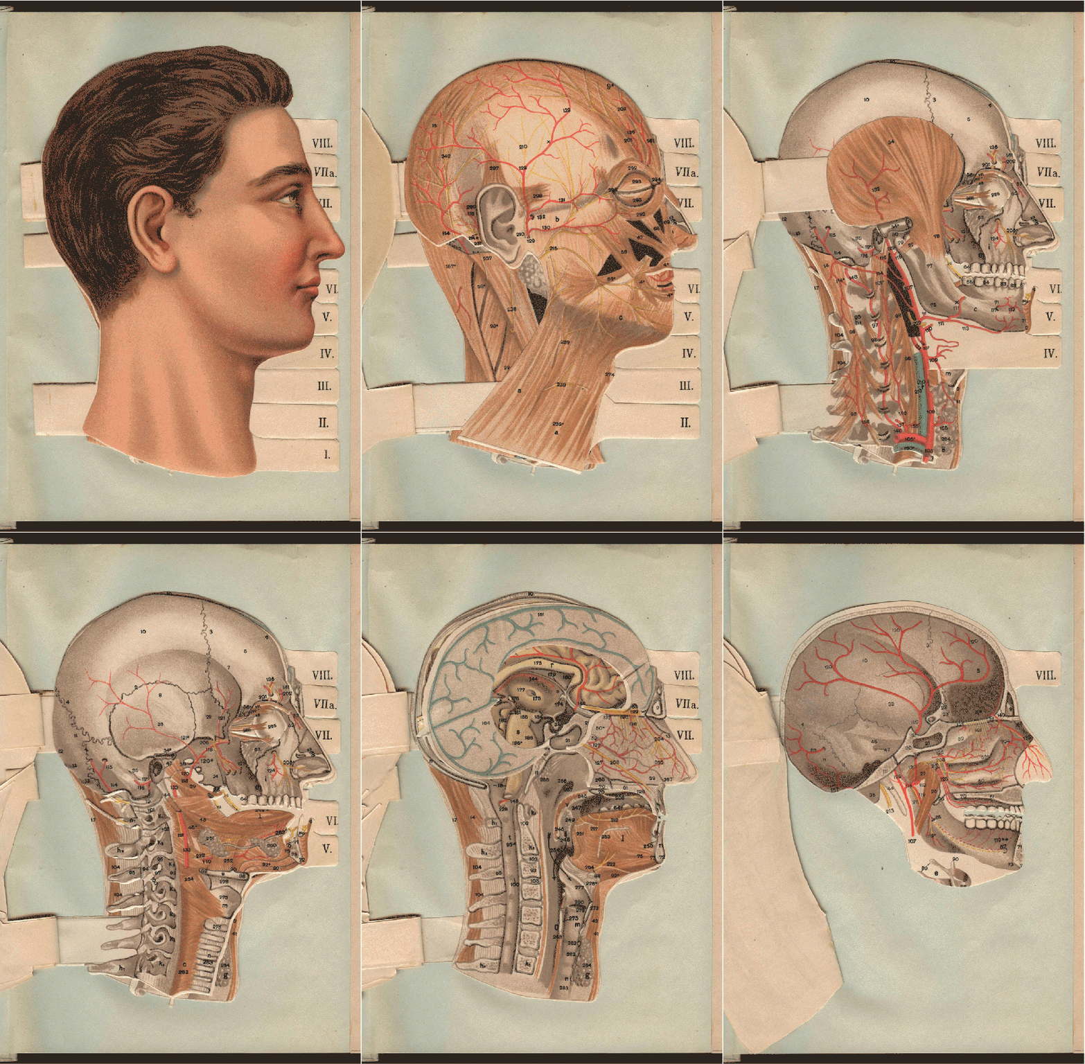
Flap books https://wp.me/p7LiLW-IV

Leonardo who? https://wp.me/p7LiLW-1WJ

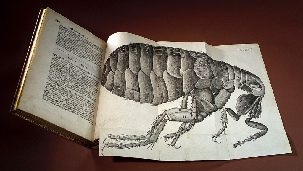
Microscopic https://wp.me/p7LiLW-1W5

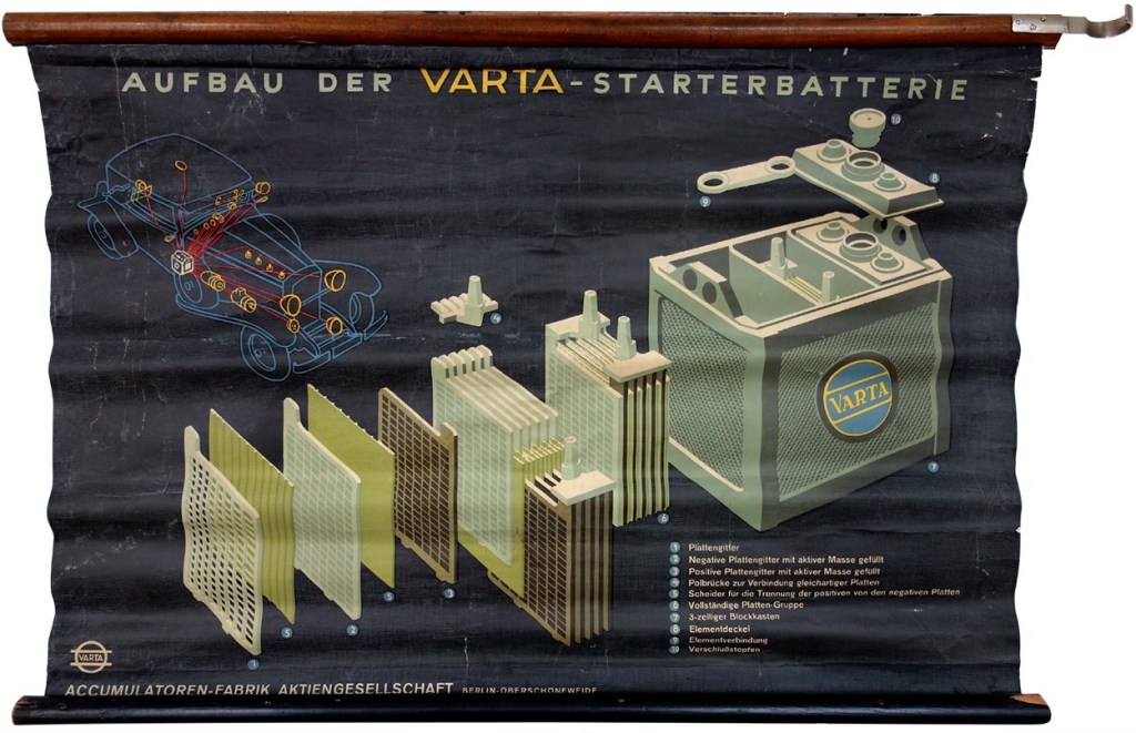
Wall charts https://wp.me/p7LiLW-1Sj

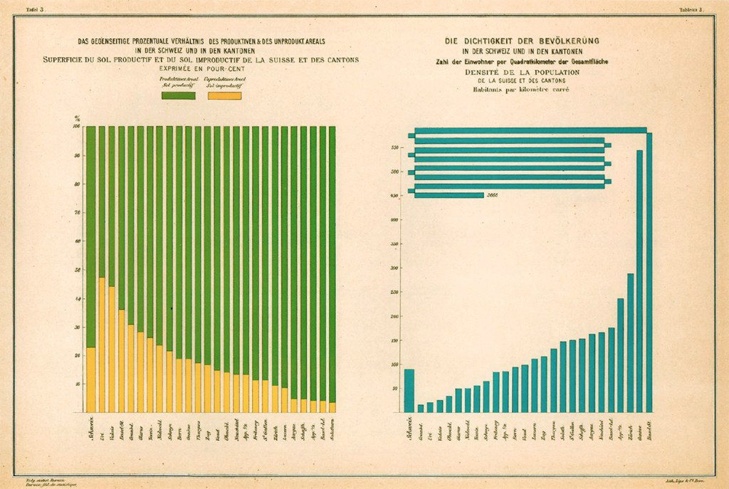
Swiss data viz https://wp.me/p7LiLW-2iq

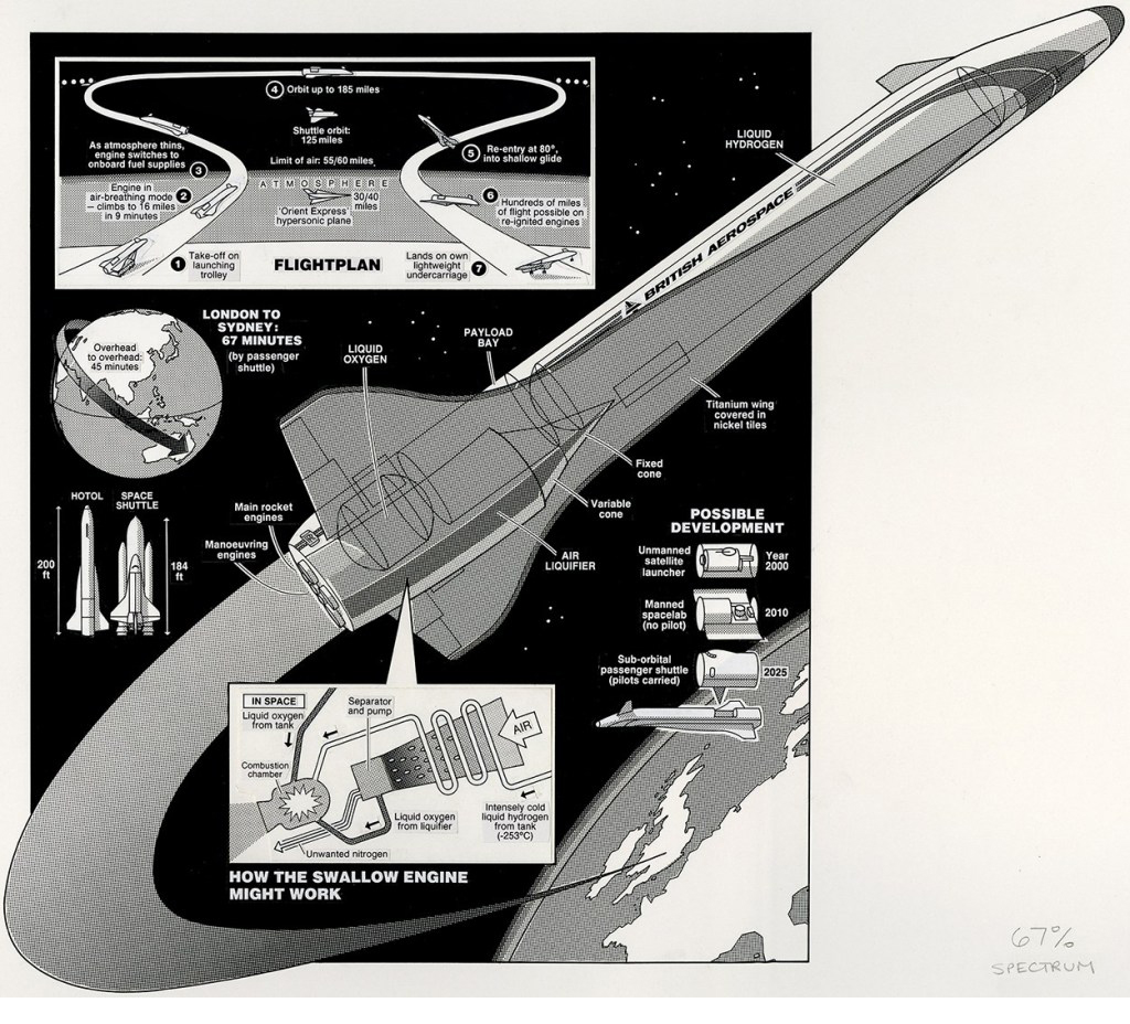
Space Age https://wp.me/p7LiLW-2RW

Last week’s post: Maps revisited
https://wp.me/p7LiLW-2Ze

Next week’s post: Tools

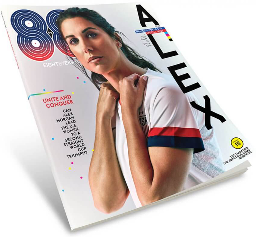
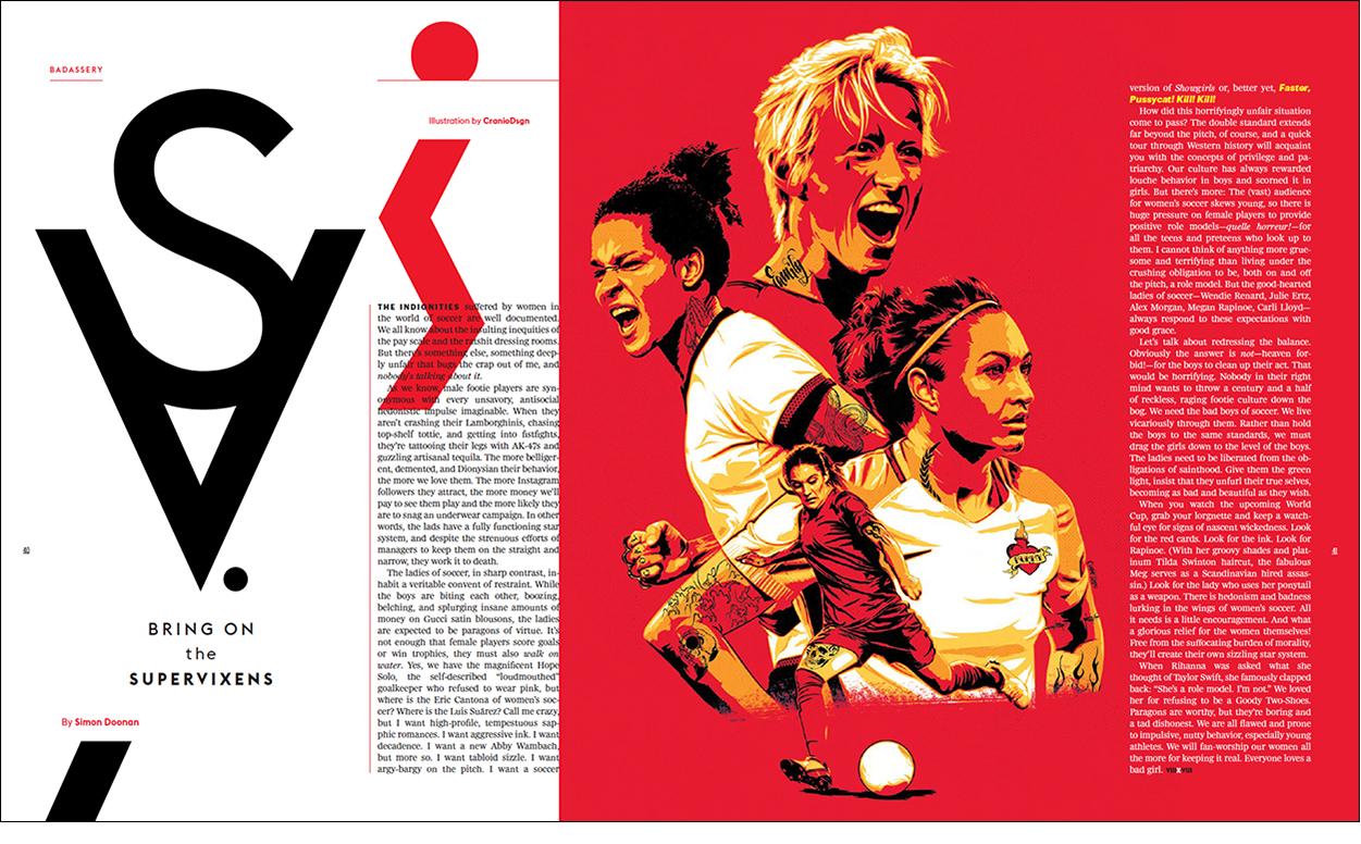
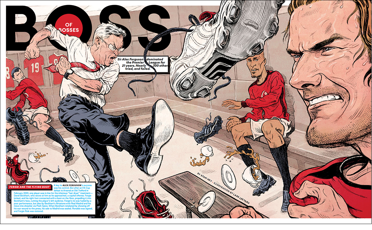
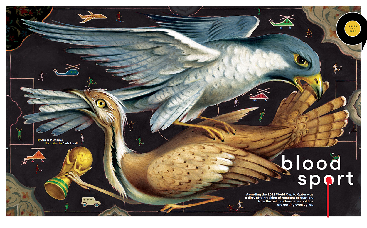
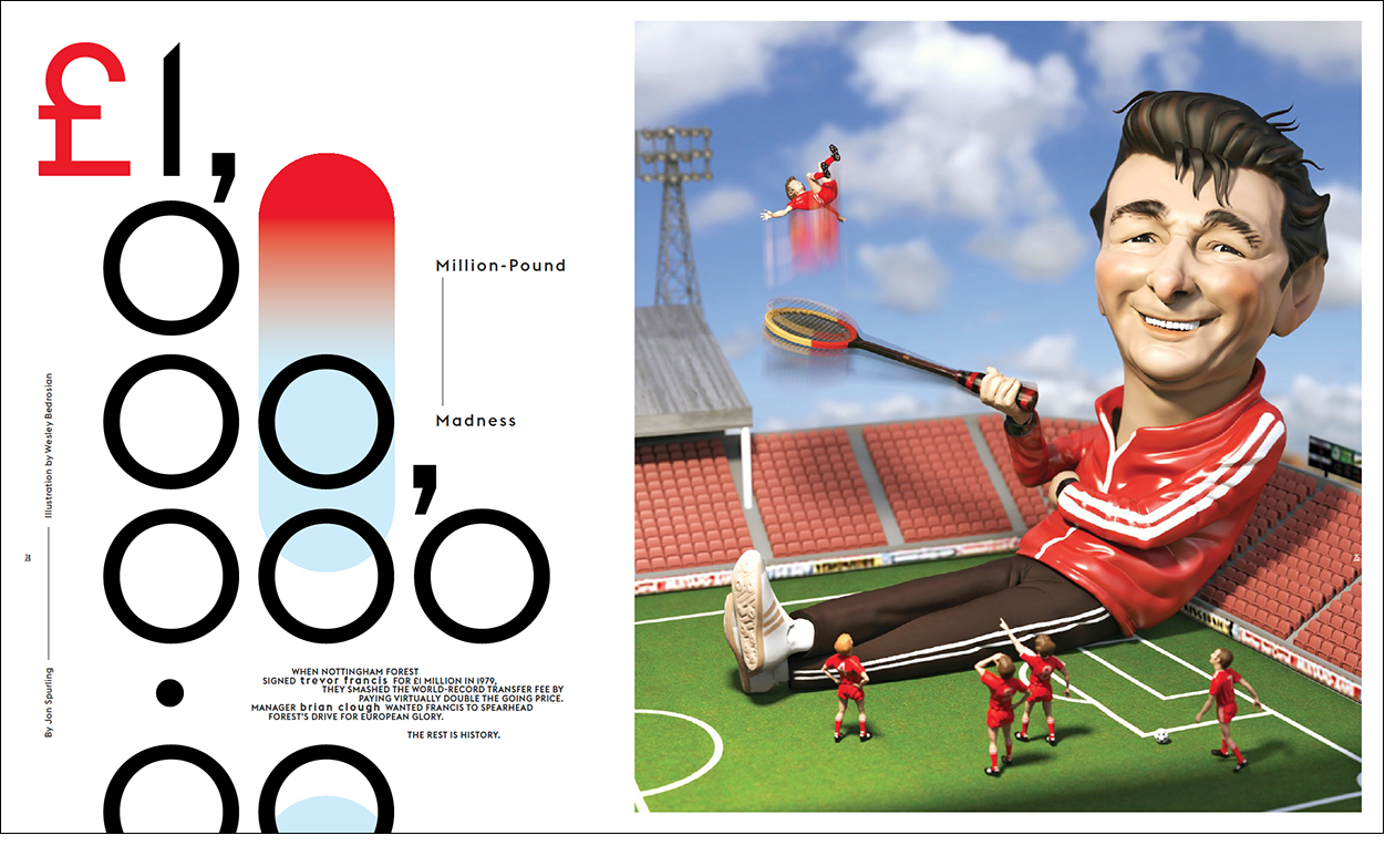
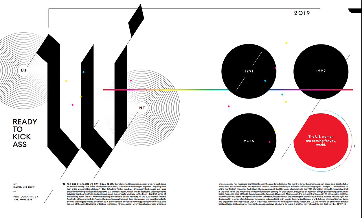
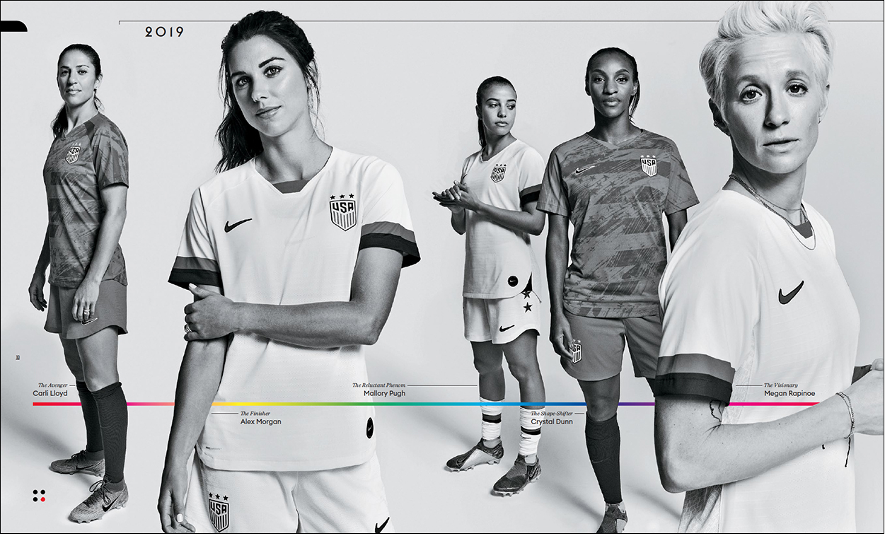
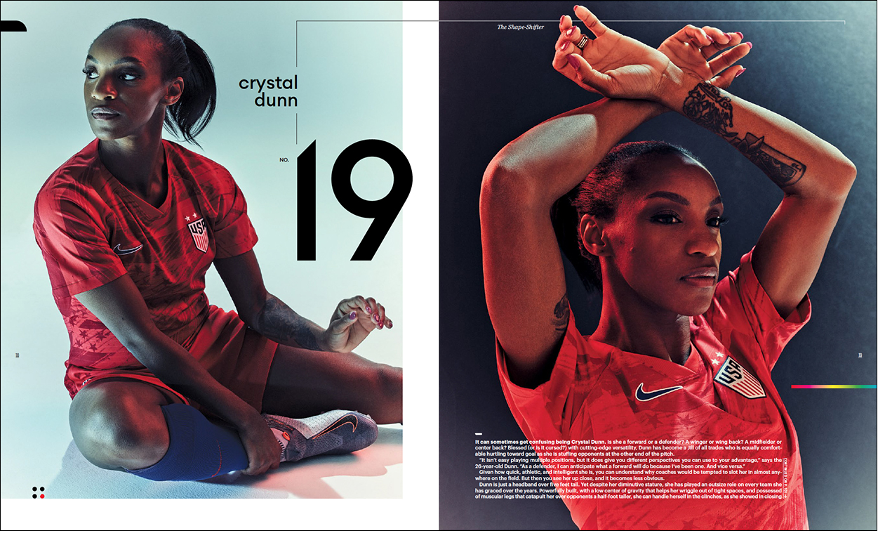
Eight by Eight Issue 15: Women’s World Cup

THE MAGAZINE FOR PEOPLE WHO LOVE FOOTBALL (SOCCER), AND EXCELLENT DESIGN.


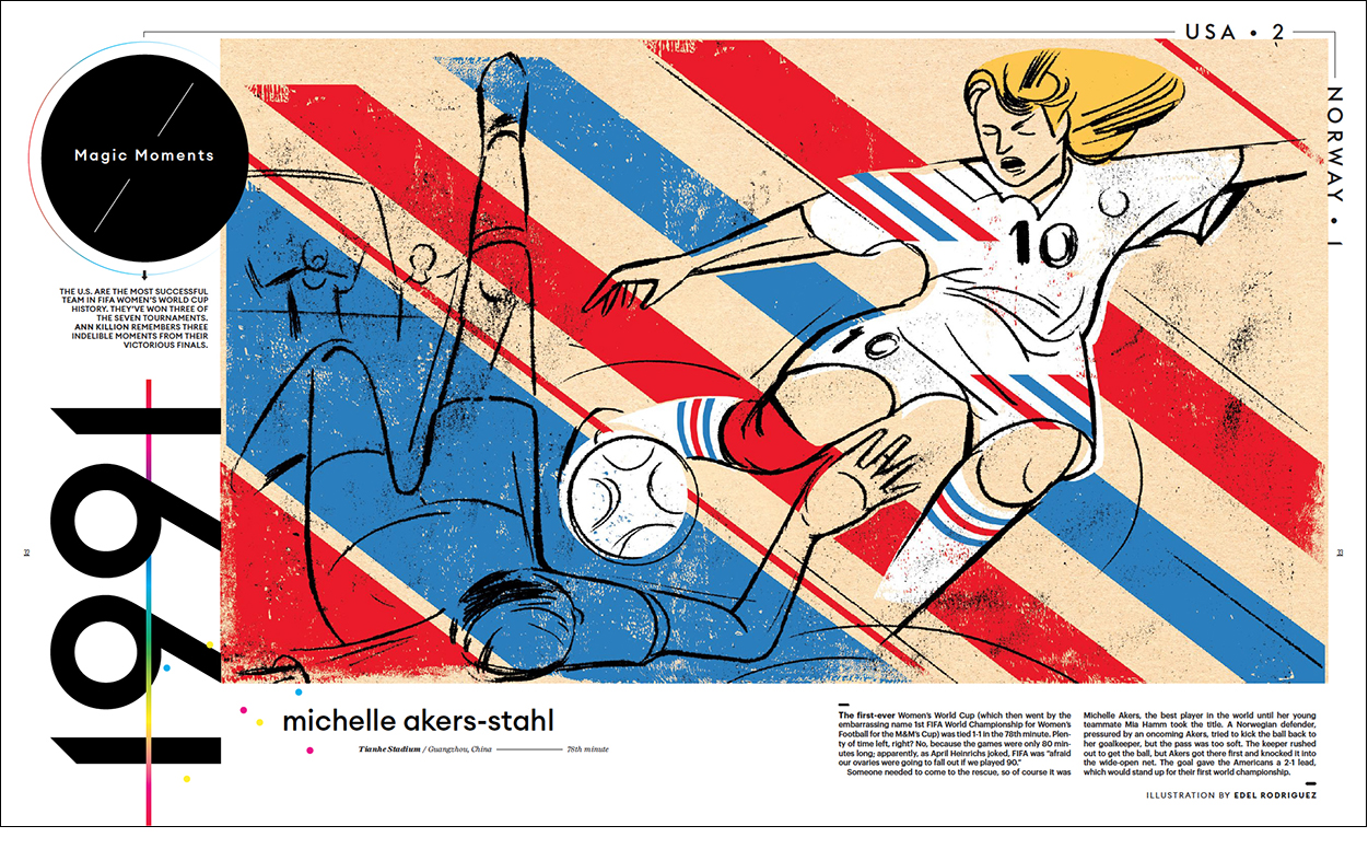
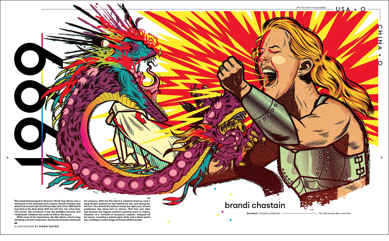
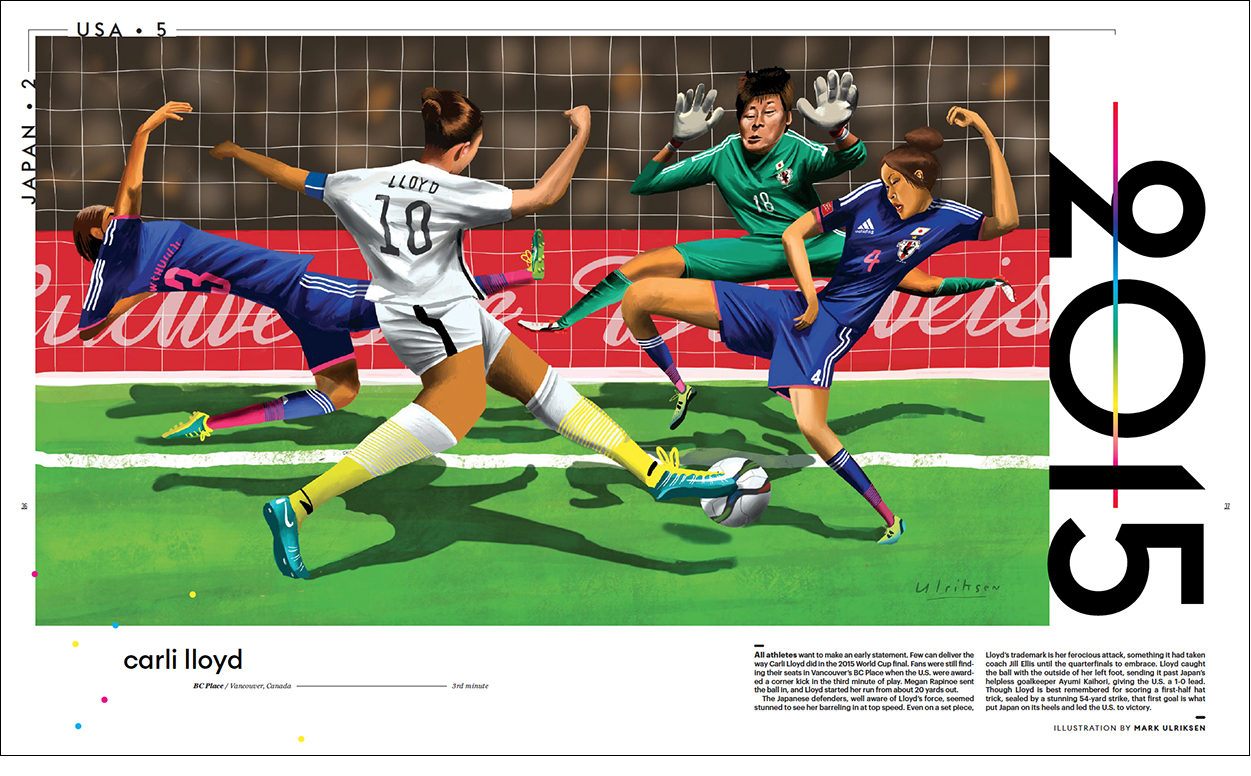
The latest issue features the FIFA Women’s World Cup which starts on June 7 in Paris. The United States team is aiming to defend its world title, and win the tournament for the fourth time. They can do it, but there will be some tough games ahead. Below are some of the spreads from Issue 15. Order it here: https://shop.8by8mag.com/collections/current-issue

Maps revisited

A SAMPLE OF PREVIOUS GEOGRAPHIC POSTS.

Another set of examples from the multiple Nobel Prize-winning Grimwade archive. This time it’s all about location.

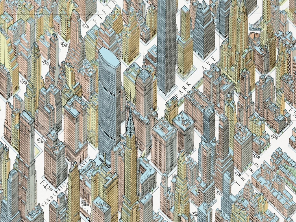
The incredible Bollmann map workshop https://wp.me/p7LiLW-Ak

Moving borders https://wp.me/p7LiLW-UY

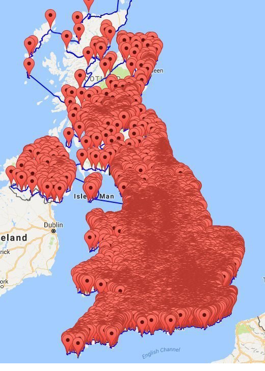
Data mapping https://wp.me/p7LiLW-2J1

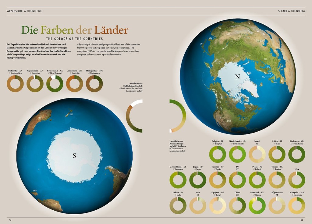
Mega-globes https://wp.me/p7LiLW-3D

North https://wp.me/s7LiLW-north

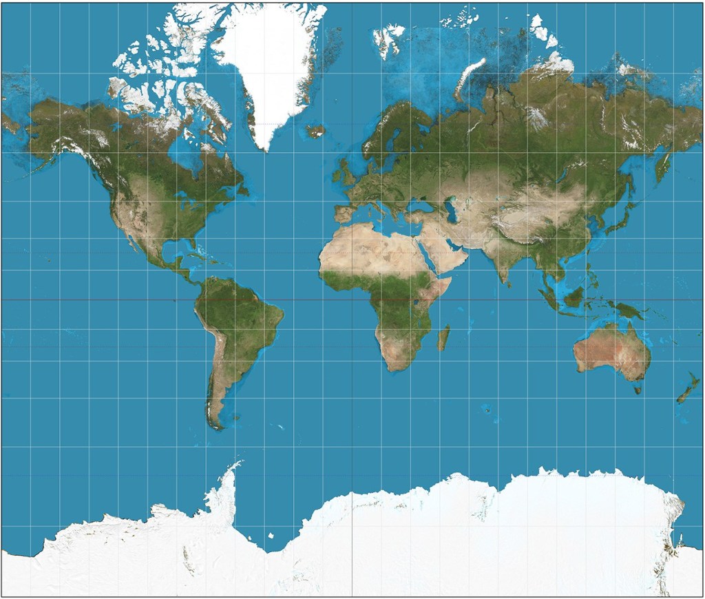
Mercator projection https://wp.me/p7LiLW-1Qn

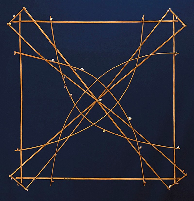
Stick maps https://wp.me/p7LiLW-2bd

Equator https://wp.me/s7LiLW-equator

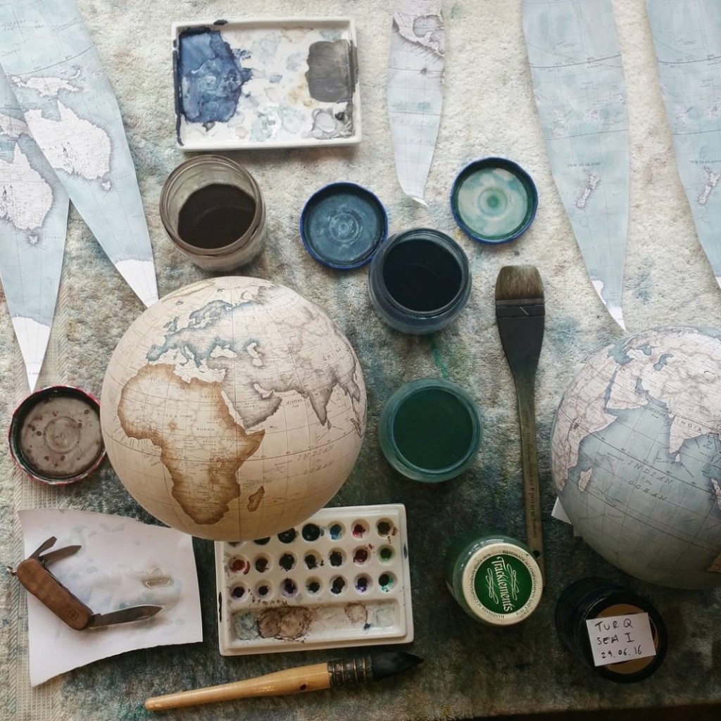
Globemaker https://wp.me/p7LiLW-qD

Earthlight https://wp.me/p7LiLW-1Y0

Last week’s post: Data viz revisited
https://wp.me/p7LiLW-2Yy

Next week: Historical graphics

Data viz revisited

FROM PIE CHARTS TO FAKE CHARTS.

Following on from last week’s roundup of past infographic posts, here’s ten from the data visualization category.

Pie chart anxiety https://wp.me/p7LiLW-zt

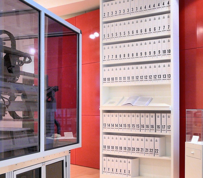
DNA https://wp.me/s7LiLW-dna

Colors of cars https://wp.me/p7LiLW-2b1

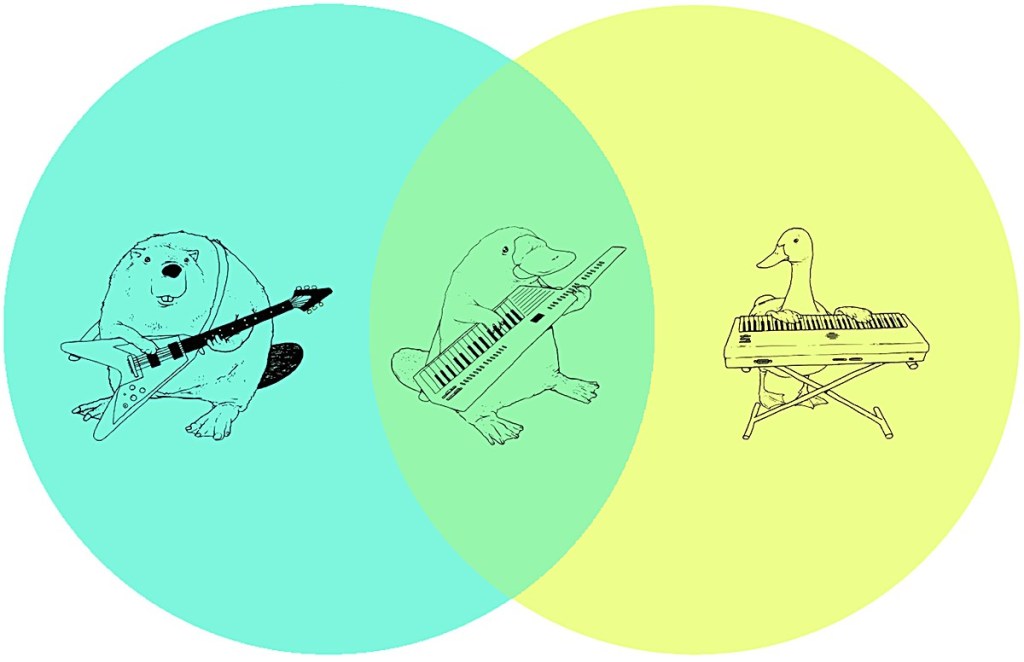
Venn diagram https://wp.me/p7LiLW-1F9

A question of scale https://wp.me/p7LiLW-Fc

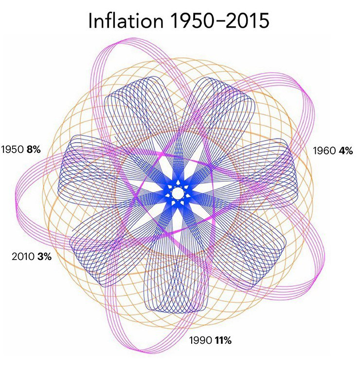
Circular data https://wp.me/p7LiLW-24O

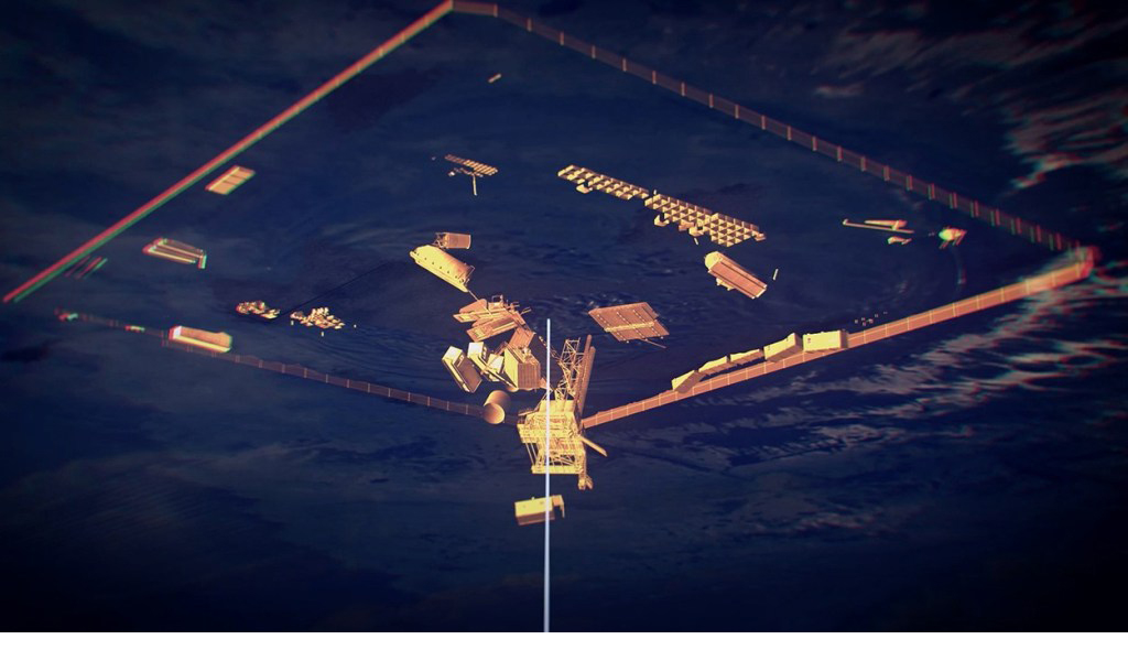
Invisible Netherlands https://wp.me/p7LiLW-Ru

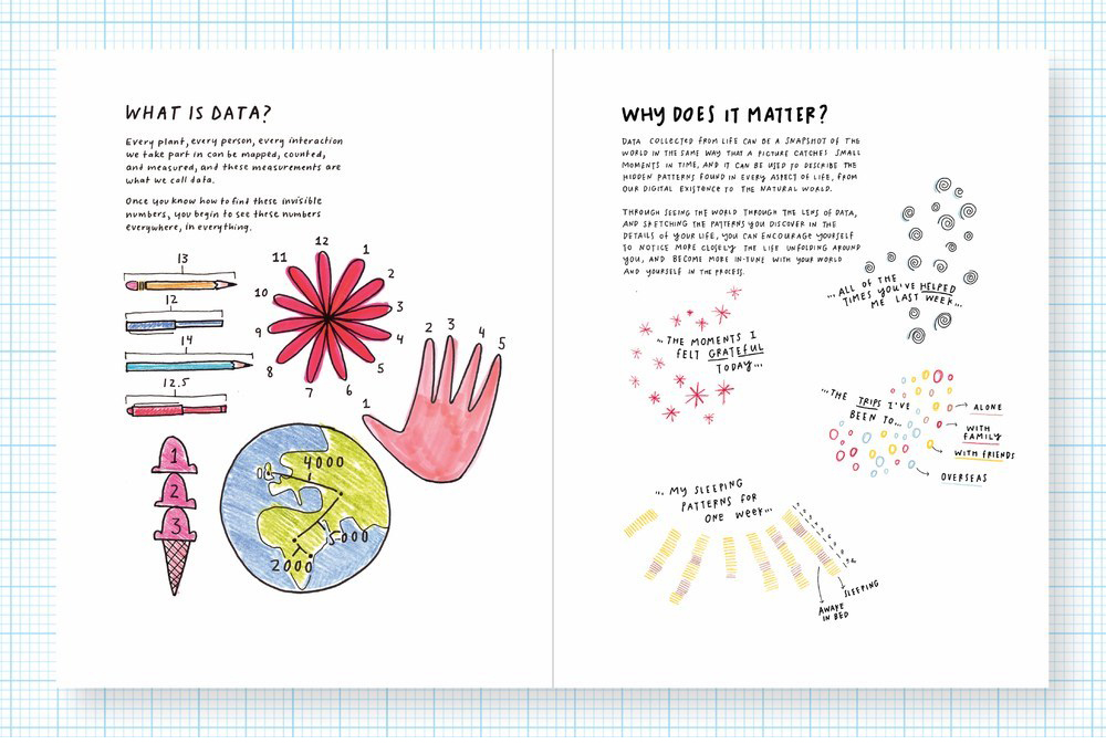
Personal data viz https://wp.me/p7LiLW-2Ip

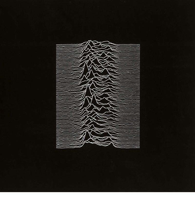
The dataviz album cover https://wp.me/p7LiLW-Yb

Fake data viz https://wp.me/p7LiLW-11q

Last week’s post: Infographics revisited
https://wp.me/p7LiLW-2Y6

Next week: Maps