WATCHING THE UNIVERSE.
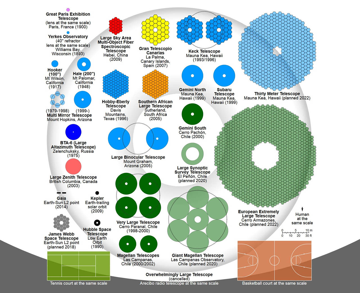
A comparison of primary mirrors. If a telescope has more than one mirror, the dotted lines show how large a single mirror would be (if it had the equivalent light-gathering ability). Below, some details of the three telescopes with the largest mirrors.
Infographic by Cmglee (via Wikimedia).
Overwhelmingly Large Telescope (OLT)
Sadly this massive example (with its “this-is-what-it-is” name) has been canceled. The mirror would have been a shocking 328 feet (100 meters) in diameter. It could have captured images 1,500 times fainter than the faintest Hubble Space Telescope image. Huge telescope mirrors are segmented because it’s not practical to make, or transport over long distances, a single mirror of the same size. By the way, the OLT would have cost $1.5 billion.
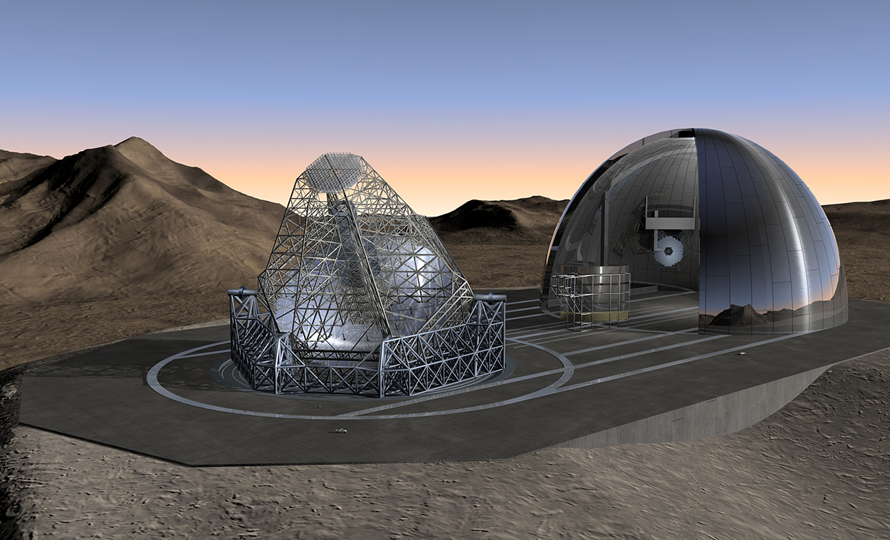
Image: ESO.
Extremely Large Telescope (ELT)
Under construction in the Atacama Desert, Chile. It’s estimated that the images captured will be 16 times sharper than those from the Hubble Space Telescope.
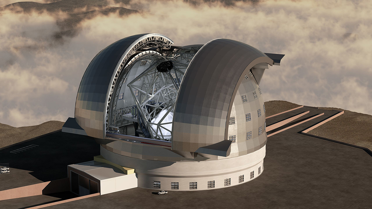
Image: Swinburne Astronomy Productions/ESO
Thirty Meter Telescope (TMT)
Proposed for Mauna Kea, Hawaii. Will operate in the near-ultraviolet to mid-infrared part of the spectrum.
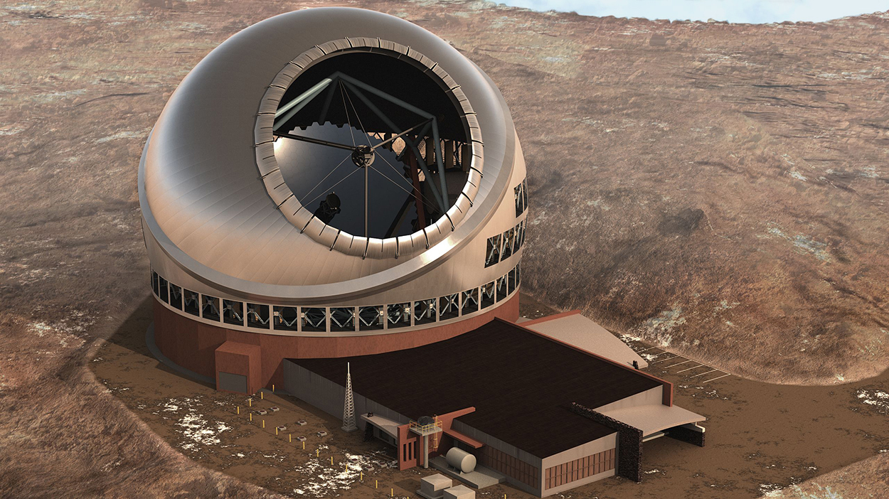
Image: TMT Observatory Corporation
Laser guide
The Very Large Telescope (VLT) in the Atacama Desert, Chile, is an array of four large optical telescopes, and four smaller auxiliary telescopes, working in unison. The Laser Guide Star (LGS) creates an artificial star at an altitude of 56 miles (90 km). The telescopes use a system called “adaptive optics,” that makes optical corrections for atmospheric distortion using this laser reference point. Computers send signals to deform the secondary mirrors and thus make the necessary high-speed adjustments to the real-time image. The primary mirror’s shape is constantly adjusted using “active optics,” a computer-controlled system of actuators.
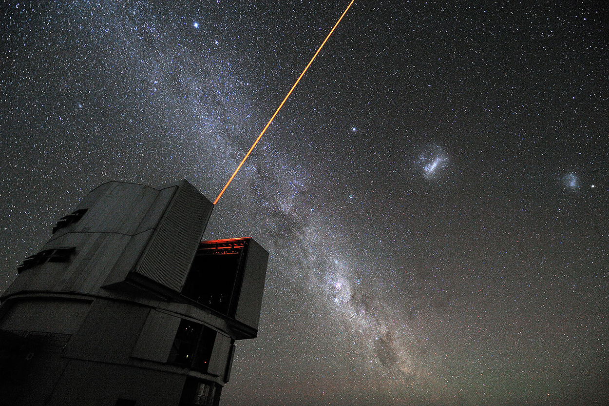
Photograph: G.Hüdepoh/ESO.
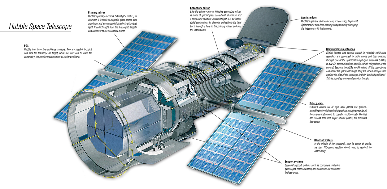
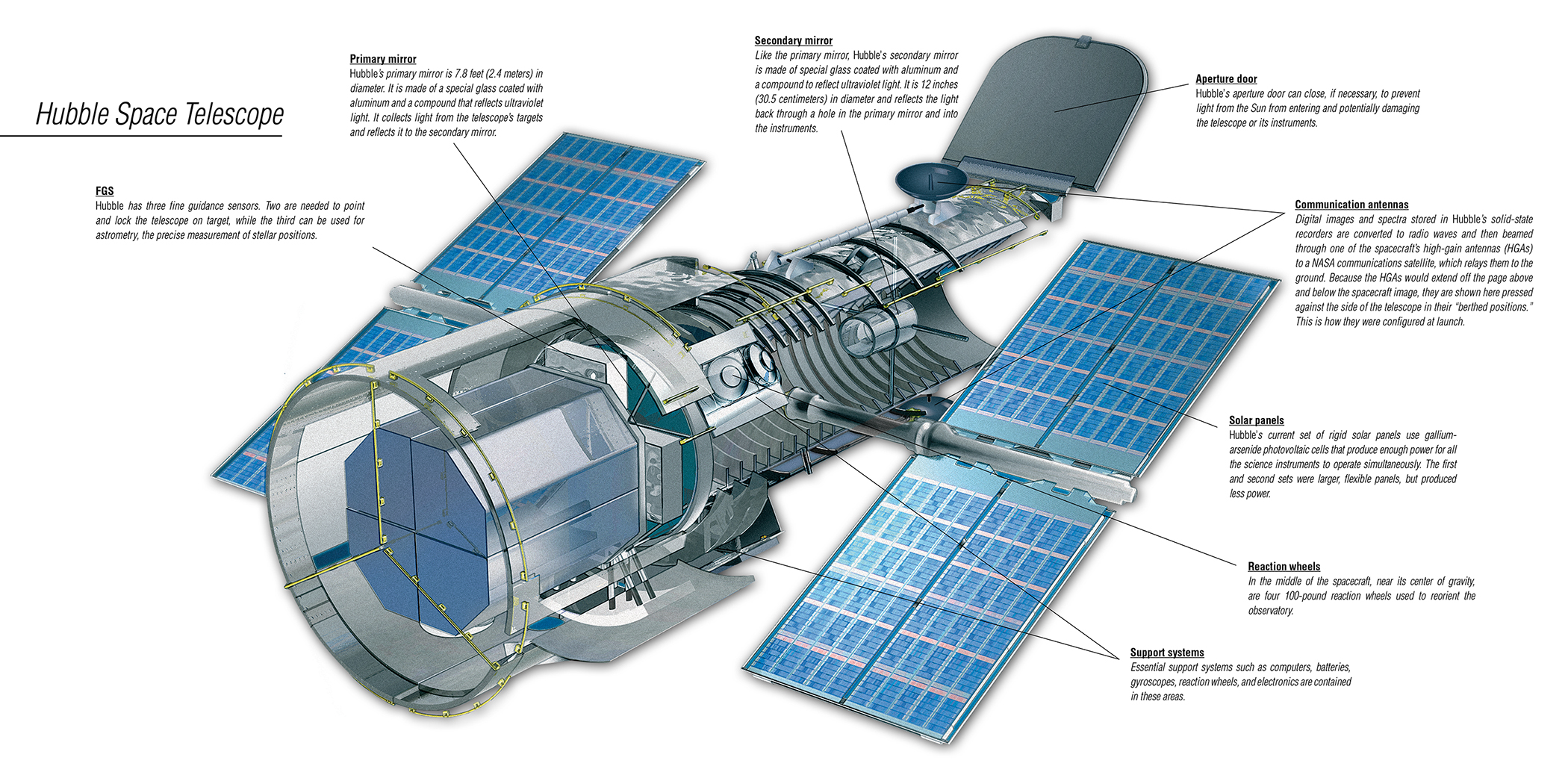
Hubble Space Telescope
This very successful orbital workhorse was launched in 1990 into a low Earth orbit of 340 miles (547 km). It’s primary mirror is 7.8 feet (2.4 meters) in diameter. Now, here comes one of those mind-blowing space facts (from NASA) that none of us can get our head around: Hubble can lock onto a target without deviating more than 7/1000th of an arcsecond, or about the width of a human hair seen at a distance of one mile. And it’s moving at 17,000 mph (27,300 kph).
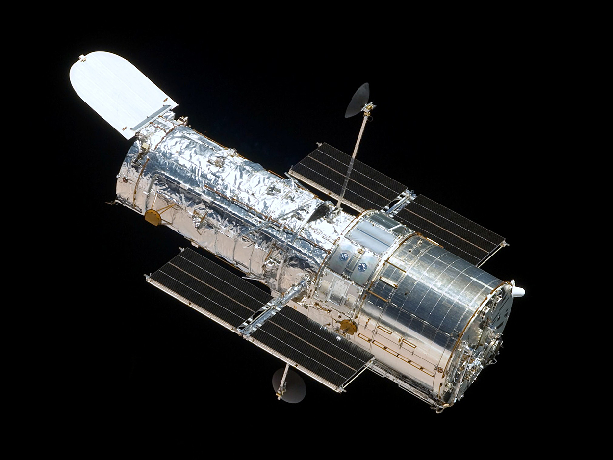
Photograph: NASA.
Inside view. Click on the image for a larger version.
The future of space observation
The James Webb Telescope, launching in 2021, will be parked about one million miles from Earth. It’s orbit around the sun at Lagrange point 2 (L2) is optimal for maintaining a constant temperature. The sunshield will keep out light from the Sun and the Earth, and allow the telescope’s sensors (which detect infrared light) to generate unprecedented views of stars and galaxies.
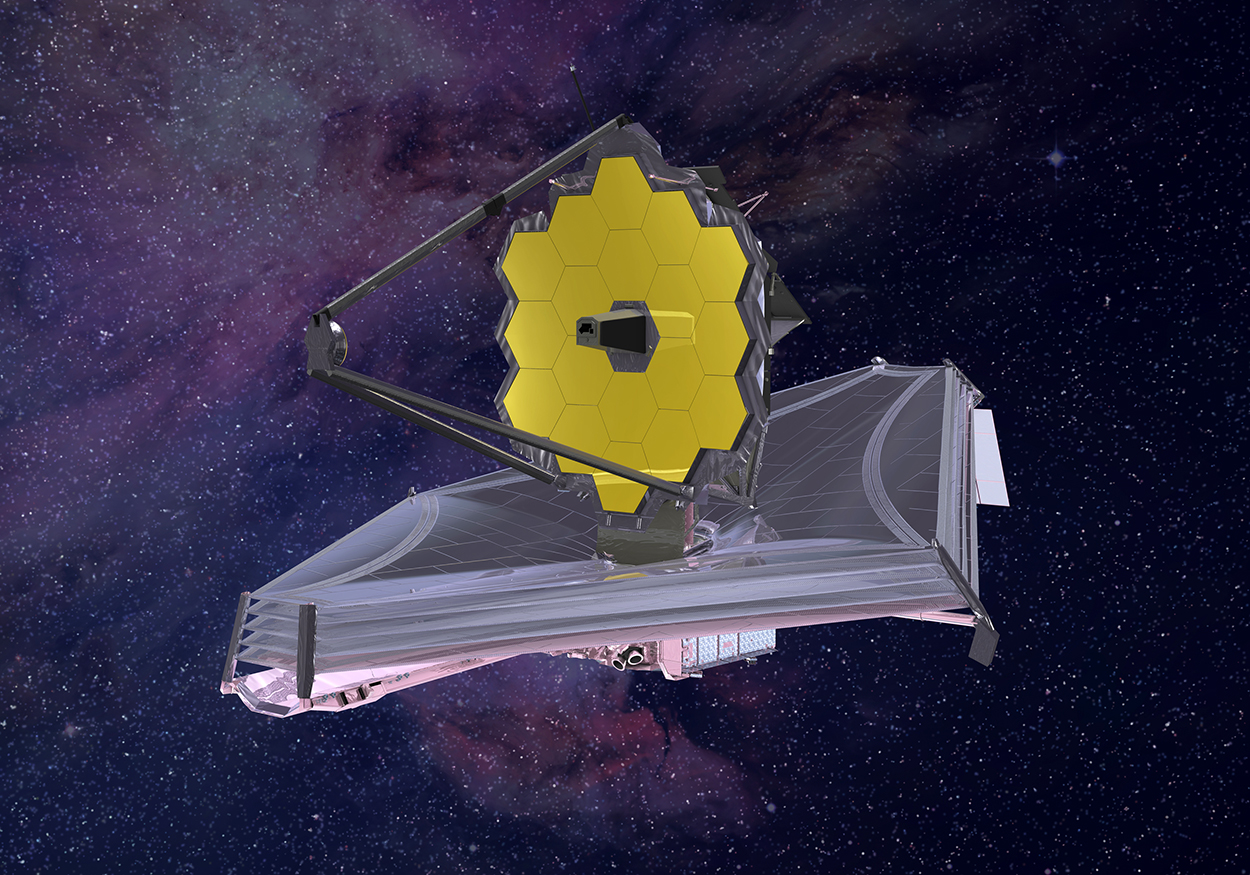
Image: NASA.
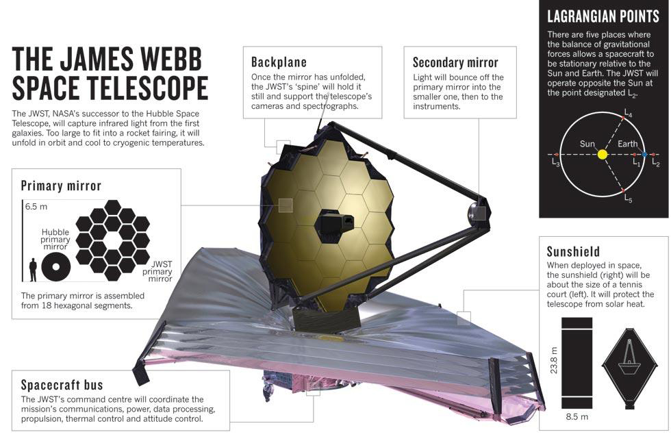
Infographic: NASA
The primary mirror is made of gold-plated beryllium. Explore the telescope in 3D here: https://wst.nasa.gov/webb3d/#
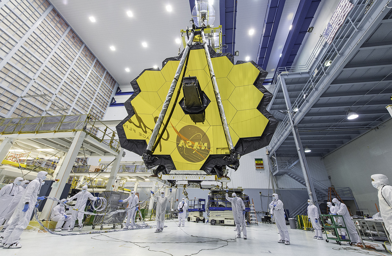
Photograph: NASA.
Traditional
The Yerkes Observatory in Williams Bay, Wisconsin, houses the world’s largest refracting telescope, which has a 40-inch lens (102 cm). It was completed in 1897 for the University of Chicago. The telescope played a huge role in the development of modern astrophysics, but has been superseded by technological developments, and will close next month.
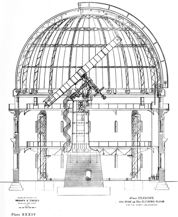
Albert Einstein paid a visit to the famous telescope in 1921.
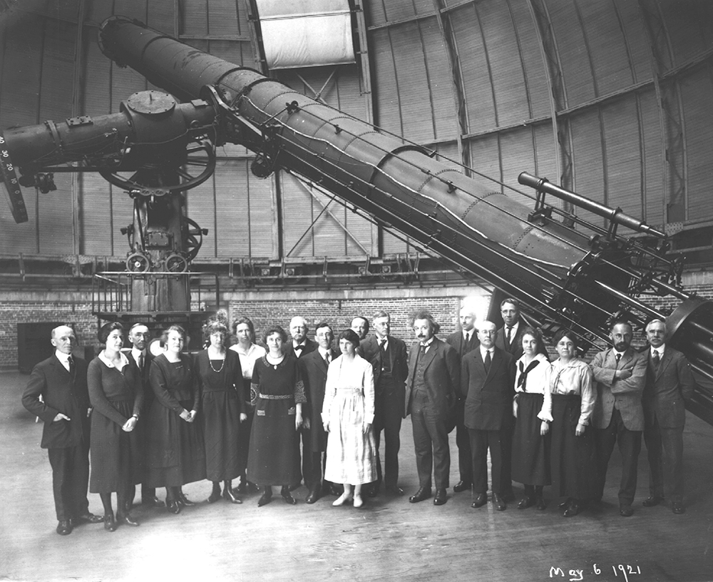
Photograph: University of Chicago Photographic Archive
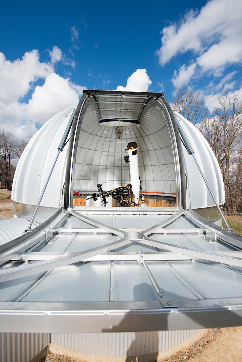
A telescope for the people
Ohio University owns a 10-inch (25.4 cm) Fecker refracting telescope that was built in 1950. It was restored a few years ago to it’s original condition, and is now inside a new observatory building. In the photograph below, the project is nearly complete.
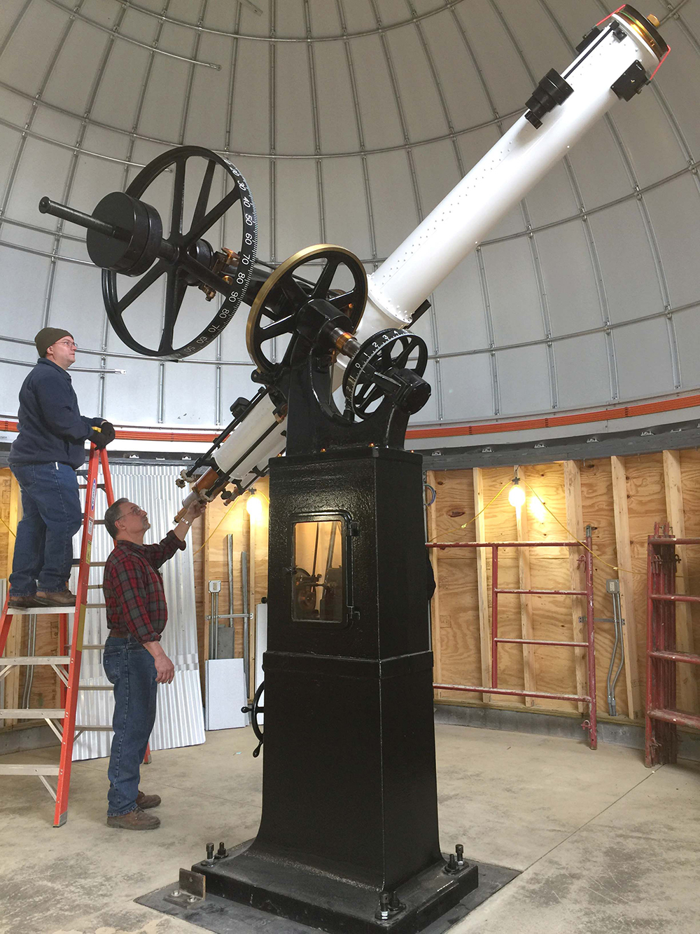
© Ohio University/Photograph by Jean Andrews.
Now the facility is frequently open to both students and the public, so they can experience the magic of looking at the stars.
The schedule: https://www.ohio.edu/cas/physastro/research/observatory/public-telescope.cfm
© Ohio University/Photograph by Ben Siegel.
Thank you to Ahmad Shamloumehr, a graduate student in Physics and Astronomy at Ohio University for giving me the idea for this post, and to Jean Andrews, Special Projects Assistant, Physics and Astronomy, for help with the OU images.
A related post, “The color of space:” https://wp.me/p7LiLW-2lV


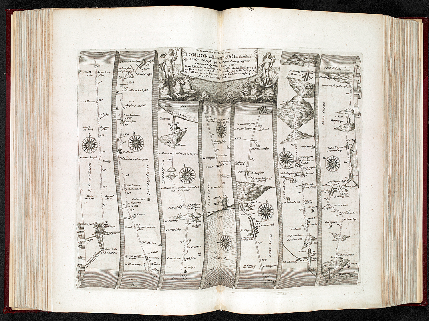 Photograph: The British Library.
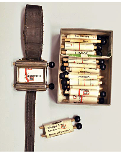


 Images and video © Gústi Productions.